
 /home/wwwroot/advids.co/design/index.php on line 425
Introduction: Bridging the Divide Between Data and Decision
The global supply chain is no longer just a physical network of ships, ports, and trucks; it has evolved into a complex digital ecosystem powered by remote sensing, IoT telemetry, and massive data streams. For industry leaders, the challenge has shifted from simply moving goods to gaining granular, real-time visibility into how they move. In this high-stakes environment, where a single delay can ripple across continents, the ability to visualize complex data is not merely an aesthetic choice—it is a strategic operational asset.
As we look toward the future, the industry is poised for unprecedented expansion. The global geospatial analytics market size is estimated to be valued at USD 73.04 Bn in 2025, driven by a universal demand for transparency and predictive intelligence. This growth signals a fundamental shift: logistics platforms are transforming from record-keeping systems into proactive "control towers." However, this influx of sensor data—from hull integrity readings to container temperature logs—creates a new barrier: cognitive overload. Without effective visualization, this wealth of data remains an abstract burden rather than a competitive advantage.
The bridge between raw remote sensing data and actionable strategy lies in advanced video and motion design. By translating millions of data points into intuitive visual narratives, software platforms can empower users to process information instantly. The impact of this clarity is measurable and profound. Research indicates that implementing real-time visibility solutions can reduce supply chain costs by up to 20%, proving that when operators can see the problem clearly, they can solve it efficiently.
This guide explores 30 distinct visualization styles tailored for Remote Sensing and Logistics SaaS platforms. From the high-level clarity of flat vector art to the immersive depth of digital twins, each style is analyzed not just for its beauty, but for its ability to reduce friction, build trust, and drive adoption. Whether you are creating a Top-of-Funnel awareness campaign or a Bottom-of-Funnel feature walkthrough, these examples serve as a blueprint for turning the invisible currents of global trade into visible, manageable realities.
Visual Style Analysis: Styles 1-10
1. Minimalist Flat 2D Vector
Funnel Stage: TOFU (Brand Awareness) | Goal: 1.1 Brand Awareness
The Visual & Narrative Approach
This style embraces a philosophy of radical subtraction, removing all textures and shadows to focus entirely on geometry and color. The visualization depicts a massive container ship in profile, constructed from clean, sharp blocks of cobalt blue and safety orange. The ship sits on a stylized ocean of jagged turquoise waves. The sky is a solid block of pale icy blue with a single perfect white circle representing the sun. The narration for this style should be crisp, rhythmic, and professional, mirroring the visual precision. It communicates stability and modern efficiency, stripping away the "noise" of real-world logistics to present an idealized, orderly view of global trade.
Psychological Impact & KPI Focus
For a Top-of-Funnel (TOFU) audience, the primary psychological barrier is the perceived complexity of logistics software. This style lowers Cognitive Load by presenting familiar icons (ship, container, ocean) in their simplest forms. It triggers a feeling of "ease" and "control," signaling to the viewer that the platform simplifies the chaotic reality of shipping.
- Primary KPI: Brand Recall (Safety Orange/Cobalt Blue association).
- Secondary KPI: Click-Through Rate (CTR) on social feeds due to high contrast.
Strategic Implementation & Trade-offs
- Best Use Case: LinkedIn Organic posts (15-30 seconds) aimed at C-Suite executives who need a quick, high-level understanding of the value proposition without getting bogged down in technical details.
- Strategic Trade-off: While excellent for clarity, this style lacks "technical depth." It is suboptimal for demonstrating complex features like granular sensor data or predictive analytics, as the flat aesthetic cannot convey data density effectively.
2. Abstract 2D Glossy
Funnel Stage: TOFU (Market Education) | Goal: 1.3 Market Education
The Visual & Narrative Approach
Moving beyond the rigid geometry of flat design, this style introduces fluidity and premium texture. A stylized globe is rendered in deep liquid silver, with trade routes represented as flowing, viscous lines of glowing teal and electric cyan connecting continents. The background is a clean, deep navy void. The lighting mimics studio soft-box reflections on the glossy surfaces, creating a high-end, modern tech feel. The visual represents the fluidity of global trade networks. The narrative tone here is sophisticated and aspirational, using terms like "fluidity," "ecosystem," and "seamless integration."
Psychological Impact & KPI Focus
This style leverages the Aesthetic-Usability Effect, where users perceive attractive designs as more usable and credible. By rendering data flows as smooth, glowing liquids, it metaphorically suggests that the software handles data frictionlessly. It combats the anxiety of "clunky" legacy systems.
- Primary KPI: Time on Page (Website). The mesmerizing motion holds attention.
- Secondary KPI: Perceived Value. The "glossy" look implies a high-ticket, enterprise-grade solution.
Strategic Implementation & Trade-offs
- Best Use Case: Website Hero Backgrounds or "About Us" explainer videos (45-60 seconds). It sets a high-tech tone immediately upon visitor arrival.
- Strategic Trade-off: The abstract nature can be vague. It is excellent for "Market Education" (showing the concept of global connectivity) but poor for "Product Training" (showing how to click a button).
3. Isometric 3D + Low Poly
Funnel Stage: TOFU (Shaping Brand Perception) | Goal: 1.5 Shaping Brand Perception
The Visual & Narrative Approach
This hybrid 3D illustration combines isometric perspective with low-poly modeling. A miniature, toy-like shipping port is viewed from a 45-degree top-down angle. Faceted cranes painted in soft coral and pastel yellow lift geometric cubes (containers) onto a low-poly ship. The water is rendered as crystalline, faceted blue triangles. The lighting is bright and warm, casting sharp, defined shadows. The color palette is soft and inviting, utilizing pastel cyan, mint green, and matte white to make logistics look approachable and modern.
Psychological Impact & KPI Focus
Logistics can feel gritty and industrial. This style functions as a Brand Perception Shaper, softening the industry's hard edge. The "God's Eye View" (isometric angle) gives the viewer a sense of total dominion and oversight over the operation, directly addressing the anxiety of "losing control" over cargo.
- Primary KPI: Engagement Rate (Instagram). The colorful, stylized look stops the scroll.
- Secondary KPI: Brand Affinity. Users associate the soft palette with a user-friendly interface.
Strategic Implementation & Trade-offs
- Best Use Case: Instagram Reels or Carousel Ads (15-30 seconds). The 4:5 aspect ratio works perfectly for mobile feeds.
- Strategic Trade-off: The "toy-like" aesthetic runs the risk of looking too casual for highly conservative defense or government logistics sectors. It works best for commercial B2B SaaS, not necessarily for heavy industrial hardware sales.
4. Wireframe to Reality
Funnel Stage: TOFU (Category Creation) | Goal: 1.2 Category Creation
The Visual & Narrative Approach
A split-screen composition visualizing the transition from traditional to digital logistics. The screen is divided vertically. The left side shows a technical white wireframe blueprint of a container ship hull on a blueprint blue background. As the image crosses to the right side, the wireframe transforms seamlessly into a photorealistic, steel-plated ship hull in daylight. The transition point glows with a digital white light. The visual metaphor emphasizes the bridge between engineering and reality.
Psychological Impact & KPI Focus
This visual metaphor directly addresses the Trust Gap in remote sensing. Buyers often doubt if the data on their screen matches reality. By visually fusing the wireframe (data) with the photo (reality), the video subconsciously confirms accuracy.
- Primary KPI: Conversion Rate (Demo Requests). It validates the technology's core promise.
- Secondary KPI: Credibility. It appeals to engineers and operations managers who value technical accuracy.
Strategic Implementation & Trade-offs
- Best Use Case: LinkedIn Video Ads (30-45 seconds) targeting "Category Creation." It defines the software as the bridge between physical assets and digital management.
- Strategic Trade-off: High production cost. Sourcing high-quality matching footage and aligning it perfectly with 3D wireframes requires significant effort compared to fully synthetic styles.
5. Bold Kinetic Typography (Visual)
Funnel Stage: TOFU (Vertical Social Organic) | Goal: 3.5 Vertical Social Organic
The Visual & Narrative Approach
A visual representation of bold kinetic typography (without legible text) utilizing dynamic shapes to convey speed. Large, blocky diagonal shapes in electric lime green and deep purple slash across the screen against a stark white background. Speed lines and motion blur effects suggest rapid movement from left to right. The composition is energetic and aggressive, symbolizing the speed of expedited freight, with abstract arrowheads pointing forward.
Psychological Impact & KPI Focus
Designed for the Attention Economy, this style exploits the "Orienting Reflex"—our brain's involuntary response to rapid movement and bright colors. It conveys "Speed" and "Urgency" without needing a complex voiceover. It is perfect for signaling "Expedited Freight" or "Instant Alerts."
- Primary KPI: Retention Rate (TikTok/Shorts). The constant motion prevents drop-off.
- Secondary KPI: Message Recall. The bold shapes act as visual anchors for key terms.
Strategic Implementation & Trade-offs
- Best Use Case: TikTok or YouTube Shorts (9:16 vertical). Ideal for quick tips, feature announcements, or "myth-busting" clips.
- Strategic Trade-off: Zero nuance. This style cannot explain how a feature works; it can only announce that it exists. It is purely for awareness, not education.
7. Isometric 3D Workflow
Funnel Stage: MOFU (Skippable Pre-Roll Ad) | Goal: 4.1 Skippable Pre-Roll Ad
The Visual & Narrative Approach
A highly detailed isometric 3D render of a "Logistics Control Tower" room. The view is a cutaway diorama style. Inside, sleek white desks are arranged in a grid, with miniature server racks glowing in amber. On the walls, large abstract screens display heatmaps of global ports in slate blue and cool grey. The lighting is soft and ambient, simulating a high-tech office environment. The rendering style is smooth with a matte finish, emphasizing the organized, data-driven nature of the software.
Psychological Impact & KPI Focus
This style satisfies the Need for Structure. For an Operations Manager, a chaotic desk is a nightmare. This pristine, organized 3D environment represents the "Future State" of their business after adopting the software. It visualizes organization and competence.
- Primary KPI: View Through Rate (YouTube Pre-roll). The detailed environment invites the eye to linger and explore.
- Secondary KPI: Product Understanding. It shows the context of where the software is used (the control room).
Strategic Implementation & Trade-offs
- Best Use Case: YouTube Skippable Ad (Pre-roll). The high detail establishes authority quickly before the skip button appears.
- Strategic Trade-off: It can feel impersonal. Without human characters, it focuses entirely on the process and infrastructure, which is great for selling efficiency but less effective for selling "team collaboration."
8. Abstract 3D AI Visualization
Funnel Stage: MOFU (Product Differentiation) | Goal: 1.7 Product Differentiation
The Visual & Narrative Approach
An abstract 3D visualization of artificial intelligence in logistics. A central node, rendered as a glowing sphere of bioluminescent blue, connects to hundreds of smaller nodes via thin, pulsing magenta fiber-optic lines. The background is a deep void black to contrast the luminosity. The camera focuses on the macro details of the connections, simulating a neural network or a digital supply chain brain. Floating dust particles add depth and a sense of high-end production value.
Psychological Impact & KPI Focus
AI is often a "black box" to buyers. This visualization makes the abstract concept of Machine Learning tangible. The "bioluminescent" look triggers associations with synapses and organic intelligence, positioning the software not just as a calculator, but as a "thinking" partner.
- Primary KPI: Differentiation. It visually separates "AI-powered" software from standard legacy databases.
- Secondary KPI: Perceived Sophistication. The high-end VFX look implies cutting-edge technology.
Strategic Implementation & Trade-offs
- Best Use Case: Paid Social (Instagram/LinkedIn) 1:1 Square Video. It stands out against the white backgrounds typical of social feeds.
- Strategic Trade-off: It is purely metaphorical. It does not show the UI. If a user asks, "What does the dashboard look like?", this video does not answer that. It sells the technology, not the interface.
9. 3D Parallax UI Presentation
Funnel Stage: MOFU (Feature Education) | Goal: 1.8 Feature Education
<img src="https://advids.co/design/images/3D Floating Glass UI Screens in Office]
The Visual & Narrative Approach
A 3D parallax composition of floating UI screens. The screens are rendered as semi-transparent, frosted glass panels with glowing white and sky blue interface elements. They hover in a 3D space with a shallow depth of field; the background is a blurred, bright modern office. The foremost screen displays a stylized "ETA Prediction" curve graph ascending. The perspective is angled to show the thickness and premium quality of the glass interface elements.
Psychological Impact & KPI Focus
Standard screen recordings can be boring. This style elevates the UI to an object of desire (the "Apple Aesthetic"). By giving the interface depth and texture, it makes the data feel tangible and valuable. It reduces the "boredom" friction often associated with software demos.
- Primary KPI: Feature Adoption. Users are more likely to want to use a tool that looks beautiful and modern.
- Secondary KPI: Dwell Time. The parallax effect creates a sense of immersion.
Strategic Implementation & Trade-offs
- Best Use Case: Website Product Pages or Feature Highlight Reels (60-90 seconds).
- Strategic Trade-off: It flatters the UI. If the actual software looks dated or "flat" compared to these gorgeous 3D glass renders, users might feel disappointed upon login. It requires the actual UI to be reasonably modern.
10. Split Screen: Optimized Reality
Funnel Stage: MOFU (Competitive Displacement) | Goal: 1.13 Competitive Displacement
{Filename: Split Screen Sepia Desk vs Modern Tablet]
The Visual & Narrative Approach
A split-screen comparison. The left half depicts "The Old Way": a gritty, desaturated sepia-toned photo of a messy desk piled high with crumpled paper manifests and a landline phone. The right half depicts "The New Way": a vivid, technicolor, high-gloss 3D render of a pristine tablet displaying a clean, organized logistics dashboard in bright white and blue. The contrast creates a visual argument for organization over chaos.
Psychological Impact & KPI Focus
This triggers Loss Aversion (fear of staying in the messy past) and Aspiration (desire for the clean future). It effectively displaces competitors by visually labeling them as "outdated" without naming them. The stark contrast creates an emotional preference for the "clean" side.
- Primary KPI: Lead Generation (Competitive Displacement). It motivates users to switch providers.
- Secondary KPI: Emotional Resonance. It validates the user's frustration with their current messy workflow.
Strategic Implementation & Trade-offs
- Best Use Case: LinkedIn Ads (Comparison Campaigns). "Still managing freight like it's 1999?"
- Strategic Trade-off: It can feel "salesy." This is a direct marketing tactic, not a subtle brand play. It works best for conversion-focused campaigns, not general brand awareness.
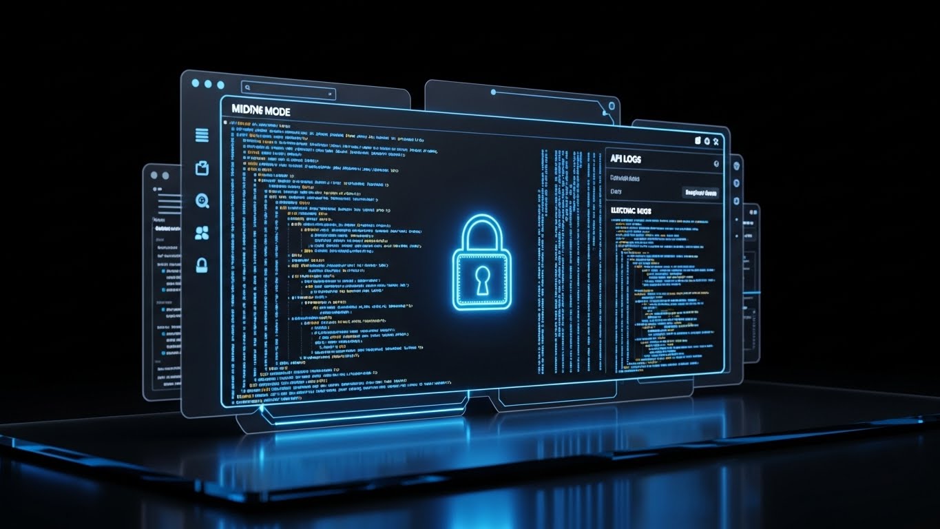
11. Futuristic Neon/Dark Mode**
MOFU | ABM Awareness
{Filename: 715_13_11_2.png" alt="Case Study Image" loading="lazy" style="max-width:100%;height:auto;margin:15px 0;display:block;border-radius:20px;">
The Visual & Narrative Approach
This aesthetic embraces a "Cyberpunk Corporate" visual language to communicate advanced security and speed. The visualization presents a global supply chain network on a dark charcoal grid. A world map is outlined in glowing neon blue laser lines, with key port cities highlighted by pulsing laser red dots. Connecting these nodes are animated arcs of light that represent secure data encryption and real-time telemetry. The tone is intense, precise, and highly technical, utilizing sound design rich with digital hums and data-processing textures to emphasize infrastructure robustness.
Psychological Impact & KPI Focus
For IT Directors and CTOs, the primary anxiety is data security and latency. The dark mode aesthetic is synonymous with "developer environments" and "command centers," subtly signaling that this is a serious, enterprise-grade tool. The glowing arcs visualize End-to-End Encryption, turning the invisible concept of cybersecurity into a tangible, defensive shield.
- Primary KPI: Account Penetration (ABM). The sophisticated look appeals to technical decision-makers within target accounts.
- Secondary KPI: Perceived Security. The visual language mimics high-end cybersecurity platforms.
Strategic Implementation & Trade-offs
- Best Use Case: Display Ads or LinkedIn Video Ads (15-30 seconds) targeting IT professionals and CTOs.
- Strategic Trade-off: It can feel "cold" or overly complex for non-technical users. It lacks the human element, making it less effective for HR or Driver Retention campaigns.
Companies using similar video content -
Mapbox – Mapbox GL JS – Provides customizable 2D vector maps for location data.
CARTO – Location Intelligence Platform – Visualizes geospatial data with clean 2D maps.
12. Photorealistic 3D Renders
MOFU | Building Trust
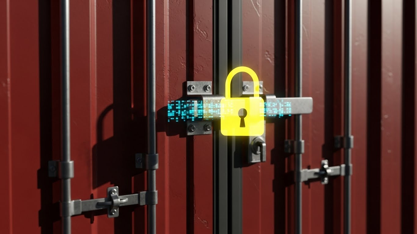
The Visual & Narrative Approach
This style rejects abstraction in favor of hyper-realism. It features a close-up 3D render of a shipping container door, where the texture of the corrugated steel is visible, painted in a weathered rust red with industrial grey accents. Focused on the locking mechanism, a glowing, digital holographic padlock in sunlight yellow hovers over the physical latch. The lighting is natural daylight with sharp shadows. The narrative emphasizes "Real-world protection," grounding digital features in the physical reality of heavy industry.
Psychological Impact & KPI Focus
A common objection in logistics is that software is "vaporware"—disconnected from the gritty reality of the shipping yard. By rendering the rust and imperfections of the container, this style bridges the Trust Gap. It tells the Operations Manager, "We understand your physical assets." The digital lock overlay visually reinforces the concept of a Digital Twin securing physical cargo.
- Primary KPI: Time on Page. The extreme detail encourages viewers to scrutinize the image, increasing dwell time.
- Secondary KPI: Credibility. It proves the brand understands the "heavy" nature of the industry.
Strategic Implementation & Trade-offs
- Best Use Case: Website "Security" or "Hardware Integration" pages (45-60 seconds).
- Strategic Trade-off: Production costs are high. Achieving this level of photorealism requires significant rendering time and 3D modeling expertise compared to vector art.
Companies using similar video content -
Spire Global – Maritime Domain Awareness – Visualizes global ship movements and weather.
HERE Technologies – Location Platform – Offers fluid, high-fidelity mapping and location services.
13. Dynamic Data Visualization
MOFU | Demand Gen
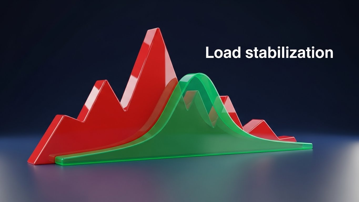
The Visual & Narrative Approach
To visualize the financial impact of logistics software, this style blends abstract data with literal objects. In a clean, white studio space, vertical bars representing financial growth rise from a reflective floor. Uniquely, these bars are constructed from stacks of stylized gold coins and miniature shipping containers. The palette uses emerald green for growth and alert red for costs. The camera utilizes a low "worm's eye view," looking up at the soaring graphs to convey dominance and high Return on Investment (ROI).
Psychological Impact & KPI Focus
CFOs and Finance Directors often struggle to see the direct link between "better tracking" and "bottom-line profit." This visual metaphor creates a direct Cognitive Association between moving containers and stacking revenue. It simplifies the complex equation of "efficiency = profit" into a single, undeniable image.
- Primary KPI: Marketing Qualified Leads (MQLs). It speaks the language of the buyer who holds the budget.
- Secondary KPI: Sales Material Utility. Sales teams can use this to visually justify the software cost.
Strategic Implementation & Trade-offs
- Best Use Case: Sales Presentations and Pitch Decks (30-45 seconds). It serves as a powerful visual anchor during pricing discussions.
- Strategic Trade-off: It is purely conceptual. It explains why to buy, but not what the product actually does (no UI is shown).
Companies using similar video content -
OpenTCS – Open Transportation Control System – Visualizes automated guided vehicle (AGV) workflows.
Konecranes – Agile Fleet Management – Depicts port equipment and material flow in 3D.
14. 3D X-Ray Visualization
MOFU | Visitor Re-engagement

The Visual & Narrative Approach
This style uses a "Superman Vision" metaphor. A standard 40-foot shipping container is rendered with semi-transparent, skeletal white mesh walls. Inside, the cargo is visible as glowing, geometric crates in a ghostly x-ray blue. The background is dark grey, making the internal glow pop. This serves as a powerful visual metaphor for "Total Visibility," demonstrating the ability to see what is hidden—tracking condition, temperature, and status without opening the doors.
Psychological Impact & KPI Focus
Compliance Officers and Customs Brokers fear the unknown—contraband, damage, or spoilage hidden inside a sealed box. This style triggers a sense of Omniscience. It alleviates the anxiety of "blind spots" in the supply chain, visually promising that the software reveals the truth behind the steel walls.
- Primary KPI: Re-engagement Rate (Retargeting Ads). It reminds users of the core value proposition: Visibility.
- Secondary KPI: Trust in Compliance. It suggests a higher level of scrutiny and safety.
Strategic Implementation & Trade-offs
- Best Use Case: Website "Compliance" pages or Retargeting Ads (15-30 seconds) for visitors who bounced from the pricing page.
- Strategic Trade-off: It implies hardware integration (sensors). If your software is purely administrative (paperwork only) and doesn't track physical cargo condition, this visual may overpromise.
Companies using similar video content -
PTC – ThingWorx – Connects digital models to physical IoT assets.
Siemens – MindSphere – Bridges industrial asset data with digital twin visualizations.
15. 2D Line Art Animation
MOFU | Overcoming Objections
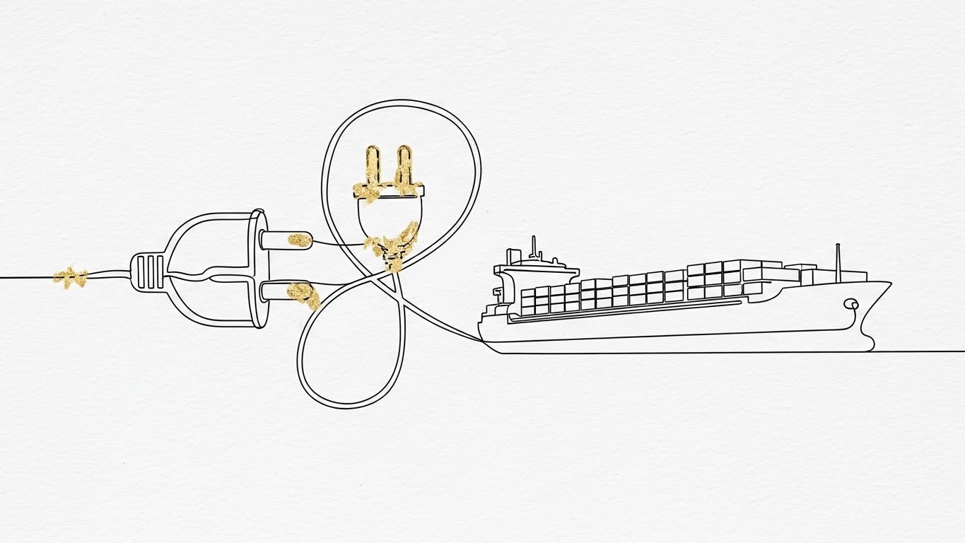
The Visual & Narrative Approach
To address the complexity of software integration, this style uses elegant simplicity. A single, unbroken thin line in ink black forms the shape of a standard wall plug, loops intricately, and transforms into the outline of a cargo ship. Touches of gold leaf texture accent the connection points. The background is textured paper-white. The continuous line metaphorically represents the "seamless" flow of data between legacy systems and the new platform—the API Interoperability.
Psychological Impact & KPI Focus
"Implementation Friction" is a major sales blocker. IT teams fear that new software will break existing workflows. This fluid, continuous animation reduces Perceived Effort. It subconsciously tells the viewer, "This is not a hard stop; it is a continuation of what you already do, just elevated."
- Primary KPI: Whitepaper Downloads (Technical Specs). It invites deeper reading without scaring off the user.
- Secondary KPI: Conversion Rate on "Integration" pages.
Strategic Implementation & Trade-offs
- Best Use Case: Technical Whitepapers or "Integrations" section of the website (15-20 seconds).
- Strategic Trade-off: It is very stylized. It doesn't show the code or the documentation, so it must be paired with substantive technical text to be credible.
Companies using similar video content -
Tive – Solo 5G Tracker – Conveys real-time shipment speed and alert urgency.
Roambee – Real-Time Visibility Platform – Highlights rapid asset movement and alerts.
16. Lifestyle Stock with UI Overlay
MOFU | The Functional Buyer

The Visual & Narrative Approach
This style places the technology in the hands of the decision-maker. A cinematic shot captures a professional executive in a navy blue suit standing in a high-rise office. The view overlooks a blurred city harbor. Floating just above the tablet in their hands is a futuristic, holographic HUD (Heads Up Display) showing financial logistics metrics in UI blue and white. The lighting is natural and aspirational. It answers the question: "What does this feel like to use as a leader?"
Psychological Impact & KPI Focus
For the C-Suite, software is about control and foresight. This style leverages Social Proof and aspiration. It mirrors the self-image of the executive: commanding, informed, and overlooking the global operation. It validates their role as the "Captain" of the business.
- Primary KPI: LinkedIn Engagement (Senior Leadership).
- Secondary KPI: Brand Prestige. It elevates the software from a "tool" to a "strategic asset."
Strategic Implementation & Trade-offs
- Best Use Case: LinkedIn Image Ads or "Solutions for Executives" landing pages (30-45 seconds).
- Strategic Trade-off: It is a "stock photo" trope. If the stock footage is generic, it can feel inauthentic. The key is high-quality compositing of the UI to make it look bespoke.
Companies using similar video content -
Navis – N4 Terminal Operating System – Visualizes port operations and container flow.
Tideworks Technology – Mainsail 10 – Demonstrates terminal management workflows.
17. Clean UI Workflow (Light Mode)
MOFU | Time-to-Value
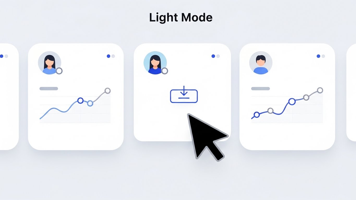
The Visual & Narrative Approach
For the daily user (the dispatcher or analyst), clarity is king. This style features a pristine, high-key UI presentation. The focus is on a flat, clean interface design showing a "Vessel Schedule" or "Download" action. The background is stark hospital white. The UI elements utilize soft shadows to create depth (neumorphism), and colors are restricted to soft blues and dark greys. It creates a sense of calm, order, and hygiene.
Psychological Impact & KPI Focus
This directly attacks Cognitive Load. Logistics is chaotic; the software shouldn't be. By presenting a zen-like, clean interface, it promises the user that their workday will be less stressful. It signals "Ease of Use" and rapid Time-to-Value.
- Primary KPI: Free Trial Sign-ups. It lowers the barrier to entry.
- Secondary KPI: User Retention. Users prefer tools that don't strain their eyes or brains.
Strategic Implementation & Trade-offs
- Best Use Case: "Features" page or Help Center tutorials (45-60 seconds).
- Strategic Trade-off: It can look "simple." Power users who want complex data density might perceive it as "lite" software. It's important to show that depth exists behind the clean surface.
Companies using similar video content -
C3 AI – Supply Chain Suite – Visualizes complex AI-driven predictions and optimizations.
o9 Solutions – Digital Brain – Depicts AI-powered integrated business planning.
18. Rapid UI Feature Montage
BOFU | ROI Justification
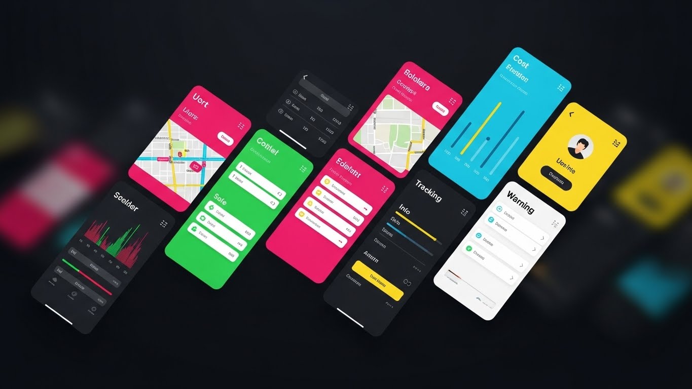
The Visual & Narrative Approach
When closing a deal, volume matters. This style uses a dynamic collage composition suggesting a rapid montage. Angled slices of different UI screens—maps, cost tables, tracking bars, user profiles—cut diagonally across the frame diagonally against a dark void. The palette is a vivid spectrum of functional UI colors: alert red, safe green, info blue, and warning yellow. Motion blur at the edges suggests speed and the sheer breadth of the platform's capabilities.
Psychological Impact & KPI Focus
This triggers the "More is Better" Heuristic. It visually overwhelms the viewer with value, suggesting that for one price, they are getting a massive suite of tools. It serves as a visual "thud factor"—the digital equivalent of dropping a heavy manual on the desk to prove substance.
- Primary KPI: Conversion (Demo to Paid). It justifies the price point.
- Secondary KPI: Feature Awareness. It hints at modules the user might not know existed.
Strategic Implementation & Trade-offs
- Best Use Case: Email Nurture Campaigns (Closing Sequence) or Pricing Page headers (15-30 seconds).
- Strategic Trade-off: It is chaotic. It is not for teaching how to use the software, but for impressing the viewer that the software can do it all.
Companies using similar video content -
project44 – Movement by project44 – Showcases advanced UI with depth and interactive elements.
FourKites – Real-Time Visibility Platform – Presents UI features with modern, layered aesthetics.
19. 2D Animation & UI Composition
BOFU | Risk Mitigation

The Visual & Narrative Approach
Implementation is the final hurdle. This style uses approachable 2D vector illustration. A friendly female character with deep skin tones and a purple blouse interacts with floating, oversized UI elements in a clean white space. She points to a "Checklist" panel where green checkmarks animate into existence. The style uses flat colors and soft abstract blobs to add warmth. It transforms the scary process of "Onboarding" into a friendly, guided checklist.
Psychological Impact & KPI Focus
This leverages the Human-Computer Interaction principle of anthropomorphism. By adding a smiling human proxy, it reduces Implementation Anxiety. It reassures the buyer that they won't be left alone with the code; there is a process, and it is manageable.
- Primary KPI: Onboarding Completion Rate.
- Secondary KPI: Customer Satisfaction (CSAT) during the trial phase.
Strategic Implementation & Trade-offs
- Best Use Case: In-App Onboarding Videos or "Welcome" emails (45-60 seconds).
- Strategic Trade-off: It can feel "childish" if overused. It should be reserved for "Help" and "Onboarding" contexts, not for the high-stakes "Security" or "Architecture" pitches.
Companies using similar video content -
Motive – Fleet Management Platform – Contrasts old paper logs with digital ELD data.
Omnitracs – Intelligent Vehicle Gateway – Compares traditional fleet management to modern telematics.
20. 2D Character-Driven Story
BOFU | Sales Cycle Acceleration

The Visual & Narrative Approach
Ultimately, software is bought by people who want to go home on time. This style features a 2D vector illustration of a logistics manager sitting relaxed on a dock crate, using a laptop. The background shows stylized cranes and a sunset sky in gradients of denim blue and orange. The laptop screen glows with a bright green "Success" icon. It visualizes the result of the software: a job well done and a peaceful end to the day.
Psychological Impact & KPI Focus
This targets Personal Aspiration. Logistics is a high-burnout industry. This image sells "Peace of Mind." It connects the software not just to business KPIs, but to the user's personal quality of life—less stress, fewer late-night emergencies, and more "green checkmarks."
- Primary KPI: Renewal Rates / Churn Reduction. It reminds users of the personal value the software provides.
- Secondary KPI: Emotional Connection. It builds loyalty beyond the feature set.
Strategic Implementation & Trade-offs
- Best Use Case: Customer Success stories, Case Studies, or Holiday/End-of-Year communications (60-90 seconds).
- Strategic Trade-off: It is soft on data. It doesn't prove ROI; it illustrates emotional satisfaction. It is a closer/retainer style, not an opener.
Companies using similar video content -
Windward – Maritime AI Platform – Visualizes secure maritime intelligence and risk.
HawkEye 360 – RFGeo Analytics – Depicts encrypted RF signal intelligence networks.
21. Hyper-lapse Stock Footage**
BOFU | The Economic Buyer
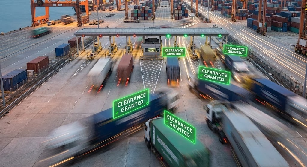
The Visual & Narrative Approach
This style utilizes the "Hyper-lapse" technique to compress time and emphasize scale. A static, high-angle camera captures a bustling port gate or distribution hub at dusk. The physical elements (trucks, cranes, forklifts) are rendered with heavy motion blur, appearing as continuous streams of light and color to indicate rapid activity. Overlaid on this blurred reality are sharp, static UI elements—bright "Traffic Green" boxes floating over lanes with text like "Clearance Granted" or "Processing Complete." The narrative contrasts the chaotic speed of the physical world with the calm, instantaneous precision of the digital verification system.
Psychological Impact & KPI Focus
The Economic Buyer (CFO or VP of Ops) is less concerned with feature lists and more focused on throughput and capacity. This visual directly triggers the Efficiency Heuristic. It demonstrates that the software does not just "track" activity; it accelerates it. The static UI elements amidst the blur subconsciously suggest that the software is the stable, controlling force managing the chaos of enterprise-scale logistics.
- Primary KPI: Conversion Rate (Sales Qualified Leads). It proves the software can handle high volume without latency.
- Secondary KPI: Perceived Scalability. It reassures buyers that the system performs during peak seasons.
Strategic Implementation & Trade-offs
- Best Use Case: Social Media Ads (LinkedIn/Facebook) targeting "Logistics Efficiency" interests (15-20 seconds).
- Strategic Trade-off: Generic stock footage can feel disconnected from the specific brand. The key to success here is the quality of the UI compositing—it must look like the software is actually reading the video feed in real-time, not just pasted on top as an afterthought.
Companies using similar video content -
Nexxiot – Asset Intelligence – Renders detailed railcar and container IoT sensors.
Amsted Digital Solutions – IQ Series – Showcases realistic railcar telematics hardware.
22. Abstract 2D Motion Graphics
BOFU | The Technical Buyer

The Visual & Narrative Approach
A pure celebration of user activation. Against a clean, high-key white background, a central burst of geometric "confetti" explodes outward. The shapes—triangles, circles, and abstract data nodes—are colored in "Success Gold," "Bright Teal," and "Navy Blue." They swiftly assemble into a stylized star or an upward-pointing arrow. The motion is snappy, elastic, and joyous (following the "Whisk" motion model). Sound design features a satisfying "ding" or positive chime, reinforcing the feeling of a completed task or a successful integration.
Psychological Impact & KPI Focus
In the final stages of the funnel, or immediately post-purchase, the goal is to validate the user's decision. This style leverages Gamification Psychology. By associating a technical setup task (like connecting an API or adding a fleet) with a visual celebration, it triggers a dopamine release. It transforms a boring configuration step into a "win," reducing the emotional friction of technical implementation.
- Primary KPI: Activation Rate (User Onboarding). It encourages users to finish the setup process.
- Secondary KPI: User Sentiment. It builds a positive emotional association with the interface.
Strategic Implementation & Trade-offs
- Best Use Case: In-App "Success" screens or "Welcome" emails after a purchase (5-10 seconds loop).
- Strategic Trade-off: It is purely decorative. It conveys zero information. It should strictly be used for emotional punctuation (celebration), never for explanation, to avoid trivializing complex tasks.
Companies using similar video content -
Kinaxis – RapidResponse – Visualizes financial impact and supply chain ROI.
Blue Yonder – Luminate Platform – Demonstrates financial and operational growth metrics.
23. 2D Graphics Over Live Action
BOFU | Objection Handling

The Visual & Narrative Approach
To humanize the software experience, this style blends photography with vector art. A high-quality photo shows a smiling customer support agent wearing a headset in a modern, blurred office environment. Surrounding the agent are hand-drawn, animated white vector doodles: speech bubbles, question marks transforming into exclamation points, and connecting lines linking the agent to a stylized truck. This "mixed reality" aesthetic conveys that while the software is automated, there are real, capable humans ready to help.
Psychological Impact & KPI Focus
A major objection to SaaS adoption is "Support Anxiety"—the fear of being trapped in a chatbot loop when a shipment goes missing. This style uses the Halo Effect of the smiling human face to transfer warmth to the software brand. It reassures the buyer that "Technology" and "Service" are not mutually exclusive. The doodles suggest that complex problems are easily sketched out and solved.
- Primary KPI: Trust Score / Reduction in Sales Objections regarding support.
- Secondary KPI: Click-Through to "Help Center" or "Contact Sales."
Strategic Implementation & Trade-offs
- Best Use Case: "Contact Us" page or "Support" section of the sales deck (15-30 seconds).
- Strategic Trade-off: Authenticity is key. Using a generic "Call Center Model" stock photo can backfire and look fake. Using a photo of an actual team member works significantly better to build genuine rapport.
Companies using similar video content -
Controlant – Cold Chain Visibility – Shows internal cargo conditions via X-ray view.
Sensitech – TempTale Geo – Visualizes internal temperature and location of sensitive cargo.
24. Dark Mode UI Showcase
RETENTION | Reducing Friction
The Visual & Narrative Approach
Logistics doesn't stop when the sun goes down. This style highlights the software's "Dark Mode" UI. The visual is a sleek, high-contrast interface in midnight blue, charcoal, and slate grey. Against this dark canvas, a single element pops: a pulsing "Warning Red" padlock icon or a bell notification indicating a security breach or delay. The background is out of focus, drawing the eye exclusively to the glowing alert. The aesthetic is "Command Center" chic—serious, professional, and easy on the eyes for night-shift operators.
Psychological Impact & KPI Focus
For 24/7 dispatchers, eye strain is a real physical pain point. Showing a Dark Mode signals User Empathy. Furthermore, the high contrast of the alert against the dark background utilizes Pre-Attentive Processing, proving that the system will instantly grab attention when it matters most. It sells "Safety" and "Vigilance."
- Primary KPI: Feature Utilization (Dark Mode toggle).
- Secondary KPI: Net Promoter Score (NPS) among power users/dispatchers.
Strategic Implementation & Trade-offs
- Best Use Case: Product Update Emails or "Pro Tips" social posts (10-15 seconds).
- Strategic Trade-off: It can feel "cold" or "developer-centric." It appeals strongly to the actual users (dispatchers) but perhaps less to the HR director who might prefer a bright, friendly "Day Mode" aesthetic.
Companies using similar video content -
E2open – Global Trade Management – Illustrates seamless integration across trade partners.
Infor Nexus – Multi-Enterprise Business Network – Depicts fluid data flow between partners.
25. Isometric 2D Motion Design
RETENTION | Reducing Churn
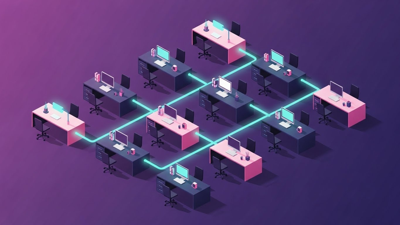
The Visual & Narrative Approach
This style creates a visual metaphor for growth and stability. Using a flat 2D isometric perspective, the video depicts a clean, organized office network. Desks with monitors are connected by glowing teal data lines, forming a grid of collaboration. The color palette is calming: mint green, soft purple, and slate blue. The motion is smooth and continuous, showing data packets moving gently between stations. It creates a sense of a humming, well-oiled machine.
Psychological Impact & KPI Focus
Churn often happens when users feel the tool is stagnant or disconnected from their workflow. This style reinforces the Sunk Cost Effect (positively) by visualizing the complex, valuable web of connections the software has created within the business. It reminds the client, "We are the infrastructure that keeps your team connected," making the idea of disconnecting feel disruptive.
- Primary KPI: Renewal Rate. It reinforces the structural importance of the software.
- Secondary KPI: Customer Lifetime Value (CLTV).
Strategic Implementation & Trade-offs
- Best Use Case: "Year in Review" emails or Account Management presentations (30-45 seconds).
- Strategic Trade-off: It is abstract. It doesn't show new features, but rather reinforces existing value. It is a "Reminder" style, not a "Selling" style, and works best for maintaining relationships.
Companies using similar video content -
C.H. Robinson – Navisphere – Shows executives using the platform for strategic decisions.
Oracle – SCM Cloud – Presents leaders interacting with high-level supply chain dashboards.
26. Macro UI Micro-Interactions
RETENTION | Knowledge Base

The Visual & Narrative Approach
An extreme macro close-up of the user interface. The camera focuses so closely that you can almost see the pixel grid. The subject is a "Help" or "Support" icon glowing in a vibrant "Button Orange." A soft-focus finger enters the frame and taps the button, triggering a smooth, satisfying ripple animation and the instant opening of a chat window. The audio highlights the "click" and the "pop" of the window opening. This style focuses entirely on the responsiveness and accessibility of help.
Psychological Impact & KPI Focus
Users abandon software when they get stuck. This visual counters Learned Helplessness. By making the "Help" button look large, inviting, and tactile, it subconsciously trains the user that assistance is just one easy tap away. It reframes support from a "hassle" to an "instant interaction."
- Primary KPI: Reduction in Support Ticket Resolution Time (Self-Serve).
- Secondary KPI: Knowledge Base Usage stats.
Strategic Implementation & Trade-offs
- Best Use Case: Social Media "Did You Know?" clips or loading screen tips (5-10 seconds).
- Strategic Trade-off: Extremely limited scope. It only works for highlighting specific, small UI behaviors. It cannot explain complex workflows or heavy data.
Companies using similar video content -
Geotab – MyGeotab – Showcases a clean, user-friendly fleet management dashboard.
Samsara – Connected Operations Cloud – Presents a clear, intuitive UI for daily operations.
27. Holographic UI over 3D Render
RETENTION | Proactive Support

The Visual & Narrative Approach
A visualization of the "God's Eye View" for the strategic leader. A sleek tablet sits on a conference table in a sunlit room. Projecting upwards from the screen is a volumetric, 3D wireframe hologram of the Earth in "Laser Purple" and "Hologram Blue." Arcs of light representing trade lanes loop high above the globe, pulsing with real-time data. A "Security Certification" badge floats in the foreground. The style is futuristic, clean, and premium, suggesting that the software provides insights that transcend the 2D screen.
Psychological Impact & KPI Focus
This appeals to the Ego and Aspiration of the C-Suite. It positions the software not just as a tool for tracking boxes, but as a "Command & Control" system for the global enterprise. It validates the high cost of the subscription by presenting a high-tech, proactive value proposition.
- Primary KPI: Upsell to "Enterprise" tier packages.
- Secondary KPI: Executive Buy-in during contract renewal.
Strategic Implementation & Trade-offs
- Best Use Case: Website Homepage Hero or Executive Briefing Center displays (Loops).
- Strategic Trade-off: It can look like "Sci-Fi Vaporware." If the actual product is a spreadsheet-heavy tool, this marketing style might set unrealistic expectations for the UI experience.
Companies using similar video content -
Descartes Systems Group – Logistics Technology Platform – Rapidly displays diverse features and modules.
WiseTech Global – CargoWise – Showcases a broad range of logistics execution features.
29. Aspirational Stock Montage
EXPANSION | Driving Upsell

The Visual & Narrative Approach
A heroic, cinematic shot of a diverse logistics team standing in a glass-walled boardroom. They are looking off-camera at a large screen (implied to be the software dashboard), their expressions filled with pride and satisfaction. The lighting is bright "Corporate Blue" and natural white. The visual is not about the software pixels, but about the result of the software: a unified, successful team.
Psychological Impact & KPI Focus
This utilizes Social Proof and Tribal Leadership. It suggests that "Winning Teams use this software." For a Director of Operations, the goal is not just efficient trucks, but a happy, cohesive workforce. This image sells the culture of success that comes with digital transformation.
- Primary KPI: Advocacy / Internal Referrals.
- Secondary KPI: Brand Sentiment.
Strategic Implementation & Trade-offs
- Best Use Case: Case Study PDFs, Customer Success stories, or "Careers" pages (Static or Slow Motion Video).
- Strategic Trade-off: The "Stock Photo" risk. It must be color-graded to match the brand palette perfectly, otherwise, it looks like a generic placeholder.
Companies using similar video content -
Blume Global – Blume Logistics – Illustrates positive outcomes for logistics managers.
Transporeon – Transportation Management Platform – Depicts successful, stress-free freight management.
30. Generative AI Realistic Character
EXPANSION | Driving Referrals
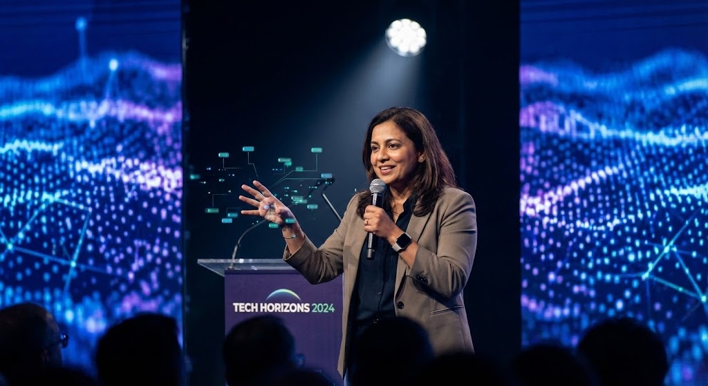
The Visual & Narrative Approach
A realistic, AI-generated video of a charismatic industry futurist speaking on stage. The character, dressed in business casual, gestures towards floating, augmented reality data nodes that appear near their hands. The background is a blurred tech conference stage with "Tech Horizons" branding. The speaker articulates a vision of "The Future of Autonomous Supply Chains." This style positions the software vendor not just as a tool provider, but as a thought leader guiding the industry forward.
Psychological Impact & KPI Focus
This targets Authority Bias. Buyers want to partner with winners who see the future. By using a high-end, futurist aesthetic, the brand elevates itself above the "feature wars" and becomes a strategic partner. It encourages customers to refer their peers because they want to be associated with this forward-thinking vision.
- Primary KPI: Referral Rate / Share of Voice in industry conversations.
- Secondary KPI: Event Registration (Webinars/Conferences).
Strategic Implementation & Trade-offs
- Best Use Case: Keynote intro videos, "Vision 2026" roadmap announcements, or high-level LinkedIn thought leadership (30-60 seconds).
- Strategic Trade-off: The Uncanny Valley. If the AI generation is low quality (bad lip sync, dead eyes), it destroys trust immediately. It must be premium execution or nothing.
The Visual Operations Doctrine: A Strategic Knowledge Base
Having explored 30 distinct visual styles, the question shifts from "What does it look like?" to "How do we use this?" This section synthesizes the visual examples into a cohesive operational strategy. These three segments serve as the blueprint for transforming visualization from a marketing tactic into a core business asset.
Strategic Alignment & Visual Architecture
The "Pre-Production" Strategy: Defining the Why and Who.
- The Cognitive Load Audit: Before creating any asset, conduct an audit of your current training materials. If a PDF manual takes 10 minutes to read, the goal of the visual alternative (e.g., Style 17 Clean UI) must be to convey the same data in under 60 seconds with 50% less mental effort.
- Role-Based Visual Mapping: A "One Size Fits All" video strategy fails in logistics. Drivers on mobile phones need Style 5 (Bold Kinetic)—high contrast, large text, sound-optional. Fleet Managers on three-monitor setups need Style 24 (Dark Mode)—dense data, low glare. Map styles to personas.
- The "Glanceability" Standard: In a moving truck or a busy warehouse, a user has 2 seconds to understand a visual. Apply the "Squint Test" to all assets. If the core message (e.g., "Delay Alert") isn't visible when squinting, the design has failed.
- Brand Voice Consistency: Your Style 1 (Minimalist Vector) marketing ads must visually rhyme with your Style 19 (Onboarding) videos. Disconnects here cause "Brand Vertigo." Use a unified color palette (e.g., "Safety Orange" for action items) across the entire funnel.
- The Advids Strategic Audit: Do not rush into production. Engage a strategic partner like Advids to define this "Visual Operating System" first. A 2-week audit of your user journey can prevent months of wasted animation budget on styles that don't fit your funnel.
- Standardization vs. Customization: For core features (Login, Dashboard), use standardized Style 17. For niche, complex scenarios (Hazmat routing), invest in bespoke Style 8 (Abstract 3D) to explain the unique value.
- The Cross-Departmental Bridge: Sales uses "ROI" terms; Ops uses "Throughput" terms. Use Style 13 (Dynamic Data) to visually link these concepts, creating a shared visual lexicon that unifies your Sales and Customer Success teams.
- Legacy System Integration: Visualizing the invisible link between old hardware and new software is critical. Use Style 4 (Wireframe to Reality) to visually prove that your modern SaaS plays nicely with their 20-year-old sensor network.
- Accessibility in Trucking: The logistics workforce is global and multilingual. Prioritize Style 15 (Line Art) and Style 1 (Vector) which rely on universal icons rather than translated text. Visuals are the universal language of the road.
- The Mobile-First Mandate: 60% of logistics consumption happens on tablets or phones. Ensure all 30 styles—even complex 3D renders—are legible when scaled down to a 9:16 vertical mobile screen.
Operational Adoption & Implementation
The "Deployment" Phase: Embedding Visuals into the Workflow.
- Overcoming "Big Brother" Anxiety: Telemetry tracking scares drivers. Use Style 20 (Character Story) to reframe tracking as "Safety" and "Protection" rather than "Surveillance." Empathy in visualization is key to adoption.
- The Micro-Learning Shift: Nobody reads the manual. Break your 30-minute training webinar into a library of thirty 60-second clips using Style 18 (Rapid Montage) for overview and Style 26 (Macro UI) for specific tasks.
- Just-in-Time Support: Embed Style 26 (Micro-interaction) GIFs directly into the software tooltips. When a user hovers over "API Settings," show them the visual guide instantly. This is "Deflection by Design."
- Gamification of Training: Use Style 22 (Celebration Motion) to reward drivers for completing safety modules. Visual dopamine hits increase training completion rates significantly compared to static checkboxes.
- Reducing Support Ticket Volume: There is a direct correlation: for every high-quality Style 19 (Onboarding) video you deploy, you can expect a measurable drop in "How do I...?" support tickets. Visuals are cheaper than call centers.
- Remote Onboarding: You cannot fly trainers to every depot. Use Style 7 (Isometric 3D) to create a "Virtual Walkthrough" of the system deployment, ensuring consistent training across distributed global fleets.
- Visual SOPs: Transform text-heavy Standard Operating Procedures into Style 15 (Line Art) flowcharts. A visual "If This, Then That" animation prevents costly operational errors in the field.
- Feedback Loops: Use interactive video elements. After a Style 18 (Feature Montage), ask the user, "Did this help?" to gather qualitative data on your visual strategy.
- Scalable Localization: When expanding to new regions (e.g., LATAM or APAC), use Style 1 (Vector) which requires zero re-shooting—just swap the text layer. This allows for rapid market entry.
- Leadership Communication: When pitching a renewal to the C-Suite, do not show raw data. Use Style 27 (Holographic UI) to visualize the "Strategic Oversight" they are paying for. Speak their visual language.
Measuring Impact & Future-Proofing
The "ROI" Phase: Measuring Success and Looking Ahead.
- Beyond "Views": Do not measure success by video views. Measure it by "Time-to-Competency." Did watching the Style 17 video reduce the time it took a new dispatcher to file their first report? That is the real metric.
- The "Idle Time" Metric: In software, confusion equals idle time. Correlate the deployment of clear Style 1 (Minimalist) guides with a reduction in "Session Duration" for routine tasks (indicating efficiency).
- Compliance Velocity: When a new regulation drops (like a new ELD mandate), measure how fast your fleet achieves compliance after watching a Style 14 (X-Ray) explainer versus a text memo. Speed is money.
- Retention and Churn: User Experience (UX) is the primary driver of retention. High-end visuals like Style 9 (Parallax UI) increase the "Perceived Value" of the platform, making it harder for customers to switch to a "cheaper, uglier" competitor.
- The AI Visual Frontier: Prepare for the future where Style 30 (Gen AI) isn't just a video, but a real-time avatar generated on the fly to answer driver questions. Build your asset library today to train tomorrow's AI models.
- Scalability of Assets: Don't build "disposable" videos. Build a "Modular Visual System." Elements from Style 3 (Low Poly) should be reusable in Style 25 (Isometric). This component-based approach reduces long-term production costs.
- The Advids Partnership: Scaling from 1 video to a library of 300 requires a partner, not a freelancer. Advids provides the infrastructure to maintain visual consistency (Segment 1) while scaling production volume (Segment 2) as your software grows.
- Benchmarking Success: Regularly audit your visuals against competitors using Style 10 (Split Screen). If your training videos look like 2015 and theirs look like 2025, you are losing the "Innovation Perception" battle.
- The ROI of Safety: For logistics, safety is the ultimate ROI. Quantify the reduction in accident claims among drivers trained with high-impact Style 4 (Wireframe to Reality) safety simulations.
- Final Call to Innovation: Treat video not as "Marketing Content," but as digital infrastructure. In the remote sensing industry, visibility is the product. Your ability to visualize that data is your competitive advantage.
End of Guide. Produced by the Advids Expert Team.
Companies using similar video content -
Verizon Connect – Fleet Management – Visualizes high-volume fleet activity with overlaid data.
Kalmar – Terminal Automation – Shows rapid port operations with real-time data overlays.
Author & Editor Bio


