
Introduction: The Visual Bridge to the "Perfect Order"
The global supply chain has never been more visible, yet somehow, it remains incredibly opaque. For retail fulfillment leaders, the pressure is binary: achieve "Amazon-like" efficiency or face obsolescence. The stakes are quantified by the explosive growth of the technology sector itself; the warehouse automation market is projected to soar to over $107 billion by 2035, driven by the desperate need to digitize physical flows.
However, buying the software is only half the battle. The real challenge—and the "Physical/Digital Divide"—lies in adoption. How do you convince a warehouse manager that a new algorithm will reduce their walk time? How do you prove to a CFO that a new WMS will lower the cost of inventory distortion, a problem that cost retailers a staggering $1.77 trillion in 2023?
The answer lies in strategic visualization.
In the B2B fulfillment space, "showing" is not just about aesthetics; it’s about reducing the cognitive load of complex systems. It’s about translating "API integration" into a visual language that implies seamless connectivity. It’s about turning "inventory visibility" into a tangible, pulsating asset on a screen.
This guide acts as your visual supply chain strategy. We have curated 30 distinct motion design styles, mapped directly to the retail fulfillment funnel. These are not just artistic choices; they are functional tools designed to bridge the gap between complex code and operational reality, helping you articulate value, reduce skepticism, and drive the industry forward.
1. The "Liquid Logistics" Approach
TOFU | Brand Awareness

The Visual & Narrative Approach:
Imagine a world where friction doesn't exist. This style uses 2D vector art to depict the supply chain not as a series of rigid stops, but as a continuous, fluid stream. Packages aren't square boxes here; they are morphing organic shapes that flow effortlessly from a "Soft Teal" manufacturer node to a "Vivid Coral" consumer destination. The animation creates a "Liquid Motion" effect, where connections stretch and snap back elastically, implying a resilient, cloud-based infrastructure that adapts to demand spikes instantly.
Psychological Impact & KPI Focus:
Niche Psychology: This style addresses the anxiety of Rigidity. Legacy supply chains break under pressure; this visual metaphor promises Agility. By removing gravity and hard edges, we subtly communicate that your software removes the "heavy lifting" and friction of manual processes. It triggers a sense of relief and ease, ideal for capturing attention in a chaotic social media feed.
Operational Impact: Focuses on Process Fluidity and Integration Ease.
Strategic Implementation & Trade-offs:
- Best Use Case: 6-10 second Instagram/LinkedIn ads targeting brands suffering from seasonal bottlenecks.
- Trade-off: It is highly abstract. It sets a mood but explains nothing about technical functionality. Do not use this for feature demos.
Companies using similar video content -
Flexport – Global Freight Platform – Visualizes seamless, adaptable global shipping.
project44 – Movement by project44 – Fluid data flow for end-to-end supply chain visibility.
E2open – Network Platform – Connects disparate supply chain partners into a continuous flow.
2. The Digital Nervous System
TOFU | Category Creation

The Visual & Narrative Approach:
We fly through a dark, infinite digital void populated by glowing "Deep Purple" hexagonal nodes. These nodes represent warehouses, trucks, and stores. They are connected by "Electric Cyan" beams of light that pulse with data packets. The camera moves dynamically, swooping through this network to show the complexity and beauty of a fully integrated ecosystem. Particle effects float around the nodes, suggesting a living, breathing data organism rather than a static database.
Psychological Impact & KPI Focus:
Niche Psychology: This visual targets the desire for Control and Omniscience. Operations Directors fear "dark data"—info they can't see. This style visualizes the "Digital Twin" concept, reassuring the viewer that your platform illuminates every corner of their network. It validates the sophistication of your AI/ML algorithms without needing to show a single line of code.
Operational Impact: Highlights Network Visibility and Real-Time Data.
Strategic Implementation & Trade-offs:
- Best Use Case: YouTube pre-roll ads (15s) or Event Background loops.
- Trade-off: High production cost. It creates a "premium" perception but can feel distant or "cold" if not paired with human-centric copy.
Companies using similar video content -
FourKites – Real-Time Visibility Platform – Visualizes a connected network of shipments and data.
Verusen – AI-Powered Inventory Optimization – Shows data flowing to optimize materials.
o9 Solutions – Digital Brain Platform – Connects planning across a vast digital network.
3. X-Ray Vision Blueprint
TOFU | Market Education

The Visual & Narrative Approach:
The screen displays a top-down, high-contrast blueprint of a warehouse floor. The background is "Deep Charcoal," making the "Neon Cyan" outlines of racking and conveyor belts pop. We see no humans, only data. Specific zones (e.g., the packing area) pulse with a brighter light, representing a heatmap of activity or a bottleneck being resolved. Digital noise textures and grid lines overlay the scene, giving it a tactical, "command center" aesthetic.
Psychological Impact & KPI Focus:
Niche Psychology: This appeals to the Tactician persona. It looks like the interface of a high-tech tool used by experts. It communicates Precision and Granular Visibility. The "dark mode" aesthetic reduces eye strain and suggests a tool designed for heavy, daily use by serious operators. It visually answers the question, "Can I see what's happening on the floor right now?"
Operational Impact: Emphasizes Space Utilization and Zone Efficiency.
Strategic Implementation & Trade-offs:
- Best Use Case: Blog headers or Hero sections for "Analytics" feature pages.
- Trade-off: Can look intimidating to non-technical buyers. It screams "complexity," so ensure the accompanying text promises simplification.
Companies using similar video content -
Dematic – Warehouse Control System – Blueprint-like views of automated warehouse layouts.
AutoStore – Robotic Storage System – Visualizes internal grid system and robot movements.
Swisslog – SynQ Software – Provides a detailed, X-ray view of warehouse operations.
4. The Weight of Momentum
TOFU | Brand Perception

The Visual & Narrative Approach:
There are no cameras, only words and geometry. Massive, blocky shapes resembling shipping containers slam into the frame, carrying text like "SPEED," "SCALE," and "SHIP." The palette is industrial: "Electric Yellow" and "Bold Black." The shapes are arranged diagonally, conveying high energy and forward momentum. Motion blur lines accentuate the speed. The background is a flat, vibrant electric blue, making the yellow shapes pop intensely.
Psychological Impact & KPI Focus:
Niche Psychology: This taps into the industry's obsession with Velocity and Capacity. It’s visceral. The "heavy" motion implies that your software can handle massive SKU volumes without crashing. It projects confidence and market dominance. It frames your brand not just as software, but as the engine of commerce.
Operational Impact: Reinforces Throughput Velocity and Reliability.
Strategic Implementation & Trade-offs:
- Best Use Case: 1:1 Social Ads (Instagram/LinkedIn) where sound might be off. The visual rhythm creates the sound in the viewer's mind.
- Trade-off: Zero educational value. It builds hype but doesn't explain "how." Use purely for brand recall.
Companies using similar video content -
UPS – Logistics Services – Conveys speed and scale of package delivery.
FedEx – Express Shipping – Emphasizes rapid, high-volume freight movement.
DHL – Global Logistics – Projects confidence in handling massive cargo volumes.
6. The "Single Pane of Glass"
TOFU | Skippable Ad
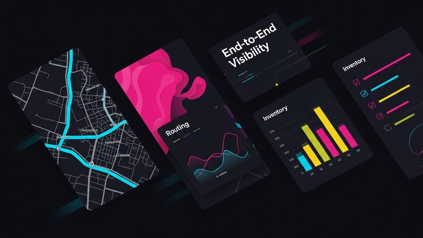
The Visual & Narrative Approach:
We don't show a boring, static screenshot. Instead, we see multiple angled slices of UI screens cutting across the frame diagonally. Each slice shows a different abstract feature: a map with routing lines, a bar chart of inventory, and a list of checkmarks. The color palette is high-energy Vibrants (Yellow, Pink, Cyan) against a dark background. Motion blur effects are applied to the edges of the slices to imply speed.
Psychological Impact & KPI Focus:
Niche Psychology: Buyers hate toggling between tabs. This visual montage promises the Holy Grail: Centralization. It communicates "End-to-End Visibility" in a literal sense, showing multiple disparate functions (transport, inventory, order processing) existing harmoniously in one visual space.
Operational Impact: Visualizes Platform Breadth and Workflow Unification.
Strategic Implementation & Trade-offs:
- Best Use Case: The first 5 seconds of a YouTube ad (hook).
- Trade-off: The UI is stylized. You must manage expectations that the actual software, while powerful, might not float in 3D space.
Companies using similar video content -
Manhattan Associates – Active Omni Platform – Shows unified view of order, inventory, and labor.
Blue Yonder – Luminate Platform – Presents integrated dashboards for supply chain management.
Oracle NetSuite – ERP & WMS – Displays various business functions in one interface.
7. The Linear Logic of Accuracy
MOFU | Demand Gen
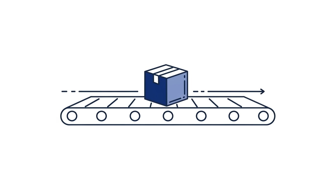
The Visual & Narrative Approach:
The screen is Stark White. A single continuous "Navy Blue" line enters from the left. It traces the journey of a geometric cube (representing a package) moving through a stylized conveyor system. The composition flows strictly from left to right. The aesthetic is minimal, clean, and elegant, utilizing thin, consistent line weights.
Psychological Impact & KPI Focus:
Niche Psychology: This is about Trust and Error-Reduction. The "unbroken line" creates a subconscious association with an unbroken chain of custody. It appeals to the detail-oriented Operations Manager who values a clean, error-free process over flashy graphics. It communicates that your logic is sound, uninterrupted, and precise.
Operational Impact: Emphasizes Process Consistency and Error Reduction.
Strategic Implementation & Trade-offs:
- Best Use Case: Email marketing visuals or "How it Works" diagrams in whitepapers.
- Trade-off: Low emotional excitement. It’s purely intellectual. It validates a decision but rarely triggers an impulse buy.
Companies using similar video content -
Manhattan Associates – Active Omni Platform – Shows unified view of order, inventory, and labor.
Blue Yonder – Luminate Platform – Presents integrated dashboards for supply chain management.
Oracle NetSuite – ERP & WMS – Displays various business functions in one interface.
8. The Routing Rules Engine
MOFU | Differentiation

The Visual & Narrative Approach:
We adopt a flat 2D isometric illustration of a conveyor belt system. The palette is Vibrant Lime Green and Flat Grey. The image focuses on a specific intersection where boxes are being diverted. Sharp, hard edges and solid color blocks define the style. White arrow indicators on the floor show the direction of flow. The boxes are uniform cubes, reinforcing the concept of standardization and order.
Psychological Impact & KPI Focus:
Niche Psychology: This visualizes Standardization and Automation. It answers the question, "How does your system handle exceptions?" The rigid isometric grid implies that everything has a place and a rule. It converts the abstract concept of "if/then logic" into a tangible mechanical action that anyone can understand.
Operational Impact: Demonstrates Routing Logic and Exception Management.
Strategic Implementation & Trade-offs:
- Best Use Case: Landing pages for "Order Routing" or "Allocation" features.
- Trade-off: Can feel mechanical. It celebrates the machine, not the human. Great for operations, less so for customer service teams.
Companies using similar video content -
Cin7 – Inventory Management – Visualizes precise, unbroken inventory flow.
Finale Inventory – Multi-Channel Inventory – Depicts accurate, linear tracking of stock.
SkuVault – Warehouse Management – Shows clean, error-free inventory processes.
9. The Friendly Warehouse
MOFU | Feature Education

The Visual & Narrative Approach:
We see an isometric 3D render of a "miniature" warehouse facility. The style is "Claymorphism" with soft, matte textures in Clay Red and Pastel Blue. Tiny, stylized trucks are docked at the bays, and workers are represented as simple geometric pegs. The lighting is soft and global, casting gentle shadows that define the depth of the loading docks and storage racks. The entire scene looks like a pristine, organized toy set.
Psychological Impact & KPI Focus:
Niche Psychology: Warehouses are usually dirty, loud, and chaotic. This style re-frames the warehouse as a Manageable Asset. It reduces the intimidation factor of large-scale logistics. By making the facility look like a "toy," we subconsciously tell the user: "Our software makes managing this giant beast as easy as playing a game." It promotes User Experience (UX) ease.
Operational Impact: Ideal for explaining Dock Management and Facility Overview.
Strategic Implementation & Trade-offs:
- Best Use Case: Website "Platform Overview" video or Homepage loop.
- Trade-off: May seem too "cute" for heavy industrial clients (e.g., steel logistics), but perfect for e-commerce/retail brands.
Companies using similar video content -
Körber Supply Chain – K.Motion WMS – Illustrates automated routing and sorting logic.
Locus Robotics – LocusONE – Shows robots following precise routing paths.
RightHand Robotics – RightPick – Depicts items being sorted and routed by robotic arms.
10. The Before & After Contrast
MOFU | Displacement
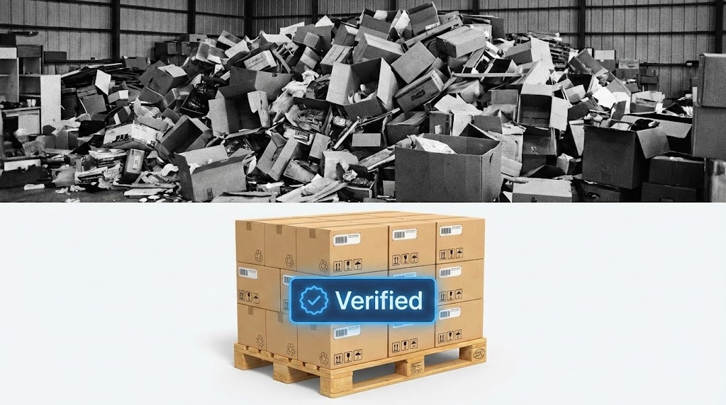
The Visual & Narrative Approach:
A horizontal split-screen image. The top half shows a chaotic, gritty, black-and-white photo of a disorganized warehouse pile—conveying stress and lost inventory. The bottom half shows a clean, high-key, full-color photo of a perfectly stacked pallet with a "Verified" UI badge overlaid. The contrast represents "Before vs. After" or "Competitor vs. Us." The lighting in the bottom half is bright and clinical.
Psychological Impact & KPI Focus:
Niche Psychology: This is the Displacement play. It forces the viewer to confront the Cost of Inefficiency (Stat: $1.77T in distortion) versus the peace of mind your software offers. It triggers Loss Aversion (fear of the chaos) and immediately offers the solution (the verified pallet). It visualizes the transition from "Operational Hell" to "Process Heaven."
Operational Impact: Highlights Inventory Accuracy and Compliance Assurance.
Strategic Implementation & Trade-offs:
- Best Use Case: Retargeting Ads. "Still drowning in returns? Switch to [Brand]."
- Trade-off: It is aggressive. You are highlighting pain. Ensure the "After" state looks attainable, not just fantasy.
Companies using similar video content -
Odoo – Warehouse Management Module – Presents a simplified, user-friendly view of warehouse layout.
ERPNext – Stock Management – Visualizes a clean, organized inventory environment.
Deposco – Bright Warehouse – Shows an approachable, manageable facility overview.
11. The Layered Deep Dive
MOFU | Demo Requests
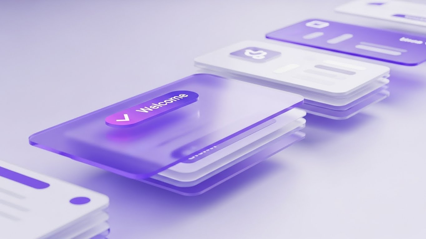
The Visual & Narrative Approach:
Standard screenshots feel flat and limited. This style breaks the interface apart into a 3D "Parallax Deck." We see multiple UI cards floating in a soft, dreamlike void, rendered in "Soft Purple" and "Pristine White." The cards are arranged in a cascading formation; as the camera drifts, the depth between the layers becomes apparent. The front card, focused sharply, displays a gratifying "Welcome" checkmark, while background cards blur slightly, hinting at the depth of features (analytics, settings, user profiles) waiting to be explored.
Psychological Impact & KPI Focus:
Niche Psychology: This addresses the fear of Superficiality. Buyers often worry a platform is just a "pretty face" with no backend substance. The depth (parallax) visually implies Deep Functionality. It suggests that behind the simple welcome screen lies a robust, multi-layered architecture capable of supporting complex enterprise needs. It invites the user to "dive in" and explore the system.
Operational Impact: Visualizes System Depth and User Onboarding.
Strategic Implementation & Trade-offs:
- Best Use Case: Landing Pages for "Request a Demo." The motion guides the eye to the CTA.
- Trade-off: It is stylized. Ensure the actual UI is recognizable, even if the floating composition is artistic.
Companies using similar video content -
Sensormatic Solutions – Inventory Intelligence – Highlights reduction in inventory distortion.
Optoro – Returns Optimization – Shows transformation from messy returns to organized processing.
Loop Returns – Returns Management – Contrasts chaotic returns with streamlined, efficient process.
12. The Algorithm of Allocation
MOFU | ABM Awareness
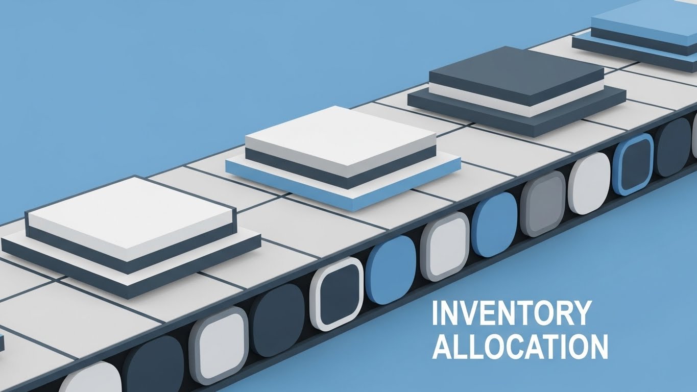
The Visual & Narrative Approach:
Supply chain logic is often invisible code. This style makes it physical. We watch a mesmerizing geometric pattern where "Slate Grey" and "Sky Blue" squares slide along a stylized track. The movement is rhythmic and satisfying—like a digital conveyor belt. The shapes don't just move; they slot into place with satisfying precision, stacking perfectly. There are no organic curves here, only the clean, reassuring geometry of perfect order.
Psychological Impact & KPI Focus:
Niche Psychology: This appeals to the Logistics Planner who craves Order amidst chaos. It visually represents "Inventory Allocation" algorithms. The perfect fit of the squares subconsciously assures the viewer that your software will eliminate "lost" inventory and ensure every SKU finds its correct bin location. It transforms the anxiety of mismanagement into the satisfaction of a solved puzzle.
Operational Impact: Demonstrates Allocation Logic and Inventory Accuracy.
Strategic Implementation & Trade-offs:
- Best Use Case: Display Ads for Account-Based Marketing (ABM) campaigns targeting Operations Directors.
- Trade-off: It is highly abstract. It sells the feeling of efficiency, not the specific features.
Companies using similar video content -
SAP – Digital Supply Chain – Visualizes layered insights across complex modules.
IBM – Supply Chain Intelligence Suite – Shows depth of analytics and interconnected features.
C3.ai – Supply Chain Suite – Presents a multi-layered view of AI-driven insights.
13. The Augmented Operator
BOFU | Building Trust

The Visual & Narrative Approach:
We bridge the gap between digital tools and human reality. A high-resolution photo shows a confident warehouse manager on the floor, holding a tablet. The lighting is natural and warm. Surrounding the tablet, however, are floating 2D vector graphics in "Bright Purple." These icons—representing "Efficiency," "Speed," and "Checkmarks"—orbit the device, visually manifesting the software's impact on her daily work. The background shows the blur of a real warehouse, grounding the tech in reality.
Psychological Impact & KPI Focus:
Niche Psychology: Technology adoption often fails because of User Resistance. This style humanizes the software. It doesn't show the tool replacing the human; it shows the tool augmenting the human. It signals to the buyer that this software empowers their workforce rather than complicating their jobs. It builds Trust by showing a relatable face succeeding with the tool.
Operational Impact: Highlights User Adoption and Workforce Empowerment.
Strategic Implementation & Trade-offs:
- Best Use Case: Social Media (LinkedIn) case studies or "Customer Success" stories.
- Trade-off: Requires high-quality custom photography or very careful stock selection to look authentic, not cheesy.
Companies using similar video content -
Kinaxis – RapidResponse – Visualizes precise, synchronized planning and allocation.
ToolsGroup – Service Optimizer 99+ – Shows algorithms perfectly balancing inventory.
Gurobi Optimization – Optimizer – Depicts complex mathematical models solving allocation puzzles.
14. The Tangible ROI
BOFU | ROI Justification

The Visual & Narrative Approach:
How do you visualize "Return on Investment"? We turn data into physical value. A wooden shipping pallet sits on a "Dark Grey" studio floor. Growing directly out of it—like cargo—are 3D bar charts. But these aren't flat graphs; they are made of glass and gold. As the bars rise, they transition from a warning red to a brilliant "Metallic Gold," reflecting light. It literally visualizes the transmutation of efficient shipping into financial gold.
Psychological Impact & KPI Focus:
Niche Psychology: The CFO doesn't care about "features"; they care about Value. This visual is for the Economic Buyer. It bypasses technical details to hit the bottom line: "This software makes us money." The use of gold and premium textures subliminally cues high value and profitability. It answers the question, "Is this a cost center or a profit center?"
Operational Impact: Focuses on ROI Optimization and Profitability.
Strategic Implementation & Trade-offs:
- Best Use Case: The "Pricing" page or the final slide of a Sales Deck.
- Trade-off: It is purely metaphorical. It must be paired with hard numbers (e.g., "20% Cost Reduction") to be effective.
Companies using similar video content -
Zebra Technologies – Mobility Solutions – Shows workers using rugged devices with overlaid data.
Honeywell – Connected Worker Solutions – Visualizes digital tools enhancing human tasks.
TeamViewer Frontline – AR Solutions – Depicts augmented reality guiding frontline workers.
15. The Risk Revealer
BOFU | Risk Mitigation

The Visual & Narrative Approach:
A shipping container is usually a black box—opaque and unknown. This style renders the container in "X-Ray Green" glass. We see through the steel walls to the pallets inside. Specific high-value items glow with a warm orange core, while data lines connect the cargo to the exterior. The background is a stark black void, ensuring total focus on the internal structure. It creates a superpower effect: the ability to see the unseen.
Psychological Impact & KPI Focus:
Niche Psychology: Logistics leaders fear the Unknown—theft, damage, or lost items inside a sealed container. This visual creates a sense of Omniscience. It assures the viewer that your platform provides total transparency, mitigating risk. It taps into the desire for Control over assets that are geographically distant.
Operational Impact: Visualizes Cargo Visibility and Loss Prevention.
Strategic Implementation & Trade-offs:
- Best Use Case: Service pages for "Tracking" or "Security" features.
- Trade-off: Can look "medical" if the colors aren't managed well. Stick to industrial greens/blues, not bone whites.
Companies using similar video content -
Anaplan – Supply Chain Planning – Visualizes financial impact of optimized plans.
Coupa – Business Spend Management – Shows cost savings and financial gains from efficiency.
SAS – Supply Chain Analytics – Translates data insights into tangible business value.
16. The Future-Proof Promise
BOFU | Sales Cycle
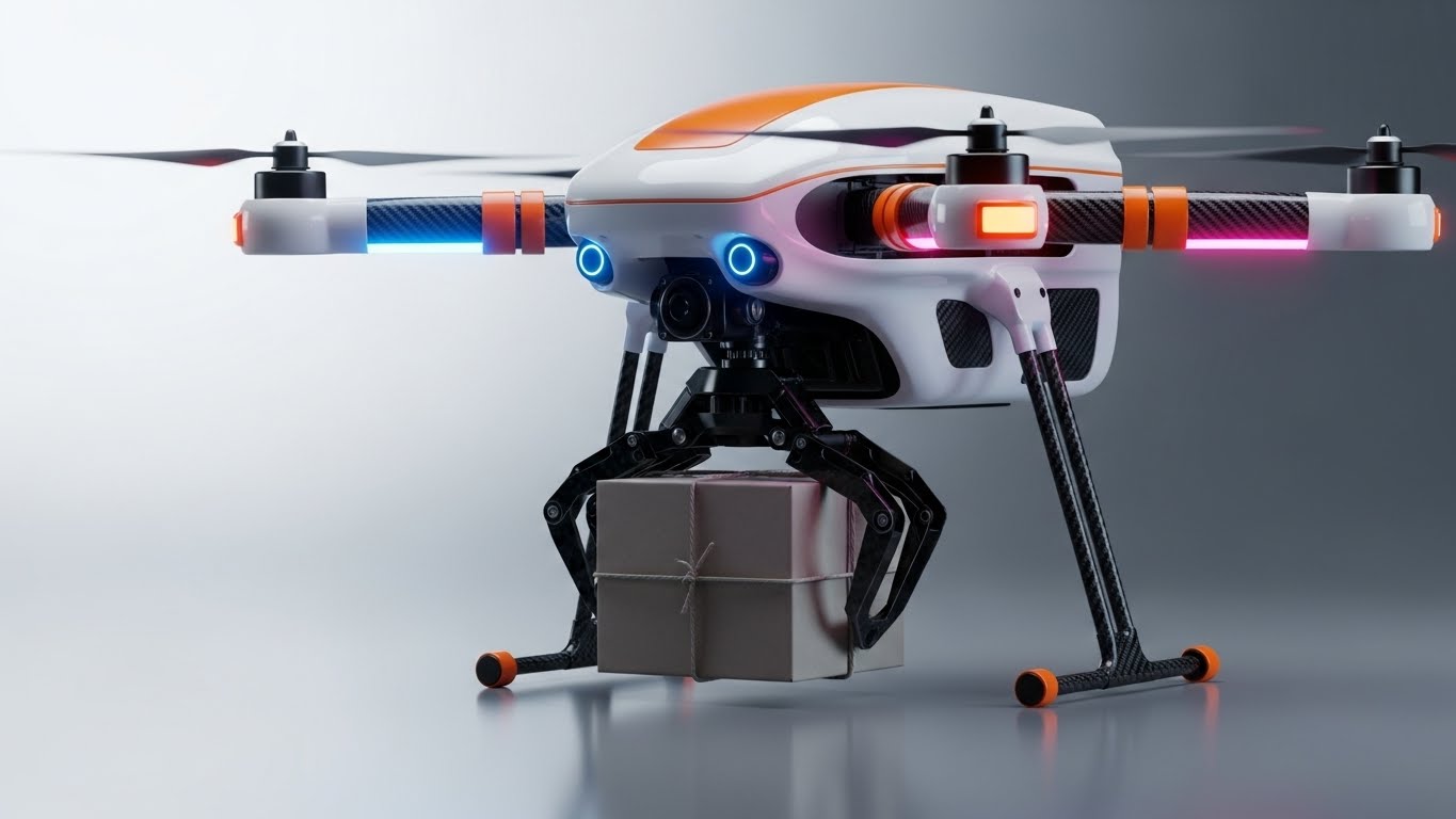
The Visual & Narrative Approach:
We move to the cutting edge. A photorealistic close-up of a delivery drone, finished in clean white with "Safety Orange" accents. It hovers precisely, carrying a generic parcel. The lighting is studio-quality, highlighting the carbon fiber textures and the aerodynamic curves. It looks like a product shot for a high-end consumer device.
Psychological Impact & KPI Focus:
Niche Psychology: Even if the client isn't using drones today, they want to buy software that is Future-Ready. This visual signals Innovation. It tells the buyer, "We are ahead of the curve." It creates a "Halo Effect" where the sophistication of the drone reflects on the sophistication of your code. It appeals to the C-Suite's desire to partner with market leaders, not followers.
Operational Impact: Represents Last-Mile Innovation and Modern Logistics.
Strategic Implementation & Trade-offs:
- Best Use Case: Pitch Decks (The "Vision" Slide) or Investor Relations materials.
- Trade-off: Do not use if your software is strictly for legacy warehousing. It sets a high bar for innovation that you must meet.
Companies using similar video content -
Tive – Real-Time Tracker – Visualizes seeing inside shipments for condition monitoring.
Controlant – Cold Chain Visibility – Shows transparency into temperature-sensitive cargo.
Sensitech (Carrier) – Cold Chain Monitoring – Depicts insight into cargo integrity.
17. The Culture of Execution
BOFU | Economic Buyer

The Visual & Narrative Approach:
We step away from the machines. This is a low-angle, high-quality photograph of a diverse logistics team in a sun-drenched, modern warehouse office. They are high-fiving, laughing, and looking genuinely relieved. The background blurs out the organized racking. The lighting is warm and optimistic. It captures the feeling of a good day at work—something rare in logistics.
Psychological Impact & KPI Focus:
Niche Psychology: Burnout is a massive issue in supply chains. This visual sells Relief. It tells the Economic Buyer that this software solves the "people problem" by reducing stress and errors. It frames the software purchase not just as an operational upgrade, but as a Cultural Upgrade. It promises a happier, more retained workforce.
Operational Impact: Focuses on Team Productivity and Retention.
Strategic Implementation & Trade-offs:
- Best Use Case: "About Us" page or the closing section of a proposal ("Join our happy customers").
- Trade-off: Generic stock photos kill credibility. This must look high-end and candid, not staged.
Companies using similar video content -
Gatik – Autonomous Logistics – Showcases cutting-edge autonomous delivery vehicles.
Plus.ai – Autonomous Trucking – Highlights advanced self-driving truck technology.
Wing (Alphabet) – Drone Delivery – Focuses on innovative last-mile drone solutions.
18. The Boots-on-the-Ground Truth
BOFU | Functional Buyer

The Visual & Narrative Approach:
The Functional Buyer (the Warehouse Manager) doesn't work in a pristine office; they work on the floor. This shot is Over-The-Shoulder (OTS), looking at a ruggedized tablet held by a worker with gloved hands. The screen glows with a crisp "Blue" UI showing inventory metrics. The background is the real, gritty warehouse environment—forklifts and shelves—but it is out of focus. The focus is entirely on the data in the hand.
Psychological Impact & KPI Focus:
Niche Psychology: This validates Usability in the field. It answers the question, "Can I use this while wearing gloves?" "Can I see this under warehouse lighting?" It grounds the abstract cloud data into a physical tool. It respects the reality of the worker's environment, building massive rapport with the end-user.
Operational Impact: Demonstrates Mobility and Real-Time Access.
Strategic Implementation & Trade-offs:
- Best Use Case: Product brochures and technical specification sheets.
- Trade-off: The UI overlay must be tracked perfectly to the screen. Bad tracking ruins the illusion instantly.
Companies using similar video content -
UKG (Kronos) – Workforce Management – Focuses on employee satisfaction and team success.
Workforce Software – WFM Suite – Emphasizes positive impact on employee morale and productivity.
SAP SuccessFactors – HR Solutions – Promotes a thriving, engaged workforce.
19. Plug-and-Play Simplicity
Onboarding | Implementation

The Visual & Narrative Approach:
Implementation is the scariest word in B2B software. We diffuse this fear with radical simplicity. A minimalist vector illustration uses flat "Mint Green" and "Light Gray." A stylized plug connects effortlessly into a server socket. There are no sparks, no complex wires, no mess. Just a clean, simple connection. The extensive white space around the object suggests "breathing room" and ease.
Psychological Impact & KPI Focus:
Niche Psychology: This addresses Implementation Anxiety. The CTO worries about months of downtime and integration hell. This visual promises "Plug and Play" simplicity. The lack of visual clutter implies a lack of technical clutter. It creates a calming effect, reassuring the buyer that the switch-over will be painless.
Operational Impact: Visualizes Integration Speed and Ease of Deployment.
Strategic Implementation & Trade-offs:
- Best Use Case: The "Integration" section of a whitepaper or the Onboarding Guide cover.
- Trade-off: It simplifies a complex process. Use it to sell the concept of easy integration, but follow up with technical docs.
Companies using similar video content -
Zebra Technologies – Handheld Computers – Shows real-world use of devices in warehouses.
Honeywell – Mobile Computers – Depicts frontline workers interacting with data on rugged devices.
Picavi – Pick-by-Vision – Illustrates AR glasses providing real-time data to pickers.
20. The Clean Slate
Onboarding | Freemium

The Visual & Narrative Approach:
Finally, we strip away all the metaphors and show the product in its purest form. A pristine, high-key render of the UI interface floats in a white void. The dashboard is clean "White" with "Soft Blue" data accents. Smooth line graphs ascend gently. Soft studio lighting creates subtle drop shadows, giving the interface a tangible, premium weight. It looks like the "Apple" of logistics software.
Psychological Impact & KPI Focus:
Niche Psychology: In a chaotic industry, Clarity is the ultimate luxury. This style appeals to the user's desire for a clean slate. It promises that once they adopt this software, their data will look this organized. It represents the "After" state of the transformation—clean, understandable, and under control. It reduces Cognitive Load to zero.
Operational Impact: Showcases Analytics Visibility and UI/UX Excellence.
Strategic Implementation & Trade-offs:
- Best Use Case: App Store screenshots or the "Freemium" signup page.
- Trade-off: It must be accurate. If your actual software is clunky and grey, this image will create a false promise (Expectation Gap).
Companies using similar video content -
ShipStation – Shipping Software – Visualizes easy integration with e-commerce platforms.
Shippo – Shipping API – Depicts seamless connection for shipping labels.
Logicbroker – EDI & Drop Ship Automation – Shows effortless integration for data exchange.
21. The "Self-Serve" Enabler
Onboarding | Self-Serve

The Visual & Narrative Approach:
Onboarding is often where momentum dies. We revive it with an empowering, frictionless visual. A stylized 2D vector hand enters the frame, interacting with a floating, simplified UI panel. The panel highlights a "Search" bar and a "Help" lifebuoy icon. As the hand clicks, surrounding bubbles containing "Question Marks" instantly transform into glowing "Lightbulbs." The animation is snappy, elastic, and cheerful, using "Bright Primary Blue" and "Yellow" to create a sense of optimism and instant discovery.
Psychological Impact & KPI Focus:
Niche Psychology: New users often fear feeling "stupid" or getting stuck in a support queue. This style promotes Autonomy. It visually validates the concept of "Self-Serve" support. It reassures the user that help is not a phone call away, but a click away. It reduces the anxiety of learning a new system by framing the support tools as intuitive and magical.
Operational Impact: Directly targets Support Ticket Reduction and User Independence.
Strategic Implementation & Trade-offs:
- Best Use Case: In-App "Welcome" pop-ups or the header of the Knowledge Base.
- Trade-off: It is playful. It works for general onboarding and FAQs but may feel too casual for critical error handling (e.g., server downtime alerts).
Companies using similar video content -
Google Cloud – Supply Chain Twin – Presents a clean, intuitive dashboard for data.
Microsoft Dynamics 365 – Supply Chain Management – Showcases a modern, organized UI.
Salesforce – Commerce Cloud – Displays a clean, user-friendly interface for order management.
22. The Holographic Instruction
Onboarding | TTV

The Visual & Narrative Approach:
We merge the physical and digital worlds to visualize "Augmented Reality" (AR) guidance. A realistic brown cardboard box sits on a wooden packing table. Floating immediately above it is a futuristic, curved "Holographic Blue" UI menu. The menu displays "Pick," "Pack," and "Ship" icons, with a laser-like grid scanning the box dimensions. The light from the hologram spills realistically onto the cardboard, grounding the tech in the physical workspace.
Psychological Impact & KPI Focus:
Niche Psychology: Warehouse staff turnover is high; training needs to be fast. This visual sells Speed to Competency. It implies that the software provides such clear, "heads-up" guidance that a new hire could start packing instantly. It removes the fear of complex memorization, suggesting the software acts as a "digital supervisor" that is helpful, not intrusive.
Operational Impact: Highlights Training Efficiency and Error Reduction.
Strategic Implementation & Trade-offs:
- Best Use Case: Video guides for "Packing Station" modules or "New Hire" training materials.
- Trade-off: It promises a high-tech experience. If your actual software is a text-heavy DOS screen, this visual will create dissonance (Expectation Gap).
Companies using similar video content -
Zendesk – Help Center Software – Visualizes intuitive self-service support.
Intercom – Customer Messaging Platform – Shows easy access to help and FAQs.
WalkMe – Digital Adoption Platform – Guides users through software with interactive prompts.
23. The Integration Link
Retention | Knowledge Base

The Visual & Narrative Approach:
Sometimes, the smallest details matter most. This is an extreme macro close-up of a single digital button. The button is round, glowing "Electric Blue," and features a "Link" icon (two interlocking loops). We see the texture of the screen pixels, giving it a tactile quality. The lighting suggests the button is being pressed, pulsing with an intense glow. It represents the crucial moment of connecting two systems (e.g., Shopify to WMS).
Psychological Impact & KPI Focus:
Niche Psychology: Integrations are the fail-points of logistics. This visual creates a sense of Security. The macro focus implies that you have sweated the small stuff. The "solid" look of the link icon reassures the user that once connected, the bond is unbreakable. It visualizes the abstract concept of "API Handshake" as a physical, touchable event.
Operational Impact: Reinforces Platform Stability and Connectivity.
Strategic Implementation & Trade-offs:
- Best Use Case: Help Center articles about "Integrations" or API documentation covers.
- Trade-off: It is very specific. It doesn't show the "whole picture," only the specific action of connecting.
Companies using similar video content -
Vuzix – Smart Glasses for Logistics – Demonstrates AR overlays for picking and packing.
Magic Leap – Enterprise AR Solutions – Shows holographic instructions in a real-world setting.
TeamViewer Frontline – xPick – Visualizes AR-guided workflows for warehouse tasks.
24. The Peace of Mind
Retention | Re-engagement

The Visual & Narrative Approach:
We pivot from software to emotion. A flat 2D vector illustration features a female warehouse manager. She wears a "Warm Beige" vest and "Navy Blue" shirt, smiling confidently at a tablet. The background is a simplified, monochromatic warehouse abstraction. The key is her expression: relaxed, in control, and happy. The text "PEACE of MIND" is integrated into the negative space.
Psychological Impact & KPI Focus:
Niche Psychology: Churn often happens due to frustration or burnout. This visual reminds the user of the Emotional Payoff of your platform. It mirrors the user's aspirational state: a day without fires to fight. By focusing on the person rather than the process, we build an emotional bond that makes it harder to switch to a competitor who feels "cold" or "corporate."
Operational Impact: Focuses on Customer Satisfaction (CSAT) and User Sentiment.
Strategic Implementation & Trade-offs:
- Best Use Case: Re-engagement emails ("We miss you") or Blog headers about "Mental Health in Logistics."
- Trade-off: It’s soft. It doesn't sell features. It sells a feeling. Use it to warm up a cold relationship.
Companies using similar video content -
Zapier – Automation Platform – Focuses on seamless, secure connections between apps.
Workato – Integration Platform as a Service – Highlights robust, unbreakable system integrations.
Boomi – Integration Platform – Emphasizes easy and reliable data flow between systems.
25. The Efficiency Pulse
Retention | Churn
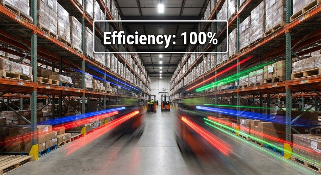
The Visual & Narrative Approach:
To prove value to existing customers, we show them the flow they might be taking for granted. A hyper-lapse simulation looks down a long warehouse aisle. The racking is sharp and static, but the center is a blur of "Red," "Blue," and "Green" light streaks, representing forklifts and pickers moving at high speed. A crisp white UI badge overlay reads: "Efficiency: 100%."
Psychological Impact & KPI Focus:
Niche Psychology: Clients often forget the software is working when things are going well. This visual makes the Invisible Visible. It visualizes the "uptime" and "throughput" that the software is orchestrating in the background. It reinforces the idea that the stillness of the warehouse management system is what allows for the speed of the physical operation.
Operational Impact: Demonstrates High Throughput and Operational Uptime.
Strategic Implementation & Trade-offs:
- Best Use Case: Quarterly Business Review (QBR) presentations or "Year in Review" customer emails.
- Trade-off: Requires a sense of scale. It works best for clients with medium-to-large physical footprints.
Companies using similar video content -
Happy Returns (PayPal) – Returns Management – Focuses on stress-free returns for customers and retailers.
Narvar – Post-Purchase Experience – Promotes customer satisfaction and reduced anxiety.
Returnly (Affirm) – Returns & Exchanges – Visualizes a calm, controlled returns process.
26. The Gamified Driver
Retention | Feature Adoption

The Visual & Narrative Approach:
Driver retention is a massive challenge. We address it with gamification. A "Low-Poly 3D" scene shows a blocky, stylized delivery truck in "Bright Teal" driving on a purple digital highway. Yellow lane markers glow. The aesthetic is reminiscent of a video game. This style is used to introduce features like "Driver Scorecards" or "Safety Bonuses" in a way that feels fun and rewarding, rather than punitive.
Psychological Impact & KPI Focus:
Niche Psychology: Drivers hate being monitored; they love winning. This style re-frames "tracking" as "Gaming." It taps into the psychology of rewards and levels. By using a toy-like, low-poly aesthetic, we lower the stakes and make the software feel like a companion app rather than a surveillance tool.
Operational Impact: Encourages Feature Adoption and Driver Engagement.
Strategic Implementation & Trade-offs:
- Best Use Case: Mobile app splash screens for drivers or "New Feature" announcements.
- Trade-off: Avoid using this for serious compliance features (like DOT logs). Keep it for performance/rewards.
Companies using similar video content -
GreyOrange – Fulfillment Operating System – Shows continuous, high-speed movement of robots.
Exotec – Skypod System – Depicts rapid, efficient flow of goods in automated storage.
Symbotic – AI-Powered Robotics – Visualizes intense, continuous operational velocity.
27. The Reality Check
Expansion | Upsell
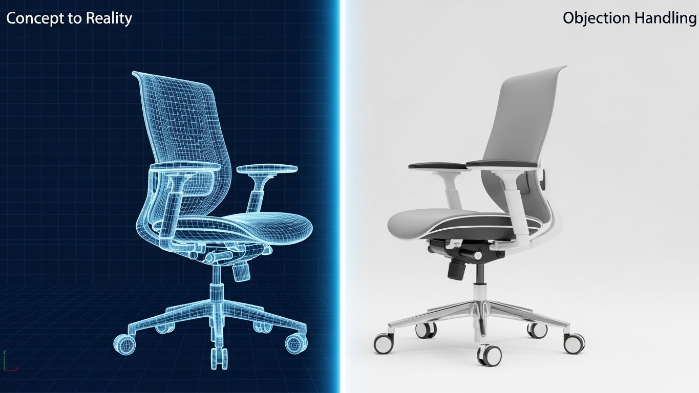
The Visual & Narrative Approach:
Upselling often involves selling a "Planning" or "Design" module. We visualize the bridge between concept and reality. A split-screen image shows a wireframe blueprint on the left (blue/white grid) transforming into a photorealistic object on the right. (Note: While the placeholder depicts a chair, this style is applied in fulfillment to warehouse racking or facility layouts). A glowing white beam separates the two worlds. The lighting on the right is realistic and industrial.
Psychological Impact & KPI Focus:
Niche Psychology: Expansion involves risk. The buyer asks, "Will this plan actually work?" This style visualizes Predictability. It demonstrates that your software's planning tools (left) translate perfectly into physical reality (right). It reduces the perceived risk of expanding into a new facility or adding automation hardware.
Operational Impact: Visualizes Network Planning and Implementation Accuracy.
Strategic Implementation & Trade-offs:
- Best Use Case: Landing pages for "Network Design" or "Warehouse Simulation" add-on modules.
- Trade-off: Ensure the alignment is perfect. The wireframe must match the photo exactly to sell the "accuracy" point.
Companies using similar video content -
Geotab – Fleet Management – Gamified driver scores and performance metrics.
Mojio – Connected Car Platform – Visualizes driving performance in an engaging way.
Route4Me – Route Planner – Presents route optimization with a fun, interactive feel.
28. The Matrix Manifest
Expansion | Referrals

The Visual & Narrative Approach:
For the "Power User" or the Logistics Nerd, data is beautiful. We embrace the "Dark Mode" aesthetic. The screen is deep black, populated by dense rows of data in glowing "Matrix Green." The interface simulates a live, scrolling shipping manifest. The data is abstract (lines and dots) but arranged in strict, orderly columns. It looks like the screen of a hacker or a mission control operator—someone with ultimate access.
Psychological Impact & KPI Focus:
Niche Psychology: This appeals to the Expert ego. It suggests that your platform handles "Big Data" with ease. It separates the "pro" users from the novices. When a user shares this visual (Referral), they are signaling their own sophistication. It communicates Robustness and Enterprise-Grade capability.
Operational Impact: Highlights Data Density and System Performance.
Strategic Implementation & Trade-offs:
- Best Use Case: LinkedIn posts targeting CTOs or "Advanced Analytics" feature pages.
- Trade-off: It is intimidating to non-technical users. Use only when talking to the "Data" persona.
Companies using similar video content -
FlexSim – Simulation Software – Shows warehouse layouts moving from design to operational reality.
AutoCAD (Autodesk) – Design Software – Visualizes architectural plans becoming physical structures.
TGW Logistics Group – System Integration – Depicts warehouse designs transitioning to built facilities.
29. The Human Expert
Expansion | Support

The Visual & Narrative Approach:
At the enterprise level, clients buy partnership, not just SaaS. We use high-fidelity video. A professional man in his 40s (smart-casual blazer) stands in a blurred modern office. He speaks directly to the camera, gesturing with enthusiasm. The lighting is cinematic. This is not a stock model; this represents your "Dedicated Account Manager" or "Implementation Specialist."
Psychological Impact & KPI Focus:
Niche Psychology: Enterprise buyers fear being treated like a ticket number. This visual sells Accountability. It puts a face to the brand. It reassures the client that when they upgrade to the "Enterprise Plan," they get humans, not bots. It builds the highest level of Trust required for six-figure contracts.
Operational Impact: Emphasizes Customer Success and Strategic Partnership.
Strategic Implementation & Trade-offs:
- Best Use Case: The "Enterprise" pricing column or a personal intro video for high-value prospects.
- Trade-off: Production quality must be TV-grade. Bad lighting or audio destroys authority instantly.
Companies using similar video content -
Splunk – Operational Intelligence – Displays high-contrast, scrolling logs and data streams.
Datadog – Monitoring & Security Platform – Visualizes dense, real-time system metrics in dark mode.
Elastic (ELK Stack) – Search & Analytics – Shows complex data queries and results in a dark, technical interface.
30. The Enterprise Scale
Expansion | Thought Leader

The Visual & Narrative Approach:
We conclude with the ultimate statement of power. A sweeping, wide-angle drone shot glides over a massive, state-of-the-art fulfillment center. The facility is dimly lit, illuminated only by cool "Navy Blue" ambient light and the "Neon Cyan" status lights of automated bots. The scale is immense—rows stretching into infinity. It conveys silence, power, and perfect orchestration.
Psychological Impact & KPI Focus:
Niche Psychology: This is for the Visionary. It associates your brand with the industry giants (Amazon, Walmart). It tells the market: "We run the biggest networks in the world." It acts as Social Proof of your scalability. It answers the unasked question: "Can you handle our peak season volume?"
Operational Impact: Visualizes Infinite Scalability and Market Leadership.
Strategic Implementation & Trade-offs:
- Best Use Case: The Hero background of your Homepage or the opening shot of a keynote presentation.
- Trade-off: It feels distant. It inspires awe but not intimacy. Use it to set the stage, then zoom in (see Style 18) to show the work.
Strategic Knowledge Base: The Visual Operations Doctrine
This section synthesizes the 30 visual styles into a cohesive strategic framework. It transforms "motion graphics" from a marketing tactic into a core operational asset for Retail Fulfillment SaaS.
Visual Architecture & Strategic Alignment
The "Pre-Production" Strategy: Defining the Visual Operating System
Before a single pixel is animated, the visual strategy must align with the operational reality of the logistics client.
-
The Cognitive Load Audit: Logistics professionals operate under high stress. Review your current training materials (PDFs, Wikis). If they require more than 15 seconds to understand a core concept, they are failing. Use Style 1 (Liquid Logistics) or Style 19 (Plug-and-Play) to replace dense text with instant visual comprehension.
-
Role-Based Visual Mapping: A "One-Size-Fits-All" visual style fails in logistics.
-
For Drivers (Mobile): Use Style 26 (Low-Poly) and Style 4 (Kinetic Typography). High contrast, large elements, readable in sunlight, simple shapes.
-
For Fleet Managers (Desktop): Use Style 3 (X-Ray Vision) and Style 28 (Dark Mode UI). Dense data, dark backgrounds to reduce eye strain, precise lines.
-
The "Glanceability" Standard: In a warehouse, a packer cannot watch a 2-minute video. Visuals must be "glanceable." Use Style 22 (Holographic UI) to convey instructions that can be absorbed in <3 seconds.
-
The Advids Strategic Audit: Partnering with an expert team like Advids allows for a comprehensive audit of your feature set. We identify which features are "Invisible" (algorithms, backend logic) and map them to "Physical" metaphors (e.g., Style 8 Routing Rules), ensuring no value proposition is left to the customer's imagination.
-
Standardization vs. Customization: For generic workflows (truck docking), use high-quality abstract styles (Style 10 Friendly Warehouse) to save budget. Save bespoke, high-fidelity visualization (Style 16 Future-Proof) for your unique value propositions (e.g., proprietary robotics integration).
-
The Cross-Departmental Bridge: Use visuals to unify terminology. If Sales calls it "Flow," and Ops calls it "Routing," use Style 7 (Linear Logic) to visually demonstrate that they are talking about the same process, creating a single source of truth.
-
Accessibility in Trucking: Designing motion graphics for a diverse, multi-lingual workforce is critical. Visuals like Style 25 (2D Anim) rely on pantomime and iconography rather than voiceover, making them universally understood without expensive translation costs.
Operational Adoption & Workflow Integration
The "Deployment" Phase: Embedding Visuals into the Workstream
The best video is useless if it sits in a folder. Visuals must be embedded directly into the software and the physical environment.
- Overcoming "Big Brother" Anxiety: When introducing tracking or AI monitoring, avoid cold, clinical visuals. Use Style 13 (Augmented Operator) and Style 24 (Peace of Mind) to frame the technology as a helper that protects the worker, rather than a watcher that judges them.
- The Micro-Learning Shift: Replace the 50-page implementation manual with a playlist of 30-second clips. Use Style 6 (Single Pane of Glass) for module overviews and Style 23 (Macro UI) for specific button-click actions.
- Just-in-Time Support: Embed Style 21 (Self-Serve) animations directly into the software's error messages. When a "Sync Error" occurs, play a loop showing how to fix it, reducing the "Time-to-Resolution" and support ticket volume.
- Gamification of Training: Use Style 26 (Gamified Driver) to visualize performance metrics. A driver is more likely to improve their "Eco-Score" if it looks like a game level (Teal/Purple) rather than a spreadsheet row.
- Scalable Localization: Logistics is global. Advids specializes in creating "Master Assets"—videos where text overlays are separated from the animation, allowing for rapid localization into Spanish, Polish, or Hindi for global fleet rollouts.
- Visual SOPs: Transform Standard Operating Procedures (SOPs) into visual process flows. A glowing path on a map (Style 3) is instantly more memorable than a paragraph of text describing aisle locations.
- Leadership Communication: When shifting strategy, don't send a memo. Use Style 29 (Realistic Character) videos from leadership to humanize the change management process and align the entire fleet.
Measuring Impact & Future-Proofing
The "ROI" Phase: Visual Assets as Long-Term Infrastructure
Visual assets are not "content"; they are infrastructure that drives business metrics.
- Beyond "Views" – Measuring Competency: Do not measure video success by "views." Measure it by "Time-to-Competency." If Style 22 (Holographic UI) reduces packing training from 2 days to 4 hours, that is a calculable ROI.
- The "Idle Time" Metric: In the cab or on the dock, confusion equals idle time. Correlate the deployment of clear visual guides (Style 18 Boots-on-the-Ground) with a reduction in "app navigation time" or "screen idle time."
- Compliance Velocity: When regulations change (e.g., ELD mandates), measure how fast the fleet achieves compliance after releasing a Style 2 (Digital Nervous System) explainer video. Speed of information is a competitive advantage.
- Retention and LTV: High-quality UX visualization (Style 20 Clean Slate) creates a perception of premium value. Clients are less likely to churn from a platform that looks and feels organized and modern, increasing Lifetime Value (LTV).
- The Advids Scalability Model: As your product evolves, your visuals must adapt. Advids specializes in building "Visual Design Systems"—libraries of assets (Style 11, Style 15) that can be re-assembled for new features. This ensures that your visual library grows with your codebase, preventing your marketing from becoming outdated.
- The AI Visual Frontier: Prepare for the future. Styles like Style 2 (Digital Nervous System) set the stage for AI integration. By visualizing data as a "living network" now, you prime your customers to accept and pay for advanced AI features (predictive analytics, generative routing) in the future.
- The ROI of Safety: For logistics, safety is a cost center. Quantify the reduction in accidents or insurance claims following the rollout of Style 26 (Gamified Driver) safety training modules.
- Final Call to Innovation: Treat video as infrastructure, not content. It is the fiber-optic cable that carries understanding from your code to their brain. Invest in it with the same rigor you invest in your server architecture.
End of Guide.
Companies using similar video content -
Gartner – Supply Chain Consulting – Features experts providing strategic advice.
Accenture – Supply Chain & Operations Consulting – Showcases professional consultants.
Deloitte – Supply Chain & Network Operations – Emphasizes human expertise and partnership.
Author & Editor Bio


