
Introduction: Visualizing the Invisible Currency of Healthcare
The revenue cycle is the operational heartbeat of the healthcare industry, yet for many organizations, that heartbeat is becoming irregular. We are witnessing a pivotal moment in healthcare finance where the aspiration for seamless, autonomous revenue capture collides with the friction of legacy infrastructure. For CFOs and Revenue Cycle Directors, the challenge is no longer just about "getting paid"; it is about orchestrating a complex ecosystem of data, compliance, and patient trust without exploding administrative costs.
The industry is currently navigating a "Physical/Digital Divide." While electronic health records (EHRs) have digitized clinical care, the financial backend often remains a patchwork of manual interventions and disjointed systems. This friction has tangible consequences. Recent industry data reveals that the initial denial rate on claims hit 11.81% in 2024, a stark indicator that the complexity of payer rules is outpacing the capability of traditional workflows.
For software vendors, this environment presents a massive opportunity. The market is hungry for solutions that don't just "manage" the cycle but optimize it. However, skepticism is high. Buyers are wary of "black box" AI promises; they need to see how the technology works. This is where strategic video visualization becomes your most powerful asset. It acts as a translation layer, converting abstract algorithms and invisible API integrations into tangible, reassuring narratives of efficiency.
The cost of inaction is severe. Hospitals and health systems spent an estimated $19.7 billion in 2022 trying to overturn denied claims—resources that should be directed toward patient care. By adopting the visual strategies outlined in this guide, you can articulate a new future—one where data flows effortlessly, denials are prevented proactively, and financial health is restored. We invite you to explore these examples not just as creative assets, but as strategic tools to reshape market perception and drive adoption in a high-stakes industry.
1. Abstract 3D AI Visualization + Motion Graphics
TOFU | Brand Awareness

The Visual & Narrative Approach
Scenario: This style addresses the invisible nature of data processing. The scene opens with a chaotic, jagged cluster of charcoal-colored rocks on the left, representing "dirty" or unstructured data—the raw, error-prone inputs of manual entry. As these rocks flow rightward across a digital void, they undergo a metamorphosis. They are refined, polished, and transformed into streamlined, glowing electric cyan crystalline spheres. The flow represents the purification of financial data.
Narration & Tone: The narrative is visual-first, requiring no voiceover. The tone is sophisticated, high-tech, and transformative, using a deep, atmospheric slate grey background to make the "purified" data pop.
Psychological Impact & KPI Focus
Niche Psychology: RCM professionals are overwhelmed by "noise"—duplicate records, missing codes, and messy data. This visualization validates their pain (the chaotic rocks) and offers a soothing, orderly resolution (the spheres). It leverages the Cognitive Ease principle, showing that the software handles the complexity so the user doesn't have to.
Operational Impact: By visualizing the "cleaning" process, this style directly addresses the Clean Claim Rate KPI. It metaphorically demonstrates how the software intercepts errors before they reach the payer, bridging the gap between messy reality and the pristine data required for reimbursement.
Strategic Implementation & Trade-offs
Use Case: Ideal for TOFU Social Ads (Instagram/LinkedIn) where you have 3-5 seconds to stop the scroll. The high contrast and motion are "eye candy" that signal innovation.
Trade-offs: This style is purely metaphorical. It builds Brand Awareness but does not educate on how the cleaning happens. It sacrifices technical detail for emotional impact.
Companies using similar video content -
Innovaccer – Data Activation Platform – Unifies disparate healthcare data for insights.
FinThrive – AI-Powered RCM – Automates revenue cycle with intelligent data processing.
2. Generative AI cinematic video
TOFU | Market Education

The Visual & Narrative Approach
Scenario: A dramatic, cinematic visualization of protection. A low-angle shot frames a stylized, miniature 3D hospital building. A glowing, translucent gold energy shield encompasses the building. As red geometric projectiles (representing claim denials) rain down from the sky, they shatter harmlessly against the shield. The lighting is ethereal, with 'god rays' beaming down. The environment is a twilight blue architectural landscape.
Narration & Tone: The tone is epic, protective, and reassuring. It positions the software not just as a tool, but as a guardian. The aesthetic is grand and high-tech, evoking feelings of safety and resilience.
Psychological Impact & KPI Focus
Niche Psychology: Fear of revenue loss is a primary driver for CFOs. This visual speaks directly to that anxiety, offering a "Shield of Reliability." It uses Visual Metaphor to tangible-ize the concept of "Denial Prevention," making the abstract threat of audits feel manageable.
Operational Impact: This style highlights the Denial Rate reduction. It visually reinforces the value proposition of proactive defense—stopping threats before they impact the bottom line. It effectively communicates the software's role in preserving revenue integrity.
Strategic Implementation & Trade-offs
Use Case: Best for Market Education on YouTube or landing pages. The cinematic quality conveys premium value and authority.
Trade-offs: While emotionally resonant, it can feel "too Hollywood" for highly technical buyers if not paired with substantive text or follow-up content. It prioritizes Brand Perception over feature specificity.
Companies using similar video content -
Waystar – Denial + Appeal Management – Proactively prevents and manages claim denials.
Optum – Integrity One – Combines rules-based logic with machine learning for revenue integrity.
3. Bold Kinetic Typography + Organic Vector
TOFU | Shaping Brand Perception

The Visual & Narrative Approach
Scenario: A 2D vector illustration featuring bold, heavy geometric shapes arranged to abstractly suggest a dollar sign entwined with a medical cross. The palette uses vivid lime green, slate grey, and pure white. The shapes have hard edges and are interlocked in a dynamic, kinetic composition that implies upward movement and growth. The background is a flat, clean slate grey. No text or letters, only symbolic shapes.
Narration & Tone: Fast-paced and energetic. The "Voice" is the motion itself—confident, precise, and direct. The lack of text focuses the viewer entirely on the symbology of profit meets care.
Psychological Impact & KPI Focus
Niche Psychology: Healthcare providers often feel a tension between clinical care and financial necessity. This visual resolves that tension by visually interlocking the two symbols (Cross + Dollar), suggesting they are mutually supportive. It uses Processing Fluency—simple shapes are easier to remember.
Operational Impact: This style reinforces Net Collection Rate. The upward kinetic movement subconsciously cues "increase" and "growth," aligning the viewer's mindset with revenue optimization goals without needing a spreadsheet.
Strategic Implementation & Trade-offs
Use Case: Highly effective for Social Media (LinkedIn/Twitter) snippets where sound might be off. It acts as a "Brand Signal" that reinforces the company's identity as a growth partner.
Trade-offs: It is abstract. It tells you what the outcome is (growth) but not how it's achieved. It is a mood setter, not an explainer.
Companies using similar video content -
athenahealth – athenaCollector – Streamlines billing and accelerates claims processing.
R1 RCM – R1 Acceleration Platform – Optimizes revenue cycle with advanced financial analytics.
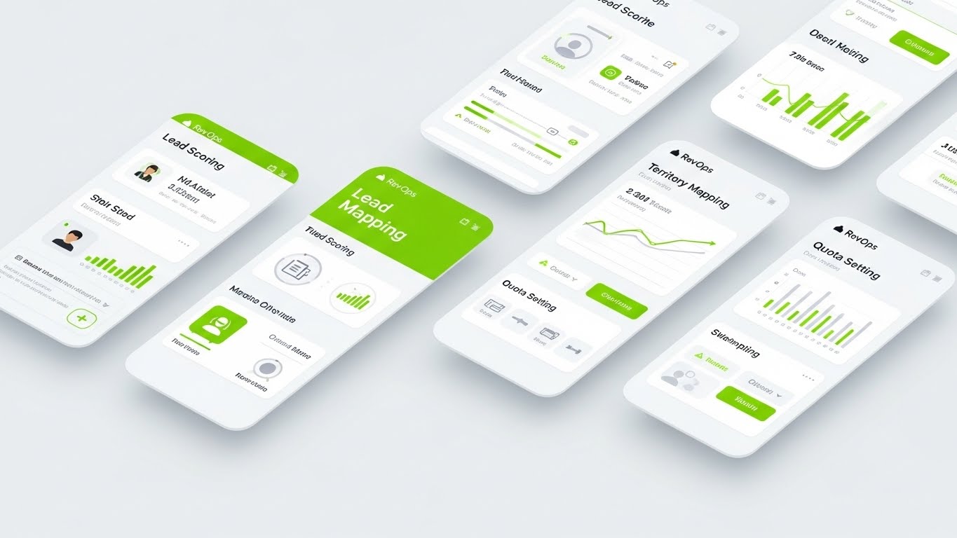
4. Isometric 2D Motion Design
TOFU | ABM Awareness

The Visual & Narrative Approach
Scenario: An isometric flat 2D illustration of a hospital floor plan on a soft coral background. Tiny, simplified white documents are traveling along teal conveyor belts connecting different rooms (exam room, billing office, reception). The style is clean, vector-based, and shadowless, utilizing a palette of soft coral, teal, and cream. The scene conveys automated workflow efficiency without clutter.
Narration & Tone: The tone is clinical, clean, and organized. It conveys a sense of "Automated Workflow Efficiency." The soft coral and teal palette is modern and approachable, reducing the perceived complexity of hospital operations.
Psychological Impact & KPI Focus
Niche Psychology: Administrators deal with silos—departments that don't talk to each other. This visual proves connectivity. It alleviates the anxiety of Interoperability by showing a literal physical link between disparate rooms. It lowers Cognitive Load by simplifying the hospital into a neat, manageable map.
Operational Impact: This style visualizes Days Sales Outstanding (DSO) reduction. The conveyor belt metaphor implies speed and continuous movement, countering the reality of claims getting "stuck" on a desk.
Strategic Implementation & Trade-offs
Use Case: Perfect for ABM Awareness campaigns on LinkedIn, targeting Operations Directors. It respects their need for process visibility.
Trade-offs: The "flat" style can sometimes feel less "enterprise-grade" than 3D. It risks looking too playful if not balanced with professional copy.
Companies using similar video content -
UiPath – Healthcare Claims Automation – Automates claims processing with robotic process automation.
FlowForma – Healthcare Claims Automation – Streamlines claims handling with AI-powered process automation.
6. Low-Poly 3D + Minimalist Flat
TOFU | Overcoming Objections

The Visual & Narrative Approach
Scenario: A low-poly 3D scene rendered in matte pastel blue, soft pink, and white. A stylized, faceless doctor character constructed of geometric polygons is removing red cubic "blocks" from a precarious tower, replacing them with stable green cubes. The lighting is soft and shadowless (ambient occlusion). The background is a solid, clean pastel blue.
Narration & Tone: The tone is helpful, constructive, and calm. It focuses on "Overcoming Objections" regarding the difficulty of fixing errors. The soft, shadowless lighting creates a friendly, non-threatening environment.
Psychological Impact & KPI Focus
Niche Psychology: Fear of "breaking the system" is real. This visual demonstrates that fixing the revenue cycle can be surgical and non-disruptive. It appeals to the desire for Stability and control. The faceless character allows the viewer to project themselves into the role of the problem-solver.
Operational Impact: This speaks to First Pass Yield. It visualizes the act of correction before the collapse (denial), emphasizing the value of scrubbing and editing claims upfront.
Strategic Implementation & Trade-offs
Use Case: Excellent for YouTube Explainer segments where you need to break down a specific feature (like claim scrubbing) without getting bogged down in UI screenshots.
Trade-offs: The low-poly aesthetic is stylized and may not appeal to traditionalists who prefer photorealism. It simplifies the problem significantly, which is good for marketing but perhaps too basic for technical training.
Companies using similar video content -
MD Clarity – RevFind – Detects underpayments and manages denials proactively.
Atom Audit – Medical Coding Audit Tool – Streamlines coding review and enhances accuracy.
7. Photorealistic 3D Renders
TOFU | Skippable Pre-Roll Ad

The Visual & Narrative Approach
Scenario: A hyper-photorealistic close-up render of a crystal chess piece on a polished mahogany executive desk. The chess piece is knocking over a simple wooden pawn marked with a red abstract 'X'. In the blurred background, vague shapes of medical charts and digital tablets are visible. The lighting is warm and sophisticated, emphasizing the refraction of light through the crystal. Palette: Pure white, silver, glass, mahogany.
Narration & Tone: The tone is premium, authoritative, and decisive. It positions RCM as a "Strategic Game" that you play to win. It elevates the software from a utility to a competitive advantage.
Psychological Impact & KPI Focus
Niche Psychology: CFOs view themselves as strategists. This visual mirrors their self-image. It validates their need for Control and Dominance over payers. The "Checkmate" metaphor is universally understood as the ultimate victory.
Operational Impact: This targets Revenue Recovery. It implies that with the right tool (the crystal piece), even difficult denials (the red X) can be overturned. It speaks to the ROI of intelligent appeal strategies.
Strategic Implementation & Trade-offs
Use Case: High-impact LinkedIn Pre-Roll Ads. The visual quality signals "Enterprise Solution" and justifies a higher price point.
Trade-offs: High production cost. It is a metaphor that requires the viewer to make the connection between chess and claims; it doesn't show the product interface.
Companies using similar video content -
Experian Health – Revenue Cycle Management – Provides strategic solutions for claims and patient access.
Craneware – Revenue Integrity Solutions – Optimizes charge capture and pricing for compliance.
8. Isometric 3D Workflow
MOFU | Demand Gen
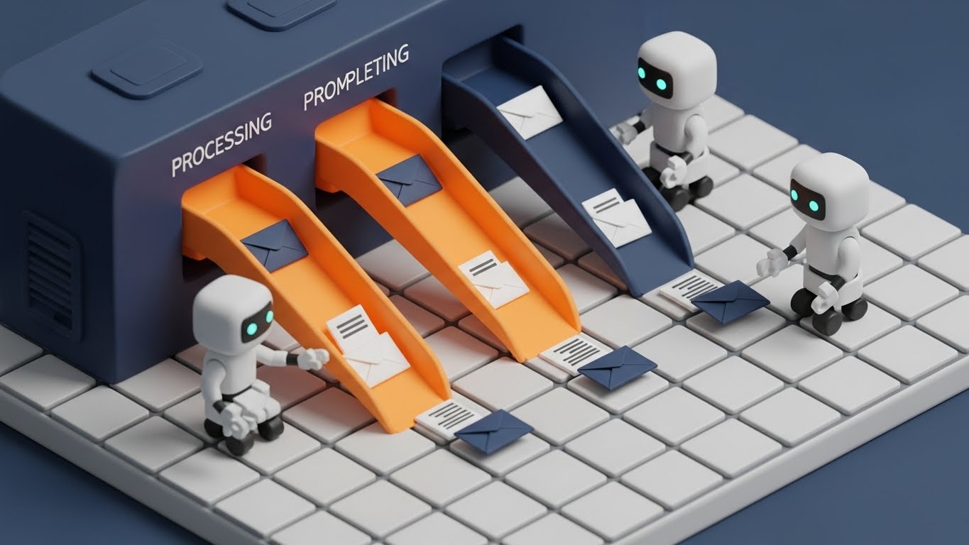
The Visual & Narrative Approach
Scenario: A detailed 3D isometric render of a revenue cycle processing center. The style is clay-like with a matte finish. Miniature white robots are sorting small envelopes into chutes glowing with bright orange (processing) and navy blue (completed). The floor is a grid of soft white tiles. The lighting is soft studio lighting with gentle shadows. Palette: Navy blue, bright orange, white.
Narration & Tone: The tone is industrious, precise, and efficient. It visualizes "Demand Gen" by showing a scalable factory. The robots represent the "digital workers" (bots/RPA) that handle the repetitive tasks.
Psychological Impact & KPI Focus
Niche Psychology: Staff burnout is a huge issue. This visual promises Relief. It tells the manager: "You don't have to force your team to stuff envelopes; the robots will do it." It leverages the Labor Saving bias.
Operational Impact: This directly visualizes Cost to Collect. By replacing human labor (implied) with robots, it suggests a dramatic reduction in operational overhead and an increase in throughput.
Strategic Implementation & Trade-offs
Use Case: Display Ads and website hero sections. It communicates "Automation" instantly without words.
Trade-offs: Can be perceived as "de-humanizing" if not careful. It's important to frame this as supporting staff, not replacing them, in the accompanying copy.
Companies using similar video content -
ARDEM – AI Claims Processing – Automates medical billing and insurance claims.
P3Care – Denial Management – Detects denial types using RPA for quick resolutions.
9. Split Screen: Optimized Reality and UI
MOFU | Product Differentiation
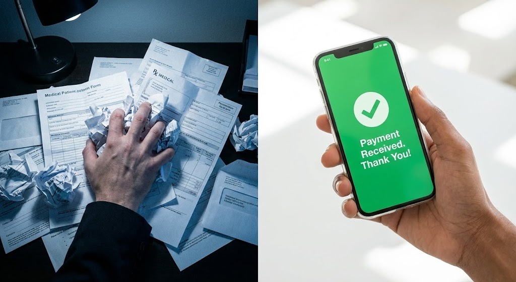
The Visual & Narrative Approach
Scenario: A vertical split screen. The top half shows a close-up photograph of a stressed person's hand buried in a pile of paper medical forms, lighting is dim and cool. The bottom half shows a bright, high-key photograph of a diverse hand holding a sleek glass smartphone displaying a simplified "Payment Received" notification in vibrant green UI. The contrast highlights the shift from legacy chaos to modern ease.
Narration & Tone: The tone is "Problem/Solution." It uses high contrast to drive home the value proposition of "Product Differentiation." The visual journey is instant: from the darkness of legacy chaos to the light of modern ease.
Psychological Impact & KPI Focus
Niche Psychology: This taps into the Contrast Principle. It validates the user's current suffering (the paper pile) and offers an immediate dopamine hit of resolution (the green screen). It addresses the "Physical/Digital Divide" directly.
Operational Impact: This visualizes the shift in Patient Experience and Time to Payment. It shows the end-result of a frictionless payment process, which accelerates cash flow.
Strategic Implementation & Trade-offs
Use Case: LinkedIn Ads (MOFU). It serves as tangible proof of the "After" state.
Trade-offs: It's a static concept that relies on the "Before" being relatable. If the target audience has already digitized, the "paper pile" might feel outdated.
Companies using similar video content -
Cedar – Patient Engagement Platform – Modernizes patient payments and financial experience.
RevSpring – Patient Engagement Solutions – Improves patient financial literacy and payment propensity.
10. Futuristic Neon/Dark Mode
MOFU | Feature Education
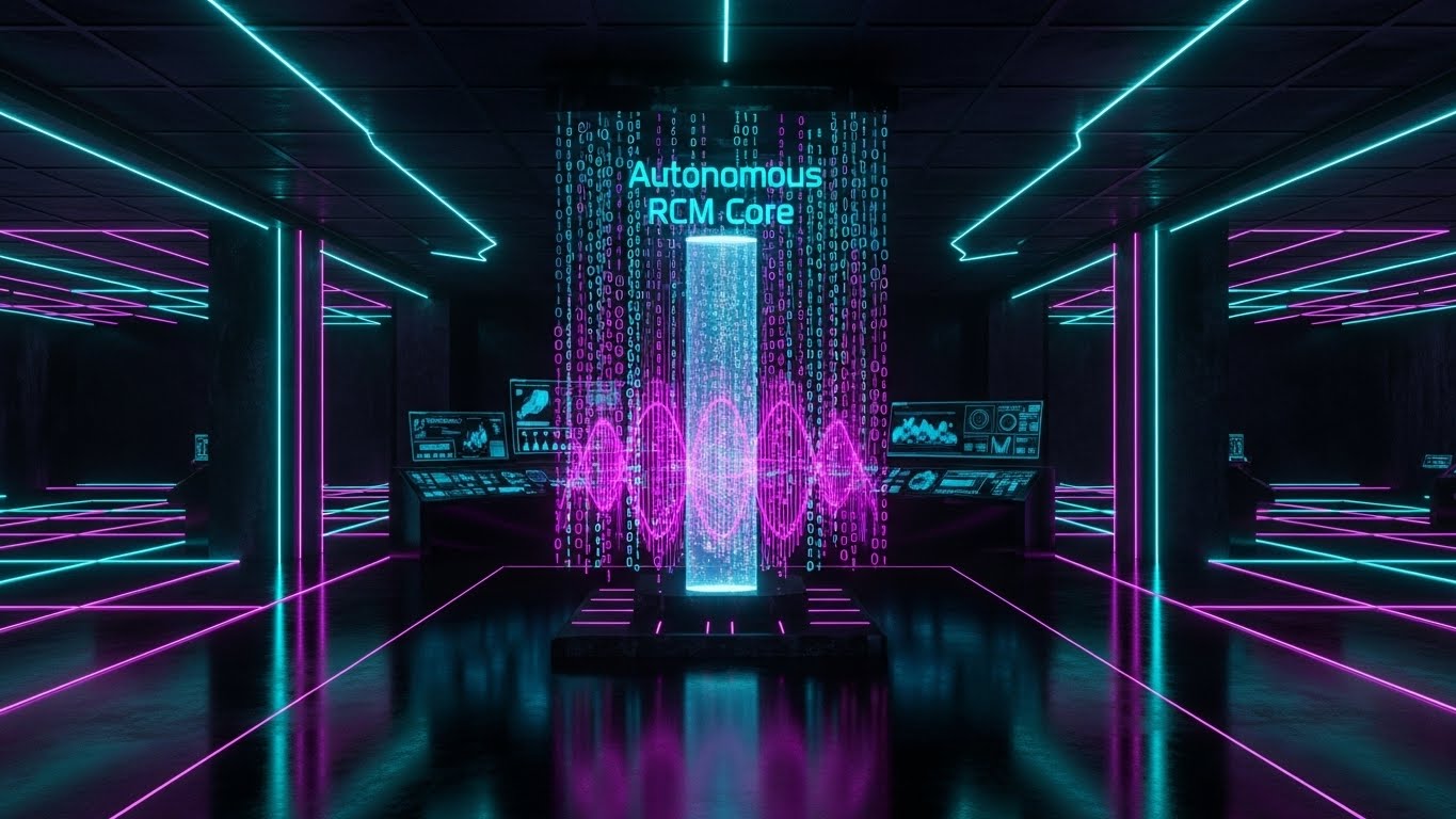
The Visual & Narrative Approach
Scenario: A futuristic dark mode environment dominated by cyan and magenta neon lines. A central holographic pillar represents the "Autonomous RCM Core." Streams of binary code (0s and 1s) flow vertically into the pillar, which pulses with light. The floor is a reflective black surface mirroring the neon. The aesthetic is "Cyberpunk Healthcare," visualizing a new category of tech.
Narration & Tone: The tone is visionary, cutting-edge, and disruptive. It frames the software as a "New Category" of tech—Autonomous RCM. It borrows the visual language of fintech and crypto to suggest speed and security.
Psychological Impact & KPI Focus
Niche Psychology: For the "Early Adopter" segment, this style triggers FOMO (Fear Of Missing Out). It suggests that the future is here and it looks nothing like the beige spreadsheets of the past. It signals Innovation.
Operational Impact: This abstractly represents Predictive Analytics and AI-Driven Coding. The "black box" of AI is visualized as a glowing, powerful core, building trust in the algorithm's capability.
Strategic Implementation & Trade-offs
Use Case: YouTube Feature Education or Keynote backdrops. It establishes the brand as a thought leader.
Trade-offs: It can look "dark" or "scary" to conservative healthcare providers. It needs to be balanced with warm, human elements elsewhere in the campaign to avoid feeling cold.
Companies using similar video content -
Jorie AI – RCM AI System – Automates RCM tasks with artificial intelligence.
Akasa – AI-Powered RCM Automation – Delivers autonomous revenue cycle management.
11. Dynamic Data Visualization
MOFU | Competitive Displacement

The Visual & Narrative Approach
Scenario: A sophisticated 3D data visualization set in a pristine white abstract space. Bars made of translucent emerald green glass rise aggressively from left to right, morphing into stylized dollar signs at their peak. A golden trend line weaves through the bars, indicating a trajectory that outperforms the standard. The studio lighting emphasizes the gloss and solidity of the metrics, creating a tangible sense of financial gain.
Narration & Tone: The tone is analytical yet triumphant. It visualizes "Competitive Displacement" by showing your solution's performance literally towering over the status quo. The aesthetic is clean and premium, suggesting that the data—and the money—is real and substantial.
Psychological Impact & KPI Focus
Niche Psychology: RCM buyers are data-driven skeptics. They need to see the numbers. This visual uses Data Materialization—turning abstract percentages into solid, glass objects—to make the financial uplift feel tangible and attainable. It appeals to the CFO's desire for wealth creation rather than just maintenance.
Operational Impact: This directly visualizes Net Collection Rate (NCR) improvement. The upward trajectory and the transformation into dollar signs reinforce the direct correlation between software performance and increased revenue capture.
Strategic Implementation & Trade-offs
Use Case: Highly effective for LinkedIn Sponsored Content targeting CFOs. It provides instant visual proof of performance.
Trade-offs: It focuses entirely on the result, not the process. It validates the "What" (more money) but leaves the "How" for deeper content.
Companies using similar video content -
Health Catalyst – DOS Platform – Delivers predictive and operational finance analytics.
MedeAnalytics – Healthcare Analytics Platform – Provides data-driven insights across financial domains.
12. Abstract 2D Motion Graphics
MOFU | The Functional Buyer
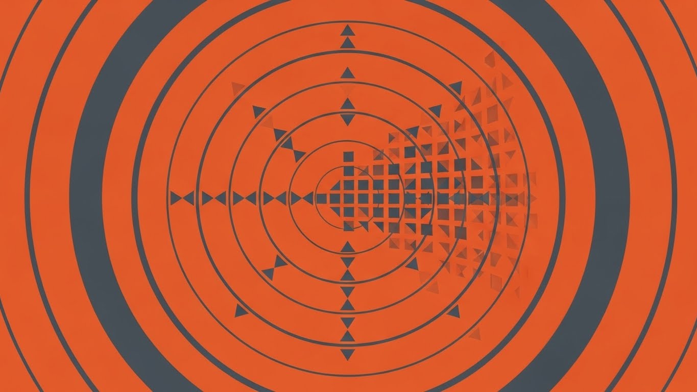
The Visual & Narrative Approach
Scenario: A flat, geometric 2D animation using a palette of burnt orange and charcoal gray. Concentric circles ripple outward from a center point like a radar or sonar sweep. As the "radar" passes over chaotic, scattered shapes, they snap into a perfect, organized grid of squares and triangles. The motion is rhythmic and hypnotic, symbolizing the continuous scanning for revenue opportunities.
Narration & Tone: The tone is vigilant and systematic. It visualizes the "Functional Buyer's" need for a system that catches what humans miss. The "radar" metaphor communicates constant surveillance of the revenue cycle.
Psychological Impact & KPI Focus
Niche Psychology: Fear of "Revenue Leakage" keeps directors up at night. This visual assuages that fear by demonstrating a mechanism of Total Visibility. It uses the Closure Principle, where the brain enjoys seeing chaos resolve into order.
Operational Impact: This targets Aged A/R and Uncompensated Care. It visually demonstrates the software's ability to identify billable events that would otherwise slip through the cracks of a manual review process.
Strategic Implementation & Trade-offs
Use Case: Ideal for Display Ads and retargeting banners. The strong geometric contrast stands out on cluttered webpages.
Trade-offs: The abstract nature requires a clear headline (e.g., "Stop Revenue Leakage") to ensure the viewer understands the "Radar" metaphor immediately.
Companies using similar video content -
Access Healthcare – Revenue Integrity Services – Identifies and prevents revenue leakage.
Streamline Health – RevID – Prevents revenue leakage through automated charge capture.
13. Clean UI Workflow (Light Mode)
MOFU | Competitive Switcher
The Visual & Narrative Approach
Scenario: A close-up, polished presentation of the software's interface in a clean light-mode. The screen is predominantly white with soft sky blue and vibrant green accents. The focus is on a streamlined workflow: a cursor glides smoothly to a pill-shaped button labeled with an abstract "Approve" icon. The UI elements are slightly raised with soft drop shadows (neumorphism), giving them a tactile feel. The background is a blurred, modern office, grounding the digital tool in the physical reality of a workspace.
Narration & Tone: The tone is frictionless and modern. It targets the "Competitive Switcher" who is tired of clunky, 1990s-era medical software. It promises a consumer-grade user experience (UX) similar to the apps they use in their personal lives.
Psychological Impact & KPI Focus
Niche Psychology: Administrative burnout is often driven by "Click Fatigue." This visual promises Cognitive Ease. By showing a clean, spacious interface, it subconsciously signals that the work is easier to perform, reducing the perceived effort of adoption.
Operational Impact: This visualizes Staff Productivity and Training Time. A clean UI implies that new staff can be onboarded quickly without navigating complex, counter-intuitive menus.
Strategic Implementation & Trade-offs
Use Case: Essential for Landing Pages and product brochures. It serves as "Visual Proof" that the software is modern.
Trade-offs: It reveals the actual product. If your UI is outdated, this style will backfire. It requires the software design to be top-tier to have the desired persuasive effect.
Companies using similar video content -
Kareo – Kareo Billing – Simplifies claims management with an intuitive interface.
SimplePractice – Practice Management Software – Offers easy-to-use billing and client management.
14. Rapid UI Feature Montage
MOFU | Category Creation
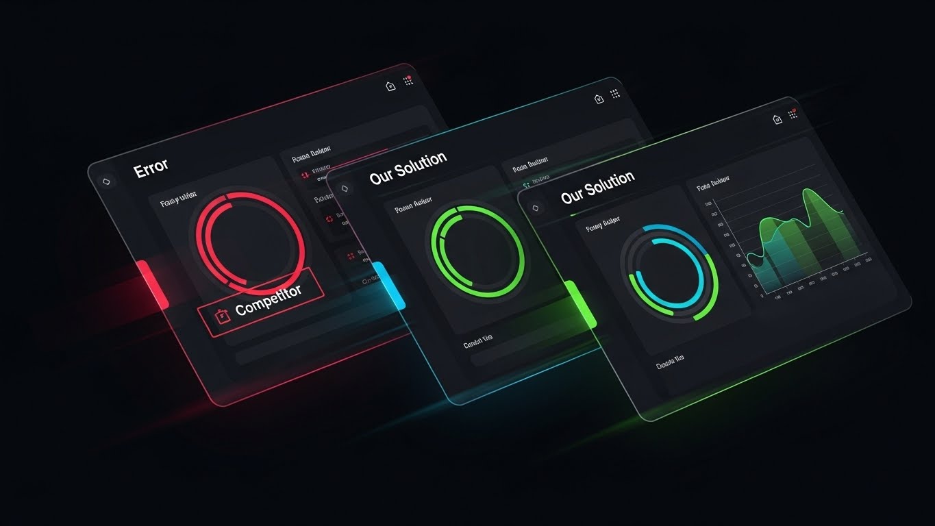
The Visual & Narrative Approach
Scenario: A high-energy dynamic composition featuring diagonal slices of interface screens. The left slice shows a dark, red-accented "Error" log labeled "Competitor." The middle and right slices push this aside, revealing vibrant green and blue dashboards labeled "Our Solution," displaying smooth data curves. Motion blur suggests speed and displacement.
Narration & Tone: The tone is competitive and decisive. It positions the product as a "New Category"—a leap forward rather than an incremental step. The visual language is "Out with the Old, In with the New."
Psychological Impact & KPI Focus
Niche Psychology: Buyers often suffer from Status Quo Bias. This visual disrupts that by creating a stark contrast between "Red/Error" (Current State) and "Green/Flow" (Future State). It triggers the Contrast Principle, making the new solution appear significantly more desirable by direct comparison.
Operational Impact: This speaks to Claim Scrubbing Efficiency. It visualizes the transition from reactive error management (the red slice) to proactive revenue optimization (the green slices).
Strategic Implementation & Trade-offs
Use Case: High-impact YouTube Pre-Roll Ads. The fast cuts and high contrast are designed to hold attention in the first 5 seconds.
Trade-offs: It is aggressive. It requires confidence in your competitive advantage. It simplifies the competitor's product to "Errors," which is a bold marketing stance.
Companies using similar video content -
NextGen Healthcare – NextGen Enterprise – Enhances billing accuracy with AI-driven coding.
CureMD – RCM & Practice Management – Provides advanced AI claim scrubbing and analytics.
15. 2D Line Art Animation
MOFU | Building Trust

The Visual & Narrative Approach
Scenario: An elegant, minimalist animation where a single, continuous black line morphs fluently on a cream background. It starts as a medical stethoscope, transforms into a heartbeat pulse (ECG), and finally resolves into the sturdy outline of a bank vault door. A single pulse of red energy travels along the line, connecting the care to the cash.
Narration & Tone: The tone is sophisticated, fluid, and trustworthy. It builds trust by visually proving the company understands the intrinsic link between clinical excellence and financial security. It is understated and "quiet" compared to the loud 3D visuals.
Psychological Impact & KPI Focus
Niche Psychology: Healthcare providers resent the commodification of care. This visual respects their values by starting with the stethoscope (care) before moving to the vault (finance). It uses Processing Fluency through the continuous line, suggesting a seamless, unbroken process.
Operational Impact: This visualizes Revenue Integrity. It metaphorically demonstrates that the software ensures the value generated in the exam room is safely locked away in the bank, without "leakage" along the line.
Strategic Implementation & Trade-offs
Use Case: Perfect for Website "About Us" sections or as a subtle loading animation. It reinforces brand values rather than specific features.
Trade-offs: It is symbolic. It does not show the software interface or specific features. It builds brand affinity, not feature comprehension.
Companies using similar video content -
Global Healthcare Resource – Hospital RCM Services – Connects clinical excellence with financial security.
EvidenceCare – Clinical Decision Support – Prevents RCM issues at the source.
16. Lifestyle Stock with UI Overlay
BOFU | ROI Justification

The Visual & Narrative Approach
Scenario: A cinematic shot of a confident female executive (CFO persona) in a modern, glass-walled office at golden hour. She is looking out at the city skyline, smiling. Floating in the air next to her is a sleek, semi-transparent UI dashboard showing a green upward trend arrow and the text "Cash Flow: +15%". The lighting is warm and aspirational.
Narration & Tone: The tone is successful, human, and results-oriented. It targets "ROI Justification" by showing the human result of the software: a confident, relaxed leader who has met her targets. It moves the focus from the tool to the outcome.
Psychological Impact & KPI Focus
Niche Psychology: CFOs want to see themselves in the marketing. This serves as a Mirror Neuron trigger—"That could be me." It associates the software with professional success, reduced stress, and executive control.
Operational Impact: This directly visualizes Cash Flow Acceleration and Operating Margin. The "+15%" metric anchors the visual in specific financial reality, validating the investment to the buying committee.
Strategic Implementation & Trade-offs
Use Case: LinkedIn Case Study Posts and bottom-of-funnel retargeting. It humanizes the tech decision.
Trade-offs: Stock footage can feel generic if not high quality. The UI overlay must look integrated and premium to avoid looking "tacked on."
Companies using similar video content -
Conifer Health Solutions – RCM Solutions – Manages complex hospital billing for financial success.
AdvancedMD – RCM Management – Delivers comprehensive RCM with deep analytics.
17. 3D X-Ray Visualization
BOFU | Sales Cycle Acceleration

The Visual & Narrative Approach
Scenario: A technical 3D visualization of a "Server Block" rendered as a transparent glass cube. Inside, complex gold and silver gears are visible, turning in perfect synchronization. Small green lights travel along the gears, representing data packets. The background is a clean technical grid. This "X-Ray" view reveals the precision engineering inside the "black box."
Narration & Tone: The tone is precise, engineering-focused, and transparent. It accelerates the sales cycle by answering the technical buyer's question: "How does it actually work?" It removes the mystery and replaces it with mechanical certainty.
Psychological Impact & KPI Focus
Niche Psychology: IT Directors and Compliance Officers fear "Black Boxes"—systems they can't see inside. This visual utilizes Transparency to build confidence. It suggests that because you are showing the "insides," you have nothing to hide. It implies robustness and reliability.
Operational Impact: This visualizes Back-End Processing and Rules Engine Precision. It suggests that the billing rules (the gears) are hard-coded, precise, and error-free, leading to a higher Clean Claim Rate.
Strategic Implementation & Trade-offs
Use Case: Technical White Papers and "How it Works" website sections. It appeals to the logical, detail-oriented buyer.
Trade-offs: It is cold and mechanical. It appeals to the IT buyer but may not resonate emotionally with the clinical or financial buyer who cares more about the outcome than the machine.
Companies using similar video content -
BESLER – Revenue Integrity Solutions – Reveals precision engineering in billing logic.
PCH Global – Revenue Integrity Management – Optimizes charge capture and claims resolution.
18. 2D Animation & UI Composition
BOFU | Risk Mitigation

The Visual & Narrative Approach
Scenario: A friendly, flat 2D vector illustration using pastel pinks and blues. A young man sits at a desk, smiling and giving a "thumbs up." Next to him, a floating UI screen displays a shield icon actively deflecting small red arrows (representing claim denials). The style is approachable and non-threatening, simplifying the concept of defense.
Narration & Tone: The tone is reassuring and simplified. It addresses "Risk Mitigation" not with fear, but with confidence. It visualizes the software as a helpful sidekick that handles the "arrows" so the user doesn't have to.
Psychological Impact & KPI Focus
Niche Psychology: Lower-level staff and managers often fear that new software will be hard to use or will expose their mistakes. This friendly aesthetic lowers Affective Filter—it looks easy and forgiving. It reframes denial management from a battle to a background process.
Operational Impact: This visualizes Denial Prevention. The shield metaphor is simple but effective in communicating that the system actively blocks bad claims from leaving the building.
Strategic Implementation & Trade-offs
Use Case: Social Media (Meta/Instagram) and staff training materials. It makes the software feel accessible to the daily user.
Trade-offs: The "cartoon" style may seem too casual for some enterprise enterprises. It is best used for "ease of use" messaging rather than "enterprise power" messaging.
Companies using similar video content -
GoBill – Denial Management – Simplifies denial prevention with active defense.
Quadax – Denial Management Solutions – Automates denial capture and routing rules.
19. Dark Mode UI Showcase
BOFU | Risk Mitigation

The Visual & Narrative Approach
Scenario: A sleek, high-tech visualization in "Dark Mode." The background is deep purple and black. A central UI screen glows with electric green code and bar charts, anchored by a prominent, glowing padlock icon. Faint "Matrix-style" digital rain falls in the background. The aesthetic is cyber-secure and encrypted.
Narration & Tone: The tone is serious, secure, and elite. It targets the IT buyer's concern for "Security." It borrows visual cues from cybersecurity and fintech to signal that patient data is under the highest level of protection.
Psychological Impact & KPI Focus
Niche Psychology: With healthcare data breaches on the rise, Security is a top priority. This visual triggers a feeling of safety through the "Dark Mode" aesthetic, which is culturally associated with high-end tech and encryption.
Operational Impact: This visualizes HIPAA Compliance and Data Integrity. It reassures the buyer that the revenue cycle will not be interrupted by security vulnerabilities.
Strategic Implementation & Trade-offs
Use Case: Security Compliance Pages and IT-focused sales decks. It answers the "Is it safe?" question visually.
Trade-offs: Dark mode can feel "heavy" or "intense." It should be used specifically for security topics, not for general user workflow visualization.
Companies using similar video content -
Hyland Healthcare – Intelligent Document Processing – Secures financial data with advanced AI.
Kofax – AI-Powered Document Processing – Automates workflows and improves data accuracy.
20. 2D Character-Driven Story
Onboarding | Self-Serve Onboarding

The Visual & Narrative Approach
Scenario: A vibrant, cheerful 2D vector scene. A young adult male character with glasses, dressed casually in a hoodie, sits comfortably in a bright yellow beanbag chair holding a laptop. He is smiling. A thought bubble above him shows a rocket ship taking off. The environment is a stylized, colorful co-working space with plants.
Narration & Tone: The tone is enthusiastic and "Self-Serve." It visualizes the Onboarding phase not as a chore, but as a launch. The casual setting suggests that getting started is so easy it can be done from a beanbag, removing the fear of a painful, months-long implementation.
Psychological Impact & KPI Focus
Niche Psychology: The biggest barrier to closing is often the fear of Implementation Drag. Buyers fear months of downtime. This visual leverages the Ease of Use bias, promising a "Plug and Play" experience. The rocket ship signifies rapid "Time to Value."
Operational Impact: This visualizes Time to First Payment. It promises that the team will be up and running—and collecting revenue—at "rocket speed," minimizing the disruption to cash flow during the transition.
Strategic Implementation & Trade-offs
Use Case: Welcome Emails, Onboarding portals, and "Implementation Process" slides in the sales deck.
Trade-offs: It is very casual. It implies a "light" implementation, which is great for SaaS but might seem unrealistic for massive enterprise RCM overhauls without accompanying text explaining the support structure.
Companies using similar video content -
DrChrono – RCM Solution – Visualizes easy onboarding for practice management.
CERTIFY Health – RCM System – Streamlines invoicing and claims processing.
21. Macro UI Micro-Interactions
Onboarding | Trial/Freemium User Activation

The Visual & Narrative Approach
Scenario: An extreme macro close-up of a critical interface element: the pill-shaped "SUBMIT" button, rendered in vivid lime green. The text is crisp white sans-serif. A stylized cursor is captured in the split-second of clicking, creating a realistic depression and a subtle ripple effect on the button's surface. The background is a clinical, pristine white, forcing 100% focus on the action.
Narration & Tone: The tone is encouraging, tactile, and immediate. It creates a "sensory anchor" for the most important action in the software. It transforms a mundane click into a satisfying, tangible event.
Psychological Impact & KPI Focus
Niche Psychology: New users often experience "Click Anxiety"—fear that submitting a claim will cause an error or crash the system. This visual utilizes Haptic Visual Cues to make the digital environment feel physical, responsive, and safe. It creates a micro-dopamine reward for completing a task.
Operational Impact: This style drives User Activation Rate. By visually glamorizing the "Commit" action, it subconsciously encourages users to push past hesitation and complete their first workflow cycle, reducing drop-off during onboarding.
Strategic Implementation & Trade-offs
Use Case: Critical for Onboarding Emails (e.g., "You are one click away from faster payments") and in-app "Welcome" tooltips.
Trade-offs: It is hyper-focused. It shows a moment, not a process. It is effective for motivation but useless for explanation.
Companies using similar video content -
CollaborateMD – Medical Billing System – Validates user actions for efficient claim submission.
EZClaim – Medical Billing Software – Offers simple billing workflows and automation.
22. Hyper-lapse Stock Footage with Data
Onboarding | Accelerating Time-to-Value

The Visual & Narrative Approach
Scenario: A high-energy hyper-lapse sequence of a hospital hallway. Doctors and nurses are rendered as streaks of motion blur, conveying the frantic pace of the environment. In the center, a sharp, semi-transparent holographic plane remains perfectly static, displaying a "Checkmark" and a digital timer frozen at "00:05". The contrast between the blue/white blur and the crisp data is stark.
Narration & Tone: The tone is efficient and respectful of time. It acknowledges the "Time Famine" of healthcare professionals. It visually asserts that while the hospital is chaotic, the software is an anchor of speed and stability.
Psychological Impact & KPI Focus
Niche Psychology: RCM staff fear software that slows them down with loading screens or complex menus. This visual leverages the Contrast Principle. The stillness of the data amidst the chaos signals control and efficiency. It promises that the tech works at the speed of the user.
Operational Impact: This visualizes Time-to-Value and Task Velocity. It communicates that the software fits into the micro-moments of a busy day, reducing the perceived burden of adoption.
Strategic Implementation & Trade-offs
Use Case: YouTube Pre-Roll Ads and Onboarding Intro Videos. It sets the expectation of speed immediately.
Trade-offs: Stock footage can feel generic. The holographic overlay must be high-quality design to elevate the "stock" feel to a "premium brand" experience.
Companies using similar video content -
RapidClaims – AI-Driven Claims Automation – Accelerates claims processing and time-to-value.
Langate Software – AI in RCM – Speeds up claim processing and reduces denials.
23. 2D Graphics Over Live Action
Retention | Knowledge Base & FAQ Videos

The Visual & Narrative Approach
Scenario: A medium shot of a friendly, diverse female doctor holding a tablet. She smiles at the camera while playful, flat 2D vector icons (orange question marks transforming into bright yellow lightbulbs) pop up around her head. The live-action provides human relatability, while the graphics represent the digital ease of finding answers.
Narration & Tone: The tone is supportive, accessible, and "light." It visualizes the Knowledge Base not as a dry manual, but as a friendly, instant resource. It lowers the stakes of asking for help.
Psychological Impact & KPI Focus
Niche Psychology: Users often feel intimidated by complex medical coding software. This visual lowers the Affective Filter. The combination of a smiling peer and whimsical graphics signals that "not knowing" is okay and finding the answer is easy.
Operational Impact: This targets Support Ticket Reduction. By making self-help resources look inviting, it encourages users to solve problems themselves (Self-Service) rather than opening a ticket, lowering support costs.
Strategic Implementation & Trade-offs
Use Case: Knowledge Base Landing Pages and FAQ video thumbnails. It makes the help center feel human.
Trade-offs: The playful style might feel too casual for "Compliance Violation" topics. Use it for "How-To" content, not "Audit Warnings."
Companies using similar video content -
AGS Health – Code Auditing – Scales knowledge transfer for coding compliance.
Healthicity – Audit Manager+ – Automates coding, compliance, and audit workflows.
24. Holographic UI over 3D Render
Retention | Reducing Support Overhead

The Visual & Narrative Approach
Scenario: A pristine, photorealistic 3D render of a futuristic medical handheld device resting on a white surface. A translucent blue holographic interface projects upward from the screen, displaying a floating "Help" chat bubble icon and a spiraling DNA strand. The lighting is clinical and clean.
Narration & Tone: The tone is advanced, autonomous, and integrated. It suggests that support is not a separate phone call, but an intrinsic part of the device's "DNA." It visualizes AI-Driven Support.
Psychological Impact & KPI Focus
Niche Psychology: Tech-savvy users prefer to stay in the "Flow State." They don't want to switch context to find help. This visual appeals to the desire for Seamlessness. It implies that the software is smart enough to guide them contextually.
Operational Impact: This visualizes First Contact Resolution. It implies that the answer is right there in the interface, fostering a habit of using in-app tools rather than external support channels.
Strategic Implementation & Trade-offs
Use Case: Feature Release Emails and "New Version" announcements. It signals that the software is evolving into an intelligent assistant.
Trade-offs: It is abstract. It sells the concept of smart support, not the literal interface of a help ticket.
Companies using similar video content -
Sohar Health – Eligibility Verification Solutions – Offers predictive coverage matching for eligibility.
Infinitus – Autonomous Prior Authorization – Provides AI-driven contextual intelligence for authorizations.
25. Aspirational Stock Montage
Retention | Reducing Churn

The Visual & Narrative Approach
Scenario: A cinematic "Hero Shot" of a diverse medical team standing in a boardroom, looking out a floor-to-ceiling window at a golden-hour city skyline. They are smiling and pointing forward. A subtle, glowing white wireframe mesh connects the team members, symbolizing digital connectivity and shared success.
Narration & Tone: The tone is victorious, unified, and grand. It shifts focus from "features" to "feelings." It targets Retention by reminding the stakeholder that the software is the glue holding this high-performing team together.
Psychological Impact & KPI Focus
Niche Psychology: Churn often happens when buyers lose sight of the strategic value. This visual triggers Tribal Unity. It validates the decision-maker's ego, confirming that they have built a successful, connected organization (with your help).
Operational Impact: This targets Net Promoter Score (NPS) and Renewal Rates. By associating the brand with team success and organizational health, you increase the emotional cost of switching.
Strategic Implementation & Trade-offs
Use Case: Quarterly Business Review (QBR) slides and "Year in Review" videos. It reinforces the partnership.
Trade-offs: It relies on generic stock. The "wireframe mesh" is critical—without it, it’s just a generic corporate photo.
Companies using similar video content -
CareCloud – cirrusAI Suite – Unifies vision for strengthening RCM retention.
ModMed – ModMed Scribe – Improves documentation and coding accuracy with AI.
26. 3D Parallax UI Presentation
Retention | Driving Deep Feature Adoption
The Visual & Narrative Approach
Scenario: A sophisticated 3D composition where a UI screen is "exploded" into floating layers in Z-space. The back layer is a dark blue map; the middle layer is a white data grid; the front layer is a popping electric pink notification card. The camera tilts to reveal the depth between layers.
Narration & Tone: The tone is analytical and deep. It combats "Feature Blindness." It invites the user to look "under the hood" and discover the advanced features (the layers) they are ignoring.
Psychological Impact & KPI Focus
Niche Psychology: Long-term users often plateau, using only 10% of the tool. This visual triggers Curiosity. By giving the interface volume, it suggests substance and hidden value that warrants exploration.
Operational Impact: This visualizes Feature Utilization Rate. It metaphorically unpacks complex modules (like "Root Cause Analysis"), making them appear structured and accessible rather than overwhelming.
Strategic Implementation & Trade-offs
Use Case: Advanced Training Webinars and "Pro Tips" email campaigns. It works best for complex, multi-step features.
Trade-offs: It is abstract. It requires the viewer to understand that the layers represent software depth. It is a design showcase.
Companies using similar video content -
Qlik Sense – Qlik Sense – Drives feature adoption with layered data depth.
Domo – Business Intelligence Platform – Provides cloud-based BI and analytics.
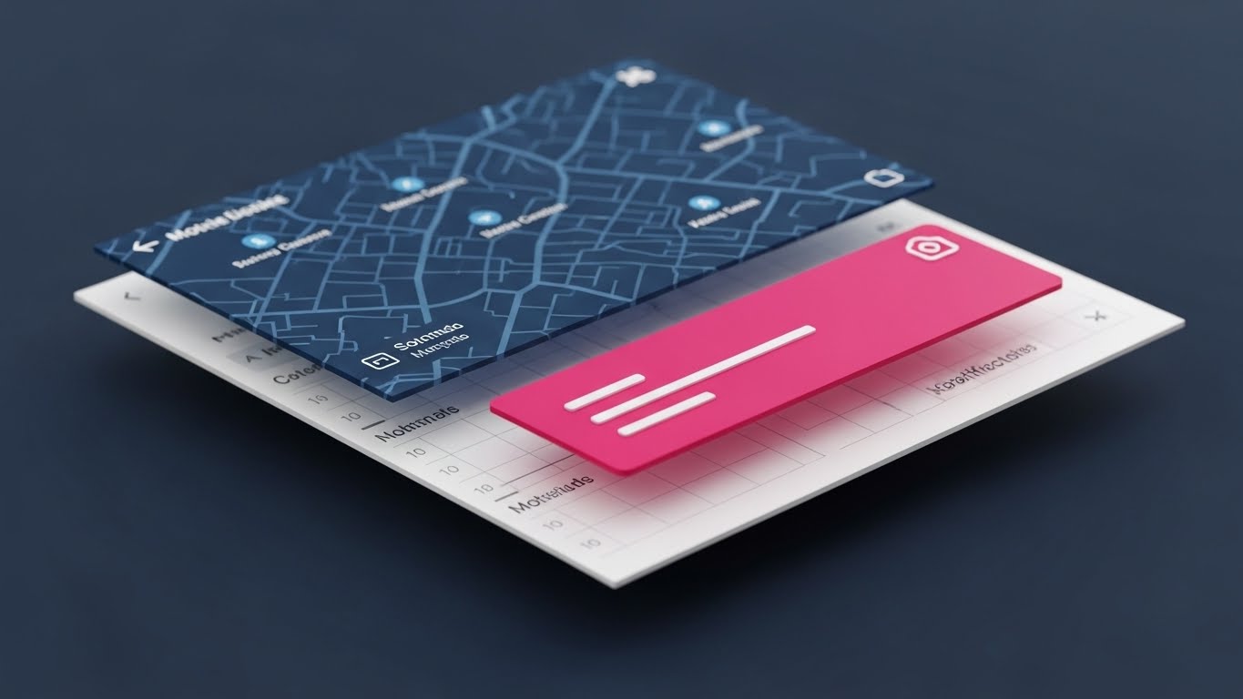
27. Wireframe to Reality Transition
Retention | Website Visitor Re-engagement
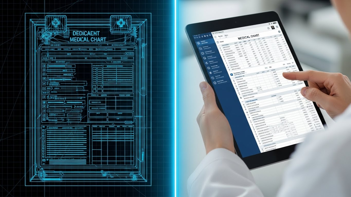
The Visual & Narrative Approach
Scenario: A split screen image. The left side shows a technical "blueprint" wireframe of a medical chart in glowing blue lines. The right side shows a sharp, high-res photo of the same chart on a digital tablet held by a doctor. A glowing line travels down the middle, transforming the plan into reality.
Narration & Tone: The tone is transformative and realizing. It targets Re-engagement. It says: "You planned it. Now build it." It visualizes the journey from "Project" (Wireframe) to "Product" (Tablet).
Psychological Impact & KPI Focus
Niche Psychology: Stalled deals often get stuck in the "Research Phase." This visual leverages the Completion Bias. It shows the satisfying conclusion of the project, urging the viewer to bridge the gap between theory and execution.
Operational Impact: This targets Implementation Velocity and Conversion. It reminds the viewer of the value of modernization, reducing the inertia of the status quo.
Strategic Implementation & Trade-offs
Use Case: Retargeting Display Ads. It serves as a visual reminder of the "After" state the client desired.
Trade-offs: It relies on the "After" image being compelling. If the tablet screen looks cluttered, the "Blueprint" might actually look cleaner.
Companies using similar video content -
Pena4 – Guru Auditor – Evolves blueprints into real-world coding audit solutions.
GeBBS Healthcare Solutions – iCode Assurance – Automates medical coding auditing for compliance.
28. Abstract 2D flat vector organic
Expansion | Driving Upsell/Cross-sell

The Visual & Narrative Approach
Scenario: An elegant abstract composition. Violet and cyan organic shapes grow and expand like a vine or root system from a central node. The shapes are vector-based with glossy highlights. They branch out into new nodes against a clean white background.
Narration & Tone: The tone is organic, inevitable, and healthy. It targets Upsell/Cross-sell by framing it as "Natural Growth." It suggests that adding new modules is the natural evolution of a healthy business.
Psychological Impact & KPI Focus
Niche Psychology: Clients fear "bloat" and "sales pressure." This visual uses Biophilic Design (organic forms) to soften the message. It implies that the software is a living ecosystem that grows with the client's needs, rather than a rigid cost center.
Operational Impact: This visualizes Customer Lifetime Value (CLTV) expansion. The branching nodes represent new capabilities (e.g., adding "Patient Payment" module to the "Billing" core).
Strategic Implementation & Trade-offs
Use Case: Upsell Email Campaigns and "Product Roadmap" presentations. It sets a positive, expansive mood.
Trade-offs: It is purely metaphorical. It needs strong copy ("Grow your Revenue Cycle") to anchor the meaning.
Companies using similar video content -
Arcadia Analytics – Arcadia Analytics – Visualizes ecosystem growth for value-based care.
CitiusTech – Healthcare Analytics – Provides predictive analytics for payer risk and compliance.
29. Generative AI Realistic Character video
Expansion | Driving Referrals & Advocacy
The Visual & Narrative Approach
Scenario: A realistic video of a professional woman in her 30s (business casual) speaking directly to the camera. She is in a blurred, modern office. The lighting is studio-quality. She gestures with open hands, simulating a genuine testimonial or peer recommendation.
Narration & Tone: The tone is authentic, personal, and trustworthy. It targets Referrals. It moves from "Brand Voice" to "Peer Voice."
Psychological Impact & KPI Focus
Niche Psychology: In B2B, Social Proof is king. Buyers trust peers more than vendors. This visual triggers Mirror Neurons. Seeing a calm, successful professional validates the decision to recommend the software.
Operational Impact: This targets Referral Conversion Rate. By modeling what a "Happy Customer" looks like, it encourages satisfied clients to become advocates.
Strategic Implementation & Trade-offs
Use Case: Social Media (LinkedIn) Ads and Case Study pages.
Trade-offs: Uncanny Valley Risk. The AI generation must be flawless. If it looks fake, it damages trust. Transparency is key.
Companies using similar video content -
PayZen – Patient Payment Platform – Humanizes advocacy for flexible patient payments.
Collectly – Patient Financial Engagement – Drives referrals through improved patient experience.
30. Minimalist Flat 2D + Data
Expansion | Establishing Thought Leadership

The Visual & Narrative Approach
Scenario: A minimalist vector illustration on a "Tech Blue" background. A central dark blue node (the user) connects via straight white lines to a ring of light blue nodes, which then expand to a larger ring of grey nodes. The composition is symmetrical and infinite, visualizing a massive network.
Narration & Tone: The tone is authoritative, logical, and macro-strategic. It positions the company not just as a software vendor, but as the "Hub" of the industry. It visualizes the ecosystem that the buyer is joining.
Psychological Impact & KPI Focus
Niche Psychology: Executives want to bet on the winning horse. This visual triggers the Bandwagon Effect. By showing a massive, interconnected network, it implies that "everyone is doing it," and staying outside the network is a competitive disadvantage.
Operational Impact: This visualizes Market Share and Interoperability. It implies that the software connects to everyone (Payers, Providers, Patients), positioning the vendor as the industry standard.
Strategic Implementation & Trade-offs
Use Case: White Paper Covers and Keynote backgrounds. It is the "Flagship" visual that asserts dominance.
Trade-offs: It is abstract. It requires labels to give the nodes meaning (e.g., "500+ Payer Connections").
Strategic Knowledge Base: The Visual Operations Doctrine
To conclude this guide, we synthesize the 30 styles into a cohesive Visual Operations Doctrine. This framework bridges the gap between "visual style" and "business outcomes," empowering RCM leaders to treat video as a strategic asset.
STRATEGIC ALIGNMENT & VISUAL ARCHITECTURE
The "Pre-Production" Strategy. Why and Who.
- The Cognitive Load Audit: Before creating assets, audit your current training materials. Identify "high-friction" topics (e.g., Denial Codes). Replace text-heavy explanations with Style 8 (Isometric Workflow) to simplify the concept before explaining the detail.
- Role-Based Visual Mapping: Differentiate your visual strategy. Use Style 13 (Clean UI) for front-line billing staff who need clarity and speed. Use Style 11 (Dynamic Data Viz) for CFOs who need to see trends and ROI.
- The "Glanceability" Standard: In high-volume billing centers, staff cannot watch long videos. Design "micro-assets" (like Style 21) that convey meaning in under 3 seconds for use in internal chat channels or LMS dashboards.
- Brand Voice Consistency: RCM software often consists of disparate modules (Scheduling vs. Billing). Use a unified visual thread—like Style 3 (Kinetic Typography)—to create a cohesive user experience across all modules.
- The Advids Strategic Audit: Partner with Advids to define this "Visual Operating System" before production begins. A fragmented visual style leads to fragmented user understanding. We help you audit your "Visual Taxonomy."
- Standardization vs. Customization: Use standardized styles (Style 4 Isometric) for recurring processes like "Patient Check-in." Reserve bespoke, high-end styles (Style 7 Photorealistic) for high-stakes "Payer Negotiation" or "Audit Defense" training.
- The Cross-Departmental Bridge: Use Style 9 (Split Screen) to visually demonstrate how an action in the "Clinical" department (e.g., coding) directly impacts the "Financial" department (e.g., revenue), bridging the silo gap.
- Legacy System Integration: Visualizing the invisible link between old on-premise servers and your new cloud SaaS is critical. Use Style 27 (Wireframe to Reality) to show how your software modernizes legacy infrastructure without breaking it.
- Accessibility in RCM: Ensure that text-heavy motion graphics (Style 3) are compliant with accessibility standards (color contrast, screen reader compatibility) to support a diverse workforce.
- The Mobile-First Mandate: Operations Directors are often moving between facilities. Ensure high-level dashboard visualizations (Style 16) are optimized for mobile consumption (9:16 vertical), allowing for decision-making on the go.
OPERATIONAL ADOPTION & IMPLEMENTATION
The "Deployment" Phase. How to embed visuals into the workflow.
- Overcoming "Big Brother" Anxiety: Staff often fear AI will replace them. Use Style 18 (2D Animation) to depict AI as a "helpful sidekick" or "shield" that protects them from errors, rather than a robot taking their job.
- The Micro-Learning Shift: Replace hour-long training seminars with a library of 30-second clips using Style 13 (Clean UI). Tag these clips by "Error Code" so staff can watch the specific fix they need, exactly when they need it.
- Just-in-Time Support: Embed Style 24 (Holographic UI) snippets directly into the software's "Help" tooltips. When a user hovers over a complex field, a 5-second loop should visually explain the input required.
- Gamification of Training: Use Style 14 (Rapid Montage) to create "hype reels" for training certification programs. Visualizing completion badges and progress bars increases staff engagement with mandatory training.
- Reducing Support Ticket Volume: There is a direct correlation between proactive visual guides and reduced call center load. Deploy Style 23 (Graphics over Live Action) in your FAQ section to humanize the answer and reduce the need for a live agent.
- Remote Onboarding: For distributed health systems, use Style 20 (Character Story) to guide new remote staff through the setup process, replacing the need for expensive on-site trainers.
- Standard Operating Procedures (SOPs): Transform text-based SOPs into dynamic visual flows using Style 4 (Isometric 2D). A visual map of the revenue cycle is far easier to memorize than a numbered list.
- Feedback Loops: Use interactive video elements (inspired by Style 21) to gather user feedback. A simple "Did this help?" micro-interaction at the end of a video provides data to refine your training assets.
- Scalable Localization: RCM is often outsourced globally. If expanding, use Style 15 (Line Art) which relies on symbology rather than text. This reduces the cost and complexity of translating assets for different language markets.
- Leadership Communication: When the VP of Revenue needs to present to the Board, equip them with Style 2 (Cinematic AI) or Style 11 (Data Viz) loops. These premium assets make them look prepared and visionary.
MEASURING IMPACT & FUTURE-PROOFING
The "ROI" Phase. Measuring success and looking ahead.
- Beyond "Views": Do not measure video success by "views." Measure it by Time-to-Competency. Does a new biller reach full productivity in 2 weeks instead of 4 after watching the visual onboarding series?
- The "Idle Time" Metric: Correlate the use of Style 22 (Hyper-lapse) quick-start guides with a reduction in "Idle Time" within the software. Better visuals should lead to faster, more confident navigation.
- Compliance Velocity: When a new payer rule is introduced, measure how fast the team adapts. Use Style 10 (Futuristic Neon) to broadcast the update and track the decline in specific denial codes related to that rule.
- Retention and Churn: High-quality UX visualization (Style 25) reinforces value. Track customer renewal rates among clients who engage with your "Pro Tips" video series versus those who don't.
- The AI Visual Frontier: Prepare for the future where RCM data is visualized in real-time. Experiment with Style 29 (Gen AI) to represent personalized user guides, positioning your brand as ready for the next wave of AI.
- Scalability of Assets: Build a modular library. If you use Style 6 (Low Poly) for one feature, you can reuse the assets for the next. This reduces the marginal cost of production over time.
- The Advids Partnership: RCM moves fast. Partner with Advids to maintain an "Asset Lifecycle." As your software UI updates, your visual assets must evolve instantly to avoid confusion. We ensure your visual library never becomes "Legacy Debt."
- Benchmarking Success: "Good enough" visuals are a competitive risk in a market flooding with AI tools. Compare your "Visual Click-Through Rate" on ads against industry benchmarks to ensure your style (Style 7) is cutting through.
- The ROI of Safety: For compliance officers, quantify the reduction in HIPAA violation risks. Visual training on "Data Security" (Style 19) should correlate with fewer compliance incidents.
- Final Call to Innovation: Treat video as Infrastructure, not content. In the complex world of RCM, the ability to visualize the invisible flow of money is not just a creative advantage—it is a strategic imperative.
Companies using similar video content -
Availity – Payer-Provider Collaboration – Visualizes network centrality for industry authority.
pVerify – Payer Contract Parsing – Verifies benefits with AI-driven contract intelligence.
Author & Editor Bio


