
Introduction: Visualizing the Signal in the Noise
The modern digital landscape is expanding at a breakneck pace. Recent industry analysis reveals that the marketing technology landscape grew by a 27.8% increase year-over-year, flooding the market with over 14,000 solutions. For the "Scale-Up Orchestrator"—the strategic mind behind a Social Media Management platform—this explosion presents a unique paradox: you have more tools than ever, yet clarity has never been harder to achieve.
Your users are not looking for more features; they are looking for a lifeline. They are navigating a chaotic sea of notifications, algorithm changes, and data silos. To capture their attention and earn their trust, your visual communication must do more than just "look good"—it must function as a cognitive accelerator. It must bridge the gap between complex back-end operations and seamless front-end experiences.
The strategic imperative for high-quality visualization is backed by hard data. Research indicates that organizations leveraging advanced data visualization are 5 times more likely to make faster decisions and execute them effectively than their peers. This is your opportunity. By shifting from static, text-heavy explanations to dynamic, visual narratives, you transform your platform from a "tool" into a strategic partner.
This guide explores 30 expert-curated visualization styles designed specifically for the B2B SaaS environment. From the kinetic energy of brand awareness to the precise geometry of feature adoption, these examples serve as a blueprint for reducing cognitive load and accelerating the buyer's journey. Let us explore how to turn your abstract code into a tangible competitive advantage.
1. Bold Kinetic Typography
TOFU | Brand Awareness

The Visual & Narrative Approach
Visualization Scenario: The screen explodes with energy as a composition of abstract geometric shapes—resembling stylized megaphones and speech bubbles—forms the word "AMPLIFY." The aesthetic adheres to a flat vector style with hard Bauhaus edges, utilizing a vibrant palette of Electric Violet and Neon Coral against a Pure White background. The subtle gray grid pattern anchors the floating elements, giving the motion a sense of engineering precision rather than chaotic noise.
Narration Style & Tone: Energetic, confident, and rhythmic. Fast-paced sound design with a "stomp" or "clap" beat replaces voiceover, letting the text speak.
Psychological Impact & KPI Focus
Niche Psychology: For a social media manager, "Amplification" is the primary desire. This style triggers the psychological association between your platform and volume—not just of sound, but of reach. It leverages Rapid Serial Visual Presentation (RSVP) to force focus.
Operational Impact:
- Metric: Ad Recall Lift.
- Why it Works: Kinetic typography reduces the time-to-comprehension to near zero. It creates an instant visual imprint of the brand’s core promise (Reach/Scale).
Strategic Implementation & Trade-offs
- Best Use Case: 6-second bumper ads on YouTube or Instagram Stories.
- Duration: 5-10 Seconds.
- Trade-off: This style excels at grabbing attention but fails at explaining how the software works. It creates heat, not light. Use it to fill the top of the funnel, but pair it with explanatory styles later.
Companies using similar video content -
Hootsuite – Amplify – Boost employee advocacy and brand reach.
Buffer – Publish – Schedule content across all social channels.
Sendible – Social Media Management – Scale social media presence efficiently.
2. Abstract Organic Vector
TOFU | Market Education

The Visual & Narrative Approach
Visualization Scenario: A mesmerizing, top-down view of distinct fluid shapes—representing different social media data streams—merging into a single, cohesive river. The illustration uses glossy textures and glassmorphism, creating a sensation of "liquid mercury" or premium silicone. The palette is soothing, blending Mint Green (growth), Soft Lavender (calm), and Cream. The motion is smooth and continuous.
Narration Style & Tone: Smooth, therapeutic, and sophisticated. A soft, ambient soundtrack with a calm voiceover explaining "The power of unity."
Psychological Impact & KPI Focus
Niche Psychology: The "Overwhelmed Strategist" craves order. This visual directly addresses the anxiety of fragmentation. The fluid motion psychologically suggests that using your platform will be a frictionless, stress-free experience (Cognitive Ease).
Operational Impact:
- Metric: Time-on-Site / Bounce Rate Reduction.
- Why it Works: It visualizes the abstract concept of "API Integration" without using technical diagrams. It frames integration as a natural, organic process.
Strategic Implementation & Trade-offs
- Best Use Case: Website hero backgrounds or "Why Us" section headers.
- Duration: 10-15 Seconds (Loop).
- Trade-off: While beautiful, it is highly abstract. It sets a "mood" of ease but doesn't show the actual interface. It is best used to establish a premium brand feel before diving into feature specifics.
Companies using similar video content -
Sprinklr – Unified CXM – Integrate customer experiences across channels.
Agorapulse – Social Media Management – Unify fragmented social media feeds.
Zoho Social – Social Media Management – Streamline multi-channel social operations.
3. 2D Character Story
TOFU | Market Education

The Visual & Narrative Approach
Visualization Scenario: We see a relatable protagonist—a social media manager with deep olive skin and a Teal blouse—standing firm in a chaotic office environment. She holds a glowing digital shield that effortlessly deflects a barrage of paper airplanes labeled "Urgent," "Troll," and "Viral Trend." The style features clean, thick dark outlines and a Navy Blue background. The visual metaphor is clear: your platform is the shield.
Narration Style & Tone: Empathetic, narrative-driven, and slightly humorous. "We know what your day looks like."
Psychological Impact & KPI Focus
Niche Psychology: This style leverages Mirror Neurons. The viewer sees themselves in the character. The shield represents control and safety, directly addressing the fear of burnout and the anxiety of missing critical notifications.
Operational Impact:
- Metric: Click-Through Rate (CTR) on Video Thumbnails.
- Why it Works: It humanizes B2B software. By focusing on the user's daily life rather than the software's code, it builds immediate emotional rapport.
Strategic Implementation & Trade-offs
- Best Use Case: YouTube thumbnails, blog headers, or the opening scene of an explainer video.
- Duration: 15-30 Seconds.
- Trade-off: 2D characters can sometimes feel "too playful" for enterprise-level buyers. Ensure the character design looks professional and the office setting is modern to maintain credibility.
Companies using similar video content -
Sprout Social – Smart Inbox – Deflect notification fatigue with unified inbox.
Loomly – Brand Success Platform – Manage content and target audiences effectively.
SocialBee – Social Media Management – Automate content workflows, reduce chaos.
4. AI Generated Mixed Media Video
TOFU | Shaping Brand Perception

The Visual & Narrative Approach
Visualization Scenario: A high-energy, mixed-media collage that blends high-resolution photography of diverse professionals with 3D rendered fiber-optic cables. The cables, glowing in Cyan and Magenta, weave through the frame, physically connecting the people in a global network. The aesthetic uses "digital static" transitions and fast cuts to convey speed and modernity against a white backdrop.
Narration Style & Tone: Visionary, global, and fast-paced. A driving electronic beat.
Psychological Impact & KPI Focus
Niche Psychology: This appeals to the aspiration of Global Reach. It visualizes the SaaS platform not as a static tool, but as a living network. The CMYK palette hints at creativity and print-ready precision, while the fiber-optics symbolize speed and infrastructure.
Operational Impact:
- Metric: LinkedIn Engagement Rate (Shares/Comments).
- Why it Works: It stands out in a feed dominated by boring stock photos. The mixed media approach feels "cutting edge," signaling that your platform uses the latest tech (AI/Machine Learning).
Strategic Implementation & Trade-offs
- Best Use Case: LinkedIn/Twitter video ads targeting C-Level executives.
- Duration: 15-20 Seconds.
- Trade-off: The fast pace can be overwhelming if the video is too long. It is a "mood piece" designed to shape perception, not to teach specific workflows.
Companies using similar video content -
Brandwatch – Consumer Intelligence – Leverage AI for deep consumer insights.
Smartly.io – AI Advertising Platform – Orchestrate cross-platform ad performance.
Sprinklr – Unified CXM – Humanize digital networks with AI.
5. Aspirational Stock
TOFU | Vertical Social

The Visual & Narrative Approach
Visualization Scenario: A high-quality vertical photograph of a creative professional in a sunlit modern cafe. The subject is a young male with glasses laughing while looking at a smartphone. The lighting is natural and warm. Floating around the phone are subtle, glowing particles in Warm Beige and Sage Green, representing positive social engagement metrics (likes, hearts).
Narration Style & Tone: Authentic, warm, and lifestyle-oriented. Minimalist audio—ambient cafe sounds.
Psychological Impact & KPI Focus
Niche Psychology: This taps into the Freedom aspect of the SaaS promise: "Work from anywhere." The Warm Beige and Sage Green palette moves away from aggressive "tech blue" to a more organic, human-centric vibe, suggesting that the platform supports a balanced lifestyle.
Operational Impact:
- Metric: TikTok/Reels Watch Time and Loop Rate.
- Why it Works: It looks native to the platform. It doesn't look like an ad; it looks like a successful creator sharing a win. This "camouflaged" advertising builds trust.
Strategic Implementation & Trade-offs
- Best Use Case: Instagram Reels or TikTok ads promoting mobile app features.
- Duration: 9-15 Seconds.
- Trade-off: Reliance on stock footage can feel generic. The key is the custom "particle overlay" (Augmented Reality style) that brands the footage as yours.
Companies using similar video content -
Later – Visual Social Media Marketing – Schedule visual content for remote freedom.
Pallyy – Social Media Scheduling – Plan Instagram feeds for aesthetic success.
Tailwind – Smart Marketing Platform – Automate visual content for growth.
6. Abstract Motion
TOFU | Social Ads
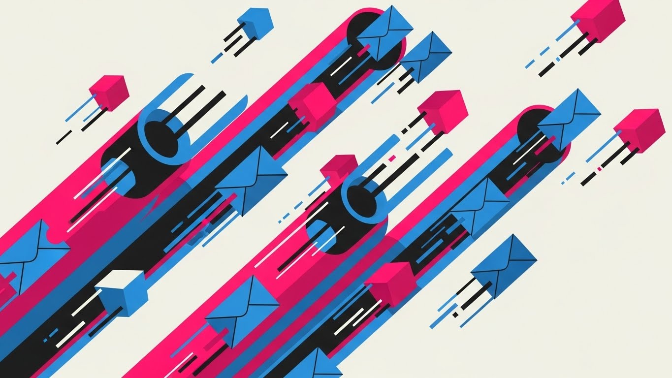
The Visual & Narrative Approach
Visualization Scenario: A flat design motion graphic composition with kinetic energy. Geometric shapes representing data packets (envelopes and cubes) are zipping through diagonal tubes. The style utilizes motion blur effects to convey high speed. The color palette is high-contrast Hot Pink, Electric Blue, and Matte Black. The composition is diagonal and dynamic.
Narration Style & Tone: Urgent, efficient, and precise. Sound effects of "swishing" and "locking into place."
Psychological Impact & KPI Focus
Niche Psychology: Speed is the ultimate currency for the "Efficiency-Seeking Marketing Director." This style visualizes Latency Reduction. The Matte Black background suggests a "Dark Mode" UI, which is popular among power users, while the neon accents imply high energy.
Operational Impact:
- Metric: Cost Per Click (CPC).
- Why it Works: The high contrast stops the scroll. The directional motion (bottom-left to top-right) is subconsciously associated with growth and progress.
Strategic Implementation & Trade-offs
- Best Use Case: Instagram Feed ads or Sidebar display ads.
- Duration: 6-10 Seconds (Loop).
- Trade-off: It is purely metaphorical. It communicates "Fast," but not "What." It is best used for retargeting users who already know what the platform does but need a reminder of its efficiency.
Companies using similar video content -
SocialBu – Social Media Management – Accelerate bulk scheduling and content delivery.
Social Champ – Social Media Management – Speed up content scheduling and publishing.
Viraly – Social Media Management – Drive fast data throughput for campaigns.
7. Wireframe to Reality
MOFU | Differentiation
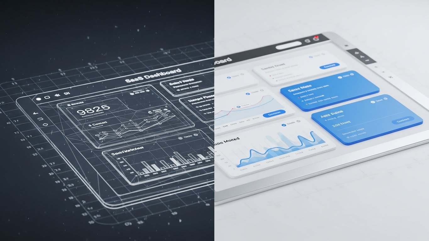
The Visual & Narrative Approach
Visualization Scenario: A split-screen composition. The left half shows a white wireframe blueprint of a dashboard on a grid paper background. The right half transforms into a glossy, high-fidelity 3D render of the same SaaS interface in Vivid Blue and Silver. The transition line is sharp vertical.
Narration Style & Tone: Engineering-focused, reliable, and transformative. Mechanical sound design.
Psychological Impact & KPI Focus
Niche Psychology: This appeals to the Builder mindset. It proves that your platform is grounded in solid architecture. The transition from Grid Paper (planning) to Vivid Blue UI (execution) validates the user's need for a tool that turns strategy into tangible results.
Operational Impact:
- Metric: Landing Page Conversion Rate.
- Why it Works: It acts as a "Truth Serum." It shows the actual UI (building trust) while emphasizing the thoughtful design process behind it (building authority).
Strategic Implementation & Trade-offs
- Best Use Case: "How it Works" page or Feature release videos.
- Duration: 10-20 Seconds.
- Trade-off: Requires high-quality assets of the actual UI. If the real UI is cluttered or ugly, this style will backfire. It demands a polished interface to be effective.
Companies using similar video content -
Planable – Social Media Collaboration – Bridge content concept to execution.
CoSchedule – Marketing Calendar – Transform marketing plans into reality.
Sprout Social – Social Media Management – Showcase thoughtful dashboard design.
8. Isometric 2D Motion
MOFU | Feature

The Visual & Narrative Approach
Visualization Scenario: An isometric vector illustration of a social media calendar. Colorful 3D blocks in Pastel Blue, Canary Yellow, and Soft Pink are dropping like Tetris pieces into a clean white grid. The aesthetic is flat shading with precise geometry. The background is a clean white void.
Narration Style & Tone: Satisfying, organized, and light. The sound of blocks clicking perfectly into place.
Psychological Impact & KPI Focus
Niche Psychology: Social media managers suffer from "Calendar Chaos." This style triggers a Closure dopamine hit. Seeing the blocks fit perfectly relieves the anxiety of gaps in the schedule. The Pastel palette keeps the mood light and approachable.
Operational Impact:
- Metric: Feature Adoption Rate (Calendar Module).
- Why it Works: It simplifies the complex task of scheduling into a game-like mechanic. It makes the work look fun and manageable.
Strategic Implementation & Trade-offs
- Best Use Case: Email newsletters announcing new scheduling features or onboarding tooltips.
- Duration: 10-15 Seconds.
- Trade-off: It abstracts the UI significantly. Users don't see the actual buttons they need to click. It sells the concept of the calendar, not the mechanics of it.
Companies using similar video content -
Agorapulse – Social Media Management – Organize content chaos with visual calendar.
Loomly – Brand Success Platform – Simplify content scheduling with clear grids.
SocialPilot – Social Media Management – Streamline scheduling into manageable blocks.
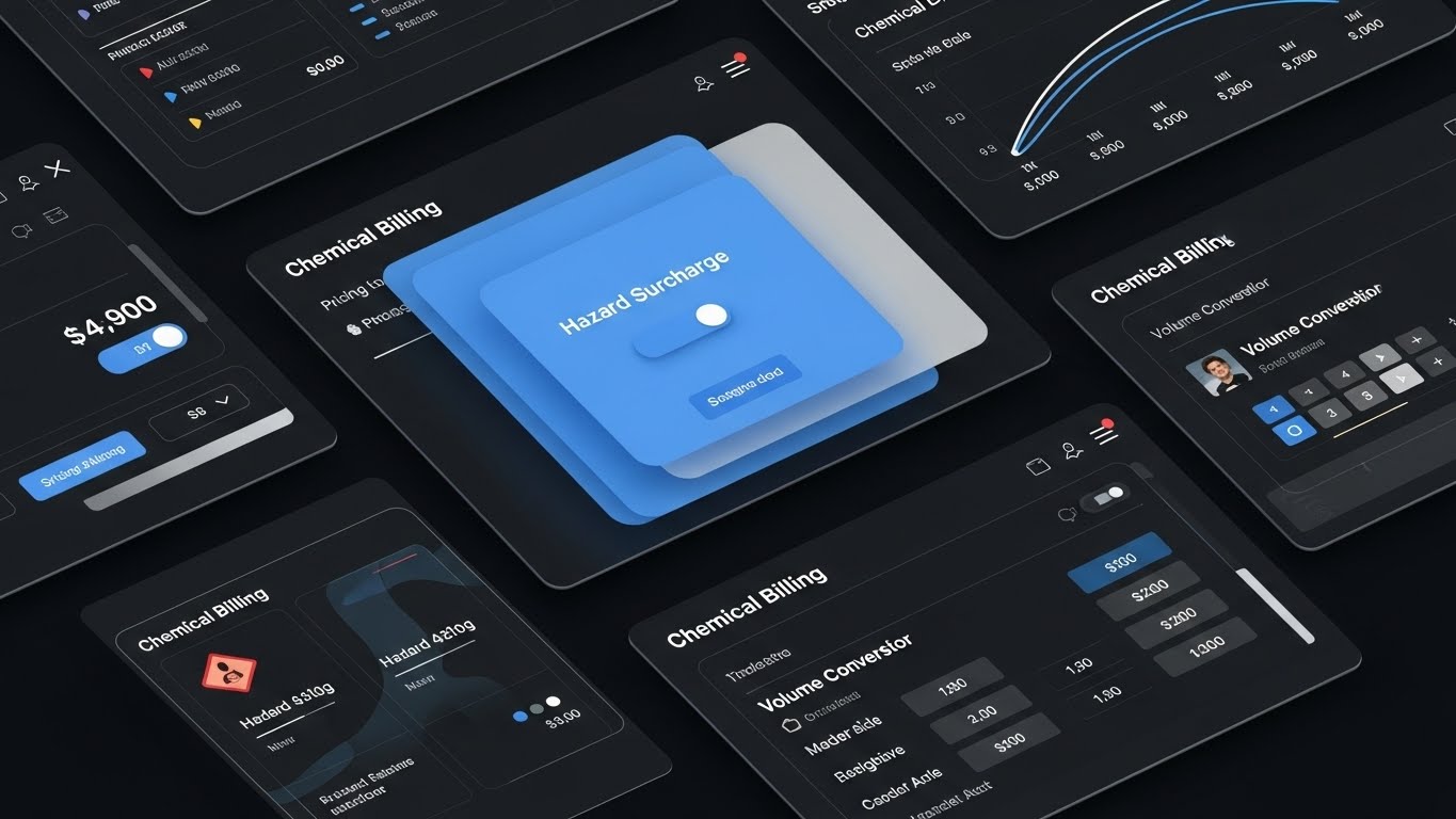
9. Dynamic Data Viz
MOFU | Feature

The Visual & Narrative Approach
Visualization Scenario: A visualization of floating 3D bar charts and line graphs rendered in translucent glass. The charts are glowing in Deep Purple and Bioluminescent Blue. The camera angle is low, looking up at the towering data structures. The background is a bright white infinity curve.
Narration Style & Tone: Intelligent, futuristic, and premium. "See what others miss."
Psychological Impact & KPI Focus
Niche Psychology: Data is often scary and opaque. By rendering it as glowing glass, you transform "boring numbers" into "precious gems." The Deep Purple signifies wisdom and premium value. This style assures the user that the platform will provide clarity (transparency), not just raw spreadsheets.
Operational Impact:
- Metric: Time spent on "Analytics" pages.
- Why it Works: It elevates the perceived value of the data. It frames analytics as a high-tech asset rather than a chore.
Strategic Implementation & Trade-offs
- Best Use Case: Blog posts about "Deep Dives" or "Year-End Reports."
- Duration: 15-20 Seconds.
- Trade-off: This is a "glamour shot" of data. It is less effective for showing specific metrics (like exact click counts) and more effective for selling the power of the analytics engine.
Companies using similar video content -
Social Status – Social Media Analytics – Elevate analytical insights with clear data.
Iconosquare – Social Media Analytics – Visualize performance metrics for clarity.
Keyhole – Social Media Analytics – Transform raw data into glowing insights.
10. Lifestyle Stock + UI
MOFU | Building Trust
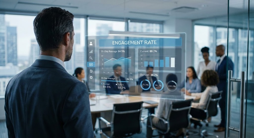
The Visual & Narrative Approach
Visualization Scenario: A cinematic photograph taken over the shoulder of a business executive in a glass-walled boardroom. In the foreground, a sharp, semi-transparent holographic UI overlay displays "Engagement Rate" metrics in HUD Blue and White. The background shows a diverse team in soft focus. The lighting is professional and cool.
Narration Style & Tone: Professional, authoritative, and commanding. "Lead with confidence."
Psychological Impact & KPI Focus
Niche Psychology: This targets the Imposter Syndrome many executives feel. It visualizes the user as the commander of the data. The HUD (Heads-Up Display) aesthetic borrows from sci-fi/military visual language, implying tactical advantage and superior situational awareness.
Operational Impact:
- Metric: Demo Request Rate from C-Suite.
- Why it Works: It places the software in the context of decision-making. It answers the question: "How does this look in a board meeting?"
Strategic Implementation & Trade-offs
- Best Use Case: LinkedIn headers or the "Solutions for Enterprise" page.
- Duration: 6-10 Seconds.
- Trade-off: It can look cheesy if the hologram tracking is poor. The integration between the stock footage and the UI element must be flawless (Hollywood quality) to maintain credibility.
Companies using similar video content -
Hootsuite – Analytics – Overlay strategic intelligence for confident decisions.
Sprout Social – Advanced Reporting – Empower executives with real-time data.
Brandwatch – Consumer Intelligence – Provide C-suite with actionable insights.
11. Split Screen Reality
MOFU | Competitive
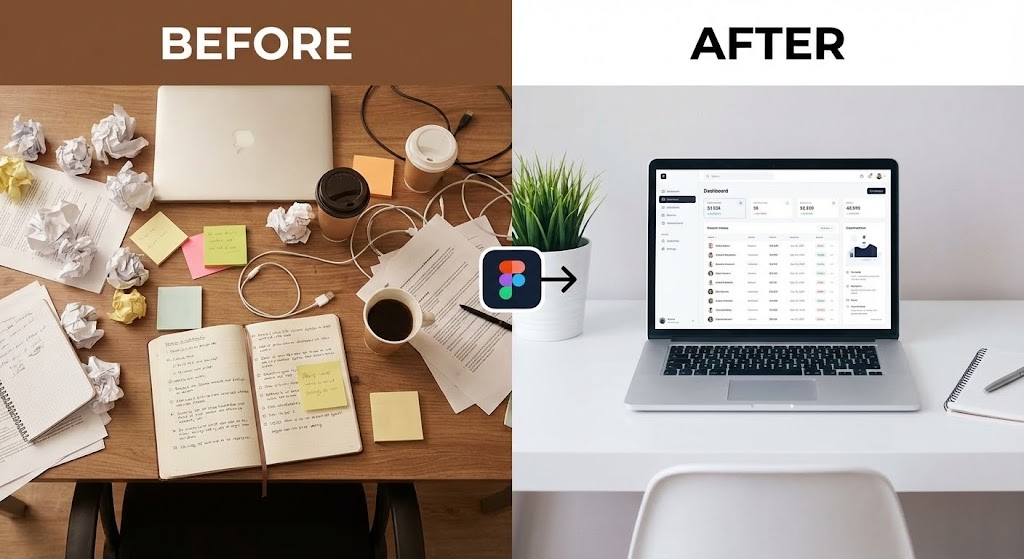
The Visual & Narrative Approach
Visualization Scenario: A stark, split-screen composition contrasting the "Status Quo" with the "Solution." The left side reveals a chaotic, top-down view of a wooden desk cluttered with crumpled papers, sticky notes, and tangled wires—a palette of Cluttered Brown and Anxious Beige. A central arrow points to the right side: a pristine, Zen-like workspace featuring a single laptop displaying a clean, organized interface in Soft Gray and Pure White.
Narration Style & Tone: Problem/Solution structure. "Stop drowning in details. Start orchestrating success." Sound design shifts from office cacophony to digital silence.
Psychological Impact & KPI Focus
Niche Psychology: This speaks directly to the "Spreadsheet Fatigue" plaguing social media teams. The visual triggers the Contrast Principle, making the value proposition undeniable by physically showing the relief of organization. It validates the user's desire for a "clean slate" and reduced cognitive load.
Operational Impact:
- Metric: Free Trial Sign-up Rate (from Retargeting).
- Why it Works: It visualizes the feeling of using the software. It promises not just a tool, but a lifestyle shift from reactive chaos to proactive control.
Strategic Implementation & Trade-offs
- Best Use Case: Instagram/Facebook retargeting ads or "Switching to Us" landing pages.
- Duration: 6-10 Seconds.
- Trade-off: It is a binary simplification. It works best for users migrating from manual processes or legacy tools, but may feel too simplistic for enterprise users already using a competitor's complex tool.
Companies using similar video content -
Zoho Social – Social Media Management – Visualize operational order from chaos.
Buffer – Social Media Management – Streamline workflows, reduce clutter.
Sendible – Social Media Management – Transition from manual to organized processes.
12. Rapid UI Montage
MOFU | Drive Freemium
The Visual & Narrative Approach
Visualization Scenario: A sleek, grid-based montage of floating interface cards in "Dark Mode." The cards, utilizing a Midnight Blue and Charcoal palette, display modular widgets like toggle switches, data fields, and progress bars accented in Electric Blue and Cyan. The composition emphasizes depth, with layers of functionality stacked to suggest a comprehensive, all-in-one command center.
Narration Style & Tone: Fast, rhythmic, and capability-focused. "Publish. Analyze. Report. All in one place." High-tempo electronic underscore.
Psychological Impact & KPI Focus
Niche Psychology: Buyers fear "Tool Sprawl"—paying for five different apps. This visual communicates Consolidation. The "Dark Mode" aesthetic signals that this is a pro-grade tool designed for heavy usage, reducing eye strain and increasing perceived value.
Operational Impact:
- Metric: Feature Usage / Activation Rate.
- Why it Works: It conveys the breadth of the platform without needing to show a full workflow. The dense, organized grid implies that the platform is robust enough to handle complex enterprise needs.
Strategic Implementation & Trade-offs
- Best Use Case: Display Ads (Google Display Network) or Product Page headers.
- Duration: 10-15 Seconds.
- Trade-off: It risks looking generic if the UI elements aren't distinct. The focus is on the volume of features, not the specific utility of one. Use it to sell the "Suite," not the "Feature."
Companies using similar video content -
Hootsuite – Dashboard – Unify feature density in one command center.
Sprout Social – Comprehensive Suite – Showcase breadth of platform capabilities.
SocialBee – Social Media Management – Consolidate tools for robust management.
13. 2D Line Art
MOFU | Re-engagement

The Visual & Narrative Approach
Visualization Scenario: An elegant, minimalist animation where fine Gold lines connect star-like nodes on a Soft White background. The lines form a constellation, dynamically linking disparate points to create a unified geometric shape. The focus is macro-level, highlighting the connection points (nodes) which represent customer touchpoints in a non-linear journey.
Narration Style & Tone: Sophisticated, continuous, and fluid. "Connect the dots between intent and action." Soft, ambient chimes.
Psychological Impact & KPI Focus
Niche Psychology: Marketing leaders struggle with Attribution. They know the journey isn't linear. This abstract style validates that complexity while offering a solution that "makes sense of the stars." The Gold palette implies high value and premium insight.
Operational Impact:
- Metric: Return on Ad Spend (ROAS) (by selling better attribution features).
- Why it Works: It simplifies the terrifying complexity of multi-touch attribution into a beautiful, manageable visual. It promises clarity without getting bogged down in spreadsheet rows.
Strategic Implementation & Trade-offs
- Best Use Case: Retargeting ads for users who visited the "Analytics" page but didn't convert.
- Duration: 6-12 Seconds (Loop).
- Trade-off: Highly abstract. It sets a tone of "Intelligence" but explains nothing about the software interface. Best for brand reinforcement, not education.
Companies using similar video content -
HubSpot Marketing Hub – Marketing Automation – Map customer journeys and attribution.
Salesforce Marketing Cloud – Customer Journeys – Connect dots between intent and action.
ActiveCampaign – CX Automation – Visualize complex customer constellations.
14. Generative AI Cinematic Video
BOFU | Demand Gen

The Visual & Narrative Approach
Visualization Scenario: An epic, wide-angle shot of a futuristic server farm. The room is pristine, bathed in Cool Silver and Clinical White light. Massive curved screens loom overhead, displaying cascading waterfalls of Cyan data streams. The camera glides through the aisle, emphasizing the scale, cleanliness, and power of the infrastructure.
Narration Style & Tone: Grand, secure, and industrial. "Built for scale. Secured for enterprise." Deep, resonant drone soundscape.
Psychological Impact & KPI Focus
Niche Psychology: For the Enterprise CTO or CMO, the fear is Downtime and Data Breaches. This style uses the visual language of "Big Tech" (servers, clean rooms) to signal stability. It reassures the buyer that the platform isn't just a startup toy; it's industrial-grade infrastructure.
Operational Impact:
- Metric: Enterprise Lead Form Submissions.
- Why it Works: It addresses the "Risk" objection before it's raised. It visualizes the backend reliability that SaaS platforms usually keep hidden, mitigating the fear of migration.
Strategic Implementation & Trade-offs
- Best Use Case: YouTube Pre-roll ads targeting IT decision-makers or Investor Relations presentations.
- Duration: 15-30 Seconds.
- Trade-off: It is impersonal. It sells the "Machine," not the "Human." It must be balanced with styles that show user experience to avoid seeming cold.
Companies using similar video content -
Sprinklr – Unified CXM – Scale enterprise infrastructure with confidence.
Everbridge – Critical Event Management – Showcase robust, secure backend systems.
Adobe Marketo Engage – Marketing Automation – Visualize enterprise-grade data centers.
15. Photorealistic 3D
BOFU | ROI Justification

The Visual & Narrative Approach
Visualization Scenario: A hyper-realistic render focusing on the tangible outcome of success. Stacks of Gold Coins are arranged to form an escalating bar chart. A glowing Neon Blue arrow traces the upward trajectory, illuminating the textured ridges of the coins. The background is a premium dark marble, creating high contrast with the gleaming metal.
Narration Style & Tone: Direct, confident, and transactional. "Turn engagement into revenue." The sound of coins stacking and a "ching" of success.
Psychological Impact & KPI Focus
Niche Psychology: The "ROI Skeptic" (often the CFO) views social media as a cost center. This visual explicitly translates "soft" metrics (likes) into "hard" currency (gold). It is the ultimate Reassurance that the platform pays for itself.
Operational Impact:
- Metric: Conversion Rate on Pricing/Checkout Page.
- Why it Works: It removes ambiguity. It anchors the platform's value in financial terms, which is the language of the final decision-maker.
Strategic Implementation & Trade-offs
- Best Use Case: Pitch decks, Proposal PDFs, or "Pricing" page visuals.
- Duration: Static Image or 5-second Loop.
- Trade-off: It can feel "salesy" or aggressive if used too early (TOFU). It belongs at the bottom of the funnel where the conversation is strictly about value for money.
Companies using similar video content -
Hootsuite – ROI Reporting – Tangibilize social media return on investment.
Sprout Social – ROI Measurement – Convert engagement into financial outcomes.
Agorapulse – Social Media Management – Justify social spend with clear ROI.
16. Minimalist Flat 2D
BOFU | Objections

The Visual & Narrative Approach
Visualization Scenario: A clean, Bauhaus-inspired vector animation. On the left, a chaotic, tangled Red knot vibrates with tension. As it moves to the right, it effortlessly unravels into a smooth, straight Blue line. The background is a calming Cream. The motion is fluid and satisfying.
Narration Style & Tone: Simple, relieving, and logical. "Complexity, simplified." A sigh of relief or a "whoosh" sound effect.
Psychological Impact & KPI Focus
Niche Psychology: This addresses Implementation Anxiety. Buyers worry that new software will be hard to learn. This visual metaphor promises Cognitive Ease. It signals that the vendor does the hard work (untangling) so the user doesn't have to.
Operational Impact:
- Metric: Time-to-Close (Sales Cycle Length).
- Why it Works: It overcomes the "It's too complicated" objection instantly. It is a visual promise of a frictionless onboarding experience.
Strategic Implementation & Trade-offs
- Best Use Case: Sales PDFs, "Onboarding" section of the website, or email signatures.
- Duration: Loop / Static.
- Trade-off: It is purely metaphorical. It relies on the user trusting that the actual software is as simple as the drawing.
Companies using similar video content -
eClincher – Social Media Management – Untangle workflow complexity effortlessly.
Mautic – Marketing Automation – Simplify complex automation processes.
Planable – Social Media Collaboration – Reduce implementation anxiety with ease.
17. 3D X-Ray Viz
BOFU | Risk Mitigation

The Visual & Narrative Approach
Visualization Scenario: A close-up 3D visualization of a translucent, frosted-glass padlock. Through the "X-Ray" shell, we see a robust, intricate mechanism of Silver gears and glowing Green circuitry working in perfect synchronization. The camera zooms in to show the precision of the internal locking mechanism.
Narration Style & Tone: Technical, precise, and secure. "Transparency you can trust. Security you can rely on." Mechanical, locking sound effects.
Psychological Impact & KPI Focus
Niche Psychology: Security is often an invisible abstract. By giving it a physical form (gears and lock), you make it Tangible. The Green glow signifies "System Active/Safe," while the transparency signals that you have nothing to hide.
Operational Impact:
- Metric: Enterprise Contract Sign-offs.
- Why it Works: It builds trust through transparency. It suggests that the system is sophisticated on the inside, not just a pretty shell on the outside, satisfying the IT compliance check.
Strategic Implementation & Trade-offs
- Best Use Case: "Security" page on the website or compliance documentation.
- Duration: 10-15 Seconds.
- Trade-off: Highly technical appeal. It is boring to a creative social media manager but fascinating (and necessary) to an IT Compliance Officer.
Companies using similar video content -
Sprinklr – Unified CXM – Reveal robust security architecture and compliance.
Brandwatch – Threat Monitoring – Showcase transparent, intricate security mechanisms.
Everbridge – Critical Event Management – Visualize secure, reliable infrastructure.
18. Realistic Character Video
BOFU | Economic Buyer

The Visual & Narrative Approach
Visualization Scenario: A low-angle "Hero Shot" of a confident female CEO in a modern glass office. The natural sunlight reflects off the skyscrapers behind her. She interacts with a futuristic, transparent tablet displaying a sharp, upward-trending White growth curve. Her expression is one of calm, strategic command. The palette is corporate Navy Blue and Crisp White.
Narration Style & Tone: Aspirational, leadership-focused. "See the future. Lead the market."
Psychological Impact & KPI Focus
Niche Psychology: This appeals to Ego and Ambition. It visualizes the buyer not as a "manager," but as a "visionary leader." The Transparent Tech suggests that she has clarity that her competitors lack. It aligns the software with career advancement and executive presence.
Operational Impact:
- Metric: LinkedIn Ad Engagement (C-Suite targeting).
- Why it Works: It reflects the user's aspirational self-image. It positions the software as a tool for leadership, not just administration.
Strategic Implementation & Trade-offs
- Best Use Case: LinkedIn Video Ads or Case Study headers.
- Duration: 15-20 Seconds.
- Trade-off: High production value is required. If the acting or lighting is poor, it looks like cheap stock footage. Authenticity is key.
Companies using similar video content -
Khoros – Customer Engagement Platform – Empower executive vision with strategic tools.
Salesforce Marketing Cloud – Customer Journeys – Inspire leadership with future-focused insights.
Sprinklr – Unified CXM – Reflect aspirational executive self-image.
19. Isometric 3D Workflow
BOFU | Functional Buyer

The Visual & Narrative Approach
Visualization Scenario: A playful yet precise isometric view of a "Social Factory." Small robotic arms in Safety Orange are positioned along a conveyor belt. As icons representing "Likes" (Thumbs Up) and "Love" (Hearts) flow down the belt, the robots efficiently sort and stack them into neat, organized piles. The floor is Industrial Grey. The lighting is soft studio style.
Narration Style & Tone: Efficient, productive, and satisfying. "Let automation handle the noise." Rhythmic mechanical sounds.
Psychological Impact & KPI Focus
Niche Psychology: This targets the pain of Manual Moderation. Social teams dread sorting through thousands of comments. This visual triggers a sense of relief—the robots are doing the "grunt work." It frames automation as a helpful assistant, not a replacement.
Operational Impact:
- Metric: Adoption of "Automated Rules" features.
- Why it Works: It makes the abstract concept of "Rules Engine" or "Ticket Routing" easy to understand. It creates a satisfying visual loop that implies continuous, 24/7 productivity.
Strategic Implementation & Trade-offs
- Best Use Case: Whitepapers, Feature Explainers, or "Automation" product pages.
- Duration: 10-20 Seconds (Loop).
- Trade-off: It simplifies the process significantly. It doesn't show how to set up the rules, but why you should.
Companies using similar video content -
Zoho Social – Social Media Automation – Automate engagement triage with precision.
Sendible – Social Media Management – Streamline moderation with efficient workflows.
SocialBee – Social Media Management – Simplify content curation with automated processes.
20. Low-Poly 3D
BOFU | ROI Hook

The Visual & Narrative Approach
Visualization Scenario: A charming low-poly 3D landscape viewed from an aerial angle. We see a digital forest where the trees have geometric foliage made of Gold Coins. As the camera pans, new trees pop up from the Green terrain, symbolizing organic growth turning into financial yield. The style is clean, colorful, and gamified.
Narration Style & Tone: Growth-oriented, optimistic. "Plant strategy. Harvest results." Nature sounds mixed with digital chimes.
Psychological Impact & KPI Focus
Niche Psychology: This taps into the Gardener Mindset of community managers. They nurture audiences. This visual connects that nurturing (trees) directly to business value (gold). It bridges the gap between "Brand Awareness" and "Revenue" in a friendly, non-aggressive way.
Operational Impact:
- Metric: Customer Lifetime Value (CLTV) perception.
- Why it Works: It’s a "sticky" visual metaphor. It reinforces the idea that social media is a long-term investment (growing a forest), not a quick cash grab, aligning with the SaaS recurring revenue model.
Strategic Implementation & Trade-offs
- Best Use Case: Social Ads (Facebook/Instagram) or "Year in Review" videos.
- Duration: 6-12 Seconds.
- Trade-off: The "Low Poly" style can feel "indie" or "playful." Ensure it aligns with your brand guidelines; it might not fit a hyper-corporate enterprise brand identity.
Companies using similar video content -
Buffer – Community Engagement – Cultivate organic revenue through audience nurturing.
Later – Visual Social Media Marketing – Grow social presence into financial yield.
Pallyy – Social Media Scheduling – Nurture content for long-term value.
21. 2D over Live Action
Onboarding | Time-to-Value

The Visual & Narrative Approach
Visualization Scenario: A vibrant medium shot of a diverse marketing team high-fiving in a collaborative workspace. Superimposed over the live footage are hand-drawn, neon-style animated scribbles in Electric Pink and Bright Yellow. We see animated fireworks exploding above their heads and glowing "Checkmarks" popping up as they clap. The aesthetic blends the authenticity of real people with the high energy of digital success.
Narration Style & Tone: Jubilant, encouraging, and human. "That feeling when the campaign goes live? Let's make it a daily habit." Upbeat indie-pop background track.
Psychological Impact & KPI Focus
Niche Psychology: Onboarding is often stressful. This style injects Dopamine into the process. By visualizing the emotional reward of finishing a task (the high five + fireworks), you associate the platform with professional victory and team cohesion.
Operational Impact:
- Metric: Time-to-First-Value (TTFV).
- Why it Works: It frames the software setup not as a chore, but as the prelude to a party. It encourages the user to push through the configuration steps to get to the "win."
Strategic Implementation & Trade-offs
- Best Use Case: "Welcome" email sequence or the "Congratulations" screen after account setup.
- Duration: 5–10 Seconds.
- Trade-off: It is purely emotional. It confirms success but doesn't teach functionality. Use it strictly as a reward mechanism, not an instructional tool.
Companies using similar video content -
Canva – Content Planner – Celebrate instant wins in creative collaboration.
SocialBu – Social Media Management – Reward quick scheduling and campaign launches.
Loomly – Brand Success Platform – Visualize team success and campaign milestones.
22. 2D Anim & UI
Onboarding | Implementation
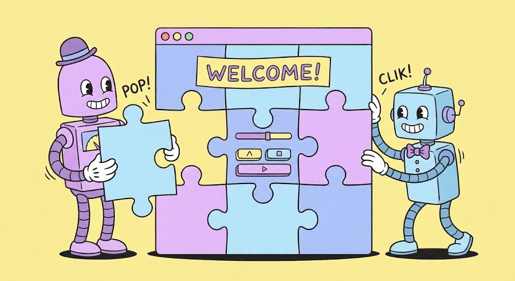
The Visual & Narrative Approach
Visualization Scenario: A charming "rubber-hose" style animation featuring two cute robots in Pastel Purple and Soft Blue. They are working together to slot a large jigsaw puzzle piece into place. The puzzle forms a simplified version of the SaaS dashboard. As the piece clicks in, the UI lights up with a "Welcome" banner. The background is a clean, solid Pale Yellow, keeping the focus entirely on the cooperative action.
Narration Style & Tone: Playful, helpful, and disarming. "Setting up is a snap. We'll handle the pieces; you see the big picture."
Psychological Impact & KPI Focus
Niche Psychology: This addresses Tech Intimidation. The playful, retro character design lowers the user's guard. It utilizes the IKEA Effect—showing the assembly process makes the user feel more invested and capable, but the "robots" imply that the heavy lifting is automated.
Operational Impact:
- Metric: Onboarding Completion Rate.
- Why it Works: It makes the "work" of implementation look like play. It reduces the perceived cognitive load of integrating a new tool into the tech stack.
Strategic Implementation & Trade-offs
- Best Use Case: In-app tooltips or the "Loading/Processing" screens during data import.
- Duration: Loop (Indefinite).
- Trade-off: The "cute" aesthetic might feel too juvenile for very serious, traditional enterprise sectors (e.g., Banking). Ensure it aligns with your specific brand voice.
Companies using similar video content -
Sprout Social – Onboarding – Assemble the workspace with playful guidance.
Agorapulse – Social Media Management – Make setup feel like a cooperative game.
Zoho Social – Social Media Management – Simplify implementation with charming animation.
23. Clean UI Light
Onboarding | Self-Serve
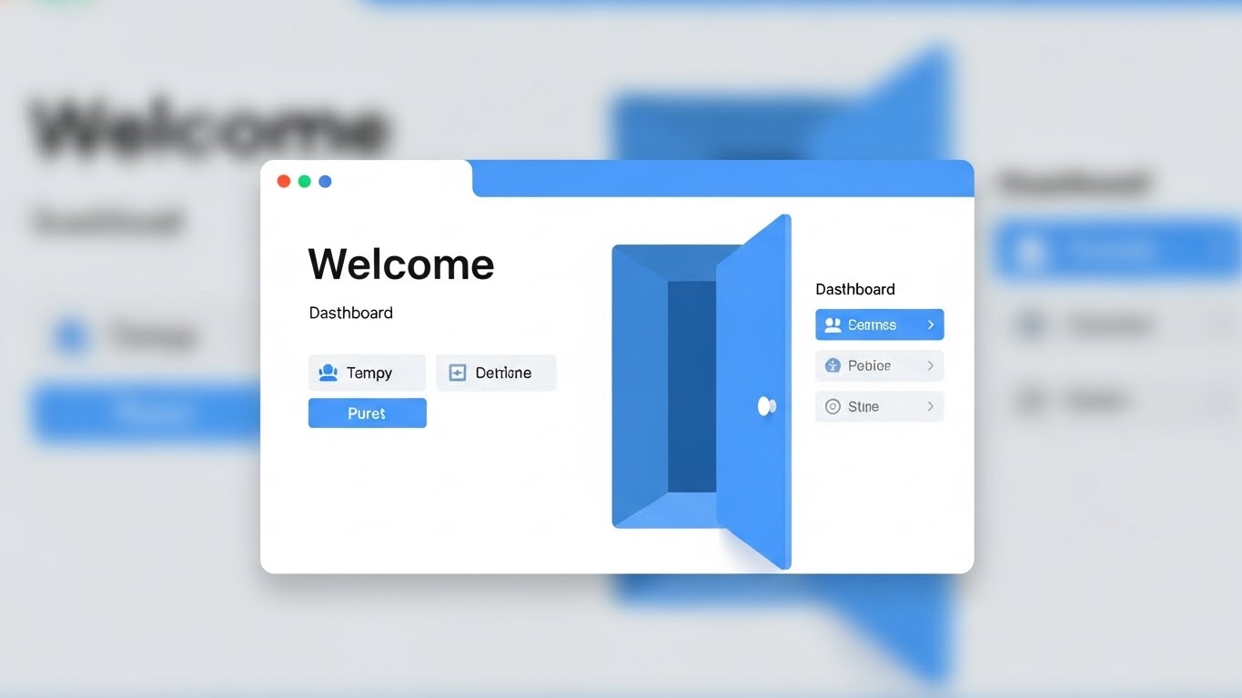
The Visual & Narrative Approach
Visualization Scenario: A pristine, high-contrast illustration of a UI widget. The central element is a dashboard panel that stylistically resembles an Open Door, inviting the user in. The palette is airy, using Sky Blue, Pure White, and Light Gray. The background is a soft, abstract blur, ensuring the sharp edges of the UI pop. Shadows are soft and diffused, creating a sense of depth without weight.
Narration Style & Tone: Clear, crisp, and welcoming. "Walk right in. Your command center awaits."
Psychological Impact & KPI Focus
Niche Psychology: The "Empty State" (a dashboard with no data yet) can be discouraging. This visual uses the Open Door metaphor to promise opportunity. The usage of White Space suggests clarity and room for growth, countering the fear of a cluttered interface.
Operational Impact:
- Metric: Feature Activation Rate (Self-Serve Users).
- Why it Works: It serves as a visual "Welcome Mat." It provides a clear focal point for the next action, removing the "Where do I click?" friction.
Strategic Implementation & Trade-offs
- Best Use Case: "Getting Started" guide covers or empty state placeholders in the app.
- Duration: Static or Micro-motion (3 seconds).
- Trade-off: It is minimalist. It works best when the interface is actually simple. If the real product is complex, this creates a false expectation of simplicity.
Companies using similar video content -
Buffer – Dashboard – Invite user access with pristine, open interfaces.
Sendible – Social Media Management – Provide clear, welcoming self-serve options.
Vista Social – Social Media Management – Guide users with intuitive, clean UI.
24. Hyper-lapse + Data
Retention | Knowledge Base

The Visual & Narrative Approach
Visualization Scenario: A fast-paced time-lapse of a busy city street at night. The taillights of cars form long, streaking lines of Orange and Teal. Superimposed over this organic traffic flow are glowing White data lines and nodes that move in perfect synchronization with the speed of the city. The visual connects the physical speed of the world with the digital speed of your support/data processing.
Narration Style & Tone: Fast, urban, and reliable. "The world moves fast. Your support should move faster."
Psychological Impact & KPI Focus
Niche Psychology: Social media never sleeps. This style validates the user's high-pressure environment. It signals Responsiveness. The organized chaos of the traffic, overlaid with the orderly data lines, suggests that your platform brings structure to the 24/7 news cycle.
Operational Impact:
- Metric: Customer Satisfaction Score (CSAT) regarding Support.
- Why it Works: It visualizes "Velocity." It reassures the user that the knowledge base or support engine is keeping pace with real-time demands.
Strategic Implementation & Trade-offs
- Best Use Case: Header video for the "Help Center" or "Video Portal."
- Duration: 10–15 Seconds (Loop).
- Trade-off: It is atmospheric. It sets a tone of efficiency but doesn't solve a specific problem. It builds confidence, not competence.
Companies using similar video content -
Talkwalker – Social Intelligence – Visualize information flow in real-time.
Meltwater – Media Intelligence – Show rapid data processing and support.
Brand24 – Social Media Monitoring – Connect physical speed with digital insights.
25. Abstract 3D AI
Retention | Reduce Churn

The Visual & Narrative Approach
Visualization Scenario: A mesmerizing macro view of a 3D neural network. Glowing nodes in Deep Indigo and Violet are interconnected by a strong, pulsating web of Pink light. The camera focuses on the strength of the connections. As one node pulses, energy flows instantly to the others. The background is a bright, clinical White Digital Ether, making the colors vibrate.
Narration Style & Tone: Intelligent, interconnected, and reassuring. "Stronger together. Powered by intelligence."
Psychological Impact & KPI Focus
Niche Psychology: Churn often happens when users feel isolated or stuck. This visual metaphor represents the Network Effect of the platform—how data, AI, and community are interlinked to support the user. The Pink/Indigo blend suggests a fusion of human creativity and machine logic.
Operational Impact:
- Metric: Retention Rate / Net Revenue Retention (NRR).
- Why it Works: It elevates the platform from a "tool" to an "ecosystem." It implies that leaving the platform means severing a vital, living connection.
Strategic Implementation & Trade-offs
- Best Use Case: Email backgrounds for "Subscription Renewal" reminders or "State of the Platform" updates.
- Duration: 10–15 Seconds.
- Trade-off: Highly abstract. It works on a subconscious level to build brand affinity but requires accompanying text to explain the specific value of renewing.
Companies using similar video content -
Brandwatch – Consumer Intelligence – Network customer resilience with AI.
Sprinklr – Unified CXM – Power ecosystem with intelligent interconnections.
Smartly.io – AI Advertising Platform – Reinforce platform's network effect.
26. Macro UI Micro
Retention | Deep Feature

The Visual & Narrative Approach
Visualization Scenario: An extreme close-up (macro) 3D render of a human fingertip hovering millimeters above a glass UI button. The button is glowing Vivid Lime against a Dark Grey textured metal surface. The image captures the split-second of anticipation before execution. The lighting highlights the ridge of the fingerprint and the sleek curve of the glass.
Narration Style & Tone: Precision-focused, tactile, and powerful. "One touch. Infinite possibilities." Sound of a high-tech "power up" hum.
Psychological Impact & KPI Focus
Niche Psychology: Software often feels intangible. This style creates Haptic Visuals—the viewer can almost "feel" the click. It triggers the desire for Control. The Vivid Lime is associated with "Go" and "Launch," creating an urge to act.
Operational Impact:
- Metric: Feature Discovery / Click-Through Rate on "New Feature" announcements.
- Why it Works: It glamorizes the interaction. It makes the simple act of clicking a button feel momentous and consequential, combating feature fatigue.
Strategic Implementation & Trade-offs
- Best Use Case: Blog headers for "Deep Dives" or feature release notes.
- Duration: Static or Micro-loop (Finger hovers, button pulses).
- Trade-off: It’s a detail shot. It doesn't show the full workflow. Use it to sell the quality of the UX, not the quantity of features.
Companies using similar video content -
Hootsuite – Feature Discovery – Anticipate the click for deep features.
Sprout Social – UI Precision – Glamorize interaction, combat feature fatigue.
Pallyy – Visual Planner – Highlight quality of user experience.
27. Futuristic Neon
Expansion | Upsell

The Visual & Narrative Approach
Visualization Scenario: A dark mode aesthetic where a stylized "Crown" or "Pro Badge" is constructed from precision laser lines. The lasers etch the shape in Neon Purple and Laser Green against a dark grid background. The object rotates slowly, glowing with an inner light that illuminates the grid floor. It looks like a high-end gaming asset or a cyber-security protocol.
Narration Style & Tone: Exclusive, elite, and rewarding. "Unlock the ultimate level. Go Pro."
Psychological Impact & KPI Focus
Niche Psychology: Upselling is about status and power. This style appeals to the Power User. The "Dark Mode + Neon" aesthetic signals Pro-Grade tools, separating the "Enterprise" user from the "Standard" user. It leverages the desire for exclusivity.
Operational Impact:
- Metric: Upgrade Conversion Rate (Standard to Pro).
- Why it Works: It visualizes the upgrade as obtaining a "power-up." It makes the higher tier feel like a distinct, superior product class, not just "more of the same."
Strategic Implementation & Trade-offs
- Best Use Case: In-app pop-ups for gated features or "Upgrade" email campaigns.
- Duration: 5–8 Seconds.
- Trade-off: It can look aggressive if the user is happy with the free plan. Use sparingly and only when the user hits a usage limit to position it as a solution, not a paywall.
Companies using similar video content -
Hootsuite – Enterprise Plans – Illuminate premium value for power users.
Sprout Social – Advanced Tiers – Unlock ultimate levels with exclusive features.
Agorapulse – Agency Features – Signal pro-grade tools and exclusivity.
28. Holographic UI
Expansion | Referrals

The Visual & Narrative Approach
Visualization Scenario: A cinematic 3D render of a metallic hand holding a spinning holographic globe. The globe is constructed of a translucent wireframe mesh in Hologram Blue and White. Volumetric light beams radiate from the globe, illuminating the surrounding atmospheric smoke in a dimly lit tech room. Points of light on the globe connect, symbolizing a referral network spreading.
Narration Style & Tone: Visionary, expansive, and influential. "Share the power. Grow the network."
Psychological Impact & KPI Focus
Niche Psychology: Referrals are driven by social capital. This visual frames the act of referring as Granting Access to a global, high-tech community. It appeals to the user's desire to be a "connector" or an influencer within their industry.
Operational Impact:
- Metric: Referral Program Sign-ups.
- Why it Works: It makes the platform look like a "Secret Weapon" that is valuable to share. The holographic tech implies that the user is on the cutting edge.
Strategic Implementation & Trade-offs
- Best Use Case: Social media posts promoting the "Partner Program" or Referral landing pages.
- Duration: 10–15 Seconds.
- Trade-off: It is highly stylized. It focuses on the concept of "Global," which might be overkill for local businesses. Best for platforms with an international user base.
Companies using similar video content -
Traackr – Influencer Marketing Platform – Project network growth through referrals.
Upfluence – Influencer Marketing – Visualize global community and connections.
CreatorIQ – Influencer Marketing Cloud – Frame referrals as granting access.
29. 3D Parallax UI
Expansion | Activation

The Visual & Narrative Approach
Visualization Scenario: A beautiful 3D composition where UI screens are deconstructed into floating layers, styled like thick paper cut-outs or matte plastic. The layers have physical depth and cast soft shadows on each other. The palette is trendy Coral, Teal, and White. The camera tilts, revealing the parallax effect—showing that what looks flat actually has deep, rich functionality underneath.
Narration Style & Tone: Sophisticated, smooth, and deep. "There is more than meets the eye. Dive deeper."
Psychological Impact & KPI Focus
Niche Psychology: Users often only use 20% of a platform. This style triggers Curiosity. By showing the "layers" beneath the surface, it visually hints that the user is missing out on hidden value. It invites exploration without being overwhelming.
Operational Impact:
- Metric: Usage of Secondary Features (Discovery).
- Why it Works: It makes the UI look "delicious" and tactile. It transforms the flat screen into a multi-dimensional object that demands to be explored.
Strategic Implementation & Trade-offs
- Best Use Case: Retargeting ads for existing users or "Did You Know?" feature tips.
- Duration: 10–15 Seconds.
- Trade-off: It creates a stylized version of the UI. It is artistic interpretation, not a literal tutorial. It inspires the intent to explore.
Companies using similar video content -
Zoho Social – Social Media Management – Layer feature depth, invite exploration.
Sendible – Social Media Management – Reveal hidden value in multi-dimensional UI.
SocialBee – Social Media Management – Showcase comprehensive toolkit's depth.
30. Dark Mode UI
Expansion | Proactive Support
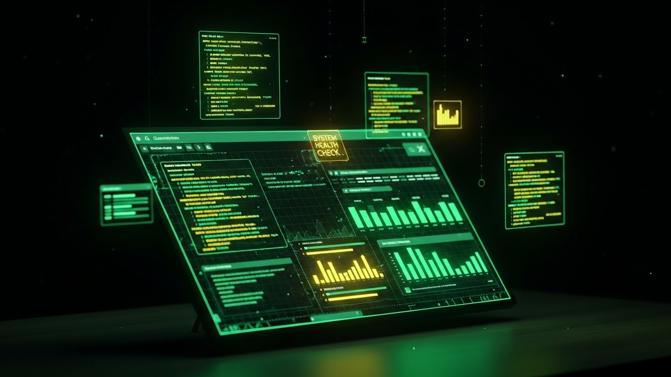
The Visual & Narrative Approach
Visualization Scenario: A sleek, "Dark Mode" illustration of a monitoring dashboard. The screen sits on a dark desk and displays scrolling code snippets and system health bars in Code Green and Slate Gray. The text is high contrast and legible. The screen is tilted slightly, and the background features subtle floating data particles. The vibe is "Mission Control."
Narration Style & Tone: Vigilant, professional, and secure. "We watch the system, so you can watch the strategy."
Psychological Impact & KPI Focus
Niche Psychology: For enterprise users, "Uptime" and "Security" are paramount. This style visualizes Proactive Monitoring. The "Matrix-like" green code implies that deep technical work is happening constantly in the background to keep the user's data safe.
Operational Impact:
- Metric: Trust Score / Renewal Rate for Enterprise Accounts.
- Why it Works: It visualizes the invisible service of "Security." It reassures the client that the platform is not just a toy, but a robust, monitored infrastructure.
Strategic Implementation & Trade-offs
- Best Use Case: "System Status" emails, Security Compliance pages, or Enterprise Newsletters.
- Duration: 10–15 Seconds.
- Trade-off: It is technical. It appeals to the IT/Ops mindset, not the creative marketer. Use it specifically when communicating about stability and infrastructure.
The Visual Operations Doctrine: A Strategic Knowledge Base
Having explored 30 distinct visualization styles, we must now synthesize these creative approaches into a cohesive business strategy. The following three segments bridge the gap between "good design" and "measurable growth," tailored specifically for the Social Media Management & SaaS landscape.
Strategic Alignment & Visual Architecture (The Pre-Production Phase)
Before a single pixel is rendered, the "Scale-Up Orchestrator" must define the rules of engagement. This phase ensures that your visual content is not just decorative, but structurally aligned with your platform’s operational goals.
- The Cognitive Load Audit: Conduct a rigorous audit of your platform's most complex workflows (e.g., API integration, multi-channel scheduling). If a task takes 10 clicks, the accompanying video (Style 16 or 19) must visually simplify it to 3 steps. Goal: Ensure the video reduces anxiety, rather than mirroring the complexity of the UI.
- Role-Based Visual Mapping: Differentiate your visual language by user persona. Use "High-Energy/Kinetic" styles (Style 1, 6) for Social Media Creators who crave speed and trends. Conversely, use "Data Viz/Dark Mode" styles (Style 9, 30) for Data Analysts and CTOs who value precision, security, and stability.
- The "Glanceability" Standard: In a high-velocity social environment, users don't have time to study videos. Design visuals (Style 13, 22) that communicate the core concept within 1.5 seconds—the "Glance Value." If the viewer cannot identify the benefit instantly, the visual has failed.
- Brand Voice Consistency: Your platform likely spans Marketing, Sales, and Support. Establish a "Visual Operating System" (e.g., consistent use of the "Glassmorphism" from Style 2 or "Neon Accents" from Style 27) that unifies these disparate modules into a single brand experience.
- The Advids Strategic Audit: Partnering with a specialized agency like Advids allows for an objective "Visual Health Check." We help define this "Visual Operating System" early, ensuring that your asset library remains consistent even as you scale from 10 videos to 1,000.
- Standardization vs. Customization: For core features (Login, Dashboard), use standardized, clean UI styles (Style 23). For unique value propositions (AI Engine, Proprietary Algorithms), invest in bespoke, abstract motion (Style 2, 25) to create a defensible brand moat.
- The Cross-Departmental Bridge: Use visuals to unify terminology. If Sales calls a feature "The Growth Engine" but Support calls it "The Analytics Tab," confusion reigns. A "Wireframe to Reality" video (Style 7) can visually link the sales promise to the actual interface, aligning all teams.
- Legacy System Integration: Many enterprise clients are migrating from spreadsheets or legacy tools. Use "Split Screen Reality" (Style 11) to visually validate their pain (the old way) while gently guiding them toward the solution (the new way), bridging the gap between the familiar and the innovative.
- Accessibility in Design: Your users are global and diverse. Ensure that motion graphics (especially Kinetic Typography - Style 1) remain readable for non-native speakers and accessible to those with visual impairments. High contrast and clear hierarchy are non-negotiable.
- The Mobile-First Mandate: Social media managers work on phones. All 30 styles must be legible on a vertical 9:16 screen. Avoid tiny UI details in favor of zoomed-in "Macro UI" (Style 26) to ensure the message lands on a mobile device.
Operational Adoption & Implementation (The Deployment Phase)
A video is only effective if it is seen at the exact moment of need. This phase focuses on embedding these visual assets directly into the user's workflow to drive adoption and reduce friction.
- Overcoming "Algorithm" Anxiety: Users often fear AI will replace them. Use empathetic styles (Style 19) to frame automation as a "Digital Assistant" that handles the grunt work, liberating the human to be creative. Visuals should show the AI serving the user, not controlling the process.
- The Micro-Learning Shift: Abandon the 50-page PDF manual. Slice your training into 30-second "Micro-Visuals" (Style 8, 12). Embed these directly into the UI tooltips, allowing users to learn a feature while they are trying to use it.
- Just-in-Time Support: Integrate "Hyper-lapse" or "Clean UI" videos (Style 23, 24) into your help center search results. When a user queries "How to export," they should see a 10-second loop showing the button location, not a wall of text.
- Gamification of Training: Use celebration styles (Style 21) to reward users for completing onboarding milestones. Visualizing progress with fireworks or checkmarks triggers dopamine, increasing the likelihood of full platform adoption.
- Reducing Support Ticket Volume: There is a direct correlation between proactive visual guides and reduced support costs. By placing "Objection Handling" videos (Style 16) on the FAQ page, you answer complex questions visually, stopping the ticket before it is filed.
- Remote Onboarding: For distributed teams, use "2D Character Stories" (Style 3) to simulate a human welcome. This replaces the need for expensive in-person seminars while maintaining a personal, human touch in a digital-first environment.
- Standard Operating Procedures (SOPs): Transform dry, text-based SOPs into "Isometric Workflow" animations (Style 19). Visualizing the flow of data makes complex approval processes or publishing rules instantly understandable for new hires.
- Feedback Loops: Use interactive video elements (Style 26) to gather feedback. After a "New Feature" video plays, a simple "Thumbs Up/Down" overlay can provide product teams with immediate sentiment data.
- Scalable Localization: Design your "Kinetic Typography" (Style 1) and "UI Montages" (Style 12) with text layers that are easily swappable. This allows you to deploy the same visual asset across 20 languages with minimal re-rendering costs.
- Leadership Communication: When pitching to the C-Suite, shift to "High-Fidelity Stock + UI" (Style 10, 18). Executives buy the vision, not the buttons. Visuals for this audience must look cinematic and expensive to justify the enterprise price tag.
Measuring Impact & Future-Proofing (The ROI Phase)
The final phase moves beyond "vanity metrics" (views) to measure true business impact. It also prepares your visual strategy for the next wave of technological evolution.
- Beyond "Views": Stop counting plays. Start measuring Feature Adoption Rate. If you release a video about the "Calendar Tool" (Style 8), does usage of that tool spike in the following 48 hours? That is the only metric that matters.
- The "Workflow Latency" Metric: Measure how long it takes a user to perform a task before and after watching a visual guide. A successful video should measurably reduce the time spent searching for buttons (Style 23).
- Platform Compliance: When social networks change their APIs, use "Abstract Motion" (Style 6) to quickly disseminate the news. Measure the speed at which your user base adapts to the new rules (e.g., "No more text on thumbnails") after viewing the update.
- Retention and Churn: High-quality onboarding visuals (Style 22) directly correlate to higher retention. Track the LTV (Lifetime Value) of cohorts exposed to your video academy versus those who were not. The data will likely justify a larger video budget.
- The AI Visual Frontier: Prepare for Generative Video. Soon, you will be able to personalize "Welcome" videos (Style 2) for every single user instantly. Build your asset library now to be ready for this level of dynamic personalization.
- Scalability of Assets: Build a "Modular Asset Library." Don't create one-off videos. Create libraries of "Backgrounds," "Icons," and "Character Rigs" (Style 3, 22). This allows you to assemble new videos like Lego bricks, drastically reducing production time.
- The Advids Partnership: Scalability requires a long-term partner. Advids functions as your "Visual Archive," managing these assets and ensuring that as your software evolves (v1.0 to v2.0), your video library evolves with it without starting from scratch.
- Benchmarking Success: Do not just compare yourself to competitors. Compare your visuals to the "Best in Class" B2C apps (like Spotify or Apple). Your users expect that level of polish. "Good enough" B2B design is a competitive risk in a design-led market.
- The ROI of Safety: For enterprise clients, the "Dark Mode/Security" visuals (Style 17, 30) are insurance. They mitigate the perceived risk of data breaches. Quantify this by tracking the Conversion Rate of security-conscious leads exposed to these specific assets.
- Final Call to Innovation: Treat video not as "Marketing Content," but as Digital Infrastructure. Just as you invest in servers and code, invest in the visual layer that interprets that code for humans. In the noisy SaaS landscape, clarity is the ultimate competitive advantage.
Companies using similar video content -
Sprinklr – Unified CXM – Monitor system health with vigilance.
Brandwatch – Security Monitoring – Visualize proactive support and infrastructure.
Everbridge – Critical Event Management – Reassure clients with robust system monitoring.
Author & Editor Bio


