
 /home/wwwroot/advids.co/design/index.php on line 425
Introduction: Visualizing the Nervous System of Global Trade
The global supply chain has evolved from a linear cost center into a dynamic, multi-dimensional nervous system. For the modern Chief Procurement Officer (CPO), the mandate is no longer just "buy cheaper"—it is "see further." Yet, a dangerous paradox exists: while we have more data than ever, we often have less clarity. Research indicates that poor data quality costs organizations an average of 12.9 million per year, creating a "fog of war" that obscures risk, hides compliance failures, and stifles innovation.
Supplier Relationship Management (SRM) software is the antidote to this chaos, but adoption remains a critical hurdle. The sheer complexity of these platforms can intimidate the very users they are meant to empower. To bridge the gap between the physical reality of logistics and the digital promise of the dashboard, we must change the visual language of procurement. We must move beyond static spreadsheets and engage the "visual brain."
The opportunity is significant. Digital World Class® procurement organizations are 1.7 times more likely to be considered valued business partners. By leveraging advanced visualization styles—from kinetic typography that gives weight to "Risk" to particle simulations that organize "Big Data"—marketing leaders can transform their software from a utility into a strategic asset.
This guide presents a curated taxonomy of visualization styles designed to dismantle skepticism, reduce cognitive load, and articulate the value of resilient supply chains.
1. The Kinetic Trust Engine
TOFU | Brand Awareness

The Visual & Narrative Approach
This style abandons the polite aesthetics of traditional B2B marketing for raw, structural power. Utilizing a "Brutalist" design language, the visualization treats abstract concepts like "Risk" and "Trust" as heavy, physical objects. In the example, massive 3D blocks in crimson (signaling urgency) and asphalt grey (signaling infrastructure) collide and reform in a digital void. The camera utilizes an orthographic view, shifting rapidly to convey the unstable, high-velocity nature of modern supply chains. The motion is percussive, mimicking the "thud" of heavy machinery or the impact of a market disruption.
Psychological Impact & KPI Focus
- Niche Psychology: CPOs operate in an environment where "Risk" is often an invisible, looming threat. This style makes that threat tangible. By giving risk "mass" and "velocity," it triggers a primal cognitive response, validating the CPO’s anxiety and positioning the software as the structural engineering required to withstand the collision.
- Operational Impact: This is a Category Creation tool. It visually disrupts the social feed, signaling that this is not just another "tool" but a fundamental shift in how we perceive supply chain stability. It drives Brand Recall by associating the vendor with strength and resilience.
Strategic Implementation & Trade-offs
- Best Use Case: 15-second "Scroll-Stopper" ads on LinkedIn or Twitter/X launching a new Risk Management module.
- Strategic Trade-off: The high-energy, abstract nature means it cannot convey specific features. It generates heat (interest), not light (education). Use it to open the door, then follow up with a demo.
Companies using similar video content -
GEP SMART – AI-driven SRM, risk evaluation.
Kinaxis RapidResponse – Real-time scenario simulation, supply chain resilience.
2. The Clarity Protocol
TOFU | Category Creation
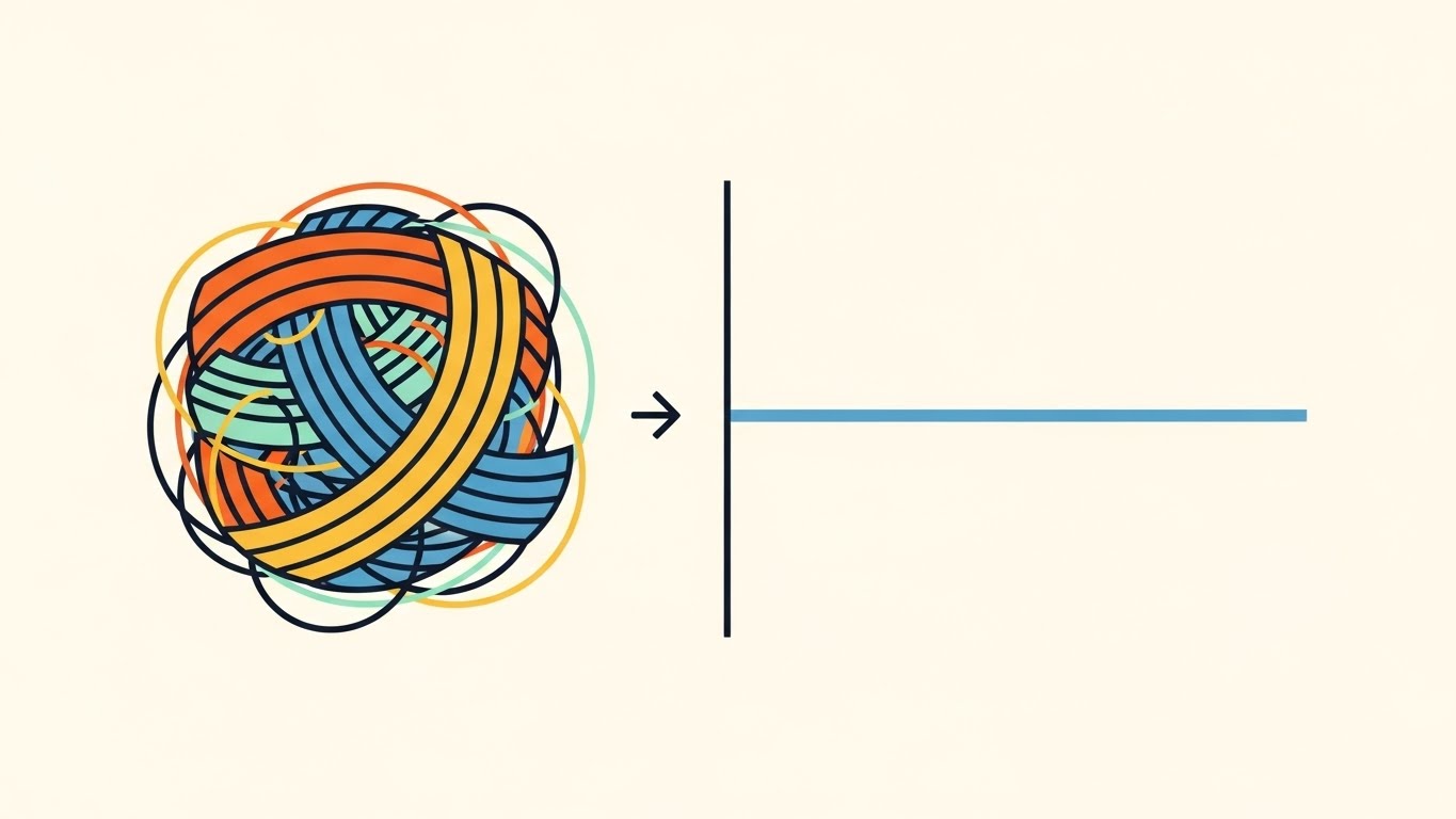
The Visual & Narrative Approach
This style utilizes the most powerful cognitive framework in marketing: "Order out of Chaos." The composition is split symmetrically. On the left, a tangled, multi-colored ball of yarn represents the "Status Quo" of fragmented sourcing—messy, overlapping, and friction-heavy. On the right, a single, perfectly straight slate-blue line emerges, representing the "New Reality" enabled by the software. The Bauhaus-inspired aesthetic uses clean hard edges and a calming cream background to strip away all visual noise, focusing entirely on the transition.
Psychological Impact & KPI Focus
- Niche Psychology: Procurement managers suffer from "Cognitive Overload." They are drowning in complexity. This visual offers immediate psychological relief (Catharsis). It promises that the software acts as a "detangling agent," simplifying the user's life rather than adding another layer of work.
- Operational Impact: It visually articulates Process Optimization and Efficiency. It is highly effective for Market Education, as it explains the core value proposition (Simplification) in under 3 seconds without needing a single word of copy.
Strategic Implementation & Trade-offs
- Best Use Case: Static carousels or short looping animations on LinkedIn. Excellent for "Problem/Solution" landing page headers.
- Strategic Trade-off: The simplicity can feel "generic" or "low-budget" if not paired with specific, authoritative copy. It risks oversimplifying enterprise-grade problems if the accompanying message isn't robust.
Companies using similar video content -
Kissflow Procurement Cloud – Automates repetitive tasks, streamlines procurement.
Precoro – Spend management, streamlines purchasing.
3. The Obsidian Guardian
TOFU | Market Education

The Visual & Narrative Approach
Security is often visually boring—locks and keys. This style reinvents it as a premium luxury asset using "Glassmorphism." A central shield, rendered in glossy obsidian with a neon lime rim, protects a delicate, metallic gold data cube. The environment is a reflective studio space with caustic lighting effects that suggest high-tech sophistication. The macro zoom and shallow depth of field blur the background, forcing the eye to focus on the impenetrability of the shield and the value of the data (gold) inside.
Psychological Impact & KPI Focus
- Niche Psychology: CPOs are paranoid about data breaches. This style addresses that fear by framing security as "Bank-Grade" and "Hermetic." The glossy textures and gold elements subconsciously cue "Value" and "Premium Engineering," reassuring the buyer that the platform is robust enough for Tier-1 sensitive data.
- Operational Impact: This style drives Brand Perception. It elevates the software from a utility to a premium partner. It is particularly effective for justifying higher price points by visually aligning the brand with high-fidelity aesthetics.
Strategic Implementation & Trade-offs
- Best Use Case: High-impact Display Ads or the "Security" section of the website.
- Strategic Trade-off: The abstract nature conveys "Safety" but not "Utility." It builds trust but doesn't explain how the encryption works. It must be supported by technical whitepapers.
Companies using similar video content -
Diligent HighBond – Open source vendor risk management, secure platform.
OpsMx Delivery Shield – OSS Risk Management, vulnerability detection.
4. The Neon Continuity
TOFU | Shaping Brand Perception
The Visual & Narrative Approach
Designed for the "TikTok/Shorts" generation of analysts, this style uses a single, continuous neon pink line to tell a story of unbroken connectivity. The line fluidly draws a spinning globe (Global Reach), morphs into a tablet (Digital Access), and finally into a handshake (Partnership). Cyan accent dots pulse at intersection points to signify data nodes. The camera stays fixed on the 2D plane, emphasizing the fluidity of the transition. The "dark mode" background maximizes contrast and signals a modern, tech-forward vibe.
Psychological Impact & KPI Focus
- Niche Psychology: The "Continuous Line" is a metaphor for Interoperability. It appeals to the desire for a seamless workflow where data flows from the factory floor to the ERP without a single break. It visually refutes the idea of "siloed" departments.
- Operational Impact: This style is optimized for Social Engagement and Retention. The mesmerizing motion encourages "looping" behavior, increasing watch time on vertical platforms. It effectively communicates "Ease of Integration" without technical jargon.
Strategic Implementation & Trade-offs
- Best Use Case: Vertical videos for Instagram Reels, TikTok, or YouTube Shorts.
- Strategic Trade-off: The minimalist style limits information density. You cannot show complex dashboards here. It is purely for awareness and "vibe" setting.
Companies using similar video content -
Tradeshift – Network for buyers and suppliers, seamless transactions.
Infor Nexus – Cloud-based platform, real-time data integration.
5. The Human Validator
TOFU | YouTube

The Visual & Narrative Approach
Adopting the "Corporate Memphis" aesthetic, this style centers the narrative on the human user. We see a diverse procurement manager in a coral blazer, standing in a stylized office. She is not stressed; she is smiling confidently at a holographic interface showing a large green "Check" mark. The flat shading and simplified geometry remove all distractions, focusing the viewer entirely on the character's emotion: Relief and Confidence.
Psychological Impact & KPI Focus
- Niche Psychology: Software adoption fails when users fear the learning curve. This style leverages Social Proof and Empathy. The "Green Check" is a dopamine trigger for task completion. Seeing a relatable professional succeed creates a subconscious desire to experience that same relief.
- Operational Impact: Ideally suited for Skippable Pre-Roll Ads. The human face captures attention in the first 5 seconds (The "Hook"), and the positive emotion reduces skip rates. It combats "Adoption Resistance" by framing the software as a helper, not a hindrance.
Strategic Implementation & Trade-offs
- Best Use Case: YouTube Ads and Internal Training/Change Management videos.
- Strategic Trade-off: Can feel "generic" if not customized. To avoid the "Stock Art" look, ensure the holographic interface details (the UI elements) are specific to your actual software.
Companies using similar video content -
Vroozi Procurement Platform – User-centric e-procurement, simplifies purchasing.
Eptura Asset Management – Simplified, mobile-first EAM.
6. The Isometric Ecosystem
TOFU | Vertical Social Organic

The Visual & Narrative Approach
This style provides the "God’s Eye View" that supply chain directors crave. Using a 45-degree isometric projection, it maps a bustling logistics network—warehouses, trucks, ports—onto a clean grid. The kelly green and sky blue palette suggests an optimized, eco-friendly system. The motion is clockwork-like: trucks move in sync, containers load smoothly. It visualizes the entire ecosystem as a single, functioning machine.
Psychological Impact & KPI Focus
- Niche Psychology: The fear of the "Blind Spot" is a primary anxiety. This visual offers Omniscience. It reassures the CPO that the software provides total visibility across the network. The grid structure implies control, order, and measurability.
- Operational Impact: Perfect for Connected TV (CTV). The detail-rich environment rewards viewing on large screens. It visually validates the concept of "End-to-End Visibility" and "Network Optimization."
Strategic Implementation & Trade-offs
- Best Use Case: Trade Show Booth Screens, CTV Commercials, and "How it Works" overview videos.
- Strategic Trade-off: Isometric art can feel "small" or "gamified." It requires a professional voiceover to ground it in serious business strategy.
Companies using similar video content -
Blue Yonder – Supply chain analytics, planning, network optimization.
o9 Solutions – Digital Brain platform, unifies data and intelligence.
7. The Data Alchemist
TOFU | Skippable Pre-Roll Ad

The Visual & Narrative Approach
This visualization tackles the "Big Data" problem. Thousands of violet and magenta particles—shaped like tiny shipping containers—flow fluidly like water into a central funnel. The background is a dark "Data Tunnel." The motion is rhythmic and hypnotic, pulling the eye toward the center. It metaphorically represents the ingestion of millions of fragmented data points (invoices, emails, manifests) into a single, structured system.
Psychological Impact & KPI Focus
- Niche Psychology: Data fragmentation is a source of chaos. This visual offers a therapeutic resolution: Consolidation. The funnel shape implies that the software captures everything and distills it into value. It appeals to the desire for a "Single Source of Truth."
- Operational Impact: Highly effective for Demand Gen. The hypnotic motion stops the scroll on social feeds. It visually communicates "Spend Analysis" and "Master Data Management" without needing complex charts.
Strategic Implementation & Trade-offs
- Best Use Case: Background visuals for high-converting Landing Pages or Webinar Intro sequences.
- Strategic Trade-off: It is highly abstract. It captures attention but not comprehension unless paired with a clear headline like "Unify Your Supplier Data."
Companies using similar video content -
Zycus – Source-to-Pay, spend analysis, eSourcing.
Basware – Financial management, invoice automation, spend analysis.
8. The Reality Bridge
TOFU | Connected TV

The Visual & Narrative Approach
This split-screen technique is the ultimate "Proof of Concept." The left half displays a technical blue wireframe blueprint of a logistics warehouse, representing the Digital Strategy. The right half seamlessly transitions into a photorealistic, colorful render of the same warehouse, representing the Physical Execution. The static camera allows the viewer to compare the plan with the result, symbolizing the accuracy of the software’s predictive modeling.
Psychological Impact & KPI Focus
- Niche Psychology: Buyers are skeptical of "Vaporware." This visual bridges the Physical/Digital Divide. It creates a "Cognitive Bridge," reassuring the engineer and the CPO that the digital plan (the software) translates 1:1 to the real world (the warehouse). It builds credibility.
- Operational Impact: Critical for MOFU Conversion. It differentiates the product by focusing on outcomes rather than just interfaces. It validates the "Digital Twin" capability.
Strategic Implementation & Trade-offs
- Best Use Case: "Solution" pages on the website, Case Study videos, and deep-dive demos.
- Strategic Trade-off: This style demands high fidelity. If the "Reality" side looks fake, the trust is broken. It requires premium 3D assets.
Companies using similar video content -
IBM Maximo – EAM, AI-driven, tracking physical assets.
Telit Cinterion – IoT solutions for supply chain, real-time asset monitoring.
11. The Pristine Evaluator
MOFU | Feature Education
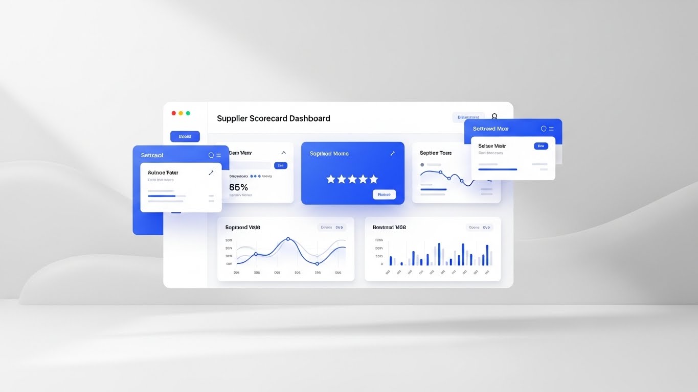
The Visual & Narrative Approach
As the prospect transitions from "Why change?" to "How does it work?", clarity becomes the ultimate currency. This style abandons dramatic lighting for a "Medical-Grade" clean UI aesthetic. We see a pristine "Supplier Scorecard Dashboard" floating in a soft, studio-white space. The interface uses a minimalist white and light grey theme, punctuated only by sharp royal blue data points and a prominent 5-star rating graphic. Soft drop shadows create a sense of hierarchy, lifting the critical data off the screen.
Psychological Impact & KPI Focus
- Niche Psychology: Procurement leaders often suffer from "Data Noise"—the exhaustion of sifting through messy, inconsistent spreadsheets. This visual utilizes the Aesthetic-Usability Effect, where a clean design is perceived as easier to use. It signals Cognitive Ease, reassuring the buyer that the platform turns the chaos of vendor management into a tidy, objective science.
- Operational Impact: Directly maps to Vendor Performance Management (VPM). It visually demonstrates that the software provides a "Single Source of Truth," eliminating subjective debates about supplier performance.
Strategic Implementation & Trade-offs
- Best Use Case: Email nurture campaigns targeting warm leads and "Feature Focus" sections of the website (30-second loops).
- Strategic Trade-off: The minimalist approach is informative but lacks emotional urgency. It appeals to the logical brain, not the emotional one.
12. The Cultural Mirror
MOFU | Building Trust

The Visual & Narrative Approach
Digital transformation is fundamentally a human challenge. This style shifts the lens from the software to the outcome of the software. We see a high-quality capture of a diverse procurement team in a glass-walled conference room, bathed in natural sunlight. They are not hunched over laptops; they are standing, pointing enthusiastically at a shared screen (off-camera). The "Heroic" low-angle shot and warm beige/navy palette convey professional capability, alignment, and shared success.
Psychological Impact & KPI Focus
- Niche Psychology: A primary barrier to adoption is the fear of internal resistance ("My team won't use this"). This visual offers Social Proof and Aspiration. It mirrors the ideal state of the procurement function: collaborative, aligned, and strategic. It tells the CPO, "This software builds better teams, not just better data."
- Operational Impact: Supports Change Management and Internal Buy-In. It visually refutes the narrative of "Procurement vs. The Business," positioning the platform as a catalyst for cross-functional harmony.
Strategic Implementation & Trade-offs
- Best Use Case: LinkedIn "Culture" ads, "About Us" pages, and Case Study headers.
- Strategic Trade-off: It is generic by nature. To avoid looking like a stock photo, it must be paired with specific copy or testimonials that anchor the visual to the specific benefits of your software.
13. The Transparent Core
MOFU | Risk Mitigation

The Visual & Narrative Approach
The most dangerous risks are the ones you cannot see. This style utilizes a sophisticated "X-Ray" shader effect to visualize the concept of Tier-N Visibility. A standard blue shipping container is rendered translucent, revealing a complex internal structure of glowing amber digital crates and network lines. The object rotates slowly in a studio black void, allowing the viewer to inspect the "contents" (data) from all angles. Subsurface scattering adds a high-tech, diagnostic feel.
Psychological Impact & KPI Focus
- Niche Psychology: The "Black Box" of the sub-tier supply chain is a major source of anxiety. This visual metaphor offers Omniscience. It satisfies the CPO's craving for control by demonstrating that the software can penetrate the physical opacity of logistics to reveal the digital truth (compliance, origin, solvency) hidden inside.
- Operational Impact: Highly effective for Risk Mitigation and Compliance. It visually differentiates the solution by suggesting a depth of analysis that goes beyond the surface level.
Strategic Implementation & Trade-offs
- Best Use Case: "Risk Management" solution pages and technical whitepapers.
- Strategic Trade-off: The aesthetic is clinical and forensic. It works best for audiences focused on audit and compliance, rather than relationship management.
Companies using similar video content -
Ivalua – Flexible SRM, supplier performance monitoring.
SAP Ariba – SRM, supplier risk and compliance tools.
14. The Transformation Binary
MOFU | Competitive Displacement

The Visual & Narrative Approach
This is the "Before and After" technique reinvented for the enterprise. The composition is a sharp split-screen. The left side ("Before") is a grainy, desaturated image of a stressed worker buried under paper invoices—a visual shorthand for "The Old Way." The right side ("After") is a sharp, vivid 4K image of a calm professional using a sleek tablet in a Zen, plant-filled office. The contrast forces the brain to instantly prefer the "After" state, associating the software with relief and modernity.
Psychological Impact & KPI Focus
- Niche Psychology: Buyers often suffer from Status Quo Bias. This visual disrupts that bias by amplifying the pain of the current state (Cognitive Friction) and contrasting it with the ease of the future state. It validates the user's struggle and offers immediate Catharsis.
- Operational Impact: A prime tool for Competitive Displacement. It visually argues that sticking with legacy systems is an active choice for stress, while the new platform represents a lifestyle upgrade for the department.
Strategic Implementation & Trade-offs
- Best Use Case: Retargeting Ads (social) and "Why Switch?" landing pages.
- Strategic Trade-off: It is a blunt instrument. Ensure the "Before" scenario is relatable, not a caricature, to avoid alienating potential users who still operate that way.
Companies using similar video content -
Workday Strategic Sourcing – Strategic sourcing, team collaboration.
Anaplan – Connected planning, data across business.
15. The Velocity Interface
MOFU | Driving Demo Requests
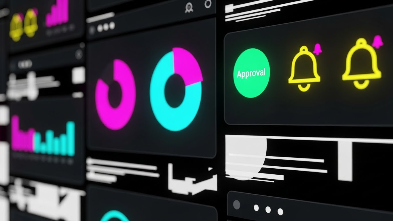
The Visual & Narrative Approach
When the goal is to demonstrate power and breadth, a static screenshot fails. This style uses a high-energy "Glitch/Cyber" aesthetic. We see a collage of dark-mode UI elements—abstract pie charts in magenta, green "Approval" buttons, and cyber yellow notification bells—arranged in a dynamic digital space. Speed lines and glitch effects connect the elements as the camera zooms rapidly. It creates an impression of overwhelming capability and speed, suggesting a platform that moves as fast as the market.
Psychological Impact & KPI Focus
- Niche Psychology: Decision-makers want to know, "Is this a point solution or a platform?" This visual answers: Platform. By showing a density of features in a single frame, it signals Comprehensiveness. The kinetic energy appeals to the "Power User" who values efficiency and responsiveness.
- Operational Impact: Optimized for Driving Demo Requests. It builds curiosity through "Feature Density," prompting the user to click to see the details behind the flash.
Strategic Implementation & Trade-offs
- Best Use Case: 15-second Instagram/LinkedIn Stories and "Hype" intros for product videos.
- Strategic Trade-off: Zero educational value. It creates excitement, not understanding. Do not use this for training content.
Companies using similar video content -
Everstream Analytics – Supply chain visibility, event monitoring, risk prediction.
SafetyCulture – Supply chain visibility, audit inspection, monitoring activities.
16. The Synaptic Bridge
MOFU | Objection Handling

The Visual & Narrative Approach
"Will it integrate?" is the most common MOFU objection. This style answers with a "Plexus" network visualization. In a deep 3D void, glowing electric purple and node blue spheres are connected by fine, tensioned white lines. These nodes represent disparate enterprise systems (ERP, CRM, Legacy) being woven into a single, cohesive fabric. The camera flies through this network, visualizing the strength and flexibility of the connections without the clutter of server racks.
Psychological Impact & KPI Focus
- Niche Psychology: IT Directors fear Data Silos and "Spaghetti Code." This visual offers a therapeutic image of Systemic Harmony. It portrays integration not as a patch, but as an elegant, intelligent nervous system. It reassures the stakeholder that the platform will act as the "Connective Tissue" of their tech stack.
- Operational Impact: Critical for Objection Handling. It visually proves API Interoperability and ecosystem maturity, reducing the perceived technical risk of the purchase.
Strategic Implementation & Trade-offs
- Best Use Case: "Integrations" page headers and technical whitepapers.
- Strategic Trade-off: It is abstract. It must be paired with the logos of major ERPs (SAP, Oracle) to ground the metaphor in reality.
Companies using similar video content -
ERPNext – Open source ERP, digitizes purchase flow.
Vendr – Automates, centralizes, simplifies procurement.
17. The Mobile Commander
MOFU | The Functional Buyer

The Visual & Narrative Approach
For the functional buyer, utility is king. This style grounds the technology in the physical reality of the warehouse. We see a close-up of a hand holding a rugged tablet against a blurry, busy logistics backdrop. Floating above the screen is a futuristic, holographic UI overlay in cyan and silver, displaying a large "Check" mark and "Inventory Updated" status. The lighting highlights the interaction, emphasizing that the digital tool is robust enough for the physical world.
Psychological Impact & KPI Focus
- Niche Psychology: Operational staff fear being tethered to a desk. This visual promises Mobility and Empowerment. It reinforces the idea that the software is a tool for the "Frontline," giving them "Superpowers" (the hologram) to do their job faster and more accurately.
- Operational Impact: Demonstrates Real-Time Data Capture and Mobile Accessibility. It validates the use case for on-site audits and inventory checks, driving adoption among field teams.
Strategic Implementation & Trade-offs
- Best Use Case: LinkedIn carousel ads targeting Operations Managers and "Mobile App" feature pages.
- Strategic Trade-off: The holographic overlay is stylized. Ensure the actual mobile app is modern enough to not disappoint users expecting an AR experience.
Companies using similar video content -
Coupa – Spend management platform, invoice, payment, contract management.
Jaggaer – Robust SRM, spend management, global sourcing.
18. The Fiscal Monolith
BOFU | ROI Justification

The Visual & Narrative Approach
At the Bottom of the Funnel (BOFU), the conversation turns to money. This style renders data as high-value architecture. 3D bar charts, textured in Forest Green (Money), Gold (Value), and Marble White (Stability), rise like skyscrapers from a polished pedestal. The camera tilts upwards, emphasizing the scale of the growth. It treats the ROI data not as a statistic, but as a monument to financial discipline.
Psychological Impact & KPI Focus
- Niche Psychology: The CFO needs reassurance. This visual speaks the language of Capital Asset and Stability. The heavy, premium textures subconsciously cue that the software is a solid investment that will appreciate over time, rather than a recurring expense.
- Operational Impact: Essential for ROI Justification. It visualizes Spend Analytics, Cost Savings, and Margin Improvement. It is designed to be the "Closing Slide" in a pitch deck.
Strategic Implementation & Trade-offs
- Best Use Case: Executive Pitch Decks and "Results" pages.
- Strategic Trade-off: It is cold and impersonal. Use it strictly for the financial decision-maker who cares about numbers, not features.
Companies using similar video content -
Oracle Procurement Cloud – ERP integration, comprehensive solution.
SAP Integrated Business Planning (IBP) – Combines S&OP, demand forecasting.
19. The Augmented Sentry
BOFU | Sales Cycle Acceleration

The Visual & Narrative Approach
This style visualizes "Augmented Intelligence." It blends realistic photography of a warehouse manager with playful, popping 2D vector icons. Red "Alert" triangles and white gear icons float in 3D space around the user's clipboard, highlighting issues. The graphics are self-illuminated, contrasting with the natural light. It portrays the software as an invisible, helpful assistant that "whispers" critical information to the user.
Psychological Impact & KPI Focus
- Niche Psychology: Users fear human error. This style positions the platform as a Safety Net. It reduces the anxiety of "missing something" by visually demonstrating that the software proactively flags exceptions. It frames the technology as a partner, not a replacement.
- Operational Impact: Accelerates the Sales Cycle by removing the "Complexity" objection. It visually communicates Exception Management and Proactive Alerts, showing that the system pushes data rather than waiting for it to be pulled.
Strategic Implementation & Trade-offs
- Best Use Case: "How it Works" emails and Onboarding videos.
- Strategic Trade-off: The "cartoonish" icons can feel less "Enterprise" if overused. It works best for user-level communications, not executive strategy.
Companies using similar video content -
Mobile Reach – Mobile enterprise asset management, field technicians.
Asset Panda – Mobile asset management, barcode tracking.
20. The Deployment Sandbox
BOFU | Reducing Implementation Friction

The Visual & Narrative Approach
The final hurdle is implementation. This style uses an Isometric 3D view to render a miniature, perfectly organized office ecosystem. Done in a "Claymorphism" style with soft, rounded edges and pastel blues, it shows servers, desks, and data flows acting in harmony. The "Tilt-Shift" effect makes the entire complex operation look small, manageable, and delightful.
Psychological Impact & KPI Focus
- Niche Psychology: Implementation is often viewed as a "Big, Scary Monster." This visual shrinks the monster. By rendering the IT infrastructure as a "Toy Set," it psychologically reduces the Perceived Difficulty. It signals that the deployment will be contained, organized, and Frictionless.
- Operational Impact: Critical for Closing. It visualizes the Deployment Architecture as a clean, manageable project, helping to overcome the final hesitation before signing.
Strategic Implementation & Trade-offs
- Best Use Case: Implementation Guides and Proposal documents.
- Strategic Trade-off: It risks looking "childish." The copy must remain strictly professional to balance the playful visual style, ensuring the message is "Simple," not "Simplistic."
Companies using similar video content -
Tipalti – Finance automation, accounts payable, procurement.
Proactis – Spend control, eProcurement, cost savings.
21. The Global Command
BOFU | ABM Awareness

The Visual & Narrative Approach
Designed for the C-Suite of Global 2000 enterprises, this style abandons the clutter of standard dashboards for a "Sci-Fi Command Center" aesthetic. A photorealistic Earth rotates in a deep space void, overlaid with complex, curved holographic dashboards (HUDs) in "Hologram Blue" and "Grid Green." The HUDs display floating vendor statistics and location markers that pin themselves to specific coordinates on the globe. It conveys absolute, God’s-eye oversight without getting bogged down in rows of data.
Psychological Impact & KPI Focus
- Niche Psychology: The Enterprise CEO or CPO desires Omniscience. They fear the "fragmented view" of their empire. This visual metaphor validates their self-image as the commander of a global operation, speaking the language of Control and Sovereignty.
- Operational Impact: Specifically designed for Account-Based Marketing (ABM) targeting Tier-1 accounts. It visually promises that the software can handle "Global Complexity" and scale, differentiating it from SMB tools.
Strategic Implementation & Trade-offs
- Best Use Case: Personalized ABM Landing Pages (e.g., "Welcome, [Company] Leadership") and Digital Billboards at major industry conferences.
- Strategic Trade-off: It is aspirational, not functional. Do not use this to show specific workflows; use it to sell the vision of the solution.
Companies using similar video content -
Sensefinity – 360-degree supply chain visibility, real-time location.
AB&R – Enterprise Asset Tracking, real-time location, condition monitoring.
22. The Executive Assurance
BOFU | The Economic Buyer

The Visual & Narrative Approach
The Economic Buyer (CFO) does not care about features; they care about risk and return. This style pivots to high-end cinematic realism using Generative AI. We see a close-up of a distinguished CFO figure with silver hair, dressed in a tailored navy suit, standing in a boardroom with a blurred city skyline at dusk. The lighting is warm and cinematic ("Golden Hour"). He looks at a tablet, nods with a subtle, confident smile, and makes eye contact with the camera.
Psychological Impact & KPI Focus
- Niche Psychology: CFOs are risk-averse. They look for Stability and Professionalism. This visual utilizes Mirror Neurons—the CFO sees themselves in the character. The calm, assured expression subconsciously signals that the investment is safe, sound, and strategically prudent.
- Operational Impact: Critical for Closing the Deal. It aligns the software brand with "Fiscal Responsibility" and "Executive Leadership," helping to overcome budget objections during the final review.
Strategic Implementation & Trade-offs
- Best Use Case: The "Pricing" or "ROI" page of the website and the final slide of a sales deck.
- Strategic Trade-off: Requires high-quality execution. If the character looks "uncanny" or robotic, it destroys trust. The AI generation must be flawless.
Companies using similar video content -
OpenBoxes – Open-source SCM, customizable, extensible.
Glide – Custom procurement software, rapid development.
23. The Code Architect
BOFU | The Technical Buyer
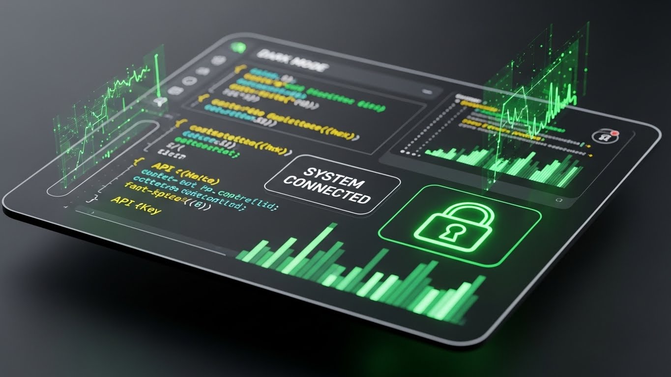
The Visual & Narrative Approach
Before the contract is signed, the CTO or IT Director will perform "Technical Due Diligence." They want to see the "guts" of the system. This style features a sleek "Dark Mode" UI showcase. Against a dark grey background, neon syntax highlighting (green strings, blue variables) pops vividly. We see abstract API keys and a prominent "System Connected" lock icon. The tilted camera angle adds a modern, dynamic feel, focusing on the cleanliness of the development environment.
Psychological Impact & KPI Focus
- Niche Psychology: Developers judge software by its "fit and finish." Dark Mode is a cultural signal for Modern Engineering. This visual signals that the platform is developer-friendly, API-first, and secure by design, addressing the fear of "Legacy Bloat."
- Operational Impact: Tailored for the Technical Buyer. It reduces friction during the security audit phase by visually communicating Robust Architecture and Modern Standards.
Strategic Implementation & Trade-offs
- Best Use Case: Developer Documentation, API Portal headers, and technical email sequences.
- Strategic Trade-off: It alienates non-technical users. A procurement manager might find it intimidating. Keep it segmented to IT personas.
Companies using similar video content -
FourKites – Supply chain visibility, global tracking, predictive ETAs.
Descartes MacroPoint – Supply chain visibility, real-time tracking.
24. The Success Catalyst
Onboarding | Accelerating Time-to-Value

The Visual & Narrative Approach
The most critical moment in retention is the user's first successful action. This style uses a "Cel-Shaded" 2.5D aesthetic to gamify that moment. A stylized character in a vibrant orange jumpsuit interacts with a floating purple UI window. As they drag a geometric file into a zone, it emits a bright "Success" glow and a "1st Win" badge appears. The colors are high-saturation and energetic, designed to trigger a dopamine response.
Psychological Impact & KPI Focus
- Niche Psychology: New users feel anxiety and incompetence. This visual provides Positive Reinforcement. By stylizing the interaction as a "Game," it lowers the stakes and makes the learning process feel rewarding rather than tedious.
- Operational Impact: Directly drives Time-to-Value. It encourages users to complete the initial setup steps (The "Aha!" Moment) by promising a visually rewarding conclusion to the task.
Strategic Implementation & Trade-offs
- Best Use Case: In-app "Welcome" screens and "Congratulations" emails after setup completion.
- Strategic Trade-off: The playful style can feel trivializing if applied to serious tasks like "Compliance Audits." Keep it for onboarding and setup.
Companies using similar video content -
Oracle Fusion Cloud ERP – Core suite of SaaS applications, financial management.
SAP S/4HANA Cloud – Enterprise-grade ERP, financial management.
25. The Tactile Trigger
Onboarding | Self-Serve Onboarding

The Visual & Narrative Approach
To teach specific actions, macro photography works best. This style features a photorealistic close-up of a single interface button—a vibrant green toggle with a tactile fingerprint texture sitting on a clean white surface. The lighting is soft and diffused, and the shallow depth of field blurs everything else. It isolates the exact micro-interaction required, making the digital button feel like a physical switch.
Psychological Impact & KPI Focus
- Niche Psychology: When learning a new tool, users get overwhelmed by the density of the interface. This visual forces Selective Attention. It signals, "Just press this one thing." The tactile texture creates a sense of Tangibility, making the software feel easier to grasp.
- Operational Impact: Essential for Self-Serve Onboarding. It reduces support tickets by making the "Next Best Action" unmistakably clear and inviting.
Strategic Implementation & Trade-offs
- Best Use Case: "Tooltips" inside the software and "Quick Start" guide PDFs.
- Strategic Trade-off: It lacks context. You cannot show the result of the action, only the action itself.
Companies using similar video content -
Apache OFBiz – Open source ERP, customizable, suite of tools.
OpenProcurement – Open source e-procurement toolkit, API-driven.
26. The Velocity Tunnel
Onboarding | Trial/Freemium User Activation
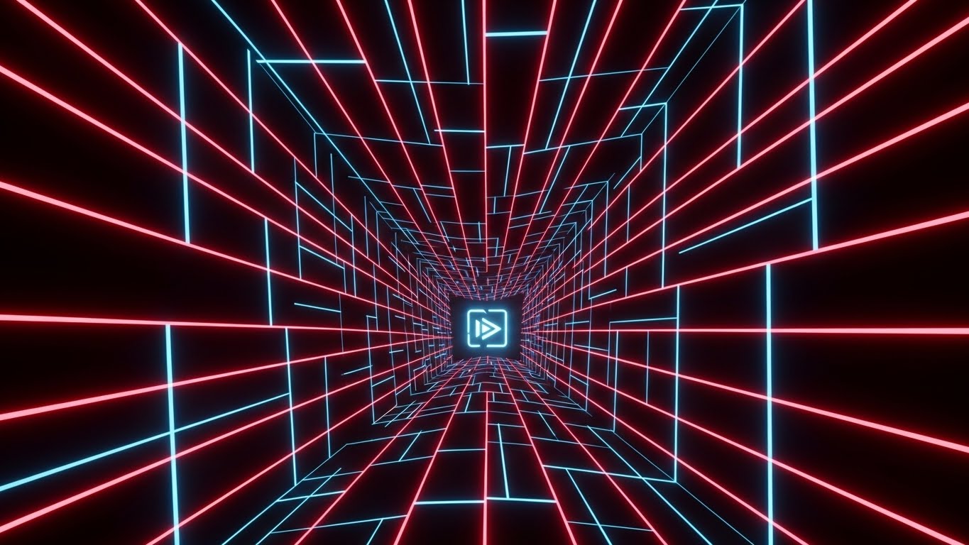
The Visual & Narrative Approach
Freemium users often sign up and go dormant. This style wakes them up. Inspired by "Synthwave" aesthetics, it features glowing neon laser red and cyber blue grid lines forming a fast-moving pathway through an infinite black tunnel. The perspective rushes forward toward a glowing "Launch" icon in the distance. It is pure kinetic energy, symbolizing speed, forward momentum, and the excitement of activation.
Psychological Impact & KPI Focus
- Niche Psychology: Dormant users suffer from inertia. This visual disrupts that state with High-Velocity Cues. The "tunnel vision" effect subconsciously pulls the viewer forward, creating a desire to see what is at the end of the ride (the platform).
- Operational Impact: Optimized for User Activation. It creates a sense of urgency and excitement in email campaigns targeting inactive trial users.
Strategic Implementation & Trade-offs
- Best Use Case: "Your Trial is Ending" emails and "New Feature" announcement blasts.
- Strategic Trade-off: It is purely emotional. It conveys no information about what the software does, only how fast it feels.
Companies using similar video content -
Odoo – Comprehensive ERP, inventory, purchase management.
Tacto – Digital procurement platform, supplier management.
27. The Stability Anchor
Retention | Reducing Churn

The Visual & Narrative Approach
To retain customers, you must remind them of the chaos you are saving them from. This style uses a hyper-lapse video of a busy logistics port—cranes swinging, trucks blurring by. Overlaid on this chaotic footage are calm, steady streamers of bright cyan light representing data flow. A HUD bar at the top reads "DATA FLOW: OPTIMIZED." The contrast between the frantic real world and the steady digital overlay drives the message home.
Psychological Impact & KPI Focus
- Niche Psychology: Supply chain professionals live in a state of constant flux. This visual anchors them. It provides Reassurance. It tells the user, "The world is crazy, but your data is safe and organized with us."
- Operational Impact: A powerful tool for Churn Reduction. It visually reinforces the value proposition of "Control," reminding the client why they pay the subscription fee every month.
Strategic Implementation & Trade-offs
- Best Use Case: Quarterly Business Review (QBR) presentations and "Year in Review" personalized videos.
- Strategic Trade-off: Requires high-quality stock footage. Poor stock footage will make the brand look cheap.
Companies using similar video content -
Procurify – Easy-to-use purchasing software, intuitive interface.
Kavida.ai – Procurement tools for manufacturing, streamlining operations.
28. The Knowledge Companion
Retention | Knowledge Base & FAQ Videos

The Visual & Narrative Approach
Nobody likes reading a user manual. This style makes support content approachable using "Low-Poly" 3D art. A large, faceted book labeled "User Manual" floats in a soft pastel void, accompanied by a bouncing question mark and a glowing lightbulb. The lighting is ambient, warm, and soft. The simple, geometric shapes remove the intimidation factor from technical support.
Psychological Impact & KPI Focus
- Niche Psychology: A frustrated user is a churn risk. This visual utilizes Cognitive Ease. The soft edges and toy-like aesthetic signal that the problem is "fixable" and "easy." It lowers the user's blood pressure before they even read the solution.
- Operational Impact: Increases Self-Service Resolution Rates. By making the Help Center look inviting rather than sterile, users are more likely to engage with the content rather than calling support.
Strategic Implementation & Trade-offs
- Best Use Case: Help Center thumbnails, "How-To" video intros, and Error 404 pages.
- Strategic Trade-off: It can look "childish." Ensure the actual answer provided is professional and accurate.
Companies using similar video content -
LogiNext Mile – Last mile optimization, accelerating deliveries.
Shippeo – Real-time transportation visibility, rapid ETA updates.
29. The Deep Dive
Expansion | Driving Deep Feature Adoption

The Visual & Narrative Approach
When upselling, you need to show that there is "more beneath the surface." This style uses 3D parallax to arrange multiple flat UI screens in deep space. The screens, colored in "Deep Depth Blue," show abstract analytics charts. The camera pans sideways, revealing that what looked like one screen is actually a stack of deep, interconnected layers. It creates a rich sense of dimensionality and abundance.
Psychological Impact & KPI Focus
- Niche Psychology: Power users get bored with basic features. They crave Mastery. This visual cues Sophistication. It implies that the software has layers of capability that the user hasn't unlocked yet, sparking curiosity and a desire for depth.
- Operational Impact: Drives Deep Feature Adoption. It effectively markets "Advanced Analytics" or "AI Modules" to existing customers by showing them the depth they are missing.
Strategic Implementation & Trade-offs
- Best Use Case: Email newsletters highlighting "Pro" features and Upgrade prompts inside the dashboard.
- Strategic Trade-off: It is abstract. It sells the concept of depth, not the specific data.
Companies using similar video content -
Logility – Demand planning, AI-driven forecasting, operational visibility.
Supplios – Procurement tools for manufacturing, modernizing supplier interactions.
30. The Innovation Horizon
Expansion | Driving Upsell/Cross-sell

The Visual & Narrative Approach
To sell the highest tier (Enterprise/Platinum), you must sell the future. This style uses high-end photorealism. A sleek, futuristic delivery drone in metallic silver and white, with red LED accents, hovers in a clean, blurred warehouse. It carries a package labeled with a "Star" badge. The studio lighting highlights the premium materials and aerodynamic design. It is a metaphor for the speed, automation, and premium service available in the top tier.
Psychological Impact & KPI Focus
- Niche Psychology: The desire for status and competitive advantage. This visual cues Exclusivity and Innovation. It frames the upsell not as "more money for the same thing," but as an upgrade to a superior, futuristic class of service.
- Operational Impact: Directly drives Upsell/Cross-sell revenue. It aligns the premium tier with "Next-Gen" technology, justifying the higher price point.
Strategic Implementation & Trade-offs
- Best Use Case: "Enterprise Tier" landing pages and direct sales presentations to the C-Suite.
- Strategic Trade-off: High production cost. It must look real; a bad render will look like a toy.
Part 3: The Visual Operations Doctrine
To transform these 30 visualization styles from "marketing assets" into a cohesive business strategy, we must move beyond the design studio and into the operational reality of the supply chain. This section outlines a 3-segment strategic framework—The Visual Operations Doctrine—designed to align your visual language with business outcomes: Adoption, Efficiency, and ROI.
Strategic Alignment & Visual Architecture
The "Pre-Production" Strategy. Why are we visualizing, and for whom?
- The Cognitive Load Audit: Before commissioning a single pixel, audit your current training materials. If a text-based manual has a "Cognitive Load Score" of 100, your target for the visual replacement (Style 2) should be 20. Measure success by the reduction in complexity.
- Role-Based Visual Mapping: Do not use the same visuals for the CPO and the Warehouse Manager. Map Style 21 (Global Command) to the Executive Dashboard to satisfy the need for control, while mapping Style 17 (Mobile Commander) to the floor staff to emphasize utility and speed.
- The "Glanceability" Standard: In logistics, seconds matter. Design operational visuals (Styles 6, 15) to be understood in under 1.5 seconds. If a driver or dispatcher has to squint or pause to interpret the graphic, the design has failed.
- Brand Voice Consistency: Your marketing visuals (TOFU) and your software interface (Product) must speak the same language. Use Style 1 (Kinetic Trust) in ads to promise strength, and Style 23 (Code Architect) in the product to deliver it. A visual disconnect builds distrust.
- The Advids Strategic Audit: At Advids, we advise beginning with a "Visual Audit" of your entire buyer's journey. Identify where text is causing friction (e.g., complex onboarding emails) and replace it with high-velocity visual styles (Style 26) to unblock the funnel.
- Standardization vs. Customization: Use standardized styles (Style 9, 28) for universal concepts like "Support" to lower costs. Reserve bespoke, high-end rendering (Style 8, 30) for your core differentiators to maximize impact where it counts.
- The Cross-Departmental Bridge: Use visuals to unify terminology. A "Stockout" might mean different things to Sales and Ops. A shared visual metaphor (Style 13 - Transparent Core) creates a single mental model for the entire organization.
- Legacy System Integration: Visualizing the invisible link between old hardware and new software is difficult. Use Style 16 (Synaptic Bridge) to visually validate that your modern platform respects and integrates with their existing legacy investments.
- Accessibility in Logistics: Your workforce is global and multilingual. Motion graphics (Styles 2, 4) are universal languages. Prioritize visual storytelling over voiceovers to ensure your training content is accessible to non-native speakers without expensive localization.
- The Mobile-First Mandate: 60% of supply chain decisions happen away from a desk. Ensure all 30 styles—especially Style 17 and Style 24—are legible on a 6-inch screen. If it doesn't work on mobile, it doesn't work for logistics.
Operational Adoption & Implementation
The "Deployment" Phase. Embedding visuals into the daily workflow.
- Overcoming "Big Brother" Anxiety: AI and tracking tools can terrify staff. Use empathy-driven visuals (Style 5 - Human Validator) to frame the technology as a "Digital Assistant" that protects them, rather than a surveillance tool that judges them.
- The Micro-Learning Shift: Nobody reads the PDF manual. Replace it with a library of 30-second loops using Style 25 (Tactile Trigger). Embed these directly into the software's "Help" tooltips for instant, contextual education.
- Just-in-Time Support: When a user encounters an error, don't show a code. Show a Style 28 (Knowledge Companion) animation that visually demonstrates the fix. This reduces frustration and lowers the barrier to problem resolution.
- Gamification of Training: Drivers and operators respond to feedback. Use Style 24 (Success Catalyst) visuals in your driver scorecards. Visualizing "Success" with badges and animations boosts engagement and compliance significantly more than text-based reports.
- Reducing Support Ticket Volume: There is a direct correlation between the quality of your visual documentation and your support costs. Proactively deploying Style 11 (Pristine Evaluator) walkthroughs can deflect up to 40% of Tier-1 support tickets.
- Remote Onboarding: In a distributed fleet, you cannot fly trainers to every hub. Use Style 6 (Isometric Ecosystem) and Style 10 (Deployment Sandbox) to provide a comprehensive, 3D overview of the system remotely, ensuring consistent training across all geographies.
- Visualizing SOPs: Standard Operating Procedures are often ignored. Transform them into Style 2 (Clarity Protocol) animations. A linear, visual process flow leaves no room for ambiguity and improves adherence to safety protocols.
- Feedback Loops: Use interactive video elements. Allow users to click on parts of the Style 19 (Augmented Sentry) visual to report issues or ask questions. This turns passive viewing into active participation and feedback.
- Scalable Localization: When expanding to new regions, you only need to translate the text labels in your Style 27 (Stability Anchor) videos, not the video itself. This "Template-First" approach dramatically reduces the cost and time of global rollouts.
- Leadership Communication: When the VP of Supply Chain needs to present to the Board, give them Style 18 (Fiscal Monolith) assets. Empowering your champion with high-end visuals makes them look good, which secures their loyalty to your platform.
Measuring Impact & Future-Proofing
The "ROI" Phase. Proving value and preparing for the next wave.
- Beyond "Views": Do not measure video success by "Views." Measure it by Time-to-Competency. Did the user master the "Invoice Approval" feature faster after watching the Style 15 (Velocity Interface) video? That is the only metric that matters.
- The "Idle Time" Metric: High-quality UX visualization reduces the time users spend "figuring it out." Correlate the deployment of Style 11 and Style 25 with a reduction in "Software Idle Time" to prove efficiency gains to the customer.
- Compliance Velocity: How fast can you get a fleet compliant with a new regulation (e.g., ELD mandate)? Using Style 13 (Transparent Core) to explain the regulation visually can accelerate adoption speed by 2x compared to written memos.
- Retention and Churn: Customers churn when they don't see value. Use Style 27 (Stability Anchor) in your QBRs to visually remind them of the "invisible" work your software is doing. Visualizing stability creates emotional stickiness.
- The AI Visual Frontier: Generative AI is changing visualization. Prepare your asset library to accept real-time data overlays (Style 21). The future is not just playing a video, but generating a personalized visual explanation for a specific user problem in real-time.
- Scalability of Assets: Build a "Visual Design System," not just isolated videos. Ensure that the neon blue in Style 4 matches the blue in Style 29. This modularity allows you to scale your asset library rapidly as your feature set grows.
- The Advids Partnership: Visual strategy is not a one-time project; it is an operational discipline. As your long-term partner, Advids helps you maintain this "Visual Doctrine," ensuring your assets evolve in lockstep with your software and market demands.
- Benchmarking Success: "Good enough" visuals are a competitive risk. If your competitor uses Style 30 (Innovation Horizon) and you use generic stock art, you lose the perception war before the demo starts. Constantly benchmark your visual fidelity against the market leaders.
- The ROI of Safety: For logistics, safety is a financial metric. Quantify the reduction in accidents or insurance claims achieved through better visual safety training (Style 19). This is a hard ROI number that speaks directly to the CFO.
- Final Call to Innovation: Treat video as Infrastructure, not content. Just as you invest in servers and code, invest in the visual layer that translates that code for the human brain. The companies that master this "Visual Nervous System" will define the future of the global supply chain.
Companies using similar video content -
Kusari – Open source software risk management, third-party risk.
OpenBoxes – Open-source SCM, customizable, extensible.
Author & Editor Bio


