
Introduction: Visualizing the Future of Workforce Intelligence
The mandate for today's Talent Management leaders is no longer just administration; it is architecture. You are building complex, living ecosystems of skills, potential, and performance. Yet, a significant disconnect remains between the sophistication of these platforms and the way they are communicated. While 41% of HR leaders agree their [workforce lacks required skills](https://www.gartner.com/en/newsroom/press-releases/2024-09-18-gartner-hr-research-finds-orgs-current-talent-management-efforts-inhibit-optimal-employee-and-org-performance), the data needed to bridge this gap is often trapped in uninspiring spreadsheets or disjointed dashboards.
For the modern HR tech buyer, cognitive load is the enemy. They are drowning in data but starving for insights. The opportunity for software providers is to bridge the "Physical/Digital Divide" through strategic visualization. We must transform abstract backend logic—algorithms, retention models, and workflow triggers—into compelling, human-centric narratives.
When done correctly, the impact is measurable. Research confirms that 93% of employees stay at a company longer if it [invested in their career development](https://www.peoplescout.com/insights/2024-in-review/). Video visualization is the tool that makes that investment visible. It turns the intangible promise of "growth" into a tangible, inspiring reality.
This guide presents a curated taxonomy of high-performance video styles, specifically engineered for the Talent Management domain. Each example is dissected not just for its aesthetic appeal, but for its psychological ability to drive adoption, articulate value, and humanize the technology.
1. The Organic Network
TOFU | Brand Awareness
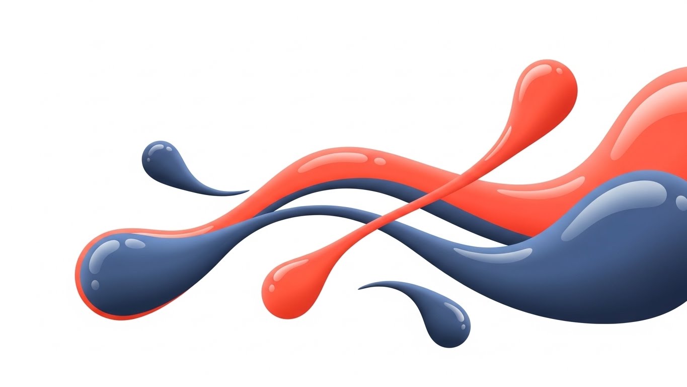
The Visual & Narrative Approach
This style visualizes the concept of a "Talent Network" through a mesmerizing liquid metaphor. We see individual droplets—representing candidates or skills—drifting in a clean white space. Slowly, efficiently, they morph and merge into a cohesive, powerful stream of Vivid Coral and Slate Blue. The movement is elastic and smooth, suggesting that talent acquisition shouldn't be rigid or forced, but rather a natural convergence of potential.
Psychological Impact & KPI Focus
For an audience overwhelmed by the fragmentation of the gig economy and remote work, this "organic connection" alleviates anxiety about disconnected teams. It targets the psychological need for unity and flow.
- Niche Psychology: Alleviates the fear of "fragmented data" and disjointed tools.
- Operational Impact: Visualizes Talent Pool Health and Candidate Engagement, suggesting a system that naturally nurtures relationships rather than just processing applications.
Strategic Implementation & Trade-offs
- Best Use Case: High-level brand videos explaining your platform's philosophy or "ecosystem" approach.
- Duration: 15-30 seconds (Short, impactful loops).
- Trade-off: While visually soothing, it lacks technical detail. It creates an emotional connection but doesn't explain how the merging happens technically. It is a "Why" style, not a "How" style.
Companies using similar video content -
Remote – Global HR Solutions – Unifying global HR, payroll, and compliance for distributed teams.
Deel – Global HR & Payroll – Seamless global hiring, onboarding, and compliance for remote teams.
Rippling – Workforce Management – Integrating HR, IT, and finance for a unified employee experience.
2. Synthesizing Data Chaos
TOFU | Market Education
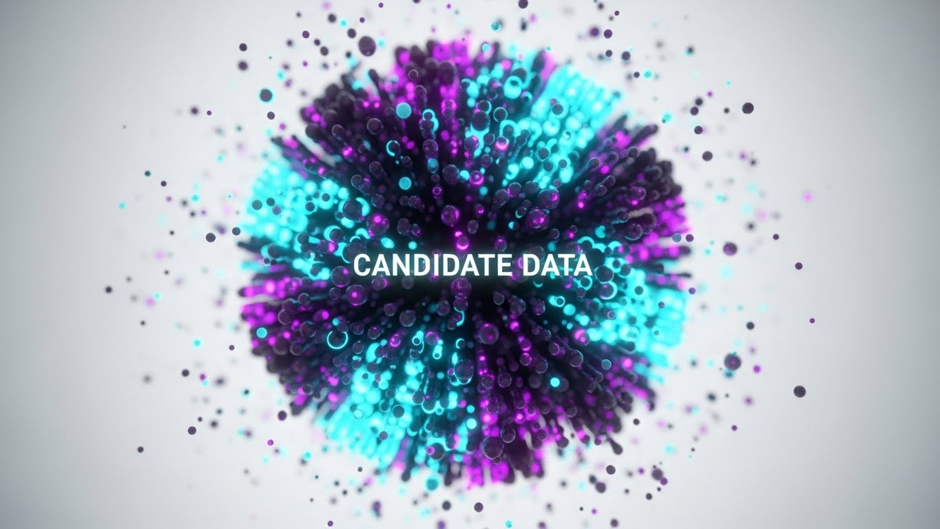
The Visual & Narrative Approach
Here, we visualize the "Brain" of your software. In a sterile, high-tech laboratory void, thousands of chaotic particles (Neon Cyan and Deep Purple) swarm aggressively. Suddenly, an invisible force—your AI algorithm—pulls them into a perfectly organized, rotating sphere. The focus is sharp, high-end, and precise, reminiscent of scientific simulations. It visually demonstrates the transition from "Data Chaos" to "Candidate Intelligence."
Psychological Impact & KPI Focus
This appeals to the "Scientific" side of the HR persona—the leader who needs to trust the algorithm. It directly addresses the fear of Data Overload. By showing order emerging from chaos, it promises Cognitive Relief.
- Niche Psychology: Counters the "Black Box" anxiety of AI by showing a clear transformation from chaos to order.
- Operational Impact: The visual suggests sophistication and predictive power, directly linking to KPIs like Quality of Hire and Predictive Analytics Accuracy.
Strategic Implementation & Trade-offs
- Best Use Case: LinkedIn feeds where "scroll-stopping" high-tech visuals perform well to announce new AI features.
- Duration: 10-15 seconds (Vertical or 4:5 aspect ratio).
- Trade-off: It can feel cold or impersonal if overused. It builds authority in technology but may distance the viewer from the "human" aspect of HR. Use it to sell the engine, not the culture.
Companies using similar video content -
Agentnoon – Workforce Planning – AI-powered insights for data-driven workforce and organizational design.
Phenom – AI Recruiting Platform – AI-driven fit scoring and candidate matching for faster hiring.
Quantum Workplace – HR Software – Expert-informed AI for engagement, performance, and development insights.
3. Accelerated Velocity
TOFU | Category Creation
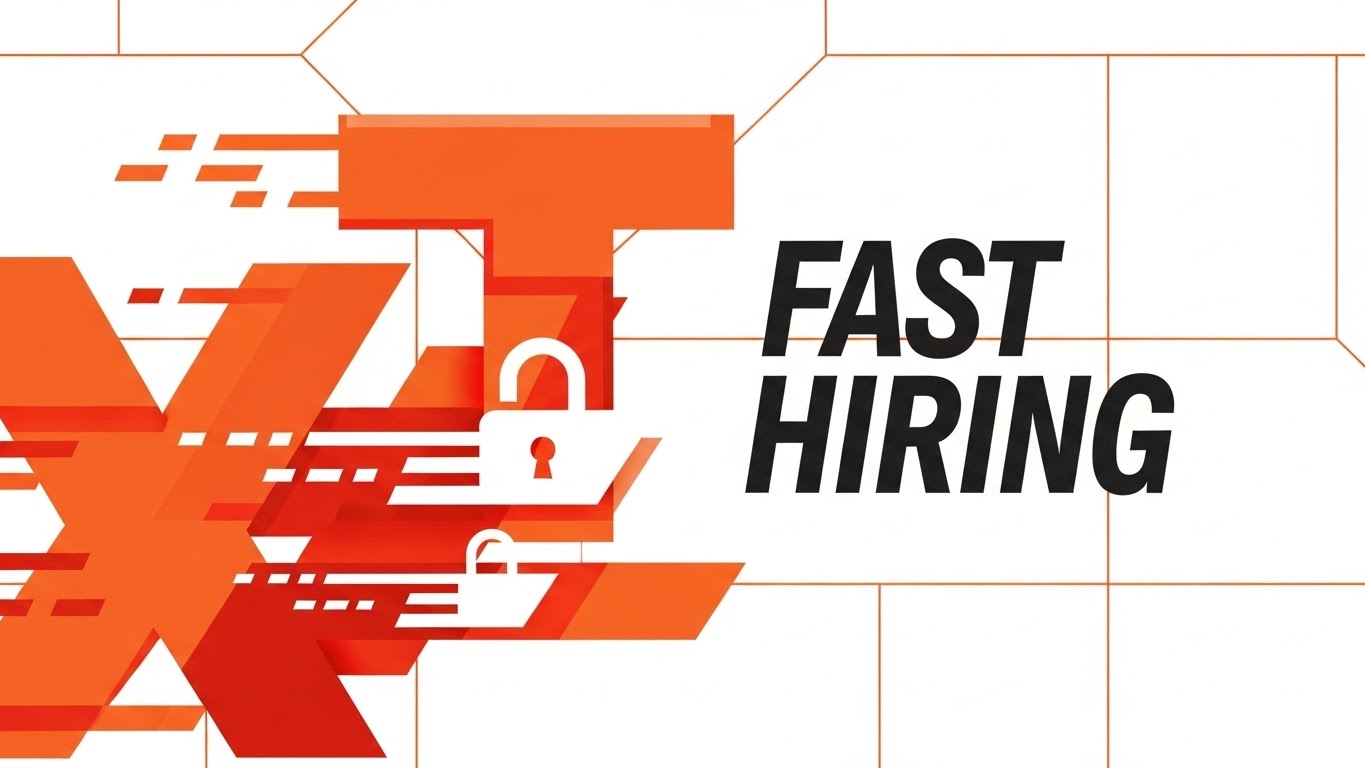
The Visual & Narrative Approach
This style creates a sense of undeniable urgency and impact. There are no characters, only heavy, geometric blocks of Bright Orange and Stark White that slam into place with the weight of physical objects. These shapes suggest letters or process blocks, sliding diagonally and locking together to form a solid structure. It visualizes "Fast Hiring" not as a rush, but as a precision assembly line where every piece fits instantly.
Psychological Impact & KPI Focus
The aggressive, fast-paced motion triggers a sense of Efficiency and Momentum. It appeals to leaders frustrated by slow "Time-to-Fill" metrics.
- Niche Psychology: Validates the user's need for speed and decisiveness.
- Operational Impact: The locking mechanism psychologically validates the concept of "Fit"—that the software ensures the right candidate locks into the right role immediately. It is a visual metaphor for Process Optimization.
Strategic Implementation & Trade-offs
- Best Use Case: YouTube bumper ads or intro sequences for thought leadership manifestos.
- Duration: 5-10 seconds (Punchy, energetic).
- Trade-off: It is very aggressive. It works for "Speed" messages but is ill-suited for topics requiring empathy, such as "Wellness" or "Inclusion."
Companies using similar video content -
JazzHR – Recruiting Software – Empowering small businesses to find and hire talent fast.
GoPerfect – AI Recruiting Platform – Streamlining the entire interview process for faster hiring.
Aptahire – Workforce Intelligence – AI-powered hiring for speed and intelligence in skill-intensive industries.
4. The Growth Spiral
TOFU | Thought Leadership
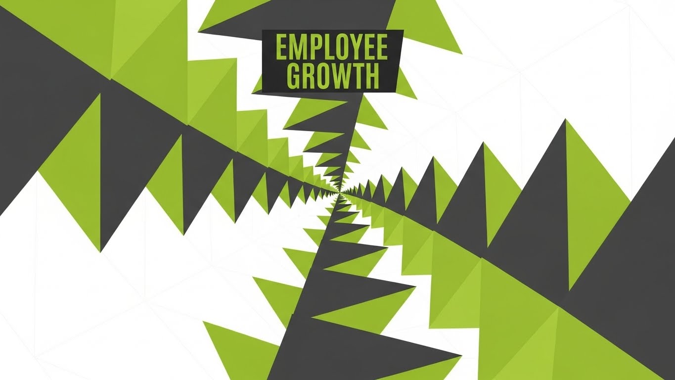
The Visual & Narrative Approach
Using a vivid Lime Green and Charcoal Gray palette, this style employs a kaleidoscope effect. Geometric patterns, specifically spiraling triangles, expand outward from a central point, creating an endless, upward-moving tunnel. This is a visual metaphor for "Employee Growth" and "Career Pathing"—it is not a ladder, but an expanding horizon of opportunities. The movement is rhythmic and hypnotic.
Psychological Impact & KPI Focus
This style reduces the Cognitive Load of explaining complex career hierarchies. Instead of a messy org chart, the viewer sees infinite potential. It targets the aspiration for Retention.
- Niche Psychology: Appeals to the aspiration of "Retention through Development." It combats the fear of stagnation.
- Operational Impact: The upward, expanding motion psychologically cues feelings of progress and optimism, essential for selling Learning & Development (L&D) modules.
Strategic Implementation & Trade-offs
- Best Use Case: Vertical social content (Instagram Reels/TikTok) and digital signage.
- Duration: 15-60 seconds (Loopable background content).
- Trade-off: It is highly abstract. Without clear text overlays or voiceover explaining the "Growth" concept, it risks being just "pretty shapes."
Companies using similar video content -
Leapsome – Performance & Engagement – Unifying goals, feedback, reviews, and learning for employee growth.
Oracle Talent Management Cloud – Talent Management – Managing the entire talent lifecycle with continuous learning.
iMocha – Skills Intelligence Cloud – Predicting skill gaps and recommending personalized upskilling plans.
5. The Human Connection
TOFU | Brand Perception

The Visual & Narrative Approach
We shift from the abstract to the hyper-real. A camera floats through a sun-drenched, glass-walled office. We see a diverse group of professionals—distinct individuals—laughing and collaborating. The lighting is "Golden Hour" (Teal and Gold palette), and the shallow depth of field (f/1.8) blurs the background distractions, focusing entirely on the human connection. This is the "Promise" of the software: a happy, thriving culture.
Psychological Impact & KPI Focus
This addresses the "Human" factor that abstract tech styles miss. It builds Trust and Social Proof. For a CPO, this visualizes the ultimate goal: high Employee Engagement.
- Niche Psychology: HR professionals entered the field to help people, not manage databases. This visual validates that core purpose.
- Operational Impact: Supports Employer Branding and Demand Gen, showing the result of good talent management rather than the mechanism of the software.
Strategic Implementation & Trade-offs
- Best Use Case: Social Ads (Facebook/LinkedIn) where human faces stop the scroll better than graphics.
- Duration: 15-30 seconds.
- Trade-off: High production value (or high-quality GenAI prompting) is required. Poor execution here lands in the "Uncanny Valley," which destroys trust immediately.
Companies using similar video content -
Workvivo – Employee Experience App – Fostering engagement and emotional connection through a social intranet.
HiBob – HRIS – Enabling transparency, engagement, and a people-first culture.
Culture Amp – Employee Engagement – Building high-performing cultures with actionable feedback and insights.
6. The Pipeline Blueprint
TOFU | Demand Gen
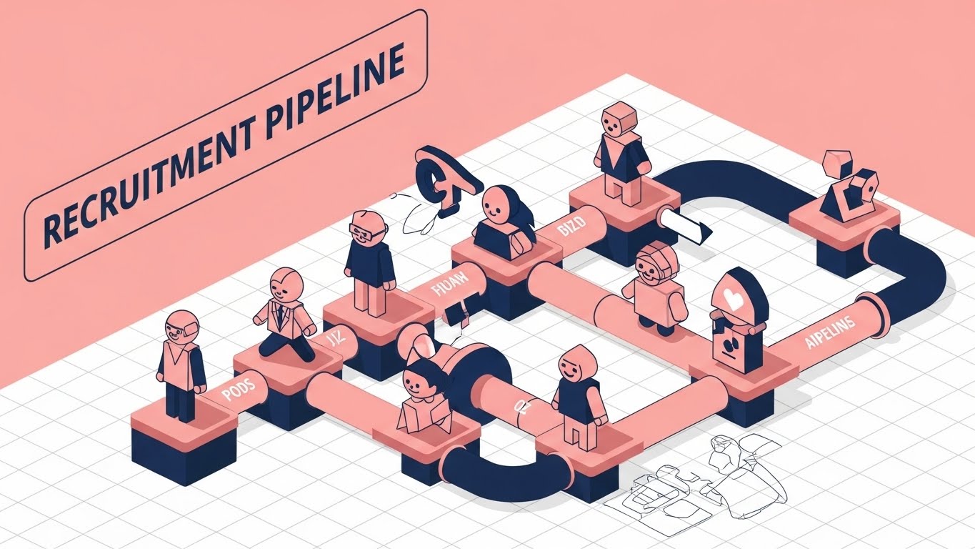
The Visual & Narrative Approach
This style brings us down to the tactical level. On a precise isometric grid, we see the "Recruitment Pipeline" visualized as a literal pipeline of interconnected tubes and platforms in Soft Pink and Navy Blue. Simplified geometric avatars slide effortlessly from "Application" to "Interview" to "Offer." The background is a technical blueprint, emphasizing that this is an engineered process, not a random one.
Psychological Impact & KPI Focus
This appeals to the "Operator"—the user who manages the daily workflow. It visualizes Order, Control, and Visibility. The shadowless, clean lines reduce complexity, making the recruitment process look manageable and linear.
- Niche Psychology: Calms the anxiety of "leaky pipelines." It visually demonstrates that nothing falls through the cracks.
- Operational Impact: It directly supports KPIs related to Pipeline Velocity and Process Compliance.
Strategic Implementation & Trade-offs
- Best Use Case: Website "Features" page or product explainer videos.
- Duration: 30-90 seconds.
- Trade-off: It can feel rigid. Real-world recruitment is rarely this linear. However, for a product explanation, this "Ideal State" visualization is powerful for clarity.
Companies using similar video content -
iCIMS Talent Cloud – Applicant Tracking System – End-to-end talent acquisition suite for sourcing and onboarding.
SmartRecruiters – Recruitment Platform – Modern ATS, CRM, and onboarding for dynamic hiring.
Greenhouse – ATS – Comprehensive applicant tracking and candidate experience management.
7. Friendly Automation
MOFU | Differentiation
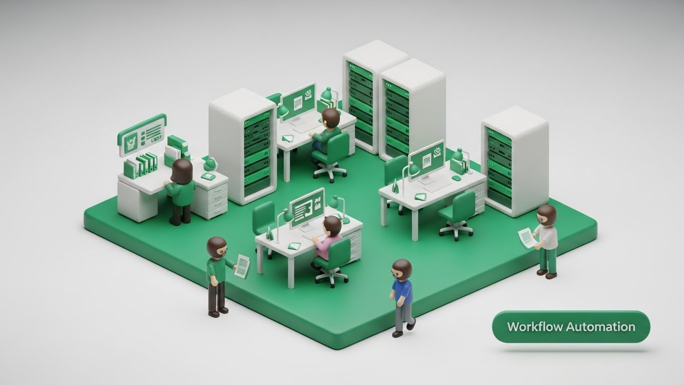
The Visual & Narrative Approach
Rendered in a trendy "Claymorphism" style (soft, matte, rounded), this scene depicts a miniature office workflow. Emerald Green and Pure White dominate. We see tiny, cute 3D avatars moving between server racks and desks. It looks like a high-end toy set. This visualizes "Workflow Automation" not as a scary robot taking jobs, but as a helpful, friendly background process.
Psychological Impact & KPI Focus
The soft edges and toy-like aesthetic lower the barrier to entry. It combats Technophobia. It says, "This software is easy to use; it's friendly."
- Niche Psychology: Addresses the fear of steep learning curves. It says, "This is easy to use."
- Operational Impact: It is particularly effective for SMBs or organizations transitioning from spreadsheets, as it visualizes User Adoption and Ease of Use.
Strategic Implementation & Trade-offs
- Best Use Case: Website landing pages or onboarding videos.
- Duration: 60-120 seconds.
- Trade-off: The "cute" factor might be too informal for enterprise-grade security solutions. It works best for "Ease of Use" narratives, not "Military-Grade Compliance" narratives.
Companies using similar video content -
Zoho People – HR Software – Simple and flexible HR platform for employee management and workflows.
BambooHR – HR Software – Intuitive HR platform for hiring, onboarding, and performance management.
TalentHR – HR Software – Built for small teams, offering intuitive HR, onboarding, and performance.
8. Transparent Value
MOFU | Feature Education
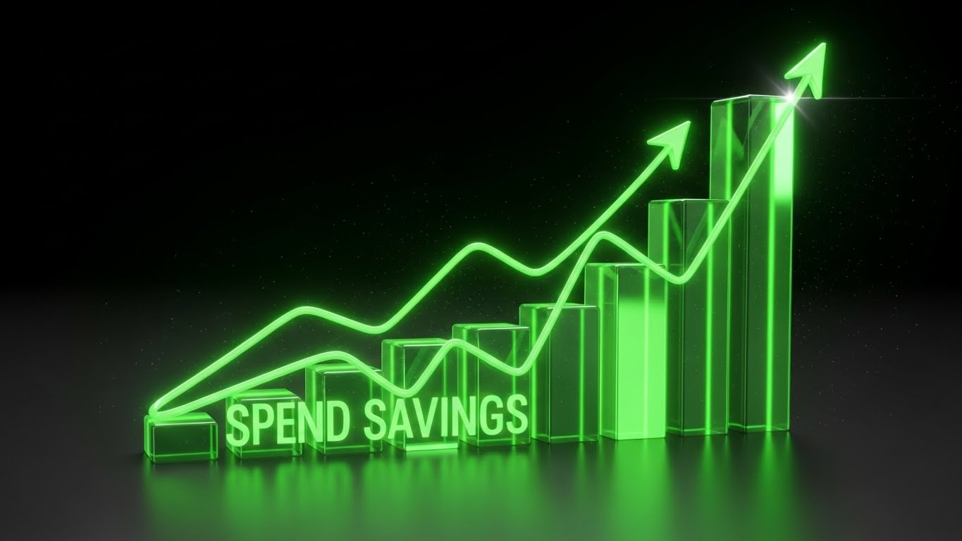
The Visual & Narrative Approach
This is the "Money Shot." Using 3D Glassmorphism, translucent angled bars rise sharply from a frosted glass base, glowing in Violet and Bright Yellow. The light refracts through the bars, making the data look precious and tangible. This visualizes "ROI" and "Performance Metrics." It’s not just a chart; it’s a gleaming trophy of success.
Psychological Impact & KPI Focus
This targets the C-Suite Decision Maker. It validates the investment by making the results (Data) look expensive and valuable. The transparency of the glass metaphorically suggests Organizational Transparency.
- Niche Psychology: Addresses skepticism regarding financial returns. It moves the conversation from "HR sentiment" to "Business Logic."
- Operational Impact: It supports the narrative of ROI, Revenue per Employee, and Strategic Impact.
Strategic Implementation & Trade-offs
- Best Use Case: Pitch decks, investor presentations, or "Results" sections of case studies.
- Duration: Static imagery or short 5-second loops.
- Trade-off: It is purely analytical. It lacks human emotion. It must be paired with a narrative about what that growth means for the company (e.g., "Growth means we can hire more.").
Companies using similar video content -
Visier – Workforce Analytics – Providing data-driven insights for strategic workforce planning.
Anaplan – Planning Analytics – Excelling in scenario planning and real-time resource management.
Workday HCM – Human Capital Management – Delivering AI-driven insights for finance and HR.
9. Blueprint to Reality
MOFU | ROI Justification
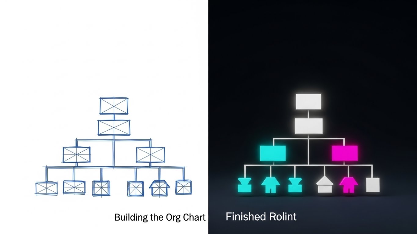
The Visual & Narrative Approach
A vertical split-screen effect. The left side shows a technical, blue-line wireframe blueprint of an organizational chart structure on white. The right side reveals the "Finished Render" in full color (Cyan, Magenta, White) with realistic lighting and solidity. Visualizes the concept of "Building the Org Chart." The transition line is sharp, highlighting the contrast between planning and reality.
Psychological Impact & KPI Focus
This visualizes Transformation and Implementation. It reassures the buyer that the software can bridge the gap between "Strategy" (the wireframe) and "Operational Reality" (the render).
- Niche Psychology: Creates a powerful "Before vs. After" hook, validating the software as the catalyst for transformation.
- Operational Impact: It is powerful for displacing competitors by showing that your tool makes the complex planning phase simple and the result beautiful. It supports Workforce Planning and Organizational Design KPIs.
Strategic Implementation & Trade-offs
- Best Use Case: LinkedIn carousel ads or comparison videos ("Old Way" vs. "New Way").
- Duration: 10-20 seconds.
- Trade-off: Requires precise timing in the animation to ensure the transition feels magical, not jarring. The contrast between the two states must be stark to be effective.
Companies using similar video content -
Agentnoon – Workforce Planning – Data-driven platform for organizational design and headcount modeling.
ChartHop – Organizational Design – Visual canvas for workforce planning and organizational structure.
Workday HCM – Human Capital Management – Adaptable platform for workforce planning and organizational design.
11. The Feature Velocity**
MOFU | Demo Requests
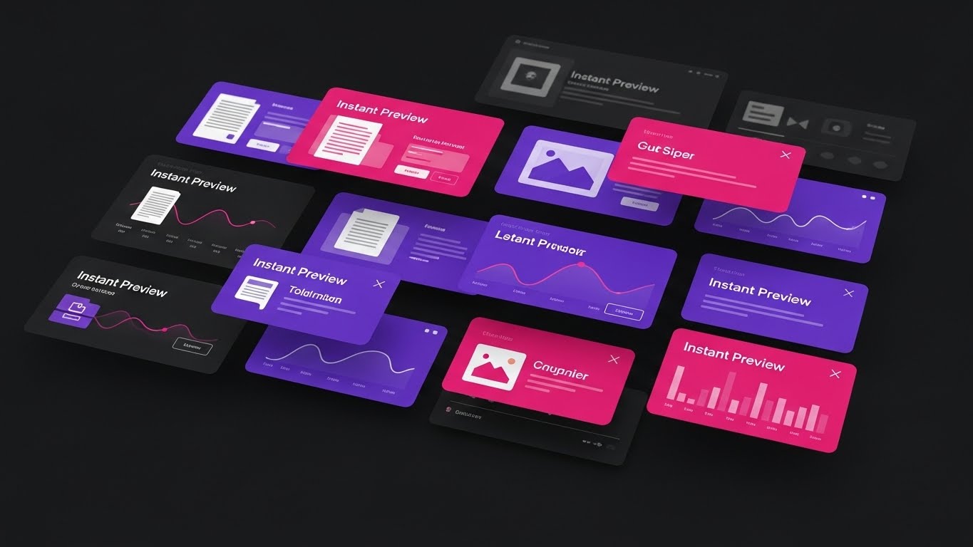
The Visual & Narrative Approach
This style abandons the static screenshot for a dynamic, high-velocity montage. Set against a deep, sophisticated void, we see a fleet of UI cards—Candidate Profiles, Search Bars, and Analytics Widgets—rendered in a vibrant "Dark Mode" palette of Neon Purple and Magenta. The panels float in 3D space with motion blur on the edges, implying they are zooming past the viewer. It creates a sensation of depth and infinite capacity, suggesting that the platform is not just a tool, but a vast, accessible library of features.
Psychological Impact & KPI Focus
The speed and density of the visuals trigger a feeling of Abundance and Power. It satisfies the "Power User" persona who fears limited functionality or slow load times.
- Niche Psychology: Combats the "Feature FOMO" (Fear Of Missing Out). It visually reassures the buyer that the suite is comprehensive and rapid.
- Operational Impact: Visualizes Platform Depth and User Efficiency, implying that users can access any tool instantly without administrative drag.
Strategic Implementation & Trade-offs
- Best Use Case: Email marketing campaigns or retargeting ads where you need to remind the user of the platform's breadth.
- Duration: 10-15 seconds (Fast-paced).
- Trade-off: It sacrifices readability for feeling. Users can't read the text on the cards, so it's not for training. It is designed for impression, not instruction.
Companies using similar video content -
Paycom – HR & Payroll Software – Employee-driven payroll automation for financial clarity.
Paylocity – HCM Software – Comprehensive product suite for payroll, HR, and benefits administration.
ADP Workforce Now – HCM Platform – Powerful payroll processing and benefits administration for manufacturers.
12. The Financial Line
MOFU | ROI Hook
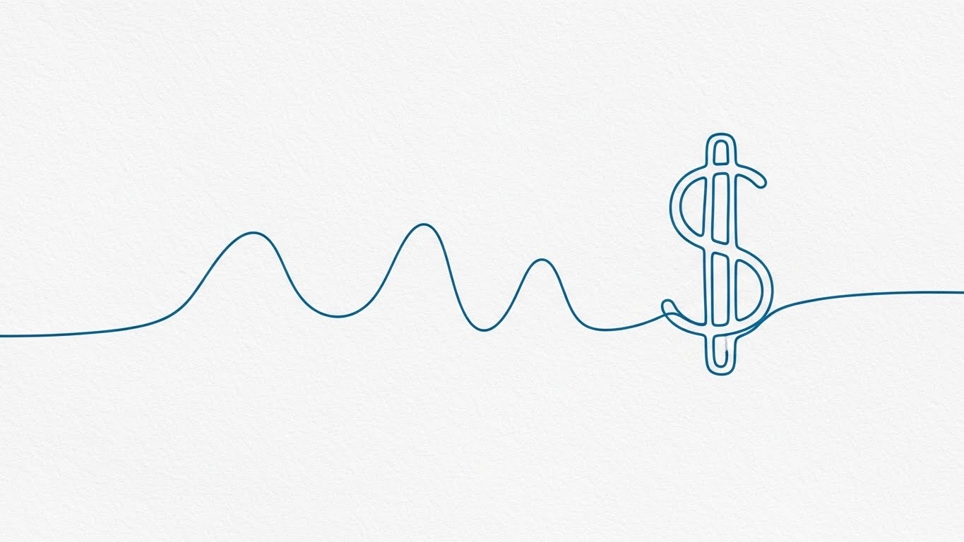
The Visual & Narrative Approach
Simplicity cuts through the noise. A single, elegant blue line draws itself across a textured paper background. It flows organically, forming abstract waves representing market volatility, before tightening into a precise, confident "Dollar Sign." This minimalist animation strips away the UI and the jargon to focus entirely on the bottom line: Value. The motion is fluid, suggesting that financial returns from talent management are a natural outcome of using the software.
Psychological Impact & KPI Focus
This appeals to the Economic Buyer (CFO/Finance). It translates "Soft HR Metrics" (like engagement) into "Hard Business Logic" (Money).
- Niche Psychology: Alleviates the fear that HR software is a cost center. It reframes the purchase as a profit generator.
- Operational Impact: Directly supports narratives around Cost of Vacancy, Retention Savings, and Total Cost of Ownership (TCO).
Strategic Implementation & Trade-offs
- Best Use Case: LinkedIn feeds or pitch deck slides dedicated to pricing and ROI.
- Duration: 5-10 seconds (Loopable).
- Trade-off: It is conceptual. If your ROI claim isn't backed by hard data in the accompanying text or voiceover, this style can feel empty.
Companies using similar video content -
UKG Pro – HCM Suite – Unified HR, payroll, and talent management for enterprise success.
SAP SuccessFactors – HCM Suite – Integrated HR solutions with modules for core HR, payroll, and talent.
Oracle HCM Cloud – Human Capital Management – Comprehensive solution with robust workforce planning and analytics.
13. Precision Calibration
BOFU | Building Trust

The Visual & Narrative Approach
We move to extreme photorealism to visualize "Precision." The camera focuses intimately on a machined brass and silver nozzle. A stream of clear liquid flows perfectly into a waiting receptacle, controlled by a high-tech LED ring indicator. In the context of Talent Management, this is a powerful metaphor for Compensation Management and Resource Allocation. It shows that your platform doesn't just "spray and pray"—it calibrates rewards, benefits, and development budgets with engineering-grade accuracy.
Psychological Impact & KPI Focus
This creates a sense of Trust and Reliability. The tactile quality of the metal and water suggests that the software is robust, not "vaporware."
- Niche Psychology: Addresses the anxiety of "Payroll Errors" or misallocated budgets. It signals Operational Excellence.
- Operational Impact: Visualizes Data Integrity and Compensation Accuracy, crucial for building trust with the Finance and Legal teams.
Strategic Implementation & Trade-offs
- Best Use Case: Website "Trust" or "Infrastructure" pages, and high-stakes BOFU presentations.
- Duration: 10-20 seconds.
- Trade-off: As a metaphor, it requires context. Without a voiceover explaining "Precision in Pay," the viewer might just see a nozzle. Connect the visual explicitly to accuracy.
Companies using similar video content -
Syndio – Pay Equity Platform – AI-driven pay recommendations for compensation accuracy.
Remote – Global HR Solutions – Ensuring compliant global payroll, tax, and HR management.
Papaya Global – Workforce Management – Unified platform for global payroll and workforce management.
14. The Compliance Core
BOFU | Risk Mitigation

The Visual & Narrative Approach
This style uses an "X-Ray" effect to look inside the "Black Box" of your algorithms. We see a translucent blue cube. Inside, complex white gears and mechanisms are visible, turning in perfect synchronization, guarded by a prominent lock icon labeled "INTERNAL COMPLIANCE ENGINES." This visualizes the invisible backend logic: the diversity filters, the GDPR safeguards, and the bias-prevention protocols.
Psychological Impact & KPI Focus
This targets the Chief Legal Officer or Risk Officer. It transforms "Compliance" from a boring checklist into a sophisticated, active defense system.
- Niche Psychology: Mitigates the fear of Legal Liability and Algorithmic Bias. It offers transparency as a feature.
- Operational Impact: Directly supports KPIs regarding Audit Readiness, DE&I Compliance, and Data Security.
Strategic Implementation & Trade-offs
- Best Use Case: Whitepapers, security documentation, and technical deep-dive videos.
- Duration: 15-30 seconds.
- Trade-off: It is highly technical. It may bore a creative recruiter, but it will fascinate a risk manager. Know your audience.
Companies using similar video content -
Checkr – Background Check Platform – AI-driven background screening and compliance processes.
HR Acuity – Employee Relations Software – Managing workplace issues consistently with built-in compliance.
RemotePass – Global HR & Payroll – Automatically collecting country-specific documentation for international compliance.
15. The Command Center
BOFU | Sales Acceleration
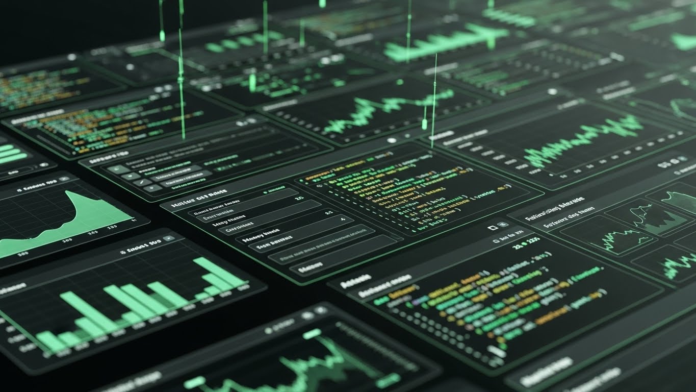
The Visual & Narrative Approach
Here, we showcase the interface in its most professional form: Dark Mode. The screen is densely packed with green line graphs, code syntax, and real-time analytics dashboards. The camera angles are sharp and tilted, emphasizing the depth of data. This isn't the view for the casual employee; this is the cockpit for the People Analytics Leader. It screams "Pro Tool."
Psychological Impact & KPI Focus
This appeals to the desire for Mastery and Insight. It validates the user's expertise, suggesting that the tool is powerful enough to handle their complex queries.
- Niche Psychology: Counters the fear of "Dumbed-down tools." It assures the analyst that they will have granular control.
- Operational Impact: Visualizes Workforce Analytics, Predictive Modeling, and Real-Time Reporting.
Strategic Implementation & Trade-offs
- Best Use Case: LinkedIn ads targeting "Head of People Analytics" or technical demos.
- Duration: 20-40 seconds.
- Trade-off: It can look overwhelming to a non-technical user. Avoid using this style for "Ease of Use" campaigns targeting general HR generalists.
Companies using similar video content -
Workday HCM – Human Capital Management – Leveraging Workday AI for insights and efficiency in HR.
Quantum Workplace – HR Software – Data-driven engagement suite for performance and culture insights.
Visier – Workforce Analytics – Providing predictive modeling and real-time reporting for HR leaders.
16. Visionary Implementation
BOFU | Implementation

The Visual & Narrative Approach
This style places your software directly into the environment where buying decisions happen: the Boardroom. We see a high-end wooden conference table. Above it, a futuristic hologram projects the "Implementation Roadmap" or "Succession Plan" as floating, iridescent nodes. It elevates the software from a "screen tool" to a "strategic centerpiece" present in the room with the executives.
Psychological Impact & KPI Focus
This visualizes Consensus and Strategy. It helps the champion visualize how they will present this to their leadership team.
- Niche Psychology: Appeals to the Status of the buyer. It frames the software purchase as a career-defining strategic move.
- Operational Impact: Supports the narrative of Seamless Implementation and Organizational Alignment.
Strategic Implementation & Trade-offs
- Best Use Case: Final stage presentation decks and "Vision" videos.
- Duration: 10-20 seconds.
- Trade-off: It is aspirational. It sells the feeling of being a strategic leader, rather than the specific features of the software.
Companies using similar video content -
Anaplan – Planning Analytics – Advanced analytics for strategic alignment and scenario planning.
IBM Planning Analytics – Workforce Planning – Comprehensive planning and advanced analytics for strategic goals.
PeopleFluent – Workforce Planning – Workforce modeling and predictive analytics for strategic objectives.
17. The Pulse of Hiring
BOFU | Economic Buyer
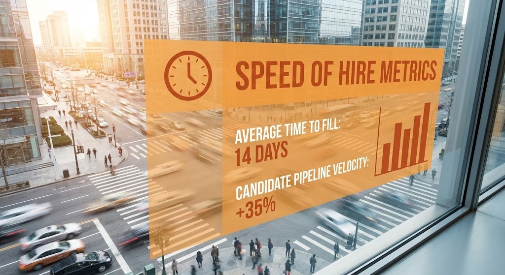
The Visual & Narrative Approach
We return to the real world to ground the data. A hyper-lapse of a busy city street (symbolizing the talent market) is overlaid with a sleek, orange glass interface. The data is specific and bold: "SPEED OF HIRE METRICS... AVERAGE TIME TO FILL: 14 DAYS... +35%." The juxtaposition of the chaotic, fast-moving world with the stable, sharp data overlay visualizes Control amidst Chaos.
Psychological Impact & KPI Focus
This provides Social Proof and Quantifiable Results. It tells the Economic Buyer that the software translates directly into speed and efficiency.
- Niche Psychology: Addresses the urgency of the market. "The world moves fast; our software keeps up."
- Operational Impact: Explicitly visualizes Time-to-Fill, Pipeline Velocity, and Recruitment Efficiency.
Strategic Implementation & Trade-offs
- Best Use Case: Social proof ads, case study headers, and performance marketing.
- Duration: 6-12 seconds (Social Vertical 9:16).
- Trade-off: The stock footage must be high quality. Generic "people shaking hands" stock footage will kill the credibility. Use kinetic, environmental footage.
Companies using similar video content -
Jobvite – Talent Acquisition Suite – Speeding up hiring from search to onboarding.
JazzHR – Recruiting Software – Empowering companies to find and hire talent fast.
GoHire – Hiring Software – User-friendly interface and robust features for efficient recruitment.
18. The Cloud Ecosystem
BOFU | Technical Buyer

The Visual & Narrative Approach
To visualize the "Cloud" nature of modern talent management, we use a Low-Poly aesthetic. Floating islands composed of geometric purple and teal facets drift in a white sky, connected by invisible data bridges. This represents the Distributed Workforce (Remote, Hybrid, Global). It makes the complex infrastructure look clean, modern, and mathematically precise.
Psychological Impact & KPI Focus
This appeals to the IT Director or CTO. It creates an impression of a lightweight, modern, and scalable architecture.
- Niche Psychology: Alleviates the fear of "Bloatware" or heavy, legacy on-premise systems. It screams "Modern Tech Stack."
- Operational Impact: Visualizes Scalability, Global Reach, and Cloud Integration.
Strategic Implementation & Trade-offs
- Best Use Case: IT-focused blog posts, "Architecture" pages, or integration documentation.
- Duration: 15-30 seconds.
- Trade-off: It is abstract. It explains where the data lives, but not what the user does. It is an infrastructure visualization, not a workflow visualization.
Companies using similar video content -
Remote – Global HR Solutions – Modern, web-based interface for global distributed teams.
Deel – Global HR & Payroll – Cloud-based solutions for seamless global hiring and compliance.
Rippling – Workforce Management – Unified cloud platform for HR, IT, and finance.
19. The Pristine Welcome
Onboarding | Time-to-Value
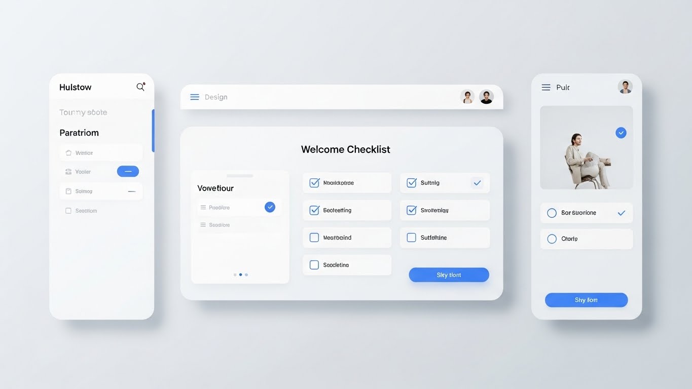
The Visual & Narrative Approach
The sale is closed; now retention begins. This style uses a high-key, "Pure White" aesthetic to visualize the Onboarding Experience. We see a pristine "Welcome Checklist" on a mobile and desktop screen, with satisfying blue ticks appearing as tasks are completed. Soft drop shadows add depth. The lighting is even and studio-quality, evoking feelings of freshness, clarity, and new beginnings.
Psychological Impact & KPI Focus
This targets the Employee Experience. It combats "New Hire Anxiety." It promises that the first day will be organized, not chaotic.
- Niche Psychology: "First impressions matter." This validates the buyer's desire to provide a world-class welcome to new talent.
- Operational Impact: Visualizes Time-to-Productivity and New Hire Engagement.
Strategic Implementation & Trade-offs
- Best Use Case: "Welcome" emails, Onboarding module trailers, and Customer Success/Training videos.
- Duration: 30-60 seconds.
- Trade-off: It must look exactly like the UI. If the actual product is cluttered, this "clean" version will create a gap in expectations.
Companies using similar video content -
BambooHR – HR Software – Streamlining onboarding and employee data management.
Zoho People – HR Software – Building onboarding workflows and tracking new joiner progress.
TalentHR – HR Software – Attracting and onboarding top talent with a welcoming careers page.
20. Self-Serve Empathy
Onboarding | Self-Serve
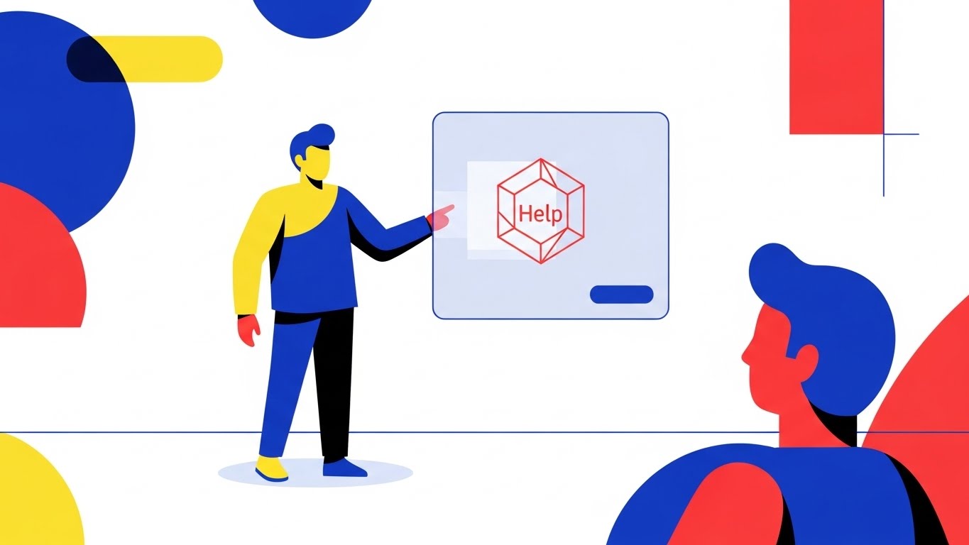
The Visual & Narrative Approach
Finally, we humanize the support process. Using Primary Colors (Red, Blue, Yellow) and flat 2D vector characters, we see an employee interacting with a floating "Help" hexagon. The style is playful and approachable. It visualizes HR Service Delivery not as a ticket in a queue, but as a friendly, self-serve interaction.
Psychological Impact & KPI Focus
This reduces the stigma of asking for help. It makes the HR portal feel accessible rather than bureaucratic.
- Niche Psychology: Addresses the "Admin Burden" on HR teams. By showing employees helping themselves, it promises time savings for the HR staff.
- Operational Impact: Visualizes Ticket Deflection, Employee Satisfaction (eNPS), and Service Level Agreement (SLA) Adherence.
Strategic Implementation & Trade-offs
- Best Use Case: Internal launch videos, "How-to" guides, and Employee Handbooks.
- Duration: 45-90 seconds.
- Trade-off: It leans "internal." It is great for end-users (employees) but might feel too "cartoonish" for a C-Suite purchase decision. Use it for adoption, not acquisition.
Companies using similar video content -
Workleap – Employee Experience – Simple, flexible solution to align engagement, performance, and growth.
Officevibe – Employee Feedback – Tools for employee feedback and engagement with pulse surveys.
Nectar – Employee Recognition – User-friendly platform for recognition and rewards.
21. The "Aha" Moment
Onboarding | Activation

The Visual & Narrative Approach
Transitioning into the critical "Activation" phase, this style uses a stylized 2D character illustration to capture the emotional breakthrough of mastering the software. We see a professional woman, rendered in warm Earth Tones and clean lines, pumping her fist in a moment of genuine triumph. A simple desk plant anchors the scene. There are no complex gradients; the aesthetic is flat, modern, and cheerful. It visualizes the "Aha! Moment"—that split second when a user realizes the tool actually works for them.
Psychological Impact & KPI Focus
This targets the End-User Employee. It validates their competence and frames the software as a source of personal victory, not administrative drudgery.
- Niche Psychology: Alleviates "New Tool Frustration." It creates a mirror neuron effect where the viewer feels the character's success.
- Operational Impact: Visualizes User Activation Rate and First-Time Success, encouraging users to push through the initial learning curve to reach the reward.
Strategic Implementation & Trade-offs
- Best Use Case: "Congratulations" emails after completing the first profile setup or onboarding module.
- Duration: Static Image or short GIF (3-5 seconds).
- Trade-off: It is lighthearted. It works best for celebrating small wins (profile completion) rather than serious compliance tasks.
Companies using similar video content -
Engagedly – Talent Management Platform – AI-powered performance management and employee learning.
15Five – Performance Management – Strategic platform driving action and impact through check-ins.
Betterworks – Performance Management – Integrating performance, engagement, and learning tools.
22. The Knowledge Unravel
Onboarding | Knowledge Base
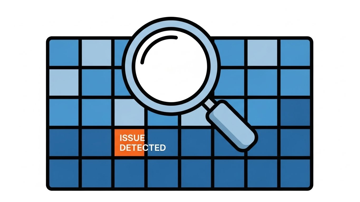
The Visual & Narrative Approach
When a user is stuck, they don't want decoration; they want clarity. This style utilizes a stark, minimalist 2D vector approach in Black, White, and Electric Blue. A large, tangled "Question Mark" visually unravels into a perfectly straight line. Negative space dominates the composition. It is the visual equivalent of a deep breath—calm, ordered, and resolved. It represents the transformation of "Confusion" into "Answer."
Psychological Impact & KPI Focus
This appeals to the Frustrated User seeking support. It promises that the Knowledge Base is efficient and decluttered.
- Niche Psychology: Reduces Cognitive Friction. It signals, "We respect your time; here is the answer, plain and simple."
- Operational Impact: Directly supports Ticket Deflection and Self-Service Usage Rates by making help content look approachable and easy to digest.
Strategic Implementation & Trade-offs
- Best Use Case: Help Center thumbnails, FAQ headers, and "Tip of the Day" in-app pop-ups.
- Duration: Static vector or subtle 2-second animation.
- Trade-off: It is too simple for complex troubleshooting. Use it to categorize topics, not to explain detailed technical workflows.
Companies using similar video content -
Workleap – Employee Experience – Simple, flexible solution for engagement and performance.
Officevibe – Employee Feedback – Intuitive tool for employee feedback and engagement.
TINYpulse – Feedback Platform – Capturing quick insights into employee sentiment and well-being.
23. The Hybrid Harmony
Retention | Support Overhead
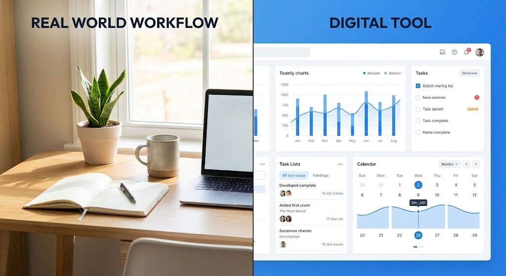
The Visual & Narrative Approach
This style bridges the gap between the physical office and the digital dashboard. A split-screen composition divides the frame vertically. The left side features a high-quality photograph of a tidy, sunlit workspace with natural daylight. The right side mirrors this tranquility with a crisp, organized UI dashboard in UI Blue. The dividing line is thin and clean. It visualizes the harmony between "Real World Work" and "Digital Management," suggesting they are perfectly synced.
Psychological Impact & KPI Focus
This targets the HR Practitioner who fears that software adds a layer of separation from their real work. It reassures them that the tool integrates seamlessly into their daily life.
- Niche Psychology: Combats "Screen Fatigue." It visually links the digital task to the physical environment, grounding the software in reality.
- Operational Impact: Supports Workflow Integration and Daily Active Users (DAU) by framing the software as a natural extension of the desk.
Strategic Implementation & Trade-offs
- Best Use Case: Retention emails, newsletter headers, and "Pro Tips" video covers.
- Duration: Static or slow-motion video.
- Trade-off: Requires high-quality matching of lighting between the stock photo and the UI render to feel cohesive.
Companies using similar video content -
Rippling – Workforce Management – Unified solution integrating HR and IT functions seamlessly.
Workday HCM – Human Capital Management – Adaptable and flexible for global, distributed workforces.
Oracle HCM Cloud – Human Capital Management – Comprehensive solution with robust integration capabilities.
24. The Human Concierge
Retention | Reducing Churn

The Visual & Narrative Approach
To humanize the "Customer Success" experience, we use a photorealistic character (generated via advanced AI or filmed). A Customer Success Manager (male, 30s) in a Navy blazer smiles warmly directly at the camera. The background is a soft-focus modern office. This isn't a stock photo model looking at a spreadsheet; it is a direct eye-contact engagement. It visualizes "Support" not as a helpdesk ticket, but as a person ready to help.
Psychological Impact & KPI Focus
This builds Emotional Loyalty. It targets the user who feels isolated by technology. It says, "There are humans behind this platform."
- Niche Psychology: Mitigates the feeling of being "just a number." It mimics the reassurance of a face-to-face meeting.
- Operational Impact: Powerful for Churn Reduction and Net Promoter Score (NPS). It puts a face to the brand promise.
Strategic Implementation & Trade-offs
- Best Use Case: Personalized "Check-in" videos from account managers or "What's New" update intros.
- Duration: 15-60 seconds.
- Trade-off: Authenticity is key. If the voiceover is robotic or the lip-sync is off, it falls into the "Uncanny Valley."
Companies using similar video content -
RemotePass – Global HR & Payroll – Ask AI for instant workforce answers and visual insights.
Moveworks – AI-powered Support – Empowering employees with 24/7 multilingual AI assistance.
Phenom – AI Recruiting Platform – Enhancing employee experience through AI-powered interactions.
25. The Success Montage
Retention | Re-engagement

The Visual & Narrative Approach
Sometimes, you need to sell the feeling of success. This style uses an aspirational photo montage bathed in "Golden Hour" sunlight. We see a diverse team on a rooftop terrace, laughing and pointing at a tablet. It is vibrant, high-resolution, and full of energy. It visualizes the ultimate outcome of good talent management: a thriving, happy, connected culture.
Psychological Impact & KPI Focus
This targets the Team Leader or Department Head. It reminds them of the "Why"—they use the software to build great teams.
- Niche Psychology: Taps into the aspiration for status and belonging. It frames the software user as a leader of a winning team.
- Operational Impact: Supports Re-engagement campaigns. When users drift away, this visual reminds them of the positive culture the software helps build.
Strategic Implementation & Trade-offs
- Best Use Case: Social media "Culture" posts, login screens, and quarterly business review (QBR) covers.
- Duration: Static or subtle zoom slideshow.
- Trade-off: It is generic. It builds brand affinity but explains zero features. It must be paired with specific copy.
Companies using similar video content -
Culture Amp – Employee Engagement – Building high-performing cultures with actionable feedback.
Workvivo – Employee Experience App – Fostering engagement and emotional connection within company culture.
Motivosity – Rewards & Recognition – Strengthening workplace culture through peer-to-peer recognition.
26. The Layered History
Retention | Proactive Support
The Visual & Narrative Approach
To visualize the constant evolution of your platform, we use a 3D parallax effect. Layers of the UI—dashboards, maps, and logs—are separated in Z-space, floating above one another in Deep Indigo and Hot Pink. The camera angles from the side, revealing the gap between the layers. This visualizes an "Update Log" or "Version History" not as a flat list of text, but as a deepening stack of value.
Psychological Impact & KPI Focus
This appeals to the Technical Administrator. It visually demonstrates that the platform is deep, robust, and constantly improving.
- Niche Psychology: Counters the fear of "Stagnant Software." It proves the vendor is active and investing in the product.
- Operational Impact: Visualizes Product Velocity and Feature Adoption, encouraging users to explore the "layers" they haven't touched yet.
Strategic Implementation & Trade-offs
- Best Use Case: "Product Update" videos, release notes, and webinar backdrops.
- Duration: 10-20 seconds.
- Trade-off: It is abstract. Users can't read the details on the back layers. It is about the impression of depth, not the readability of every screen.
Companies using similar video content -
SAP SuccessFactors – HCM Suite – Integrated suite of HR solutions with continuous evolution.
UKG Pro – HCM Suite – Unified HR, payroll, and talent management with deep functionality.
Oracle HCM Cloud – Human Capital Management – Comprehensive solution with robust tools and updates.
27. The Premium Unlock
Expansion | Upsell
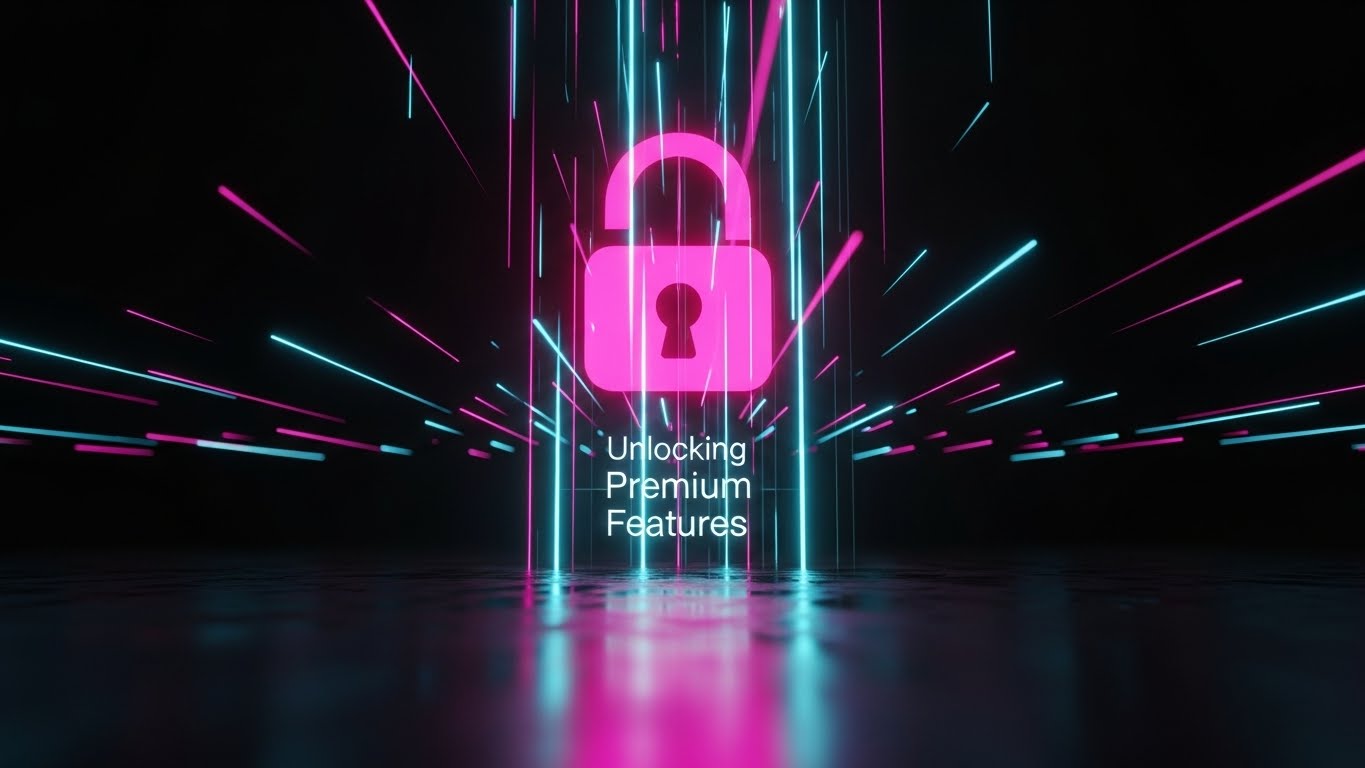
The Visual & Narrative Approach
When asking a customer to pay more, the visual must look expensive. This style utilizes a futuristic Dark Mode aesthetic with Cyberpunk Pink and Blue neon accents. We look up at a towering, holographic lock symbol that is just clicking open. The surface below is reflective and wet, doubling the neon glow. It visualizes "Unlocking Premium Features" as accessing a VIP area.
Psychological Impact & KPI Focus
This targets the Ambitions of the buyer. It frames the upsell not as a cost, but as an exclusive advantage they are unlocking.
- Niche Psychology: Triggers FOMO (Fear Of Missing Out) and the desire for Exclusivity. It makes the "Pro" tier look desirable, not just functional.
- Operational Impact: Directly supports Expansion Revenue and Upsell Conversion Rates.
Strategic Implementation & Trade-offs
- Best Use Case: In-app paywalls, email campaigns for "Enterprise" tiers, and end-of-trial notifications.
- Duration: 5-10 seconds.
- Trade-off: It is aggressive. Use it only for significant value upgrades. Using this drama for a minor feature update feels manipulative.
Companies using similar video content -
Workday HCM – Human Capital Management – Enterprise-grade solution for complex organizational needs.
SAP SuccessFactors – HCM Suite – Powerful enterprise-grade HR suite for global organizations.
Oracle HCM Cloud – Human Capital Management – Comprehensive solution for large enterprises with advanced features.
28. The Social Ripples
Expansion | Advocacy
The Visual & Narrative Approach
This style visualizes the concept of "Advocacy." We see an over-the-shoulder lifestyle shot of a person in a cozy, Muted Beige coffee shop. They hold a smartphone displaying a crisp, abstract UI graphic indicating "Referral Success." The focus is sharp on the phone, blurring the background. It integrates the software into the user's personal, social world.
Psychological Impact & KPI Focus
This targets the Happy User. It validates that sharing the software is a natural, social behavior.
- Niche Psychology: Lowers the social risk of referral. It makes the act of referring look casual and rewarding, not salesy.
- Operational Impact: Supports Referral Program Participation and Viral Coefficient.
Strategic Implementation & Trade-offs
- Best Use Case: Social media ads, "Refer a Friend" landing pages, and mobile app pop-ups.
- Duration: Static or cinemagraph.
- Trade-off: The screen replacement must be perfect. If the UI looks pasted on, it destroys the "reality" of the social proof.
Companies using similar video content -
Boon – Candidate Referrals – AI-driven platform for enhancing employee referral programs.
Teamtailor – Recruitment Platform – Integrating with social media for sourcing and hiring.
Workable – Recruiting Software – Streamlining hiring with social recruiting capabilities.
29. The Tactile Upgrade
Expansion | In-App Upsell

The Visual & Narrative Approach
This is an extreme macro close-up of a single UI button element. The button, colored Electric Lime against a clean White texture, appears to be depressed slightly, capturing the exact nanosecond of interaction. We see the sub-pixel texture of the screen. It visualizes the "Upgrade" action as a physical, satisfying event.
Psychological Impact & KPI Focus
This appeals to the sensory desire for Quality. It suggests that the software is built with incredible attention to detail.
- Niche Psychology: "God is in the details." It builds subconscious trust in the engineering quality of the platform.
- Operational Impact: Increases Click-Through Rate (CTR) on CTA buttons. It makes the button look begging to be clicked.
Strategic Implementation & Trade-offs
- Best Use Case: Final "Purchase" screens, feature highlight reels, and high-converting landing pages.
- Duration: 2-5 seconds.
- Trade-off: It is hyper-specific. It focuses entirely on the action of clicking, not the result. It must be paired with text explaining what happens next.
Companies using similar video content -
Lattice – People Management Platform – Intuitive design and user experience for engaged employees.
Workleap – Employee Experience – Simple, flexible solution with an intuitive user interface.
TalentHR – HR Software – User-friendly system for small teams, built for smooth operations.
30. The Reality Comparison
Expansion | Comparison
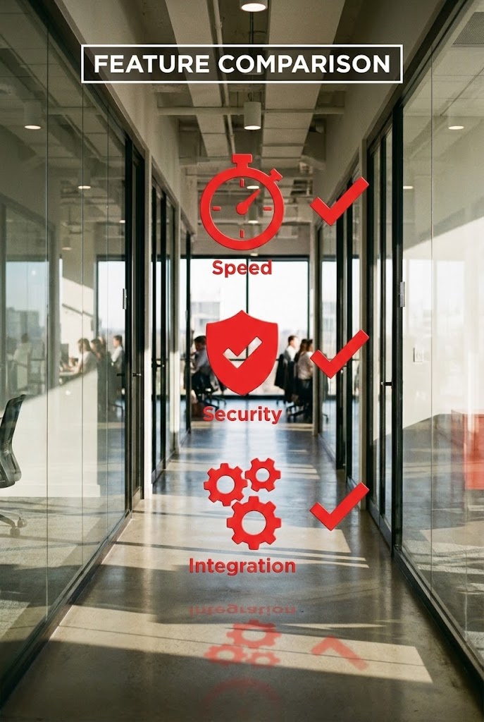
The Visual & Narrative Approach
To close the loop, we return to the office environment. A vertical shot of a real-world sunlit office hallway serves as the canvas. Floating in the air are 2D Vivid Red icons and checkmarks, integrated into the 3D space as if through Augmented Reality. They highlight "Speed," "Security," and "Integration." It visualizes the "Feature Comparison" by overlaying the software's benefits directly onto the physical workspace.
Psychological Impact & KPI Focus
This targets the Decision Maker comparing vendors. It forces them to visualize your benefits physically inhabiting their office.
- Niche Psychology: "Occupation of Space." It subtly claims the buyer's environment as your territory.
- Operational Impact: Supports Competitive Displacement and Win Rates. It makes the benefits feel immediate and present.
Strategic Implementation & Trade-offs
- Best Use Case: Comparison videos, "Why Us" social shorts (TikTok/Reels), and trade show booth loops.
- Duration: 10-20 seconds.
- Trade-off: Requires advanced tracking (match moving) to ensure the 2D icons stick to the 3D world realistically.
The Visual Operations Doctrine: A Strategic Knowledge Base
The 30 styles outlined above are not merely artistic choices; they are strategic instruments. To transform Talent Management from a "Support Function" into a "Business Driver," organizations must move beyond decorative graphics and embrace a Visual Operations Doctrine.
This framework synthesizes the visual strategies into three core operational segments, designed to guide the Advids expert team and HR leadership in deploying these assets for maximum impact.
Strategic Alignment & Visual Architecture
The "Pre-Production" Strategy: Defining the Visual Standard
Before a single pixel is rendered, the visual architecture must be aligned with the organizational design.
- The Cognitive Load Audit: Before creating training videos (Styles 19, 22), conduct an audit of current text-based manuals. If a process takes 500 words to explain, it qualifies for a "Style 7" (Friendly Automation) visualization.
- Role-Based Visual Mapping: Differentiate the visual diet. Recruiters (high-volume, transactional) require High-Velocity Kinetic Typography (Style 3) to maintain energy. C-Suite executives require Data Glassmorphism (Style 8) to see transparent ROI. One style does not fit all.
- The "Glanceability" Standard: For internal mobility and employee portals, apply the "Glanceability" test. Can an employee understand their career path (Style 4) in under 5 seconds? If not, the visual is decorative, not functional.
- Brand Voice Consistency: Talent Management suites often consist of disjointed modules (Recruiting, L&D, Payroll). Use a unified visual language—like the Organic Network (Style 1)—to visually stitch these disparate tools into a cohesive "Employee Lifecycle" narrative.
- The Advids Strategic Audit: We recommend partnering with a specialized agency (like Advids) early to define this "Visual Operating System." This ensures that assets created for Marketing (TOFU) share the same DNA as assets created for Training (Onboarding), reducing friction as the user moves down the funnel.
- Standardization vs. Customization: For core HR processes (Payroll), use standardized, clean UI styles (Style 19) to ensure clarity. For cultural initiatives (Wellness, DE&I), use custom, human-centric styles (Style 5) to evoke emotion.
- The Cross-Departmental Bridge: Use visuals to unify terminology. A "Pipeline Blueprint" (Style 6) video should be shared with Finance and Ops so that "Time-to-Fill" is visualized exactly the same way across the enterprise.
- Legacy System Integration: When replacing legacy on-premise systems, use Blueprint to Reality (Style 9) visuals to validate the transition. Show the "Old Way" fading into the "New Way" to visually displace the incumbent technology.
- Accessibility in Visuals: Talent Management is global. Ensure motion graphics (Style 4, 12) rely on iconography and visual metaphor rather than heavy text, ensuring the content is accessible to a multi-lingual, diverse workforce without costly re-versioning.
- The Mobile-First Mandate: 70% of candidate interactions happen on mobile. Styles 28 (Social Ripples) and 4 (Growth Spiral) must be optimized for vertical (9:16) consumption, acknowledging that the "Deskless Workforce" is a primary user base.
Operational Adoption & Implementation
The "Deployment" Phase: Embedding Visuals into the Workflow
A video that sits unwatched in a folder is a failed asset. Visuals must be injected into the flow of work.
- Overcoming "Big Brother" Anxiety: When deploying AI-driven monitoring or predictive analytics, use Transparent Compliance visuals (Style 14). Showing the "inside" of the algorithm builds trust and mitigates the fear of surveillance.
- The Micro-Learning Shift: Replace the "LMS Course" with the "Micro-Moment." Embed Style 19 (Pristine Welcome) videos directly into the software's tooltips. Learning should happen in the flow of work, not in a separate classroom.
- Just-in-Time Support: Integrate Minimalist Vector (Style 22) visuals into the helpdesk ticketing system. If a user types "Reset Password," the visual should auto-play, resolving the issue before the ticket is submitted.
- Gamification of Performance: Use Dynamic Data Visualization (Style 8) to display employee performance scorecards. Visualizing progress as "Leveling Up" rather than "Audit Logs" increases engagement and performance motivation.
- Reducing Support Ticket Volume: There is a direct correlation between the quality of Onboarding Visuals (Style 19) and the reduction of "Level 1" support tickets. Invest heavily in the "First 5 Minutes" visual experience.
- Remote Onboarding: For distributed teams, Gen AI Characters (Style 24) can serve as "Virtual Onboarding Buddies," providing a consistent, friendly face for new hires in Singapore, London, and New York simultaneously.
- Standard Operating Procedures (SOPs): Transform text-based SOPs into Isometric Workflow (Style 7) loops. A 10-second loop of a recruitment process is more memorable and less ambiguous than a 10-page PDF.
- Feedback Loops: Use interactive video elements (Style 29) to gather feedback. After a visual plays, a simple "Did this help?" micro-interaction measures the effectiveness of the asset in real-time.
- Scalable Localization: By separating text layers from the background animation (as seen in Style 4), global companies can swap languages in seconds, ensuring that the "Global Talent Pool" feels locally respected.
- Leadership Communication: When rolling out a new comp strategy, C-Suite leaders should use Holographic Boardroom styles (Style 16) to present the vision. High-fidelity visuals signal that the initiative is a strategic priority, not an administrative update.
Measuring Impact & Future-Proofing
The "ROI" Phase: Quantifying Visual Intelligence
Visuals are not just "content"; they are operational infrastructure. Their impact must be measured.
- Beyond "Views": Move beyond vanity metrics. Measure Time-to-Competency. Does the group exposed to the Precision Calibration video (Style 13) make fewer compensation errors than the group that read the manual?
- The "Idle Time" Metric: Correlate better visualization with reduced software navigation time. If Feature Velocity visuals (Style 11) are effective, users should navigate directly to features without "idle hovering."
- Compliance Velocity: Measure how fast new regulations (e.g., GDPR updates) are acknowledged. A Kinetic Typography alert (Style 3) often achieves 90% compliance faster than a text email.
- Retention and Churn: Track the correlation between High-Touch Onboarding Visuals (Style 5) and 90-day employee retention. The "First Impression" visual often dictates the long-term relationship.
- The AI Visual Frontier: Prepare for Generative UI. Future interfaces will generate Just-in-Time visuals (Style 2) based on the specific user query. Your static asset library must evolve into a dynamic prompt library.
- Scalability of Assets: Build a "Modular Visual Library." The Organic Network elements (Style 1) should be reusable for "Recruiting," "Succession," and "Alumni" videos, reducing the cost-per-asset over time.
- The Advids Partnership: Long-term value comes from asset evolution. As features change, your visuals must adapt. Advids acts as the custodian of this visual history, ensuring that a UI update doesn't render your entire video library obsolete.
- Benchmarking Success: Compare your "Visual Density" against competitors. If your competitor uses Real-Time Data Overlays (Style 17) and you use static screenshots, you are visually signalling "Legacy Tech" to the market.
- The ROI of Safety & Compliance: Quantify the reduction in legal risk. Compliance Core visuals (Style 14) that effectively teach anti-bias protocols can be directly linked to a reduction in compliance violations.
- Final Call to Innovation: Treat video as infrastructure. In the Talent Management War, the winner is not just the platform with the best algorithm, but the platform that makes that intelligence visible, accessible, and inspiring to the human behind the screen.
End of Part 3.
Companies using similar video content -
Dayforce – HCM Platform – Real-time data processing and integrated human capital management.
UKG Pro – HCM Suite – Outperforming competitors in healthcare HR with compliance engine.
ClearCompany – Talent Management – Combining ATS, onboarding, performance, and engagement in one system.
Author & Editor Bio


