
Introduction: Visualizing the Invisible Nervous System
Unified Communications (UC) has evolved from a convenience to the critical "nervous system" of the global enterprise. As the market races toward a projected USD 417.86 billion by 2030, the underlying infrastructure has become exponentially more complex. IT leaders are no longer just managing phones; they are orchestrating a hybrid symphony of SIP trunks, cloud licenses, and diverse endpoints.
However, a dangerous "Visibility Gap" persists. While the SaaS layer is user-friendly, the backend reality involves invisible friction—jitter, packet loss, and security vulnerabilities. A recent study found that 35% of businesses still lack a formal workplace collaboration security program, largely because these risks are invisible to non-technical decision-makers.
How do you sell the value of a "Jitter Buffer" to a CFO? How do you visualize the security of a "Session Border Controller"?
This guide presents a strategic framework for bridging the Physical/Digital divide through advanced visualization. By translating invisible data metrics into tangible visual narratives, you can reduce cognitive load, accelerate stakeholder buy-in, and position your platform not as a cost center, but as the guardian of enterprise connectivity.
1. The "Signal Stabilizer" (Abstract 2D Motion Graphics)
TOFU | Market Education
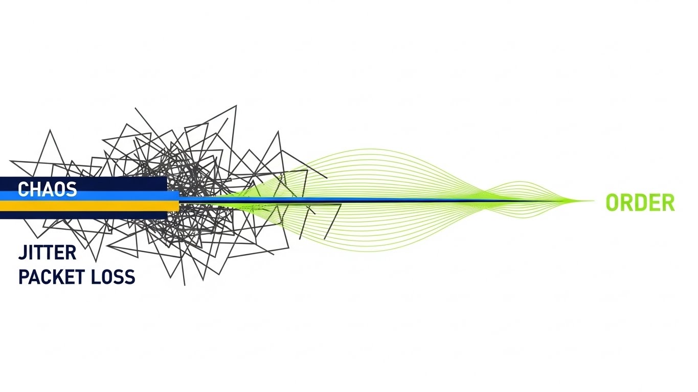
Visualization Scenario
This composition visualizes the core function of a UC management utility: creating order from chaos. The left side of the frame features jagged, erratic charcoal gray lines scrambling aggressively against a white background, visually simulating "Jitter" and "Packet Loss." As these lines flow to the right, they pass through a "Policy Engine" (a vertical transition point) and instantly smooth out into parallel, elegant neon lime green waves.
Psychological Impact & KPI Focus
- Niche Psychology: For the "Resilient Architect" (IT Persona), visual chaos induces stress. Resolving that chaos into mathematical perfection triggers a "relief" response. It visually proves the platform's ability to handle network volatility.
- Operational Impact: This style simplifies the complex algorithm of QoS (Quality of Service) into a binary state: Problem vs. Solution. It is highly effective for TOFU Market Education, explaining "Why do we need this tool?" without technical jargon.
Strategic Implementation
- Distribution: YouTube (Organic search for "VoIP troubleshooting").
- Duration: 15-20 Seconds.
- Trade-off: Ideal for high-level concepts, but too abstract for showing specific UI workflows.
Companies using similar video content -
Integrated Research – IR Collaborate – Optimizes UC networks, preventing performance issues with analytics.
Zenoss – SL1 Platform – Improves UC visibility, reducing complexity with AI-driven monitoring.
PathSolutions – TotalView – Delivers root-cause troubleshooting, recommending fixes for network problems.
2. The "Foundation Builder" (Bold Kinetic Typography)
TOFU | Brand Awareness

Visualization Scenario
In the absence of a UI, we use the weight of words. Massive, blocky geometric shapes—colored in Hot Pink, Deep Navy, and Stark White—slam into the center of the frame with a palpable, percussive "thud." These shapes lock together to form a solid, immovable foundation (e.g., the word "UPTIME"). The shadows are hard and distinct, creating a sense of physical heavy lifting. The movement is aggressive and synchronized to a high-tempo beat.
Psychological Impact & KPI Focus
- Niche Psychology: It leverages Motion Semantics to imply "Solidity." In a SaaS market often perceived as "light" or ephemeral, this style asserts that the platform is "Infrastructure-Grade"—a rock-solid foundation for the business.
- Operational Impact: Designed for Brand Awareness in a fast-scrolling feed (LinkedIn/Instagram). It stops the scroll by creating a "Visual Thud" that demands attention.
Strategic Implementation
- Distribution: Social Ads (Sound-off capable).
- Duration: 6-10 Seconds (Looping).
- Trade-off: High impact, low information density. Use for brand recall, not education.
Companies using similar video content -
Bandwidth – Provides a robust network for improving operations and expanding reach.
Telnyx – Offers enterprise-grade SIP trunking with private network and dynamic failover.
Oracle – Communications Session Border Controller – Secures and manages enterprise voice and video communications.
3. The "Trust Architect" (Gen AI Realistic Character)
TOFU | Brand Perception
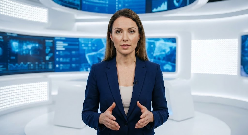
Visualization Scenario
A hyper-realistic, AI-generated female presenter stands in a pristine, high-tech white studio. She wears a sharp navy blazer, signaling authority and corporate alignment. The background features a subtle "Heads Up Display" (HUD) with blurred network metrics. She looks directly at the camera with a confident, empathetic expression, using open-palm gestures to explain the importance of "Unified Visibility" in a hybrid workforce.
Psychological Impact & KPI Focus
- Niche Psychology: IT buyers are skeptical of faceless software. This style uses the Halo Effect—we attribute competence to the software because the presenter appears competent and professional. It humanizes the brand.
- Operational Impact: Crucial for Brand Perception and trust-building, especially when discussing sensitive topics like Security or Compliance. It positions the vendor as a "Consultative Partner."
Strategic Implementation
- Distribution: LinkedIn Video / Website "Welcome" Section.
- Duration: 45-60 Seconds.
- Trade-off: The "Uncanny Valley" risk is high; the render must be flawless (8k texture, natural blinking) to maintain credibility.
Companies using similar video content -
ExtraHop – RevealX – Exposes cyber risk, building business resilience with network detection.
Nectar Services – UC Management Platform – Collects critical data, assisting in risk mitigation and change management.
VOSS Solutions – VOSS Insights – Automates UC management, providing comprehensive orchestration and analytics.
4. The "Global Connector" (Gen AI Cinematic Video)
TOFU | Skippable Pre-Roll

Visualization Scenario
To visualize "Global SIP Trunking," we take to the skies. A breathtaking aerial shot captures a modern city skyline at night. Streams of Neon Magenta and Cyber Blue light arc across the atmosphere, physically connecting skyscrapers to invisible points beyond the horizon. A "Dutch Angle" camera tilt adds dynamism and speed. The lighting is moody and volumetric, making the invisible data streams look like epic physical infrastructure.
Psychological Impact & KPI Focus
- Niche Psychology: This appeals to the "Empire Builder" aspiration of the CIO. It validates the scale of their operation. It reframes the UC utility from a "maintenance tool" to a "global power grid."
- Operational Impact: Visualizes Scalability and Global Reach. It answers the question, "Can this support my multi-national offices?" with a resounding "Yes" through visual scale.
Strategic Implementation
- Distribution: YouTube Pre-Roll Ads (Skippable).
- Duration: 15-30 Seconds.
- Trade-off: Purely aspirational. It sets the mood but doesn't explain the how.
Companies using similar video content -
8x8 – Offers a comprehensive cloud communications suite with global calling plans.
AVOXI – Provides global SIP trunking with instant channel activation and custom routing.
Twilio – Elastic SIP Trunking – Enables instant global scaling for customized, reliable communication tools.
6. The "Seamless Integrator" (Abstract 2D Flat Vector)
TOFU | Category Creation

Visualization Scenario
This style creates a visual metaphor for "Frictionless Integration." Three distinct colored streams—Electric Blue (Voice), Metallic Silver (Data), and Pure White (Video)—flow from separate corners. They meet in the center and merge seamlessly into a perfectly circular "unification hub." The liquid-like motion suggests that the integration is native and easy, not clunky or forced. The background is a clean, clinical white.
Psychological Impact & KPI Focus
- Niche Psychology: IT managers fear "Integration Hell" (API conflicts, breaking changes). This fluid motion subconsciously reassures them that the platform handles the complexity gracefully. It triggers Processing Fluency.
- Operational Impact: Supports Category Creation by positioning the platform as the central "Hub" that unifies disparate tools (Teams, Zoom, Webex) into one smooth workflow.
Strategic Implementation
- Distribution: Display Ads / Partner Program Pages.
- Duration: 10-15 Seconds (Looping).
- Trade-off: Abstract. Requires strong copy overlays to anchor the meaning (e.g., "Unify Your Stack").
Companies using similar video content -
Microsoft – Teams – Unifies chat, meetings, calls, and collaboration into one platform.
RingCentral – MVP – Integrates phone, video, and messaging for all-in-one communication.
GoTo Connect – Combines cloud phone and meeting systems for remote teams.
7. The "Security Guardian" (Isometric 2D Motion Design)
MOFU | Product Differentiation
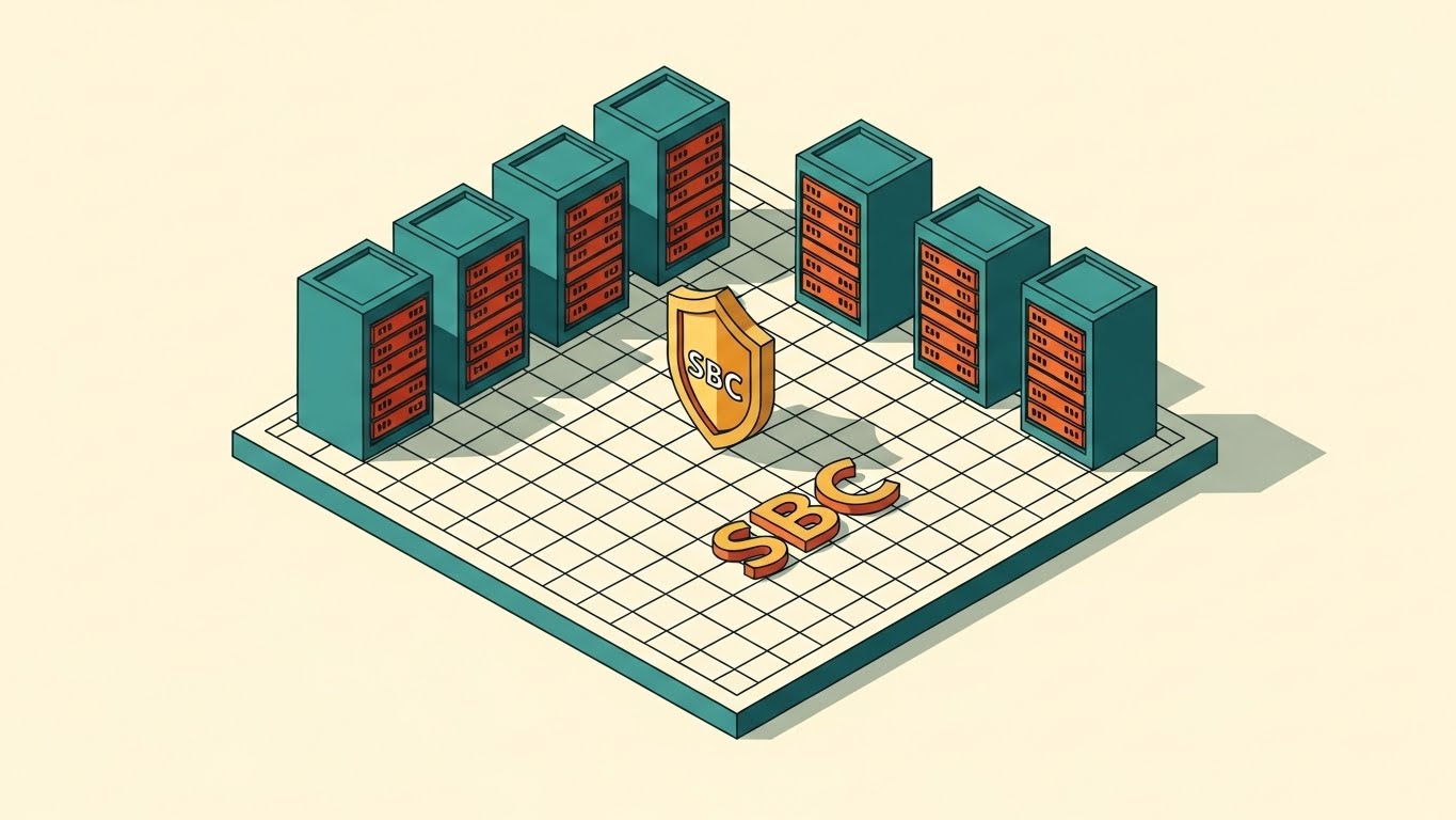
Visualization Scenario
We adopt the visual language of the engineer: the blueprint. An isometric vector illustration shows a server room floor plan on a grid. A central "SBC" (Session Border Controller) is stylized as a gold shield standing guard. Data packets flow along the grid; the shield deflects red "threat" packets while allowing green "safe" packets to pass. The palette is Teal, Burnt Orange, and Cream—technical yet modern.
Psychological Impact & KPI Focus
- Niche Psychology: The isometric perspective offers a "God's Eye View," giving the viewer a sense of total control and visibility. The Gold Shield acts as a Semiotic Anchor for security and value.
- Operational Impact: Differentiates the product on Security. It visually demystifies the role of the SBC, making it clear that this platform is the gatekeeper of the network.
Strategic Implementation
- Distribution: Product Landing Pages (Security Feature).
- Duration: 30-60 Seconds.
- Trade-off: Can feel "dry" or static. Needs subtle animation (blinking lights, flowing data) to keep it engaging.
Companies using similar video content -
AudioCodes – Mediant SBCs – Delivers seamless connectivity, enhanced security, and voice quality assurance.
Ribbon Communications – Provides robust SBCs for enterprise and service provider security.
Cisco – Cisco Unified Border Element (CUBE) – Offers enterprise call control and session management with security.
8. The "Workflow Gamifier" (Isometric 3D Workflow)
MOFU | Feature Education
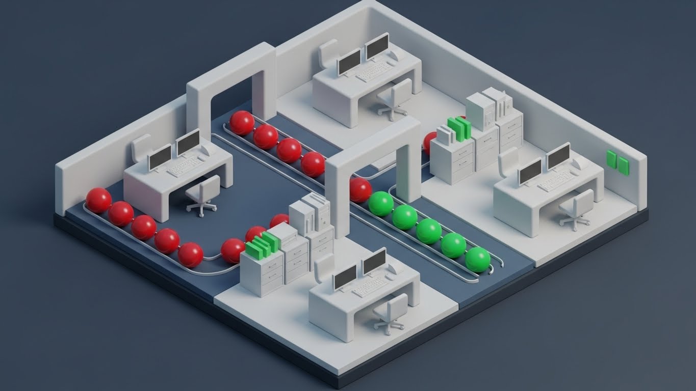
Visualization Scenario
Using "Claymorphism," we render a miniature office floor with soft, tactile, toy-like textures. We see tiny white desks and computers. Red spheres (representing Packet Loss) roll along a track. As they pass through a central gateway arch (the optimization engine), they instantly turn into Green spheres. The lighting is soft and diffuse, making the technical troubleshooting process look accessible and "clean."
Psychological Impact & KPI Focus
- Niche Psychology: "Gamification" reduces the anxiety of complex problem-solving. The Red-to-Green color shift is a universal signifier of success. It makes the platform feel friendly and approachable, lowering the barrier to entry for junior admins.
- Operational Impact: Excellent for Feature Education. It simplifies the "Logic" of the software (If Packet Loss > Optimize) into a physical reaction that requires zero technical knowledge to understand.
Strategic Implementation
- Distribution: LinkedIn Organic / Educational Shorts.
- Duration: 45-90 Seconds.
- Trade-off: The "Cute" aesthetic must be balanced with high-end rendering to avoid looking childish.
Companies using similar video content -
Vyopta – vAnalytics – Optimizes digital collaboration and experience with intelligent monitoring and analytics.
NetBeez – Monitors network performance, quickly detecting and troubleshooting issues with agents.
9. The "Migration Bridge" (Wireframe to Reality)
MOFU | Comp. Displacement

Visualization Scenario
A split-screen composition visualizes "Transformation." The left side shows a technical blueprint wireframe of a legacy PBX system (complex, monochromatic blue lines). A sharp diagonal line slices across the screen. As it moves, it reveals the right side: a sleek, photorealistic glossy silver 3D cloud icon on a white background. This visualizes the journey from "Legacy Complexity" to "Modern Simplicity."
Psychological Impact & KPI Focus
- Niche Psychology: Addresses the Sunk Cost Fallacy of legacy hardware. It validates the old (blueprint) while clearly positioning the new (3D Cloud) as the evolved, superior state.
- Operational Impact: Supports Competitor Displacement. It visually argues that the legacy system is a "draft" and the cloud platform is the "finished product."
Strategic Implementation
- Distribution: Remarketing Ads (Targeting legacy users).
- Duration: 10-15 Seconds.
- Trade-off: Binary. It assumes the user wants to migrate.
Companies using similar video content -
Yeastar – P-Series PBX – Offers easy-first business communications, supporting cloud and on-premises deployment.
Avaya – Provides customer experience solutions, migrating from on-premise to cloud platforms.
10. The "Success Story" (2D Character-Driven Story)
MOFU | Functional Buyer

Visualization Scenario
A flat, vector-style illustration features the "Hero": a confident IT Manager (Ochre skin, Navy shirt) holding a tablet. He stands against a vibrant Yellow background (optimism). He gestures toward a floating Green Shield with a checkmark. He is smiling. The style is clean, bold, and corporate—focusing entirely on the human emotion of relief and success.
Psychological Impact & KPI Focus
- Niche Psychology: Validates the Functional Buyer. IT staff want to be seen as successful problem solvers. This image mirrors their desired emotional state: "Job Done, System Secure."
- Operational Impact: Humanizes the ROI. It moves the focus from "Features" to "Feelings"—specifically, the feeling of confidence and control.
Strategic Implementation
- Distribution: Blog Headers / Case Studies.
- Duration: Static Image or 5-Second Loop.
- Trade-off: Generic. Needs specific context (e.g., the tablet screen showing the dashboard) to tie it to the specific niche.
End of Part 1. Part 2 will explore Styles 11-20.
Companies using similar video content -
Nextiva – NextivaONE – Centralizes conversations and uses AI to surface insights, improving productivity.
Dialpad – Offers AI-powered calls and real-time analytics for enhanced communication.
11. The "Threat Deflector" (Minimalist Flat 2D Vector)**
MOFU | Building Trust

Visualization Scenario
Security in Unified Communications is often abstract until a breach occurs. This style makes protection tangible. A central, geometric shield icon—rendered in authoritative Royal Blue and Gold—stands firm against a white background. Sharp, aggressive "spikes" (representing toll fraud or DDoS attacks) attempt to penetrate the perimeter but are instantly deflected by the shield’s hard edge. The design is ultra-clean, utilizing flat vector precision to convey a "zero-tolerance" policy.
Psychological Impact & KPI Focus
- Niche Psychology: For the Security Architect, clutter implies vulnerability. The sterile, precise geometry of this style signals "absolute control." It alleviates the anxiety of invisible threats by giving them a physical form that is easily defeated.
- Operational Impact: Directly supports Risk Mitigation. It translates complex firewall rules and Session Border Controller (SBC) policies into a singular, undeniable symbol of safety.
Strategic Implementation
- Distribution: Website "Security" Page / Trust Center.
- Duration: Static SVG or 5-Second Loop.
- Trade-off: High authority, but low emotional warmth. Best used to reinforce facts, not to build relationships.
Companies using similar video content -
Ingate Systems – SIParator – Develops firewall capabilities, facilitating secure SIP and WebRTC interactions.
Patton – SmartNode – Develops solutions for UC, cloud, and IoT, securing VoIP networks.
12. The "Reality Check" (Split Screen: Reality/UI)
MOFU | ABM Awareness

Visualization Scenario
This composition confronts the user's current reality. The screen is split down the middle. The left side reveals the "Physical Reality" of legacy infrastructure: a gritty, desaturated photo of a server room with tangled, chaotic grey cables hanging in disarray. The right side presents the "Digital Solution": a pristine, Bright Azure and White vector UI dashboard showing clean global connectivity maps. The contrast creates a visual argument that the platform creates order from physical entropy.
Psychological Impact & KPI Focus
- Niche Psychology: This triggers the pain of "Technical Debt." No IT leader wants to own the mess on the left. The image validates their desire to migrate to the clean, organized future on the right. It leverages "Before/After" psychology to drive action.
- Operational Impact: Highly effective for Account-Based Marketing (ABM) targeting legacy hardware users. It visually proves the efficiency gains of cloud migration without a single word of copy.
Strategic Implementation
- Distribution: LinkedIn Slides / Competitor Comparison Decks.
- Duration: Static Comparison or Swipe Interaction.
- Trade-off: Can appear negative if the "Before" state is too exaggerated. It must look realistic to resonate.
Companies using similar video content -
Unisys – Power Suite – Provides digital workplace and cloud solutions, transforming IT infrastructure.
Computer Solutions East (CSE) – Offers UC monitoring, creating order from physical entropy.
13. The "ROI Validator" (Dynamic Data Visualization)
BOFU | ROI Justification

Visualization Scenario
To satisfy the CFO, we speak the language of growth. Isometric 3D bar charts rise sharply from a clean white floor, rendered in confident Emerald Green and Jet Black. There is no clutter—only the upward trajectory of success. The bars are glossy, reflecting light to suggest a "premium" financial outcome. As the bars ascend, they click into place, symbolizing the stability and scalability of the communication platform as the business expands.
Psychological Impact & KPI Focus
- Niche Psychology: Financial approvers filter out fluff; they look for Trends. The sharp, unhindered rise of the graph triggers a "Growth Mindset." It reassures the buyer that this purchase is an asset that appreciates, not a utility that drains budget.
- Operational Impact: Visualizes ROI and Scalability. It answers the "Why pay for this?" question by linking the platform to business expansion and uptime stability.
Strategic Implementation
- Distribution: Investor Decks / BOFU Proposal Documents.
- Duration: Static or simple 3-second build animation.
- Trade-off: Purely analytical. Lacks the human element required for user adoption campaigns.
Companies using similar video content -
Genesys – Provides customer experience solutions, optimizing contact center performance and ROI.
Zoom – Zoom Workplace – Offers AI-driven business collaboration, enhancing productivity and competitiveness.
14. The "Deep Diagnostic" (3D X-Ray Visualization)
BOFU | Risk Mitigation
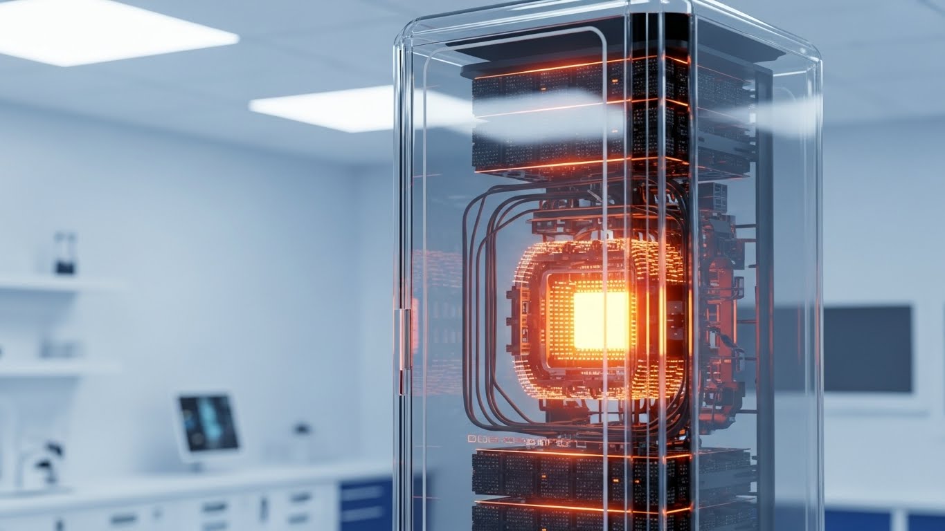
Visualization Scenario
Trust requires transparency. This style uses a "High-Key" medical-grade aesthetic to X-ray the infrastructure. We see a pristine, glass-encased server unit in a clinical white lab. The outer shell is transparent, revealing a glowing, intense Orange core within. This visualizes the "Deep Packet Inspection" capabilities of the platform—showing that the software sees inside the traffic, identifying risks that superficial tools miss.
Psychological Impact & KPI Focus
- Niche Psychology: IT buyers fear "Black Box" solutions where they can't see the mechanics. The X-ray effect satisfies the Need for Cognition—the desire to understand how things work. It signals that the vendor has nothing to hide.
- Operational Impact: Differentiates on Depth of Observability. While competitors show surface-level dashboards, this visual implies a deeper, more forensic level of network control.
Strategic Implementation
- Distribution: Technical Whitepapers / Security Datasheets.
- Duration: Static High-Res Render.
- Trade-off: Very technical. Can be alienating to non-technical stakeholders (e.g., HR or Sales leads).
Companies using similar video content -
Empirix – Diagnostix – Provides advanced solutions for contact center migration and comprehensive testing.
Progress Flowmon – Offers network performance monitoring, providing deep insights into systems.
15. The "Ops Commander" (Dark Mode UI Showcase)
BOFU | Technical Buyer
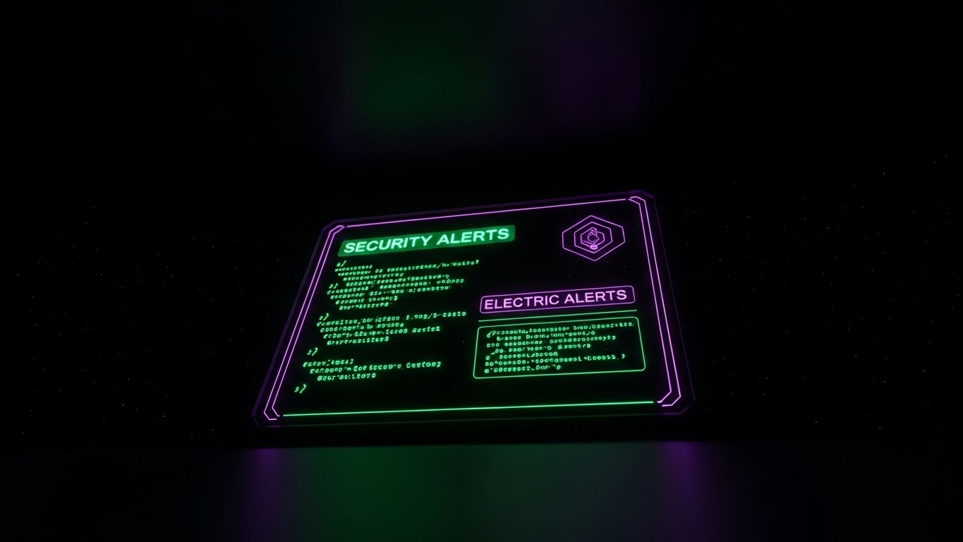
Visualization Scenario
We shift to the environment of the "Night Shift" engineer. The visual features a sleek, low-angle "Worm's Eye View" of a floating interface screen in Dark Mode. The palette is Obsidian Black, illuminated by glowing Neon Green syntax and Electric Purple accents. The screen displays raw "Security Alerts" and code-level diagnostics. This is not a manager's dashboard; this is a command line for the expert who keeps the lights on.
Psychological Impact & KPI Focus
- Niche Psychology: Dark Mode is a cultural signifier for "Pro-Grade" tools. It tells the SysAdmin, "This tool was built for you, not just for your boss." It builds immediate affinity with the technical influencer who recommends the purchase.
- Operational Impact: Highlights Granular Control. It visualizes the ability to troubleshoot at the packet level, a critical requirement for resolving complex Voice over IP (VoIP) issues.
Strategic Implementation
- Distribution: Developer Docs / API Portal / Technical Demos.
- Duration: 15-30 Seconds.
- Trade-off: Intimidating to the C-Suite. Use strictly for technical audiences.
Companies using similar video content -
Cisco – ThousandEyes – Provides network intelligence, offering deep visibility into digital experiences.
ServicePilot Platform – Offers comprehensive observability and security, integrating data from IT components.
16. The "Ecosystem Unifier" (3D Parallax UI Presentation)
BOFU | Demo Requests
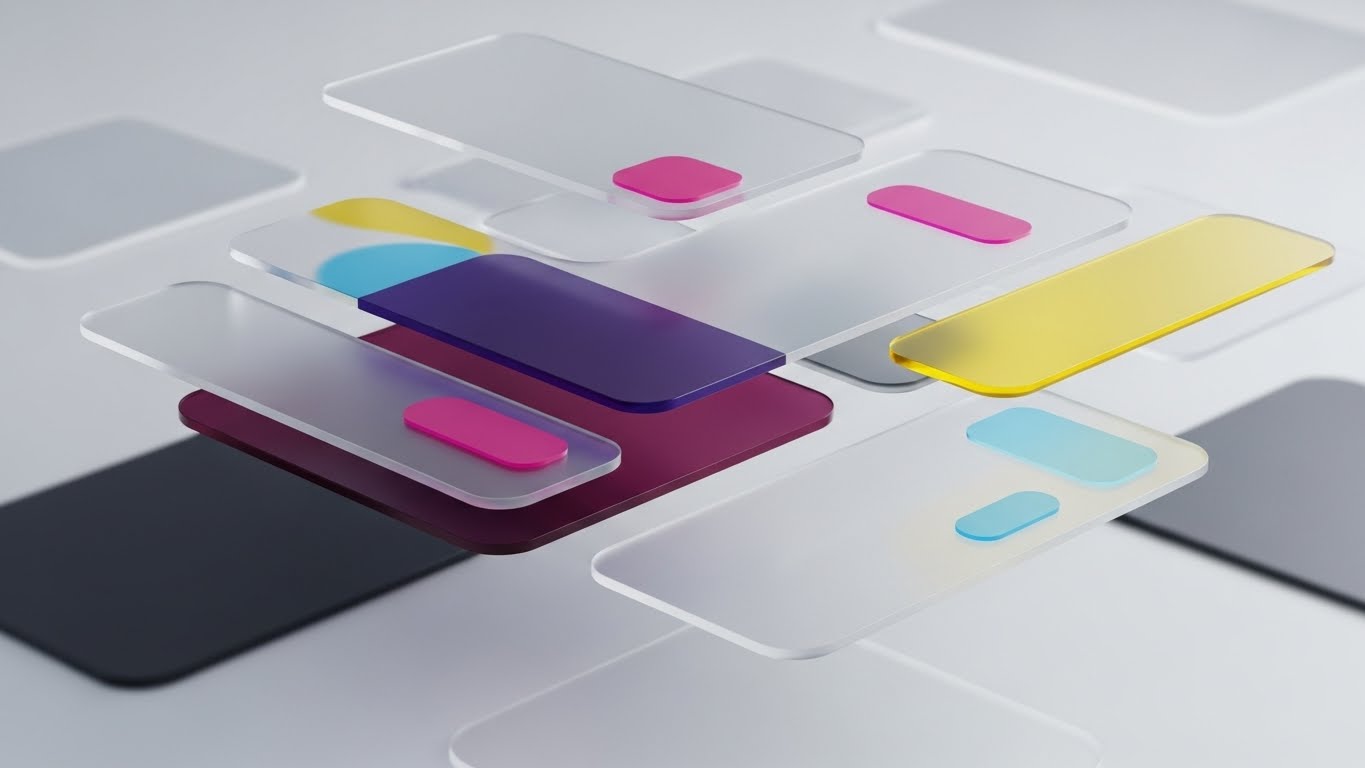
Visualization Scenario
To visualize the "Unified" in Unified Communications, we use depth. Multiple semi-transparent UI screens float in a void, layered one behind the other using a "Glassmorphism" effect. Magenta and Yellow accents catch the rim light. The camera pushes through the layers (Parallax), showing how the Voice, Video, and Messaging modules are separate yet perfectly stacked and integrated. The depth of field blurs the background, keeping the focus on the interface hierarchy.
Psychological Impact & KPI Focus
- Niche Psychology: Buyers are overwhelmed by feature lists. This style uses Visual Hierarchy to organize complexity. It makes the platform feel "Modern" and "Lightweight," despite its robust feature set.
- Operational Impact: Effective for Demo Requests. It creates a "craving" to interact with the interface. It positions the UX as a competitive advantage.
Strategic Implementation
- Distribution: Landing Page Hero Sections.
- Duration: 10-15 Second Loop.
- Trade-off: Prioritizes aesthetics over data readability. Good for "Wow factor," bad for reading specific metrics.
Companies using similar video content -
Mitel – MiVoice – Provides a unified communications platform for business communication.
Vonage – Business Communications – Offers a flexible cloud phone system with customizable features.
17. The "Humanizer" (Lifestyle Stock with UI Overlay)
BOFU | Sales Cycle Accel

Visualization Scenario
Technology exists to serve people. This style overlays the digital onto the physical. We see a high-quality photo of a diverse, smiling IT team collaborating in a sunlit, glass-walled office. Superimposed over them are floating, semi-transparent Cyan augmented reality widgets displaying "System Health: 98%." The tech is not replacing them; it is hovering helpfully nearby, enhancing their collaboration without obstructing their human connection.
Psychological Impact & KPI Focus
- Niche Psychology: Addresses the Fear of Replacement or complexity. It shows the "Desired State": a happy, productive team supported by technology, not struggling with it. It validates the "People-First" leader.
- Operational Impact: Accelerates Sales Cycles by appealing to HR and Operations stakeholders concerned with user adoption and team morale.
Strategic Implementation
- Distribution: ABM Display Ads / "About Us" Page.
- Duration: Static Image.
- Trade-off: Generic stock photography risk. The UI overlay must look bespoke to avoid the "Corporate Memphis" cliché.
Companies using similar video content -
Clariti – Unifies emails, chats, and documents for seamless communication and collaboration.
Ziro – Simplifies unified communications, transforming complex decisions into effortless processes.
18. The "Velocity Trigger" (Rapid UI Feature Montage)
BOFU | Cart Abandonment
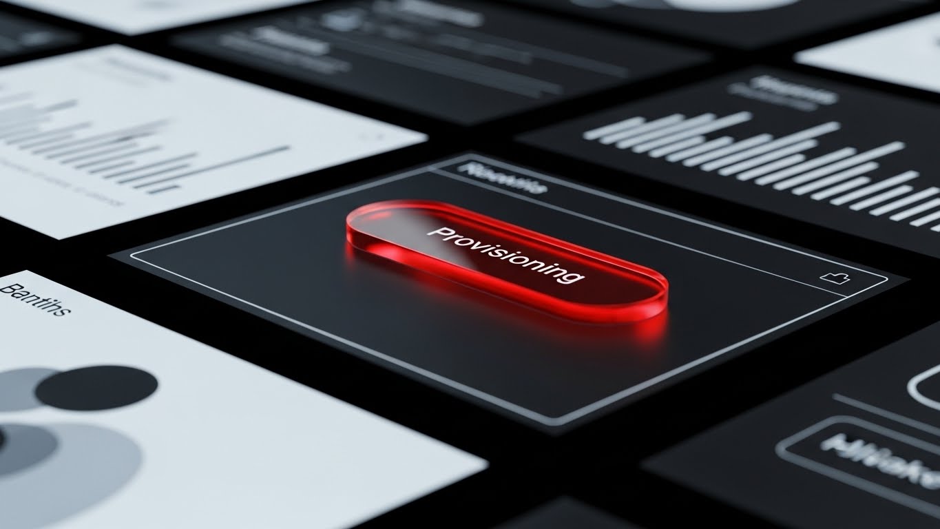
Visualization Scenario
This style focuses on the "Moment of Action." The camera focuses tightly on a single, crucial UI element: a glossy, glass-like "Provisioning" button glowing in Fiery Red against a dark background. A subtle cursor interaction or light flare suggests the button is being pressed. The surrounding elements are blurred (rack focus), forcing the eye to the action. It implies speed, decisiveness, and the immediate gratification of a system going live.
Psychological Impact & KPI Focus
- Niche Psychology: Reduces Friction Anxiety. The visual suggests that deploying a complex SIP trunk is as easy as "pushing a button." It capitalizes on the desire for instant results.
- Operational Impact: Combating Cart Abandonment (or drop-off in the trial phase). It visually promises that the hard work is done by the software, requiring only a simple trigger from the user.
Strategic Implementation
- Distribution: Retargeting Emails / Bottom-of-Funnel Nudges.
- Duration: 3-5 Second GIF.
- Trade-off: Hyper-focused. It lacks context, so the viewer must already know what "Provisioning" means.
Companies using similar video content -
Plivo – Zentrunk – Offers developer-friendly SIP trunking with API flexibility and global reach.
SIP.US – Provides reliable and transparent SIP trunking service with unlimited calling plans.
19. The "Value Accelerator" (Clean UI Workflow - Light Mode)
Onboarding | Accelerating TTV
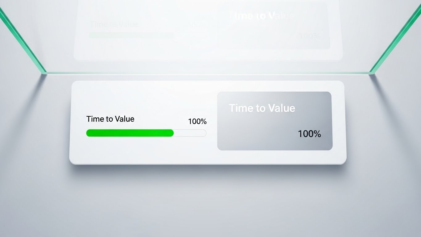
Visualization Scenario
The most critical moment in SaaS is Onboarding. This style visualizes that success. A pristine, light-mode UI element floats in a clean white space. A Vivid Green progress bar labeled "Time to Value" zips instantly from 0% to 100%. A soft drop shadow lifts the element, giving it importance. The perspective is looking up at the interface (Under-Glass view), placing the user in a position of authority and expectation.
Psychological Impact & KPI Focus
- Niche Psychology: New users fear a steep learning curve. This visual triggers a Dopamine Hit—the feeling of completion and success before they have even started. It sets a positive expectation for the onboarding journey.
- Operational Impact: Directly targets Time-to-Value (TTV) metrics. It reassures the buyer that implementation will be swift and the ROI will be immediate.
Strategic Implementation
- Distribution: In-App Welcome Screen / "Getting Started" Email.
- Duration: 3-5 Second Animation.
- Trade-off: Abstract. Real onboarding takes time; this is a metaphorical promise, not a literal timeline.
Companies using similar video content -
DIDlogic – Ranks as a top SIP trunk provider for reliability and cost-effective solutions.
Ooma – Offers an easy-to-use SIP trunking provider with great desk phone compatibility.
20. The "Cloud Tether" (2D Line Art Animation)
Onboarding | Self-Serve Onboard

Visualization Scenario
We end with the elegance of simplicity. A single, continuous line—shifting from Cobalt Blue to Tangerine Orange—traces the outline of a headset, flows smoothly across the screen, and forms a cloud icon. There are no breaks, no knots, and no friction. The background is an infinite white canvas. The wide-angle "fish-eye" perspective adds a subtle sense of global scale.
Psychological Impact & KPI Focus
- Niche Psychology: For the overwhelmed IT Admin, "Simple" is the ultimate luxury. This style uses Minimalism to signal that the vendor has "figured it out" so the user doesn't have to. It lowers Cognitive Load to near zero.
- Operational Impact: Ideal for Self-Serve Onboarding and "Product Tours." It explains the fundamental concept of the service without intimidating the user with technical details.
Strategic Implementation
- Distribution: Setup Wizard / Help Center.
- Duration: 10-15 Seconds (Looping).
- Trade-off: Low Authority. It feels "friendly" but not "heavy duty." Use for concepts, not for proving security or scale.
Companies using similar video content -
SkySwitch – Offers private-label UCaaS platforms for MSPs and resellers.
Global Call Forwarding – Provides extensive global coverage for international calling needs.
21. The "Friction Remover" (2D Animation & UI Composition)
Onboarding | Reducing Friction

Visualization Scenario
To debunk the myth that UC implementation requires weeks of downtime and complex wiring, we use a cheerful, simplified 2D vector animation. A character stylized in Sage Green and Charcoal—representing an IT generalist—effortlessly plugs a large, simplified cable into a wall socket. As the "Click!" sound wave radiates outward, the background (a stylized server room in pastel peach) instantly lights up in organized patterns. The motion is bouncy and elastic, conveying ease and delight.
Psychological Impact & KPI Focus
- Niche Psychology: The greatest barrier to software switching is Implementation Anxiety. This style utilizes Affective Design—using friendly aesthetics to lower cortisol levels. It subconsciously reassures the buyer, "This won't break your existing stack."
- Operational Impact: Directly targets Time-to-Implementation. It visualizes the concept of "Zero-Touch Provisioning," promising that the system is ready to go the moment it connects.
Strategic Implementation
- Distribution: Welcome Email Series / Onboarding Wizard.
- Duration: 10-15 Seconds.
- Trade-off: High abstraction. It sells the feeling of ease, not the technical reality of porting numbers.
Companies using similar video content -
Net2Phone – Offers high-quality Polycom phone systems with advanced features and integrations.
Fusion Connect – Provides flat-rate SIP trunking with a variety of add-on features.
22. The "Activation Trigger" (Macro UI Micro-Interactions)
Onboarding | Trial Activation
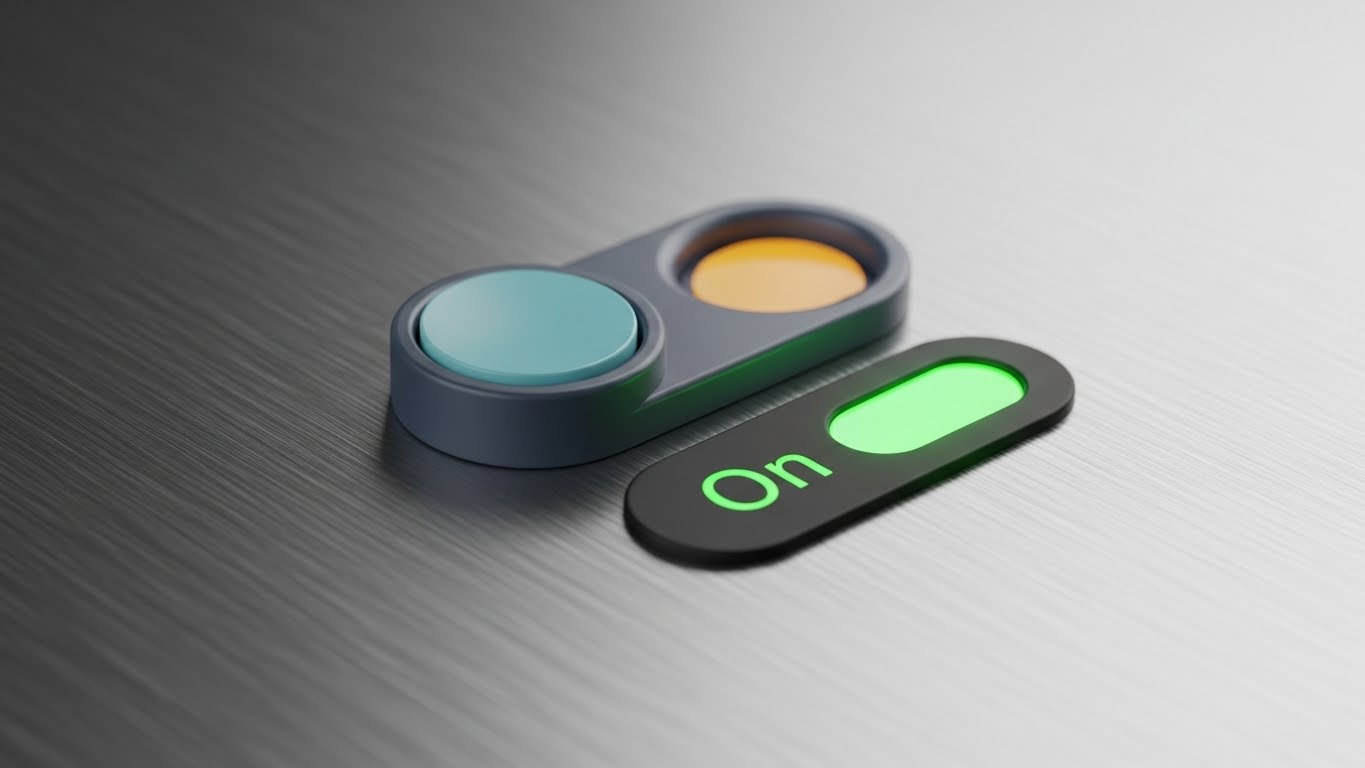
Visualization Scenario
We zoom in—extreme macro—on a single decisive moment. A photorealistic 3D toggle switch sits on a brushed steel surface, representing the platform's control panel. A finger (or invisible force) flips the switch. We see the physical resistance, the snap, and the immediate glow of an LED Green "On" light. The depth of field is shallow, blurring the surroundings to focus entirely on this binary change of state.
Psychological Impact & KPI Focus
- Niche Psychology: This triggers the Need for Closure. In a trial phase, users often hesitate to "turn on" the full features. This tactile visual creates a sensory craving to flip the switch and see the green light—symbolizing system health and activity.
- Operational Impact: Focused on Feature Activation Rate. It makes the act of enabling complex features (like Call Recording or AI Analytics) feel simple, tangible, and reversible.
Strategic Implementation
- Distribution: In-App Tooltips / "Feature of the Month" Emails.
- Duration: 3-5 Second Loop.
- Trade-off: Very specific. Needs to be paired with copy explaining what is being turned on.
Companies using similar video content -
Flowroute – Specializes in carrier-grade SIP trunking with powerful APIs and detailed analytics.
IntelePeer – Offers a communications platform as a service (CPaaS) for automated workflows.
23. The "Knowledge Hologram" (Holographic UI over 3D Render)
Retention | Knowledge Base
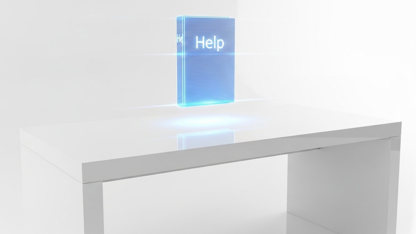
Visualization Scenario
Support documentation is usually boring. We make it futuristic. A pristine, high-end white desk sits in a studio environment. Hovering just above the surface is a semi-transparent, Electric Blue holographic projection of a book labeled "Help." Scanlines flicker gently, and the pages turn automatically with a fluid light trail. It suggests that knowledge is "always on" and accessible without physical clutter.
Psychological Impact & KPI Focus
- Niche Psychology: IT admins value Autonomy. They prefer to solve problems themselves rather than calling support. This visual elevates the "Help Desk" from a repository of PDFs to an advanced, interactive knowledge engine.
- Operational Impact: Supports Ticket Deflection. By making the self-serve resources look premium and advanced, you encourage users to consult the Knowledge Base first, reducing support costs.
Strategic Implementation
- Distribution: Support Portal Header / Chatbot Avatar.
- Duration: Static or Slow Rotation Loop.
- Trade-off: The "Sci-Fi" aesthetic must align with the actual sophistication of your search function.
Companies using similar video content -
Huawei – SE1000-E300/E600 – Provides ICT solutions, focusing on connectivity and intelligent world.
REVE Systems – REVE Session Border Controller – Specializes in IP-based communication, including SBCs and cloud telephony.
24. The "Uptime Validator" (Hyper-lapse Stock with Data)
Retention | Reducing Support
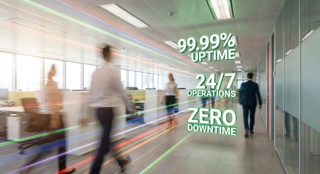
Visualization Scenario
To visualize "Business Continuity," we show the business in motion. A hyper-lapse video captures a busy modern office corridor. Employees are streaks of blurred motion, signifying speed and productivity. Floating immovably in the 3D space are sharp, high-contrast White and Green metrics: "99.999% Uptime," "24/7 Operations." The camera pans, but the data remains locked in place, symbolizing stability amidst the hustle.
Psychological Impact & KPI Focus
- Niche Psychology: IT leaders are judged on stability. The juxtaposition of chaotic human motion (business speed) against the rock-solid, static data (infrastructure stability) validates their goal: Invisible Reliability.
- Operational Impact: Reinforces Service Level Agreements (SLAs). It serves as visual proof that the platform acts as the steady backbone of the dynamic enterprise.
Strategic Implementation
- Distribution: Trust Center / Renewals Presentation.
- Duration: 10-20 Seconds.
- Trade-off: Relies on stock footage quality. Must look high-end to avoid feeling generic.
Companies using similar video content -
Verizon – Offers SIP trunking for large organizations, ensuring scalability and reliability.
CallTower – Provides Microsoft Teams and Cisco Webex integration for UCaaS.
25. The "Value Shield" (Photorealistic 3D Renders)
Retention | Reducing Churn
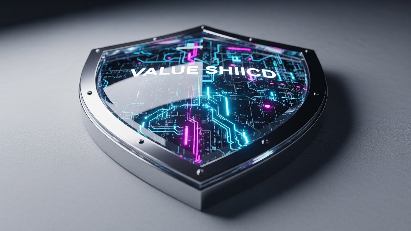
Visualization Scenario
When discussing retention, we focus on value preservation. A magnificent, thick beveled glass shield with a chrome rim rests on a white velvet surface. Inside the glass, intricate circuits and glowing data streams in Cyan and Magenta are visible, protected from the elements. The lighting is "Jewelry Store" quality—high contrast, sparkling reflections. It treats the customer's data and voice configurations as precious gems to be guarded.
Psychological Impact & KPI Focus
- Niche Psychology: Existing customers need to feel their investment is safe. This "Premium" aesthetic triggers the Endowment Effect—we value what we own more when it looks valuable. It reinforces the decision to stay.
- Operational Impact: Targets Churn Reduction. It visually represents the "Moat" the software provides—security, data integrity, and configuration history—making the idea of leaving feel like losing something precious.
Strategic Implementation
- Distribution: Quarterly Business Review (QBR) Decks / Newsletter Footer.
- Duration: Static Image.
- Trade-off: Passive. It creates a feeling of safety but doesn't drive new action.
Companies using similar video content -
Alianza – Offers cloud communications platform, including the Perimeta SBC.
Thinktel – Focuses on making Microsoft Teams voice work seamlessly.
26. The "Feature Bridge" (Low-Poly 3D Modeling)
Retention | Feature Adoption

Visualization Scenario
We visualize the concept of "Bridging Gaps" (e.g., between on-premise PBX and Cloud, or between CRM and Voice). In a soft, pastel-lit void, colorful low-poly blocks (Turquoise, Sand, Coral) fly together from opposite sides of the screen. They rapidly self-assemble into a sturdy, perfect bridge. The animation is satisfying and rhythmic (ASMR-style). It simplifies the complex engineering of API integrations into a child-friendly building block metaphor.
Psychological Impact & KPI Focus
- Niche Psychology: Integrations are often seen as "fragile." The snapping together of solid blocks implies Structural Integrity and compatibility. It assures the architect that the connection will hold.
- Operational Impact: Drives Feature Adoption (specifically integrations). It makes the prospect of connecting two systems look fun and easy, rather than a technical headache.
Strategic Implementation
- Distribution: Integration Marketplace / API Documentation.
- Duration: 5-8 Second Loop.
- Trade-off: Playful style might seem too casual for banking or government clients.
Companies using similar video content -
TelcoBridges – Provides robust SBCs, bridging various communication networks.
Sansay – Offers high-performance SBCs for service providers and enterprises.
27. The "Infinite Scaler" (Abstract 3D AI Visualization)
Retention | Thought Leadership

Visualization Scenario
To sell the future, we use abstraction. An explosion of crystalline white nodes connects via laser-thin beams of light, expanding infinitely outward into a bright white void. The camera moves through this neural network, suggesting speed, infinite scalability, and the complexity of a global nervous system. It looks like art, not software. It represents the "Meta-Data" layer of the organization.
Psychological Impact & KPI Focus
- Niche Psychology: For the CIO, this appeals to Visionary Leadership. It moves the conversation from "fixing phones" to "orchestrating global intelligence." It elevates the vendor to a strategic partner status.
- Operational Impact: Supporting Brand Authority. It is used in high-level content (Whitepapers, Keynotes) to establish the vendor as a forward-thinking innovator, not just a utility provider.
Strategic Implementation
- Distribution: Blog Headers (Thought Leadership) / Event Backgrounds.
- Duration: 15-30 Seconds.
- Trade-off: Zero instructional value. It is purely for brand positioning and mood.
Companies using similar video content -
Ekinops – Provides optical transport and routing solutions for high-capacity networks.
Ericsson – Offers communication technology and services, including 5G and IoT.
28. The "Velocity Tunnel" (Futuristic Neon/Dark Mode)
Expansion | Upsell/Cross-sell

Visualization Scenario
We flip the "Dark Mode" trope to create a "Bright Future" aesthetic. The viewer rushes down a pristine, polished tunnel of silver rings and Cyan light beams. The background is white, making the scene feel airy and fast. This isn't a dark server room; it's the high-speed lane of the future. The motion blur suggests intense velocity. This visualizes the performance boost of upgrading to a higher tier or a dedicated fiber connection.
Psychological Impact & KPI Focus
- Niche Psychology: Speed is a proxy for efficiency. The visual sensation of forward motion triggers excitement and a desire for Progress. It frames the upsell not as a cost, but as an accelerator.
- Operational Impact: Drives Upsell/Cross-sell. It visually answers "What do I get for the extra cost?" Answer: You get into the fast lane.
Strategic Implementation
- Distribution: Upgrade Prompts / Performance Reports.
- Duration: 5-10 Second Loop.
- Trade-off: Risk of motion sickness if too fast. Must be smooth.
Companies using similar video content -
Cataleya – Provides real-time communications software, accelerating network performance.
46 Labs – Offers network infrastructure and automation for high-speed data.
29. The "Social Spark" (2D Graphics Over Live Action)
Expansion | Referrals

Visualization Scenario
We humanize the referral process. A cinematic, backlit shot shows two colleagues talking in a coffee shop (silhouetted against a bright window). Superimposed over their heads are glowing, neon purple and pink 2D speech bubbles containing "Referral" icons and stars. The graphics "pop" with energy. This grounds the abstract concept of a software referral in a real, human interaction.
Psychological Impact & KPI Focus
- Niche Psychology: Trust is transferred peer-to-peer. Seeing real humans (even in silhouette) validates the Social Contract. The fun graphics make the act of referring a colleague seem lighthearted and rewarding.
- Operational Impact: Boosts Referral Program Participation. It draws attention to the "Invite a Friend" button by associating it with positive social interaction.
Strategic Implementation
- Distribution: Social Media (LinkedIn/Instagram) / Referral Landing Page.
- Duration: 10-15 Seconds.
- Trade-off: Requires high-quality footage. Poor acting or lighting kills the credibility.
Companies using similar video content -
ULTATEL – Offers UCaaS solutions, fostering collaboration and communication.
M5 Technologies – Provides unified communications and contact center solutions.
30. The "Executive Vision" (Aspirational Stock Montage)
Expansion | Switcher Strategy

Visualization Scenario
The final image validates the decision maker's ego. A high-end cinematic photo shows a sharp executive (Generic male/female) standing in a sun-drenched marble lobby, looking up and off-camera toward a bright light source (the future). The environment screams "Success" (Gold, Platinum, Marble). There is no technology visible—only the result of good technology: Time, Calm, and Vision.
Psychological Impact & KPI Focus
- Niche Psychology: Ultimately, B2B buyers buy Career Safety and Prestige. This image mirrors the buyer's self-image (or desired self-image) after successfully migrating to the new platform. It is the "Hero Shot" of the case study.
- Operational Impact: Supports Competitor Displacement (Switcher Strategy). It implies that leaders who switch to this platform ascend to this level of calm, collected success.
Strategic Implementation
- Distribution: ABM Ads / Case Study Hero Images.
- Duration: Static Image.
- Trade-off: Can feel like a cliché bank ad if not graded with a unique color palette (e.g., tinting the shadows with your brand color).
Strategic Knowledge Base: The Visual Operations Doctrine
Having established a library of 30 distinct visual styles, the challenge shifts from "Creation" to "Strategic Application." A fragmented collection of assets will not drive ROI. To transform Unified Communications management from a cost center into a strategic asset, you must deploy these visuals within a cohesive framework.
The following three segments outline the "Visual Operations Doctrine"—a blueprint for integrating these styles into the nervous system of your enterprise, leveraging Advids as your strategic partner.
Strategic Alignment & Visual Architecture
Defining the "Why" and "Who" before a single pixel is rendered.
- The Cognitive Load Audit: IT environments are cognitively expensive. Before creating assets, audit your current training materials. If a concept (e.g., SIP Trunking) takes 3 paragraphs to explain, it qualifies for a Style 1 (Signal Stabilizer) intervention to reduce mental friction.
- Role-Based Visual Mapping: Differentiate your visual language. The CIO (Persona: Empire Builder) responds to Style 27 (Infinite Scaler) and Style 30 (Executive Vision). The SysAdmin (Persona: Troubleshooter) requires Style 15 (Ops Commander). Do not show marketing fluff to engineers; do not show raw code to CFOs.
- The "Glanceability" Standard: In Network Operations Centers (NOCs), data must be read in milliseconds. Adopt Style 2 (Foundation Builder) principles—bold, high-contrast shapes—for critical alert icons. If it can't be understood in a blur (like Style 24), it fails the NOC test.
- Brand Voice Consistency: Your marketing visuals (LinkedIn) and product visuals (UI empty states) must speak the same language. Use the same color palette for Style 6 (Seamless Integrator) and Style 26 (Feature Bridge) to create a seamless subconscious link between "Promised Value" and "Delivered Value."
- The Advids Strategic Audit: Partner with Advids during the pre-production phase to define this "Visual Operating System." We help align your diverse software modules (Voice, Video, Contact Center) under a unified visual taxonomy, ensuring that a "Warning" looks the same in every part of the suite.
- Standardization vs. Customization: For core infrastructure concepts, use standardized Style 19 (Value Accelerator) visuals. Save your budget for bespoke Style 14 (Deep Diagnostic) 3D renders where you need to prove your unique proprietary technology (e.g., AI Codecs).
- The Cross-Departmental Bridge: Sales talks "ROI," Ops talks "Packets." Use Style 13 (ROI Validator) and Style 8 (Workflow Gamifier) as translation tools to align these departments on a shared definition of value.
- Legacy System Integration: Visualizing the invisible link between on-prem hardware and cloud SaaS is critical. Use Style 12 (Reality Check) to honestly depict the "Messy" legacy state while showing your platform as the clean overlay. This builds trust more effectively than pretending the legacy hardware doesn't exist.
- Accessibility in Global Teams: Motion graphics (Style 1) are universal languages. An animation of "Red Lines turning Green" is understood by support teams in Tokyo, London, and New York without translation, reducing localization costs.
- The Mobile-First Mandate: IT leaders approve POs on their phones. Ensure all "Executive Vision" assets (Style 30) are optimized for vertical viewing on mobile devices.
Operational Adoption & Implementation
Embedding the visual strategy into the daily workflow.
- Overcoming "Big Brother" Anxiety: Employee monitoring features can cause friction. Use Style 17 (The Humanizer) to frame these features as "Augmented Support" rather than surveillance, fostering trust.
- The Micro-Learning Shift: Replace 50-page PDF admin manuals with 15-second Style 22 (Activation Trigger) loops embedded directly in the UI tooltips. Teach the user in the moment of need.
- Just-in-Time Support: When a trunk fails, don't show a text error code. Trigger a Style 8 (Workflow Gamifier) animation showing exactly where the packet dropped. Visualizing the failure point reduces "Mean Time to Resolution" (MTTR).
- Gamification of Training: Use Style 26 (Feature Bridge) to visualize training progress. Users are more likely to complete "Levels" of visual training than they are to read chapters of a manual.
- Reducing Support Ticket Volume: There is a direct correlation between the clarity of your "Troubleshooting" visuals (Style 8) and the volume of Tier-1 support calls. Invest here to lower support costs.
- Remote Onboarding: For distributed teams, you cannot send trainers on-site. Use Style 16 (Ecosystem Unifier) video walkthroughs to simulate the "Over the Shoulder" training experience, ensuring consistent knowledge transfer.
- Visualizing SOPs: Transform text-based Standard Operating Procedures into Style 20 (Cloud Tether) line-art flowcharts. Visual process maps are followed 323% better than text instructions.
- Feedback Loops: Use Style 29 (Social Spark) visuals in your feedback forms. Show users that their feedback is being "heard" and valued by the community.
- Scalable Localization: When generating Style 3 (Trust Architect) avatars, use AI to lip-sync the same message into Spanish, French, and German. This allows for global consistency without re-shooting video.
- Leadership Communication: When the CIO presents the quarterly review, arm them with Style 24 (Uptime Validator) visuals. Make them look good, and they will renew the contract.
Measuring Impact & Future-Proofing
Quantifying the ROI of visualization and preparing for the AI era.
- Beyond "Views": Do not measure video success by "Views." Measure it by "Feature Adoption Rate" after watching a Style 26 clip, or "Reduction in Idle Time" after a Style 19 tutorial.
- The "Idle Time" Metric: High idle time suggests user confusion. Deploy Style 16 (Ecosystem Unifier) walkthroughs on pages with high idle times to unblock users.
- Compliance Velocity: How fast can you get the organization compliant with new security protocols? Style 7 (Security Guardian) visuals can communicate new firewall rules faster than a memo.
- Retention and Churn: Customers churn when they don't see value. Style 25 (Value Shield) is a strategic asset designed specifically to remind decision-makers of the invisible security value they are paying for.
- The AI Visual Frontier: Prepare for the future. Style 27 (Infinite Scaler) positions you as an AI-ready platform. As Generative AI evolves, your visual library must evolve to show "Self-Healing" networks.
- Scalability of Assets: Build a library, not a folder. Organize assets by "Style Code" so your marketing team can rapidly assemble new campaigns without shooting new footage.
- The Advids Partnership: As your platform evolves, your visuals must keep pace. Advids acts as your long-term visual partner, ensuring that your asset library scales and adapts to new features and market trends.
- Benchmarking Success: Compare your visual engagement against industry benchmarks. If your "Security" page has high bounce rates, swap the text for Style 11 (Threat Deflector) and measure the difference.
- The ROI of Safety: For sectors like Healthcare or Finance, "Security" is the product. Visualizing that security (Style 14) allows you to charge a premium for "Peace of Mind."
- Final Call to Innovation: Treat video as Infrastructure, not content. A robust visual strategy is as critical to your SaaS platform as the code itself. It is the interface through which value is perceived, understood, and bought.
End of Part 3. This concludes the Master Meta Template Prompt (V7) for Unified Communications Management.
Companies using similar video content -
ATOS – Offers digital transformation services, including UC and collaboration.
Nokia – Provides network infrastructure and technology for a connected world.
Author & Editor Bio


