
Introduction: Visualizing the Invisible Supply Chain
The modern warehouse is no longer just a storage facility; it is a high-velocity data center where physical goods and digital information must move in perfect synchronization. For Operations Directors and Supply Chain Managers, the greatest anxiety isn't just inventory shrinkage—it is the "visibility gap" between what is on the floor and what is on the screen.
We are witnessing a fundamental shift in how logistics technology is communicated. The industry is moving away from generic stock footage of forklifts toward precision visualization that articulates control, synchronization, and intelligence. The goal of video in this sector is not merely to show movement, but to demonstrate the "Digital Twin" capacity of your software—proving that your system is the brain orchestrating the brawn.
The opportunity for software vendors is immense. The global Warehouse Management Systems market size is forecast to grow rapidly, accelerating at a CAGR of 14.8% through 2029. This surge is driven by a desperate need for efficiency in an era of labor shortages and SKU proliferation. However, capturing this growth requires overcoming deep-seated skepticism. Buyers are wary of complex systems that promise the world but fail to deliver.
To win, your visual messaging must be razor-sharp. It must promise—and visualize—tangible operational improvements. Research indicates that early adopters of AI-powered supply chain software have achieved approximately 15% lower logistics costs compared to their peers. Your video content must visually codify these gains, translating abstract algorithms into concrete evidence of speed, accuracy, and flow.
This guide provides a strategic framework for that translation. We have curated distinct visualization styles, mapped to the buyer's journey, to help you move beyond "explaining features" to "demonstrating mastery."
1. Minimalist Flat 2D Vector
TOFU | Brand Awareness

The Visual & Narrative Approach
This style utilizes a "less is more" philosophy to depict the ideal state of warehouse operations: perfect flow. The visualization strips away the grime and noise of a physical warehouse, leaving only the geometric essence of logistics—uniform squares moving in rhythm on a stylized conveyor. The palette is restricted to Vivid Amber and Cool Gray on a cream background, eliminating gradients or shadows. The boxes are uniform squares, conveying perfect order and rhythm.
Psychological Impact & KPI Focus
For a Logistics Manager plagued by the chaos of variable package sizes and irregular flows, this symmetry is psychologically soothing. It triggers a "cognitive ease" response, associating the WMS brand with stability and predictability. It visualizes the KPI of Throughput Reliability, promising a future where exceptions are eliminated and order prevails.
Strategic Implementation & Trade-offs
- Recommended Duration: 15-20 Seconds (Looping).
- Strategic Trade-off: While excellent for clarity, it lacks specific detail. It sells the concept of order, not the features of the interface. Use this to hook attention on LinkedIn, not to close the deal.
Companies using similar video content -
Odoo – Inventory – Streamlined inventory and warehouse operations.
Zoho Inventory – Simple, intuitive inventory management.
2. Abstract 2D Motion Graphics
TOFU | Market Education

The Visual & Narrative Approach
Supply chains are often invisible networks of intent. This style makes that invisible network visible using fluid, organic shapes in Electric Blue and Pure White against a matte gray background. The animation serves as a narrative arc: it begins with chaotic, scribbled lines on the left—representing unmanaged inventory—which flow across the screen, morphing and untangling into straight, parallel streams of data on the right.
Psychological Impact & KPI Focus
This visualization addresses the "Black Box" anxiety. It visualizes the Algorithm. It demonstrates the transition from entropy (disorder) to negentropy (order), which is the core promise of a WMS. It appeals to the CTO/CIO persona who cares about data architecture and API interoperability, symbolizing how your platform untangles complex data knots.
Strategic Implementation & Trade-offs
- Recommended Duration: 10-15 Seconds.
- Strategic Trade-off: It is highly metaphorical. Operational buyers might find it too "artsy" if not quickly followed by screens of the actual interface.
Companies using similar video content -
Kinaxis – RapidResponse – Visualizing complex supply chain networks.
o9 Solutions – Digital Brain – Abstracting data flow for decision making.
3. Isometric 2D Motion Design
TOFU | Shaping Brand Perception
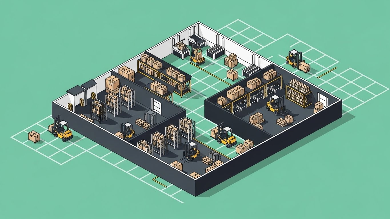
The Visual & Narrative Approach
The 45-degree isometric angle provides a "God’s-eye view" of the warehouse, allowing the viewer to see the entire ecosystem simultaneously. On a Mint Green grid, tiny flat-rendered forklifts, racks, and sorting stations interact in harmony. This style shifts the perspective from individual tasks to holistic orchestration, demonstrating how receiving, slotting, and shipping interconnect without the expense of full 3D rendering.
Psychological Impact & KPI Focus
This style appeals to the "Controller" aspect of the Operations Director persona. It implies total visibility and command over the facility. By shrinking the warehouse to a manageable, viewable size, it reduces the anxiety associated with sprawling, opaque operations. It directly supports KPIs related to Space Utilization and Fleet Management.
Strategic Implementation & Trade-offs
- Recommended Duration: 30-45 Seconds.
- Strategic Trade-off: Can become cluttered if too many elements are animated at once. The "toy-like" aesthetic must be balanced with professional voiceover to ensure it isn't perceived as too juvenile for enterprise software.
Companies using similar video content -
Manhattan Associates – Warehouse Management – Holistic view of warehouse operations.
Dematic – Software – Orchestrating automated warehouse systems.
4. Bold Kinetic Typography
TOFU | Category Creation

The Visual & Narrative Approach
Warehousing is a heavy industry, and your visuals should have mass. This style treats text not just as information, but as physical objects. Thick, blocky shapes representing text (without being legible words) tumble, crash, and stack like heavy shipping containers. The palette is high-contrast Heavy Black and Lime Green on white. The motion conveys weight and impact, simulating the tangible reality of moving heavy goods.
Psychological Impact & KPI Focus
This style leverages Sensory Marketing. It simulates the physical reality of the warehouse—the "thud" of a pallet hitting the floor. It signals that your software is "Robust" and "Heavy Duty," capable of handling high throughput without crashing. It differentiates you from "lightweight" or "generic" SaaS tools.
Strategic Implementation & Trade-offs
- Recommended Duration: 15 Seconds (Vertical 9:16).
- Strategic Trade-off: Zero educational value. This is purely for brand attitude and stopping power on platforms like Instagram or TikTok.
Companies using similar video content -
Zebra Technologies – Savanna – Robust data intelligence for industrial environments.
Siemens – Logistics Automation – Powerful industrial automation.
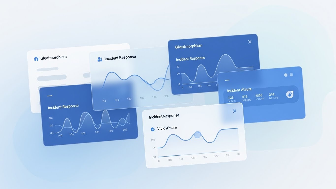
5. Dynamic Data Visualization
TOFU | Vertical Social Organic

The Visual & Narrative Approach
Data is the product. This style features floating 3D bar charts and line graphs rendered in a translucent, "glassmorphic" material. The data elements—representing "Efficiency Metrics"—soar upwards in a gradient of Purple to Gold, popping with crystal clarity against a soft, blurred bokeh background. The aesthetic is futuristic, clean, and premium, treating the data as a precious asset.
Psychological Impact & KPI Focus
This appeals to the Analytical Buyer (CFOs and Ops Directors). It visualizes the result of the software: data transparency. By making the charts look like precious glass objects, you subtly communicate that the data your WMS produces is valuable and fragile, requiring the best tools to handle. It reinforces KPIs like Reporting Accuracy and Forecast Precision.
Strategic Implementation & Trade-offs
- Recommended Duration: 10-15 Seconds.
- Strategic Trade-off: Without context, it's just pretty shapes. It must be paired with specific voiceover or text overlays (e.g., "30% Reduction in Overtime") to have concrete meaning.
Companies using similar video content -
FourKites – Visibility Platform – Real-time supply chain data and analytics.
Descartes Systems Group – Logistics Technology – Data-driven logistics optimization.
6. Split Screen: The Reality Check
TOFU | YouTube
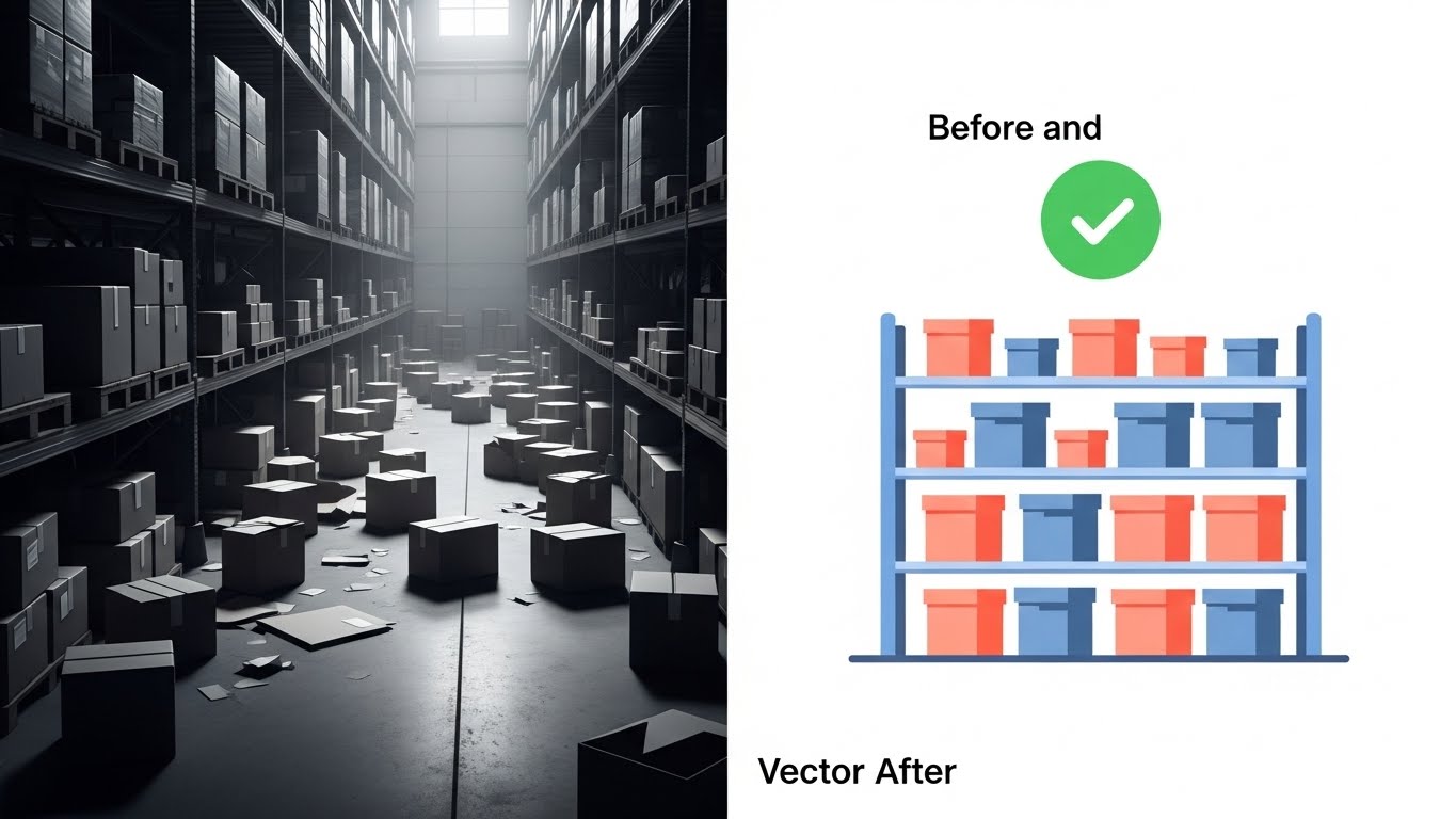
The Visual & Narrative Approach
This is the classic "Problem/Solution" structure, elevated. The screen is split vertically. The left side displays a gritty, black-and-white photograph of a chaotic warehouse aisle with boxes strewn on the floor—the "Before." The right side displays a clean, vibrant vector illustration of the same aisle, but organized and color-coded in Coral and Slate Blue—the "After." A floating "Checkmark" icon bridges the gap, symbolizing the successful implementation of the WMS.
Psychological Impact & KPI Focus
This triggers Pain Point Activation followed by Relief. It forces the viewer to confront the reality of their current inefficiencies (the B&W chaos) and offers an immediate visual escape. It effectively communicates Inventory Accuracy and the elimination of Dead Stock.
Strategic Implementation & Trade-offs
- Recommended Duration: 20 Seconds.
- Strategic Trade-off: Can seem cliché if the "Before" image is too exaggerated. The contrast must be stark but fair—the "after" state must look achievable, not impossible.
Companies using similar video content -
Extensiv – 3PL Warehouse Manager – Transforming chaotic 3PL operations.
Deposco – Bright Suite – Modernizing fulfillment for growth.
7. Macro UI Micro-Interactions
MOFU | Product/Solution Differentiation

The Visual & Narrative Approach
User adoption is a massive hurdle. This style zooms in—extreme macro—on the interface. We focus on a single, rounded "Execute" button rendered in a soft Teal gradient. A cursor hovers, the button glows subtly, and then clicks. The background is a blurred white UI panel. The focus is entirely on the satisfaction and simplicity of that single interaction.
Psychological Impact & KPI Focus
This addresses UX Anxiety. Warehouse staff are often not digital natives; complex screens scare them. By focusing on a single, large, friendly button, you communicate Usability and Low Training Overhead. It suggests that the software is intuitive, reducing the fear of long onboarding times.
Strategic Implementation & Trade-offs
- Recommended Duration: 5-10 Seconds (GIF format).
- Strategic Trade-off: It isolates a single action, losing the context of the workflow. It is effective for showing simplicity, but not for showing capability.
Companies using similar video content -
Veeqo – WMS – Simple, intuitive interface for e-commerce.
ShipStation – Shipping Software – Easy-to-use shipping and fulfillment.
8. Isometric 3D Workflow
MOFU | Feature Education & Demonstration
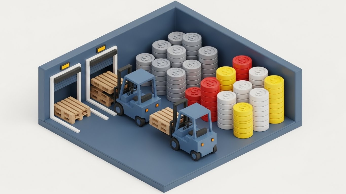
The Visual & Narrative Approach
This style moves beyond logistics to economics. A detailed 3D isometric diorama with a tactile "clay" finish depicts a loading dock. However, instead of goods, the pallets are being magically converted into stacks of Gold and Silver coins. It is a literal visual metaphor for "operational efficiency equals profit." The soft shadows and clean white background give it a premium, investment-grade feel.
Psychological Impact & KPI Focus
This is purely for the Financial Buyer (CFO). It translates operational metrics (pick rates, loading times) into the universal language of business: Revenue Generation. The clay aesthetic softens the industrial edge, making the concept approachable and polished.
Strategic Implementation & Trade-offs
- Recommended Duration: 15 Seconds.
- Strategic Trade-off: It is highly metaphorical. Technical buyers might find it too "marketing-fluff" if they are looking for specific feature validation.
Companies using similar video content -
SAP – Extended Warehouse Management (EWM) – Connecting operations to business value.
Infor – WMS – Optimizing warehouse operations for financial returns.
9. Lifestyle Stock with UI Overlay
MOFU | ABM Awareness

The Visual & Narrative Approach
Technology serves people, not the other way around. This style uses high-quality professional photography of a Warehouse Operations Director standing on a mezzanine, surveying the floor. A holographic, "Safety Orange" UI floats above his tablet, displaying live Picking Rates. The lighting is warm and natural. The narrative is about "Empowerment"—the software gives the human the superpowers of sight and prediction.
Psychological Impact & KPI Focus
This resonates with the Functional Buyer who fears losing control to automation. It visualizes Supervisory Empowerment. It positions the WMS as a tool that gives the manager "superpowers" (vision, data, control). It bridges the gap between the physical floor and the digital dashboard, showing them co-existing in harmony.
Strategic Implementation & Trade-offs
- Recommended Duration: 20-30 Seconds.
- Strategic Trade-off: It relies heavily on the quality of the stock footage. Generic "people pointing at things" footage will damage credibility; the actor must look like a genuine industry professional.
End of Part 1. Part 2 will explore Styles 11-20, focusing on Bottom-of-Funnel conversion and technical validation.
Companies using similar video content -
Tecsys – Omni-Channel Fulfillment – Empowering warehouse managers with data.
Made4net – SCExpert – Human-centric supply chain execution.
11. Rapid UI Feature Montage
MOFU | Accelerating Time-to-Value
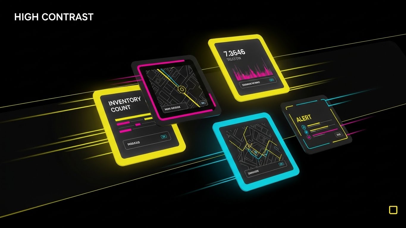
The Visual & Narrative Approach
Speed is the currency of modern logistics. This style abandons linear storytelling for a high-velocity injection of data. Against a High Contrast Black and Yellow background—colors synonymous with industrial caution and high visibility—individual UI widgets (Inventory Counts, Map Views, Alert Boxes) fly into the frame. They arrange themselves into a dynamic formation, using motion blur to simulate the speed of a high-throughput facility.
Psychological Impact & KPI Focus
This visual addresses the "Lag Anxiety" often associated with legacy software. By presenting the UI elements in rapid, fluid flight, you subliminally promise a system that is lightweight and responsive. It suggests that the software moves as fast as the physical goods on the conveyor. It effectively highlights KPIs like Order Cycle Time and System Responsiveness.
Strategic Implementation & Trade-offs
- Recommended Duration: 10-15 Seconds (Square 1:1 for Social).
- Strategic Trade-off: This is an impressionistic style, not an instructional one. It creates excitement about the interface's speed but moves too fast to teach a specific workflow. Use it for retargeting to maintain brand momentum.
Companies using similar video content -
OneLogistics – WMS – Fast-paced, responsive warehouse operations.
12. 2D Graphics Over Live Action
MOFU | Building Trust & Credibility

The Visual & Narrative Approach
Adoption fails when software feels like a burden. This style reframes the user experience as a series of "wins." We use a first-person Point-of-View (POV) photograph of a warehouse associate's hand holding a rugged scanner. As they complete a task, vibrant Bright Yellow and Cyan 2D vector icons (checkmarks, coins, upward arrows) "pop" out of the screen into the real world. The background is a realistic, slightly blurred warehouse aisle, grounding the gamification in reality.
Psychological Impact & KPI Focus
This taps into Dopamine Loops. Gamification reduces the monotony of repetitive tasks like picking and packing. By visualizing positive reinforcement, you signal to the Operations Director that this software will boost Employee Morale and reduce Churn. It sells the idea that the software is a partner to the worker, not a policeman.
Strategic Implementation & Trade-offs
- Recommended Duration: 30-60 Seconds.
- Strategic Trade-off: Requires high-quality live-action footage or excellent stock matching. If the hand/scanner looks fake, the "grounded reality" effect is lost.
Companies using similar video content -
Softeon – WMS – High-speed, agile warehouse execution.
MercuryGate – TMS – Rapid execution in transportation management.
13. Wireframe to Reality Transition
MOFU | Competitive Displacement

The Visual & Narrative Approach
For facilities undergoing retrofit or expansion, the gap between planning and execution is terrifying. This style visualizes the bridge. A diagonal wipe splits the screen. On the left, a technical Blueprint Blue wireframe depicts the planned racking layout. As the wipe moves, it reveals the photorealistic, fully stocked reality on the right. The transition is seamless, implying that the software ensures the physical reality perfectly matches the digital plan.
Psychological Impact & KPI Focus
This appeals to the Architect/Planner persona. It validates the software’s capability in Warehouse Design and Slotting Optimization. It reduces the fear of implementation errors or capacity miscalculations. It strongly reinforces KPIs related to Space Utilization and Implementation Speed.
Strategic Implementation & Trade-offs
- Recommended Duration: 15-20 Seconds.
- Strategic Trade-off: It is highly specific to the "Implementation/Setup" phase. It may be less relevant to prospects who are looking for immediate operational optimization of an existing layout.
Companies using similar video content -
Locus Robotics – LocusONE – Gamified experience for robot-assisted picking.
Geek+ – Robotics Solutions – Engaging human-robot collaboration.
14. Photorealistic 3D Renders
MOFU | Demand Gen & Lead Capture

The Visual & Narrative Approach
This is the "Future State" visualization. We see a pristine, futuristic warehouse floor illuminated by cool, clean light. Autonomous Mobile Robots (AMRs) glide silently in perfect synchronization. There are no humans, no clutter, and no noise. The aesthetic is "Industrial Chic"—metallic silvers, soft Cyans, and polished concrete. It positions the WMS not just as software, but as the orchestrator of a fully automated future.
Psychological Impact & KPI Focus
This targets Aspirational Ambition. It validates the buyer's desire to be on the cutting edge. Even if their current facility isn't this advanced, buying your software feels like a step toward this ideal. It speaks directly to Labor Cost Reduction and Automation Readiness.
Strategic Implementation & Trade-offs
- Recommended Duration: 15-30 Seconds (Instagram/LinkedIn).
- Strategic Trade-off: It can feel cold or impersonal. It risks alienating smaller operations that rely heavily on manual labor. It should be used to signal "Enterprise Grade" capability.
Companies using similar video content -
Swisslog – SynQ – Planning and executing automated warehouse designs.
Mecalux – Easy WMS – From layout planning to operational warehouse.
15. Abstract 3D AI Visualization
BOFU | ROI Justification

The Visual & Narrative Approach
How do you visualize an algorithm? This style uses a macro lens to enter the "brain" of the WMS. In a clean white void, silver nodes are interconnected by pulsing Laser Red beams. As data flows, the network reconfigures itself, symbolizing real-time learning and optimization. It translates the abstract concept of "Machine Learning" into a tangible, sophisticated structure.
Psychological Impact & KPI Focus
This is for the Intellectual Buyer. It answers the question, "How does it optimize?" without needing lines of code. It suggests that the system is alive, thinking, and constantly improving. It supports high-value claims around Dynamic Route Planning and Predictive Demand Forecasting.
Strategic Implementation & Trade-offs
- Recommended Duration: 10-15 Seconds.
- Strategic Trade-off: Purely conceptual. It must be supported by voiceover or text that explains what is being optimized (e.g., "AI-Driven Slotting Logic") to avoid being interpreted as generic stock art.
Companies using similar video content -
Exotec – Skypod System – Highly automated, futuristic warehouse solutions.
GreyOrange – Fulfillment Operating System – Advanced robotic automation.
16. Aspirational Stock Montage
BOFU | Overcoming Objections

The Visual & Narrative Approach
The number one objection to new software is "My team will hate it." This style directly counters that fear. We use high-key, "Bright Daylight Balanced" photography of a diverse warehouse team (men and women) gathering around a large dashboard screen. They are smiling, pointing, and engaged. The key is the interaction—the software is the campfire around which the team gathers to celebrate success.
Psychological Impact & KPI Focus
This leverages Social Proof and Cultural Reassurance. It visualizes a friction-free implementation. It tells the Operations Director that this tool will unite their team rather than divide it. It supports soft KPIs like User Adoption Rates and Change Management Success.
Strategic Implementation & Trade-offs
- Recommended Duration: 30-60 Seconds.
- Strategic Trade-off: Extremely reliant on casting. If the actors look like models rather than warehouse workers, it destroys credibility. Authenticity in wardrobe (safety vests, casual wear) is non-negotiable.
Companies using similar video content -
Relex Solutions – Living Retail Platform – AI-driven supply chain optimization.
ToolsGroup – Service Optimizer 99+ – Machine learning for inventory optimization.
17. 3D X-Ray Visualization
BOFU | Risk Mitigation

The Visual & Narrative Approach
Inventory shrinkage is a hidden plague. This style offers a superpower: X-Ray vision. A standard metal shipping container is rendered with Translucent White walls. Inside, we clearly see perfectly stacked boxes, with high-value items glowing in Red. The camera pans around, revealing that nothing can be hidden from the system. It is a powerful metaphor for 100% inventory accuracy.
Psychological Impact & KPI Focus
This triggers Relief. It addresses the anxiety of the "unknown"—lost stock, theft, or misplacement. By making the container transparent, you metaphorically make the entire supply chain transparent. It directly visualizes Inventory Integrity and Shrinkage Reduction.
Strategic Implementation & Trade-offs
- Recommended Duration: 10-15 Seconds.
- Strategic Trade-off: A strong visual metaphor, but static. To be effective, the "X-Ray" effect should sweep or toggle on/off to emphasize the contrast between "blindness" (opaque container) and "vision" (transparent container).
Companies using similar video content -
One Network Enterprises – Business Network – Collaborative supply chain success.
Coupa – Business Spend Management – Empowering teams with spend visibility.
18. Abstract 2D Flat Vector Organic Modern
BOFU | The Economic Buyer

The Visual & Narrative Approach
When speaking to the CFO, the language is flow and growth. This style moves away from industrial grit to corporate elegance. Fluid, liquid shapes in Glossy Indigo and Silver rise upwards, resembling a cumulative growth chart but with an organic, premium feel. The motion is smooth and heavy, suggesting financial stability and substantial returns.
Psychological Impact & KPI Focus
This creates a Premium Perception. It distances the software from being a mere "tool" and positions it as an "asset." The aesthetic matches the visual language of high-end fintech or consulting firms, appealing directly to the executive who signs the check. It reinforces ROI, Margin Growth, and Capital Efficiency.
Strategic Implementation & Trade-offs
- Recommended Duration: 15-20 Seconds (Email embedding).
- Strategic Trade-off: Too abstract for operational staff. It offers zero functional information. It is strictly a "trust signal" for the financial decision-maker.
Companies using similar video content -
Pinc Solutions – YMS – Real-time visibility into yard and inventory.
C3 Solutions – Yard Management – Complete visibility for dock and yard.
19. Dark Mode UI Showcase
BOFU | The Technical Buyer
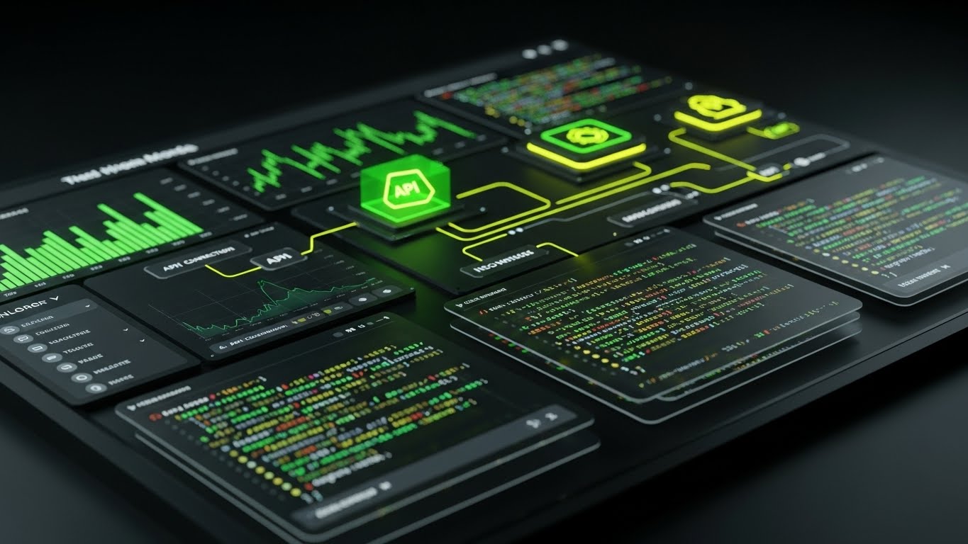
The Visual & Narrative Approach
The CTO/CIO is not impressed by pretty pictures; they want to see the code, the API nodes, and the data architecture. This style presents the software in "Dark Mode"—the preferred environment of developers. Against a Dark Gray matte background, Neon Green terminal text and connection nodes pulse with activity. We see code snippets and API health monitors. It looks like a command center, not a marketing brochure.
Psychological Impact & KPI Focus
This establishes Technical Authority. It signals that the platform is "Open," "Extensible," and "Secure." It assures the technical buyer that the system can handle complex integrations without breaking. It supports KPIs like System Uptime, API Latency, and Integration Speed.
Strategic Implementation & Trade-offs
- Recommended Duration: 30-45 Seconds.
- Strategic Trade-off: Alienating to non-technical users. A warehouse manager might find this screen intimidating or overly complex. Keep this content gated or targeted specifically at IT personas.
Companies using similar video content -
WiseTech Global – CargoWise – Driving financial growth in logistics.
FreightWaves – SONAR – Financial intelligence for freight markets.
20. 2D Character-Driven Story
BOFU | Objection Handling
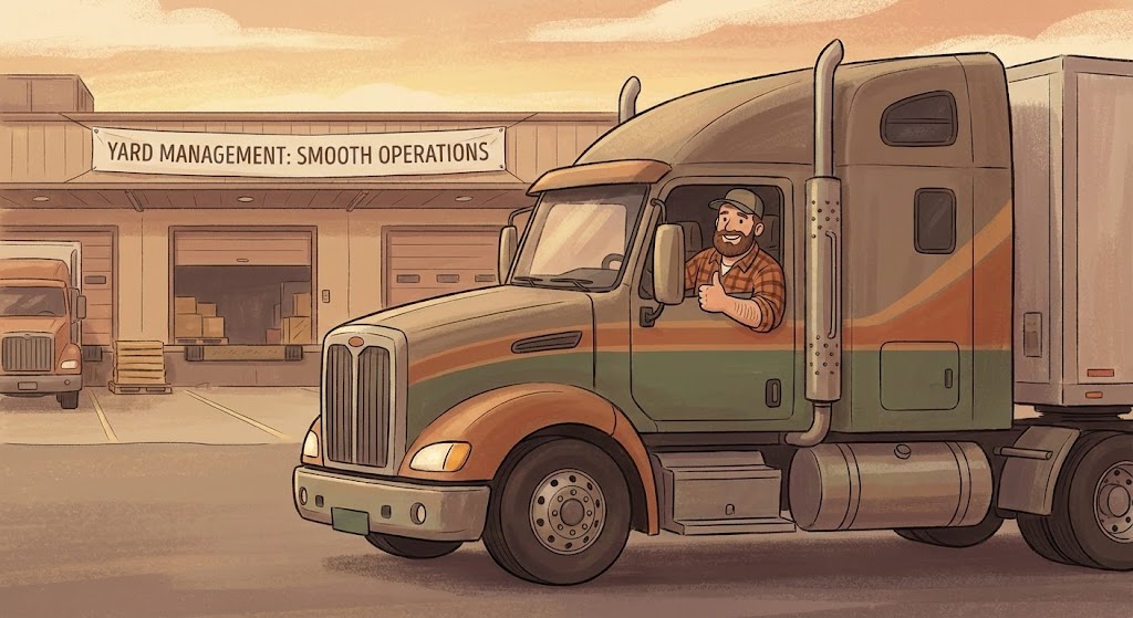
The Visual & Narrative Approach
WMS affects more than just warehouse staff; it impacts the entire logistics ecosystem. This style zooms out to the loading dock. Using a warm, hand-drawn illustration style with Soft Earth Tones, we see a truck driver leaning out of his cab, giving a "thumbs up." The dock behind him is orderly. This narrative confirms that the software reduces friction not just inside, but at the critical handover points.
Psychological Impact & KPI Focus
This targets Reputation Management. Warehouse delays frustrate carriers and drivers. Visualizing a happy driver signals smooth yard management and efficient turnarounds. It appeals to the buyer who values their vendor relationships. It reinforces Dock Turnaround Time and Carrier Satisfaction Scores.
Strategic Implementation & Trade-offs
- Recommended Duration: 45-60 Seconds.
- Strategic Trade-off: The "cartoon" style must be mature. If it looks too childish, it trivializes the serious nature of logistics. The texture and lighting in the illustration are critical to maintaining professionalism.
End of Part 2. Part 3 will cover Styles 21-30, focusing on hyper-specific use cases and retention strategies.
Companies using similar video content -
Apache OFBiz – Warehouse Management – Open-source, technically robust platform.
ERPNext – Stock Management – Developer-friendly, customizable ERP.
21. Clean UI Workflow (Light Mode)
Onboarding | Self-Serve Onboarding
The Visual & Narrative Approach
The first interaction defines the user relationship. This style utilizes a pristine Light Mode aesthetic to counter the often dark, dingy reality of legacy warehouse terminals. The screen displays a "Welcome" onboarding checklist in varying shades of Pure White and Soft Sky Blue. A hand cursor interacts with the items, checking them off with fluid grace. The lighting is even and shadowless, evoking a clinical sense of clarity and cleanliness.
Psychological Impact & KPI Focus
This triggers Cognitive Ease. New users are often intimidated by enterprise software. By presenting a clean, airy interface, you lower the Cognitive Load, signaling that the system is approachable and easy to learn. It directly impacts Time-to-Competency and reduces early-stage User Drop-off.
Strategic Implementation & Trade-offs
- Recommended Duration: 30-60 Seconds (Embedded in Welcome Email).
- Strategic Trade-off: "Light Mode" can sometimes feel less "pro" than "Dark Mode" to developers. This style is specifically optimized for generalist users and operational staff, not IT specialists.
Companies using similar video content -
3PL Central – WMS – Improving relationships with carriers and drivers.
ShipHero – Fulfillment Software – Streamlining operations for happy drivers.
22. 2D Line Art Animation
Onboarding | Reducing Implementation Friction
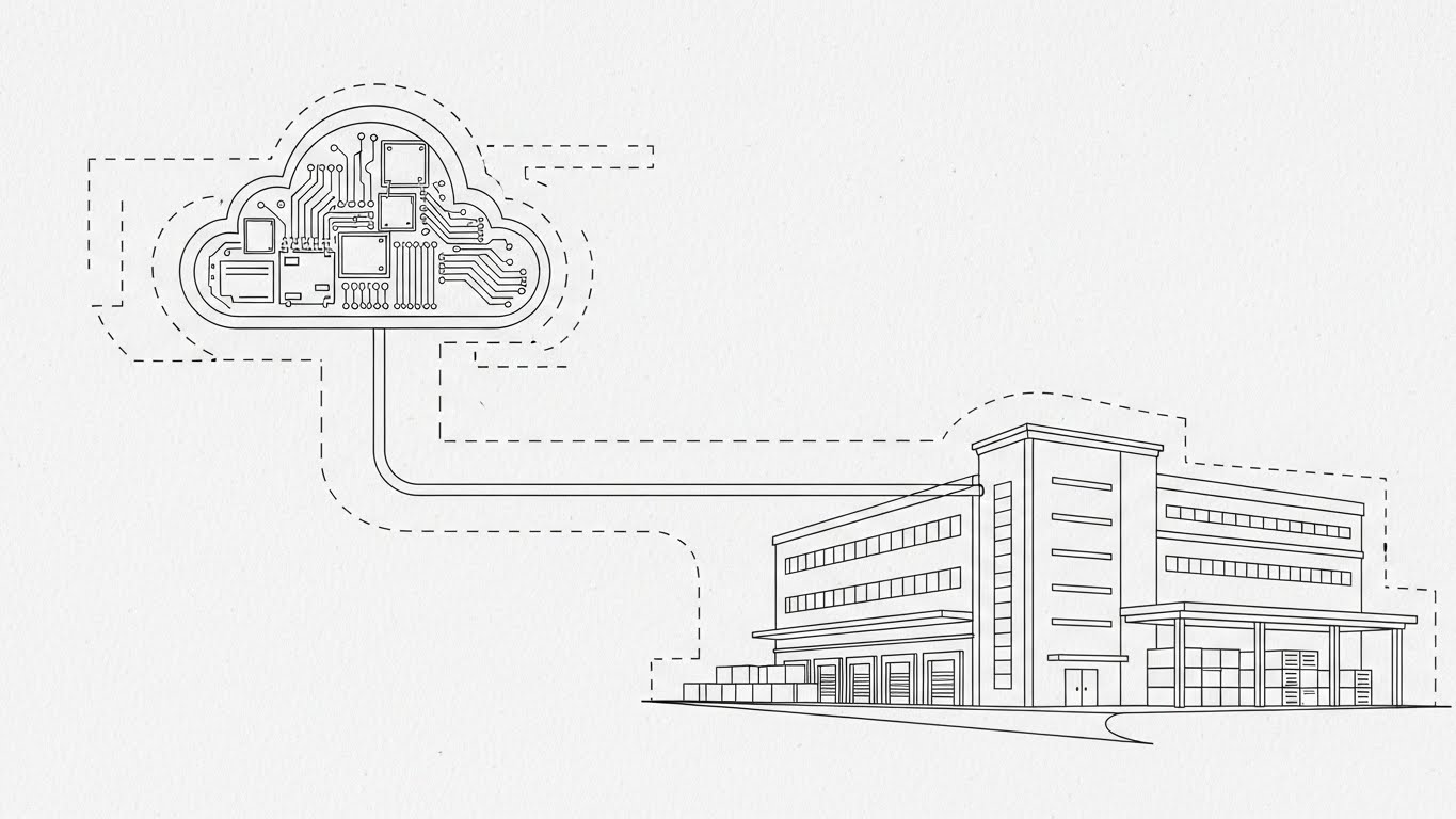
The Visual & Narrative Approach
Implementation is where the sale is truly won or lost. This style adopts the aesthetic of a high-end architectural blueprint. Thin, continuous Black lines draw themselves on a Paper White texture background. We see a schematic connection forming between a stylized cloud server and the warehouse infrastructure. The lines are precise, technical, and unbroken, symbolizing a seamless, glitch-free integration process.
Psychological Impact & KPI Focus
This appeals to the System Architect and Implementation Manager. It visualizes Structural Integrity. The precision of the line work implies precision in the code. It reduces the anxiety of "spaghetti code" or messy integrations. It supports KPIs related to Setup Time and Integration Success Rate.
Strategic Implementation & Trade-offs
- Recommended Duration: 45-60 Seconds (Technical Documentation Video).
- Strategic Trade-off: It is dry and purely functional. It lacks emotional resonance, which is perfect for technical manuals but poor for marketing hype.
Companies using similar video content -
Acumatica – Cloud ERP – User-friendly interface for business processes.
NetSuite – WMS – Intuitive cloud-based warehouse management.
23. Generative AI Realistic Character Video
Onboarding | Knowledge Base & FAQ Videos

The Visual & Narrative Approach
When users get stuck, they want a human, not a bot. This style leverages hyper-realistic AI-generated characters to deliver support content at scale. A professional female support agent, rendered with lifelike skin texture and lighting, looks directly at the camera with a helpful, patient expression. Augmented Reality (AR) graphic elements in soft blue float near her, illustrating the solutions she explains.
Psychological Impact & KPI Focus
This triggers Empathy and Reassurance. It replaces the frustration of reading long PDF manuals with a "face-to-face" interaction. It humanizes the helpdesk experience, making the user feel supported rather than abandoned. It directly targets Ticket Deflection Rates and Customer Satisfaction (CSAT) scores.
Strategic Implementation & Trade-offs
- Recommended Duration: 1-2 Minutes (Knowledge Base Articles).
- Strategic Trade-off: While AI video is efficient, "Uncanny Valley" effects can damage trust if the lip-sync or eye movement is off. High-quality rendering is non-negotiable.
Companies using similar video content -
Boomi – Integration Platform – Seamless data and system connections.
Mulesoft – Anypoint Platform – API-led connectivity.
24. Low-Poly 3D Modeling
Onboarding | Trial/Freemium User Activation

The Visual & Narrative Approach
To encourage trial users to "play" with the software, the visuals should feel like a game. This style uses "Low-Poly" 3D modeling—geometric, faceted shapes with flat lighting. A stylized forklift lifts a crate in Pastel Blue and Soft Pink against a white void. The aesthetic eliminates industrial grit, presenting the logistics process as a friendly, manageable set of building blocks.
Psychological Impact & KPI Focus
This leverages Gamification Psychology. By making the assets look like toys, you remove the fear of "breaking" the system. It encourages exploration and experimentation, which is critical for freemium conversion. It drives Feature Discovery and Trial-to-Paid Conversion Rates.
Strategic Implementation & Trade-offs
- Recommended Duration: 15-20 Seconds (Email Nurture Sequences).
- Strategic Trade-off: It can appear "casual" or "SMB-focused." Large enterprises might perceive this style as lacking the gravity required for serious, high-volume operations.
Companies using similar video content -
Oracle – WMS Cloud – AI-driven training for WMS Cloud.
SAP – Learning Hub – AI-powered support for EWM users.
25. 3D Parallax UI Presentation
Retention | Driving Deep Feature Adoption
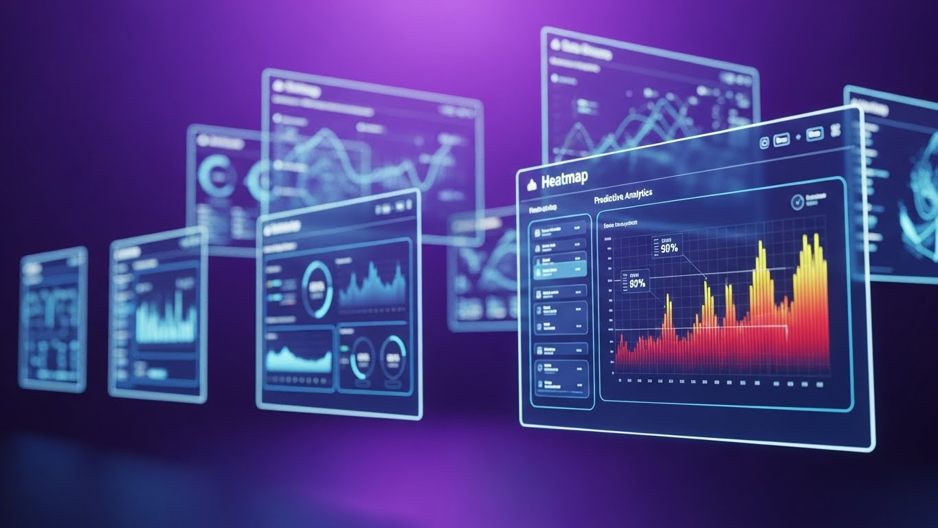
The Visual & Narrative Approach
Existing users often only use 20% of the software's capability. This style reveals the depth they are missing. Multiple UI screens float in a Bright Violet void, arranged in a parallax composition. As the "camera" moves, the layers shift, revealing advanced features like "Heatmaps" and "Predictive Analytics" hiding behind the standard dashboard. Depth of field blurs the background, focusing attention on the high-value features in the front.
Psychological Impact & KPI Focus
This triggers Curiosity and Fear Of Missing Out (FOMO) regarding one's own software usage. It visualizes the "Hidden Value" within the platform, encouraging customers to explore deeper functionalities. It supports Net Revenue Retention (NRR) and increases Daily Active Users (DAU).
Strategic Implementation & Trade-offs
- Recommended Duration: 15-30 Seconds (In-App Tooltips/Modals).
- Strategic Trade-off: It is abstract. It serves to highlight the existence of a feature, not to teach it. It must be a gateway to a tutorial, not the tutorial itself.
Companies using similar video content -
PartKeepr – Open-source inventory for playful exploration.
Inventaire – Collaborative inventory management.
26. 2D Animation & UI Composition
Retention | Reducing Churn

The Visual & Narrative Approach
Churn often happens when the software feels disconnected from the floor staff. This style bridges that gap. A hand-drawn, sketchy character (the worker) in Teal and Orange interacts with a crisp, precise vector UI panel (the software). The visual contrast—organic sketch vs. rigid vector—symbolizes the harmony between human flexibility and digital precision. It tells the story of the software supporting the worker, not replacing them.
Psychological Impact & KPI Focus
This reinforces Partnership. It reminds the buyer that the software is integral to their team's daily success. It fights the perception of the software being "just another tool" and positions it as a "team member." It strengthens User Sentiment and reduces Churn.
Strategic Implementation & Trade-offs
- Recommended Duration: 30 Seconds (Customer Success Newsletters).
- Strategic Trade-off: The "sketchy" style must be executed artistically. If it looks like a rough draft, it implies the software is also unfinished.
Companies using similar video content -
Logility – Digital Supply Chain Platform – Layered insights into supply chain planning.
Anaplan – Supply Chain Planning – Multi-dimensional planning and analysis.
27. Holographic UI over 3D Render
Retention | Proactive Support/Announcements
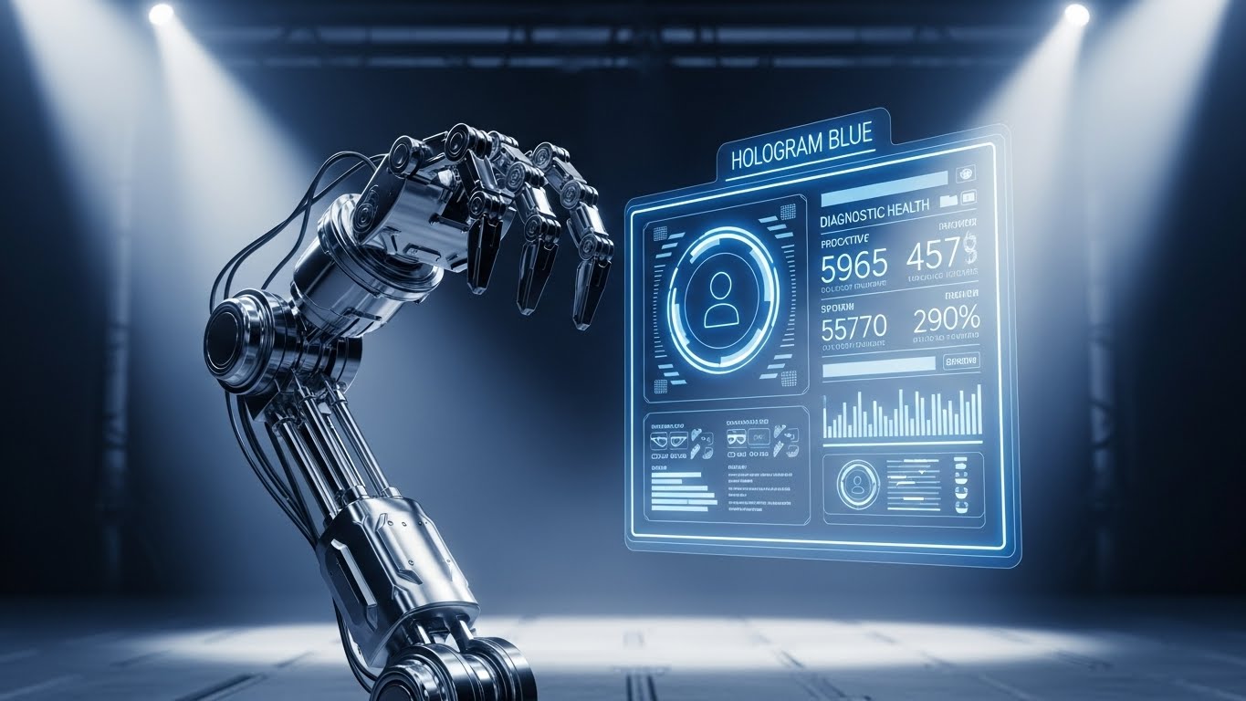
The Visual & Narrative Approach
Reliability is the ultimate retention tool. This style visualizes the system's self-healing capabilities. A high-fidelity 3D render of a robotic arm is overlaid with a semi-transparent, Hologram Blue UI. The hologram glows, displaying real-time diagnostic health stats. It conveys a "Minority Report" futuristic feel, suggesting that the system identifies and fixes issues before they become problems.
Psychological Impact & KPI Focus
This builds Trust and Security. It reassures the client that the system is constantly monitoring its own health. It appeals to the IT Director's need for stability. It reinforces KPIs like System Uptime and Preventative Maintenance Alerts.
Strategic Implementation & Trade-offs
- Recommended Duration: 10-15 Seconds (System Update Logs).
- Strategic Trade-off: It sets a very high bar for technical capability. Do not use this visual style if your software does not actually have predictive diagnostic features.
Companies using similar video content -
Zethcon – Synapse WMS – Empowering warehouse staff with intuitive UI.
Körber Supply Chain – Software – Supporting warehouse teams with intuitive UI.
28. Generative AI Cinematic Video
Expansion | Driving Upsell/Cross-sell

The Visual & Narrative Approach
To sell the "Enterprise Plan," you must visualize enterprise scale. This style uses Gen AI to create a cinematic, anamorphic wide shot of a massive global logistics hub. Thousands of containers are stacked like a city skyline under clear, bright lighting with Teal and Orange grading. It looks like a scene from a high-budget blockbuster, conveying infinite scalability and global dominance.
Psychological Impact & KPI Focus
This targets Ambition. It aligns your software with the customer's growth trajectory. It subtly says, "This is the scale we operate at; join us." It is a powerful tool for moving mid-market clients up to Enterprise Tiers. It drives Expansion Revenue.
Strategic Implementation & Trade-offs
- Recommended Duration: 30-60 Seconds (YouTube Pre-roll/Event Openers).
- Strategic Trade-off: It is purely brand building. It contains no functional information. It sells the feeling of size, not the mechanics of it.
Companies using similar video content -
Honeywell Intelligrated – Connected Solutions – Predictive maintenance for automation.
ORBCOMM – IoT Solutions – Diagnostic holograms for asset tracking.
29. Futuristic Neon/Dark Mode
Expansion | Establishing Thought Leadership
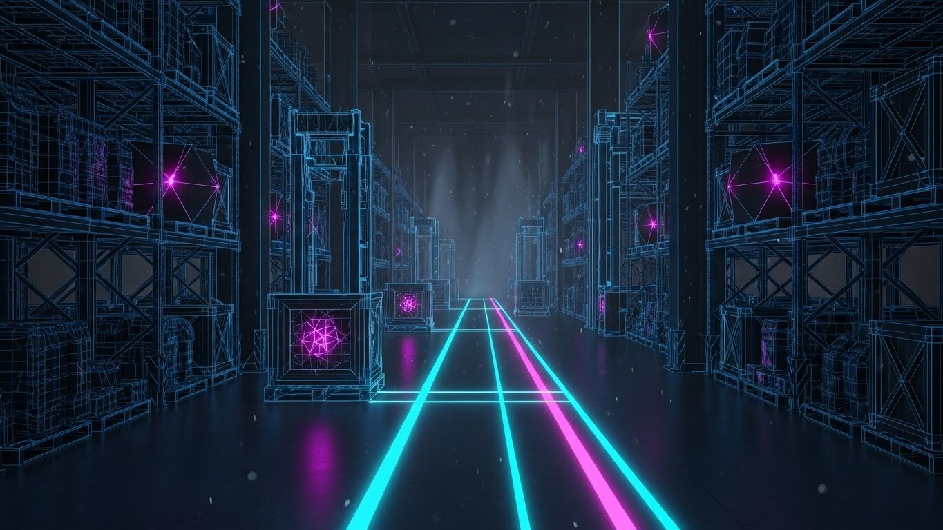
The Visual & Narrative Approach
To lead the market, you must look like you are from the future. This style adopts a "Cyberpunk Industrial" aesthetic. The warehouse is a dark charcoal void, illuminated only by glowing Neon Cyan and Magenta wireframes. Digital paths light up on the floor, guiding invisible assets. It creates a mysterious, high-tech atmosphere that implies your software is the underlying "Matrix" of the logistics world.
Psychological Impact & KPI Focus
This establishes Visionary Authority. It works exceptionally well on LinkedIn to differentiate your brand from the "boring" competition. It signals that you are pioneering the next generation of supply chain tech. It drives Share of Voice and Brand Perception.
Strategic Implementation & Trade-offs
- Recommended Duration: 15 Seconds (Social Media Loops).
- Strategic Trade-off: It is stylistically aggressive. Conservative buyers in traditional industries might find it too "video game-like." Use it to attract forward-thinking innovators.
Companies using similar video content -
Blue Yonder – Luminate Platform – Inspiring large-scale supply chain transformation.
Epicor – Kinetic – Cinematic vision of global manufacturing operations.
30. Hyper-lapse Stock Footage with Data
Expansion | Driving Referrals & Advocacy
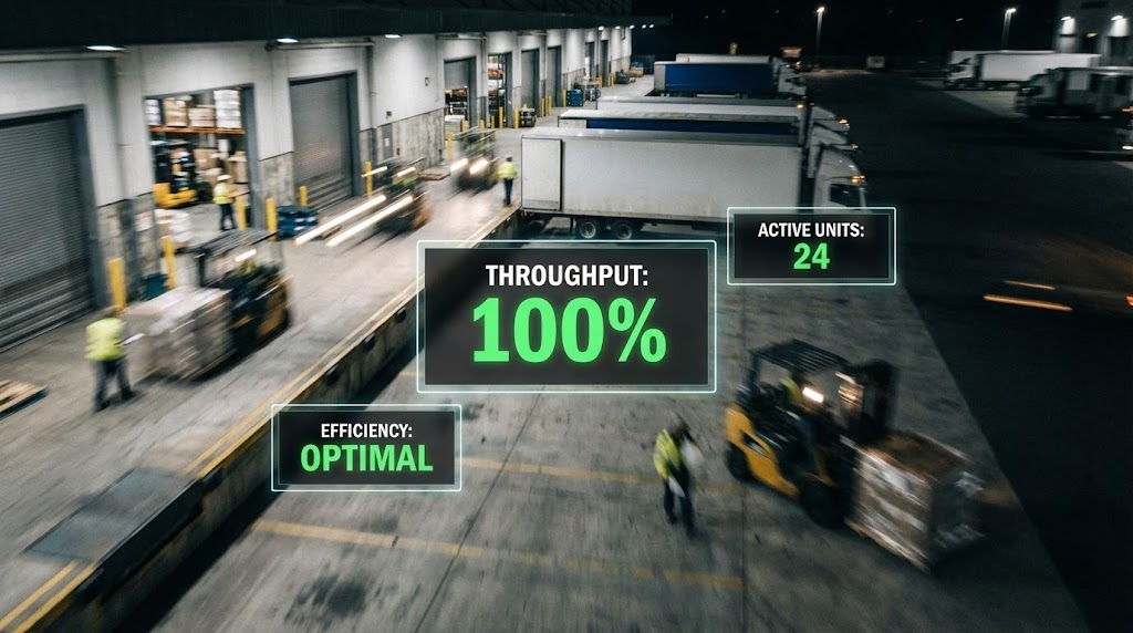
The Visual & Narrative Approach
The ultimate proof of a WMS is calm amidst chaos. This style uses a hyper-lapse (time-lapse in motion) of a busy loading dock. Forklifts and people become blurs of light, signifying intense speed. Overlaid on this chaos are sharp, static, unwavering UI widgets showing "Throughput: 100%" in Green. The contrast between the blurred reality and the sharp data visualizes absolute control.
Psychological Impact & KPI Focus
This visualizes Mastery. It tells the story that no matter how fast the physical world moves, the digital brain remains calm and accurate. It is a compelling visual for case studies and testimonials, driving Referrals and Advocacy.
Strategic Implementation & Trade-offs
- Recommended Duration: 15-20 Seconds (Case Study Headers).
- Strategic Trade-off: The data widgets must be legible. If the background motion is too frantic, it can distract from the metrics. The "glass" backing on the widgets must provide sufficient contrast.
Strategic Knowledge Base: The Visual Operations Doctrine
To transform these 30 visual styles into a cohesive business engine, we must move beyond "content creation" to "strategic infrastructure." The following three segments outline how to embed this visual language into the core of your warehouse operations.
Strategic Alignment & Visual Architecture
The "Pre-Production" Strategy. Why and Who.
Before a single pixel is rendered, the visual strategy must be aligned with operational reality. A "pretty" video that misrepresents the workflow creates friction, not adoption.
- The Cognitive Load Audit: Begin by auditing your current training materials. If a PDF manual takes 15 minutes to explain "Returns Processing," a 30-second Style 11 (Rapid UI Montage) video must not just summarize it, but visually decode it. The goal is to reduce the cognitive burden on the worker.
- Role-Based Visual Mapping: A Fleet Manager at a desk needs Style 5 (Dynamic Data Visualization) with dense information. A Driver on a mobile tablet needs Style 1 (Minimalist Flat 2D) with high contrast and large elements. Map your styles to the device and the environment of the viewer.
- The "Glanceability" Standard: In a high-velocity warehouse, attention is scarce. Visuals must be designed for "glanceability"—comprehension in under 2 seconds. Style 7 (Macro UI) is critical here, isolating single actions for instant recognition.
- Brand Voice Consistency: Your marketing videos (Styles 1-10) and your in-app support visuals (Styles 21-30) must share a "Visual DNA." If marketing is "Cyberpunk" but the app is "Bland Gray," you create a brand disconnect.
- The Advids Strategic Audit: Partnering with a specialized agency like Advids allows you to define this "Visual Operating System" before production begins. We help map the user journey to specific visual triggers, ensuring consistency across thousands of assets.
- Standardization vs. Customization: For generic workflows (e.g., "Safety Check"), use high-quality standardized styles (Style 3). For proprietary algorithms (e.g., "Cross-Docking Logic"), invest in bespoke Style 15 (Abstract 3D AI) visualization.
- The Cross-Departmental Bridge: Use these visuals to unify terminology. Sales, Ops, and Support often use different words for the same process. A shared visual library (Style 8 Isometric Workflow) creates a single source of truth.
- Legacy System Integration: When replacing legacy systems, use Style 6 (Split Screen) to visually map the "Old Way" (Green Screen) to the "New Way" (SaaS UI), reducing resistance to change.
- Accessibility in Logistics: Your workforce is diverse and often multi-lingual. Styles like 22 (Line Art) and 12 (Gamified Reality) rely on symbols and motion, not text/voiceover, making them universally understood without expensive translation.
- The Mobile-First Mandate: 80% of your post-sale content will be consumed on mobile devices (scanners, tablets, phones). Ensure all text in styles like Style 4 (Kinetic Typography) is legible on a 5-inch screen.
Operational Adoption & Implementation
The "Deployment" Phase. Embedding visuals into the workflow.
The best video is useless if it sits in a folder. This segment focuses on injecting visual intelligence directly into the operational bloodstream.
- Overcoming "Big Brother" Anxiety: WMS and telematics can feel invasive. Use Style 9 (Lifestyle Stock with UI) and Style 20 (Character Story) to frame the technology as a "Co-pilot" that protects the worker, rather than a "Spy" that monitors them.
- The Micro-Learning Shift: Replace hour-long seminars with a library of 30-second clips using Style 7 (Macro UI). These "Micro-Visuals" should be embedded directly in the app, triggered when a user hovers over a new feature.
- Just-in-Time Support: Embed Style 23 (Gen AI Character) videos into the help widget. When a user queries "Inventory Adjustment," a friendly face guides them through it instantly, preventing a support ticket.
- Gamification of Training: Use Style 12 (2D Graphics Over Live Action) to visualize "wins." Show a driver earning a "Gold Coin" graphic for a perfect safety check. This visual reinforcement hacks the dopamine loop to improve compliance.
- Reducing Support Ticket Volume: There is a direct correlation between the quality of your visual library and your support costs. Proactive, clear visuals like Style 27 (Holographic Diagnostic) answer questions before they are asked.
- Remote Onboarding: For distributed fleets, physical training is impossible. Style 3 (Isometric Motion) provides a "God's Eye View" of the facility/process, allowing remote staff to understand spatial dynamics without being on-site.
- Visual SOPs: Transform text-based Standard Operating Procedures into Style 21 (Clean UI Workflow) loops. These loops can play on screens in the breakroom or locker room, reinforcing process standards passively.
- Feedback Loops: Use interactive video elements. After a Style 24 (Low Poly) tutorial plays, ask the user to rate its helpfulness. This data is gold for optimizing your training content.
- Scalable Localization: By separating the text layers in styles like Style 11 (Rapid UI), you can easily swap languages for global rollouts without re-rendering the complex background animations.
- Leadership Communication: When rolling out a new WMS strategy to the board, don't use a spreadsheet. Use Style 28 (Cinematic Gen AI) to sell the vision of the future state.
Measuring Impact & Future-Proofing
The "ROI" Phase. Measuring success and looking ahead.
Visuals are an investment, not an expense. You must measure their return in terms of efficiency, adoption, and revenue.
- Beyond "Views": Stop counting views. Start measuring Time-to-Competency (how fast a new user reaches full productivity) and Feature Adoption Rate (how many users engage with a new feature after watching the video).
- The "Idle Time" Metric: In logistics, seconds are dollars. Correlate the deployment of Style 7 videos with a reduction in "Software Idle Time" (time spent figuring out what button to click).
- Compliance Velocity: How quickly does the fleet adapt to a new regulation (e.g., ELD mandate)? Use Style 13 (Wireframe to Reality) to explain the change visually and measure the speed of compliance adoption.
- Retention and LTV: High-quality UX visualization (Style 25 Parallax) signals a premium product. Track the correlation between deep engagement with these assets and customer Lifetime Value (LTV).
- The AI Visual Frontier: Prepare for real-time generative video. Soon, the Style 23 avatar won't just be a video; it will be a real-time AI agent answering questions in the driver's native language.
- Scalability of Assets: Build a library of "Atomic Visual Elements"—isolated 3D forklifts, UI widgets, boxes. These assets can be recombined infinitely to create new content without starting from scratch.
- The Advids Partnership: As your feature set grows, your visual library must scale. Advids acts as your long-term partner, managing this asset library and ensuring that your visual documentation keeps pace with your rapid development cycles.
- Benchmarking Success: Compare your visual "Help" section against competitors. If they use text and you use Style 21 video loops, you have a defensible competitive advantage in Usability.
- The ROI of Safety: Safety incidents are expensive. Quantify the reduction in insurance claims or accidents following the rollout of Style 12 (Gamified Safety) training modules.
- Final Call to Innovation: Treat video as infrastructure. Just as you upgrade your servers, you must upgrade your visual communication. It is the interface through which the human brain interacts with your digital intelligence.
End of Guide.
Companies using similar video content -
project44 – Movement Platform – Cutting-edge visibility and predictive analytics.
Tive – Visibility Platform – Pioneering future of supply chain.
Author & Editor Bio


