
Introduction: Visualizing the Fluid Supply Chain
The wholesale and distribution industry is navigating a profound shift. We are moving beyond the era of simple "box-moving" into an age of "Fluid Logistics," where the physical movement of goods is inextricably linked to the digital flow of data. For the modern Operations Director, the warehouse is no longer just a storage facility; it is a complex, breathing ecosystem of nodes and networks where efficiency is the only currency that matters.
However, a dangerous gap persists between the digital promise of ERPs and the chaotic reality of the loading dock. This "Physical-Digital Divide" is the primary source of operational friction. Recent industry data reveals that inventory discrepancies, returns, and reverse logistics are cited as top challenges for 47% of supply chain leaders. When stakeholders cannot clearly see the logic behind the logistics, trust erodes, and "ghost inventory" begins to eat into margins.
The response has been a surge in technology investment, yet adoption remains a struggle. Surprisingly, 62% of operations technology investments have not fully delivered the expected results. This is rarely a failure of code; it is a failure of communication. Complex algorithms and intricate WMS (Warehouse Management System) workflows are often presented in dense, text-heavy formats that overwhelm the user, leading to resistance and poor utilization.
This Video Style Guide serves as your strategic blueprint to close that gap. We have curated 30 distinct visual styles—beginning with these first ten—specifically designed to translate complex wholesale data into intuitive visual truth. By leveraging these frameworks, you can reduce cognitive load, build immediate trust, and demonstrate not just what your software does, but how it masters the chaos of the supply chain.
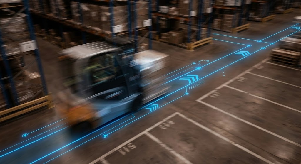
1. Isometric 2D Motion Design
TOFU | Brand Awareness

The Visual & Narrative Approach
This style employs a "God-Eye" Isometric high-angle view to visualize the complexity of a global wholesale network. By representing distribution centers as stylized geometric nodes in Clinical White and Navy Blue, and connecting them with Electric Purple pulsing grid lines, the composition turns a messy map into a clean, logical circuit board. The motion of data packets and abstract transport vehicles along these lines tells a story of synchronized, friction-free movement.
Psychological Impact & KPI Focus
Psychologically, the isometric perspective provides a sense of Total Control. It relieves the "Network Anxiety" that plagues executives who fear blind spots in their supply chain. It visually reinforces the KPI of Network Latency Reduction, implying that your software provides real-time, bird’s-eye oversight of every moving part, from the factory floor to the final mile.
Strategic Implementation & Trade-offs
- Best Use Case: Top-of-Funnel (TOFU) "Hero" videos on website homepages. It establishes immediate scale and technical sophistication.
- Recommended Duration: 15-30 Seconds (Looping).
- Trade-off: While excellent for showing scale, it lacks the detail to show depth. It is a strategic overview, not a tactical training tool.
Companies using similar video content -
Blue Yonder – Luminate Supply Chain Planning – Visualizes global supply chain networks.
Descartes Systems Group – Logistics Technology – Connects logistics nodes globally.
2. Abstract 2D Flat Vector Organic
TOFU | Market Education

The Visual & Narrative Approach
This visual metaphor tackles the concept of "Standardization." The image captures a metamorphosis: chaotic, amorphous Olive Green blobs on the left (representing unmanaged inventory) flow toward the right, transforming into perfect, glossy Sandstone and Rust Red cubes. The Three-quarter view adds dimension to the flat vector style. It illustrates the software’s ability to ingest messy, unstructured data and output clean, standardized, sellable units.
Psychological Impact & KPI Focus
The human brain seeks pattern resolution. This style triggers a sense of Cognitive Ease by resolving chaos into order. For operations managers drowning in messy SKUs, this visual offers a subliminal promise of relief. It supports the KPI of Data Integrity and SKU Rationalization, proving that the software creates order out of entropy.
Strategic Implementation & Trade-offs
- Best Use Case: Social Media feeds (LinkedIn/Instagram) where visual satisfaction stops the scroll. Perfect for Market Education.
- Recommended Duration: 6-12 Seconds (GIF/Loop).
- Trade-off: It is highly abstract. Literal-minded buyers may struggle to connect the "blobs" to their actual pallets without clear accompanying copy.
Companies using similar video content -
Infor – Nexus – Transforms messy supply chain data into structured insights.
o9 Solutions – Digital Brain – Organizes demand, supply, and financial planning.
3. Minimalist Flat 2D Vector
TOFU | Shaping Brand Perception

The Visual & Narrative Approach
Radical simplicity defines this style. A single, iconic shipping container is rendered in Slate Blue with Cool Mint accents against a Vivid Violet background. The Silhouette against a bright background composition removes all environmental noise—no cranes, no docks, no clutter. The sharp, long shadows give it a modern, architectural feel. It visualizes the "Single Source of Truth" concept—focusing entirely on the asset itself.
Psychological Impact & KPI Focus
In an industry cluttered with complex dashboards, minimalism signals Ease of Use. It shapes Brand Perception as modern and user-friendly. It appeals to the buyer who fears "bloatware" and complexity. The visual subtext supports the KPI of Asset Visibility, suggesting that the software cuts through the noise to pinpoint exactly what matters.
Strategic Implementation & Trade-offs
- Best Use Case: Display Ads (Google Display Network) and Retargeting Banners.
- Recommended Duration: Static or micro-motion (3-5 seconds).
- Trade-off: Its simplicity is its limitation. It cannot explain how the tracking works, only that it exists. Use for awareness, not education.
Companies using similar video content -
Shipium – Shipping Logistics Platform – Simplifies enterprise e-commerce shipping.
Track-POD – Delivery Management Software – Streamlines vehicle tracking and routing.
4. Bold Kinetic Typography (Visual)
TOFU | Demand Gen

The Visual & Narrative Approach
Here, the message is built from the industry's own materials. The typography ("DNGRS") is constructed from stylized wooden crates and pallets, utilizing a palette of Dark Olive, Khaki, and Bright Orange. The Side profile view gives the letters immense weight and dimensionality. It visualizes the concept of "Industrial Scale" by turning the marketing copy into heavy, physical inventory that occupies space.
Psychological Impact & KPI Focus
This style builds Domain Authority. It screams "Heavy Duty" and "Robust." It appeals to the pragmatic warehouse manager who values durability over aesthetics. It aligns well with messaging around Throughput Capacity and Safety Compliance, reinforcing the idea that the platform is built to handle the physical reality of a busy distribution center.
Strategic Implementation & Trade-offs
- Best Use Case: Social Media Teasers and Event Openers. It builds hype and energy.
- Recommended Duration: 10-15 Seconds (Fast-paced).
- Trade-off: It is aggressive. Overuse can make the brand feel "heavy." It is best used for emphatic statements rather than nuanced explanations.
Companies using similar video content -
Manhattan Associates – Active Supply Chain – Emphasizes robust, large-scale operations.
SYSPRO – ERP – Projects industrial scale for manufacturing and distribution.
5. Photorealistic 3D Renders
TOFU | Category Creation

The Visual & Narrative Approach
This visualization presents an aspirational reality. We see a pristine high-bay warehouse shelf where Platinum Silver racks hold perfectly aligned boxes in Deep Maroon with Rose Gold labels. The Reflection based composition mirrors the shelving on a polished concrete floor, creating a clinical, laboratory-like atmosphere. The narrative is Perfection. It removes the dust and debris, presenting the warehouse as a perfectly tuned machine.
Psychological Impact & KPI Focus
This style taps into Aspiration. It sells the "Platinum Standard" of warehousing. It validates the buyer's ambition for operational excellence. It strongly supports Space Utilization and Inventory Accuracy KPIs, showing the end-state of a perfectly slotted warehouse where every cubic inch is maximized.
Strategic Implementation & Trade-offs
- Best Use Case: High-stakes "Vision" videos or the main background of a "Why Us" landing page.
- Recommended Duration: 30-60 Seconds (Slow pans).
- Trade-off: It creates a high bar. If the actual software UI or the client's facility doesn't match this level of polish, it can create a "Reality Gap" that breeds cynicism.
Companies using similar video content -
Oracle Warehouse Management Cloud – WMS Cloud – Presents aspirational, optimized warehouse environments.
SAP Extended Warehouse Management (EWM) – EWM – Visualizes high-volume, precise warehouse operations.
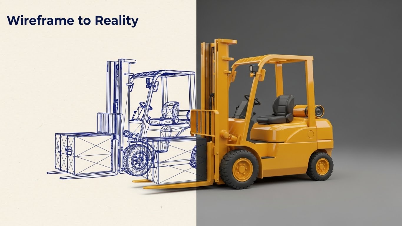
6. Wireframe to Reality Transition
TOFU | ABM Awareness
The Visual & Narrative Approach
This split-screen composition creates a visual metaphor for the "Digital Twin." On the left, a Midnight Blue wireframe blueprint of a forklift on Soft Cream paper represents the planning phase. On the right, the fully rendered Goldenrod Yellow 3D forklift represents execution. The sharp Split-screen vertical transition visualizes the software's role in translating digital plans into physical action.
Psychological Impact & KPI Focus
This style appeals to the Engineering Mindset (CTOs and Technical Leads). It validates the technical rigor behind the platform. It reassures them that the software is engineered, calculated, and exact. It effectively visualizes Forecast Accuracy and Operational Planning, demonstrating that the plan and the reality are perfectly aligned.
Strategic Implementation & Trade-offs
- Best Use Case: LinkedIn Thought Leadership posts or ABM campaigns targeting technical decision-makers.
- Recommended Duration: 15-20 Seconds (Sliding transition).
- Trade-off: It is very technical. It may feel "dry" to a non-technical audience (like a CFO) who cares more about financial outcomes than engineering schematics.
Companies using similar video content -
OpenWMS.org – Open Warehouse Management System – Bridges planning (blueprint) to physical warehouse execution.
NocoBase – No-Code/Low-Code Platform – Allows building customized inventory systems from blueprints.
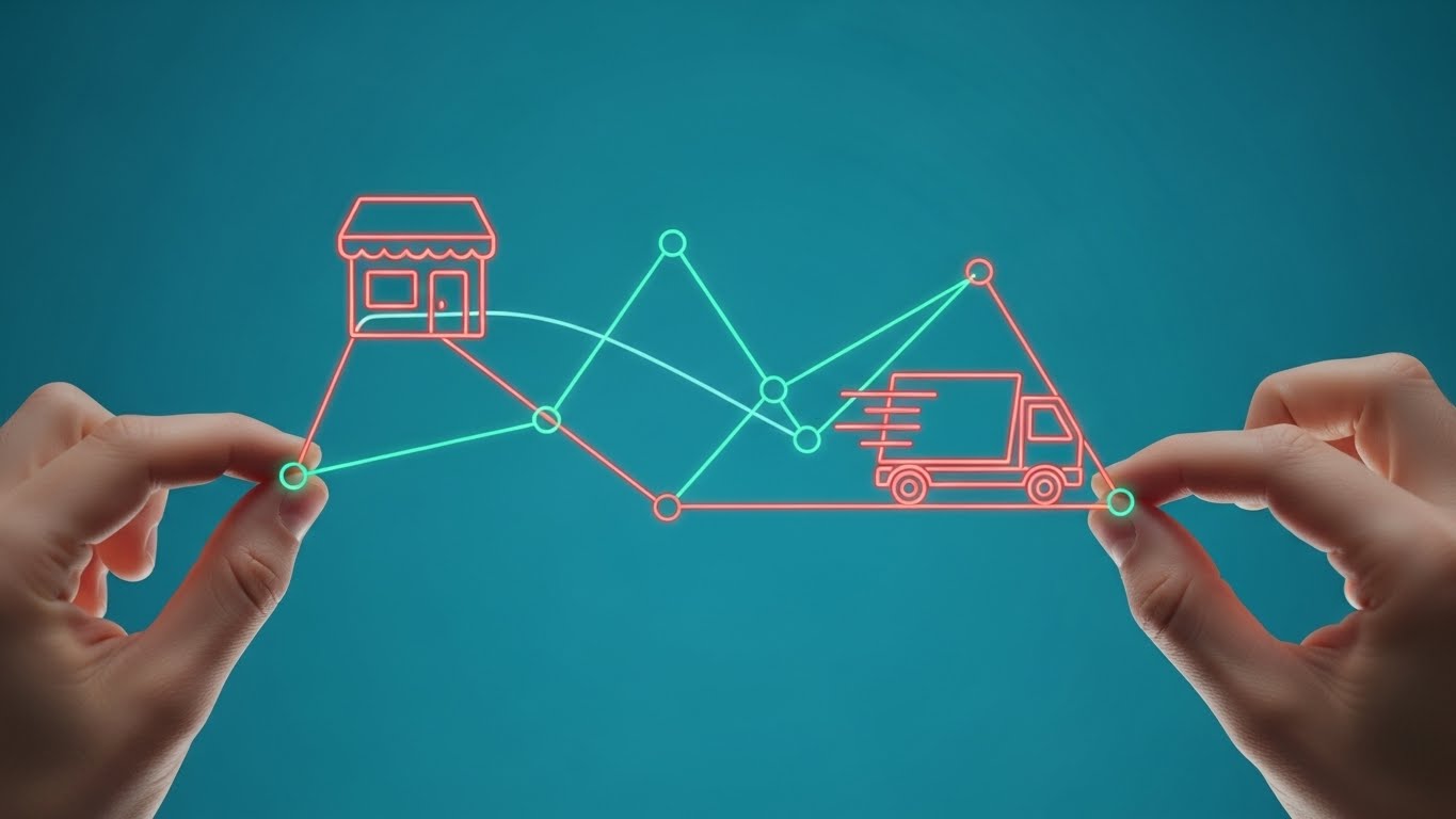
7. 2D Line Art Animation
MOFU | Product/Solution Differentiation
The Visual & Narrative Approach
Elegant and fluid, this style features thin, glowing lines in Aqua Green and Coral Red against a deep Teal Blue background. The lines fluidly connect a retail store icon to a delivery truck, suggesting an unbroken chain of custody. The composition focuses on a Close-up on hands manipulating the nodes, implying that the user has direct, tactile control over the data flow. The aesthetic is clean, precise, and distinctly modern tech.
Psychological Impact & KPI Focus
The continuous line is a powerful metaphor for an unbroken supply chain. It subconsciously reassures the viewer that there are no gaps, no dropped handoffs, and no data silos. The "hands-on" element reinforces the feeling of agency and control. This style strongly supports the KPI of End-to-End Traceability, visually promising that the user can trace a product from source to destination without losing sight of it.
Strategic Implementation & Trade-offs
- Best Use Case: Product Differentiation pages on the website. It is excellent for explaining specific workflows or integrations.
- Recommended Duration: 30-60 Seconds.
- Trade-off: It risks oversimplifying. If the actual software interface is a complex spreadsheet, this elegant line art can set an expectation of simplicity that the product fails to meet.
Companies using similar video content -
Celigo – Integration Platform – Illustrates seamless connections between systems.
MuleSoft – Anypoint Platform – Connects APIs and applications with fluid lines.
8. 2D Character-Driven Story
MOFU | YouTube

The Visual & Narrative Approach
Humanizing the tech stack, this style features a warehouse manager character—middle-aged, approachable, wearing a Dark Graphite vest. He holds a tablet with confidence, standing in a stylized Electric Blue warehouse. The Wide-angle panoramic shot places him in the center of a vast operation, yet he looks calm and in control. The art style avoids cartoony exaggeration, opting for a flat, corporate tech aesthetic that respects the professionalism of the role.
Psychological Impact & KPI Focus
Technology adoption is often stalled by the fear that "my team won't use it." This style directly addresses the User Adoption anxiety. By showing a relatable peer succeeding with the tool, it leverages Social Proof and empathy. It shifts the focus from the software to the empowered human, reinforcing the KPI of Workforce Productivity. It says, "This tool makes your people better, not obsolete."
Strategic Implementation & Trade-offs
- Best Use Case: YouTube Organic Search and Case Study videos. It tells the "Success Story."
- Recommended Duration: 60-90 Seconds.
- Trade-off: Character animation is hard to get right. If the character looks too "cartoony," it trivializes the work. It requires high-quality, mature illustration to resonate with B2B buyers.
Companies using similar video content -
Fishbowl Inventory – WMS – Focuses on empowering SMB warehouse teams.
Zoho Inventory – Inventory Management – Shows users confidently managing stock.
9. Low-Poly 3D Modeling
MOFU | Skippable Pre-Roll Ad

The Visual & Narrative Approach
This style reduces complex machinery to simple geometric facets. A forklift lifting a pallet is rendered in Forest Green, Sage Green, and Copper Bronze, creating an earthy, industrial palette. The Top-down 'god view' provides a clear, unobstructed look at the mechanics of the lift. The hard, angular shadows give the image a tactile, "toy-like" quality that makes the heavy machinery feel manageable and unintimidating.
Psychological Impact & KPI Focus
Low-poly art strips away the "grime" of reality to focus on the essence of the action. It simplifies the visual field, making it incredibly easy to understand complex spatial relationships. For a pre-roll ad, this quick readability is crucial. It supports the KPI of Process Optimization, visually stripping a process down to its most efficient, essential movements. It implies your software cuts the fat.
Strategic Implementation & Trade-offs
- Best Use Case: Skippable Pre-Roll Ads (YouTube/Social). The unique aesthetic grabs attention in the first 5 seconds.
- Recommended Duration: 10-15 Seconds.
- Trade-off: It is a stylized aesthetic that might feel "indie game" to some conservative corporate boards. It works best for younger, tech-savvy logistics startups or modernizing legacy brands.
Companies using similar video content -
InvenTree – Open-Source Inventory Management – Simplifies complex parts management into manageable units.
myWMS – Open-Source WMS – Reduces warehouse operations to essential, trackable movements.
10. 3D X-Ray Visualization
MOFU | Building Trust & Credibility

The Visual & Narrative Approach
A powerful visual metaphor for data transparency. We see a sealed shipping box, but the outer cardboard is rendered in semi-transparent Burgundy Red. Inside, the organized items glow in Pale Pink and Gold Leaf, revealing the value hidden within. The Macro close-up with shallow depth of field draws the eye specifically to the internal contents, while the background blurs away. It is a literal interpretation of "seeing inside the box."
Psychological Impact & KPI Focus
The "unknown" is the enemy of logistics. This style provides a visceral sense of Relief—the ability to see the unseen. It satisfies the craving for information and reassurance. By making the package transparent, it symbolically promises that your software removes all blind spots. It directly visualizes the core KPI of Inventory Visibility, assuring the user that nothing is hidden, lost, or unaccounted for.
Strategic Implementation & Trade-offs
- Best Use Case: Website Feature Pages (specifically for Inventory Tracking or WMS modules).
- Recommended Duration: 15-20 Seconds (Looping).
- Trade-off: It is a singular metaphor. While powerful for "Visibility," it doesn't convey motion or network-wide complexity. It is best used as a specific feature highlight.
Companies using similar video content -
Controlant – Controlant Platform – Provides real-time, internal visibility for cold chain.
Datex WMS – WMS – Offers deep visibility into pharmaceutical distribution.
11. Abstract 3D AI Visualization
MOFU | Overcoming Objections

The Visual & Narrative Approach
This style addresses the "Black Box" anxiety of Artificial Intelligence. The visual begins with thousands of chaotic Ocean Blue dots swirling in a void, representing unstructured data points—orders, inventory levels, and shipping times. Through a seamless animation, these particles rush toward a central vanishing point and reorganize themselves into a rigid, structured bar chart formation in Sky Blue and Bright White. The Central perspective draws the viewer’s eye inward, visually narrating the process of the software ingesting raw chaos and outputting actionable intelligence.
Psychological Impact & KPI Focus
For the skeptic who distrusts "magic" algorithms, this visual builds Intellectual Confidence. It shows the work. It demonstrates that the AI isn't guessing; it is organizing. It reduces the fear of the unknown by giving the algorithm a physical form. This directly supports KPIs related to Demand Forecasting and Data Accuracy, assuring the user that the "brain" behind the operation is logical, structured, and precise.
Strategic Implementation & Trade-offs
- Best Use Case: Middle-of-Funnel (MOFU) "How It Works" videos and Objection Handling content regarding automation.
- Recommended Duration: 15-20 Seconds.
- Trade-off: It is highly conceptual. While it explains the nature of the intelligence, it does not show the interface. It requires a voiceover to connect the "dots" to specific business problems like seasonal demand spikes.
Companies using similar video content -
Logility – SCM Platform – Visualizes AI-driven algorithms structuring supply chain data.
IBM Sterling Supply Chain Business Network – SCBN – Shows AI processing data for anomaly detection.
12. Lifestyle Stock with UI Overlay
MOFU | The Functional Buyer

The Visual & Narrative Approach
Here, the focus shifts to the human element of the supply chain. We see a high-quality shot of a warehouse worker in a Deep Navy Blue uniform, viewed from an Over-the-shoulder perspective. He holds a rugged tablet displaying a futuristic UI overlay in Vivid Electric Cyan. The background is a realistic blur of Cool Slate Grey racking. The narrative is one of Augmentation—the software is not replacing the worker; it is giving them superpowers (vision, accuracy, speed) directly on the floor.
Psychological Impact & KPI Focus
This style targets the Functional Buyer and the Operations Director concerned with labor efficiency. It visually resolves the tension between "blue-collar" reality and "white-collar" strategy. It proves the tool is usable in the actual environment. It reinforces KPIs regarding Picking Accuracy and Labor Efficiency, visually demonstrating that the data is available exactly where the work happens, not just in the back office.
Strategic Implementation & Trade-offs
- Best Use Case: LinkedIn Video Ads and Careers/Culture pages. It humanizes the brand and helps with recruitment.
- Recommended Duration: 15-30 Seconds.
- Trade-off: Stock footage can feel generic. To maintain authority, the UI overlay must be high-fidelity and the "worker" must look authentic, not like a model in a costume.
Companies using similar video content -
ShipBob WMS – WMS – Shows e-commerce workers using tablets for fulfillment.
Extensiv Order Manager – Order Manager – Augments in-house fulfillment teams with digital tools.
13. Macro UI Micro-Interactions
MOFU | Feature Education & Demonstration

The Visual & Narrative Approach
This style zooms in to the molecular level of user experience. The frame is entirely filled by a single "Reorder" button in Emerald Green on a Clean White background. An Extreme close-up captures the moment a stylized finger hovers over it, triggering a Bright Lime Green inner glow and a subtle physical compression of the button. It visualizes the "Tactile Satisfaction" of the software. It transforms a mundane data entry task into a responsive, frictionless interaction.
Psychological Impact & KPI Focus
In a world of clunky legacy software, "Responsiveness" is a proxy for "Modernity." This style triggers a micro-dose of Dopamine, signaling that the system is fast, easy, and satisfying to use. It addresses Dashboard Fatigue. Strategically, it highlights User Adoption and Order Processing Speed, implying that the friction has been engineered out of the daily workflow.
Strategic Implementation & Trade-offs
- Best Use Case: Website Product Pages and "Feature Spotlight" sections.
- Recommended Duration: 5-10 Seconds (Looping GIF).
- Trade-off: It lacks context. A button press means nothing without the surrounding workflow. It is a texture shot, not a story shot. Use it to punctuate larger narratives.
Companies using similar video content -
Acumatica – Cloud ERP – Highlights user-friendly interactions in its cloud platform.
Oracle NetSuite – ERP – Emphasizes seamless UI for inventory and order management.
14. Dynamic Data Visualization
BOFU | ROI Justification

The Visual & Narrative Approach
This metaphor turns inventory directly into profit. We see open Charcoal Black cardboard boxes, but instead of products, 3D bar charts in Steel Silver and Sunset Orange forcefully extrude upwards from within them. The Dutch angle (tilted) camera adds a sense of aggressive growth and kinetic energy. The background is a sleek dark gradient. The visual story is "Extraction"—the software pulls hidden value and profit margins directly out of the existing stock.
Psychological Impact & KPI Focus
This is tailored for the CFO and Financial Decision Maker. It moves the conversation from "Managing Logistics" to "Maximizing Capital." The rising bars subconsciously signal growth, profit, and upside. It strongly supports ROI Justification and GMROI (Gross Margin Return on Investment), visually arguing that the inventory in the boxes is capital waiting to be unlocked by better management.
Strategic Implementation & Trade-offs
- Best Use Case: Bottom-of-Funnel (BOFU) Presentation decks and Proposal videos.
- Recommended Duration: 10-15 Seconds.
- Trade-off: It is overtly "salesy." It works best when you are trying to close the deal and justify the cost, rather than when you are trying to educate the user on features.
Companies using similar video content -
Green Mountain Technology – Parcel Spend Management – Visualizes cost savings and optimization.
Enveyo – Logistics Analytics – Extracts and displays predictive modeling and business intelligence.
15. Clean UI Workflow (Light Mode)
BOFU | Driving Demo Requests
The Visual & Narrative Approach
Clarity is the ultimate luxury in logistics. This style presents a stylized, high-fidelity wholesale dashboard in a pristine Light Mode. The interface uses Royal Purple for headers and Neon Magenta for critical data points against a Lavender Mist background. Text is replaced with abstract lines to focus the eye on the layout and hierarchy. The Straight-on front view suggests transparency and order. It visualizes the "Control Tower" concept—a single pane of glass for all operations.
Psychological Impact & KPI Focus
This style alleviates Cognitive Load. For a manager used to staring at black-and-green terminal screens or endless spreadsheets, this clean aesthetic promises Mental Clarity. It suggests that the software handles the complexity so the user doesn't have to. It drives Demo Requests by making the software look inviting and easy to learn, supporting KPIs related to Operational Visibility and Decision Latency.
Strategic Implementation & Trade-offs
- Best Use Case: Website Homepage (Above the Fold) and Pricing Pages.
- Recommended Duration: 30-45 Seconds.
- Trade-off: The "abstract" text can backfire if the user wants to see exact data fields. It sells the feeling of the UI, not the specific functionality.
Companies using similar video content -
Logiwa – IO WMS/FMS – Presents a clean, intuitive dashboard for high-volume fulfillment.
WizCommerce – Wholesale Distribution Software – Showcases AI-powered, user-friendly interfaces.
16. Split Screen: Optimized Reality and UI
BOFU | Competitive Comparison/Switcher
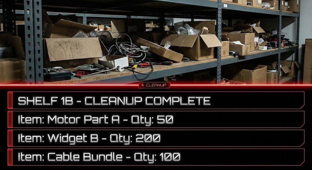
The Visual & Narrative Approach
The power of contrast is utilized here to show the "Before and After." The top half of the screen displays a gritty, realistic photo of a disorganized warehouse shelf in Gunmetal Grey. The bottom half mirrors this reality but translates it into a sleek, organized Dark Mode UI list in Chrome Silver and Laser Red. A glowing red laser line divides the two worlds. As the laser scans, the mess above is quantified and organized below.
Psychological Impact & KPI Focus
This appeals to the Switcher Psychology. It validates the user's current pain (the messy shelf) and immediately offers the cure (the clean UI). It is a "Sanity Check" that proves the software connects to reality. It supports KPIs like Inventory Accuracy and Cycle Count Efficiency, visually demonstrating how the digital tool tames the physical mess.
Strategic Implementation & Trade-offs
- Best Use Case: Social Media Comparison Ads ("Stop Guessing, Start Tracking").
- Recommended Duration: 15-20 Seconds.
- Trade-off: The "messy" imagery must be relatable but not repulsive. It needs to look like a "busy" warehouse, not a failing one, to avoid insulting the prospect's current state.
Companies using similar video content -
Infoplus – WMS – Contrasts messy warehouse reality with organized digital inventory.
Cin7 – Inventory Management – Shows physical stock transformed into organized digital data.
17. Aspirational Stock Montage
BOFU | LinkedIn Video Ads

The Visual & Narrative Approach
This style celebrates the human team behind the logistics. It features a diverse group of warehouse professionals standing in a confident V-formation on a sunlit loading dock. They wear coordinated vests in Deep Teal and Turquoise. The Low-angle worm's eye view makes them appear heroic and capable. A Mustard Yellow sunlight flare adds warmth and optimism. The narrative is that the software builds a winning, cohesive culture.
Psychological Impact & KPI Focus
This targets the Leadership Persona. It leverages Social Proof and the desire for a happy, safe, and productive workforce. It counters the fear that technology alienates employees. Instead, it positions the software as a tool for Employee Retention and Safety Culture, suggesting that a well-organized warehouse creates a proud and confident team.
Strategic Implementation & Trade-offs
- Best Use Case: "About Us" videos and LinkedIn Corporate Brand ads.
- Recommended Duration: 30-60 Seconds.
- Trade-off: It is pure brand building. It conveys zero technical information. It must be paired with hard data or UI shots to be effective for a software sale.
Companies using similar video content -
Brightpearl – Retail Operating System – Focuses on empowering teams and customizable processes.
Candid – Wholesale Platform – Builds trust through integrated communication and team collaboration.
18. Isometric 3D Workflow
BOFU | The Economic Buyer

The Visual & Narrative Approach
This style zooms out to the macro level, presenting the supply chain as a "Miniature City." Rendered in a matte plastic finish with a palette of Violet Blue, Lilac, and Cyan Glow, we see tiny trucks, warehouses, and ships moving on a synchronized grid. The Fisheye lens distortion adds a subtle curvature, implying a global reach. It visualizes the entire ecosystem as a cohesive, interconnected, and manageable unit.
Psychological Impact & KPI Focus
This appeals to the Economic Buyer (CEO/Owner) who needs to see the "Big Picture." It satisfies the craving for Holistic Integration. It visually eliminates silos, showing that the warehouse is connected to the fleet, which is connected to the port. It supports KPIs regarding Supply Chain Integration and Network Optimization, proving the software manages the gaps between nodes, not just the nodes themselves.
Strategic Implementation & Trade-offs
- Best Use Case: Website "Platform" pages and Investor Decks.
- Recommended Duration: 45-60 Seconds.
- Trade-off: The "toy-like" aesthetic creates approachability but risks reducing the perceived "industrial gravity" of the solution. It is better for strategy than for heavy operational details.
Companies using similar video content -
SAP SCM – Supply Chain Management – Visualizes the entire supply chain ecosystem.
Oracle SCM Cloud – SCM Cloud – Presents a holistic view of planning, logistics, and order management.
19. Hyper-lapse Stock Footage with Data
BOFU | Competitive Displacement
The Visual & Narrative Approach
Real-world speed meets digital precision. The background is a high-speed hyper-lapse of a warehouse floor in Dark Mocha and Taupe, where a forklift is a mere blur of motion. Overlaid on this kinetic background are sharp, static data lines and waypoints in Vivid Azure. The Motion blur background with a sharp subject (the data) visualizes the concept that while the physical world moves fast, the data captures it instantly and precisely.
Psychological Impact & KPI Focus
This style creates a sense of Urgency and Competence. It proves the software can keep up with a high-volume operation. It addresses the fear of latency or system lag. It supports KPIs related to Throughput Velocity and Real-Time Tracking, visually promising that the digital twin is perfectly synchronized with the physical reality, no matter how fast it moves.
Strategic Implementation & Trade-offs
- Best Use Case: Event Booth Backgrounds and High-Energy Social Ads.
- Recommended Duration: 15-20 Seconds.
- Trade-off: It can be visually overwhelming. The data overlay must be simple and bold to be readable against the busy background.
Companies using similar video content -
Locus – Logistics Platform – Overlays data on high-speed logistics operations.
RocketFuel Recharge – 3PL Cash Flow Automation – Visualizes rapid financial transactions in logistics.
20. 2D Animation & UI Composition
BOFU | Objection Handling & Friction Reduction

The Visual & Narrative Approach
This style bridges the gap between user and machine. A stylized, flat 2D character in Matte Black stands on the left, pointing confidently at a floating 3D gear icon in Neon Green on the right. The background is a Glossy Dark Grey. The composition uses the Rule of Thirds to balance the human element with the technical element. It visualizes the interaction: the user commands, and the complex "gear" (the backend engine) obeys.
Psychological Impact & KPI Focus
This is a disarming style designed for Objection Handling. It simplifies the relationship between the user and the tech. It suggests that while the backend (the 3D gear) is powerful and complex, the user experience (the 2D character) is simple and direct. It supports KPIs regarding Change Management and Training Time, promising that your powerful software doesn't require a PhD to operate.
Strategic Implementation & Trade-offs
- Best Use Case: Explainer Videos and "Onboarding" content.
- Recommended Duration: 30-45 Seconds.
- Trade-off: The mix of 2D and 3D can look disjointed if not lit correctly. The lighting on the 3D element must match the implied environment of the 2D character to feel cohesive.
Companies using similar video content -
Jitterbit – Harmony Platform – Simplifies complex AI-powered integration with friendly visuals.
Boomi – Integration Platform – Uses animation to explain iPaaS and data services.
21. Rapid UI Feature Montage
Onboarding | Self-Serve Onboarding
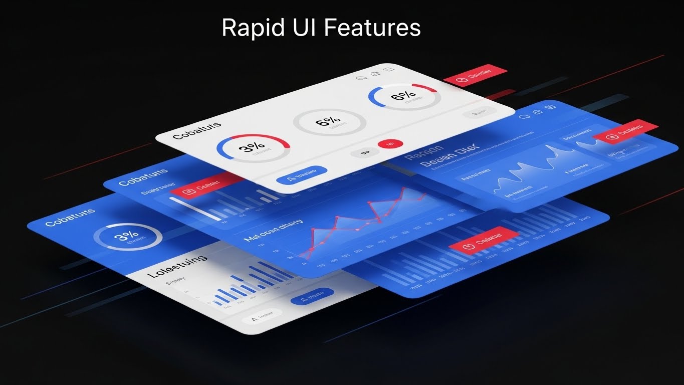
The Visual & Narrative Approach
This style addresses the "Feature Blindness" that occurs when users are overwhelmed by a new platform. The visual uses a Z-layout composition to guide the eye through a cascade of floating UI screens in Cobalt Blue and Light Grey. Notification badges in Crimson Red pop against the cool tones, signaling urgency and action. Motion lines suggest these screens are flying into place, creating a narrative of speed and accessibility. It simulates the feeling of "breezing through" the workflow.
Psychological Impact & KPI Focus
Speed is the primary currency here. This style triggers a sense of Operational Velocity. It reassures the user that the software is snappy and responsive. By showing multiple screens in rapid succession, it subliminally trains the user on where to look for critical alerts. This supports Time-to-Value and Feature Adoption KPIs, effectively combating the "bloatware" perception by highlighting only the most active, high-value interface elements.
Strategic Implementation & Trade-offs
- Best Use Case: "What's New" update videos and Self-Serve Onboarding sequences.
- Recommended Duration: 10-15 Seconds (Fast cuts).
- Trade-off: It moves too fast for deep learning. It is an impressionist tool, not an instructional one. It creates excitement about the feature set but doesn't teach the specific click-path.
Companies using similar video content -
ERPNext – Inventory Management – Showcases quick navigation through inventory features.
Odoo Inventory – Inventory Management – Highlights rapid feature access and workflow.
22. Abstract 2D Motion Graphics
Onboarding | Reducing Implementation Friction

The Visual & Narrative Approach
Implementation is often the biggest barrier to sale. This style visualizes "Connection" using simple, clean metaphors. A Pine Green plug moves toward a Fern Green socket, creating a Lemon Yellow spark of activation upon contact. The Diagonal leading lines create forward momentum. It strips away the complexity of API documentation and coding, reducing the concept of "Integration" to a simple, physical act of plugging in.
Psychological Impact & KPI Focus
This visual reduces Integration Anxiety. Technical buyers often fear that new software will break their existing stack. This smooth, vector-based animation promises a "Plug-and-Play" experience. It supports KPIs related to Implementation Time and Technical Compatibility, visually reassuring the CTO that your software plays nicely with their existing ecosystem (ERP, CRM, WMS).
Strategic Implementation & Trade-offs
- Best Use Case: "Integration" pages on the website and Technical Documentation headers.
- Recommended Duration: 5-8 Seconds (Looping GIF).
- Trade-off: It is highly metaphorical. It doesn't show the actual code or API schema. It sells the ease of the result, not the reality of the process.
Companies using similar video content -
Axway B2B Integration – B2B Integration – Visualizes smooth data exchange and API connections.
Cleo Integration Cloud – Integration Platform – Depicts seamless integration between trading partners.
23. 3D Parallax UI Presentation
Onboarding | Driving Freemium/Trials
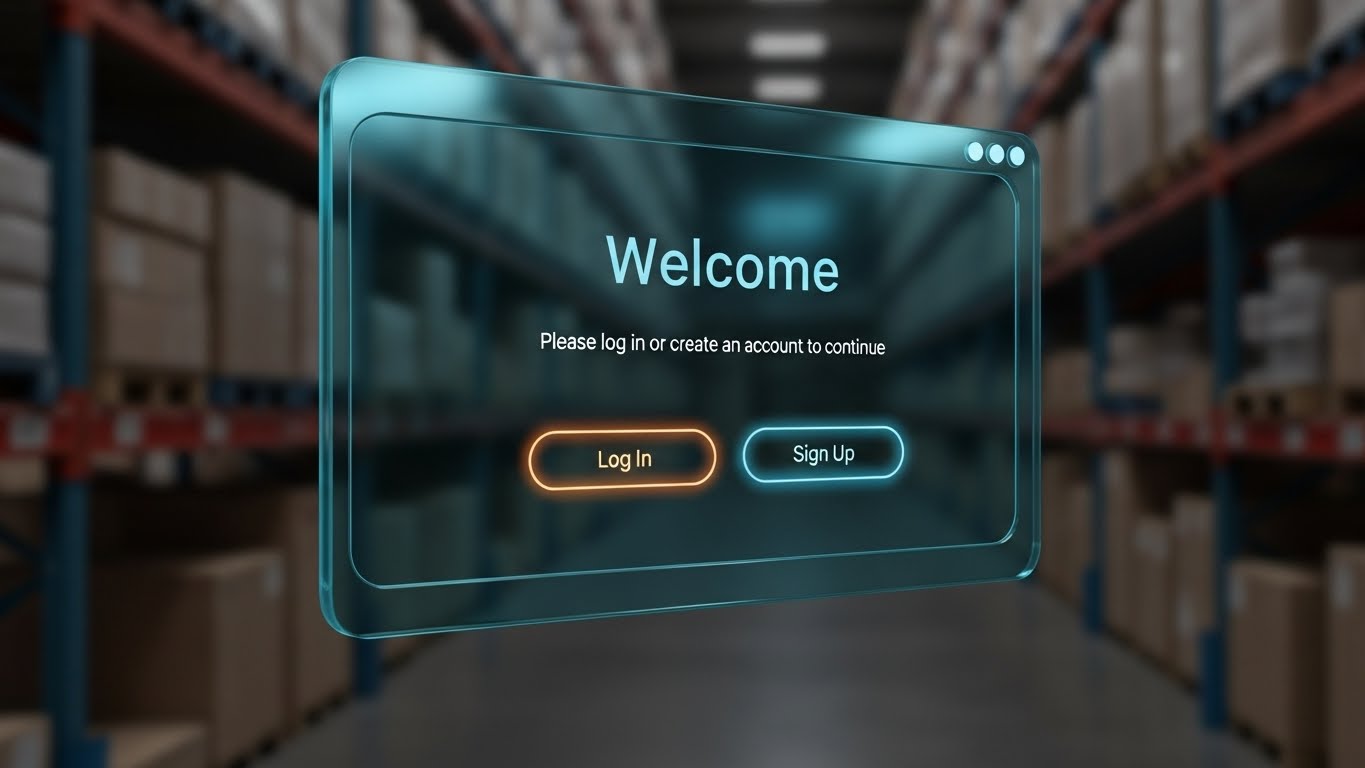
The Visual & Narrative Approach
The "Welcome" screen is the front door of your digital warehouse. This style uses 3D Parallax to give that door weight and importance. A transparent glass UI panel in Dark Cyan floats in the foreground, while the warehouse shelves in the background are blurred. Text elements in Light Azure and buttons in Neon Orange float on different Z-axis planes. This Framed within a frame composition draws the viewer specifically to the "Log In" action, treating the software entry point as a portal to productivity.
Psychological Impact & KPI Focus
This style utilizes Depth Cues to create focus. By blurring the background (the warehouse mess) and sharpening the foreground (the UI), it psychologically positions the software as the lens through which order is achieved. It supports User Activation and Trial Sign-ups, making the act of logging in feel significant and modern.
Strategic Implementation & Trade-offs
- Best Use Case: Landing Page Hero sections for Freemium or Free Trial offers.
- Recommended Duration: 10-20 Seconds (Slow, floating motion).
- Trade-off: It is purely aesthetic. It elevates the brand's perceived value but doesn't explain specific features. It is a "mood setter" for the beginning of the user journey.
Companies using similar video content -
QuickBooks Enterprise – Enterprise Solutions – Creates an inviting entry point to its ERP features.
Epicor – Eclipse ERP – Presents an immersive view of its distribution ERP.
24. 2D Graphics Over Live Action
Retention | Accelerating Time-to-Value

The Visual & Narrative Approach
This Mixed Media style bridges the gap between digital confirmation and physical service. It overlays Vivid Lime 2D sparkles and checkmarks onto a realistic photo of a delivery handover. The driver, dressed in Graphite Grey, and the customer are frozen in a Dynamic action shot. The graphics visually "pop" to confirm the signature. It illustrates the concept of "Proof of Delivery" not just as data, but as a celebratory moment of service completion.
Psychological Impact & KPI Focus
This style builds Trust and Validation. It visually confirms that the digital action (signing the tablet) has a positive real-world consequence (happy customer). It appeals to the Customer Service Manager. It supports KPIs regarding Delivery Accuracy and CSAT (Customer Satisfaction) Scores, reinforcing the idea that your software ensures the final mile is error-free.
Strategic Implementation & Trade-offs
- Best Use Case: Social Media ads targeting logistics managers and Case Study testimonials.
- Recommended Duration: 15-30 Seconds.
- Trade-off: It requires high-quality original photography. If the underlying stock photo looks cheesy, the cool graphics won't save it. Authenticity of the "driver" is key.
Companies using similar video content -
Onfleet – Last-Mile Delivery Software – Overlays graphics on proof-of-delivery moments.
Magaya Corporation – Supply Chain Solutions – Verifies actions in freight and warehouse management.
25. Dark Mode UI Showcase
Retention | Trial/Freemium User Activation
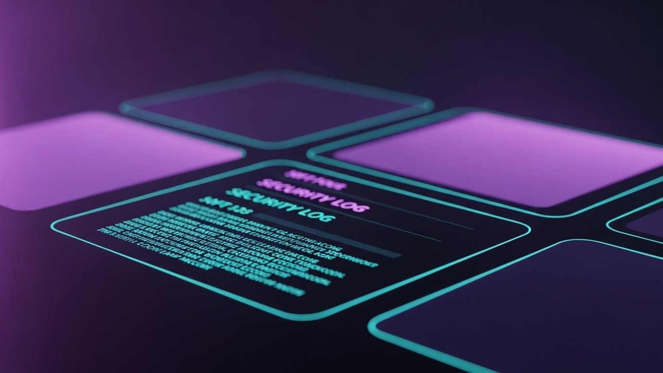
The Visual & Narrative Approach
Security is serious business. This style uses a "Dark Mode" aesthetic to convey robust protection. The interface is rendered in Midnight Purple with Soft Violet panels and Teal Accent text, evoking a cybersecurity command center. The Rack focus technique blurs the peripheral data, keeping the "Security Log" sharp and legible. It visualizes the software as a fortress—impenetrable, serious, and constantly monitoring in the background.
Psychological Impact & KPI Focus
This appeals to the Risk Averse buyer (IT Directors/CIOs). The dark palette psychologically signals "Stealth" and "Power." It reassures them that their sensitive wholesale data is safe. It supports KPIs related to Data Security Compliance and System Uptime, visually promising that the system is a vigilant guardian of their digital assets.
Strategic Implementation & Trade-offs
- Best Use Case: Security compliance pages and "Trust Center" documentation.
- Recommended Duration: 10-15 Seconds.
- Trade-off: Dark mode can feel "cold" or "intimidating" if overused. It works best for security/backend features, not for friendly front-end user engagement.
Companies using similar video content -
OpenText – Trading Grid – Showcases secure B2B integration with a dark, serious aesthetic.
Commport – EDI Network – Presents a secure, dark-themed view of EDI transactions.
26. Holographic UI over 3D Render
Retention | Reducing Churn
The Visual & Narrative Approach
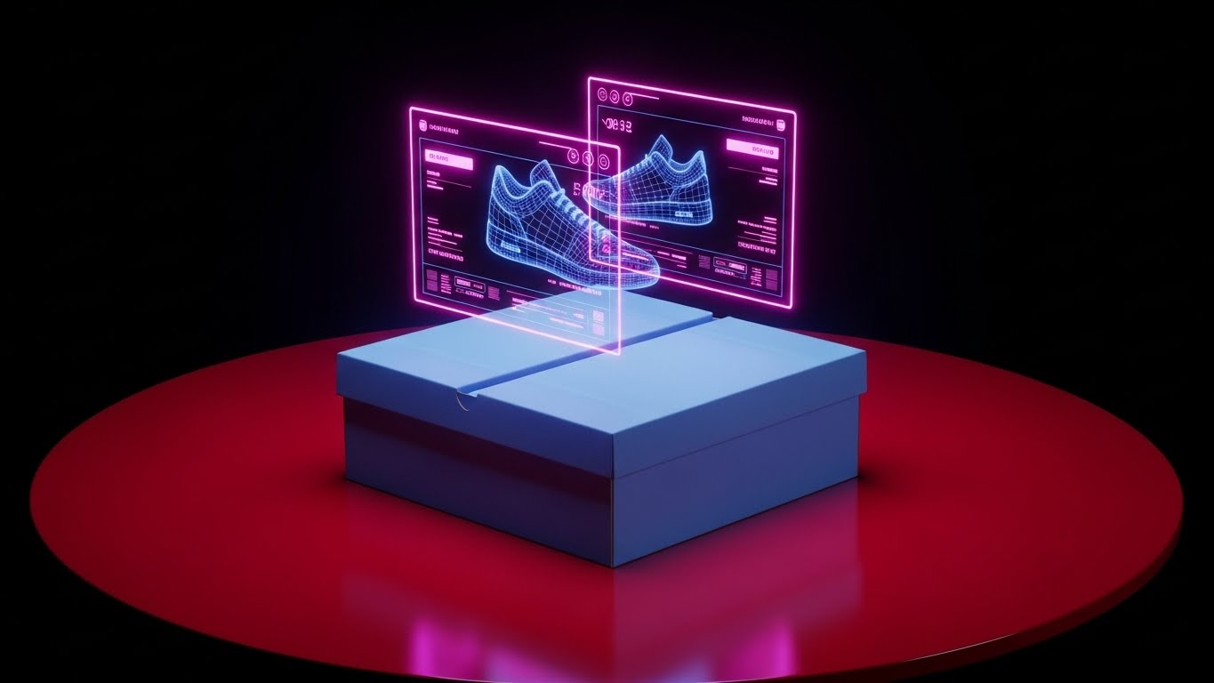
Returns kill margins. This visual combats that by showing the "Digital Twin." A realistic Powder Blue cardboard box sits on a Ruby Red table. Floating above it is a rotating Navy Blue wireframe hologram of the sneaker inside. The Circular composition allows the viewer to inspect the item without opening the box. It represents the software's ability to provide perfect product data before shipping, ensuring the right item is in the right box every time.
Psychological Impact & KPI Focus
This style alleviates Quality Control Anxiety. It visually promises "X-Ray Vision" for the packer. It confirms that the data matches the physical item perfectly. This directly supports Order Accuracy and Return Rate Reduction KPIs. It tells the Operations Manager, "We help you stop errors before they leave the dock."
Strategic Implementation & Trade-offs
- Best Use Case: Product Detail Pages and Warehouse Associate training modules.
- Recommended Duration: 20-30 Seconds (Looping).
- Trade-off: It implies a high level of tech (AR glasses/advanced scanning) that the client might not actually have hardware for. Ensure the copy clarifies this is a visualization of data accuracy, not necessarily a hardware feature.
Companies using similar video content -
CaliWare360 by Caliber Technologies – Pharma WMS – Projects internal product data for accuracy.
Deagor – WMS Software – Visualizes internal contents for pharmaceutical traceability.
27. Futuristic Neon/Dark Mode
Support | Knowledge Base & FAQ Videos
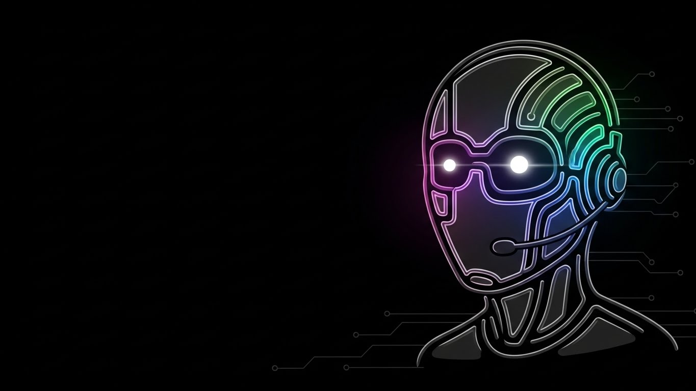
The Visual & Narrative Approach
Support bots often feel impersonal. This style gives the AI a "face" that is cool, not creepy. The avatar is drawn in glowing neon lines against a Black background, with a Holographic Rainbow glow. The Asymmetrical balance places the avatar on the right, leaving negative space for chat bubbles. It visualizes the "Always On" nature of the support system—a tireless, futuristic assistant ready to solve problems at 3 AM.
Psychological Impact & KPI Focus
This style targets Support Efficiency. It reframes the "Chatbot" from a nuisance to a high-tech asset. The neon aesthetic signals speed and intelligence. It supports KPIs related to Ticket Resolution Time and Support Availability, promising the user that help is just a click away, anytime, anywhere.
Strategic Implementation & Trade-offs
- Best Use Case: Chatbot interface avatars and "Help Center" loading screens.
- Recommended Duration: Loop (Breathing glow).
- Trade-off: It feels very "Cyberpunk." If your brand is traditional and rustic, this aesthetic might clash. It works best for SaaS-first, modern logistics brands.
Companies using similar video content -
Logi-Sys by Softlink Global – LogiTALK AI Co-Pilot – Presents an AI-powered support interface.
B2B Wave – eCommerce Platform – Offers a modern, neon-accented interface for B2B sales.
28. Generative AI Cinematic Video
Expansion | Driving Upsell/Cross-sell

The Visual & Narrative Approach
This is the "Hollywood" shot. It features a breathtaking, wide-angle view of a futuristic automated port at sunset. Massive cranes are silhouetted against Champagne light, with Emerald Green signal lights piercing the Deep Bronze shadows. The Wide shot with negative space emphasizes the sheer scale of global trade. It positions the software not as a tool, but as the engine behind this massive, beautiful global machine.
Psychological Impact & KPI Focus
This style appeals to Ego and Ambition. It validates the C-Suite's vision of their company as a global player. It builds massive Brand Prestige. It supports long-term strategic conversations about Market Expansion and Global Reach, implying that your software is robust enough to handle the largest supply chains on earth.
Strategic Implementation & Trade-offs
- Best Use Case: Keynote Opener Videos and Investor Pitch Decks.
- Recommended Duration: 60 Seconds+ (Epic pacing).
- Trade-off: It is expensive to produce (or requires high-end Gen AI prompting). It sets a very high expectation for the brand's sophistication.
Companies using similar video content -
Oracle Fusion Cloud ERP – Fusion Cloud ERP – Depicts large-scale, global distribution networks.
SAP Integrated Business Planning (IBP) – IBP – Visualizes global supply chain planning.
29. 3D Predictive Heatmap Visualization
Expansion | Driving Referrals & Advocacy

The Visual & Narrative Approach
Visualizing the invisible patterns of the warehouse, this style employs a semi-transparent, isometric view of the floor plan. "Hot zones" of high activity are rendered in Pulsing Magma Orange, while slow-moving inventory stays in Cool Ice Blue. Ghosted paths show the movement of forklifts. The narrative is "Optimization"—seeing the inefficiencies that the human eye misses and re-slotting inventory based on algorithmic logic.
Psychological Impact & KPI Focus
This appeals to the Analytical Mind. It satisfies the craving for Data-Driven Decision Making. It turns raw data into a spatial map that is instantly understandable. It supports KPIs like Slotting Optimization and Travel Time Reduction, showing exactly how the software helps re-organize the floor for maximum efficiency.
Strategic Implementation & Trade-offs
- Best Use Case: Quarterly Business Reviews (QBRs) and "Optimization" feature modules.
- Recommended Duration: 10-20 Seconds.
- Trade-off: It requires data. The visual is meaningless without the implication that real user data powers it.
Companies using similar video content -
Körber Supply Chain – Warehouse Management – Visualizes optimized resource allocation.
Autoscheduler.AI – Warehouse Optimization – Displays predictive heatmaps for labor and task.
30. Generative AI Realistic Character Video
Expansion | Driving Deep Feature Adoption
The Visual & Narrative Approach
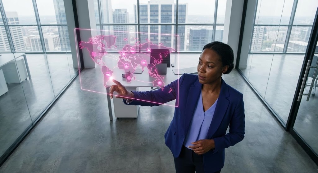
The guide concludes with the human element at its most powerful: Leadership. A photorealistic female CEO with deep skin tones, wearing an Indigo Blue blazer and Periwinkle blouse, commands the frame. She stands in a glass office, interacting with a floating Hot Pink hologram of a supply chain map. The Bird's eye view angle looks down at the hologram, placing her in a position of dominance and control. It synthesizes the human and the digital into one cohesive vision of future leadership.
Psychological Impact & KPI Focus
This style targets the Inspirational Buyer. It isn't just about managing a warehouse; it's about leading an industry. It projects Competence, Diversity, and Future-Readiness. It supports high-level KPIs like Enterprise Value and Digital Transformation Success. It leaves the viewer with the feeling that this software is the tool of champions.
Strategic Implementation & Trade-offs
- Best Use Case: "Vision" manifestos, Annual Report videos, and high-tier ABM campaigns.
- Recommended Duration: 30-60 Seconds.
- Trade-off: The "Uncanny Valley" risk is real. The AI generation must be flawless (hyper-realistic skin texture, natural eye movement) or it will feel artificial and erode trust.
Strategic Knowledge Base: The Visual Operations Doctrine
Drawing from the 30 visual styles analyzed above, we present the Visual Operations Doctrine. This is not merely a design guide; it is a business framework designed to convert visual strategy into measurable operational outcomes.
Strategic Alignment & Visual Architecture
The "Pre-Production" Strategy (Why and Who)
- The Cognitive Load Audit: Before creating a single asset, audit your current training materials. If a PDF manual takes 15 minutes to read, a Rapid UI Feature Montage (Style 21) can convey the same "how-to" in 15 seconds. Measure the reduction in "Time-to-Competency."
- Role-Based Visual Mapping: Do not use the same visuals for everyone.
- Drivers (Mobile): Use Minimalist Flat Vector (Style 3) and High Contrast Dark Mode (Style 25) for readability in sunlight/cab environments.
- Fleet Managers (Desktop): Use Isometric 2D Motion (Style 1) and 3D Predictive Heatmaps (Style 29) to show network complexity.
- The "Glanceability" Standard: In logistics, attention is scarce. Adopt a "3-Second Rule." If a Dynamic Data Visualization (Style 14) cannot be understood in 3 seconds, it is too complex for an operational dashboard.
- Brand Voice Consistency: Use the Clean UI Workflow (Style 15) as your "visual anchor." Ensure that whether a user is looking at a marketing video or a support bot, the color palette (Royal Purple/Neon Magenta) remains consistent to build subconscious trust.
- The Advids Strategic Audit: Visualizing a supply chain requires more than a graphic designer; it requires a strategist. Engaging partners like Advids early allows you to define this "Visual Operating System" before production begins, ensuring every asset builds toward a unified business goal.
- Legacy System Integration: Use Wireframe to Reality Transitions (Style 6) to visually bridge the gap between old "green screen" terminals and your new SaaS interface. This validates the old while selling the new.
- The Mobile-First Mandate: 70% of logistics interaction happens on the road. Ensure all styles, especially Interactive Elements (Style 13), are legible on a 5-inch screen.
- Accessibility in Trucking: The workforce is diverse and multi-lingual. Abstract 2D Motion (Style 22) relies on visual metaphors (plug into socket) rather than text, bypassing language barriers entirely.
- Standardization vs. Customization: Use Stock Montages (Style 17) for general culture videos, but invest in Bespoke 3D Renders (Style 5) for your unique product differentiators.
- The Cross-Departmental Bridge: Use 2D Line Art (Style 7) to unify terminology. If Sales calls it a "Node" and Ops calls it a "Hub," a simple visual connecting the two terms can align the entire organization.
Operational Adoption & Implementation
The "Deployment" Phase (How to Embed)
- Overcoming "Big Brother" Anxiety: Driver monitoring is a sensitive topic. Use 2D Character Stories (Style 8) to show the software as a "Co-pilot" that protects the driver, rather than a "Spy" that watches them. Empathy in visualization is crucial here.
- The Micro-Learning Shift: Replace the 50-page onboarding manual with a library of Micro-Interaction GIFs (Style 13) embedded directly into the software's tooltips.
- Just-in-Time Support: When a user encounters an error, pop up a Futuristic Neon Avatar (Style 27) video that explains the fix instantly, reducing support ticket volume.
- Gamification of Training: Use Bold Kinetic Typography (Style 4) to visualize driver scorecards and safety bonuses. Make the data look like a high-score screen to boost engagement.
- Reducing Support Ticket Volume: There is a direct correlation between the clarity of your Abstract 3D AI Visualizations (Style 11) and the number of "How does this work?" emails your support team receives. Clarity costs less than support hours.
- Remote Onboarding: For distributed fleets, you cannot hold in-person seminars. Use Photorealistic 3D Renders (Style 5) to simulate the warehouse environment, allowing remote staff to "tour" the facility virtually.
- Standard Operating Procedures (SOPs): Transform text-based SOPs into Isometric 3D Workflow (Style 18) loops. A visual loop of a loading dock process is infinitely more memorable than a bulleted list.
- Feedback Loops: Use 2D Graphics Over Live Action (Style 24) to show users that their feedback is being "checked off" and implemented, closing the loop on user acceptance.
- Scalable Localization: When expanding globally, avoid text-heavy videos. Isometric Motion (Style 1) relies on geometry and movement, which are universal languages, reducing localization costs.
- Leadership Communication: When the CEO presents the 5-year plan, swap the spreadsheet for a Generative AI Cinematic Video (Style 28). Inspire the team with a vision of the future they can actually see.
Measuring Impact & Future-Proofing
The "ROI" Phase (Measuring Success)
- Beyond "Views": Do not measure video success by "views." Measure Time-to-Competency. Did the Rapid UI Montage (Style 21) reduce the time it takes a new user to file their first report?
- The "Idle Time" Metric: Correlate better visualization with reduced software navigation time. If Clean UI (Style 15) reduces "stare and compare" time by 10 seconds per order, that’s thousands of hours saved annually.
- Compliance Velocity: How fast can you get the fleet compliant with a new ELD mandate? Use Bold Kinetic Typography (Style 4) to create urgent, hard-to-miss compliance updates.
- Retention and Churn: High-quality UX visualization (Styles 13, 15, 23) increases perceived value. Customers stick with software that feels premium and easy to use.
- The AI Visual Frontier: Prepare for the future where Generative AI Characters (Style 30) can generate personalized training videos for every single driver by name.
- Scalability of Assets: Build a visual library, not just one-off videos. An Isometric Node (Style 1) created today should be reusable in a network map tomorrow.
- The Advids Partnership: As your feature set grows, your visual language must evolve. A long-term partnership with Advids ensures that your "Visual Doctrine" scales with your code, preventing a fragmented brand identity.
- Benchmarking Success: Compare your "Visual Latency" against competitors. If their demo explains the workflow in 30 seconds and yours takes 3 minutes, you are at a competitive disadvantage.
- The ROI of Safety: Quantify the reduction in insurance costs. Better visual safety training using 2D Character Stories (Style 8) leads to fewer accidents and lower premiums.
- Final Call to Innovation: Treat video not as "marketing content," but as Digital Infrastructure. Just as you invest in your server architecture, invest in your visual architecture. It is the interface through which the world experiences your logic.
Companies using similar video content -
Kinaxis – RapidResponse – Features leaders making data-driven decisions for supply chain.
Microsoft Dynamics 365 – Business Central – Showcases visionary leaders interacting with business data.
Author & Editor Bio


