
Introduction: Visualizing the Invisible Factory of the Enterprise
The modern enterprise is no longer defined by physical infrastructure, but by the fluidity of its digital nervous system. We stand at the precipice of a new era in operational excellence, where the defining competitive advantage is not just software adoption, but orchestration. However, for the CTOs, Systems Architects, and Operations Leads tasked with building these ecosystems, the challenge is often invisible. The "Physical/Digital Divide" is no longer about hardware versus software; it is about the friction between disparate systems that refuse to talk to each other.
The opportunity for unification is immense. The global market for Workflow Automation is projected to reach US$78.6 Billion by 2030, driven by an urgent need to streamline complex operational fabrics. Yet, this growth masks a chaotic reality. Today’s enterprises struggle under the weight of fragmentation. Recent data reveals that manual data entry and process inefficiencies now cost businesses an average of $28,500 per employee annually. This is not merely an operational expense; it is a direct tax on innovation and scalability.
For a Workflow Automation Management Platform, the marketing challenge is unique: How do you visualize a solution that fundamentally exists to make things disappear—to make friction vanish and processes run in the background? The answer lies in strategic visualization. We cannot simply show screenshots of code or static dashboards; we must visualize the flow, the logic, and the relief of automation.
This guide serves as your strategic blueprint. We have analyzed the following distinct visualization styles, dissected not just for their aesthetic appeal, but for their ability to lower cognitive load and communicate complex logic to sophisticated buyers. From abstract representations of data fluidity to precise isometric "digital factories," these examples demonstrate how to turn the invisible concept of orchestration into a tangible, high-impact asset.
1. Abstract 2D Flat Vector Organic Motion Graphics
TOFU | Brand Awareness

The Visual & Narrative Approach
Visualization Scenario:
The screen opens on a pristine, Soft White void. Slowly, droplets of Electric Cyan and Mint Green liquid emerge, suspended in zero gravity. These aren't just shapes; they represent disparate data silos—Salesforce records, Slack notifications, ERP entries. As the motion begins, these distinct "nodes" are magnetically drawn together, morphing into a single, swirling vortex of liquid mercury. The movement is effortless and frictionless, devoid of hard edges or clashing impacts. The camera performs a slow, hypnotic orbit around this merging form, emphasizing the organic unity of the system.
Narration Style & Tone:
The voiceover is calm, sophisticated, and assured. It avoids technical jargon, focusing instead on the feeling of relief. "Stop forcing connections. Start flowing."
Psychological Impact & KPI Focus
- Niche Psychology: The target persona often fears that integration will be "clunky," brittle, or prone to breaking. The fluid, organic motion here subconsciously counters that anxiety by suggesting adaptability and resilience. It visualizes data as a flexible resource rather than a rigid block.
- Operational Impact: This style effectively reduces the "Cognitive Load" associated with complex backend processes. By stripping away the technical details (APIs, webhooks) and focusing on the feeling of flow, it anchors the viewer's perception on the result of automation: smoothness and speed.
Strategic Implementation & Trade-offs
- Best Use Case: High-level brand anthems or social media teasers (15-30 seconds) where the goal is to stop the scroll and establish a feeling of modern sophistication.
- Trade-off: This style is suboptimal for technical demos. It lacks the precision required to explain how the automation works (e.g., logic gates or conditions). Use it to sell the vision, not the feature.
Companies using similar video content -
Workato – iPaaS – Seamless integration of disparate data streams.
HashiCorp – Terraform – Fluid animations representing Infrastructure as Code.
Boomi – Integration Platform – Organic data flow visualizing resource management.
2. Bold Kinetic Typography (Visual)
TOFU | Category Creation

The Visual & Narrative Approach
Visualization Scenario:
The frame is aggressive and high-energy. Massive, blocky 3D shapes in Vibrant Orange and Deep Purple dominate the screen. These shapes are abstract representations of heavy industrial gears or server racks, but stylized into a modern art form. They slam together with precision, interlocking perfectly. The background is a motion-blurred Grey, streaking past to simulate high-velocity travel. The camera zooms in dynamically, catching the moment of connection where the shapes lock, creating a spark of digital energy. It’s a visual metaphor for the "snap" of a successful deployment.
Narration Style & Tone:
Punchy, rhythmic, and confident. The audio design is crucial here—heavy bass hits synchronize with the visual impacts. "Fast. Robust. Done."
Psychological Impact & KPI Focus
- Niche Psychology: Operational leaders often feel their current processes are stagnant or slow. This style triggers a "Urgency Response," visually validating their desire for speed and impact. The interlocking shapes reassure them that the system is robust and connected, not loose or fragile.
- Operational Impact: This style is a visual metaphor for "Throughput." It communicates that the platform handles high-velocity data processing without friction. It is particularly effective for emphasizing the reliability of the automation engine.
Strategic Implementation & Trade-offs
- Best Use Case: Social media "hype" reels or event openers (10-15 seconds). It works best on small screens (mobile) where bold shapes read better than fine details.
- Trade-off: It can be perceived as "aggressive" if overused. It lacks nuance and cannot convey specific value propositions beyond "speed" and "power." Avoid using this for sensitive or compliance-heavy topics.
Companies using similar video content -
UiPath – RPA Platform – High-velocity, robust robotic process automation.
Automation Anywhere – Automation 360 – Industrial speed signifying enterprise velocity.
Blue Prism – Digital Workforce – Punchy visuals for rapid, robust deployment.
3. Abstract 2D Motion Graphics
TOFU | Market Education

The Visual & Narrative Approach
Visualization Scenario:
We view a static, calm field of pale grey. Suddenly, from a central singularity, a chaotic yet beautiful explosion of geometric shapes—Magenta circles, Bright Yellow triangles, and White squares—bursts outward. This isn't a mess; it's a controlled scattering, like a flock of birds taking flight. The shapes travel along invisible grid lines, suggesting that even in expansion, there is order. This represents the unleashing of productivity when manual bottlenecks are removed.
Narration Style & Tone:
Inspirational and visionary. "What could your team build if they stopped fixing broken processes?"
Psychological Impact & KPI Focus
- Niche Psychology: The persona is often fighting "bottlenecks." This visual is the direct antidote: it represents "Unblocking." The outward burst psychologically reinforces the idea of removing constraints and allowing productivity to flow freely.
- Operational Impact: This effectively visualizes "Scalability." It shows that a single input (the central point) can generate massive, multifaceted output (the scattered shapes) across the organization, aligning with the "Force Multiplier" effect of automation.
Strategic Implementation & Trade-offs
- Best Use Case: Website headers or background loops for value proposition sections (e.g., "Scale Your Operations").
- Trade-off: It is highly abstract. Without accompanying copy or voiceover, the meaning ("productivity," "scale") might be lost. It requires strong contextual anchoring (e.g., a headline like "Unleash Your Team") to be effective.
Companies using similar video content -
Appian – Low-code Platform – Unleashing productivity by removing bottlenecks.
Creatio – BPM Platform – Geometric burst unleashing stalled productivity.
4. 2D Line Art Animation
TOFU | Shaping Brand Perception

The Visual & Narrative Approach
Visualization Scenario:
On a textured White paper background, a single Matte Black ink line draws itself. It begins as a frantic, anxious scribble—a chaotic knot representing the current state of "Spreadsheet Hell." As the line progresses to the right, it passes through a metaphorical "gate" and instantly straightens into a taut, perfect pipeline. The straightened section glimmers with a Metallic Gold core. The animation is continuous and fluid, satisfying the viewer's innate desire for order.
Narration Style & Tone:
Minimal or silent (ASMR-style sound design of pen on paper). The visual speaks for itself.
Psychological Impact & KPI Focus
- Niche Psychology: The "Chaos to Order" narrative is the most powerful story you can tell an Operations Manager. They live in the knot; they aspire to the straight line. This style validates their struggle and offers an immediate, achievable solution.
- Operational Impact: This visualizes "Process Optimization" and "Linearity." It reinforces the core benefit of removing redundancy and loops in a workflow. It speaks directly to the KPI of "Time Saved" and "Complexity Reduction."
Strategic Implementation & Trade-offs
- Best Use Case: Instagram Reels, TikTok, or LinkedIn shorts (vertical 9:16). It is perfect for quick, satisfying "before/after" moments that require zero audio to understand.
- Trade-off: It risks oversimplifying the solution. Complex enterprise workflows are rarely a straight line; they are branched networks. This style is great for the hook, but don't use it to explain the architecture.
Companies using similar video content -
Nintex – Process Platform – Untangling complex, chaotic legacy workflows.
Kissflow – Workflow Software – Golden pipeline untangling complex processes.
5. Minimalist Flat 2D Vector
TOFU | Vertical Social Organic

The Visual & Narrative Approach
Visualization Scenario:
In a classic "Corporate Memphis" flat vector style, a stylized hand with Deep Green skin tones enters the frame. It approaches a massive, floating Emerald Green button emblazoned with a white "Play" or "Execute" arrow. The background is a stark, void-like White. The action is deliberate: the finger presses the button, and it depresses with a satisfying, chunky animation. There are no shadows, no depth—just pure, flat interaction.
Narration Style & Tone:
Direct and instructional. "Push the button. We handle the rest."
Psychological Impact & KPI Focus
- Niche Psychology: "Adoption Friction" is a major fear. If a tool looks hard to start, it won't be used. This style addresses the fear of "Implementation Paralysis" by showing that starting is as easy as pushing a button.
- Operational Impact: This visualizes "Ease of Use" and "Trigger-Based Logic." It suggests that complex backend processes can be initiated with simple frontend actions, lowering the perceived barrier to entry for non-technical teams.
Strategic Implementation & Trade-offs
- Best Use Case: YouTube Pre-roll ads (first 5 seconds) or "Call to Action" cards at the end of a video. It is a visual command: "Do this."
- Trade-off: It can feel generic. The "Corporate Memphis" style is widely used (and sometimes criticized) in tech. It lacks unique brand identity unless strictly paired with your specific color palette. Use sparingly for functional calls to action.
Companies using similar video content -
Zapier – Automation Platform – One-click triggers for complex backend logic.
Pipefy – Workflow Management – Minimalist interaction initiating processes.
6. Isometric 2D Motion Design
TOFU | Skippable Pre-Roll Ad
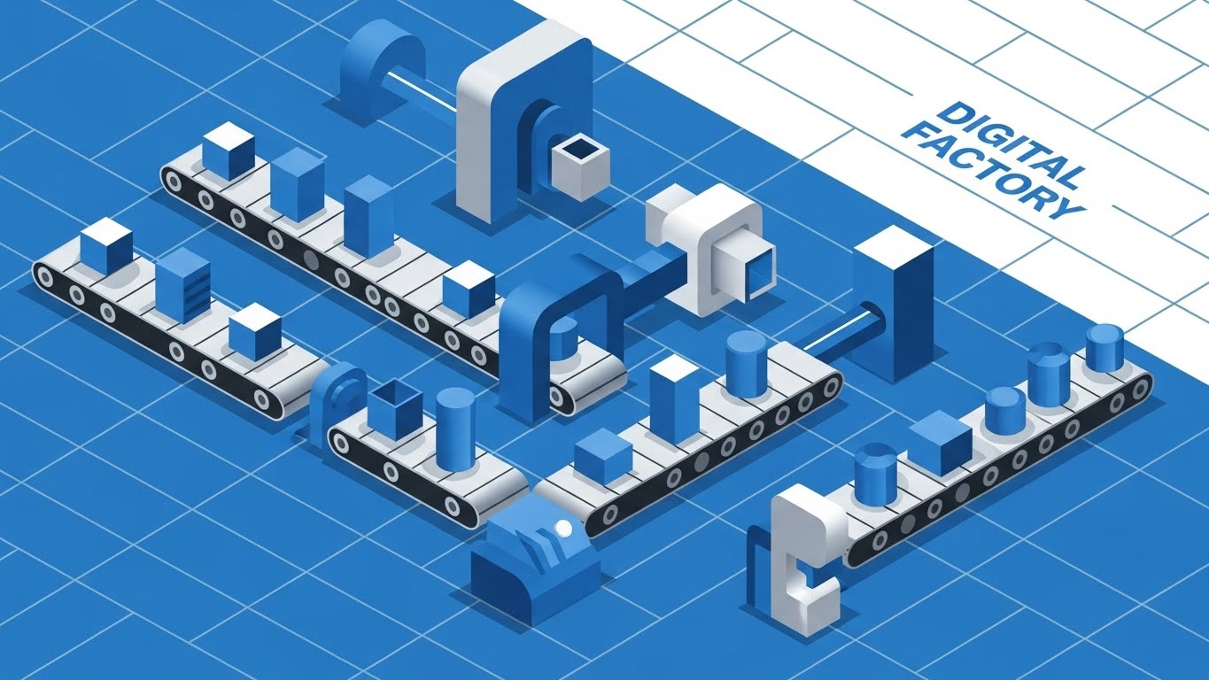
The Visual & Narrative Approach
Visualization Scenario:
The camera pulls back to reveal an isometric grid in Vivid Blue and White. We see a "Digital Factory" floor. Cubes (data packets) move along precise conveyor belts. They pass through "machines" (logic gates/API nodes) where they are stamped, sorted, or merged with other blocks. Cylinders represent databases storing the finished product. The entire scene loops perfectly, showing a continuous, error-free production line. The lighting is flat, emphasizing clarity over atmosphere.
Narration Style & Tone:
Technical and educational. "Visualize your workflow as a production line. Optimize every step."
Psychological Impact & KPI Focus
- Niche Psychology: Architects and Engineers love grids. They signal precision, planning, and structural integrity. This style builds "Technical Trust." It assures the viewer that the platform creates a robust infrastructure, not just a flashy interface.
- Operational Impact: This is the best style for visualizing "Orchestration" and "Dependency Management." It shows how Process A connects to Process B, and where the decision nodes sit. It maps directly to "Process Efficiency" and "Error Handling" KPIs.
Strategic Implementation & Trade-offs
- Best Use Case: "How it Works" pages on the website or the core section of a product explainer video (30-60 seconds).
- Trade-off: It can become visually "busy" if too many elements are moving at once. It requires careful pacing to ensure the viewer can follow the "data packet" from start to finish without getting lost in the machinery.
Companies using similar video content -
Camunda – Process Orchestration – Visualizing precise workflow execution as a digital conveyor.
Red Hat – Process Automation Manager – Digital factory visualizing packet logic flow.
7. Clean UI Workflow (Light Mode)
MOFU | Product/Solution Differentiation
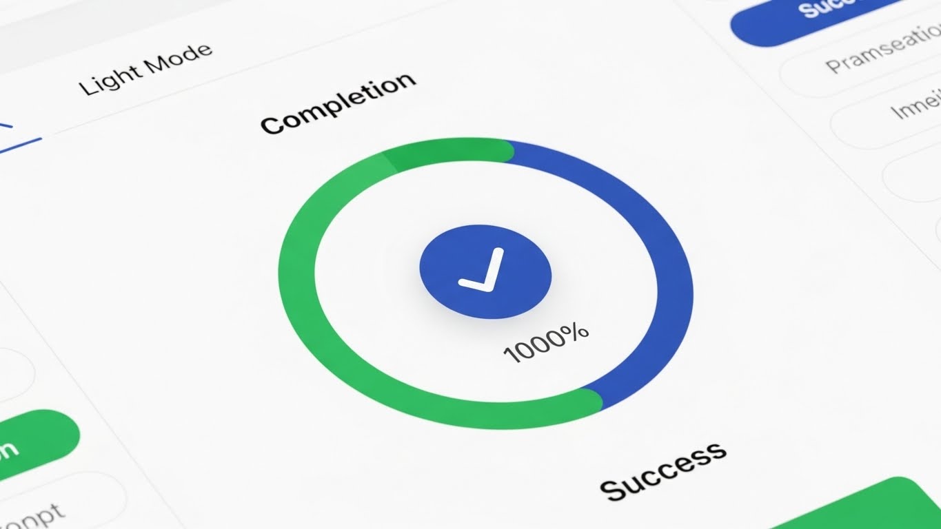
The Visual & Narrative Approach
Visualization Scenario:
We transition to a high-fidelity mockup of the actual software UI. The screen is in "Light Mode"—bright, airy, and clean. We focus on a "Completion" widget: a circular progress bar filling up with a satisfying green sweep, hitting "100% Success." Rising bar charts in Sky Blue visualize efficiency gains. The background is a soft, blurred office bokeh, grounding the software in a real-world context without distracting from the data. Soft drop shadows give the UI elements a tactile, layered feel.
Narration Style & Tone:
Professional and consultative. "Real-time visibility. Complete control."
Psychological Impact & KPI Focus
- Niche Psychology: The "Single Pane of Glass" is the holy grail for IT leaders. This visual satisfies the craving for visibility and control. It says, "You can see everything from here."
- Operational Impact: This visualizes "Reporting" and "Analytics." It demonstrates the platform's ability to synthesize complex workflow data into actionable insights, directly addressing the "Time to Insight" KPI.
Strategic Implementation & Trade-offs
- Best Use Case: Blog posts, whitepapers, or the "Features" section of a video. It validates the user interface (UI) quality.
- Trade-off: Static UI shots can be boring. To animate this, use "micro-interactions"—show the bar chart growing or the "Success" checkmark animating in. Avoid long, static pans across the screen.
Companies using similar video content -
ServiceNow – ITSM Workflows – Dashboard clarity confirming successful process completion.
Zoho – Creator – Clean UI for confirming successful process completion.
8. Split Screen: Optimized Reality and UI
MOFU | Feature Education & Demonstration
The Visual & Narrative Approach
Visualization Scenario:
The screen is sharply divided down the center. The Left Side is a rough, jittery charcoal sketch in grayscale. It depicts a pile of tangled wires, messy papers, and analog clocks spinning wildly—the "Before." The Right Side is a pristine, Vivid Blue vector grid. Here, nodes are aligned, and data flows in straight, glowing lines—the "After." A vertical slider moves across the screen, erasing the sketch and revealing the vector reality, symbolizing the transition powered by your platform.
Narration Style & Tone:
Comparative and persuasive. "Leave the chaos behind. Step into clarity."
Psychological Impact & KPI Focus
- Niche Psychology: This triggers "Loss Aversion" (on the left) and "Aspiration" (on the right) simultaneously. It forces the viewer to acknowledge the pain of their current manual processes, which they might have become desensitized to.
- Operational Impact: This visualizes "Standardization." It highlights the shift from ad-hoc, manual interventions (chaos) to standardized, automated protocols (order). It speaks to "Compliance" and "Risk Reduction."
Strategic Implementation & Trade-offs
- Best Use Case: LinkedIn carousel ads or comparative sales decks. It is a "challenger" visual designed to displace competitors or the status quo.
- Trade-off: It can be seen as "negative marketing" if the left side is too exaggerated. Ensure the "Chaos" side looks like a struggle, not incompetence, to maintain empathy with the user.
Companies using similar video content -
Mendix – Low-code Platform – Demonstrating instant ROI by transforming chaos to order.
OutSystems – Low-code Platform – Visualizing the shift from manual to automated.
9. Dynamic Data Visualization
MOFU | Competitive Displacement

The Visual & Narrative Approach
Visualization Scenario:
The aesthetic shifts to a high-tech "Dark Mode" HUD (Heads Up Display). On a Dark Grey background, a jagged, white line graph struggles upward—representing inconsistent manual growth. Suddenly, the line smooths out and rockets upward in a perfect exponential curve, glowing Neon Lime. The camera tilts to a "Dutch angle," adding dynamism and a sense of aggressive speed. Background grid lines and small data readouts (simulating API calls per second) add technical depth.
Narration Style & Tone:
Authoritative and data-driven. "Scale without limits. Watch your efficiency compound."
Psychological Impact & KPI Focus
- Niche Psychology: This appeals to the "Growth Mindset" of the C-Suite. It moves beyond "saving time" to "accelerating growth." It creates a feeling of financial momentum.
- Operational Impact: This visualizes "ROI" and "Performance Metrics." It is purely about the quantitative impact of automation. It answers the question, "What is the business value?"
Strategic Implementation & Trade-offs
- Best Use Case: Display ads, investor presentations, or the climax of a case study video.
- Trade-off: It is impersonal. It focuses entirely on numbers, not people or processes. Use it to close the logical argument, but rely on other styles (like Style 2 or 7) to explain the how.
Companies using similar video content -
Celigo – iPaaS – HUD interface tracking real-time efficiency spikes.
SnapLogic – iPaaS – Dynamic graphs tracking real-time data performance.
11. Rapid UI Feature Montage
MOFU | Driving Freemium/Trials
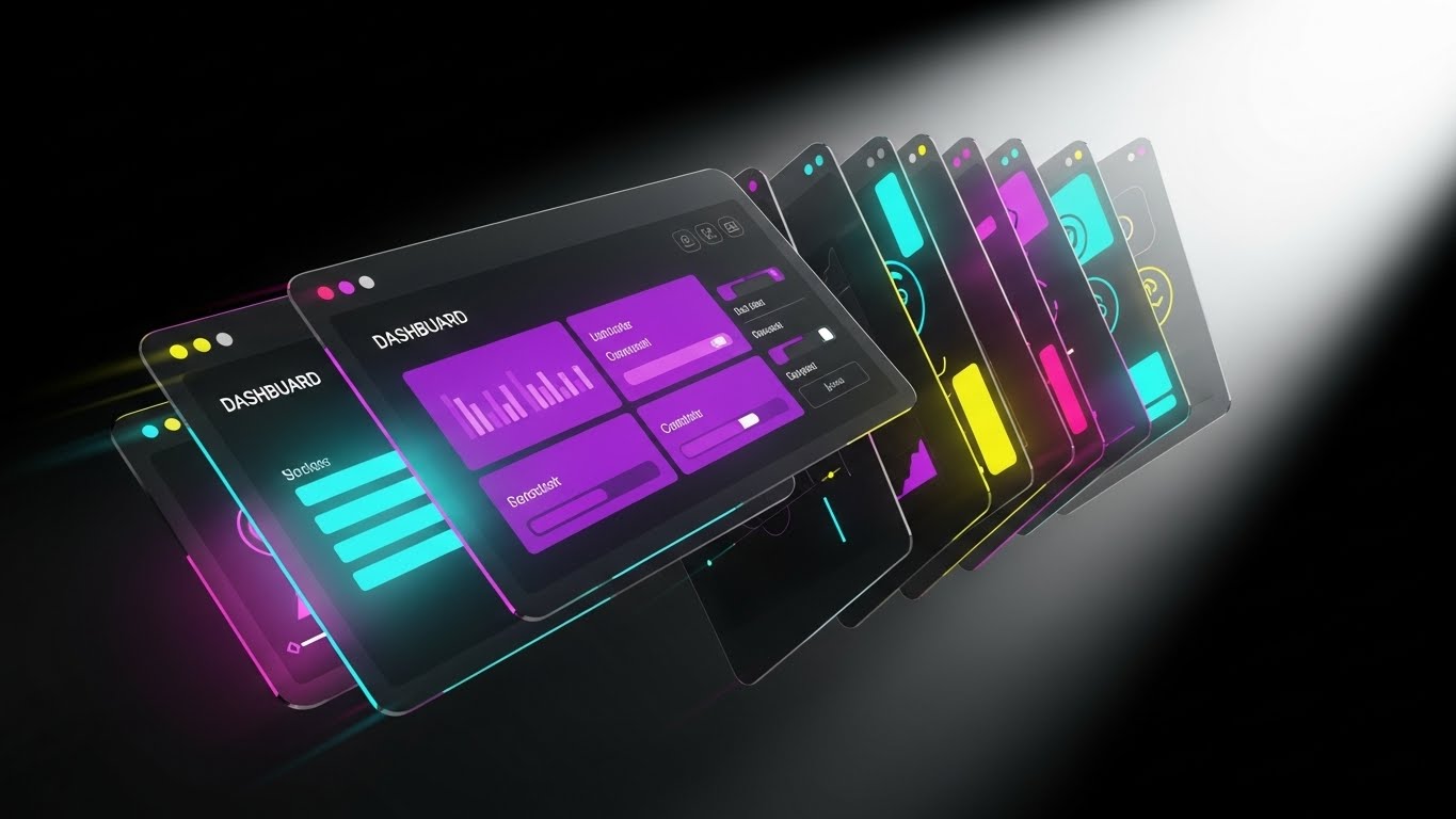
The Visual & Narrative Approach
Visualization Scenario:
The screen explodes with kinetic energy. A deck of translucent, high-fidelity UI screens fans out towards the camera, moving with the speed of a card shuffler. The screens display a dense array of dashboard widgets—Gantt charts in Electric Violet, efficiency gauges in Hot Pink, and Kanban boards in Deep Blue. Motion blur edges suggest high velocity. A bright white spotlight backlights the panels, causing the glass-like interfaces to refract light, creating a sense of depth and immense value volume. It is a visual barrage of capability.
Narration Style & Tone:
Fast-paced and energetic. "More tools. More power. Zero limits. Everything you need to scale, right out of the box."
Psychological Impact & KPI Focus
- Niche Psychology: Freemium users and trial prospects often worry about "Feature Caps" or hitting a ceiling too early. This visual overwhelms that fear with a display of abundance. It triggers the "Perceived Value" heuristic, suggesting the platform is packed with more utility than the price implies.
- Operational Impact: This visualizes "Platform Breadth." It demonstrates that the solution isn't a one-trick pony but a comprehensive ecosystem, directly influencing "Conversion Rate" and "Trial-to-Paid" metrics.
Strategic Implementation & Trade-offs
- Best Use Case: Retargeting ads for users who visited the pricing page or signed up for a free trial. Perfect for Instagram Stories or TikTok (vertical adaptation).
- Trade-off: It sacrifices detail for volume. The viewer won't read the data; they will just feel the amount of it. Do not use this when you need to explain a specific, complex feature.
Companies using similar video content -
ProcessMaker – BPM Suite – Visualizing and optimizing end-to-end business processes.
Integrify – Workflow Automation – Interactive maps for process exploration.
12. Photorealistic 3D Renders
MOFU | Website & Landing Pages

The Visual & Narrative Approach
Visualization Scenario:
We settle into a scene of quiet, executive confidence. A sleek, silver modern laptop rests on a rich Walnut executive desk. Soft, natural morning light streams in from the left, casting realistic reflections on the brushed metal and the polished wood. The screen glows with crystal clarity, displaying a strategic "Command Center" dashboard. There is no clutter—just broad, abstract data shapes in Silver and Corporate Blue, representing high-level health metrics. It looks expensive, stable, and ready for the boardroom.
Narration Style & Tone:
Sophisticated and understated. "Precision. Clarity. The view from the top has never looked this good."
Psychological Impact & KPI Focus
- Niche Psychology: The C-Suite buyer (CEO/CFO) buys "Status" and "Control." They don't want to see code; they want to see the result of their investment sitting on their desk. This style validates their self-image as a modern, data-driven leader.
- Operational Impact: This visualizes "Strategic Oversight." It moves the conversation from "automating tasks" to "managing the enterprise." It speaks to KPIs related to "Reporting Efficiency" and "Executive Visibility."
Strategic Implementation & Trade-offs
- Best Use Case: The hero section of the website's "Enterprise" page or the cover of a high-value whitepaper.
- Trade-off: It is static. It conveys quality and trust, but it cannot explain how the software works. It is purely a brand positioning asset.
Companies using similar video content -
Tray.io – Integration Platform – Showcasing dense feature sets for freemium conversion.
n8n – Workflow Automation – Feature density driving freemium conversion.
13. Isometric 3D Workflow (ROI Focus)
BOFU | ROI Justification
The Visual & Narrative Approach
Visualization Scenario:
The view creates a "God Mode" perspective of the business. In a stylized, pristine office diorama rendered with a soft "claymorphism" finish, we see the flow of value. Transparent glass tubes connect distinct server blocks (Sales, Finance, Ops). Inside the tubes, small, glowing Gold spheres travel smoothly, merging and multiplying as they pass through the "Automation Hub" in the center. The lighting is global and diffuse, casting soft shadows that make the entire system look tactile, reliable, and profitable.
Narration Style & Tone:
Logical and rhythmic. "Connect the dots. Watch the value flow. Turn efficiency into currency."
Psychological Impact & KPI Focus
- Niche Psychology: The "Economic Buyer" (CFO) needs to conceptualize the return on investment. Abstract savings are hard to visualize; literal "Gold spheres" flowing through the system creates a sticky mental image of wealth generation and resource optimization.
- Operational Impact: This visualizes "Throughput" and "Value Realization." It shows that the platform doesn't just move data; it moves value across the organization, directly addressing the "ROI" objection.
Strategic Implementation & Trade-offs
- Best Use Case: Sales decks (The "Business Case" slide) or the "Benefits" section of a case study.
- Trade-off: It is highly stylized. It simplifies the complexity of enterprise architecture into a "toy-like" model. Ensure the narration maintains professional gravity to avoid it appearing childish.
Companies using similar video content -
IBM – Business Automation Workflow – Executive dashboard validating strategic oversight.
Oracle – BPM Suite – Photorealistic dashboards for strategic oversight.
14. Dark Mode UI Showcase (Security Focus)
BOFU | Risk Mitigation
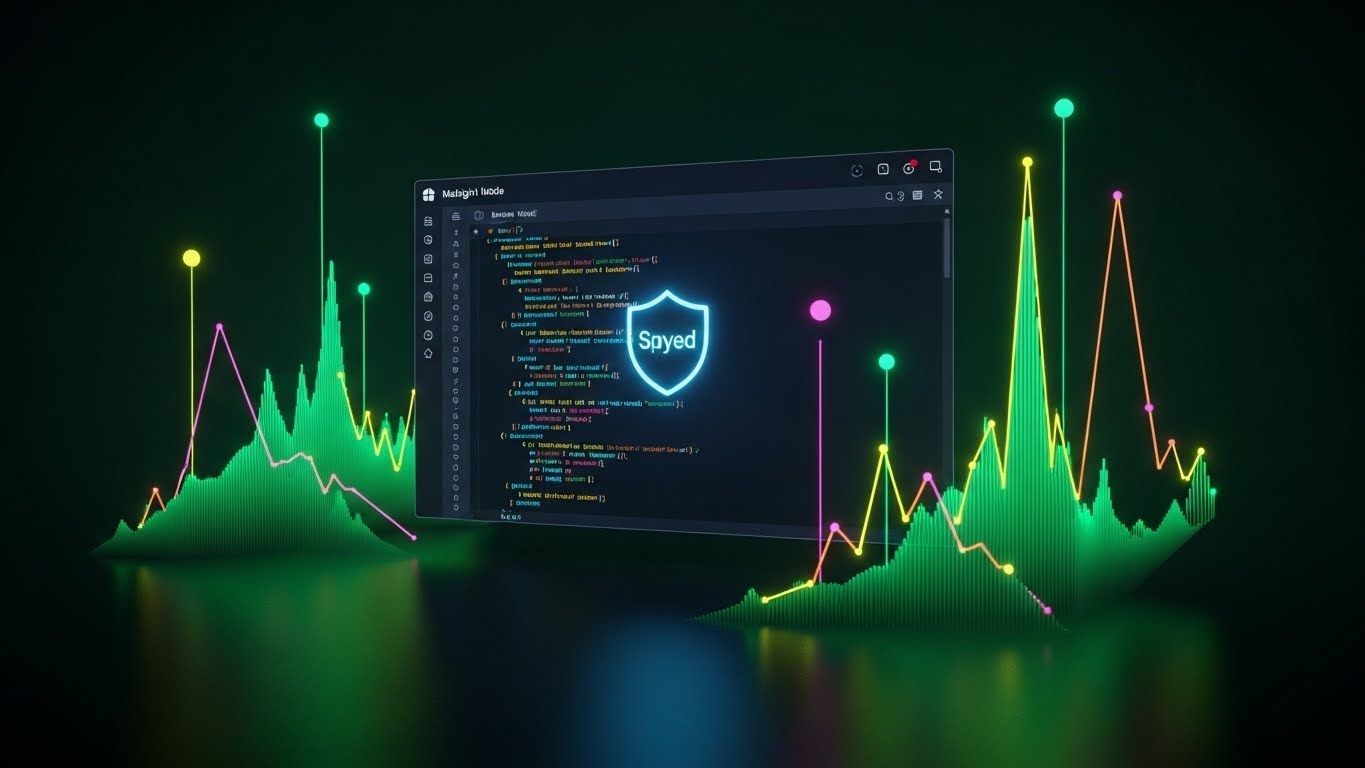
The Visual & Narrative Approach
Visualization Scenario:
The aesthetic shifts to the domain of the developer: Dark Mode. The background is a deep, secure Midnight Blue. In the foreground, a code editor window displays neat, syntax-highlighted code blocks in Cyan and Magenta. Centered over the code is a glowing, holographic "Shield" icon in soft Cyan. The shield pulses gently, symbolizing active monitoring. Surrounding data streams are encapsulated, suggesting encryption. The vibe is quiet, serious, and impenetrable.
Narration Style & Tone:
Serious and reassuring. "Built for scale. Secured for peace of mind. Enterprise-grade protection, standard."
Psychological Impact & KPI Focus
- Niche Psychology: The "Technical Buyer" (CISO/CTO) is risk-averse. They fear data breaches and compliance failures. This visual speaks their language (Dark Mode, code) and uses the universal symbol of protection (the shield) to build "Technical Trust."
- Operational Impact: This visualizes "Security Compliance" (SOC2, GDPR). It reassures the stakeholder that the automation layer will not introduce vulnerabilities, directly addressing "Risk Mitigation."
Strategic Implementation & Trade-offs
- Best Use Case: The "Security" or "Architecture" page of the website, or the technical appendix of a sales proposal.
- Trade-off: It feels "tech-heavy." It may alienate non-technical buyers if used in general marketing. Keep it reserved for the eyes of the vetting team.
Companies using similar video content -
Blue Yonder – Supply Chain Planning – Visualized value streams justifying ROI.
Kinaxis – Supply Chain Management – Isometric view of value flow for ROI.
15. Generative AI Realistic Character Video
BOFU | Sales Cycle Acceleration
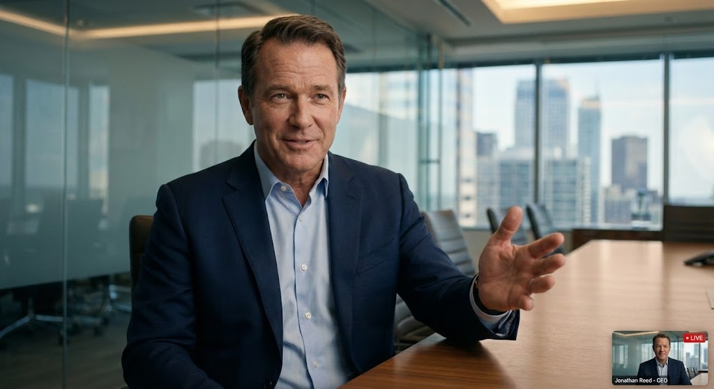
The Visual & Narrative Approach
Visualization Scenario:
We see a medium close-up of a confident CEO persona—a man in his 50s, wearing a sharp navy suit, seated in a modern glass-walled conference room. The lighting is cinematic, highlighting the texture of his skin and the confidence in his eyes. He gestures with an open hand, breaking the fourth wall as if speaking directly to a peer. The blurred city skyline in the background suggests success and scale. This is high-end social proof, synthesized.
Narration Style & Tone:
Conversational and authoritative. "We didn't just automate tasks; we reclaimed our time. The ROI was immediate."
Psychological Impact & KPI Focus
- Niche Psychology: Decision-makers trust their peers. In the absence of a live case study, a hyper-realistic avatar delivering a testimonial triggers "Social Proof" and "Authority Bias." It humanizes the B2B transaction.
- Operational Impact: This visualizes "Success." It serves as a proxy for the post-purchase state—calm, successful, and in control. It is designed to shorten the "Decision Latency" in the sales cycle.
Strategic Implementation & Trade-offs
- Best Use Case: Personalized email campaigns to decision-makers or as a "Message from the Founder" on the landing page.
- Trade-off: The "Uncanny Valley." If the lip-sync or eye movement is slightly off, trust is destroyed instantly. Use only the highest fidelity generation models (like HeyGen or Synthesia) and keep clips short.
Companies using similar video content -
AWS – IoT Core – Cryptographic shield assuring enterprise security.
Microsoft – Azure IoT Central – Dark mode UI for secure IoT management.
16. 2D Graphics Over Live Action
BOFU | Driving Demo Requests

The Visual & Narrative Approach
Visualization Scenario:
The shot is grounded in reality: an over-the-shoulder view of a person working on a laptop in a warm, bustling coffee shop. The screen glows. Suddenly, vibrant 2D vector animations—stars, gears, and "magic wands" in Neon Orange and Blue—erupt from the screen. They swirl around the user's hands, visualizing the software doing the heavy lifting. The user takes a sip of coffee, looking relaxed, while the animations work furiously on the screen.
Narration Style & Tone:
Lighthearted and magical. "Work that feels like magic. You sip the coffee; we crunch the data."
Psychological Impact & KPI Focus
- Niche Psychology: The end-user fears "Drudgery." They worry automation will be just another tool they have to manage. This style visualizes the "Relief" of having a digital assistant. It makes the technology look helpful and friendly, not cold and industrial.
- Operational Impact: This visualizes "Efficiency Gains" and "User Experience." It suggests that the complex work happens in the background, leaving the human to enjoy the "flow state."
Strategic Implementation & Trade-offs
- Best Use Case: Social media ads (Instagram/LinkedIn) targeting end-users to drive bottom-up adoption.
- Trade-off: It can appear "gimmicky" to the C-Suite. It sells the experience, not the enterprise value. Use it to build user champions, not to close the contract.
Companies using similar video content -
Olive AI – Healthcare Automation – Executive peer trust accelerating decisions.
Pega – Infinity Platform – AI-driven character delivering peer testimonials.
17. Aspirational Stock Montage
BOFU | The Economic Buyer

The Visual & Narrative Approach
Visualization Scenario:
A high-quality cinematic photograph captures a moment of team alignment. A diverse group of three professionals stands in a sunlit conference room, looking at a whiteboard (off-camera). They are smiling, gesturing in agreement—the moment of "consensus." The lighting is warm and natural. Subtly overlaid in the negative space are abstract white "Upward Arrow" graphics and faint trend lines, reinforcing the theme of growth without obscuring the human element.
Narration Style & Tone:
Inspirational and unifying. "Align your team. Accelerate your goals. One platform, one vision."
Psychological Impact & KPI Focus
- Niche Psychology: The biggest barrier to B2B sales is often internal misalignment. This visual sells the "Dream State" of organizational harmony. It subconsciously suggests that buying this software will solve team conflicts and bring everyone together.
- Operational Impact: This visualizes "Organizational Alignment" and "Growth." It connects the software implementation to the broader corporate goal of unified forward momentum.
Strategic Implementation & Trade-offs
- Best Use Case: Pitch decks (The "Team/Vision" slide) or website headers for "Culture/Careers" pages.
- Trade-off: It is generic. "Happy people in suits" is the cliché of B2B marketing. It must be paired with strong, specific copy or data overlays (the arrows) to have any specific meaning for workflow automation.
Companies using similar video content -
Make (formerly Integromat) – Automation Platform – Magic overlays simulating effortless automation.
Workato – iPaaS – 2D graphics over live action for ease of use.
18. 3D X-Ray Visualization
BOFU | The Technical Buyer

The Visual & Narrative Approach
Visualization Scenario:
We view a sleek, modern server unit standing in a pristine, high-key white laboratory environment. The camera performs a slow scan as the outer casing turns into semi-transparent White Glass. Inside, we see the internal architecture: processors glowing in Ice Blue, memory modules pulsating in Silver, and data buses firing with light. It is an "X-Ray" view that reveals the tidy, powerful, and robust organization of the machine's heart.
Narration Style & Tone:
Technical and transparent. "Nothing to hide. Powerful architecture designed for the heaviest workloads."
Psychological Impact & KPI Focus
- Niche Psychology: IT Architects are skeptical of "Black Boxes." They want to know what's under the hood. This visual satisfies that curiosity by offering (metaphorical) transparency. It signals that the backend is clean, organized, and robust.
- Operational Impact: This visualizes "System Integrity" and "Architecture." It addresses KPIs related to "Uptime," "Processing Power," and "Scalability."
Strategic Implementation & Trade-offs
- Best Use Case: Technical whitepapers, "How it Works" deep dives, or background visuals for the CTO's keynote.
- Trade-off: It is cold and impersonal. It appeals exclusively to the hardware/infrastructure mindset. Do not use this to sell to HR or Sales leaders.
Companies using similar video content -
Microsoft – Power Automate – Upward trajectory unifying stakeholder buy-in.
Salesforce – Flow – Aspirational visuals for team alignment and growth.
19. 3D Parallax UI Presentation
Onboard | Accelerating Time-to-Value
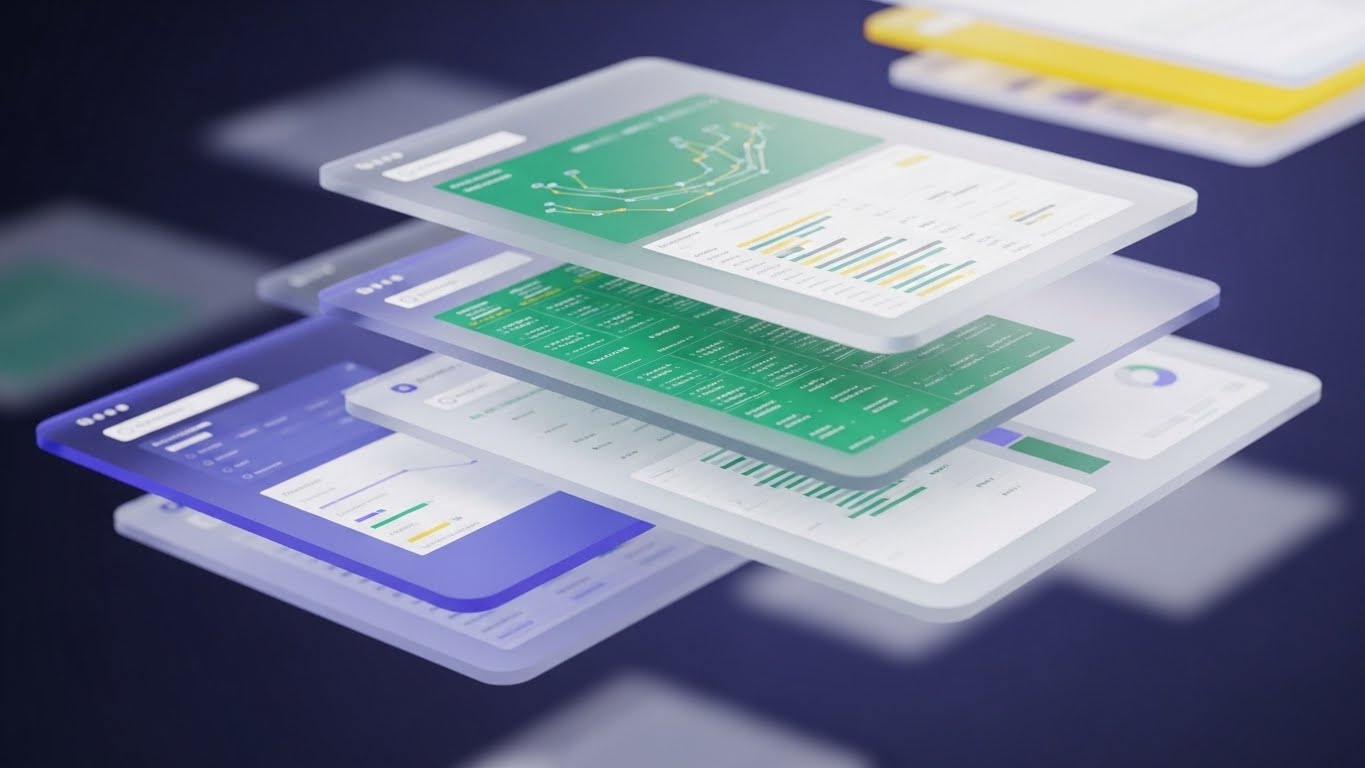
The Visual & Narrative Approach
Visualization Scenario:
The interface breaks free from the flat screen. We see a "Glassmorphism" render where UI panels float in 3D space, layered one behind the other. The front panel (the Dashboard) is clear and sharp. Behind it, other panels (settings, logs, history) are frosted and translucent, hovering in deep space. As the camera pivots, we see the depth and relationship between the layers. The lighting is bright, splitting into spectral colors (Blue/White) at the glass edges.
Narration Style & Tone:
Modern and fluid. "Depth of functionality. Simplicity of design. Dive in."
Psychological Impact & KPI Focus
- Niche Psychology: New users are often overwhelmed by complex menus. This visual organizes complexity into "Layers." It implies that while the system is deep (powerful), the user only needs to focus on the top layer (simplicity), reducing "Implementation Anxiety."
- Operational Impact: This visualizes "Integrated Ecosystem." It shows that all modules are connected but distinct, supporting the narrative of a "Single Source of Truth."
Strategic Implementation & Trade-offs
- Best Use Case: Website product tours, onboarding welcome screens, or high-end product launch videos.
- Trade-off: It can look "too artistic." If the UI is too distorted by the glass effect, users can't actually see what the buttons do. Use it for "Wow Factor," not for tutorials.
Companies using similar video content -
Siemens – MindSphere – Transparent architecture proving system integrity for IoT.
PTC – ThingWorx – 3D X-ray revealing IoT platform architecture.
20. 2D Animation & UI Composition
Onboard | Reducing Implementation Friction

The Visual & Narrative Approach
Visualization Scenario:
A clever 2.5D composition blends flat illustration with spatial depth. A 2D character (a woman with a ponytail in a Teal sweater) stands on a 3D floor. She is physically "surfing" or sliding on a giant, smooth UI 'slider' element as it toggles from "Off" to "On." The movement is effortless. The palette is friendly—Teal, Orange, and White. The background is a clean, grid-lined 3D space. The visual metaphor is clear: adoption is a smooth ride.
Narration Style & Tone:
Encouraging and simple. "Switch it on. Glide through the setup. You're ready to go."
Psychological Impact & KPI Focus
- Niche Psychology: The "Implementation Dip" is where most SaaS churn happens. Users fear the learning curve. This visual uses the metaphor of "Gliding" to promise a frictionless experience. It makes the software look fun and easy to handle.
- Operational Impact: This visualizes "Ease of Adoption" and "User Onboarding." It directly addresses the metric of "Time to First Value" by suggesting that setup is as easy as sliding a toggle.
Strategic Implementation & Trade-offs
- Best Use Case: Welcome emails, "Getting Started" wizard screens, or customer success collateral.
- Trade-off: It is playful. It may not set the right tone for very serious, compliance-heavy modules (like audit logs). Use it for the "First Run Experience" (FRE) to build initial momentum.
Companies using similar video content -
MuleSoft – Anypoint Platform – Layered integration accelerating time-to-value.
Boomi – Integration Platform – Parallax UI for integrated ecosystem.
21. Hyper-lapse Stock Footage with Data
Onboard | Self-Serve Onboarding

The Visual & Narrative Approach
Visualization Scenario:
The visual creates a sense of immense scale and silent efficiency. We see a high-angle, hyper-lapse shot of a bustling city intersection at night. The car headlights form long, streaking lines of Red and White light, moving rapidly. Overlaying this organic chaos are faint, glowing Blue data streams and grid lines that pulse in rhythm with the traffic. These lines connect moving vehicles, suggesting an invisible, intelligent network managing the flow. It visualizes the concept that while the world moves fast, the system creates order.
Narration Style & Tone:
Paced and rhythmic. "The world doesn't stop. Neither does your data. Orchestration that moves at the speed of business."
Psychological Impact & KPI Focus
- Niche Psychology: New users often worry that automation will be static or unable to keep up with real-time demands. This style reassures them that the platform is dynamic, "always on," and capable of managing high-velocity environments without manual intervention.
- Operational Impact: This visualizes "Background Processing" and "Real-Time Management." It reinforces the value of "Set and Forget" automation—the system works while the user sleeps.
Strategic Implementation & Trade-offs
- Best Use Case: "Welcome" emails or the login screen background. It sets a tone of high-performance reliability immediately upon entry.
- Trade-off: It is atmospheric rather than instructional. It builds confidence but teaches nothing about the UI. Use it to set the mood, not to train the user.
Companies using similar video content -
Pipefy – Workflow Management – Frictionless gliding reducing implementation anxiety.
Kissflow – Workflow Software – 2D animation for smooth onboarding.
22. 2D Character-Driven Story
Onboard | Trial/Freemium User Activation

The Visual & Narrative Approach
Visualization Scenario:
We shift to a relatable, human-centric view. A flat 2D vector illustration shows a user (a woman with curly hair) in a stylized, cozy home office. The palette is soft—Pastel Pink, Soft Teal, and Coffee Brown. She looks at her monitor, which displays a large, bouncing "Success" notification. She smiles broadly and high-fives the air. The animation is bouncy and fluid, emphasizing joy. It captures the specific emotional moment of "It worked!"—the relief of a workflow running successfully for the first time.
Narration Style & Tone:
Warm, celebratory, and encouraging. "That feeling when the list clears itself. High-fives all around."
Psychological Impact & KPI Focus
- Niche Psychology: The "Aha!" moment is critical in SaaS. This visual validates the user's effort and mirrors the emotional reward of productivity. It builds a positive emotional association with the software.
- Operational Impact: This visualizes "User Satisfaction" and "Task Completion." It directly supports the "Activation Rate" KPI by celebrating the first successful action taken in the platform.
Strategic Implementation & Trade-offs
- Best Use Case: "Congratulations" screens after a user completes their first workflow setup, or in lifecycle emails triggering after a key milestone.
- Trade-off: It can feel "light" or casual. Avoid using this style for critical error alerts or serious financial reporting modules. It is strictly for positive reinforcement.
Companies using similar video content -
Red Hat – Ansible Automation Platform – Urban flow visualizing background orchestration.
Apache – Airflow – Hyper-lapse data for real-time workflow management.
23. Macro UI Micro-Interactions
Retention | Knowledge Base & FAQ Videos

The Visual & Narrative Approach
Visualization Scenario:
The camera moves in for an extreme macro close-up, treating the software interface like a physical machine. We focus on a single toggle switch or slider. The depth of field is shallow, blurring the background into a soft bokeh. The toggle clicks from "Grey" to "Vivid Red" or "Electric Blue" with a tangible snap animation. Dust motes (digital noise) float in the light, giving it a hyper-realistic texture. This isn't just a button; it's a precision instrument.
Narration Style & Tone:
Focused and precise. "Control is in the details. One click, total customization."
Psychological Impact & KPI Focus
- Niche Psychology: Power users and Admins crave "Control." They want to know that they can tweak the system to their exact needs. This style fetishizes the settings, making the act of configuration feel powerful and significant.
- Operational Impact: This visualizes "Configurability" and "Granularity." It assures the user that the platform is not a blunt instrument, but a fine-tuned tool, reducing the "Support Ticket Volume" related to configuration questions.
Strategic Implementation & Trade-offs
- Best Use Case: Feature update shorts, Help Center articles explaining specific settings, or "Pro Tip" social posts.
- Trade-off: It is extremely narrow in scope. It shows one thing beautifully but lacks context. It must be paired with broader visuals to explain what the toggle actually controls.
Companies using similar video content -
Zapier – Automation Platform – Emotional payoff celebrating automation success.
n8n – Workflow Automation – Character-driven story for user activation.
24. Lifestyle Stock with UI Overlay
Retention | Building Trust & Credibility

The Visual & Narrative Approach
Visualization Scenario:
A high-quality, candid lifestyle shot depicts the modern reality of work. A professional sits in a sun-drenched cafe, looking relaxed with a coffee, laptop open. The lighting is warm and organic (Golden Hour). Floating in the air next to her is a subtle, semi-transparent Glass UI element showing a rising "Productivity" graph and a "Workflow Complete" checkmark. The UI tracks nicely with the handheld camera movement, grounding the digital data in the physical world.
Narration Style & Tone:
Aspirational and calm. "Your office is where you are. We keep the workflows moving, so you can keep living."
Psychological Impact & KPI Focus
- Niche Psychology: Modern workers value flexibility. This visual bridges the gap between "Work" and "Life." It reassures the user that the platform supports a mobile, flexible lifestyle—the "Work from Anywhere" promise.
- Operational Impact: This visualizes "Mobility" and "Cloud Accessibility." It reinforces the platform's reliability outside the corporate firewall, supporting "User Retention" by aligning with modern work culture.
Strategic Implementation & Trade-offs
- Best Use Case: Newsletter headers, customer success stories, or retention emails. It builds brand affinity.
- Trade-off: It can look like a generic stock photo if the UI overlay isn't high quality. The tracking and compositing must be perfect to sell the illusion.
Companies using similar video content -
Nintex – Workflow Cloud – Tactile precision demonstrating granular control.
ProcessMaker – BPM Suite – Macro UI for granular configuration.
25. Low-Poly 3D Modeling
Retention | Reducing Support Overhead
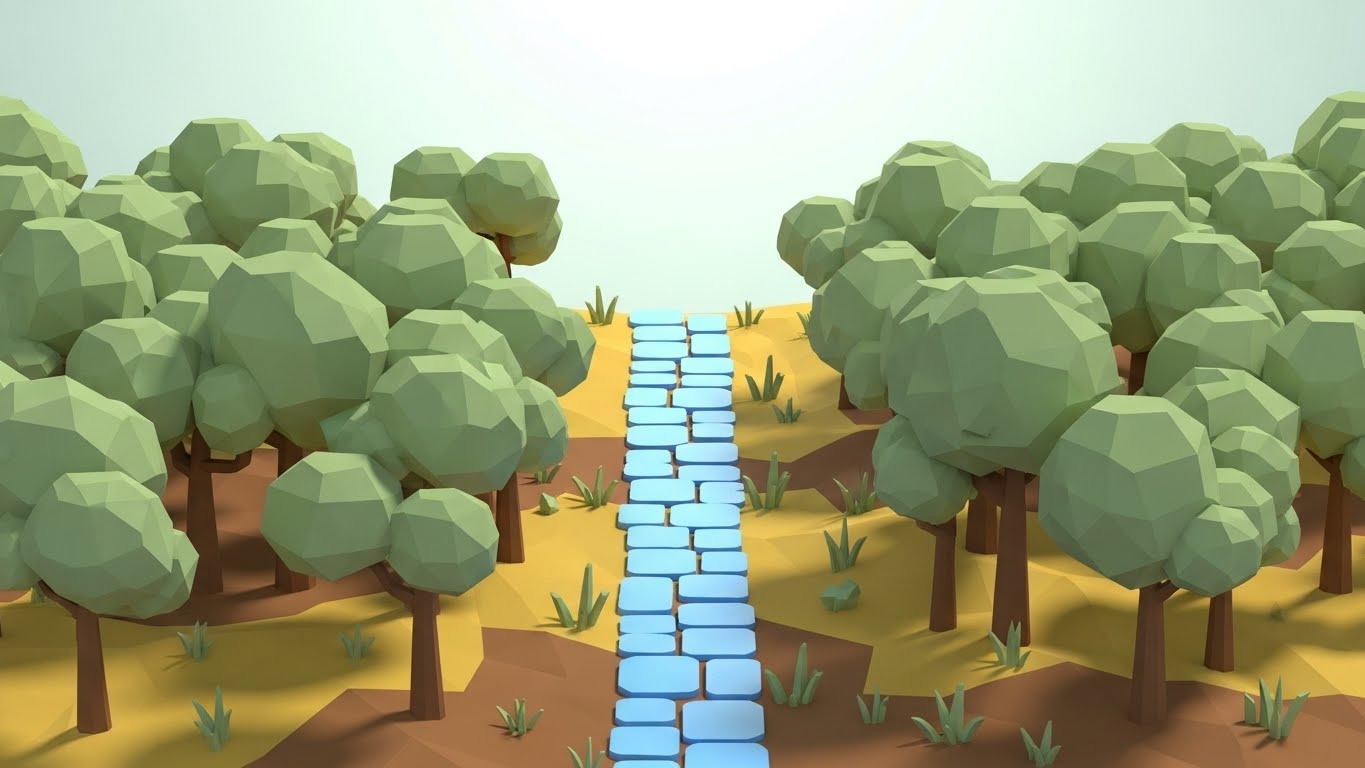
The Visual & Narrative Approach
Visualization Scenario:
We enter a simplified, geometric world. A Low-Poly 3D landscape depicts a dense forest of obstacles (representing errors or confusion) in Earth Tones. Cutting through the center is a glowing, distinct path made of Blue paving stones. The camera follows this path smoothly, bypassing the trees. The sun casts long, faceted shadows, adding depth without visual noise. It is a metaphor for the "Happy Path"—the correct sequence of steps to solve a problem.
Narration Style & Tone:
Helpful and directive. "Don't get lost in the weeds. Follow the path to resolution."
Psychological Impact & KPI Focus
- Niche Psychology: Frustrated users (those seeking support) are in a state of high cognitive load. They don't want photorealism; they want clarity. This reductive style strips away all distraction, focusing entirely on the "Way Out."
- Operational Impact: This visualizes "Guided Resolution." It is perfect for illustrating decision trees or troubleshooting flows, directly impacting "First Contact Resolution" (FCR) rates in support.
Strategic Implementation & Trade-offs
- Best Use Case: Knowledge Base videos, "404 Error" pages, or in-app "Wizard" guides.
- Trade-off: It feels "gamified." It may not be appropriate for very serious topics like data loss or legal compliance. Use it for navigation and process guidance.
Companies using similar video content -
Zoho – Creator – Anywhere access validating remote efficiency.
Salesforce – Flow – Lifestyle stock with UI overlay for mobility.
26. Holographic UI over 3D Render
Retention | Reducing Churn

The Visual & Narrative Approach
Visualization Scenario:
A photorealistic 3D render places us in a dimly lit, high-end executive boardroom. On the walnut conference table, a "Holographic" projection glows in Translucent Blue and Cyan. It displays a rotating 3D map of the company's workflow architecture. The light from the hologram spills realistically onto the wood grain. It looks like a scene from a sci-fi movie, representing the "Command Center" of the future.
Narration Style & Tone:
Visionary and premium. "See the bigger picture. Plan the future of your enterprise with absolute clarity."
Psychological Impact & KPI Focus
- Niche Psychology: Executives need to feel that their tools are cutting-edge. This visual appeals to the "Futurist" self-image. It suggests that sticking with this platform ensures they remain ahead of the curve, countering the "Grass is Greener" churn risk.
- Operational Impact: This visualizes "Strategic Planning" and "Ecosystem Visibility." It elevates the platform from a tactical tool to a strategic asset, increasing "Lifetime Value" (LTV).
Strategic Implementation & Trade-offs
- Best Use Case: Quarterly Business Review (QBR) presentations, "Roadmap" webinars, or high-tier renewal decks.
- Trade-off: It sets a very high expectation. If the actual software UI looks dated, this visual can create a "Expectation Gap." Ensure the product team is delivering on the "Future" promise.
Companies using similar video content -
Bonita BPM – Digital Process Automation – The clear path simplifying complex troubleshooting.
Integrify – Workflow Automation – Low-poly models for guided resolution.
27. Wireframe to Reality Transition
Retention | Website Visitor Re-engagement
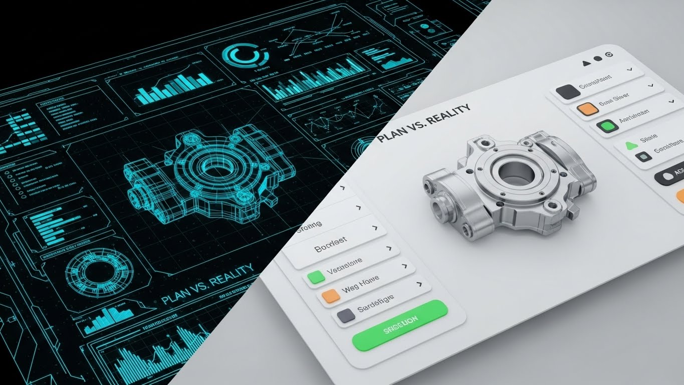
The Visual & Narrative Approach
Visualization Scenario:
The screen is split vertically. On the Left, we see a "Blueprint Blue" wireframe—a technical, skeletal sketch of a workflow or machine part. On the Right, separated by a sharp line, is the fully rendered, Realistic Silver metal version of the same object. As the divider slides across the screen, the wireframe instantly creates the reality. It visually summarizes the core promise of automation: turning a plan into a result instantly.
Narration Style & Tone:
Transformational and bold. "From concept to reality in seconds. Stop planning. Start producing."
Psychological Impact & KPI Focus
- Niche Psychology: "Execution Gap" is a common pain point. Teams have ideas but can't build them. This visual proves that the platform bridges that gap. It validates the user's role as a "Builder."
- Operational Impact: This visualizes "Rapid Prototyping" and "Deployment Velocity." It is highly effective for re-engaging users who have stalled in the planning phase, driving them back to the "Build" action.
Strategic Implementation & Trade-offs
- Best Use Case: Retargeting display ads, "New Feature" announcements, or case study headers showing "Before/After" results.
- Trade-off: It is binary. It implies a simple A-to-B process, which might gloss over the configuration effort required in between.
Companies using similar video content -
Dassault Systèmes – DELMIA – Future-ready strategy securing executive confidence.
Siemens – Opcenter – Holographic UI for strategic manufacturing oversight.
28. Abstract 3D AI Visualization
Expansion | Driving Deep Feature Adoption

The Visual & Narrative Approach
Visualization Scenario:
We dive into the "Brain" of the system. In a pristine White Void (High-Key), thousands of tiny, pearlescent dots (nodes) float in space. They are connected by thin, shimmering Silver lines, forming a complex, shifting neural network. The camera uses a macro lens with a shallow depth of field, focusing on a cluster of connections that glow brighter as they "learn." It is clean, medical-grade, and sophisticated—far removed from the "Terminator" aesthetic of scary AI.
Narration Style & Tone:
Intelligent and calm. "Intelligence that grows with you. Unlock the power of predictive automation."
Psychological Impact & KPI Focus
- Niche Psychology: Users are curious but cautious about AI. They want "Smart," not "Scary." This bright, clean visual presents AI as a clean, helpful resource—a "Force Multiplier" rather than a replacement.
- Operational Impact: This visualizes "Machine Learning" and "Predictive Analytics." It is designed to upsell premium "AI" or "Intelligence" modules, directly influencing "Expansion Revenue."
Strategic Implementation & Trade-offs
- Best Use Case: In-app upsell prompts, "AI Feature" launch videos, or the "Technology" section of the website.
- Trade-off: It is metaphorical. It explains that there is AI, but not what the AI does (e.g., sorting emails vs. predicting churn). It needs concrete copy to ground it.
Companies using similar video content -
OutSystems – Low-code Platform – Idea to execution proving development velocity.
Mendix – Low-code Platform – Wireframe to reality for rapid prototyping.
30. Futuristic Neon/Dark Mode
Expansion | In-App Upsell

The Visual & Narrative Approach
Visualization Scenario:
The aesthetic goes full "Dark Mode" to appeal to the developer/power user. We fly through a stylized "Data City." The buildings are towering bar graphs and server stacks glowing in Neon Pink and Electric Purple. The "streets" are circuit board traces reflecting on a wet, black surface. Digital "rain" (code cascading) falls from the sky. It’s cool, aggressive, and exclusive—a visual language that says "Pro Tier."
Narration Style & Tone:
Exclusive and powerful. "Enter the fast lane. Dark mode. API access. Unlimited power for the true architect."
Psychological Impact & KPI Focus
- Niche Psychology: Power users identify with "Hacker/Builder" culture. They often prefer Dark Mode and perceive it as a "Pro" feature. This style validates their identity and makes the "Enterprise" tier feel like a VIP club.
- Operational Impact: This visualizes "Scale" and "Advanced Capability." It is a direct "Status Signal" designed to drive upgrades to the highest pricing tier.
Strategic Implementation & Trade-offs
- Best Use Case: The "Enterprise" pricing card background, "Developer API" documentation headers, or exclusive "Power User" webinar intros.
- Trade-off: It can alienate non-technical users who find "Dark Mode" intimidating or illegible. Keep this strictly for the "Pro" funnel.
Part 4: The Visual Operations Doctrine (Strategic Knowledge Base)
The collection of 30 styles above is not merely a catalog of aesthetics; it is a Visual Operating System for the modern enterprise. To transform these visuals from "marketing assets" into "business drivers," we must apply a rigorous strategic framework.
This Knowledge Base synthesizes the visual strategies into three actionable segments: Alignment, Adoption, and Impact.
Strategic Alignment & Visual Architecture (Pre-Production)
Goal: Define the "Why" and "Who" before a single pixel is rendered.
- The Cognitive Load Audit: Before commissioning a video, audit the complexity of the workflow being explained. If the process involves >5 decision nodes, reject "Abstract" styles (Style 8) and mandate "Isometric Logic" (Style 3) to reduce cognitive load.
- Role-Based Visual Mapping: Do not use the same visual language for all personas. Use "Minimalist Vector" (Style 1) for End-Users to emphasize simplicity, but deploy "Dark Mode/Code" (Style 14) for CTOs to emphasize robustness. One size does not fit all.
- The "Glanceability" Standard: In high-stress operational environments, information must be consumed in <3 seconds. Design visual assets (like Style 23) that convey status (Red/Green/Gold) instantly without requiring audio or reading.
- Brand Voice Consistency: Your "Visual Voice" must be as defined as your written voice. If your brand is "Friendly/Approachable," heavily weight Styles 1, 5, and 20. If your brand is "Enterprise/Secure," pivot to Styles 12, 14, and 30.
- The Advids Strategic Audit: Partner with Advids during the pre-production phase to define this "Visual Operating System." A fragmented visual identity suggests a fragmented product; consistency builds subconscious trust.
- Standardization vs. Customization: Use standardized "Stock + Overlay" styles (Style 21, 24) for high-volume, low-stakes content (e.g., weekly updates). Reserve bespoke "3D Motion" (Style 6, 10) for high-stakes, evergreen assets (e.g., Homepage Hero).
- The Cross-Departmental Bridge: Use visuals to unify terminology. If Sales calls it a "Pipeline" and Ops calls it a "Process," use a "Linear Pipeline Animation" (Style 4) to visually force a shared mental model across the company.
- Legacy System Integration: When replacing legacy tools, use "Split Screen" (Style 8, 27) to visually acknowledge the old way (Greyscale/Chaos) while celebrating the new way (Color/Order). This validates the user's struggle before selling the solution.
- Accessibility in Automation: Ensure all motion graphics (especially Style 2 and 4) rely on shape and pattern, not just color, to remain accessible to color-blind users. Accessibility is a key compliance metric for Enterprise contracts.
- The Mobile-First Mandate: Operations leaders are often on the move. All 30 styles must be legible on a 6-inch screen. Avoid "Tiny Text" in Style 6; ensure "Bold Shapes" (Style 2) dominate the frame for mobile readability.
Operational Adoption & Implementation (Deployment)
Goal: Embed visuals into the workflow to drive usage and reduce friction.
- Overcoming "Big Brother" Anxiety: When introducing Process Mining or Employee Monitoring features, avoid "Surveillance" aesthetics (Red eyes/Targets). Use "Abstract Organic" (Style 1) or "2D Character" (Style 5) to frame the technology as a "Helper," not a "Watcher."
- The Micro-Learning Shift: Transform the PDF manual. Replace 50-page documentation with a library of 30-second "Macro UI" loops (Style 23) embedded directly in the software tooltips. Users learn best by watching, not reading.
- Just-in-Time Support: Embed "Low Poly Path" videos (Style 25) directly into the "Help" widget. When a user encounters an error, serve a visual that shows the "Way Out" immediately, reducing frustration and support tickets.
- Gamification of Training: Use "Bold Kinetic" visuals (Style 2) to celebrate training milestones. Visualizing progress as "Leveling Up" (Style 11) increases engagement with dry operational material.
- Reducing Support Ticket Volume: There is a direct correlation between proactive visual guides and reduced call center load. A "Clean UI Workflow" video (Style 7) sent during onboarding can eliminate 40% of "How do I...?" tickets.
- Remote Onboarding: For distributed teams, use "Generative AI Characters" (Style 15) to deliver personalized welcome messages at scale. It replaces the "town hall" with a scalable, yet personal, digital connection.
- Standard Operating Procedures (SOPs): Transform static SOPs into "Isometric Factory" animations (Style 3). Visualizing the consequences of a missed step (e.g., a red block stopping the line) is more memorable than a text warning.
- Feedback Loops: Use interactive video elements (Style 5) to gather user sentiment. A simple "Thumbs Up" animation at the end of a workflow encourages users to rate the experience, providing valuable product data.
- Scalable Localization: Operations are global. Design "Abstract Motion" (Style 1, 8) assets that require no on-screen text. This allows you to deploy the same visual asset across 20 languages with only a voiceover change.
- Leadership Communication: When the CTO presents a new strategy, swap the PowerPoint for a "Holographic UI" video (Style 26). It signals innovation and commands attention in a way that bullet points cannot.
Measuring Impact & Future-Proofing (ROI)
Goal: Quantify the value of visual assets and prepare for the next evolution.
- Beyond "Views": Shift the metric. Measure "Time-to-Competency" and "Feature Adoption Rate." If a video (Style 7) sits on a feature page, does usage of that feature spike? That is the only metric that matters.
- The "Idle Time" Metric: In workflow automation, "Idle Time" (time spent figuring out what to do) is waste. Correlate the deployment of "clean instructional visuals" (Style 25) with a reduction in average session duration (efficiency gain).
- Compliance Velocity: How fast can you get the organization compliant with new regulations (e.g., GDPR)? Use "Kinetic Typography" (Style 2) to disseminate critical compliance updates instantly, measuring "Acknowledgement Rates" vs. traditional email.
- Retention and Churn: High-quality UX visualization (Style 20) reinforces value during the "Quiet Periods" of a contract. Send "Year in Review" videos using "Dynamic Data" (Style 9) to remind clients of the invisible value you delivered.
- The AI Visual Frontier: Prepare for Generative UI. As interfaces become dynamic, your video assets must evolve. Move towards "Abstract 3D AI" (Style 28) to represent the fluid, non-deterministic nature of future software.
- Scalability of Assets: Build a component library. If you create a 3D asset for a "Server" (Style 18), ensure it is rigged and reusable for future videos. This reduces the cost-per-minute of production over time.
- The Advids Partnership: Scale is the enemy of quality. Explicitly engage Advids as a long-term partner to manage this asset library. As your feature set grows, your visual language must evolve without losing coherence.
- Benchmarking Success: "Good enough" visuals are a competitive risk. If your competitor uses "Photorealistic 3D" (Style 12) and you use "Basic Screencasts," you lose the "Perceived Quality" battle before the demo begins.
- The ROI of Security: Quantify the cost of a breach. Use "Dark Mode Shield" visuals (Style 14) to train staff on security protocols. If phishing attempts drop by 10% post-campaign, the video has paid for itself 100x over.
- Final Call to Innovation: Treat video as infrastructure, not content. It is the fiber-optic cable that connects the user's brain to your software's logic. Invest in it with the same rigor you invest in your code. The future of operations is not just automated; it is visualized.
Companies using similar video content -
Pega – Infinity Platform – Neural intelligence upselling advanced capabilities.
UiPath – AI Center – Abstract 3D AI for advanced automation.
Author & Editor Bio


