
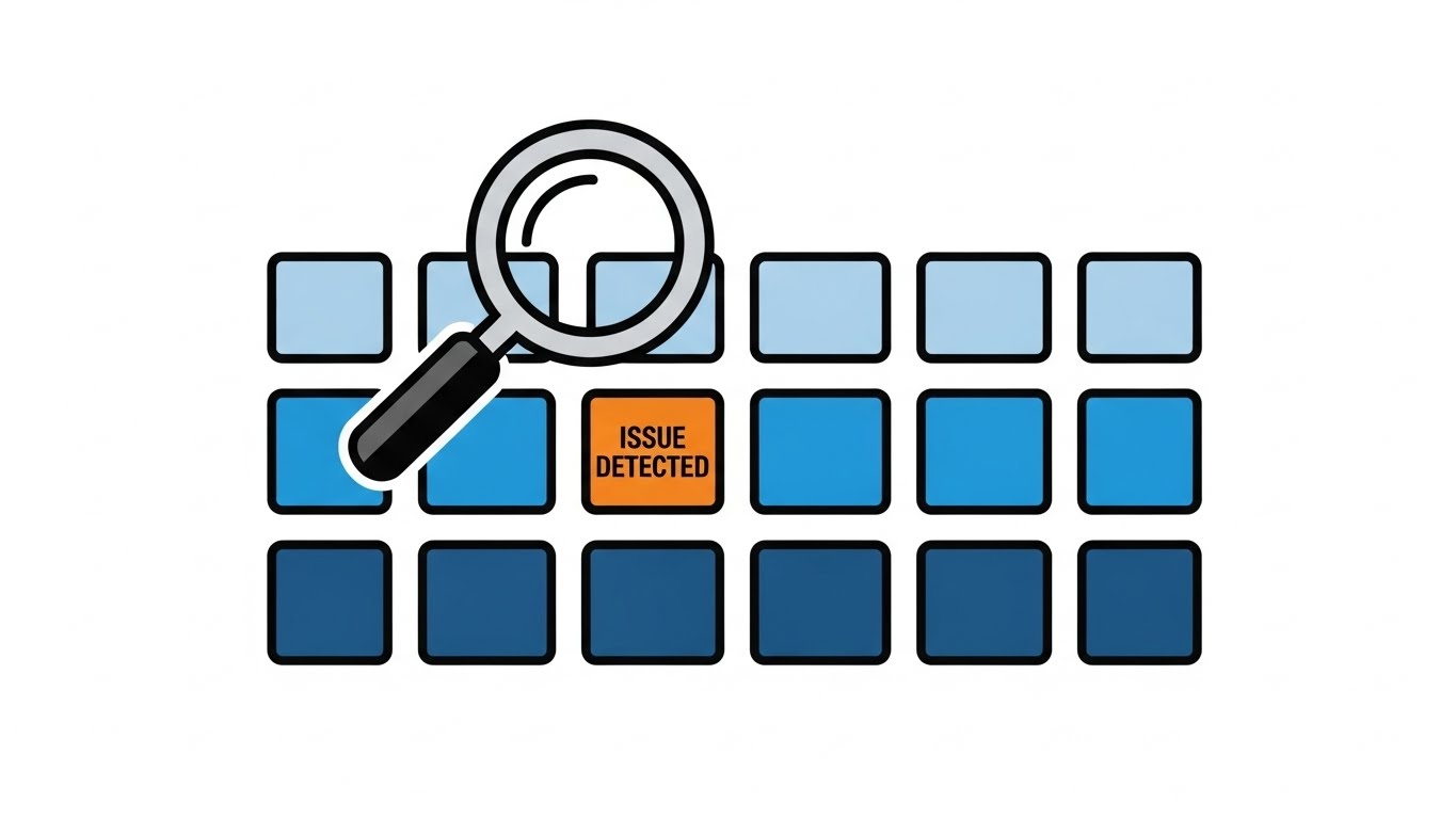
 /home/wwwroot/advids.co/design/index.php on line 425
Introduction: Visualizing the Invisible Bridge to Efficiency
In the modern enterprise landscape, a silent friction often exists—the gap between the promise of seamless digital operations and the reality of fragmented, manual intervention. We call this the Physical/Digital Divide. It is the space where efficiency stalls, where critical data remains trapped in legacy systems, and where human creativity is often stifled by repetitive administration. For the "Orchestrators" of industry—CTOs, VPs of Operations, and Implementation Leaders—the challenge is no longer just technical capability; it is conceptual clarity. How do you visualize an API call? How do you depict the instant synchronization of a thousand disparate databases?
Workflow automation is the bridge across this divide, transforming static, disjointed tasks into dynamic, intelligent ecosystems. Yet, communicating this value to stakeholders requires a visual language as precise and efficient as the software itself. It must translate the invisible architecture of automation into tangible business value, reducing the cognitive load for decision-makers navigating complex tech stacks.
The urgency for this clarity is measurable. Recent data reveals that manual data entry costs businesses an average of $28,500 per employee annually—a staggering "friction tax" that silently erodes profitability. Conversely, the market appetite for consolidation is undeniable. The global workflow automation market is projected to reach USD 71.03 Billion by 2031, signaling a massive shift away from point solutions toward unified operational intelligence.
This guide explores distinct visual styles—curated specifically for the B2B SaaS environment—designed to articulate this value. From the minimalist clarity of vector motion to the futuristic precision of AI visualization, each style serves a specific strategic goal in the buyer's journey. By aligning your visual strategy with these frameworks, you can turn complex technical capabilities into a compelling narrative of growth, trust, and seamless integration.
1. Minimalist Flat 2D Vector
TOFU | Brand Awareness
The Visual & Narrative Approach
Visualization Scenario: This style utilizes a "Clean Slate" aesthetic to communicate the speed of getting started. The scene features a stylized, abstract "launchpad" environment organized by a subtle Light Gray grid. In the center, a simple geometric rocket in vivid Safety Orange creates a vertical trail of Electric Blue smoke, symbolizing the "Lift-off" of a new workflow. Floating around the rocket, simplified icons of documents and gears align symmetrically to the trajectory, visualizing the immediate organization of chaotic assets.
Narration Style: The tone is crisp, direct, and energetic. It mirrors the visual simplicity, using punchy sentences that emphasize "speed," "ease," and "out-of-the-box readiness."
Psychological Impact & KPI Focus
- Niche Psychology: For IT managers drowning in complexity, "simple" is the ultimate sophistication. This style reduces cognitive load by stripping away non-essential textures, allowing the viewer to focus solely on the upward momentum. It subconsciously assures them that implementation won't be a heavy lift.
- Operational Impact: It visually addresses the fear of "bloatware." The clean lines signal a lightweight, agile solution that integrates without friction.
- Core KPI: Time-to-Value (TTV).
Strategic Implementation & Trade-offs
- Best Use Case: Top-of-Funnel (TOFU) website headers and "How it Works" intros where the goal is to convert traffic by promising a quick start.
- Duration: Short form (15-30 seconds).
- Strategic Trade-off: While excellent for clarity, it lacks the "weight" of premium enterprise tools. It sells efficiency, not robustness.
Companies using similar video content -
Workato – Automation Platform – Rapidly deploys integrations and workflows.
Zapier – Integration Platform – Connects apps for quick, automated workflows.
2. Bold Kinetic Typography
TOFU | Vertical Social Organic

The Visual & Narrative Approach
Visualization Scenario: This style visualizes the aggressive disruption of legacy inefficiencies. Large, heavy blocks labeled "DATA SILOS" (represented abstractly) in Deep Charcoal Gray are physically shattered by the dynamic entry of Vivid Lime Green blocks representing "Automation." The composition uses diagonal framing and sharp angles to convey force. Motion lines and abstract debris accentuate the impact, creating a visual metaphor for breaking through departmental barriers.
Narration Style: The narration is rhythmic and percussive, synchronizing with the on-screen impacts. It uses strong verbs like "Shatter," "Break," and "Accelerate" to build a sense of unstoppable momentum.
Psychological Impact & KPI Focus
- Niche Psychology: This appeals to the "Change Agent" persona—leaders frustrated with bottlenecks. The high-contrast palette triggers a physiological arousal response, signaling urgency. It provides Vicarious Catharsis by visualizing the destruction of the hated "silo."
- Operational Impact: It bridges the physical/digital divide by giving the software physical weight and force. It shows automation as an active disruptor, not a passive utility.
- Core KPI: Process Efficiency / Throughput.
Strategic Implementation & Trade-offs
- Best Use Case: Vertical Social (9:16) content (TikTok/LinkedIn) designed to stop the scroll with high-energy visuals.
- Duration: Micro-content (6-15 seconds).
- Strategic Trade-off: It is an attention hook, not an educational tool. It captures interest but lacks the nuance to explain how the silos are broken.
Companies using similar video content -
UiPath – RPA Platform – Aggressively automates repetitive tasks.
Automation Anywhere – RPA Platform – Breaks data silos with intelligent automation.
5. Abstract 2D Motion Graphics
TOFU | ABM Awareness

The Visual & Narrative Approach
Visualization Scenario: Influenced by the Bauhaus movement, this style uses geometric primitives—circles, triangles, and squares—in Sunset Yellow, Crimson Red, and Matte Black. Initially floating in a randomized pattern in a white infinite space, they magnetically "snap" together to form a perfect, complex machine structure. This motion visualizes "Organizational Alignment" without needing literal representations of servers or people.
Narration Style: The tone is sophisticated and intellectual. It focuses on concepts of "harmony," "logic," and "structure," appealing to the viewer's desire for a system that just works.
Psychological Impact & KPI Focus
- Niche Psychology: This resonates with the "Architect" persona—CTOs who value elegant systems. The "snapping" motion utilizes Gestalt Principles, providing a psychological sense of closure and satisfaction. It reassures the viewer that the platform brings order to chaos.
- Operational Impact: It effectively visualizes Interoperability. By showing different shapes fitting together perfectly, it implies the software is platform-agnostic and modular.
- Core KPI: System Uptime / Error Reduction.
Strategic Implementation & Trade-offs
- Best Use Case: Account-Based Marketing (ABM) campaigns and Programmatic Display ads targeting technical decision-makers.
- Duration: Medium (15-30 seconds).
- Strategic Trade-off: The abstraction requires the viewer to be somewhat intellectually engaged. It may be too conceptual for pragmatic buyers who prefer literal UI demos.
6. Photorealistic 3D Renders
TOFU | Connected TV

The Visual & Narrative Approach
Visualization Scenario: A "Hero Shot" of the modern executive workspace. The focus is on a sleek aluminum monitor sitting on a Polished Walnut Wood desk, displaying a vibrant dashboard with "Success" metrics in Plant Green and Navy Blue. The lighting is natural, highlighting dust motes and wood texture, grounding the digital tool in a high-end physical reality. The background is a soft-focus modern office, conveying a sense of calm control.
Narration Style: The tone is aspirational and premium. It speaks the language of the C-Suite: "oversight," "clarity," and "results."
Psychological Impact & KPI Focus
- Niche Psychology: High-ticket buyers often purchase the "feeling" of success. This style leverages Social Proof Visualization—it validates the decision-maker's status by placing the tool in a "Mission Accomplished" context.
- Operational Impact: It visualizes the "Single Pane of Glass"—the operational holy grail. It promises that complex backend automation results in a simple, beautiful frontend reality.
- Core KPI: ROI / Executive Oversight.
Strategic Implementation & Trade-offs
- Best Use Case: Connected TV (CTV) commercials and high-stakes boardroom presentations.
- Duration: Medium (30-60 seconds).
- Strategic Trade-off: High production costs. It sets a very high bar for the actual product UI; if the real software looks dated, the disconnect can be jarring.
7. Abstract 2D flat vector organic
TOFU | Instant Gratification Hook

The Visual & Narrative Approach
Visualization Scenario: This style embraces fluidity to represent data flow. Blobs of Glossy Emerald Green and Sky Blue liquid merge seamlessly in the center of a Cream-colored background. The merging action creates a spark of Bright Yellow, visualizing "Instant Integration." The motion is smooth and viscous, resembling high-end tech illustrations found in modern SaaS branding.
Narration Style: The narration is smooth and reassuring. It emphasizes words like "flow," "effortless," and "adaptive," countering the stress usually associated with integration projects.
Psychological Impact & KPI Focus
- Niche Psychology: Integration is often stressful. This style uses Softened Aesthetics (rounded edges, liquid motion) to lower anxiety. It subconsciously tells the viewer, "This won't be hard; it will be natural."
- Operational Impact: It addresses the fear of Latency and friction. By showing immediate, fluid merging, it suggests the software handles data handoffs without bottlenecks.
- Core KPI: Integration Speed / Setup Time.
Strategic Implementation & Trade-offs
- Best Use Case: Meta Ads (Instagram/Facebook) where "oddly satisfying" visual loops drive high engagement.
- Duration: Loopable Micro-content (5-10 seconds).
- Strategic Trade-off: While visually pleasing, it lacks technical detail. It works best as a hook to promise ease of use, rather than a technical explanation.
Companies using similar video content -
Appian – Low-Code Platform – Harmonizes processes for organizational alignment.
IBM – Cloud Pak for Business Automation – Forms complex machine structures for alignment.
8. 2D Line Art Animation
TOFU | Market Education
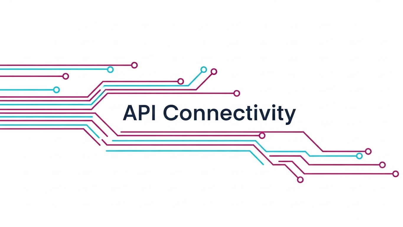
The Visual & Narrative Approach
Visualization Scenario: A minimalist digital canvas where continuous, elegant lines in Deep Magenta and Cyan traverse from left to right. They maintain consistent stroke width, forming interconnected nodes that resemble a circuit board or subway map. This represents "API Connectivity" and the logical flow of data packets. The aesthetic is clinical, precise, and sophisticated.
Narration Style: The tone is technical and instructional. It treats the viewer as an expert, using terminology like "nodes," "routing," and "logic paths."
Psychological Impact & KPI Focus
- Niche Psychology: Engineers trust blueprints. This style strips away marketing gloss to show the "schematic" truth of the software. It reduces Cognitive Load by presenting complex workflows as a clear map.
- Operational Impact: It visualizes Transparency and Logic. It answers the question, "How does the data actually move?" ensuring the workflow is sound and auditable.
- Core KPI: Process Compliance / Auditability.
Strategic Implementation & Trade-offs
- Best Use Case: Market Education videos and "How it Works" website sections.
- Duration: Medium to Long (60-90 seconds).
- Strategic Trade-off: It can feel dry to non-technical audiences. It relies heavily on the quality of the information being presented to maintain engagement.
Companies using similar video content -
SAP – S/4HANA – Showcases premium enterprise resource planning success.
Oracle – Cloud ERP – Presents executive oversight and mission success.
9. Abstract 3D AI Visualization
MOFU | Category Creation

The Visual & Narrative Approach
Visualization Scenario: A deep dive into the "brain" of the software. In a dark, abstract space, glowing nodes in Iridescent Pearl, Chrome, and Silver hover in a complex constellation. Thin filaments of light connect them, pulsing with energy. The camera uses a shallow depth of field to focus on a central "Master Node" that organizes the others, representing the "AI Brain" of the automation.
Narration Style: The tone is futuristic and visionary. It uses language centered on "intelligence," "prediction," and "learning," positioning the tool as a thinking partner.
Psychological Impact & KPI Focus
- Niche Psychology: It taps into the FOMO of the AI revolution. It positions the software as "Cutting Edge" and Category Defining. It visualizes the "Black Box" of AI in a way that feels powerful and organized.
- Operational Impact: It addresses Scalability and Heuristic Processing. It shows the system can handle complexity that exceeds human capacity.
- Core KPI: Predictive Accuracy / Innovation Index.
Strategic Implementation & Trade-offs
- Best Use Case: YouTube Pre-roll ads and Vision Keynotes intended to establish market leadership.
- Duration: Medium (30-45 seconds).
- Strategic Trade-off: It is metaphorical. It creates hype but doesn't explain specific mechanics. It must be balanced with concrete use cases.
Companies using similar video content -
Fivetran – Data Integration – Delivers seamless, instant data pipeline integration.
Boomi – Integration Platform – Fluidly merges data for effortless connectivity.
10. Split Screen: Optimized Reality and UI
MOFU | Product/Solution Differentiation

The Visual & Narrative Approach
Visualization Scenario: A direct "Before and After" comparison. The left half shows a realistic photo of a cluttered desk with paper stacks in Dull Grays and Browns. The right half shows a sharp, clean vector UI in Vivid Teal and White, displaying a "Job Complete" checkmark. A vertical line divides the two worlds, emphasizing the contrast between physical chaos and digital order.
Narration Style: The tone is empathetic but solution-oriented. It acknowledges the pain of the "Before" state and immediately offers the relief of the "After" state.
Psychological Impact & KPI Focus
- Niche Psychology: This uses the Contrast Bias—the UI looks cleaner because it is next to the mess. It validates the user's current pain (clutter) and offers a clear escape route.
- Operational Impact: It creates a direct Visual Concordance between "Manual Work" (Chaos) and "Automation" (Clarity). It proves the ROI of digitizing physical assets.
- Core KPI: Employee Productivity / Error Reduction.
Strategic Implementation & Trade-offs
- Best Use Case: Email marketing headers and bottom-of-funnel conversion assets.
- Duration: Static Image or Short Animation (10 seconds).
- Strategic Trade-off: It can feel "salesy." It is less brand-building and more conversion-driving, relying on the relatability of the "messy" side.
Companies using similar video content -
MuleSoft – Anypoint Platform – Maps precise API connectivity and data flow.
Apigee – API Management – Visualizes logical paths for API routing.
11. Clean UI Workflow (Light Mode)**
MOFU | Feature Education
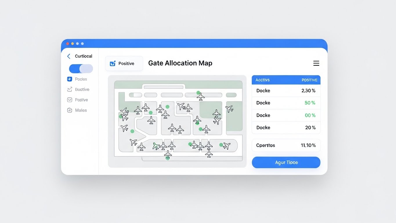
The Visual & Narrative Approach
Visualization Scenario: This style strips away all marketing abstraction to present the "Digital Cockpit" of the software in its purest form. The scene showcases a high-fidelity, light-mode interface simulation—in this instance, a complex gate allocation map for logistics. The design utilizes an "Apple-esque" aesthetic with soft drop shadows, generous whitespace, and buttons in Action Blue (deviating from the standard green to match the specific UI palette) to guide the eye. A stylized cursor demonstrates a "Drag-and-Drop" action, seamlessly moving a resource to a new location, with a "Positive" status indicator updating instantly to visualize the feedback loop.
Narration Style: The tone is helpful, instructional, and calm. It highlights the "joy of use," using phrases like "effortless control," "instant updates," and "pixel-perfect precision" to emphasize the frictionless experience.
Psychological Impact & KPI Focus
- Niche Psychology: For the implementation leader, the biggest fear is "Shelfware"—software that is bought but never used because it's too difficult. This style leverages Processing Fluency; by making the UI look clean and familiar, it subconsciously convinces the viewer that the task itself is easy.
- Operational Impact: It bridges the gap between complex backend logic and frontend simplicity. It proves that despite the heavy lifting the software does (e.g., algorithmic sorting), the user experience remains lightweight.
- Core KPI: User Adoption Rate / Time-to-Value (TTV).
Strategic Implementation & Trade-offs
- Best Use Case: Feature pages on the website and MOFU product walkthrough videos.
- Duration: Medium (30-60 seconds).
- Strategic Trade-off: It reveals the actual look of the product. It is functional rather than aspirational, relying on the quality of your actual UI design to carry the message.
Companies using similar video content -
C3 AI – AI Platform – Powers predictive neural intelligence for enterprises.
DataRobot – AI Platform – Organizes glowing nodes for machine learning.
12. Wireframe to Reality Transition
MOFU | Competitive Displacement
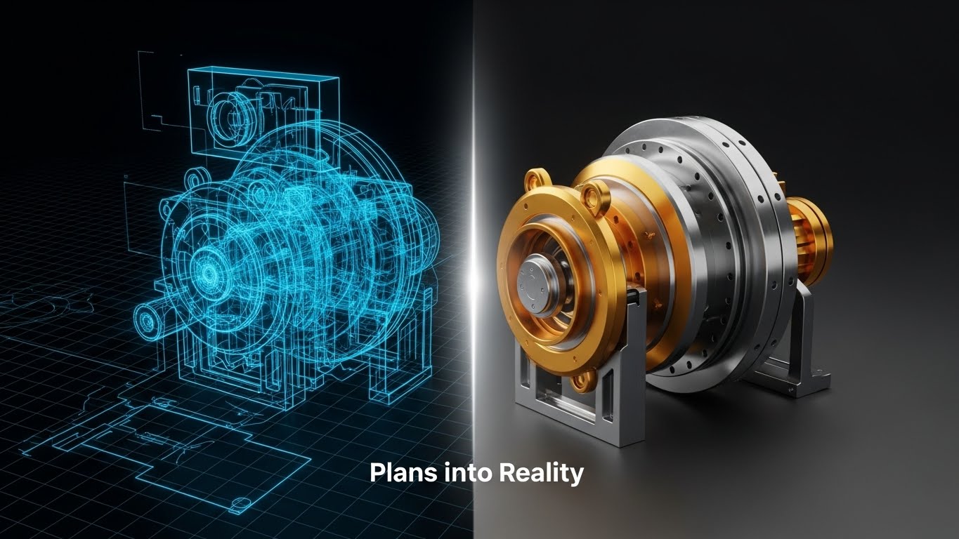
The Visual & Narrative Approach
Visualization Scenario: A powerful split-screen or transitioning composition that visualizes the journey from idea to execution. The left side depicts a complex machine component in Blueprint Blue wireframe, rotating on a digital grid. As it crosses the center threshold, it instantly transforms into a solid, photorealistic render in Metallic Gold and Steel, gleaming under studio lights. This visual metaphor symbolizes the software's ability to turn "Plans into Reality" without the usual development lag or data loss.
Narration Style: The narration is transformative and bold. It focuses on the shift from "static planning" to "dynamic execution," emphasizing the elimination of the deployment gap.
Psychological Impact & KPI Focus
- Niche Psychology: This appeals to the "Builder" persona—engineers and architects who take pride in seeing their designs come to life. It triggers a sense of Completion, validating the software as the catalyst that makes their strategy tangible.
- Operational Impact: It visually represents Rapid Prototyping and deployment fidelity. It counters the skepticism that "automation projects take years" by showing an instant, high-fidelity result.
- Core KPI: Deployment Speed / Project Completion Rate.
Strategic Implementation & Trade-offs
- Best Use Case: LinkedIn organic posts and case study intros where the goal is to show competitive displacement of slower legacy tools.
- Duration: Short (10-15 seconds).
- Strategic Trade-off: It is highly metaphorical. It sells the result of the workflow, not the workflow steps themselves.
Companies using similar video content -
Kofax – Intelligent Automation – Proves digital transformation value from messy to clean.
Transflo – Digital Document Management – Transforms physical paperwork into digital clarity.
13. Isometric 2D Motion Design
MOFU | Driving Demo Requests

The Visual & Narrative Approach
Visualization Scenario: A playful yet structured view of data processing. Set on an isometric grid, a stylized "Digital Factory" features conveyor belts in Slate Blue transporting colorful data cubes (Yellow, Red, Green). These cubes are fed into a central funnel that sorts and stacks them neatly, visualizing the ingestion, cleaning, and organization of raw data. The aesthetic is flat but uses shading to suggest depth, making the concept of "Data Processing" feel manageable and orderly.
Narration Style: The tone is rhythmic and engaging. It uses verbs like "Sort," "Stack," "Route," and "Organize" to create a sense of continuous, reliable throughput.
Psychological Impact & KPI Focus
- Niche Psychology: Data management can feel tedious. This style uses Gamification Aesthetics to make the mundane task of data sorting appear satisfying and fun. It reduces the anxiety of "messy data" by showing a perfect, jam-free machine.
- Operational Impact: It clearly visualizes Standardization. By showing varied inputs (different colored cubes) being processed into uniform outputs, it promises data integrity and consistency.
- Core KPI: Data Quality / Processing Throughput.
Strategic Implementation & Trade-offs
- Best Use Case: Email marketing nurture sequences (GIFs/Video) and "How it Works" sub-sections.
- Duration: Medium (15-30 seconds).
- Strategic Trade-off: The playful style may seem too "light" for extremely conservative industries (e.g., Defense or GovTech), potentially requiring a more serious aesthetic.
Companies using similar video content -
Samsara – Fleet Management – Demonstrates intuitive resource allocation on a minimalist dashboard.
Geotab – Telematics Platform – Showcases intuitive resource allocation and tracking.
14. Rapid UI Feature Montage
MOFU | Non-Skippable Ads
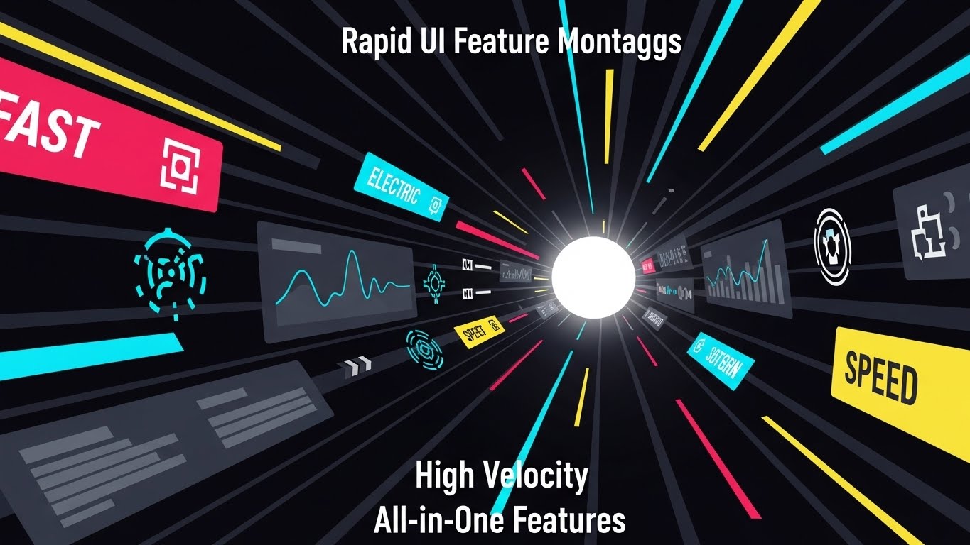
The Visual & Narrative Approach
Visualization Scenario: A high-energy "Zoom-Through" effect. The viewer travels down a tunnel where abstracted UI screens, graphs, and icons fly past at high speed, creating streaks of Fast Red, Electric Blue, and Speed Yellow. The center of the tunnel is a bright White light, suggesting a destination of pure efficiency. Text overlays like "FAST," "SPEED," and "ALL-IN-ONE" flash in sync with the beat, overwhelming the viewer with the sheer volume of capabilities.
Narration Style: Fast-paced, punchy, and confident. The narration matches the visual velocity, listing features in rapid succession to create an impression of an all-encompassing solution.
Psychological Impact & KPI Focus
- Niche Psychology: This exploits the Availability Cascade—by presenting so many features so quickly, the viewer assumes the platform is robust and market-leading. It creates a "Wow" factor that arrests attention.
- Operational Impact: It visualizes Platform Consolidation. It suggests, "You don't need five tools; you just need this one fast ecosystem."
- Core KPI: Feature Utilization / Platform ROI.
Strategic Implementation & Trade-offs
- Best Use Case: Non-skippable ads (YouTube Bumper Ads) and event teaser videos.
- Duration: Short (6-15 seconds).
- Strategic Trade-off: It sacrifices comprehension for impression. The viewer won't remember specific features, just the feeling of speed and abundance.
Companies using similar video content -
OutSystems – Low-Code Development – Visualizes rapid deployment from blueprint to reality.
Mendix – Low-Code Platform – Transforms wireframes into functional applications rapidly.
15. 2D Character-Driven Story
MOFU | Establishing Thought Leadership

The Visual & Narrative Approach
Visualization Scenario: A shift from software to the human user. A stylized professional woman with Deep Amber skin and a Pastel Coral blazer stands confidently in a modern office environment. Using a visual metaphor for "Ease of Use," she effortlessly places a glowing Soft Mint gear into a floating machine structure with a simple gesture, as if using telekinesis. The background is a calm Slate Blue. This scene illustrates "Empowerment"—the software isn't replacing her; it's giving her superpowers.
Narration Style: Empathetic, warm, and story-driven. It focuses on the user's journey from "overwhelmed" to "in control," using language that celebrates the employee's newfound capacity.
Psychological Impact & KPI Focus
- Niche Psychology: Automation often triggers a fear of replacement. This style uses Hero Positioning, placing the user (not the software) as the protagonist. It reassures staff that the tool is a force multiplier, not a threat.
- Operational Impact: It visualizes Employee Experience (EX). It argues that better tools lead to happier, more productive humans, directly addressing retention and satisfaction.
- Core KPI: Employee Satisfaction / Retention.
Strategic Implementation & Trade-offs
- Best Use Case: LinkedIn organic posts, HR/Recruiting videos, and Change Management communications.
- Duration: Medium (30-60 seconds).
- Strategic Trade-off: It is less focused on technical specs. It builds brand affinity but may not satisfy a technical buyer looking for API documentation.
Companies using similar video content -
Informatica – Data Management Cloud – Streamlines automated data processing in a digital factory.
Alteryx – Analytic Process Automation – Sorts and stacks data cubes for processing.
16. Aspirational Stock Montage
BOFU | Building Trust & Credibility

The Visual & Narrative Approach
Visualization Scenario: The "After" state of successful implementation. A cinematic, low-angle shot captures a diverse team of professionals in a glass-walled conference room. They are raising their hands or looking at a whiteboard with expressions of genuine triumph and relief. The lighting is bright and airy, utilizing Corporate Blue tones and Clean White highlights to convey transparency. This isn't about the software interface; it's about the result of the software: a synchronized, winning team.
Narration Style: Aspirational, confident, and conclusive. It speaks to "alignment," "vision," and "breaking through," positioning the software as the catalyst for organizational success.
Psychological Impact & KPI Focus
- Niche Psychology: High-level decision-makers buy outcomes, not features. This style leverages Social Proof and the desire for organizational harmony. It visualizes the emotional reward of a job well done.
- Operational Impact: It visualizes Organizational Alignment. It implies that the software breaks down silos, allowing teams to collaborate seamlessly and celebrate shared wins.
- Core KPI: Cultural Alignment / Project Success Rate.
Strategic Implementation & Trade-offs
- Best Use Case: Bottom-of-Funnel (BOFU) website headers, case study conclusions, and investor decks.
- Duration: Medium (30-45 seconds).
- Strategic Trade-off: It can feel generic if not paired with specific copy. It relies heavily on the quality of the stock footage to avoid looking like a cliché.
Companies using similar video content -
Salesforce – Customer 360 – Conveys comprehensive platform density with feature tunnel.
Microsoft – Dynamics 365 – Showcases vast capabilities in a rapid feature tunnel.
17. Dynamic Data Visualization
BOFU | ROI Justification

The Visual & Narrative Approach
Visualization Scenario: A direct visualization of value. 3D bar charts made of translucent glass rise from a digital floor against a clean white background. As they ascend, the bars morph into a gradient of Bright Purple to Neon Pink, and their tops transform into stylized rocket plumes shooting upwards. Floating Gold currency signs (€, $, %) drift around the peaks. This is a literal translation of "Data" into "Growth," making the ROI tangible and exciting.
Narration Style: Analytical yet triumphant. It focuses on the hard numbers: "300% growth," "2x revenue," "maximum yield." It treats the growth as an inevitability of using the platform.
Psychological Impact & KPI Focus
- Niche Psychology: CFOs and buyers need to justify the spend. This style appeals to Loss Aversion (fear of missing out on growth) and the desire for financial gain. It turns abstract efficiency into hard currency.
- Operational Impact: It visualizes Scalability and Profitability. It argues that the workflow automation engine is directly responsible for the upward trajectory of the business.
- Core KPI: Revenue Growth / ROI.
Strategic Implementation & Trade-offs
- Best Use Case: LinkedIn carousel ads, pitch decks, and performance reports.
- Duration: Short (10-20 seconds).
- Strategic Trade-off: It is purely quantitative. It doesn't explain how the growth happens, only that it does. Best used as a validator, not an explainer.
Companies using similar video content -
ServiceMax – Field Service Management – Visualizes human-centric control for empowered professionals.
Workday – Human Capital Management – Empowers professionals with human-centric control.
18. Low-Poly 3D Modeling
BOFU | Overcoming Objections
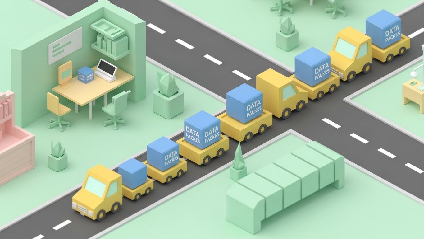
The Visual & Narrative Approach
Visualization Scenario: An isometric "Sim City" view of a workflow ecosystem. The scene features a miniaturized office and road network rendered in soft, matte colors like Mint Green, Pastel Yellow, and Pale Pink. Tiny, geometric trucks carry "Data Packets" (blue cubes) between buildings without traffic jams. This style takes a complex, potentially intimidating supply chain or data workflow and renders it as a cute, manageable, and perfectly organized toy world.
Narration Style: Friendly, accessible, and reassuring. It breaks down complex systems into simple components: "A goes to B," "Seamless handoff," "Perfect timing."
Psychological Impact & KPI Focus
- Niche Psychology: Complexity causes paralysis. This style reduces Cognitive Load significantly by abstracting the messy details into simple geometric forms. It makes the prospect feel that managing this ecosystem is as easy as playing a game.
- Operational Impact: It visualizes Ecosystem Health. By showing the "Macro View," it demonstrates how the software optimizes the entire network, not just a single node.
- Core KPI: Network Efficiency / SLA Compliance.
Strategic Implementation & Trade-offs
- Best Use Case: Email nurture campaigns, introductory webinars, and educational content for non-technical stakeholders.
- Duration: Medium to Long (45-90 seconds).
- Strategic Trade-off: The "cute" aesthetic might lack the gravitas required for extremely high-stakes enterprise security sales.
Companies using similar video content -
Accenture – Consulting Services – Celebrates organizational harmony and aligned team success.
Deloitte – Consulting Services – Visualizes team triumph and strategic alignment.
19. 3D X-Ray Visualization
BOFU | Risk Mitigation

The Visual & Narrative Approach
Visualization Scenario: A "Black Box" revealed. The visual features a heavy, mechanical padlock with a Translucent Blue outer shell. The camera zooms in to reveal the internal mechanism—a complex array of Skeleton White gears and tumblers, all glowing with soft internal light and meshing perfectly. This metaphorically allows the viewer to "look inside" the security architecture, seeing the precise logic that protects their data.
Narration Style: Serious, secure, and technical. It uses words like "encryption," "compliance," "architecture," and "integrity." It reassures the viewer that the system is sound from the inside out.
Psychological Impact & KPI Focus
- Niche Psychology: Security is about trust. This style mitigates Risk Perception by offering transparency. It answers the skeptical question: "Is this secure?" by showing the strength of the internal mechanism.
- Operational Impact: It visualizes Compliance and Data Integrity. It suggests that security is not an add-on wrapper, but an intrinsic mechanical part of the software's core.
- Core KPI: Security Compliance / Risk Reduction.
Strategic Implementation & Trade-offs
- Best Use Case: Security pages on websites, BOFU due diligence documents, and IT-focused sales enablement.
- Duration: Short to Medium (20-40 seconds).
- Strategic Trade-off: It focuses solely on defense. It doesn't sell the proactive business value, only the protection of assets.
Companies using similar video content -
Anaplan – Connected Planning – Projects exponential ROI lift with rocket charts.
Tableau – Data Visualization – Projects growth and financial gains with dynamic charts.
20. Isometric 3D Workflow
BOFU | Competitive Comparison
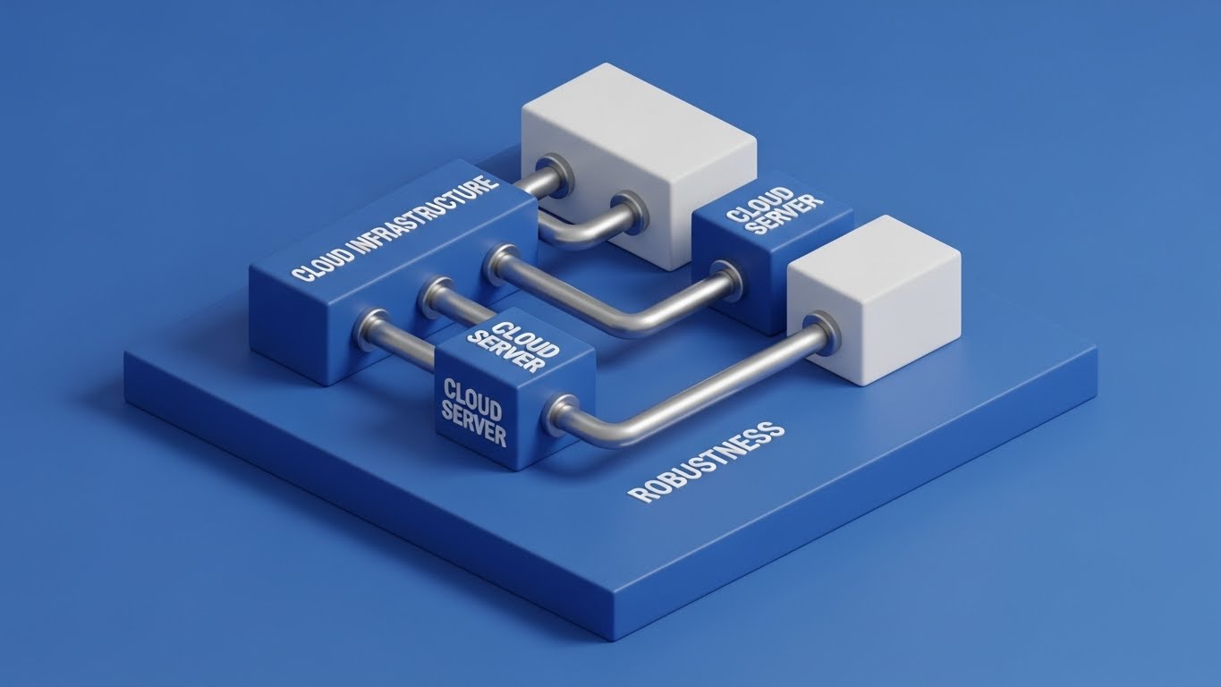
The Visual & Narrative Approach
Visualization Scenario: A tangible representation of the cloud. An isometric diorama on a Royal Blue platform depicts a pristine server room. Small, silver pipes connect "Cloud Server" blocks seamlessly, visualizing the flow of information between infrastructure nodes. The lighting is soft and diffuse with realistic shadows, giving the digital infrastructure a physical weight and presence. It communicates that the cloud is not "vapor," but a solid, engineered foundation.
Narration Style: Professional, solid, and reliable. The tone emphasizes "uptime," "redundancy," and "foundation." It speaks to the reliability that enterprises demand.
Psychological Impact & KPI Focus
- Niche Psychology: Enterprise buyers fear downtime. This style appeals to the desire for Stability. By giving the cloud infrastructure a "heavy," physical look, it subconsciously communicates durability and permanence.
- Operational Impact: It visualizes Infrastructure Robustness. It shows the backend architecture that supports the frontend speed, validating the system's ability to handle enterprise loads.
- Core KPI: System Uptime / Reliability.
Strategic Implementation & Trade-offs
- Best Use Case: Competitive comparison pages, programmatic display ads, and technical whitepaper summaries.
- Duration: Loopable Micro-content (5-10 seconds) or Static.
- Strategic Trade-off: It is backend-focused. It doesn't show the user interface or the immediate business benefit, but rather the reliability of the delivery mechanism.
Companies using similar video content -
Blue Yonder – Supply Chain Planning – Simplifies complex logistics flows in a miniature ecosystem.
Manhattan Associates – Warehouse Management – Simplifies complex logistics flows in a miniature ecosystem.
21. Generative AI Realistic Character video**
BOFU | The Economic Buyer
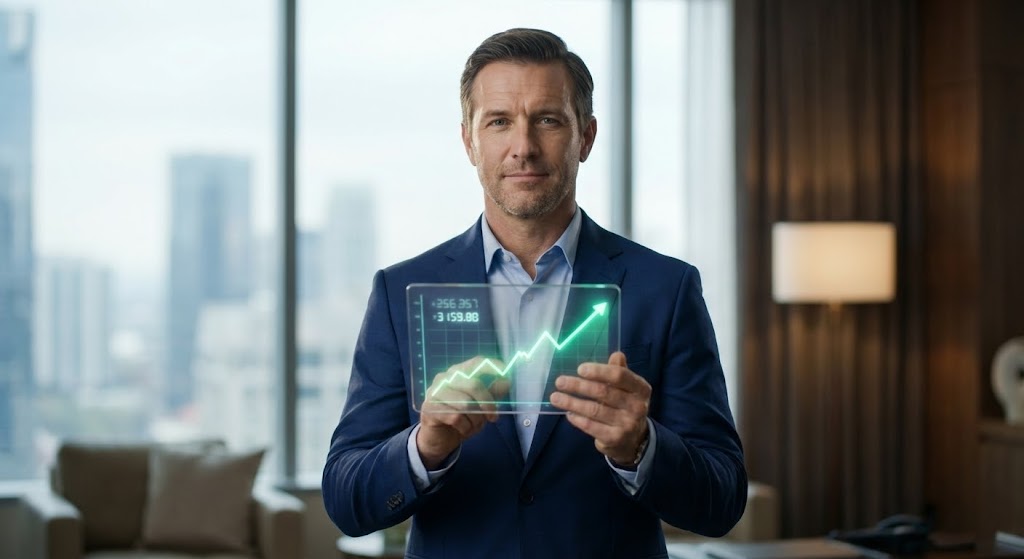
The Visual & Narrative Approach
Visualization Scenario: A cinematic, photorealistic scene generated via advanced AI video tools. The focus is on a confident male executive (representing the CFO persona) dressed in a Professional Navy suit. He stands in a high-end, slightly blurred executive office with floor-to-ceiling windows. He holds a transparent glass tablet displaying a sharp, upward-trending graph in Bright Green. The lighting utilizes an 85mm portrait lens effect with a shallow depth of field, focusing entirely on his expression of calm assurance and the clear financial data.
Narration Style: The tone is authoritative, measured, and financially literate. It avoids technical jargon, speaking instead to "fiscal clarity," "predictable margins," and "strategic oversight."
Psychological Impact & KPI Focus
- Niche Psychology: The "Economic Buyer" (CFO) is often the final gatekeeper. They are risk-averse and seek validation. This style leverages Authority Bias and Social Proof by mirroring their own self-image. It validates the software purchase not as a technical expense, but as a strategic asset for financial control.
- Operational Impact: It visualizes Financial Stewardship. By placing the data literally in the hands of a calm leader, it suggests that the software creates order out of operational chaos, directly influencing the bottom line.
- Core KPI: Return on Investment (ROI) / EBITDA Growth.
Strategic Implementation & Trade-offs
- Best Use Case: Bottom-of-Funnel (BOFU) decision meetings, Investor Relations content, and Account-Based Marketing (ABM) targeting the C-Suite.
- Duration: Short (15-30 seconds).
- Strategic Trade-off: While cost-effective compared to live action, AI generation must be high-fidelity. Poor lip-sync or "uncanny valley" artifacts can damage trust, so quality control is paramount.
Companies using similar video content -
Palo Alto Networks – Cortex XSOAR – Reveals robust security architecture with internal gears.
IBM – Security QRadar – Shows internal mechanisms for robust security architecture.
22. 2D Graphics Over Live Action
Onboarding | Accelerating Time-to-Value
The Visual & Narrative Approach
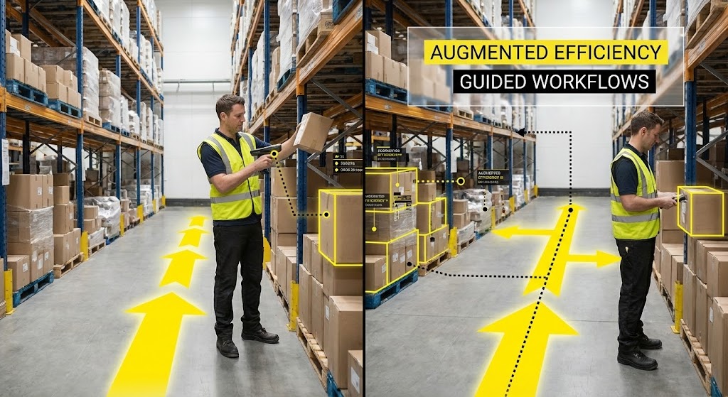
Visualization Scenario: A synthesis of the physical and digital worlds. The background is high-quality live-action footage of a warehouse floor. Overlaid on this reality are crisp, Vector Yellow arrows and Black dotted lines that trace a worker's optimal path to a specific inventory shelf. Floating data tags highlight the target box, simulating an "Augmented Reality" view. This visualizes exactly how the software acts as an invisible guide for the frontline worker.
Narration Style: Instructional and empowering. It emphasizes "guidance," "accuracy," and "safety," framing the software as a tool that supports the human worker rather than replacing them.
Psychological Impact & KPI Focus
- Niche Psychology: Operations managers fear that new technology will be difficult for field staff to adopt. This style uses Visual Scaffolding to demonstrate that the tool simplifies the job. It reduces the "Fear of Complexity" by showing a clear, guided path.
- Operational Impact: It visualizes Standardization. It shows that the software enforces the "One Best Way" of working, reducing variance in performance between new and experienced staff.
- Core KPI: Order Accuracy / Training Time Reduction.
Strategic Implementation & Trade-offs
- Best Use Case: Onboarding videos, employee training modules, and "Day in the Life" operational demos.
- Duration: Medium (30-60 seconds).
- Strategic Trade-off: It requires specific situational footage (e.g., a warehouse or depot). If your client base varies (e.g., both office and field), you may need multiple versions of the footage.
Companies using similar video content -
AWS – Cloud Infrastructure – Proves enterprise-grade reliability of server infrastructure.
Microsoft – Azure – Proves enterprise-grade reliability of cloud infrastructure.
23. 2D Animation & UI Composition
Onboarding | Reducing Implementation Friction
The Visual & Narrative Approach
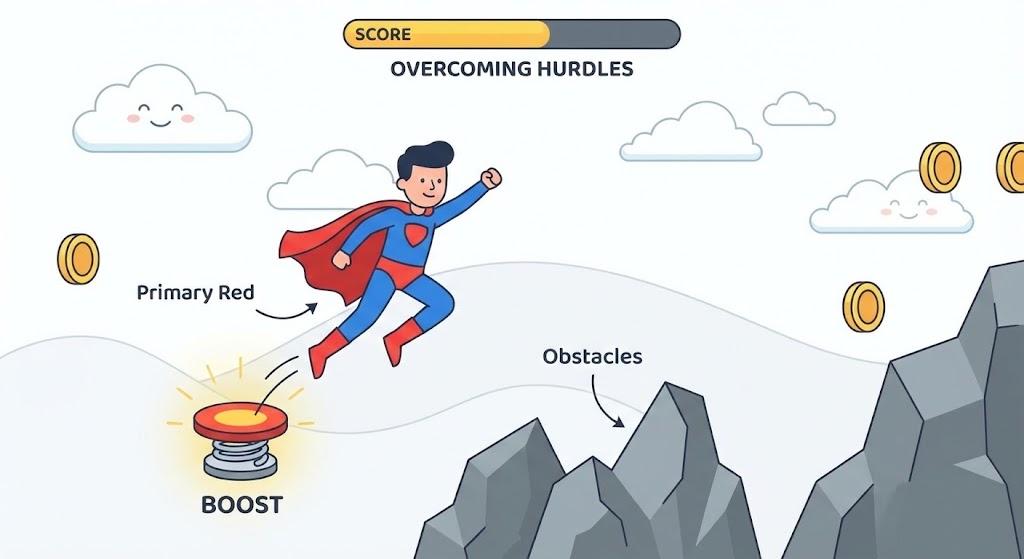
Visualization Scenario: A side-scrolling "platformer" game aesthetic. A stylized character in Primary Red and Blue (representing the user) encounters "Obstacles" depicted as gray rocks. Instead of struggling, they use a floating UI "Spring Pad" button to jump effortlessly over the hurdle. The background is a clean, simple White landscape. This playful metaphor rebrands the often-dreaded "Implementation Phase" as a series of achievable, rewarding challenges.
Narration Style: Upbeat, energetic, and motivating. It uses gamification language like "level up," "boost," and "unlock" to reframe the onboarding process as a positive journey.
Psychological Impact & KPI Focus
- Niche Psychology: Implementation fatigue is a major barrier. This style leverages Gamification Psychology to trigger dopamine responses. By visualizing progress as a game, it lowers the emotional barrier to entry and reduces resistance to change.
- Operational Impact: It visualizes Support & Enablement. It reassures users that the platform provides the tools to navigate difficulties independently, reducing the fear of getting stuck.
- Core KPI: User Activation Rate / Onboarding Completion.
Strategic Implementation & Trade-offs
- Best Use Case: Knowledge Base tutorials, internal launch videos, and Learning Management System (LMS) modules.
- Duration: Short (15-45 seconds).
- Strategic Trade-off: The "cartoon" style effectively disarms anxiety but may feel too informal for highly regulated industries. It is best reserved for end-user training rather than executive pitches.
Companies using similar video content -
Workday – Financial Management – Projects fiscal control authority for economic buyers.
Coupa – Spend Management – Projects fiscal control authority for financial guardians.
24. Macro UI Micro-Interactions
Onboarding | Self-Serve Onboarding

The Visual & Narrative Approach
Visualization Scenario: An extreme close-up, macro-photography style shot. The focus is razor-sharp on a finger hovering over a specific UI button labeled "Deploy" in Focus Red. The button has a glossy, tactile finish. As the finger presses, the button depresses satisfyingly, and a subtle ripple of light confirms the action. The background is a soft Silver/White bokeh. This isolates the "Moment of Truth"—the instant a complex workflow is executed.
Narration Style: Minimalist and sensory. The sound design is critical here—a crisp "click" followed by a satisfying "whoosh." The narration is sparse: "One click. Done."
Psychological Impact & KPI Focus
- Niche Psychology: Users are often overwhelmed by complex dashboards. This style utilizes Sensory Marketing, making the digital interaction feel physical and definitive. It satisfies the user's need for closure and control.
- Operational Impact: It visualizes Ease of Use. It argues that despite the backend complexity, the user's responsibility is reduced to a single, simple action.
- Core KPI: Time-to-Action / User Satisfaction (CSAT).
Strategic Implementation & Trade-offs
- Best Use Case: Trial activation screens, social media "shorts" (Instagram/TikTok), and feature highlight reels.
- Duration: Micro-content (3-6 seconds).
- Strategic Trade-off: It is hyper-specific. It showcases the quality of the design but explains nothing about the function or logic behind the button.
Companies using similar video content -
PTC – Vuforia – Guides precision inventory workflows with augmented reality.
Vuzix – AR Smart Glasses – Guides precision workflows with augmented reality overlays.
25. Lifestyle Stock with UI Overlay
Retention | Reducing Churn

The Visual & Narrative Approach
Visualization Scenario: An over-the-shoulder shot of a professional working in a cozy, sunlit coffee shop. Natural Sunlight streams in, creating a warm atmosphere. On their laptop screen, a semi-transparent, futuristic UI overlay in Holographic Blue displays a prominent "Task Approved" notification. The contrast between the relaxed, organic environment and the cool, efficient digital overlay visualizes the "Work from Anywhere" freedom enabled by automation.
Narration Style: Relaxed, human-centric, and reassuring. It speaks to "freedom," "flexibility," and "staying connected," positioning the software as an enabler of a better lifestyle.
Psychological Impact & KPI Focus
- Niche Psychology: Burnout is a major concern in operations. This style appeals to Lifestyle Aspirations. It validates the user's desire for a job that supports their life, not one that consumes it, acting as a retention tool.
- Operational Impact: It visualizes Mobile Accessibility. It proves the system is cloud-native and secure enough to function perfectly outside the corporate firewall.
- Core KPI: Employee Retention / Mobile Adoption.
Strategic Implementation & Trade-offs
- Best Use Case: Email retention campaigns, HR recruitment videos, and customer success stories.
- Duration: Static Image or Short Loop (10-15 seconds).
- Strategic Trade-off: It relies on the "Stock" aesthetic. To avoid feeling generic, the UI overlay must be distinct and clearly recognizable as your software.
Companies using similar video content -
WalkMe – Digital Adoption Platform – Encourages frictionless implementation adoption with gamified hero.
Pendo – Product Experience – Gamifies onboarding for frictionless implementation adoption.
26. Dark Mode UI Showcase
Retention | Proactive Support

The Visual & Narrative Approach
Visualization Scenario: A specialized view for the technical buyer. The screen displays a code editor interface in sleek Dark Mode. Syntax highlighting in Glowing Amber, Cyan, and Magenta pops against the Deep Navy background. A magnifying glass graphic glides over a specific block of code, bringing it into sharp focus to reveal clean, semantic structure. This signals "Quality" to those who know how to look for it.
Narration Style: Technical, precise, and respectful. It speaks "Dev-to-Dev," using terms like "clean syntax," "extensible," "API-first," and "low-code environment."
Psychological Impact & KPI Focus
- Niche Psychology: Developers are skeptical of "black box" tools. This style uses In-Group Signaling. By showing the code (or the low-code script), it respects their expertise and assures them the platform is built by engineers, for engineers.
- Operational Impact: It visualizes Maintainability and Extensibility. It proves the system isn't rigid; it can be scripted and adapted to fit unique edge cases.
- Core KPI: Developer Productivity / Customization Rate.
Strategic Implementation & Trade-offs
- Best Use Case: Developer documentation, API portal intros, and technical webinar segments.
- Duration: Medium (30-60 seconds).
- Strategic Trade-off: It is alienating to non-technical buyers. It should be gated or targeted specifically to the IT/Engineering persona.
Companies using similar video content -
GitHub – Actions – Emphasizes one-click execution ease for tactile deployment.
Jira – Software Development – Emphasizes one-click execution ease for workflow transitions.
27. 3D Parallax UI Presentation
Expansion | Driving Deep Feature Adoption
The Visual & Narrative Approach
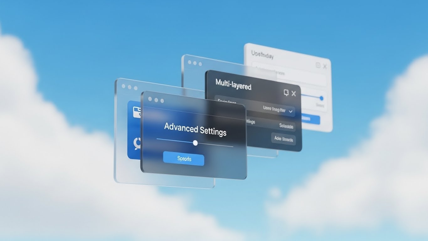
Visualization Scenario: A sophisticated deconstruction of the user interface. Glass-like UI windows float in a 3D space against a Sky Blue and Cloud White backdrop. The windows are layered, with the front window in sharp focus showing "Advanced Settings" and background layers slightly blurred. A parallax camera move reveals the distance between layers, visually representing the "Deep Feature Set" of the software—easy on the surface, but powerful underneath.
Narration Style: Sophisticated and layered. It uses metaphors of "depth," "dimension," and "control" to explain that the software grows with the user's needs.
Psychological Impact & KPI Focus
- Niche Psychology: Users want simplicity but fear outgrowing a tool. This style uses Spatial Depth Cues to imply robust functionality. It reassures the Power User that there are layers of capability waiting to be discovered.
- Operational Impact: It visualizes Scalability of Features. It suggests that while the day-to-day view is simple, the complex controls are there when needed.
- Core KPI: Feature Adoption Depth / Upsell Potential.
Strategic Implementation & Trade-offs
- Best Use Case: Product expansion announcements, upsell pages, and "Pro Feature" walkthroughs.
- Duration: Short (15-30 seconds).
- Strategic Trade-off: It is abstract. It validates the existence of depth but doesn't teach the user how to use the specific settings shown.
Companies using similar video content -
Microsoft – 365 – Balances work-life efficiency with remote harmony.
Google – Workspace – Balances work-life efficiency with remote collaboration.
28. Futuristic Neon/Dark Mode
Expansion | Driving Upsell/Cross-sell

The Visual & Narrative Approach
Visualization Scenario: A conceptual visualization of the software's core logic. In a dark, data-rich corridor, a massive double-helix DNA structure formed of Neon Cyan and Magenta light spirals upward against a Void Black background. Streams of binary data travel along the helix strands, pulsing with energy. This metaphor represents the "Genetic Code" of the modern enterprise—complex, evolving, and foundational to life.
Narration Style: Epic, grand, and visionary. It speaks of "evolution," "core logic," "adaptation," and "future-proofing," positioning the software as the living operating system of the business.
Psychological Impact & KPI Focus
- Niche Psychology: Enterprise buyers focus on longevity and adaptation. This style leverages Biological Metaphors to suggest that the software is "alive" and capable of evolving with the market. It counters the fear of investing in static, dead-end technology.
- Operational Impact: It visualizes System Resilience and growth. It shows a system that is complex yet perfectly organized, implying it can handle the mutation and growth of enterprise data over time.
- Core KPI: Long-Term Contract Value / System Adaptability.
Strategic Implementation & Trade-offs
- Best Use Case: Remarketing ads for Enterprise tiers, trade show booth backgrounds, and Keynote intros.
- Duration: Short to Medium (15-30 seconds).
- Strategic Trade-off: It is highly abstract. It creates a feeling of "cutting-edge tech" but offers zero explanation of functionality. It is a brand equity builder, best used for expansion phases.
Companies using similar video content -
Postman – API Platform – Signals developer-friendly architecture with syntax highlighting.
GitLab – DevOps Platform – Signals developer-friendly architecture with code highlighting.
29. Hyper-lapse Stock Footage with Data
Expansion | Driving Referrals

The Visual & Narrative Approach
Visualization Scenario: A bird's-eye view of a bustling city at night, captured in hyper-lapse. Traffic flows like rivers of light (long exposure). Overlaid on this kinetic reality are floating data tags in UI Green that track specific vehicles in real-time. The background is a blur of City Lights. The juxtaposition of the frantic, blurry city speed and the stable, crisp data tags visualizes "Order in Chaos."
Narration Style: Fast, global, and rhythmic. It emphasizes "visibility," "real-time," and "ubiquity," matching the frantic energy of the visual with a calm, controlling voiceover.
Psychological Impact & KPI Focus
- Niche Psychology: Logistics leaders fear losing sight of their assets. This style uses Omniscient Perspective visuals (God's eye view) to sell the feeling of total control. It reassures them that the data keeps up with the physical world.
- Operational Impact: It visualizes Real-Time Visibility. It demonstrates that the software provides a stable layer of truth over the physical chaos of global operations.
- Core KPI: Asset Utilization / On-Time Delivery.
Strategic Implementation & Trade-offs
- Best Use Case: Vertical social content (TikTok/Reels/Shorts) and trade show screens.
- Duration: Short Loop (9-16 seconds).
- Strategic Trade-off: It is visually busy. It captures attention effectively but can be overwhelming if used for detailed explanation.
Companies using similar video content -
ServiceNow – Platform – Demonstrates advanced configuration power with layered depth.
Adobe – Creative Cloud – Demonstrates advanced configuration power with layered features.
30. Holographic UI over 3D Render
Expansion | In-App Upsell
The Visual & Narrative Approach
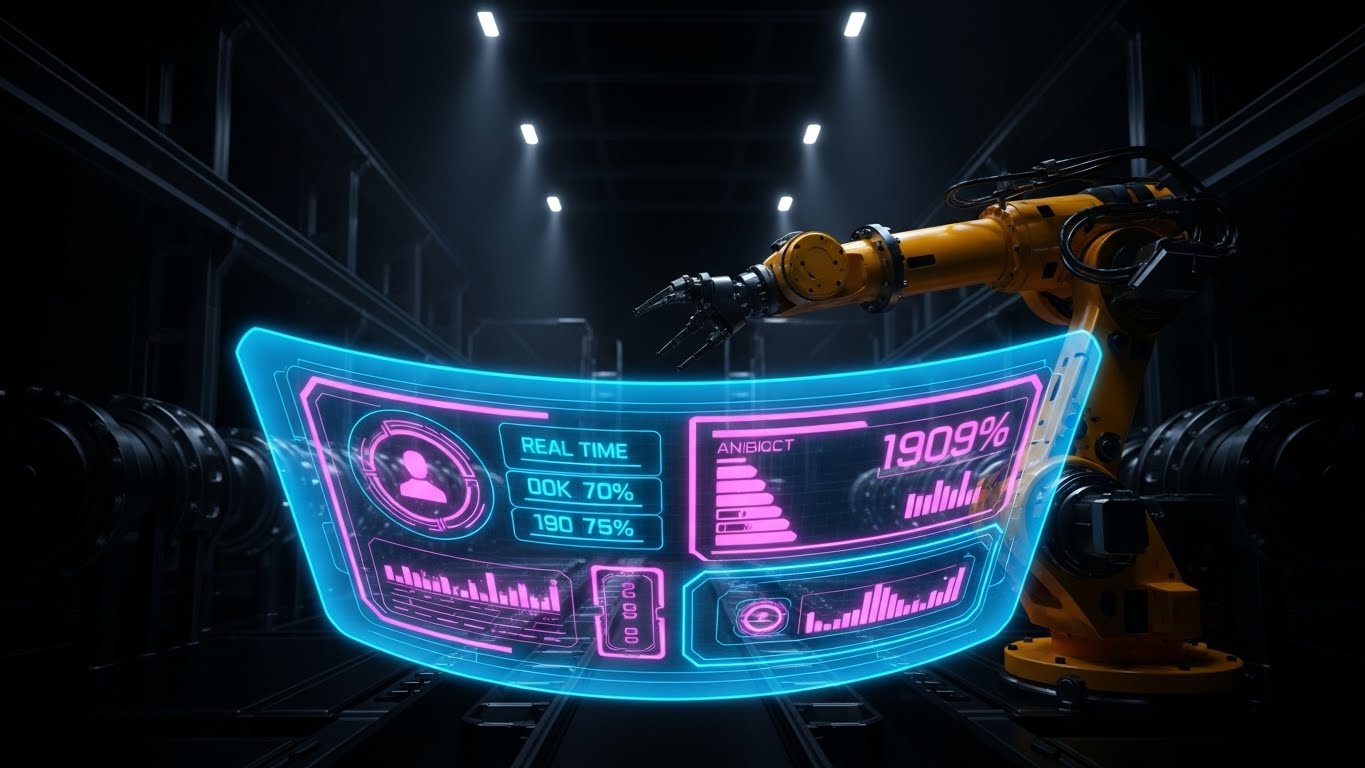
Visualization Scenario: A first-person "Digital Twin" perspective inside a smart factory. In the distance, a realistic robotic arm in Steel and Yellow performs complex maneuvers. In the foreground, a transparent, curved "Heads Up Display" (HUD) in Hologram Blue floats in the air. It displays real-time efficiency metrics (1909%), heat maps, and diagnostics that sync perfectly with the robot's movements. This visualizes the convergence of Operational Technology (OT) and IT.
Narration Style: Industrial, precise, and integrated. The tone blends the grit of manufacturing with the sophistication of software, using terms like "telemetry," "diagnostics," and "synchronization."
Psychological Impact & KPI Focus
- Niche Psychology: Industrial buyers are skeptical of software that feels disconnected from hardware. This style uses Cyber-Physical Concordance. It shows the software is not just watching; it is listening to and analyzing the physical machines in real-time.
- Operational Impact: It visualizes IoT Integration. It demonstrates the platform's ability to read and control physical devices, bridging the final gap in automation.
- Core KPI: Overall Equipment Effectiveness (OEE) / Downtime Reduction.
Strategic Implementation & Trade-offs
- Best Use Case: Product demos for manufacturing clients, in-app upsell features for IoT modules, and technical case studies.
- Duration: Medium (30-45 seconds).
- Strategic Trade-off: High production complexity. It requires high-quality 3D assets of the specific machinery relevant to the client.
The Visual Operations Doctrine: Strategic Knowledge Base
This section synthesizes the 30 visual styles into a cohesive strategic framework. It moves beyond "content creation" to establish a Visual Operating System for your enterprise—a standardized language that bridges the gap between human cognition and automated efficiency, specifically tailored for the high-stakes world of Workflow Automation and Trucking SaaS.
Strategic Alignment & Visual Architecture
The "Pre-Production" Strategy: Defining the Visual Operating System
Before a single pixel is rendered, the strategic architecture must be defined. This phase ensures that your visual assets are not just "marketing content" but functional tools that align with your operational DNA.
- The Cognitive Load Audit: Drivers and dispatchers operate in high-stress environments. Audit your current training materials. If a PDF manual takes 15 minutes to read (High Load), replace it with a Minimalist Flat Vector (Style 1) video that takes 30 seconds (Low Load). Visual strategy is an efficiency calculation, not just an aesthetic one.
- Role-Based Visual Mapping: Different personas require different visual languages. Use High-Contrast Kinetic Typography (Style 2) for "Drivers" (Mobile/Urgent) to cut through noise, but reserve Clean UI Light Mode (Style 11) for "Fleet Managers" (Desktop/Analytical) who need to see dashboard details.
- The "Glanceability" Standard: In logistics, information must be understood in under 3 seconds. Adopt the Macro UI (Style 24) approach for critical alerts on cab tablets—one button, one action, zero ambiguity.
- Brand Voice Consistency: Your automation software likely spans multiple modules (Dispatch, Safety, HR). Establish a unified visual language (e.g., consistent use of Bauhaus Primitives - Style 5) to visually signal that these disparate tools are part of one cohesive ecosystem.
- The Advids Strategic Audit: Developing this "Visual Operating System" is complex. Partnering with a specialized agency like Advids allows for a comprehensive audit of your existing assets to define a scalable visual architecture before production begins, ensuring every pixel serves a business goal.
- Standardization vs. Customization: For universal concepts (e.g., "Cloud Sync"), use high-quality Abstract 3D Motion (Style 9) to save budget. Save your bespoke budget for unique differentiators like specific hardware integrations, using Holographic UI (Style 30).
- The Cross-Departmental Bridge: Sales talks "Revenue," Ops talks "Throughput." Use Dynamic Data Visualization (Style 17) to unify these terminologies, showing how a 10% Ops increase (Bar Chart) equals a Revenue boost (Gold Coin), aligning teams around shared visual truths.
- Legacy System Integration: The biggest friction point is the transition from old to new. Use Wireframe to Reality (Style 12) to visually validate this transition, showing the "Blueprint" (Legacy Hardware) transforming into the "Render" (SaaS Interface) to respect the past while selling the future.
- Accessibility in Operations: Your workforce is diverse. 2D Character Stories (Style 15) should reflect the actual demographics of your drivers, and motion graphics must be designed to be understood without audio (Kinetic Typography - Style 2) for noisy environments.
- The Mobile-First Mandate: 90% of your user base (drivers) views content on a phone. All 30 styles must be legible on a 5-inch screen. Prioritize Vertical Social (Style 29) formats for these users, ensuring the "Global Pulse" is visible in the palm of their hand.
Operational Adoption & Implementation
The "Deployment" Phase: Embedding Visuals into Workflow
A video that isn't watched is a wasted asset. This segment focuses on embedding these visual styles directly into the software and operational workflows to drive adoption.
- Overcoming "Big Brother" Anxiety: AI monitoring (e.g., Dashcams) can cause friction. Use 2D Character-Driven Stories (Style 15) to frame the AI as a "Co-pilot" or "Guardian" rather than a "Policeman," focusing on safety and support rather than surveillance.
- The Micro-Learning Shift: Kill the hour-long webinar. Break complex workflows into a playlist of 30-second Isometric 3D Workflow (Style 20) clips. This "Just-in-Time" learning reduces the gap between watching and doing.
- Just-in-Time Support: Embed specific visual styles directly into your software's help menu. A user stuck on a button should be able to click a "?" icon and see a Macro UI (Style 24) loop demonstrating the action instantly.
- Gamification of Training: Drivers respond well to scorecards. Use 2D Animation & UI Composition (Style 23) to visualize their "Leveling Up" through training modules, turning compliance into a competitive, rewarding game.
- Reducing Support Ticket Volume: There is a direct correlation between proactive visual guides and reduced call center load. If "Password Reset" is a top ticket, a 10-second Minimalist Vector (Style 1) video sent via SMS can eliminate 20% of inbound calls.
- Remote Onboarding: For distributed fleets, physical seminars are impossible. Use Photorealistic 3D Renders (Style 6) to simulate the hardware setup remotely, ensuring a driver in a different state gets the same high-quality onboarding as one at HQ.
- Standard Operating Procedures (SOPs): Text-based SOPs are often ignored. Transform them into 2D Line Art (Style 8) animations. The "Circuit Board" logic flow maps perfectly to "If This, Then That" operational decision trees.
- Feedback Loops: Use interactive video elements (e.g., "Click the hazard in this Live Action Overlay - Style 22 video") to verify driver understanding. This moves training from "passive consumption" to "active competency verification."
- Scalable Localization: Your fleet may speak Spanish, French, or Hindi. Visual styles like Abstract 2D Motion (Style 5) rely on shapes and motion, not text, drastically reducing the cost and complexity of localizing training materials for a global workforce.
- Leadership Communication: When rolling out a new strategy, don't send a memo. Send a Generative AI Executive Video (Style 21). The high production value signals importance and captures the attention of busy fleet managers.
Measuring Impact & Future-Proofing
The "ROI" Phase: Measuring Success and Looking Ahead
Visual strategy is an investment, not an expense. This segment outlines how to measure the return on that investment and prepare for the next wave of technological evolution.
- Beyond "Views": Vanity metrics are useless in B2B. Define actionable KPIs. Measure "Time-to-Competency"—how much faster does a user execute a task after watching a Clean UI Workflow (Style 11) video compared to reading a manual?
- The "Idle Time" Metric: In software, confusion equals idle time. Correlate better visualization with reduced "dwell time" on complex dashboard screens. A Rapid UI Montage (Style 14) can remind users of shortcuts, directly impacting operational speed.
- Compliance Velocity: When a new regulation (e.g., ELD mandate) hits, how fast is your fleet compliant? Measure the speed of adoption when using Bold Kinetic Typography (Style 2) to announce the change vs. a standard email.
- Retention and Churn (LTV): Good design retains customers. Use Lifestyle Stock with UI Overlay (Style 25) in your renewal campaigns to remind clients of the personal value (time saved, stress reduced) your software provides, reinforcing emotional loyalty.
- The AI Visual Frontier: Prepare for the next wave. Generative video will soon allow real-time data overlays. Start building a library of Abstract 3D AI (Style 9) assets now to position your brand as a leader in this future, not a follower.
- Scalability of Assets: Don't build one-off videos; build a component library. An Isometric 2D (Style 13) factory scene can be rearranged to show different workflows without re-animating from scratch. This is "Visual Modular Design."
- The Advids Partnership: Visual strategy is not a "one-and-done" project; it is an evolving infrastructure. Advids acts as your long-term scalability partner, managing the evolution of your visual assets to match your software's frequent release cycles (CI/CD).
- Benchmarking Success: "Good enough" visuals are a competitive risk. If your competitor uses Photorealistic 3D (Style 6) and you use blurry screenshots, you lose the trust battle before the demo begins. Constantly benchmark your visual fidelity against the market leaders.
- The ROI of Safety: For logistics, safety is a financial metric. Quantify the reduction in insurance claims or accidents after implementing Augmented Pathways (Style 22) training. This connects visual investment directly to the bottom line.
- Final Call to Innovation: Treat your video strategy as Infrastructure, not content. Just as you invest in servers for uptime, invest in Visual Operations for understanding. The bridge between the physical and digital worlds is built with light, motion, and clarity. Cross it with confidence.
Companies using similar video content -
Splunk – Observability Platform – Visualizes enterprise evolutionary scale with digital DNA.
Datadog – Monitoring Platform – Visualizes enterprise evolutionary scale with digital DNA.
Author & Editor Bio


