
Introduction: Visualizing the Shift to "Never Trust, Always Verify"
The perimeter is dead. The traditional "castle-and-moat" security model has been rendered obsolete by the distributed reality of cloud computing, remote work, and IoT. For modern CISOs and Security Architects, the challenge is no longer just implementing Zero Trust Architectures (ZTA); it is communicating the urgency and efficacy of these invisible systems to non-technical boards.
The shift is massive and rapid. According to Gartner, by 2026, 10% of large enterprises will have a mature Zero Trust program, a significant leap from less than 1% today. This transition represents a critical window of opportunity. However, complexity remains the enemy of adoption. Stakeholders often conflate "Zero Trust" with "Zero Speed," fearing that rigorous verification will throttle business productivity.
Effective visualization is the antidote to this skepticism. It bridges the physical-digital divide, turning abstract protocols like "micro-segmentation" into tangible, logical assets. The business case for this clarity is supported by hard data: IBM’s 2024 report found that organizations deploying security AI and automation extensively saved an average of USD 2.2 million in breach costs. Visualization is not just a marketing tactic; it is a tool for demonstrating the ROI of resilience.
This guide provides 30 distinct visual styles designed to dismantle complexity. From minimalist vector maps that clarify isolation to hyper-realistic 3D renders that prove hardware integrity, these examples serve as a blueprint for communicating the future of secure, frictionless operations.
1. Minimalist Flat 2D Vector
TOFU | Market Education
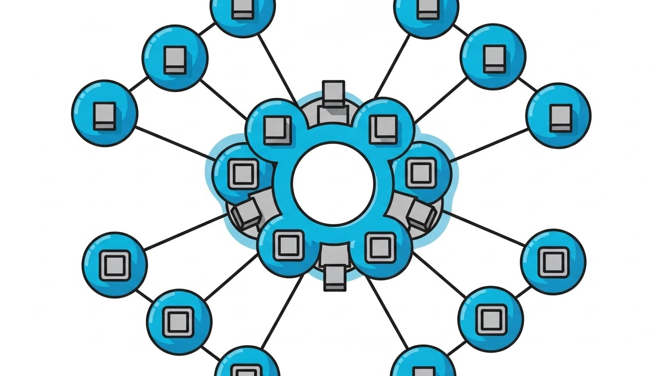
The Visual & Narrative Approach
This style utilizes a "blueprint" aesthetic to demystify the core architectural shift of Zero Trust: the removal of the perimeter. The composition presents a top-down, symmetrical map view of a digital network. Instead of a chaotic web behind a single wall, we see a "de-perimeterized" environment where individual square data nodes are each encased in protective Electric Cyan bubbles. The white space acts as a digital "moat." There is no text; the geometric precision carries the message of structural isolation.
Psychological Impact & KPI Focus
- Cognitive Load Reduction: The clean, flat aesthetic removes "visual noise," allowing viewers to instantly grasp the concept of Micro-segmentation without needing a technical background.
- Operational KPI: Supports Time-to-Comprehension. It visually answers the question, "How do we stop lateral movement?" by showing physical separation between assets.
Strategic Implementation & Trade-offs
- Best Use Case: LinkedIn educational carousels or introductory slides explaining the difference between VPNs and ZTNA.
- Trade-off: The lack of texture makes it less emotional. It appeals to logic and order, not excitement.
Companies using similar video content -
Illumio – Zero Trust Segmentation – Visualizing micro-segmentation for network isolation.
ColorTokens – Xtended Zero Trust Platform – Illustrating policy enforcement across segments.
2. Abstract 2D Flat Vector Organic Modern
TOFU | Brand Awareness
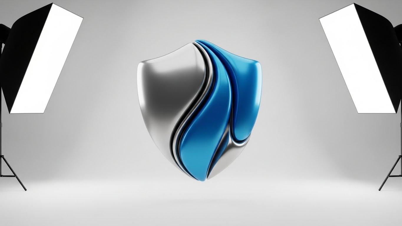
The Visual & Narrative Approach
This style embraces abstract metaphor to communicate the feeling of modern security. The central shield is constructed from flowing, liquid-like shapes in Glossy Azure and Metallic Silver, suggesting that the protection is adaptive and "alive," rather than a static, brittle wall. The lighting mimics a high-end studio setup, creating high-contrast reflections that imply premium quality. The narrative focuses on a unified, unbreakable brand identity that evolves with the threat landscape.
Psychological Impact & KPI Focus
- Brand Perception: The fluid, organic shapes subconsciously signal Agility. It combats the perception of security as a "blocker," positioning the brand as a sophisticated enabler of business flow.
- Operational KPI: Optimized for Ad Recall. The glossy, high-contrast visual stands out in cluttered display environments, ensuring the brand is remembered as "modern" and "premium."
Strategic Implementation & Trade-offs
- Best Use Case: High-level brand awareness campaigns (Programmatic Display) where the goal is emotional connection, not technical explanation.
- Trade-off: It is purely symbolic. It cannot explain features or architecture, so it must be used strictly for Top-of-Funnel awareness.
Companies using similar video content -
Netskope – Security Cloud – Fluid shapes representing adaptive cloud security.
Cloudflare – Zero Trust Platform – Organic flows symbolizing dynamic threat protection.
3. Isometric 2D Motion Design
TOFU | Category Creation
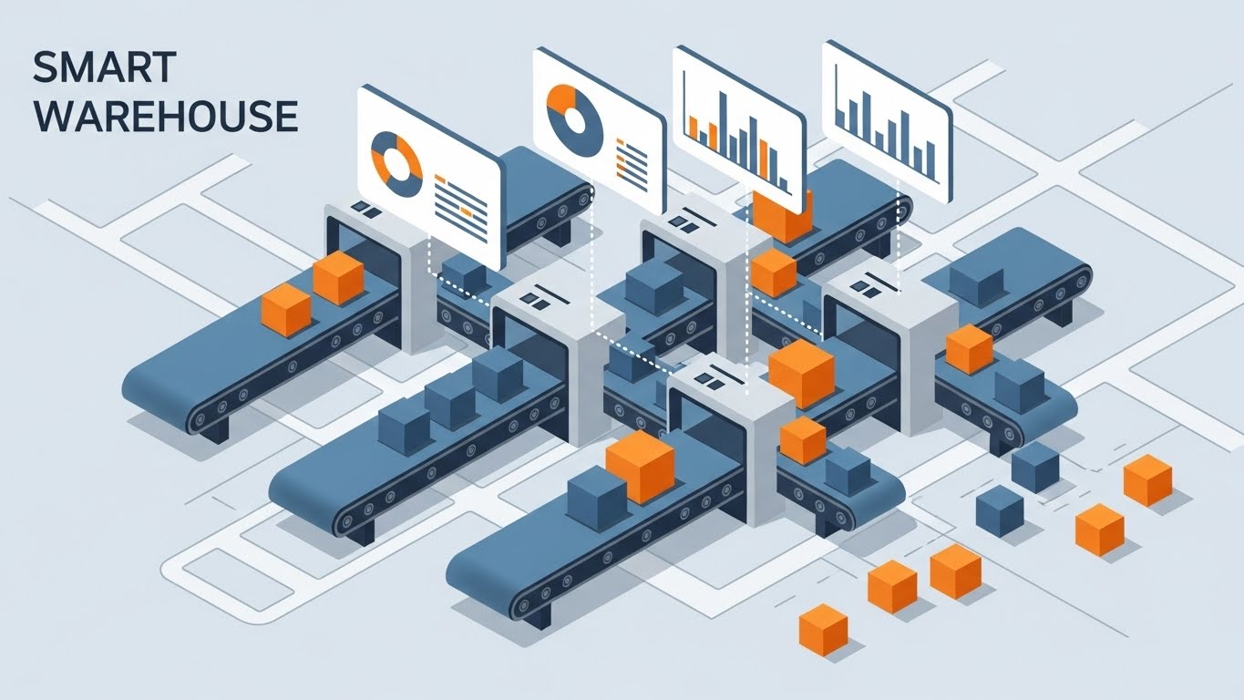
The Visual & Narrative Approach
This visualization uses a Smart Warehouse metaphor to represent the digital supply chain. Set on a precise isometric grid, we see conveyor belts (network pathways) moving distinct boxes (data packets). The focus is on Access Control: white archways act as logic gates, opening only for "verified" orange packages while blocking others. The Teal and Coral palette visually differentiates between safe and unsafe traffic. This metaphor effectively translates the abstract concept of "packet inspection" into a tangible, logical process.
Psychological Impact & KPI Focus
- Logic & Order: The isometric perspective offers a "God-tier" view of the system, giving the viewer a sense of total control and visibility—a key desire for the "Vigilant Architect."
- Operational KPI: Supports Time-on-Page (Dwell Time). The rhythmic, mechanical motion of the logistics scene encourages the viewer to pause and watch the loop.
Strategic Implementation & Trade-offs
- Best Use Case: Blog headers or explainer videos for OT (Operational Technology) security, where physical analogies resonate strongly.
- Trade-off: The "warehouse" metaphor must be clearly framed as an analogy for data traffic to avoid confusion with actual logistics software.
Companies using similar video content -
Palo Alto Networks – Prisma SASE – Smart logistics for secure access and data flow.
Versa Networks – SASE – Conveying secure network pathways and access control.
4. 2D Line Art Animation
TOFU | YouTube

The Visual & Narrative Approach
Sophistication meets simplicity. A single, continuous glowing white line weaves through a Deep Blue void, drawing complex network topologies and hexagonal checkpoints in real-time. This "blueprint" aesthetic conveys engineering excellence and the concept of a Software Defined Perimeter (SDP)—a security layer that is spun up dynamically. The absence of fill colors focuses the eye strictly on the connectivity and the architecture.
Psychological Impact & KPI Focus
- Technical Credibility: This style resonates with the engineering mindset. It looks like a schematic or CAD drawing, implying that the solution is precise, mathematical, and foundational.
- Operational KPI: Drives Viewer Retention. The unfolding, continuous motion keeps the viewer curious about the final form, effectively guiding them through complex technical explanations.
Strategic Implementation & Trade-offs
- Best Use Case: Long-form technical deep dives or webinar backgrounds where the visuals need to support complex narration without distracting from it.
- Trade-off: It is low-stimulation. It requires a compelling voiceover or script to maintain interest.
Companies using similar video content -
Appgate – SDP – Connected blueprint mapping software-defined perimeters dynamically.
Cyxtera – AppGate SDP – Illustrating secure network topologies with precision.
5. Bold Kinetic Typography (Visual)
TOFU | Skippable Pre-Roll Ad

The Visual & Narrative Approach
This style creates a visceral representation of "Active Defense." Large, heavy blocks in Vibrant Purple (the policy) move diagonally with aggressive speed, physically pushing and crushing chaotic Lime Green shapes (the threats). The background is Optical White for maximum contrast. The motion is percussive and heavy, symbolizing the strength and impermeability of the security platform. It visualizes the verb "BLOCK" without needing words.
Psychological Impact & KPI Focus
- Visceral Impact: The aggressive physics of the animation trigger a sense of protection and power. It satisfies the desire for a security tool that is proactive and strong.
- Operational KPI: Optimized for Click-Through Rate (CTR) on mobile. The high-contrast, fast-paced motion is designed to stop the scroll and grab attention in under 3 seconds.
Strategic Implementation & Trade-offs
- Best Use Case: 6-second bumper ads or Instagram Stories designed to generate immediate interest and urgency.
- Trade-off: It lacks nuance. It is a "blunt instrument" for attention and cannot convey detailed value propositions.
Companies using similar video content -
CrowdStrike – Falcon Platform – Dynamic blocks conveying active endpoint threat defense.
SentinelOne – Singularity Platform – Aggressive motion symbolizing proactive threat blocking.
6. Abstract 2D Motion Graphics
TOFU | Shaping Brand Perception
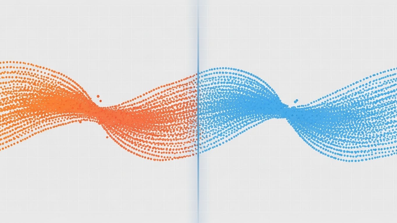
The Visual & Narrative Approach
This style visualizes the concept of Traffic Inspection as a purification process. We see a stream of digital particles transitioning from a chaotic Gradient Orange (raw traffic) to a harmonious Cool Blue (verified traffic) as they pass through a vertical, translucent filter line in the center. The background is a subtle digital grid. The motion is smooth and wave-like, suggesting that the security inspection happens seamlessly without disrupting the flow of business.
Psychological Impact & KPI Focus
- Friction Reduction: The smooth, flowing motion subconsciously reassures the viewer that the security measures will not introduce latency or "drag" into their network.
- Operational KPI: Supports Brand Trust and reduces Bounce Rate. As a website hero, it sets a sophisticated, high-tech tone.
Strategic Implementation & Trade-offs
- Best Use Case: Website hero backgrounds or lobby screens at events where the goal is to create a premium, modern atmosphere.
- Trade-off: It is abstract. It sets the mood but requires accompanying copy to explain what is being filtered.
Companies using similar video content -
Zscaler – Zero Trust Exchange – Particle flow depicting data stream purification.
Forcepoint – Forcepoint ONE – Smooth transitions visualizing seamless traffic inspection.
7. Lifestyle Stock with UI Overlay
TOFU | Vertical Social Organic

The Visual & Narrative Approach
This style grounds the technology in the real world. A high-quality photo shows a professional in a sunlit coworking space (Golden Hour lighting), overlayed with a sleek, semi-transparent Blue Shield icon hovering over her laptop. The aesthetic blends realistic lifestyle photography with clean UI elements. It visualizes the promise that enterprise-grade security travels with the user, securing the "Starbucks use case."
Psychological Impact & KPI Focus
- Relatability: It appeals to the human side of the CISO, validating the "Work from Anywhere" lifestyle. It makes the security tool feel like an enabler of freedom rather than a restriction.
- Operational KPI: Drives Social Engagement (Shares/Likes). Authentic, human-centric content performs better on platforms like TikTok.
Strategic Implementation & Trade-offs
- Best Use Case: Social media reels, recruitment videos, and internal security culture campaigns.
- Trade-off: Reliance on stock footage can look generic if not selected carefully. The UI overlay must look "native."
Companies using similar video content -
Cisco – Duo Security – Glowing shield anchoring secure remote work and access.
Perimeter 81 – Zero Trust Network Access – Blending lifestyle with secure connectivity.
8. 3D X-Ray Visualization
MOFU | Product Differentiation
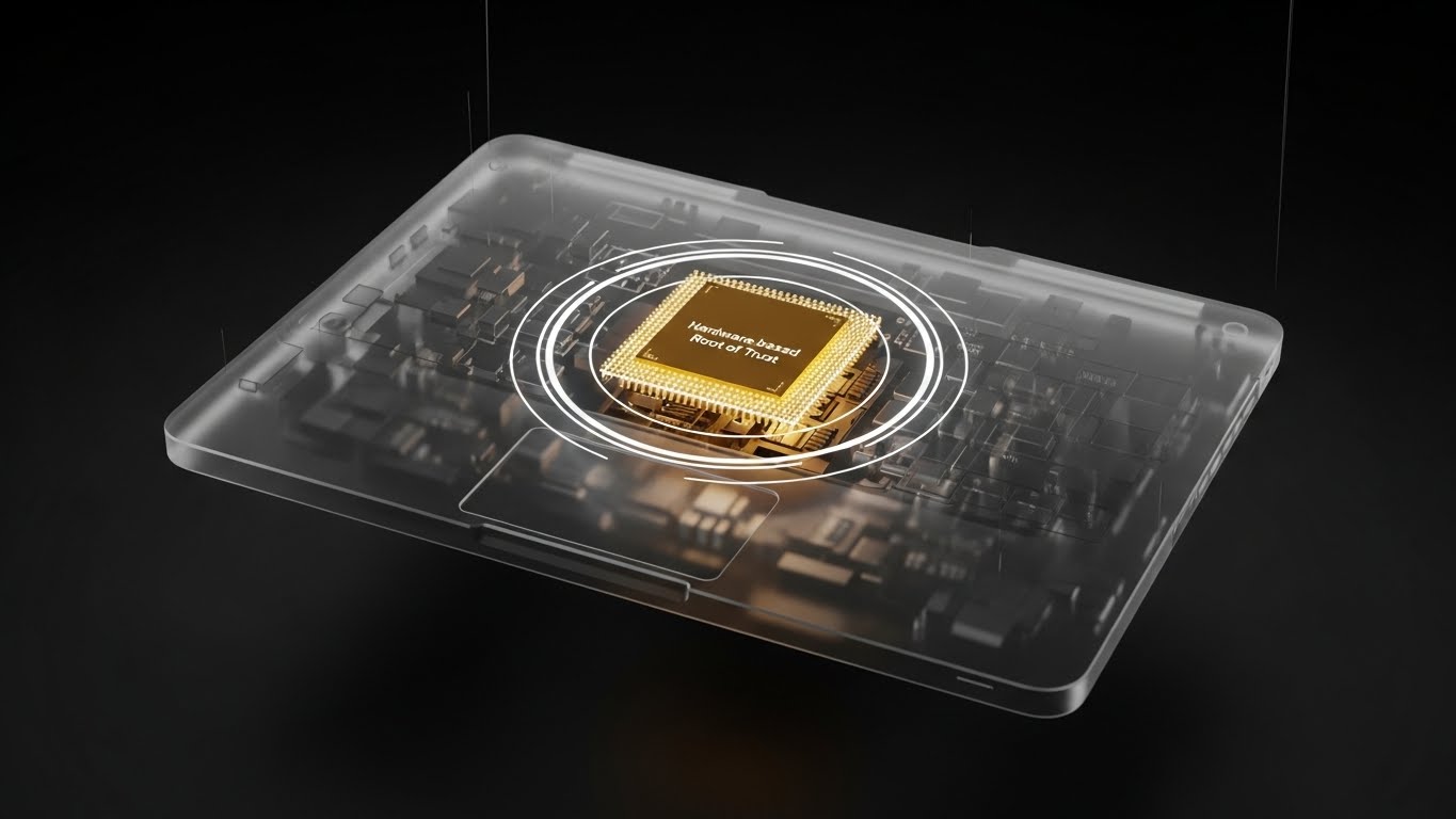
The Visual & Narrative Approach
This style visualizes the deepest layer of security. A modern laptop is rendered in translucent frosted glass, revealing a Gold glowing central processor—the "Hardware Root of Trust." Concentric white rings emanate from the chip, symbolizing protection extending from the core. The hyper-realistic ray-tracing emphasizes the solidity and immutability of hardware-backed security.
Psychological Impact & KPI Focus
- Depth & Value: The X-Ray effect satisfies the skeptic's need to "look under the hood." The Gold color codes the hardware as the "premium" foundation of the security stack.
- Operational KPI: Drives Conversion. It provides the visual proof of deep-tech capabilities that technical buyers need to validate a purchase decision.
Strategic Implementation & Trade-offs
- Best Use Case: Product pages and technical datasheets highlighting firmware security or TPM integration.
- Trade-off: High production cost. It is resource-intensive.
Companies using similar video content -
Intel – vPro Platform – Gold core revealing hardware root of trust for devices.
Microsoft – Pluton Security Processor – X-ray view of hardware-backed security.
9. Macro UI Micro-Interactions
MOFU | Feature Education

The Visual & Narrative Approach
This style zooms in to the micro-level of the user experience. The image captures a Cursor Drag-and-Drop action on a calendar/scheduler interface. The shadow of the cursor and the "lift" of the element imply a tactile, responsive interface. The narrative is Just-in-Time (JIT) Access: instead of a permanent toggle, privileges are scheduled for specific windows, enhancing security. It visualizes "Granular Control."
Psychological Impact & KPI Focus
- Competence & Control: The macro view puts the viewer in the driver's seat. It alleviates the fear of complex, command-line interfaces.
- Operational KPI: Drives Click-Through Rate (CTR) for feature-specific ads. The promise of a simple interface is a strong hook.
Strategic Implementation & Trade-offs
- Best Use Case: LinkedIn carousel ads highlighting specific UX features (e.g., "Ephemeral Access").
- Trade-off: It is narrow in scope. It highlights usability of a specific feature but not the breadth of the platform.
Companies using similar video content -
Okta – Workforce Identity Cloud – Scheduler drag-and-drop for just-in-time access.
CyberArk – Privileged Access Manager – Visualizing granular control over privileged sessions.
10. Clean UI Workflow (Light Mode)
MOFU | Driving Freemium
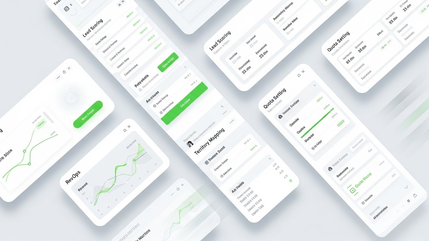
The Visual & Narrative Approach
This style presents the "End State" of the user journey. A high-fidelity UI mockup displays a Risk Territory Map and User Risk Scores (adapted from RevOps visualizations). The design features Pastel Green indicators and Soft Grey panels on a White background. The aesthetic is "SaaS Clean." The narrative is "Total Visibility"—showing the prospective user the detailed insights they will gain immediately after the setup is complete.
Psychological Impact & KPI Focus
- Anxiety Reduction: The "Light Mode" aesthetic and clear data visualizations reduce the "Intimidation Factor." It assures the user that they can master the system.
- Operational KPI: Drives Freemium Sign-ups. Visualizing the "Promised Land" of organized data encourages users to start the trial.
Strategic Implementation & Trade-offs
- Best Use Case: Landing pages and "Get Started" videos.
- Trade-off: Must be accurate. Marketing materials that over-polish the UI can lead to user disappointment during the trial.
Companies using similar video content -
Tenable – Tenable.io – Risk scoring dashboard showcasing total vulnerability visibility.
Qualys – Cloud Platform – Clean UI for managing security and compliance posture.
11. Wireframe to Reality Transition**
MOFU | Competitive Displacement
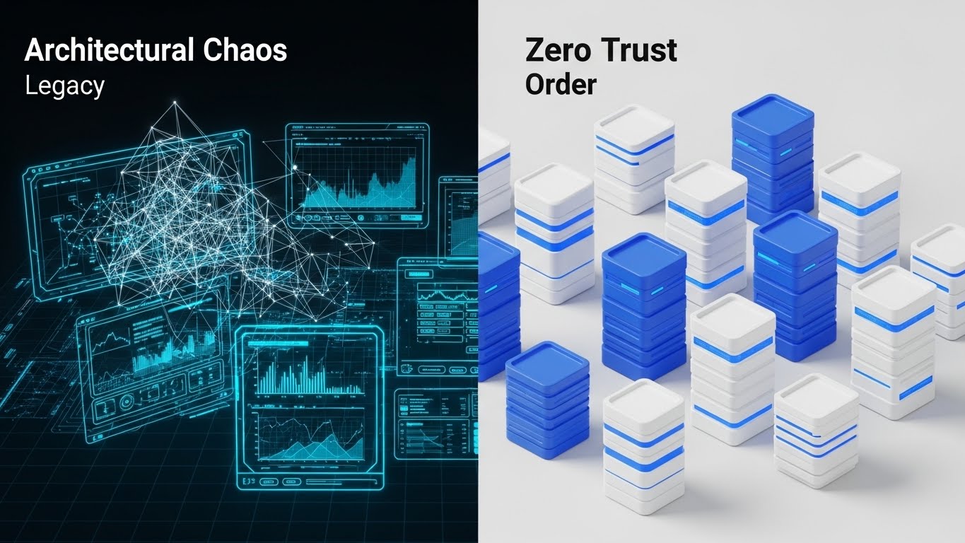
The Visual & Narrative Approach
This style employs a powerful "Before and After" split-screen composition to visualize the journey from legacy debt to modern security. The left side, representing the "Old World," depicts a chaotic, tangled Blue Wireframe network diagram that feels fragile and confusing. The right side transforms this chaos into a pristine, organized White and Blue 3D server city. The seamless transition line implies that the Zero Trust platform is the bridge, visualizing the shift from "Architectural Chaos" to "Zero Trust Order."
Psychological Impact & KPI Focus
- Cognitive Ease: By contrasting disorder with structure, the visual leverages the brain’s preference for symmetry and organization. It validates the prospect's frustration with their current mess and offers a visually soothing alternative.
- Operational KPI: Drives Conversion Rate on comparison pages. It creates a stark visual gap between the competitor (Legacy) and the solution, compelling the user to choose "Order."
Strategic Implementation & Trade-offs
- Best Use Case: "Us vs. Them" comparison pages or migration guides where the objective is to highlight the ease of transitioning from legacy VPNs.
- Trade-off: It creates a binary narrative. It must be paired with copy that acknowledges the complexity of migration so it doesn't feel like over-promising.
Companies using similar video content -
VMware – NSX – Split-screen evolution visualizing network modernization.
HashiCorp – Terraform – Transitioning from chaotic infrastructure to defined order.
12. Aspirational Stock Montage
MOFU | Thought Leadership

The Visual & Narrative Approach
This style moves away from software screens to focus on the human architect behind the strategy. It features a high-end editorial shot of a confident executive (CISO/CIO persona) in a modern, glass-walled office, looking out at a bright city skyline. The "Hero Shot" angle, looking slightly up, commands respect. The lighting is crisp and natural. There are no digital overlays; the narrative is pure Strategic Vision. It positions Zero Trust not as a tool, but as a leadership philosophy.
Psychological Impact & KPI Focus
- Ego & Identity: It appeals to the CISO’s aspiration to be seen as a business enabler rather than a compliance officer. It sells the "status" of being a mature security leader.
- Operational KPI: Increases Content Shares. Professionals share content that mirrors how they wish to be perceived—visionary and authoritative.
Strategic Implementation & Trade-offs
- Best Use Case: Thought leadership articles, whitepaper covers, and executive summary decks intended for the Board of Directors.
- Trade-off: It is non-technical. It builds authority but fails to explain how the security works, making it strictly a brand-building asset.
Companies using similar video content -
IBM – Security Services – Strategic horizon visualizing security leadership and vision.
Deloitte – Cyber Risk Services – High-level executive view of cyber strategy.
13. Dynamic Data Visualization
MOFU | Website Re-engagement
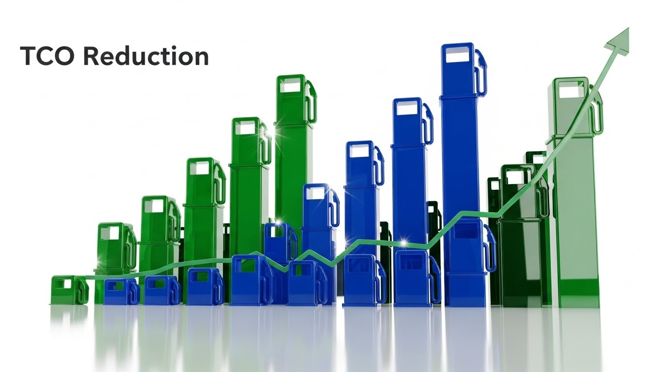
The Visual & Narrative Approach
This visualization focuses on the intersection of "Security" and "Value." Set in a sterile laboratory environment, stylized vertical bars of Glossy Blue and Green rise rhythmically, forming a dynamic chart that signifies growth and TCO (Total Cost of Ownership) reduction. The upward trend implies active improvement and resilience. The 3D perspective adds depth, making the financial data feel physical and robust. It transforms the abstract concept of "ROI" into a kinetic, observable event.
Psychological Impact & KPI Focus
- Reassurance & Value: The visual of rising structures triggers a sense of momentum and gain. It answers the subconscious question: "Is this investment paying off?"
- Operational KPI: Reduces Cart Abandonment (or Application Drop-off). Retargeting users with this visual reinforces the financial strength of the product, nudging them back to complete the signup.
Strategic Implementation & Trade-offs
- Best Use Case: Retargeting display ads or "Security Health" dashboard widgets that show the user the efficiency gains of the platform.
- Trade-off: It is data-heavy. It appeals primarily to the rational brain and requires the user to care about "TCO" rather than just threat stopping.
Companies using similar video content -
Splunk – Enterprise Security – Rising metrics visualizing efficiency and security value.
Datadog – Monitoring and Security Platform – Dynamic charts showing operational gains.
14. 2D Graphics Over Live Action
MOFU | The Functional Buyer
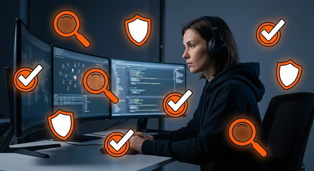
The Visual & Narrative Approach
This style bridges the gap between the human analyst and the AI tool. A cinematic shot shows a focused SOC analyst in a dim command center. Floating around her screens are stylized, glowing Bright Orange and White vector icons (shields, checkmarks, magnifying glasses). These "Pop-Art" elements visualize the "Augmented Intelligence" layer—showing how the software highlights threats and automates checks, effectively giving the analyst "superpowers."
Psychological Impact & KPI Focus
- Empowerment: For the functional buyer (the analyst or manager), this visual promises relief from burnout. It suggests the tool assists rather than replaces, reducing the fear of AI redundancy.
- Operational KPI: Supports Sales Velocity. Case studies using this style help technical champions visualize how their daily workflow will improve, speeding up internal buy-in.
Strategic Implementation & Trade-offs
- Best Use Case: "Day in the Life" videos, demo intros, and recruitment materials for security teams.
- Trade-off: It requires high-quality custom footage. Stock footage often looks too generic to be convincing in this context.
Companies using similar video content -
Exabeam – Security Operations Platform – Augmented workflow visualizing analyst efficiency.
Rapid7 – Insight Platform – Overlaying threat intelligence on SOC operations.
15. Futuristic Neon/Dark Mode
MOFU | Building Trust

The Visual & Narrative Approach
This style leverages the popular "Dark Mode" aesthetic to signify sophistication and stealth. In a matte black server corridor, Neon Blue fiber optic cables illuminate the floor and ceiling, tracing the path of data. A central Magenta beam scans the environment. This high-contrast visualization represents "Deep Visibility in the Dark"—the ability to see east-west traffic and hidden threats within the network that traditional tools miss.
Psychological Impact & KPI Focus
- Perceived Innovation: The "Cyberpunk" aesthetic is culturally coded as "cutting-edge" and "advanced." It instantly positions the platform as a next-generation solution.
- Operational KPI: Increases Time-on-Site. The high-contrast, glowing visuals are captivating and encourage users to explore the "Features" section of a website.
Strategic Implementation & Trade-offs
- Best Use Case: Feature pages describing "Threat Hunting" or "Encrypted Traffic Inspection."
- Trade-off: Can feel "gaming-oriented" if overdone. It must be balanced with clean typography to maintain enterprise gravity.
Companies using similar video content -
Darktrace – AI Cyber Defense – Glowing pathways visualizing deep network visibility.
Vectra AI – AI-driven Threat Detection – High-contrast visuals for hidden threat hunting.
16. Photorealistic 3D Renders
BOFU | ROI Justification
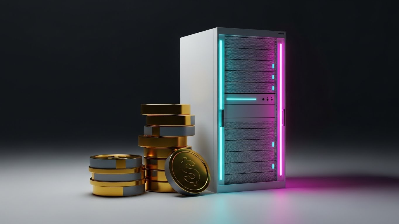
The Visual & Narrative Approach
This style speaks the language of the CFO: Value. A pristine white server unit is rendered with photorealistic precision in an "infinity cove" studio. Stacked neatly beside it are abstract Gold geometric cylinders, representing coins or hard assets. The lighting is soft and luxurious, emphasizing the textures. This visual metaphor directly links "Secure Hardware" to "Financial Value," making the intangible benefit of risk avoidance feel like a tangible asset on the balance sheet.
Psychological Impact & KPI Focus
- Value Perception: The use of gold and high-end rendering triggers a "Premium" heuristic. It subconsciously justifies a higher price point by associating the software with wealth preservation.
- Operational KPI: Supports Deal Closing. Used in the ROI slide of a pitch deck, it helps the champion defend the budget request to finance.
Strategic Implementation & Trade-offs
- Best Use Case: Pricing pages, ROI calculators, and Executive Business Review (EBR) presentations.
- Trade-off: It can appear generic if the "money" metaphor isn't tied to a specific outcome (e.g., "Breach Cost Savings").
Companies using similar video content -
Rubrik – Data Security Platform – Digital gold visualizing hard ROI of data resilience.
Cohesity – Data Cloud – Linking secure data management to financial value.
17. Low-Poly 3D Modeling
BOFU | Risk Mitigation

The Visual & Narrative Approach
This style uses simplified geometry to convey strength and structural integrity. A "Digital Fortress" is constructed from faceted, crystalline shapes in a Pastel Purple and Blue palette. A glowing white data cube sits protected at the center, while small grey projectiles deflect off the walls. The "Low-Poly" aesthetic makes the concept of defense feel architectural and engineered. It visualizes "Impenetrability" without the aggression of realistic war imagery.
Psychological Impact & KPI Focus
- Structural Confidence: The solid, faceted walls communicate stability. It appeals to the architect's desire for a system that is "secure by design" rather than patched together.
- Operational KPI: Increases Whitepaper Downloads. The unique, illustrative style stands out on cover pages, promising a fresh perspective on boring compliance topics.
Strategic Implementation & Trade-offs
- Best Use Case: Technical whitepapers on "Architecture" or "Resilience," and educational blog posts.
- Trade-off: The "cartoonish" look might be dismissed by ultra-technical buyers if not paired with rigorous engineering content.
Companies using similar video content -
Illumio – Core – Crystalline fortress visualizing impenetrable micro-segmentation.
ColorTokens – Xtended Zero Trust Platform – Simplified geometry for architectural defense.
18. Split Screen: Optimized Reality and UI
BOFU | The Economic Buyer
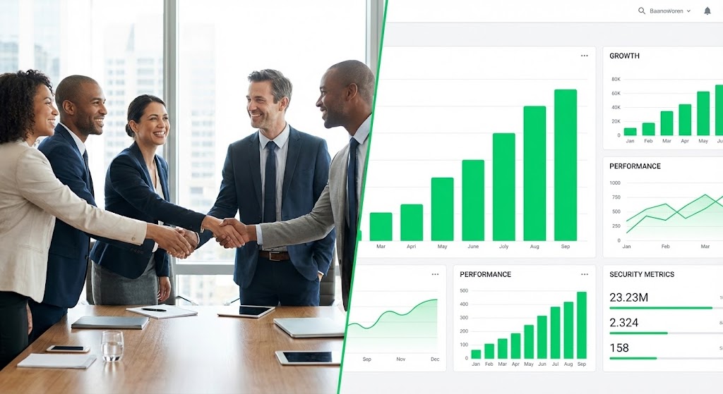
The Visual & Narrative Approach
This style connects the boardroom to the dashboard. The left half features a warm, realistic photo of a diverse team shaking hands (Human Success). The right half displays a high-fidelity UI dashboard with ascending Green charts (Data Success). The lighting is matched across both halves to create a unified image. The narrative is "Business Enablement"—showing that strong security protocols (the data) directly result in frictionless business partnerships (the handshake).
Psychological Impact & KPI Focus
- Holistic Validation: It satisfies the Economic Buyer who cares about culture and performance. It proves that the security tool supports the business rather than obstructing it.
- Operational KPI: Improves Email Click-Through Rate. It visually promises a comprehensive solution ("We cover both people and tech"), enticing the reader to learn more.
Strategic Implementation & Trade-offs
- Best Use Case: Monthly newsletters, customer success emails, and "Year in Review" reports.
- Trade-off: It is a safe, corporate choice. It lacks the "edge" of the 3D styles but is safer for conservative stakeholders.
Companies using similar video content -
ServiceNow – Security Operations – Dual perspective visualizing secure culture and data success.
OneTrust – Privacy & Security Platform – Connecting human trust with compliance dashboards.
19. Isometric 3D Workflow
BOFU | Overcoming Objections
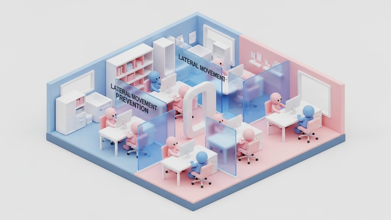
The Visual & Narrative Approach
This style uses "Claymorphism" (soft, rounded 3D shapes) to make strict policies look approachable. An isometric cutaway of an office shows desks separated by translucent, soft Blue glass walls. These walls visualize Lateral Movement Prevention—if one "room" is compromised, the others remain safe. The friendly, rounded avatars and Pink/Blue palette reduce the anxiety around "locking down" the network, framing it instead as "safe zoning."
Psychological Impact & KPI Focus
- Anxiety Reduction: "Segmentation" can sound restrictive and difficult to manage. The soft, toy-like aesthetic makes the concept feel modular, manageable, and non-threatening.
- Operational KPI: Overcoming Sales Objections. It provides a visual tool for sales teams to explain complex segmentation policies without intimidating the prospect.
Strategic Implementation & Trade-offs
- Best Use Case: One-pagers explaining "Micro-segmentation" or "Zero Trust Network Access (ZTNA)" to non-technical stakeholders.
- Trade-off: It creates a "gamified" look. Ensure the accompanying text underscores the enterprise-grade capability of the segmentation engine.
Companies using similar video content -
Twingate – Zero Trust Network Access – Soft segmentation visualizing lateral movement prevention.
Ivanti – Neurons for Zero Trust – Approachable 3D for policy management.
20. Abstract 3D AI Visualization
BOFU | ABM Awareness

The Visual & Narrative Approach
This style visualizes the "Brain" of the platform. Glowing nodes in Ethereal Purple and Fiber Optic White connect via swirling light lines to form a neural network or a vague shield shape. The background is a shimmering Silver mist. This "Hyper-Tech" aesthetic visualizes Adaptive Intelligence—showing that the security is not static rules, but a living, learning system that evolves with the threat landscape.
Psychological Impact & KPI Focus
- Future-Proofing: It appeals to the buyer's desire for longevity. It suggests the system is "smart" enough to handle tomorrow's unknown threats (like AI-driven attacks).
- Operational KPI: Drives Response Rate in Account-Based Marketing (ABM). The sophisticated visual suggests a premium, high-value conversation, distinct from generic sales spam.
Strategic Implementation & Trade-offs
- Best Use Case: Direct messages to CIOs, background visuals for AI feature announcements, and "Future of Security" webinars.
- Trade-off: It is purely conceptual. It builds hype for the "AI" component but doesn't explain what the AI actually does (e.g., anomaly detection vs. auto-remediation).
Companies using similar video content -
Deep Instinct – Deep Learning Cybersecurity – Neural network visualizing adaptive threat intelligence.
SparkCognition – AI-powered Security – Ethereal nodes representing evolving AI defense.
21. Holographic UI over 3D Render
BOFU | The Technical Buyer
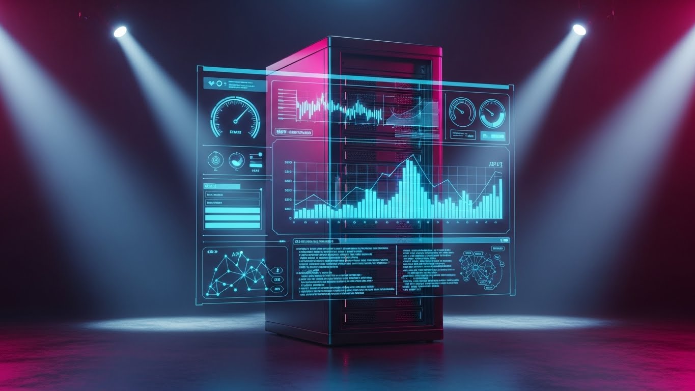
The Visual & Narrative Approach
This style targets the engineer who needs to understand the integration physics between legacy hardware and modern software. A close-up, photorealistic 3D render of a matte black Server Rack unit serves as the physical anchor. Overlaying this hardware is a floating, semi-transparent Holographic Blue UI displaying scrolling API code, network diagrams, and live metrics. The hologram glows brightly, illuminating the hardware behind it. The narrative is Seamless Integration: it visually demonstrates that the Zero Trust software layer sits perfectly on top of existing physical infrastructure without friction.
Psychological Impact & KPI Focus
- Technical Validation: The presence of scrolling code and schematic diagrams triggers a "Competence" heuristic in technical buyers. It reassures them that this is a robust engineering tool, not just a marketing wrapper.
- Operational KPI: Reduces Integration Anxiety. It visually answers the question, "Will this work with my current stack?" by showing a harmonious union of hard and soft assets.
Strategic Implementation & Trade-offs
- Best Use Case: Technical documentation headers, API integration guides, and implementation manuals.
- Trade-off: It is highly technical. It creates distance for non-technical buyers (like the CEO) who may find the code intimidatory.
Companies using similar video content -
Juniper Networks – Mist AI – Digital overlay visualizing hardware and AI integration.
Aruba – ClearPass – Holographic UI showing network access control over physical devices.
22. 2D Animation & UI Composition
BOFU | Reducing Impl. Friction
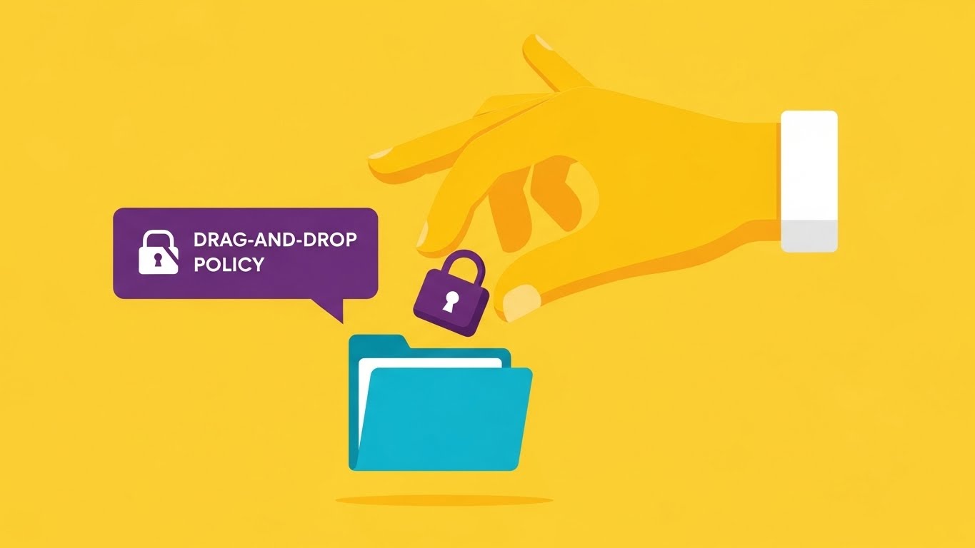
The Visual & Narrative Approach
This style gamifies the configuration process. A stylized, flat 2D character hand in Vibrant Yellow interacts with a floating UI element, physically dropping a Purple Lock icon onto a Blue Folder icon. The background is a clean abstract space. The aesthetic is playful yet professional. The narrative is Ease of Implementation: it visualizes the setting of complex security policies as a simple, tactile "Drag-and-Drop" action, stripping away the fear of command-line complexity.
Psychological Impact & KPI Focus
- Self-Efficacy: By depicting the action as a simple manual task, it boosts the viewer's confidence ("I can do this"). It leverages the "IKEA Effect"—valuing the security setup more because they feel they can easily build it themselves.
- Operational KPI: Accelerates Time-to-Deployment. It promises that a policy update takes seconds, not hours, appealing to overworked IT admins.
Strategic Implementation & Trade-offs
- Best Use Case: Implementation explainer videos, "Getting Started" wizards, and feature release notes.
- Trade-off: It can feel "consumer-grade." It must be framed as "Enterprise power with consumer simplicity" to avoid looking like a toy.
Companies using similar video content -
Ping Identity – PingOne – Tactile drag-and-drop visualizing policy simplicity for identity.
Auth0 (Okta) – Customer Identity Cloud – Gamified configuration for access policies.
23. Rapid UI Feature Montage
Onboarding | Accelerating TTV
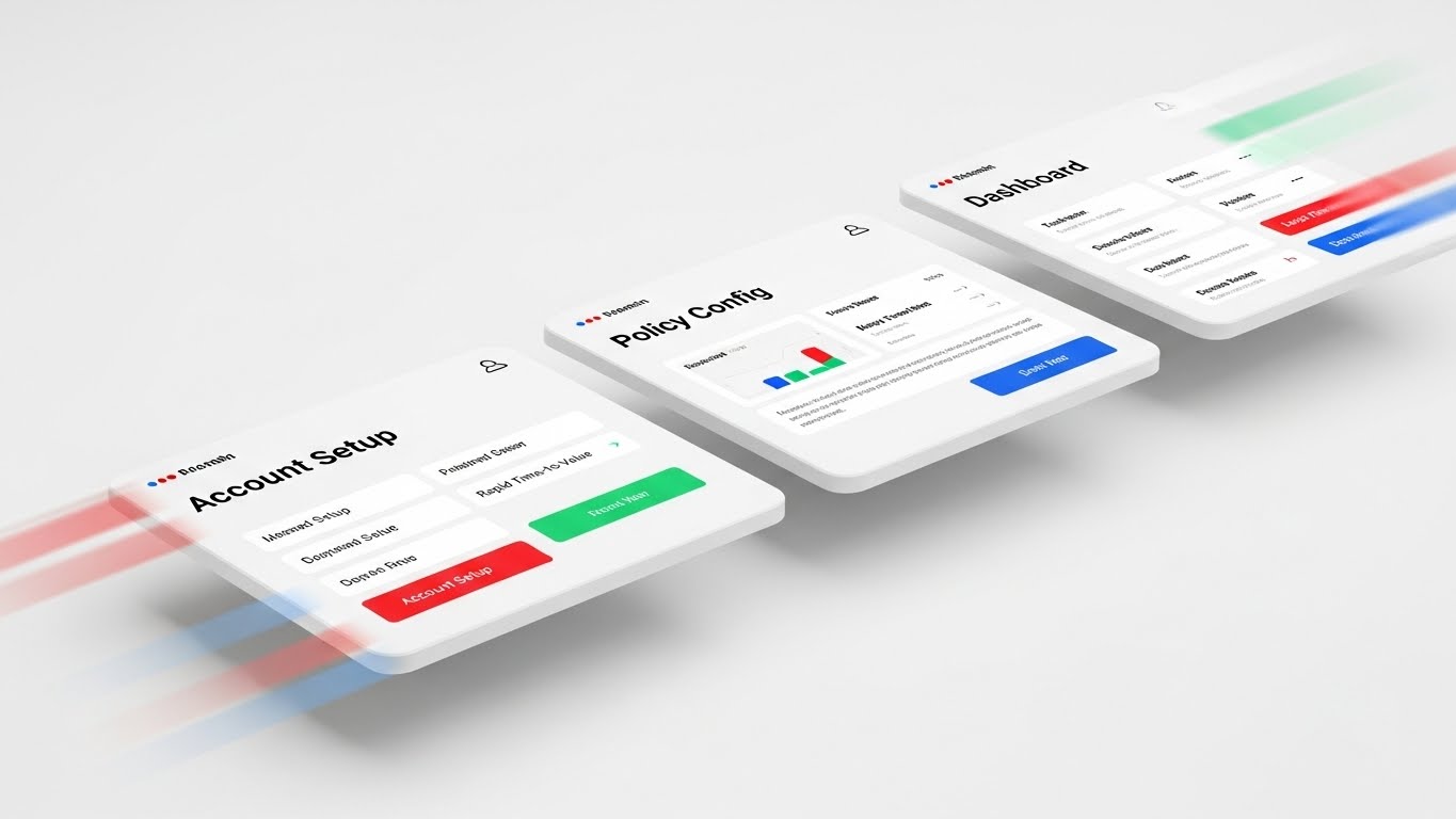
The Visual & Narrative Approach
This style is all about momentum. A dynamic montage of three distinct UI screens ("Account Setup," "Policy Config," "Dashboard") flies past the camera in 3D space. Motion Blur on the edges suggests high velocity. The color palette highlights Red, Green, and Blue accents on white interfaces. The narrative is Rapid Time-to-Value (TTV): it visually compresses the onboarding journey, promising the user that they will go from "Setup" to "Secure" in record time.
Psychological Impact & KPI Focus
- Momentum & Progress: The forward motion creates a sense of inevitability and speed. It combats "Buyer's Remorse" by immediately showing the user the destination (the Dashboard).
- Operational KPI: Increases Activation Rate. Used in welcome emails, it energetically nudges the user to log in and start the process immediately.
Strategic Implementation & Trade-offs
- Best Use Case: Welcome emails, onboarding kick-off videos, and app store preview clips.
- Trade-off: It is fast-paced. It is impressionistic, not instructional—users cannot actually read the screens, only the headers.
Companies using similar video content -
Microsoft – Entra ID – Kinetic screens visualizing rapid time-to-value for identity management.
SailPoint – Identity Security Platform – Dynamic montage of quick setup and insights.
24. 2D Character-Driven Story
Onboarding | Self-Serve Onboarding

The Visual & Narrative Approach
This style humanizes the helpdesk. A 3D character illustration in a "Pixar-esque" style depicts a friendly tech support agent with a headset, wearing a Warm Orange shirt, pointing to a floating Green Success Checkmark. The background is a blurred, inviting home office. The narrative is Supported Autonomy: even though the user is onboarding themselves, this friendly avatar implies that help is always available, reducing the isolation of the self-serve process.
Psychological Impact & KPI Focus
- Empathy & Warmth: Security software is often cold and punitive. This character introduces a "Human Touch" that lowers cortisol/stress levels during frustrating setup steps.
- Operational KPI: Reduces Support Ticket Volume. By providing a comforting visual presence during errors or success states, it keeps users in the flow without calling support.
Strategic Implementation & Trade-offs
- Best Use Case: In-app success modals, error pages (404s), and "Tip of the Day" pop-ups.
- Trade-off: It changes the tone significantly. It moves from "Military Grade" to "Friendly Tech," which must align with the overall brand voice.
Companies using similar video content -
KnowBe4 – Security Awareness Training – Friendly guide visualizing supportive security education.
Proofpoint – Security Awareness Training – Humanizing complex security concepts.
25. 3D Parallax UI Presentation
Onboarding | Driving Deep Feature Adoption
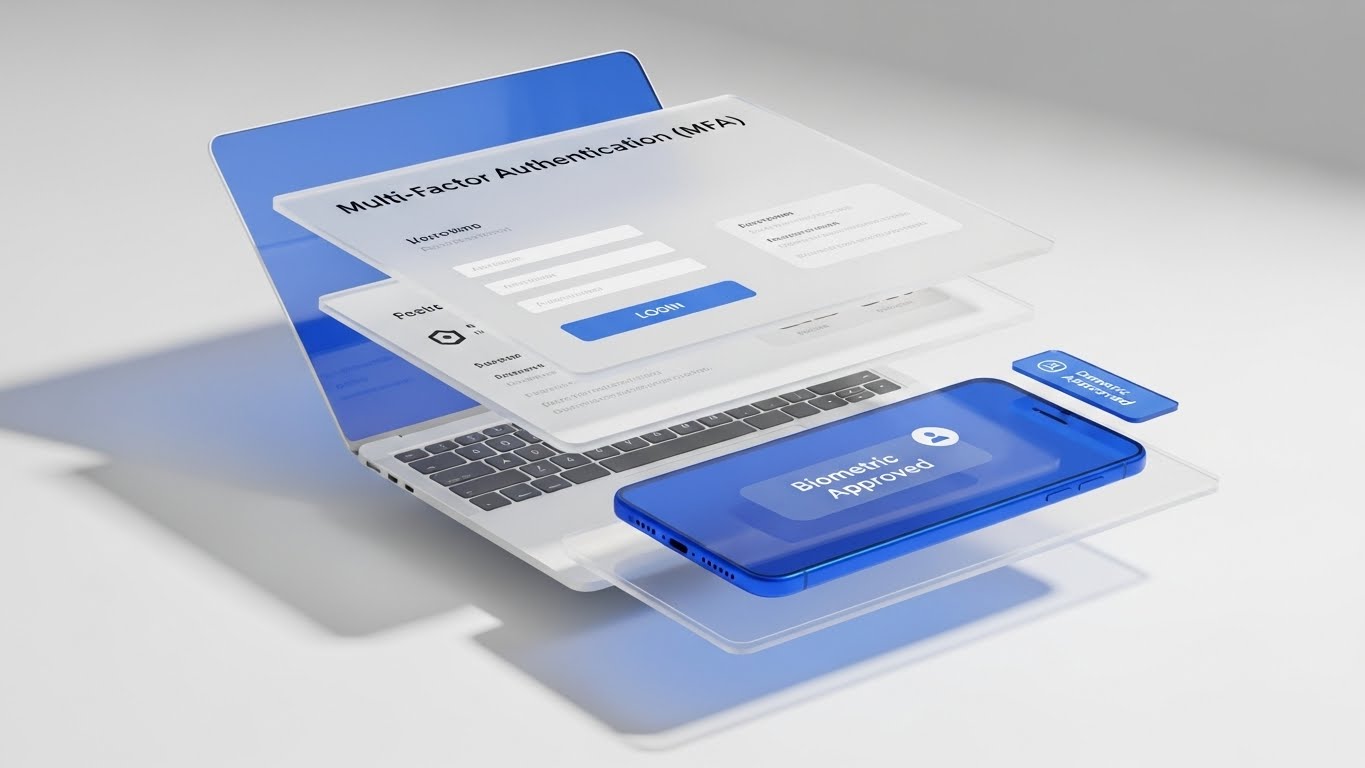
The Visual & Narrative Approach
This style deconstructs the layers of security. A 3D parallax composition shows a laptop screen (Back Layer) and a smartphone (Front Layer) floating in suspension. The laptop displays a login prompt, while the phone shows a glowing Blue "Biometric Approved" notification. The depth between the devices creates a physical representation of Multi-Factor Authentication (MFA). It visualizes the "Air Gap" between the request and the approval, making the security mechanism tangible.
Psychological Impact & KPI Focus
- Depth & Security: The physical separation of the layers visually reinforces the concept of "Defense in Depth." It makes the security feel thicker and more robust than a simple password.
- Operational KPI: Increases Feature Adoption. It makes the hassle of MFA look like a sleek, futuristic interaction, encouraging users to enable it.
Strategic Implementation & Trade-offs
- Best Use Case: Feature spotlight emails, "Security Checkup" dashboard cards, and MFA setup wizards.
- Trade-off: It requires precise design to match the actual UI. If the real app doesn't look this sleek, the user will feel deceived.
Companies using similar video content -
Yubico – YubiKey – Layered devices visualizing multi-factor authentication depth.
Thales – SafeNet Trusted Access – Physical separation for robust MFA.
26. Hybrid: Minimalist Flat + Line Art
Retention | Knowledge Base
The Visual & Narrative Approach
This style is pure utility. It combines flat vector shapes with precise line art schematics. Set against a clean White background resembling technical paper, a black ink diagram maps a "Password Reset" or "Threat Isolation" flow. Key interaction points are highlighted with flat Cyan circles. The aesthetic is instructional, eliminating all distractions. The narrative is Clarity: "Here is exactly how the logic works."
Psychological Impact & KPI Focus
- Cognitive Ease: In a support context, the user is likely frustrated. This style minimizes cognitive load, offering a calming, logical path to a solution without decorative noise.
- Operational KPI: Improves First Contact Resolution (FCR). Clear, diagrammatic visuals help users solve problems without escalating to a human agent.
Strategic Implementation & Trade-offs
- Best Use Case: Knowledge base articles, FAQ sections, and developer documentation.
- Trade-off: It is dry. It has zero emotional appeal and is strictly functional.
Companies using similar video content -
Trellix – XDR Platform – Precision schematic visualizing issue resolution workflows.
Elastic – Security – Clear diagrams for threat detection and response.
27. Hyper-lapse Stock Footage with Data
Retention | Reducing Support Overhead
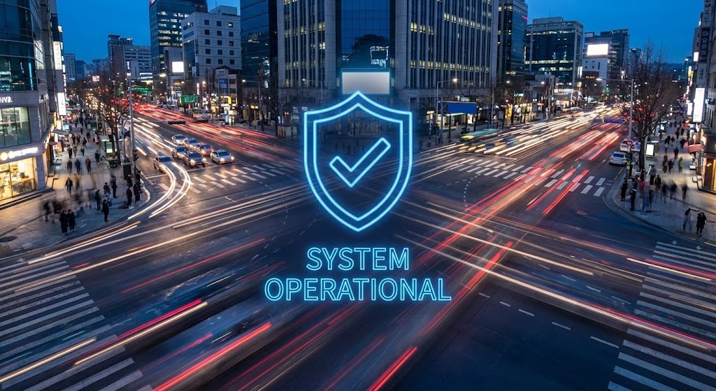
The Visual & Narrative Approach
This style contrasts chaos with stability. The background is a hyper-lapse video of a busy city intersection at dusk, with car lights streaking in long-exposure trails (symbolizing internet traffic/chaos). In the center, perfectly static, sharp, and glowing, is a Neon Blue Shield outline containing a "System Operational" checkmark. The narrative is Resilience: "The world is chaotic, but your security is constant."
Psychological Impact & KPI Focus
- Trust & Permanence: The contrast between the moving background and the static icon subconsciously signals stability. It reassures the user that the platform is a rock in a turbulent stream.
- Operational KPI: Reduces Churn. Used on status pages or during maintenance windows, it maintains confidence even when the broader internet is experiencing issues.
Strategic Implementation & Trade-offs
- Best Use Case: System Status pages, "Year in Review" videos, and high-level retention emails.
- Trade-off: It is atmospheric. It doesn't convey information other than "We are up," so it's limited to trust-building moments.
Companies using similar video content -
Akamai – Enterprise Application Access – Static shield visualizing unwavering uptime amidst chaos.
Cloudflare – DDoS Protection – Resilience against turbulent internet traffic.
28. Generative AI Cinematic Video
Retention | Reducing Churn
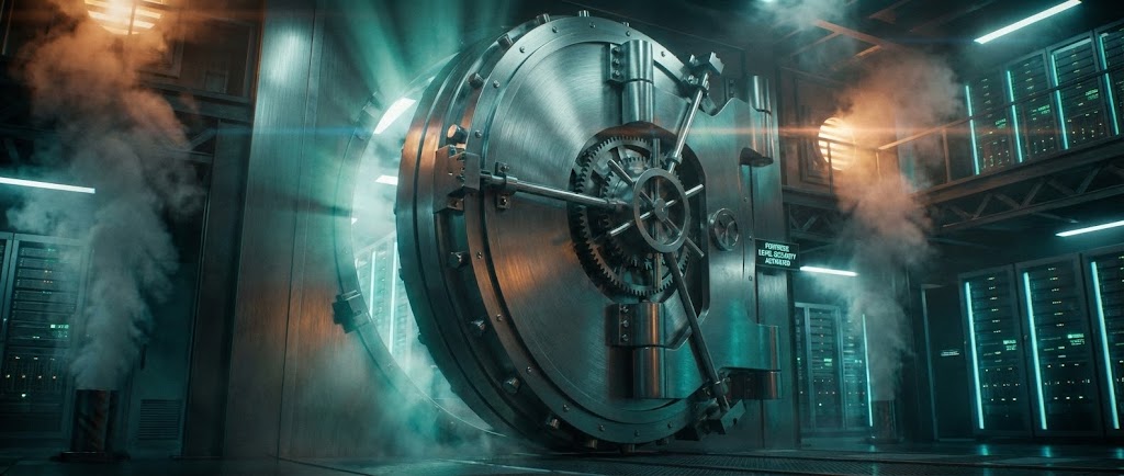
The Visual & Narrative Approach
This style is epic and theatrical. A wide, anamorphic shot depicts a massive, high-tech Vault Door sealing shut in a futuristic data center. Heavy shadows and beams of Teal and Orange light cut through steam vents. The brushed steel texture and complex locking mechanisms communicate "Fortress-Level" security. The narrative is Ultimate Protection: it reminds existing customers of the sheer power and scale of the security infrastructure they have purchased.
Psychological Impact & KPI Focus
- Pride of Ownership: It validates the customer's decision to buy "the best." The cinematic quality makes them feel they are part of an elite, well-protected club.
- Operational KPI: Drives Renewal Rates. By emotionally reconnecting the customer with the concept of "Safety," it makes the idea of switching to a cheaper competitor feel risky.
Strategic Implementation & Trade-offs
- Best Use Case: Keynote openers at user conferences, background loops for executive summits, and "Customer Appreciation" videos.
- Trade-off: It is hyperbole. It represents the feeling of security, not the reality of software, so it must be used sparingly to avoid melodrama.
Companies using similar video content -
Mandiant (Google Cloud) – Threat Intelligence – The vault visualizing enterprise fortress security.
Recorded Future – Intelligence Platform – Epic visuals for ultimate threat protection.
29. Mixed Media Motion Graphics
Expansion | Driving Upsell

The Visual & Narrative Approach
This style visualizes "Growth" by combining real footage with vector animation. A clean, cinematic shot of a physical server room (Realism) is overlayed with animated Green Data Lines that grow upwards and outwards, branching into new icons representing "Cloud," "IoT," and "Mobile" nodes. The narrative is Scalability: it shows that the current security investment is the foundation for future business expansion, prompting the user to protect those new vectors.
Psychological Impact & KPI Focus
- Ambition: It appeals to the customer's desire for business growth. It visualizes the security platform not just as a defensive wall, but as a foundation that supports expansion into new territories.
- Operational KPI: Drives Expansion Revenue. Visualizing the "Next Step" (e.g., adding Cloud Security) prompts customers to inquire about additional modules.
Strategic Implementation & Trade-offs
- Best Use Case: "Upgrade to Pro" modals, Quarterly Business Review (QBR) presentations, and product expansion emails.
- Trade-off: Contextual relevance is key. Showing "IoT" expansion to a company with no IoT devices will feel like a disconnect.
Companies using similar video content -
Fortinet – FortiGate – Growing network visualizing scalability across environments.
Cisco – Secure Access – Combining real infrastructure with animated growth for expansion.
30. Generative AI Realistic Character Video
Expansion | Driving Referrals

The Visual & Narrative Approach
This style mimics a high-end testimonial. A photorealistic rendering of a professional woman in her 30s features a warm, genuine smile and direct eye contact. The lighting is "Portrait Style" (soft key light, shallow depth of field) in a sunlit boardroom. She gestures openly, conveying trust. The narrative is Advocacy: it represents the peer recommendation, the strongest driver of B2B expansion. It visualizes the "Happy Customer" persona that every CISO aspires to be.
Psychological Impact & KPI Focus
- Social Proof & Mirroring: Viewers mirror the emotion of the face they see. A genuinely happy, relaxed professional signals that the software solves problems and removes stress.
- Operational KPI: Increases Net Promoter Score (NPS) and Referrals. It humanizes the request for a referral, making it feel like a conversation rather than a form submission.
Strategic Implementation & Trade-offs
- Best Use Case: Loyalty program landing pages, case study headers, and "Refer a Friend" email campaigns.
- Trade-off: The "Uncanny Valley." Generative AI characters must be perfect; if the eyes or mouth look wrong, it creates revulsion rather than trust.
Strategic Knowledge Base: The Visual Operations Doctrine
To transition from "Adopting a Style" to "Implementing a Strategy," organizations must treat visualization not as marketing decoration, but as a core component of their operational infrastructure. The following three segments synthesize the 30 visual examples into a cohesive framework for Zero Trust adoption, deployment, and scaling.
Strategic Alignment & Visual Architecture
The "Pre-Production" Phase: Aligning Vision and Visuals
Before a single pixel is rendered, the visual strategy must be aligned with the cognitive reality of the security team. Zero Trust is not a product; it is a philosophy that requires a shift in mental models.
-
The Cognitive Load Audit: Security analysts burn out because of alert fatigue and UI complexity. Before creating visuals, conduct an audit of your current training materials. If a concept like "Micro-segmentation" takes 5 paragraphs to explain (High Load), deploy Style 1 (Minimalist Vector) or Style 19 (Isometric Workflow) to compress that load into 3 seconds of visual processing.
-
Role-Based Visual Mapping: Different personas digest information differently.
-
The CISO (Strategic): Needs confidence and overview. Map Style 12 (Aspirational Stock) and Style 16 (Photorealistic ROI) to their decks. They react to "Status" and "Value."
-
The Analyst (Tactical): Needs clarity and speed. Map Style 15 (Dark Mode/Neon) and Style 26 (Hybrid Schematic) to their documentation. They react to "Contrast" and "Precision."
-
The "Glanceability" Standard: In a SOC (Security Operations Center), seconds matter. Visuals for dashboards and alerts must pass the "Glanceability Test"—can the status be understood in under 500ms? Style 27 (Static Shield) is the benchmark here: distinct shape, high contrast, no reading required.
-
The Advids Strategic Audit: Developing a "Visual Operating System" requires an external eye. Partnering with a specialized agency like Advids during this phase helps define a unified visual language that scales across Sales, Product, and Success teams, ensuring that a "Shield" icon in a sales deck means the same thing in the technical documentation.
-
Legacy System Integration: One of the biggest hurdles in Zero Trust is the "Hybrid" reality. Use Style 21 (Holographic UI) to visually bridge this gap, showing stakeholders exactly how the new software "wraps" their old legacy hardware. This visualizes the bridge between "Technical Debt" and "Future State."
-
Accessibility in Security: Security is a global mandate. Ensure motion graphics (Style 5) are accessible to color-blind analysts by using shape and texture, not just Red/Green indicators, to signal threats.
Operational Adoption & Implementation
The "Deployment" Phase: Embedding Visuals into Workflow
The best software fails if users refuse to adopt it. Visuals are the lubricant for the friction of change management.
- Overcoming "Big Brother" Anxiety: Zero Trust involves monitoring user behavior, which can cause internal friction. Use Style 7 (Lifestyle UI Overlay) and Style 18 (Split Screen) to frame the technology as an "Enabler of Remote Work" rather than a "surveillance tool." Visual empathy is critical here.
- The Micro-Learning Shift: Nobody reads the 50-page PDF manual. Slice your training into 30-second micro-content chunks. Use Style 22 (2D Animation) for concepts like "Policy Creation" and Style 23 (Rapid UI Montage) for "Account Setup." Embed these directly into the onboarding emails.
- Just-in-Time Support: Embed Style 24 (2D Character) visuals directly into the product's "Empty States" or error messages. When a user hits a block, meeting a friendly visual avatar reduces the frustration spike and lowers the probability of a support ticket.
- Gamification of Training: Security training is notoriously boring. Borrow the aesthetic of Style 15 (Futuristic Neon) to gamify the learning experience. Visualizing progress bars and "Threat Hunter" badges in a high-tech style increases engagement rates for internal certification programs.
- Scalable Localization: For global enterprises, text is a barrier. Style 4 (Line Art) and Style 1 (Minimalist Flat) rely on geometry, not language. These styles are "Translation-Proof," allowing you to deploy the same training assets to teams in Tokyo, Berlin, and New York without costly text localization.
- Visualizing SOPs: In a breach, panic sets in. Convert your Incident Response Plan into Style 26 (Schematic) diagrams. Visual flowcharts are processed faster than text during a crisis.
Measuring Impact & Future-Proofing
The "ROI" Phase: Measuring Success and Scaling
Visuals are an investment. You must measure their return in terms of efficiency, adoption, and retention.
- Beyond "Views" to "Competency": Do not measure video success by "views." Measure it by Time-to-Competency. Did the cohort exposed to Style 11 (Wireframe Transition) migrate from VPNs faster than the text-only cohort? This is the true ROI of visualization.
- The "Idle Time" Metric: In the software, measure the time users spend "hovering" or "idling" on a configuration screen. High idle time means confusion. Deploying Style 9 (Macro UI Interaction) in tooltips can directly reduce this metric, proving the efficiency value of the visual asset.
- Retention and LTV: High-quality visuals signal product quality. A cohesive visual experience, capped by Style 28 (Cinematic Video) at renewal time, reinforces the premium nature of the subscription. It acts as a psychological anchor against price negotiations.
- The Advids Partnership for Scale: As your feature set grows, your visual library must grow. Creating assets ad-hoc leads to fragmentation. A long-term partnership with Advids allows for the creation of a "Living Asset Library"—a repository of 3D models, vector components, and character rigs that can be reassembled rapidly for new feature launches, ensuring consistency and speed.
- The AI Visual Frontier: The future is generative. We are moving toward real-time, personalized video. Style 30 (Generative Character) is just the beginning. Prepare your brand guidelines now to accommodate AI-generated content, ensuring that even rapidly generated support videos adhere to your "Zero Trust" visual authority.
Companies using similar video content -
Gartner – Security & Risk Management – The peer advocate visualizing social proof and insights.
Forrester – Security & Risk Research – Realistic characters for trusted industry recommendations.
Author & Editor Bio


