Cybersecurity risk quantification UI animation: The Derive UI animation video masterfully transforms abstract cyber risk into quantifiable financial insights. It seamlessly integrates compelling 3D conceptual visuals with a detailed UI walkthrough, demonstrating a clear path from vague threats to strategic financial decision-making, thereby driving user engagement and clarity for complex enterprise challenges.
Why It Stands Out:
Animating Intangible Threats into Quantifiable Financials: The video brilliantly shifts from a macro view of digital business threats to micro-level financial risk analysis. Derive visually translates complex cybersecurity risks into tangible financial loss projections and mitigation benefits, providing clear, data-driven insights essential for executive decision-making and justifying cybersecurity investments.
Streamlining Complex Data for Actionable Strategic Insights: Derive's user interface is showcased with exceptional clarity, demonstrating intuitive data visualization for loss probabilities, net value projections, and simulated scenarios. The animation efficiently guides viewers through how to model cybersecurity risk in financial terms, enabling risk managers to optimize insurance and prioritize actions based on clear, digestible information.
* Visualizing the Superiority of Modern Risk Assessment: Through a powerful visual metaphor of inefficient traditional methods contrasted with Derive's rapid, data-rich approach, the video unequivocally highlights the product's advanced capabilities. This strategic comparison emphasizes Derive's speed, completeness, and ability to constantly update risk assessments, positioning it as an indispensable tool for proactive, informed risk management.
2. Raken Animated user interface Video
Get pricing of the video
PT1M
Duration : 1 minute and 10 seconds
Real-time construction reporting software is uniquely demonstrated in Raken's animated UI video, which positions its mobile platform as the definitive solution for digitizing and centralizing daily field operations. Through intuitive UI animations and live-action integration, the video masterfully showcases seamless data capture, automated reporting, and comprehensive project oversight, transforming fragmented processes into actionable insights.
Why It Stands Out:
The Digital Jobsite: Effortless On-Site Documentation Raken redefines field data collection by illustrating its mobile app's intuitive interface for logging time cards, material usage, and safety checks directly from the jobsite. This dynamic visual demonstration highlights how Raken empowers field crews to capture progress instantly, replacing cumbersome manual processes with swift, digital documentation that saves valuable time.
Seamless Data Flow: Integrated Field-to-Office Reporting The video excels in visualizing the automated journey of field data, showcasing its transformation into comprehensive, branded PDF reports. This seamless transition from mobile input to polished output, combined with automated distribution, exemplifies Raken's ability to bridge the communication gap, ensuring office teams receive real-time, organized project updates effortlessly.
* Actionable Insights: Elevating Project Oversight & Productivity Raken provides a web dashboard featuring clear, animated graphs and activity feeds, offering a centralized hub for project tracking and strategic decision-making. By consolidating diverse data inputs into easily digestible insights and integrating with crucial project management and accounting software, Raken enhances overall project visibility and drives significant productivity improvements.
3. Aircove Feature animation video
Get pricing of the video
PT1M
Duration : 1 minute and 13 seconds
Every device on your home network gains seamless, built-in VPN protection via the Aircove router. Unlike managing VPN on each gadget, this central hub extends robust security instantly, covering smart devices often incompatible with traditional software.
Strong WPA3 encryption enhances network safety, while the reliable Network Lock prevents data exposure if the VPN drops, offering peace of mind. The set and forget convenience of automatic updates keeps protection current effortlessly. This comprehensive approach to digital safety is clearly depicted in the feature animation video's explanatory visuals.
4. sennder Product tour animation
Get pricing of the video
PT1M
Duration : 1 minute and 14 seconds
This logistics fleet management animation for sennder's Orcas platform strategically simplifies complex transport planning and fleet utilization. It transforms daunting operational challenges into intuitive digital solutions, empowering transport operators with unparalleled control and efficiency. The video masterfully uses clean UI animations to guide viewers, showcasing how proactive scheduling and intelligent assignment tools can revolutionize logistics management.
Why It Stands Out:
The Digital Command Center for Your Fleet: The Orcas platform demonstration highlights effortless fleet management, allowing users to add and manage trucks, trailers, and drivers with a few clicks. The intuitive interface for uploading essential documents centralizes all critical fleet data, transforming fleet oversight into a streamlined, digital hub.
Intuitively Bridging Schedule Gaps for Maximum Efficiency: sennder's planner view presents transport schedules with clarity, visually identifying unassigned orders and gaps in routes. The video showcases the platform's smart "Find Order" functionality, which proactively suggests additional orders from the Orcas Marketplace to fill vacant slots, ensuring optimal asset utilization and reducing empty runs.
* Unlocking Unprecedented Transport Visibility: This animation provides a comprehensive, interactive overview of weekly transport operations. With custom sorting options for one, three, or seven-day views, and the ability to toggle between truck and driver perspectives, sennder's solution offers a dynamic, real-time understanding of all assignments, enabling confident and strategic decision-making.
5. Ergon Energy Energex Animated user interface Video
Get pricing of the video
PT1M
Duration : 1 minute and 14 seconds
Power line safety animation for Ergon Energy Energex masterfully demystifies critical overhead power line exclusion zones, educating workers on invisible safety perimeters. This animated user interface video uses clear visual metaphors and precise data to define safety distances, empowering proactive planning and mitigating electric shock risks for field teams and contractors.
Why It Stands Out:
Visualizing Invisible Safety Perimeters: Ergon Energy Energex effectively illustrates the abstract concept of an "exclusion zone" as an animated, invisible safety envelope surrounding power lines. This dynamic 2D motion graphic clearly demonstrates the minimum safe distances required for workers, vehicles, and equipment, transforming complex regulations into an easily digestible visual.
De-Risking High-Voltage Workflows: The video precisely breaks down the critical factors influencing exclusion zone radius, including voltage levels and work type, using clear synchronized text and authoritative narration. By quantifying common distances (e.g., 3m for up to 132kV), it simplifies high-stakes electrical safety information, equipping the audience with actionable knowledge for hazard prevention.
* Empowering Proactive Safety Planning: This animated explainer strategically integrates calls to action, encouraging pre-work planning and promoting the "Look up and Live" app for additional safety advice. This empowers users to take proactive steps, shifting from passive information consumption to active safety engagement and fostering a more informed, risk-aware culture around power lines.
6. Dexcom G7 Software demo animation
Get pricing of the video
PT1M
Duration : 1 minute and 16 seconds
Animated glucose monitoring UI takes center stage in this Dexcom G7 software demo animation, establishing the continuous glucose monitoring system as the epitome of advanced, user-centric diabetes management. Through photorealistic 3D rendering and intuitive animated user interfaces, the video powerfully communicates the G7's discreet design, lightning-fast performance, and superior accuracy, empowering users with confidence and freedom in their daily lives.
Why It Stands Out:
Animated Clarity: Real-Time Glucose at a Glance The video masterfully utilizes dynamic UI/UX animations to present complex glucose data in a clear, real-time format on a smartphone. This synchronized data visualization, alongside concise on-screen text, makes interpreting crucial health information instantaneous and actionable, fostering greater user engagement and understanding.
Advanced Design, Unmatched Speed & Accuracy Dexcom G7's superior engineering is highlighted through a compelling animated product scale comparison, showcasing its 60% smaller size. The demonstration of a lightning-fast 30-minute warm-up, coupled with its status as the most accurate CGM and the only waterproof system in Canada, sets a new benchmark for device performance and reliability.
* Empowering Freedom for Active Lifestyles By depicting users seamlessly integrating the Dexcom G7 into activities like yoga and swimming, the video transcends mere feature showcasing. It builds a narrative of empowerment, emphasizing "no routine fingersticks" and 24/7 monitoring. This strategic contextualization underscores how the G7 supports a confident, unburdened, and active lifestyle.
7. HCLTech Animated product walkthrough video
Get pricing of the video
PT1M
Duration : 1 minute and 19 seconds
This "cloud evolution data visualization" compellingly illustrates how cloud technology is rapidly transforming, necessitating a strategic, deliberate approach to modernization. Through vibrant motion graphics and insightful survey data, the video reveals the critical role of multi-cloud strategies and AI investments in fostering agility and mitigating risk for modern enterprises, positioning HCLTech as a key thought leader in this journey.
Why It Stands Out:
Dynamic Data: Charting Cloud's Rapid Evolution HCLTech masterfully translates extensive survey findings into an engaging visual narrative. Animated statistics and kinetic typography dynamically highlight trends like 87% multi-cloud adoption and 73% embracing cloud-native strategies, providing immediate, actionable insights into the evolving digital landscape.
Modernization Unleashed: Agility & AI Synergy The video strategically connects a diversified cloud approach to key business outcomes, fostering agility, delivering competitive advantage, and mitigating risk. It underscores the mandate for modernization, demonstrating how 98% of leaders are investing in custom generative AI solutions to drive new business models and enhanced decision-making.
* Strategic Partnerships for Accelerated Cloud Success Emphasizing the practical path to modernization, the video highlights that organizations are twice as likely to adopt deliberate multi-cloud strategies and 83% are partnering with global system integrators. This collaboration accelerates project timelines, boosts IT efficiency, and elevates app performance, proving critical for navigating complex cloud ecosystems successfully.
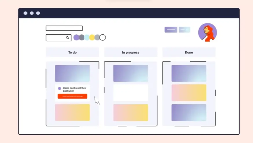
8. monday.com Animated product walkthrough video
Get pricing of the video
PT1M
Duration : 1 minute and 1 second
Gaining effortless command over intricate business processes becomes tangible watching this demonstration. It doesn't just present monday CRM; it unveils a remarkably flexible platform capable of uniting diverse operations, from managing sales pipelines and contacts to client projects and marketing campaigns.
This compelling animated product walkthrough video showcases how effortlessly teams can customize boards and visualize progress through versatile, smoothly transitioning views like Map, Kanban, or Chart. It paints a vivid picture of centralizing crucial information for unparalleled clarity, highlighting real-time reporting that empowers data-driven decisions and simplifies client communications through valuable integrations.
The video's fluid visuals make complex functionality feel immediately accessible, inspiring a seamless approach to optimizing varied business processes.
9. Mandata UI animation video
Get pricing of the video
PT1M
Duration : 1 minute and 22 seconds
This haulage software benefits animation masterfully positions Mandatas Transport Management Software (TMS) as a direct catalyst for operational and financial optimization. Through a clean, minimalist line-art aesthetic and a structured six-point narrative, the video vividly demonstrates how the software streamlines complex logistics, ensuring significant cost savings and improved cash flow from day one for haulage businesses.
Why It Stands Out:
Driving Down Costs from Day One The animation directly links Mandata TMS features to tangible financial gains, illustrating reduced operational costs and automated invoicing that puts cash back into the business, compellingly addressing core financial concerns of transport companies.
Precision Planning & Error Safeguards Complex route planning is simplified through dynamic map animations that showcase optimal routes, complemented by built-in availability alerts. This visual proof highlights Mandatas ability to minimize empty miles and prevent costly errors, enhancing operational accuracy.
Visualizing Value with Minimalist Clarity Utilizing crisp 2D motion graphics and a numbered benefit structure, the video demystifies sophisticated software functionalities like driver tracking and customer portals. Its intuitive information design, paired with a clear UI, ensures the value proposition of Mandata is immediately understood and absorbed.
10. RAM Animated user interface Video
Get pricing of the video
PT1M
Duration : 1 minute and 25 seconds
Industrial OT security animation RAM² by Otorio masterfully deconstructs the escalating cyber threats facing modern industrial operational technology (OT) environments, then presents RAM² as the holistic, proactive solution. Through sophisticated isometric animation, it visualizes the platform's comprehensive reach across critical infrastructure to logistics, empowering OT security practitioners to mitigate critical risks with contextualized intelligence.
Why It Stands Out:
Visualizing Comprehensive OT Protection Across Industries: Otorio's RAM² animation uses dynamic isometric scenes to showcase its protective capabilities across diverse industrial landscapes€”from oil rigs and manufacturing plants to smart warehouses and transportation hubs. This broad visual scope effectively communicates the product's versatility and consolidated visibility into an organization's entire operational footprint.
Proactive Risk Mitigation Through Contextual Intelligence: The video brilliantly employs procedural risk visualization and strategic color coding (red for threats, green for secure assets) to illustrate RAM²'s ability to identify, reduce, and contextualize operational risks. This empowers users to understand not just vulnerabilities, but their direct business impact, enabling proactive security decisions that maintain uptime and integrity.
* Empowering OT Security with Tangible Business Value: RAM² is presented as more than just a security tool; it's a strategic asset that enhances ROI through continuous risk identification, contextualized risk reduction, and comprehensive compliance auditing. The animation highlights how RAM² seamlessly integrates into existing security frameworks, driving operational resilience and security maturity for the long term.
11. Framia Software demo animation
Get pricing of the video
PT1M
Duration : 1 minute and 26 seconds
Minimalist electrical switch animation for ABB Framia expertly elevates user experience and interior aesthetics through sophisticated 3D product visualization. This video meticulously showcases Framia's frameless design and robust engineering, seamlessly integrating it into aspirational residential, hospitality, and commercial settings to highlight its versatile functionality and enduring quality.
Why It Stands Out:
Precision Craftsmanship: Unpacking Framia's Core: The animation employs detailed 3D rotations and exploded views to visually deconstruct Framia, highlighting its frameless elegance, slim 7.8mm profile, curved surface, and high-quality internal components, providing undeniable proof of its superior durability and safety.
Seamless Integration: Elevating Modern Spaces: By placing Framia within luxurious hotel rooms and dynamic office environments, the video demonstrates its intuitive functionality€”from key card switches to integrated charging and data ports€”showcasing how it enhances both aesthetics and user experience in sophisticated settings.
* Aesthetic Versatility: Colors & Functions for Every Vision: The video dynamically presents Framia's diverse range of colors, including matt black, space grey, and champagne gold, alongside a wide variety of functions, illustrating its adaptability to complement any contemporary design vision while meeting diverse practical needs.
12. Lattice Product tour animation
Get pricing of the video
PT1M
Duration : 1 minute and 29 seconds
This HRIS software features animation from Lattice masterfully illustrates the transformation of fragmented HR operations into a unified, intuitive experience. Through a dynamic UI walkthrough, it strategically showcases how Lattice HRIS simplifies complex processes, from comprehensive employee management to insightful data visualization, engaging viewers with a fluid and comprehensive digital journey that addresses core HR challenges.
Why It Stands Out:
Unifying HR Ecosystems From Onboarding to Offboarding The animation excels in demonstrating Lattice's holistic HR capabilities. It seamlessly connects disparate functions like employee management, document storage, and multi-step onboarding into a singular, cohesive platform. This visual narrative effectively communicates how Lattice brings all HR touchpoints together for a truly integrated employee lifecycle.
Intuitive UI Guides Effortless Management The video highlights the platform's user-centric design with fluid animations that mimic real user interactions. From filtering employee lists to drag-and-drop document uploads and step-by-step onboarding, the Lattice HRIS demonstrates its commitment to simplifying complex tasks through clear visual hierarchy and responsive UI elements.
Actionable Insights & Seamless Integration** Lattice showcases its robust data reporting and customizable visualization capabilities, enabling HR teams to quickly derive actionable insights. Furthermore, the animation clearly depicts seamless integrations with critical HR tools and demonstrates how data discrepancies are effortlessly addressed, ensuring a connected and efficient operational environment.
13. Bandwidth Software demo animation
Get pricing of the video
PT1M
Duration : 1 minute and 31 seconds
Emergency Calling API integration is critically re-envisaged in this Bandwidth animation, which meticulously exposes the hidden dangers of standard mobile emergency calls. Through crisp motion graphics and a compelling problem-solution narrative, it visually deconstructs the systemic flaws in location accuracy and presents an elegant, developer-friendly solution to ensure precise public safety connections, ultimately enhancing user safety.
Why It Stands Out:
Unmasking the Flaws in Emergency Location: This Bandwidth video brilliantly uses precise infographic-style animations on a grid-based aesthetic to illustrate the critical disconnect between traditional cell tower location and exact user position during a 911 call. It visually exposes the systemic issue of location inaccuracy, highlighting blocked map access and creating a potent sense of urgency around this overlooked vulnerability in mobile app emergency response.
Effortless API Integration for Life-Saving Accuracy: Bandwidths solution is presented as a transformative, developer-friendly API requiring just "a few lines of code." The animation clearly demonstrates how this enables apps to transmit exact, real-time location data€”complete with detailed addresses, floor numbers, and room specifics€”directly to public safety, turning a perilous situation into one of potential rescue by ensuring rapid and precise emergency service deployment.
* Elevate Your App with Essential Safety Features: Beyond merely solving a technical problem, the video strategically positions Bandwidth's API as a powerful competitive differentiator. By offering superior emergency calling capabilities and nationwide connectivity, it empowers app developers to enhance user safety significantly, building trust and offering a unique value proposition that distinguishes their application from the competition.
14. IGS software explainer animation
Get pricing of the video
PT1M
Duration : 3 minutes and 15 seconds
Integrated genomic surveillance explainer animation for IGS tackles the critical public health challenge of fragmented outbreak detection with a systematic, problem-solution narrative. This explainer masterfully visualizes how diverse genomic data converge for rapid analysis, transforming isolated infections into actionable intelligence to effectively identify and contain super-regional disease outbreaks.
Why It Stands Out:
Unifying Fragmented Data: Building a National Health Surveillance Network: The IGS animation visually traces samples and electronic reports from hospitals and labs to National Reference Centers and the Robert Koch Institute. This clear, isometric data flow animation showcases how IGS fosters crucial cross-institutional data integration, providing a holistic and coordinated view of disease spread previously hindered by isolated information.
Genomic Precision: Accelerating Outbreak Detection with WGS: Through engaging motion graphics, the video demystifies whole genome sequencing (WGS) and the concept of "genetic fingerprinting." IGS enables swift, granular pathogen identification, precisely linking geographically dispersed cases to pinpoint outbreak origins, thereby dramatically reducing the time to detection and analysis.
* Actionable Intelligence: Empowering Faster Public Health Interventions: The Robert Koch Institute's role in synthesizing complex data is clearly demonstrated, establishing infection correlations and sources. This actionable intelligence, powered by IGS, empowers public health authorities to implement rapid, targeted responses like hygiene measures or product recalls, effectively breaking transmission chains and mitigating widespread health crises.
15. Geico App UI animation video
Get pricing of the video
PT1M
Duration : 15 seconds
Animated insurance app UI videos like this Geico example expertly transform routine tasks into engaging narratives, showcasing how digital convenience enhances daily life. Through a relatable story and polished animation, it effectively proves the Geico mobile app simplifies complex insurance management, liberating user time for personal enjoyment and fostering loyalty.
Why It Stands Out:
Streamlining Digital Interactions: This GEICO video masterfully uses intuitive 2D character animation and motion graphics to visually deconstruct app functionality. It clearly demonstrates how features like paying bills and filing claims become quick, effortless actions within the mobile app, reducing perceived user effort and accelerating digital adoption.
Reclaiming Time for What Matters: Beyond functional utility, GEICO strategically employs the endearing animation of Lucy interacting with her dog, Lizzie, to personify the ultimate benefit: saved personal time. This emotional connection elevates the app from a mere tool to a lifestyle enhancer, deepening user affinity and brand loyalty.
* Animated Storytelling for User Engagement: The video's clean visual design, upbeat soundtrack, and synchronized text overlays craft a compelling narrative that keeps viewers engaged. By embedding Geico's time-saving mobile app features within a relatable, character-driven story, it transforms feature demonstration into an aspirational message.
It’s crucial to plan ahead when it comes to high-quality video production. Discuss with our team, how you can get visual style, budget, timeline in sync.
At Advids, we specialize in crafting high-quality, original Animated User Interface Videos that deliver exceptional results. With over 12 years of proven success and more than 3400 clients served, we blend creative storytelling, cutting-edge technology, and a collaborative approach to bring your UI/UX vision to life.
Transforming UI/UX with Engaging Animation:
Customized Animated User Interface Video Solutions: We tailor each project, whether it's explainer videos, micro-interactions, or full UI walkthroughs, to showcase your interface's functionality and user experience seamlessly. Creative Storytelling Through Animation: Our team crafts compelling narratives that highlight the benefits and features of your UI/UX design, engaging users and driving conversions. Cutting-Edge Animated User Interface Video Technology: We utilize the latest animation software and techniques to create visually stunning UI animations that captivate your audience and leave a lasting impression. 250+ Successful UI/UX Animation Projects: We've helped numerous businesses, from startups to Fortune 500 companies, effectively communicate their UI/UX design through engaging animated videos.
Trusted by Industry Leaders, Proven by Results:
12+ Years of Proven Success: Our extensive experience in animation speaks for itself, demonstrating our deep understanding of effective visual communication. Trusted by Industry Leaders: Brands like Razorpay, Ola, Mercedes, the United Nations, Continental, and Mercer rely on our expertise to bring their UI/UX to life through animation. Client Satisfaction Guaranteed: Over 109 five-star Google reviews reflect our commitment to delivering exceptional results and exceeding client expectations.
A Collaborative Partnership for UI/UX Success:
Collaborative Process: We work closely with you throughout the entire animation process, ensuring your vision for your UI/UX is accurately represented. Strategic Communication: We prioritize clear and open communication to understand your specific UI/UX goals, target audience, and brand identity.
Ready to unlock the potential of Animated User Interface Video for your business with the latest video design trends of 2024? Let Advids be your trusted partner in transforming your ideas into engaging and effective animated experiences.
Checkout some of the projects and work our team at Advids has been producing:
Author & Editor Bio
A video producer with a passion for creating compelling video narratives, Jai Ghosh brings a wealth of experience to his role. His background in Digital Journalism and over 11 years of freelance media consulting inform his approach to video production. For the past 7 years, he has been a vital part of the Advids team, honing his expertise in video content planning, creation, and strategy.
His collaborative approach ensures that he works closely with clients, from startups to enterprises, to understand their communication goals and deliver impactful video solutions. He thrives on transforming ideas into engaging videos, whether it's a product demo, an educational explainer, or a brand story.
An avid reader of modern marketing literature, he keeps his knowledge current. Among his favorite reads from 2024 are "Balls Out Marketing" by Peter Roesler, "Give to Grow" by Mo Bunnell and "For the Culture" by Marcus Collins. His results-driven approach ensures that video content resonates with audiences and helps businesses flourish.