

Video Marketing

Silent-First Video Ads for B2B Feeds: Design for Mute, Reward Sound

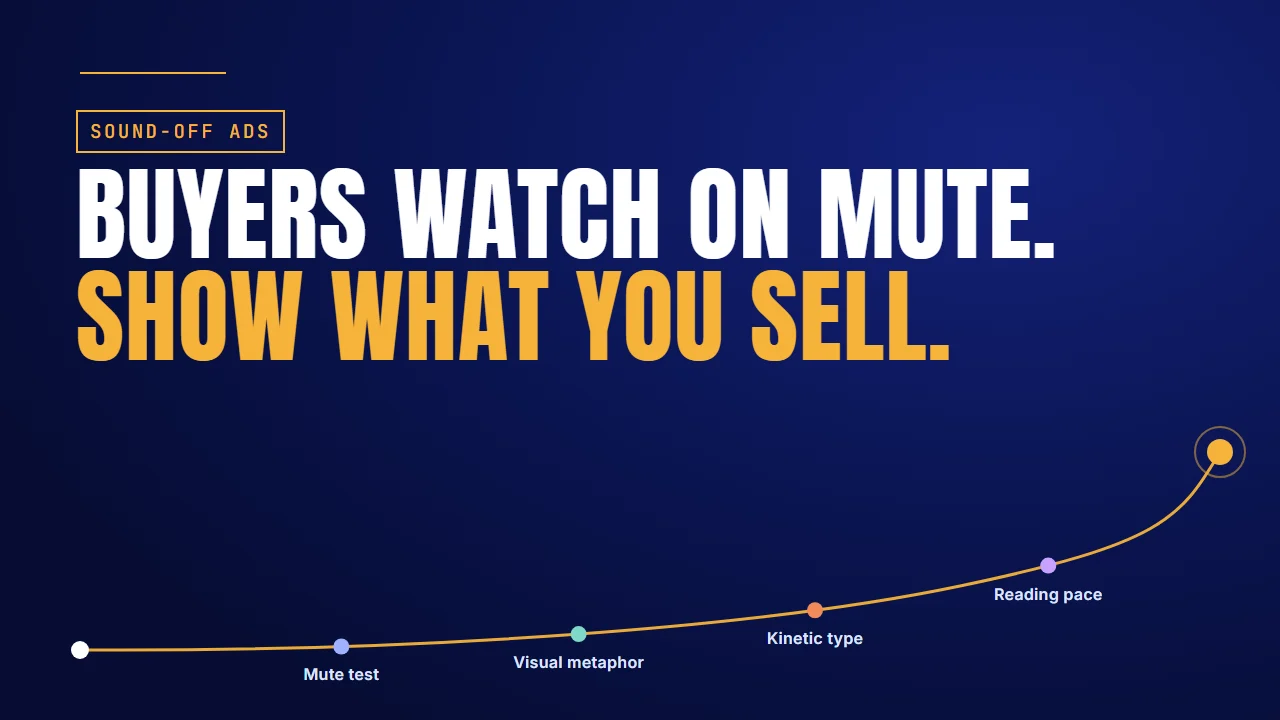
Buyers watch on mute. Show what you sell: designing B2B video ads that work without sound

Why it matters

Most of your buyers see the ad on mute

Play a B2B video ad the way most buyers meet it: in a feed, with the sound off. A presenter's lips move, a product screen slides past, and nothing tells you what it's selling. If you can't tell, neither can they.

The numbers below come from platforms and media companies, not from B2B advertisers, and each one covers a different group.

FindingSourceWhat it covers
Almost 80% watch video ads with the sound offLinkedInLinkedIn members; the page is undated
Bulleted captions lifted dwell time by about 30%LinkedIn Creative Labs, as reported by PPC Land, July 202513,000 B2B video ads
69% watch with the sound off in public, 25% in privateVerizon Media and Publicis Media, 2019, via Forbes5,616 US consumers
80% are more likely to watch to the end when captions are availableVerizon Media and Publicis Media, 2019, via Forbes5,616 US consumers
About 2.25 times the call-to-action click-through rate with sound onMetaFeed video ads

The short answer: design the ad silent first. Run a mute test on the animatic before you record any voiceover. Carry the message with a visual metaphor, moving key words and one focal point per frame. Pace scenes for reading, not listening. Then add voiceover and sound design for the viewers who tap sound on. Four of the sections below include a video we made for a client.

Planning ads for sound-off feeds?

Talk to the Advids team about storyboards that pass the mute test before a word of voiceover is recorded.

Let’s talk

Captions last

Auto-captions are a translation, not a design

Captions added last carry a story that still lives in the voice.

Here's how most teams handle sound-off. They finish the ad with a voiceover, then add auto-captions at the end.

That's a translation, not a design. The captions sit at the bottom of the frame. They lag behind the visuals. And the story still lives in the voice. Captions do help: there's a reason captions increase viewership. But a transcript added last can't fix a picture that says nothing.

Meta's guidance is plain. Most people watch with the sound off, so the message has to be clear visually, with subtitles, supers and strong visuals. Supers are text set over the picture as part of the design.

So design it the other way round: silent first. Start with one simple check.

Mute test

Run the mute test before you record a word

Play the animatic on mute and ask a stranger three questions.

Before you record any voiceover, play the animatic with the sound off to someone who hasn't seen it. Can they tell you who it's for, what problem it solves and what to do next? If they can't, the visuals aren't carrying the message yet.

Think of silent-era comedy. Charlie Chaplin never needed a voiceover to tell you he was in trouble. The picture did the work.

Here's what a passing storyboard looks like for an expense tool. It's an example we wrote, not client work.

FrameOn screenWords on screen
1A pile of crumpled receipts on a desk"Month-end, again."
2A phone snaps one receipt and the pile disappearsNone
3The logo"Close in a day."

No voice is needed. Anyone can follow it, and the voiceover you add later only makes it better.

1Password Developer Tools: no captions, still clear

1Password's explainer for its Developer Tools has no captions at all. Thin line art on a dark navy screen does the work. Keys sit on separate towers wired to a laptop, then one 1Password cube takes their place. The 1Password app creates a GitHub SSH key, GitHub's "SSH keys / Add new" page takes it, and a terminal types "git add readme.txt" and "git push" before a fingerprint approves it. See how we made it.

What works here:

  • The only words on screen are ones a developer sees anyway: app labels, a GitHub page, terminal commands.
  • Each step is one action in one frame, so a muted viewer can follow the task.

The move: Play your animatic on mute. Wherever the product's own labels can carry a step, drop the caption.

So how do you pass the mute test? Three tools. The first is a picture of the problem.

Visual metaphor

Show the problem as a picture

Don't show a dashboard and hope they get it.

A dashboard means nothing to a muted viewer who hasn't used it. A picture of the problem does. Tangled cables for disconnected tools. A leaking bucket for lost leads. Those are illustrations, not client work, but they show the idea: visual metaphors borrow an image the viewer already understands.

Then show it fixed. The cables run into one port. The bucket stops leaking. The fix lands without a word because the viewer has already read the problem. It's the same craft behind good motion graphics storytelling: one image per idea, and each image changes for a reason.

OpenText: a pile of paper, then one machine

OpenText's explainer for its intelligent contract analytics draws the problem first. A magnifying glass moves across a contract, then three cards name the burden: "Complexity", "Cost" and "Specialized skills". Later a pile of paper contracts streams into one computer marked AI and NLP, and single documents leave the other side. See how we made it.

What works here:

  • The pile of paper is the problem and the computer is the fix, both readable without a word.
  • The three cards keep the text to one or two words each.

The move: Find the one object that stands for your buyer's problem, show it piling up, then show where it goes.

Pictures carry the problem. Words still have a job, as long as they're the right words.

Kinetic type

Move the key words, not the transcript

Short phrases, one idea at a time, big enough to read on a phone.

The second tool is kinetic typography: the key words move on screen in time with the story. Not a full transcript. Short phrases, one idea at a time. LinkedIn Creative Labs studied 13,000 B2B video ads and, as reported by PPC Land, found that bulleted captions lifted dwell time by about 30%. You'll find the same approach across kinetic typography ads.

Make the type easy to read. Eleken, the SaaS design studio, points out that long blocks of all-caps text slow reading down. Use sentence case and a clear visual hierarchy, so the most important word is the biggest.

Pitch: one idea per line, the topic largest

Pitch's "Intro to sharing" video for Pitch Academy puts its lesson in a few big words. A short list states what's coming: "Invite guests to view or edit a presentation", "Make presentations public", "Embed presentations around the web", "Export presentations as a PDF". Each topic then opens on its own large title before the Pitch interface shows the steps.

What works here:

  • Each line is one idea, short enough to read at a glance.
  • The topic is set largest, so the most important words are the biggest on screen.

The move: Cut each scene's voiceover down to its key phrase and set that phrase large. Leave the full sentence to the voice.

The third tool is one focal point per frame. Video ad producer Fraser Cottrell says the strongest openings give the eye one thing to look at. If the type, the interface and a character all move at once, the viewer reads none of them.

Big, short words solve what to show. A silent ad has one more constraint: time.

Reading pace

Pace scenes for reading, not listening

People read slower than they listen. Give each line time to land.

A voiceover can race through a sentence in two seconds. A muted viewer reading the same words needs longer. So pace your scenes for reading. Give each line of text time to land before the next one comes in, and keep to one short phrase per beat.

This is where captions earn their keep. In a 2019 study by Verizon Media and Publicis Media of 5,616 US consumers, reported by Forbes, 80% said they're more likely to watch a video to the end when captions are available. That's consumers, not B2B buyers, but feeds are where both scroll. Pacing for reading matters most in short-form ads, where every line has to land in the time you have.

HCLTech Retail 5.0: one line per scene

HCLTech's commercial for Retail 5.0 at NRF 2025 gives each capability one short line over the scene where it works. "Omnichannel isn't just a buzzword" appears over a hand reaching for a screen, "Data intelligence and AI" over a data centre, and "Resilient supply chains redefining industry benchmarks" over a warehouse and a truck. It ends on one card with the date, booth and venue. See how we made it.

What works here:

  • One phrase per scene, held long enough to read before the next cut.
  • The closing card with the date, booth and venue gets the longest hold.

The move: Time each scene to its line: let the phrase land, then cut. If a viewer can't read it twice, the scene is too short.

That's silent-first. But don't make the ad silent-only.

Sound on

Then reward the viewer who taps sound on

Silent-first doesn't mean silent-only.

Meta's numbers cut both ways. Most people watch with the sound off, but feed video ads perform much better when they're watched with sound on.

2.25×

The call-to-action click-through rate Meta reports for feed video ads watched with the sound on. Source: Meta, Instagram video ad best practices.

So design for mute, then add a voiceover and sound design that make the ad better for anyone who taps the speaker. A click sound under an interface step, a riser into the reveal, a voice that adds what the screen can't. The muted viewer still gets the story. The listener gets more of it.

The same order works for SaaS teasers, where the picture has to sell the launch before anyone hears a word.

Mute first, sound second. Here's where to start.

Where to start

Where to start

The short answer: start from where your ad fails on mute.

If your adStart withDo thisExample to copy
Only makes sense with the voiceoverMute testPlay the animatic on mute before recording1Password
Shows a dashboard and hopesVisual metaphorPicture the problem, then show it fixedOpenText
Uses the full transcript as captionsKinetic typeKey words only, large, one idea per linePitch
Cuts faster than anyone can readReading paceOne short phrase per beatHCLTech
Forgets the sound-on viewerSound onAdd voiceover and sound design on topMeta's 2.25× figure

For more ads built to read in a feed, browse these social video examples. We've made video for teams such as 1Password, OpenText, Pitch and HCLTech. See the software teams we've made video for.

FAQ

Questions about silent-first video ads

What share of B2B buyers watch video ads on mute?
LinkedIn says almost 80% of its members watch video ads with the sound off. Meta says most of its users do too. Plan every feed ad for mute.
Are auto-captions enough for a feed video ad?
No. Auto-captions translate a voiceover that still carries the story. They sit low and lag the visuals. Design the pictures and on-screen words to carry it instead.
What is kinetic typography in a video ad?
Key words that move on screen in time with the story. Not a full transcript: short phrases, one idea at a time, large enough to read on a phone.
How fast should on-screen text change?
Slower than a voiceover would. Give each line time to land before the next arrives, and keep to one short phrase per beat, so viewers read rather than skim.
Should B2B video ads still have a voiceover?
Yes. Meta reports about 2.25 times the call-to-action click-through rate when feed video ads are watched with sound on. Design for mute, then add voice.
How do I test whether an ad works without sound?
Play the animatic on mute to someone new. If they can say who it's for, what problem it solves and what to do next, it passes.

About the author

About Jai Ghosh

Video Producer at Advids · LinkedIn

Jai Ghosh is a Video Producer at Advids, where he has planned and produced videos for B2B software and technology companies for 7 years. He works on product demos, explainer videos and brand videos, from the first script to the final cut, for clients from startups to enterprises.

Before Advids, Jai spent over 11 years in freelance media consulting, after starting out in digital journalism. He writes the Advids blog's breakdowns of product and demo videos, sorting real examples by the question each one answers for a buyer.

  • Focus: SaaS product demos, explainer videos and brand videos
  • Experience: 7 years at Advids, over 11 years in media consulting
  • Background: digital journalism

Connect with Jai Ghosh on LinkedIn

Sources

Sources