Well-crafted interface walkthrough videos are a powerful tool for enhancing user engagement. They transform potentially complex interfaces into intuitive and user-friendly experiences. More than simple instructions, these videos are compelling narratives that create enthusiasm and foster a stronger connection with your product. We have gathered 30 outstanding examples showcasing how interface walkthrough videos can significantly decrease support requests and improve user satisfaction.
Video's role in modern marketing:
* 87% of marketers say that video has increased traffic to their websites.
* 75% of viewers watch short-form video content on their mobile devices.
* 40% of marketers foresee 20-50% of businesses heavily relying on visual content by the end of 2024.
In today's digital environment, video has become a leading method for communicating intricate information. 30 UI walkthrough video examples provide easily understandable content that appeals to today's users, leading to better user retention. They streamline the initial setup process, reduce user difficulties, and ultimately improve the overall user journey. Discover these 30 compelling examples – ranging from refined animations to interactive demonstrations – and see how video content can revolutionize your user engagement approach. Realize the full potential of video to engage your users!
1. Thomson Reuters App walkthrough video
Get pricing of the video
PT1M11S
Duration : 1 minute and 11 seconds
Abstract innovation explainer video Thomson Reuters masterfully defines what innovation truly looks like, illustrating how individual insights propagate into transformative solutions across diverse business functions. This abstract motion graphics video uses elegant visual metaphors and a compelling narrative to showcase the company's holistic commitment to pioneering impactful change, moving beyond mere technological advancements to a fundamental philosophy.
Why It Stands Out:
Abstract Innovation Visualized: Unpacking a Core Philosophy This Thomson Reuters video brilliantly translates the intangible concept of innovation into a vivid visual narrative. Through minimalist geometric animation and dynamic line work, it makes abstract ideas?from "finding something new" to "breaking the mold"?tangible, guiding viewers through a sophisticated understanding of a core corporate philosophy.
From Spark to System: Connecting Ideas for Widespread Impact The video effectively demonstrates how a single spark of insight evolves into systemic change. It connects individual moments of discovery to broader applications, showing how innovation impacts client experience as much as the back office, reinforcing Thomson Reuters' commitment to comprehensive, integrated progress.
* Thought Leadership in Motion: Branding Through Innovative Vision Positioning Thomson Reuters as a leader in forward-thinking solutions, the video articulates a brand identity centered on relentless innovation. It communicates a powerful vision by showcasing the pursuit of new perspectives and better ways of working, inspiring confidence and trust in its capacity for transformative impact.
What We Can Learn
Get to the true root cause of incidents quickly using detailed analysis capabilities.
2. OntargIT Software onboarding video
Get pricing of the video
PT1M11S
Duration : 1 minute and 13 seconds
Dynamics 365 Copilot customer insights are masterfully illustrated in this OntargIT software onboarding video, which articulates a compelling vision of unifying fragmented data to orchestrate exceptional, personalized customer experiences. The video achieves this by demonstrating how AI-driven insights empower every team member, from data analysts to service agents, to deliver truly connected and impactful customer journeys.
Why It Stands Out:
Transforming Fragmented Data into Unified Intelligence: The video visually connects disparate applications, showcasing how OntargIT leverages Dynamics 365 Customer Insights + Microsoft Copilot to create a single, holistic customer view. This clear depiction of data unification immediately addresses the common challenge of disconnected systems.
Empowering Every Role with Actionable Customer Insights: It meticulously demonstrates how data analysts discover deeper insights, marketers create campaigns faster, sellers personalize outreach, and service agents provide tailored support?each empowered by the same unified intelligence and AI.
* Crafting Seamless, AI-Driven Customer Experiences: By illustrating real-time journey orchestration and personalized content generation, the video vividly proves how OntargIT helps businesses move beyond transactional interactions to foster meaningful, proactive engagements, ultimately boosting user satisfaction and loyalty.
What We Can Learn
Quantify performance gains visually showing cooling efficiency improving CPU performance by 38 percent.
3. Facebook Product feature video
Get pricing of the video
PT1M11S
Duration : 1 minute and 15 seconds
Facebook personal fundraising explainer masterfully demonstrates how Facebook Fundraisers empower communities to rally support for personal causes, transforming personal hardships into collective triumphs. This Facebook product feature video uses empathetic storytelling and seamless UI integration to inspire and educate users on activating social impact.
Why It Stands Out:
Humanizing Crisis: The Power of Child-Narrated Empathy: The video leverages a child's innocent narration to tell the heartwarming story of "Benson's Bodega," creating an immediate, deep emotional connection. This approach simplifies a serious issue, making the impact of personal loss and community support through Facebook Fundraisers profoundly relatable.
Digital Lifeline: Seamlessly Activating Community Support: Facebook Fundraisers are presented as an intuitive digital solution, with the video featuring a clear, step-by-step UI walkthrough. The process of creating, sharing, and tracking donations is integrated effortlessly into the narrative, demystifying the platform's functionality and highlighting its accessibility during times of need.
* The Ripple Effect: Unlocking Collective Aid for Recovery: Through dynamic animation, the video visually depicts the network effect of Facebook, showing friends and neighbors sharing and donating to the fundraiser. This powerful demonstration of collective action reinforces the platform's ability to mobilize widespread support, culminating in the triumphant "Grand Re-Opening" of Benson's and showcasing tangible community recovery.
What We Can Learn
Augment target profiles with unique data for a complete picture of audiences.
4. Irdeto Onboarding process video
Get pricing of the video
PT1M11S
Duration : 1 minute and 19 seconds
Digital fleet key management is revolutionized in Irdeto's animated explainer, transforming inefficient manual processes into a streamlined, secure digital solution. The video masterfully illustrates this transition, using clear 2D motion graphics and character animation to showcase how Irdeto Keystone empowers fleet managers with unparalleled control and efficiency in vehicle access and operations.
Why It Stands Out:
Digitizing Fleet Access: From Manual to Mobile: The video powerfully contrasts chaotic manual dispatch with instantaneous, secure digital key distribution to drivers' smartphones. Irdeto Keystone enables remote vehicle pre-conditioning and quick deployment, significantly accelerating operational flow.
Empowering Managers: Centralized Control Over Every Key: Highlighting a fleet manager's expanded authority, the animation demonstrates the ease of issuing new keys and instantly revoking old ones. This gives complete, permission-based control over when, how, and by whom vehicles are used, enhancing security and accountability within the Irdeto Keystone system.
* Seamless Integration & Swift Deployment for Peak Efficiency: Irdeto Keystone emphasizes practical benefits by showing quick, non-invasive installation within 30 minutes and seamless integration with existing Fleet Management Software. This ensures a smooth transition, streamlining driver changes, maintenance handovers, and ultimately achieving greater efficiency across the entire fleet.
What We Can Learn
Use animation to clearly visualize hidden technical details and complex internal processes for viewers.
5. Life Happens Step-by-step video guide
Get pricing of the video
PT1M11S
Duration : 1 minute and 1 second
Life insurance animated explainer video, "Life Happens Step-by-step video guide," transforms an often-daunting subject into a deeply personal narrative, by masterfully intertwining emotional storytelling with expressive 2D animation. This poignant video from Life Happens effectively demonstrates how thoughtful planning translates into an enduring legacy of care, securing family well-being beyond physical presence. This approach elevates user engagement by fostering genuine empathy and illustrating the profound human value of financial foresight.
Why It Stands Out:
Weaving a Personal Tapestry of Enduring Care: The video masterfully crafts a first-person narrative, delivered through a reflective voiceover, that takes viewers from a heartfelt marriage proposal to the challenges of illness. This deeply emotional arc, enhanced by expressive 2D character animation and a melancholic yet hopeful musical score, establishes a profound connection, emphasizing a husband's unwavering promise to "always take care of" his family.
Transforming Complexity into Tangible Assurance: Life Happens excels at simplifying the abstract concept of life insurance by grounding it in relatable, everyday moments of love and protection. Through sequential visual storytelling and symbolic objects like hidden love notes and a cherished baseball cap, the video shifts the perception from a financial product to a tangible act of continued parental presence and future security, demystifying the "how" through empathetic narrative.
* A Legacy of Love: Fulfilling Promises Beyond Presence: The video powerfully illustrates the lasting impact of foresight, showing the family finding joy and continuity even after loss, enabled by the husband's decision. The final scene, with children presenting "Happy Land" tickets and the wife discovering a final love note, provides a moving resolution, affirming that the promise of care made years ago continues to be fulfilled, positioning Life Happens as an enabler of enduring family happiness.
What We Can Learn
Let abstract animation illuminate complex solutions improving comprehension by 68 percent easily.
6. TEMASEK Onboarding process video
Get pricing of the video
PT1M11S
Duration : 1 minute and 24 seconds
Long-term investment strategy explained, this Temasek animated explainer video masterfully articulates the institution's commitment to sustainable, generational returns by visually contrasting short-term stock price fluctuations with deep, fundamental analysis. It employs sophisticated 3D infographic animation and intuitive visual metaphors to transparently walk viewers through a meticulous, forward-looking investment philosophy.
Why It Stands Out:
Deconstructing Fundamentals for Enduring Value The video uses an innovative procedural deconstruction of a building to represent a company, metaphorically "X-raying" its core components like management, governance, and business model. This technique vividly illustrates Temasek's comprehensive due diligence, ensuring all foundational aspects are thoroughly examined.
Sustainable Returns A Blueprint for Generational Prosperity Temasek effectively visualizes its long-term vision, depicting a resilient portfolio that generates stable returns to benefit "every generation." This narrative reinforces a commitment to responsible stewardship, moving beyond immediate gains to foster enduring financial health.
Building Confidence Through Methodical Assessment** By openly detailing its process?from considering broad opportunities and potential risks to calculating minimum returns?the video establishes transparency and builds trust. The clear, well-paced animation and dynamic text overlays simplify complex financial concepts, making Temasek's disciplined approach accessible and reassuring.
What We Can Learn
Show product impact clearly quantifying benefits reducing e waste generation by 89%.
7. eShipper Onboarding process video
Get pricing of the video
PT1M11S
Duration : 1 minute and 26 seconds
Logistics platform feature walkthroughs often emphasize technical capabilities, but eShipper's 2024 annual recap strategically outlines a year of unprecedented growth and innovation, driven by its human-first approach. The video leverages dynamic UI demonstrations and compelling data visualization to showcase a redesigned platform, expanded integrations, and a strong commitment to sustainability, effectively amplifying potential for its diverse clientele.
Why It Stands Out:
Redefining Logistics: eShipper's 2.0 UI and Integrated Solutions: The video offers a compelling UI walkthrough of eShipper 2.0, showcasing an intuitive dashboard with robust tracking and insightful data visualization through geographic maps and detailed charts. This feature-rich update, combined with 30+ expanded eCommerce integrations, demonstrates eShipper's commitment to simplifying complex shipping logistics and providing businesses with advanced, seamless solutions.
Powering Progress: Sustainable Growth and Strategic Partnerships: eShipper strategically highlights its dedication to environmental responsibility with the Carbon Neutral Toggle, an innovative feature clearly presented with carrier rates that allows customers to offset over a million kilograms of carbon. This, alongside a spotlight on record-breaking shipment volumes and groundbreaking career partnerships, positions eShipper as a forward-thinking leader committed to both business growth and a sustainable future.
* Human-Centric Excellence: Elevating Customer and Team Experience: Beyond technological advancements, the video emphasizes eShipper's "Premium Care Program," featuring proactive tracking, hands-on claims assessment, and a human-first approach to support. By celebrating its 25th anniversary and showcasing diverse team collaborations and customer testimonials, eShipper reinforces its core value of fostering strong connections and ensuring every problem finds a dedicated solution.
What We Can Learn
Showcase modern workplace technology through engaging animation attracting over 50% more tech-savvy potential candidates.
8. SIG Software Feature Demo
Get pricing of the video
PT1M11S
Duration : 1 minute and 27 seconds
In a world of increasingly connected and demanding consumers, securing meaningful engagement is a critical challenge. PAC.ENGAGE offers a compelling solution by transforming the physical package into a digital touchpoint. A unique pack code becomes the gateway, opening up a wealth of interactive experiences.
Scanning the code provides consumers with games, contests, and loyalty rewards, fostering direct interaction. For brands, this process yields invaluable insights into consumer behavior and preferences, enabling truly personalized communication. This innovative software feature demo creates connections that extend far beyond the moment of purchase.
What We Can Learn
Clearly demonstrating the full process using animation convinces 88 percent.
9. Knode Product feature video
Get pricing of the video
PT1M11S
Duration : 1 minute and 28 seconds
This AI knowledge management platform video for Knode demonstrates how AI redefines enterprise knowledge access, empowering teams to harness information from disparate sources. Knode's advanced natural language processing interprets user queries, delivering instant, fact-grounded answers with direct links to original documents from platforms like Google Workspace, making complex data instantly actionable for better decision-making and productivity.
Why It Stands Out:
AI-Powered Search That Understands Context: Knode's intelligent AI goes beyond keyword matching, employing natural language processing to understand the true intent of user queries. It seamlessly surfaces relevant, context-rich information from across disparate enterprise sources like Google Workspace, ensuring teams get precise answers and not just a list of documents.
Instant Answers & Curated Knowledge Bots: Knode transforms information retrieval, delivering instant, sourced answers to natural language queries. It also empowers teams to create customized knowledge bots for specific functions, such as product support, ensuring approved documentation and expertise are instantly accessible to customer-facing roles, significantly boosting efficiency.
* Secure, Verifiable, and Gap-Optimized Knowledge: Addressing critical enterprise concerns, Knode inherits permissions from underlying sources, ensuring users only access authorized information. Answers are directly linked to original documents for verification. Furthermore, real-time analytics provide 'Gap Analysis,' actively identifying areas where the knowledge base needs enrichment, fostering continuous improvement.
What We Can Learn
Clearly demonstrating the service process increases understanding video boosts comprehension 74 percent.
10. Concur TripLink Software tour video
Get pricing of the video
PT1M11S
Duration : 1 minute and 29 seconds
Integrated business travel solution, this Concur TripLink video masterfully demystifies the chaotic landscape of modern business travel. It strategically transforms fragmented booking complexities into a clear, unified vision, using dynamic animations and intuitive UI walkthroughs to demonstrate how total visibility and granular control empower both organizations and employees, enhancing engagement and efficiency.
Why It Stands Out:
Unifying Fragmented Travel for Total Visibility: The video employs a signature animated network visualization to compellingly illustrate how Concur TripLink integrates diverse booking channels and travel partners. This seamless aggregation brings all travel data into a single, comprehensive view, enabling organizations to gain unparalleled insight into their entire travel ecosystem.
Empowering Granular Control and Compliance: Concur TripLink demonstrates how it allows finance and travel managers to control spend and enforce travel policies, even across direct bookings. By capturing all expenditures and providing access to negotiated rates, the system ensures maximum compliance and cost savings without sacrificing traveler flexibility.
* Streamlining Employee Experience with Intelligent Integration: The solution extends beyond organizational benefits by offering a significantly improved traveler experience. Through the TripIt app, Concur TripLink organizes itineraries and captures outside bookings, providing employees with the freedom to choose while eliminating tedious administrative tasks, ultimately fostering a more seamless and enjoyable journey.
What We Can Learn
Showcase compact size like 30mm enabling easy physical integration benefits.
11. Rocketlane App walkthrough video
Get pricing of the video
PT1M11S
Duration : 1 minute and 45 seconds
Unified post-sales platform UI videos often tackle the immense challenge of fragmented customer data. Rocketlane's "Accounts" app walkthrough video masterfully addresses this by unveiling a central repository that transforms disconnected post-sales interactions€”from implementation and hyper-care to customer success€”into a singular, intuitive dashboard view, enabling continuous value delivery.
Why It Stands Out:
The 360-Degree Account View: Unifying Post-Sales Data: This Rocketlane video expertly illustrates the consolidation of every customer touchpoint, including projects, financials, engagement notes, and files, into a single, cohesive interface. The dynamic data visualization and seamless UI animation provide a comprehensive, 360-degree overview, empowering post-sales teams to navigate complex client journeys with unprecedented clarity and control.
Actionable Insights for Account Health & Profitability: By presenting vital metrics such as project progress, profit margins, and customer sentiment through clear graphical representations and intuitive color-coding, Rocketlane empowers users to instantly assess account health. This visual clarity enables proactive decision-making, ensuring continuous value delivery while driving optimal profitability across all managed accounts.
* Empowering Teams to Deliver Consistent Customer Value: The walkthrough articulates the challenge of disparate team efforts, then showcases how Rocketlane's unified "Accounts" platform fosters collaboration and consistency. By providing a shared, real-time view of customer engagements and project updates, the video demonstrates how teams can move as one, ensuring an exceptional client-centric experience that consistently "wows" customers across the entire post-sales journey.
What We Can Learn
Clearly demonstrating simplification can increase conversion rates by up to 20% for complex offerings.
12. Rokt Software demo video
Get pricing of the video
PT1M11S
Duration : 1 minute and 53 seconds
This e-commerce personalization explainer video vividly articulates Rokt's core thesis: to transform standard online transactions into rich, value-generating engagement opportunities. Through crisp 2D motion graphics and a compelling customer journey narrative, it effectively demonstrates how data science unlocks new revenue streams and cultivates deep brand loyalty.
Why It Stands Out:
The AI-Driven Personalization Engine Revealed: Rokt's sophisticated data science is visually demystified through engaging 2D motion graphics, portraying real-time customer profile assessment. The animation elegantly translates complex algorithms into digestible visual metaphors, showing how Rokt instantly understands individual consumer behavior to recommend optimal "next best actions."
Unlocking Revenue Across the Entire Purchase Funnel: The video meticulously maps how Rokt injects value at every stage of the e-commerce journey, from purchase review to the confirmation page. By demonstrating personalized offers like warranty extensions and free streaming trials, Rokt showcases its ability to convert routine transactions into significant upsell opportunities, increasing value by over 50%.
Seamless Journeys, Lasting Loyalty: Through a relatable customer narrative featuring "James," the video illustrates how personalized experiences delight shoppers and foster enduring brand allegiance. Rokt orchestrates these interactions with seamless UI integration, ensuring each engagement moment is relevant and meaningful, thereby building trust and driving future repeat business.
What We Can Learn
Clearly demonstrating the step by step user journey accelerates understanding and viewer confidence significantly.
13. BetterCloud Step-by-step video guide
Get pricing of the video
PT1M11S
Duration : 1 minute and 56 seconds
BetterCloud SaaS management platform walkthrough expertly addresses the growing challenge of SaaS sprawl, positioning BetterCloud as the indispensable solution for modern IT teams. This animated explainer uses dynamic UI simulations and a powerful problem-solution narrative to showcase how centralized control, automated workflows, and deep visibility streamline operations, reduce waste, and maximize the benefits of diverse SaaS ecosystems.
Why It Stands Out:
From SaaS Sprawl to Centralized Control: The video compellingly opens by visualizing the fragmented chaos of numerous SaaS applications and their management inefficiencies. It then introduces BetterCloud as the unifying platform, demonstrating through clean, intuitive animations how disparate apps can be managed from a single, centralized interface, transforming complexity into streamlined order.
Automating Lifecycle & License Management: Key to its effectiveness, the video meticulously illustrates automated workflows for user lifecycle management. From reducing wasteful license costs through efficient offboarding to accelerating new employee onboarding with pre-defined access privileges, BetterCloud showcases how routine IT tasks are simplified, saving significant time, effort, and budget.
* Unifying Visibility and Enhancing Security: This walkthrough emphasizes BetterCloud's role in providing granular visibility into app usage and optimizing spend by identifying redundancies. Customizable workflows and alerts are highlighted for proactive IT governance, alongside critical security measures like multi-factor authentication support and email policy enforcement, empowering IT teams to manage risk intelligently.
Edge network security solution for an always-on enterprise, this CDW software onboarding video masterfully deconstructs the abstract yet critical concept of "the edge," positioning CDW as the indispensable partner for comprehensive, seamless protection. It achieves this by expertly blending sophisticated motion graphics€”like dynamic red lines delineating network boundaries and glowing particles visualizing data flows€”with relatable live-action business environments, creating a highly engaging visual walkthrough.
Why It Stands Out:
Defining the Dynamic Edge: Visualizing a New Frontier: The video compellingly introduces "the edge" as a crucial meeting point of possibility and reality, using abstract figures on a red pathway and evolving digital landscapes. This sophisticated visualization clarifies an often-nebulous concept, setting the stage for CDW to address the expanding complexities of connected devices and data.
Actionable Security: Unify, Automate, Secure the Edge: Through a clear, impactful "1-2-3" framework, the video presents CDW's solution as a structured path to unified users, devices, and infrastructure. Large, synchronized on-screen text highlights key actions like secure connectivity, comprehensive protection, and predictive AI, demonstrating how CDW simplifies intricate challenges for IT decision-makers.
* Partnering for Edge Excellence: Insight That Delivers Innovation: By showcasing CDW as an Aruba Platinum Partner, the video emphasizes the strength of a combined expertise. It vividly illustrates how this partnership enables predictive issue prevention, reduces troubleshooting, and ensures absolute uptime, ultimately securing the possibility of innovation and accelerating invention at the business edge.
What We Can Learn
Emphasize transformation and impact; clear value messaging boosts desired audience actions by over 50%.
15. SourceBreaker Software tour video
Get pricing of the video
PT1M11S
Duration : 1 minute and 6 seconds
AI recruitment platform demo SourceBreaker showcases its intelligent system for revolutionizing talent acquisition by consolidating diverse candidate databases and leveraging advanced AI to identify top talent before competitors. Through sleek UI animations and dynamic data visualization, the video precisely articulates how its smart search capabilities empower recruiters.
Why It Stands Out:
AI-Powered Precision Sourcing: Outpacing the Competition: The video dynamically illustrates SourceBreaker's "smart search" with a concentric target animation, visually representing how its AI systematically refines hundreds of thousands of keyword variants and synonyms to zero in on ideal candidates, ensuring recruiters beat rivals to top talent.
Consolidated Data & Seamless Integration for Max Efficiency: SourceBreaker unifies all CV databases and platforms like LinkedIn Recruiter, presenting a single, comprehensive talent pool. This seamless aggregation, demonstrated through intuitive UI, drastically reduces manual search time, allowing recruiters to discover even more untapped talent with a single click.
* Dynamic UI Visualization of Recruitment Transformation: Through crisp motion graphics, the SourceBreaker platform's workflow is transformed into a clear, engaging narrative. From keyword expansion to real-time candidate counts, the animated interface demystifies complex AI, showing measurable outcomes like increased placements and hours saved, reinforcing brand value.
This dynamic AWS AI consulting solutions demo by Quantiphi masterfully deconstructs complex cloud architecture and advanced data capabilities. It strategically positions Quantiphi as an Advanced AWS Consulting Partner, showcasing their integrated expertise and innovative solution accelerators to deliver quantifiable business impact with unprecedented clarity and speed.
Why It Stands Out:
Quantiphi's Integrated AI & Cloud Expertise in Motion: The video employs a sophisticated 2D/3D hybrid animation to visualize Quantiphis core competencies, such as migration, DevOps, and machine learning. This visual walkthrough clearly delineates how diverse AWS services are integrated into Quantiphis comprehensive solutions, making abstract technical offerings tangible and engaging for the viewer.
Visualizing End-to-End Solution Accelerators: Quantiphi effectively simplifies complex architectures by connecting individual Amazon services (e.g., Redshift, Textract, Sagemaker) to their proprietary solution accelerators like Ginetix and QHawk. This modular, iconographic design transforms intricate data flows and AI pipelines into a digestible, easy-to-follow system, showcasing a clear path to client-specific outcomes.
* Global Scale for Quantifiable Business Impact: Beyond demonstrating technical prowess, the video strategically builds trust by highlighting Quantiphis global presence, its 1500+ employees, and over 450 AWS certified professionals. This emphasis on scale and expert resources, combined with the clear articulation of delivering "quantifiable business impact," positions Quantiphi as a reliable and high-performing partner for complex business transformations.
What We Can Learn
Use relatable character scenarios to humanize complex solutions and build viewer connection effectively.
17. LK Opera App walkthrough video
Get pricing of the video
PT1M11S
Duration : 2 minutes and 10 seconds
Healthcare interoperability platform demo for LK Opera seamlessly transforms the complex and often fragmented landscape of healthcare data exchange into an elegant, unified ecosystem. This video cleverly sets the stage by highlighting the overwhelming industry challenges before visually orchestrating how LK Opera simplifies integrations and accelerates digital transformation.
Why It Stands Out:
Orchestrating Seamless Healthcare Data Flows: A central "orchestration" animation positions LK Opera as the unifying hub for diverse health IT systems, payers, and providers. This visually clarifies how the cloud-based platform simplifies data exchanges, dissolving silos and harmonizing legacy incompatibilities.
Accelerating Digital Health Transformation: The video powerfully addresses CIO challenges, using "before and after" calendar animations. This demonstrates LK Opera's capacity to expedite complex integration projects from months to weeks, underscoring its scalable technology for rapid digital transformation.
* Empowering Personalized, Future-Ready Care: Built on 20 years of interoperability, LK Opera drives a future-focused digital data strategy. The video connects its capabilities to personalized, affordable, and improved patient care, reducing operational costs and advancing health equity.
What We Can Learn
Visually depict audience challenges upfront to create immediate connection and resonance.
18. Conversica Step-by-step video guide
Get pricing of the video
PT1M11S
Duration : 2 minutes and 15 seconds
Connecting personally with vast numbers of leads and customers often feels like an overwhelming hurdle, limiting potential growth. Conversica introduces digital assistants engineered for personalized, two-way communication across the entire lifecycle. This powerful capability liberates marketing, sales, and customer success professionals to concentrate on high-value strategic tasks.
These are far more than basic automated responses. The intelligent digital assistants build rapport through interactions that adapt based on the actual exchange, moving beyond rigid scripts to autonomously drive conversations toward the next best action. Watching this dynamic process feels like a step-by-step video guide to how intelligent automation uncovers genuinely qualified contacts ready to engage, fueling pipeline velocity and revenue acceleration at every stage.
What We Can Learn
Clearly demonstrating the scientific mechanism behind your solution can increase audience trust and boost conversion rates by 25%.
19. HEF series Software tour video
Get pricing of the video
PT1M11S
Duration : 2 minutes and 46 seconds
Compact thermal control solution: This video for the HEF series masterfully proves its central thesis€”redefining desktop thermal control with unparalleled precision, compactness, and user-centric design. Through innovative product visualizations and compelling performance data, it showcases how advanced engineering can address critical space, noise, and maintenance challenges for sensitive applications in optics, physics, and chemistry.
Why It Stands Out:
Shrinking Footprints, Expanding Capabilities: The HEF Series Redefines Desktop Cooling The HEF series video dramatically illustrates an 88% volume reduction through a side-by-side comparison with its predecessor, the HEO002 series. This visual proof immediately communicates the HEF series compact, desktop-size form factor, opening new possibilities for integration into space-constrained environments without compromising performance.
Precision Perfected: Achieving Silent, Stable Temperature Control with HEF The video highlights the HEF series key technical advancements: a refrigerant-free, Peltier-type chilling mechanism delivering exceptional temperature controllability and stability. With a low-noise design of just 37dB at low load and the ability to lower temperatures by 10°C in only 41 seconds, the HEF series provides a quiet and highly efficient thermal solution.
* Designed for You: User-Friendly Interface & Hassle-Free Maintenance The HEF series emphasizes ease of use with its intuitive digital control panel, ensuring precise temperature adjustments are straightforward. The video further showcases its user-centric design by demonstrating the simple process of removing and cleaning the integrated dust filter, reinforcing its long-term reliability and minimal maintenance requirements.
What We Can Learn
Bold, dynamic text transitions grab attention and powerfully convey core concepts quickly.
20. VTEX Software tour video
Get pricing of the video
PT1M11S
Duration : 2 minutes and 58 seconds
An enterprise composable commerce platform tour, this VTEX video meticulously demonstrates how its interconnected digital commerce platform simplifies complex B2B and B2C operations, empowering businesses with unparalleled flexibility and scalability. It strategically uses dynamic UI walkthroughs, animated overlays, and clear narration to visually prove the platform's seamless integration capabilities, making intricate processes digestible.
Why It Stands Out:
Seamlessly Orchestrating Composable Commerce VTEX showcases its composable digital commerce platform through continuous, dynamic UI walkthroughs. The video uses precise motion graphics and animated overlays to highlight how various modules€”from OMS to pricing engines€”interconnect flawlessly, visually demonstrating the powerful synergy that eliminates vendor lock-in.
Guided UI Tour Deconstructs Enterprise Complexity This VTEX software tour employs authoritative narration synchronized with crisp on-screen text and strategic visual cues. It expertly guides viewers through intricate platform features, breaking down the abstract concept of composable commerce into clear, digestible benefits for enterprise decision-makers, simplifying complex B2B scenarios.
VTEX Drives Confidence with Integrated Platform Vision With high-production fidelity and a clean aesthetic, VTEX builds trust by presenting its integrated platform as a comprehensive, future-proof solution. The polished demonstration directly addresses the needs of C-suite executives, inspiring confidence in VTEX's ability to drive business agility and large-scale digital transformation.
What We Can Learn
Clearly demonstrating solution impact on audience problems can boost conversions by 30 percent.
21. reclaim.ai App walkthrough video
Get pricing of the video
PT1M11S
Duration : 31 seconds
This AI meeting scheduling walkthrough brilliantly positions reclaim.ai as the indispensable solution for optimizing 1:1 meetings. Through dynamic calendar visualizations and clear UI demonstrations, it effectively communicates how intelligent automation alleviates scheduling conflicts, liberating professional time for focused work.
Why It Stands Out:
From Calendar Chaos to AI-Driven Clarity: The video immediately tackles the prevalent problem of "jammed" workweeks, quantifying the struggle with compelling statistics like 42% of 1:1s rescheduled and 30% canceled. reclaim.ai then provides an intelligent, automated answer, framing its solution as the clear path to an organized, efficient schedule.
Dynamic Auto-Rescheduling in Action: reclaim.ais core intelligence shines through its signature visual: a fluid, animated Google Calendar. This sophisticated motion graphics display vividly shows meetings dynamically shifting to the "next best time" within mutual availability, proving the product's proactive conflict resolution capability in a compelling, digestible way.
* User-Centric Design for Reclaimed Productivity: The walkthrough emphasizes reclaim.ais intuitive UI, making setup for "Smart 1:1s" straightforward and efficient. By showcasing how the tool effortlessly manages scheduling for both parties, the video highlights its value for busy professionals and distributed teams, translating seamless design directly into tangible productivity gains.
What We Can Learn
Use spatial visuals to represent complex or abstract concepts accessibly for your viewers.
22. Shower Mixer Faucet Product feature video
Get pricing of the video
PT1M11S
Duration : 32 seconds
Shower mixer faucet feature demo: This Deante Shower Mixer Faucet feature demo leverages sophisticated 3D product animation to provide an intuitive UI walkthrough, demonstrating precise temperature control and essential user safety features. It skillfully uses a dynamic blueprint overlay and real-time on-screen readouts to clarify complex operational sequences without narration.
Why It Stands Out:
Visualizing Intuitive Temperature Management: The video seamlessly animates the Deante Shower Mixer Faucet's temperature dial, visually demonstrating effortless adjustment. On-screen numerical displays provide instant feedback (e.g., 38°C to 28°C), while a clear safety override lock reassures users of precise and safe water temperature control, enhancing product confidence.
Precision-Guided Feature Exploration: Deante employs a dynamic blueprint overlay, magnifying key interactive components and using clear directional UI arrows to guide viewers. This methodically deconstructs the faucets operational mechanics, from temperature adjustment to flow switching, allowing for precise, step-by-step feature exploration.
* Elevating User Confidence with Clarity: By presenting complex functionality through a clean, narration-free visual dialogue, the Deante Shower Mixer Faucet video fosters profound user confidence. The high-fidelity 3D animation and precise information design ensure every feature is effortlessly understood, positioning the product as user-friendly and reliable.
What We Can Learn
Understanding competitive investment landscape improves acquisition success likelihood by up to 40 percent.
23. Samsung Electronics Software Feature Demo
Get pricing of the video
PT1M11S
Duration : 3 minutes and 17 seconds
Everyday semiconductor applications explained, this Samsung Electronics Software Feature Demo masterfully demystifies a complex, foundational technology. By tracing Dalsu's hyper-relatable morning routine through engaging 2D character animation, the video strategically reveals the ubiquitous and often-unseen role of semiconductors, transforming viewer understanding and fostering appreciation for their pervasive influence on modern life.
Why It Stands Out:
Unveiling the Hidden Heart of Everyday Devices: The video cleverly builds a compelling narrative around an "everyman's" morning, using dynamic visual overlays and procedural highlighting during a rapid recap to explicitly reveal the hidden semiconductor components within mundane objects like smartphones, LED lights, and coffee machines, making the abstract tangible.
A Day in the Life: Visualizing Semiconductor Impact: Through a structured daily walkthrough and seamless motion graphics, Samsung Electronics grounds the complex topic of technology integration in highly relatable scenarios. This human-centered storytelling effectively illustrates how semiconductors orchestrate convenience and efficiency, boosting user engagement by connecting tech to personal experience.
* Samsung as the Educator: Cultivating Tech Appreciation: This explainer positions Samsung as a leading educational authority, not just a manufacturer. By clearly and accessibly demonstrating the indispensable nature of semiconductors, the video elevates brand perception, inviting viewers to understand and appreciate the foundational innovations that silently power their daily existence.
What We Can Learn
Begin with evocative human experience footage to hook viewers emotionally resonant videos achieve seventy percent completion.
24. TRUELAYER Feature demonstration video
Get pricing of the video
PT1M11S
Duration : 41 seconds
An exceptional open banking payment UI walkthrough, TRUELAYER's demonstration redefines online transactions as instant, secure, and effortlessly streamlined. This video intricately guides viewers through a customer's journey, from checkout to biometric authentication within their banking app, simplifying complex fintech into a clear, confident narrative that boosts user engagement.
Why It Stands Out:
Seamlessly Navigating the Open Banking Checkout: The video provides a crystal-clear, step-by-step UI animation of the customer's payment process, from selecting TRUELAYER's "Instant Bank Transfer" option to choosing their bank, ensuring every action is intuitive and frictionless. This visual clarity instills confidence in the user experience.
Biometric Security: Authenticating Payments with Confidence: TRUELAYER highlights the enhanced security of open banking by showcasing biometric authentication (fingerprint or facial recognition) directly within the user's native bank app. This powerful visual proof demystifies the security layer, assuring users of protected, direct bank-to-bank transactions.
* Demystifying Fintech: A Clear Path to Modern Payments: By breaking down a potentially complex financial technology into easily digestible, animated steps with concise on-screen text, TRUELAYER transforms abstract concepts into a tangible, user-friendly reality. This approach effectively positions open banking as the innovative, accessible future of online payments.
What We Can Learn
Clearly demonstrating the interface visually empowers potential users to understand the platform quickly.
25. GoVisually Feature demonstration video
Get pricing of the video
PT1M11S
Duration : 51 seconds
Adobe plugin workflow demonstration, this GoVisually feature video powerfully illustrates how it seamlessly integrates with Adobe Creative Cloud to streamline design review and approval. Without narration, it orchestrates a rapid, visual walkthrough, showcasing direct in-app uploads, precise annotation, and dynamic version comparison to transform complex feedback into an effortless, collaborative experience.
Why It Stands Out:
Seamless Adobe Integration for Unified Workflow: GoVisually eliminates context switching by offering a direct plugin for Photoshop, Illustrator, and InDesign. This allows designers to upload files and manage proofs without ever leaving their native Adobe applications, fostering a unified workflow that boosts efficiency and reduces friction in the creative process.
Accelerating Feedback Cycles with Visual Precision: The video demonstrates how GoVisually empowers rapid iteration through precise on-canvas annotation and real-time synchronization. Critically, its side-by-side comparison feature offers immediate visual proof of changes, drastically shortening feedback loops and accelerating project approvals with undeniable clarity.
* Intuitive UI Design for Effortless Revision Management: With its clean, intuitive interface, GoVisually makes version control and revision tracking simple. The UI walkthrough highlights how designers can effortlessly upload new iterations, respond to comments, and maintain a clear history of all changes, ensuring accountability and easy management of proofs.
What We Can Learn
Showcase comprehensive features quickly, reducing support time potentially by 75 percent.
26. PINNACOL Software demo video
Get pricing of the video
PT1M11S
Duration : 16 seconds
Beneath soaring peaks and vibrant skies, the spirit of Colorado unfolds through lively animation, celebrating resilience. Diverse scenes show community members finding a way forward, from vital construction sites to bustling local spots, setting a hopeful, visually engaging stage rooted in regional identity.
This narrative artfully connects that enduring spirit to PINNACOL workers' comp insurance, positioning it as more than policy; it's the essential safety net enabling these very activities and livelihoods. As an effective software demo video approach, it shows creators how abstract support becomes tangible, inspiring others to illustrate value by focusing on real-world impact facilitated.
What We Can Learn
Average revenue loss 1 point 86 percent recover lost sales through automated claim defense.
27. XTB Software onboarding video
Get pricing of the video
PT1M11S
Duration : 16 seconds
Mobile trading app onboarding is demystified by the XTB Software onboarding video, which strategically simplifies the often-intimidating process of opening a trading account. Through a direct and concise mobile app walkthrough, the video visually guides prospective users through each necessary step, transforming perceived complexity into a promise of quick and effortless access.
Why It Stands Out:
Streamlined Account Activation in Four Steps: XTB brilliantly uses a sequential, step-by-step UI animation to demonstrate account setup, from app download to fund deposit. This clear, four-stage visual progression rapidly assures new users of the swift and straightforward path to starting their trading journey.
Building User Confidence Through Transparent Onboarding: The video proactively addresses potential user anxieties by visually demystifying identity confirmation and secure fund deposits. By transparently showcasing each action within the XTB app, it fosters trust and reduces perceived friction, positioning XTB as a reliable and user-friendly platform.
* Empowering Mobile Trading with Intuitive UI: The high-fidelity screen capture simulation and crisp UI animations put the XTB app's intuitive design at the forefront. This mobile-first approach emphasizes accessibility and ease of use, proving that managing finances and trading can be a seamless, on-the-go experience directly from a smartphone.
What We Can Learn
Videos tailored to individual recipients boost engagement and conversion rates up to thirty percent.
28. HOTWIRE Software Feature Demo
Get pricing of the video
PT1M11S
Duration : 16 seconds
Neon tech brand introduction animation, this Hotwire video powerfully asserts its thesis: empowering technology to transform the world through global expertise. It leverages a distinctive neon glow aesthetic and a confident narrative to visually articulate complex concepts like connectivity and impact, culminating in its recognition as a leading, award-winning technology agency.
Why It Stands Out:
Illuminating Global Reach with Abstract Motion Graphics: Hotwire ingeniously uses abstract motion graphics, transitioning from a hand interacting with a smartphone to a glowing world map. This visual journey eloquently illustrates technology's expanding global reach and interconnected pathways, making profound concepts of transformation instantly digestible and engaging for the viewer.
The Striking Neon Aesthetic of Tech Authority: The video's striking neon aesthetic, characterized by vibrant pink glows and minimalist design, defines Hotwire's innovative brand authority. This cohesive visual language immediately conveys a modern, high-tech identity, resonating with a sophisticated audience and positioning Hotwire as a forward-thinking, cutting-edge leader in the technology sector.
* Award-Winning Validation for a Visionary Brand: Concluding with its "PRovoke Global Technology Agency of the Year" accolade, this video strategically validates Hotwire's visionary mission. This explicit award recognition provides powerful, third-party proof of the agency's expertise and leadership, solidifying viewer trust and reinforcing Hotwire's position as a global technology force.
What We Can Learn
Showcase tangible end products to connect technical specifications with creative possibilities for viewers.
29. Aosom Software demo video
Get pricing of the video
PT1M11S
Duration : 22 seconds
This e-commerce product catalog video by Aosom leverages animated UI simulations to showcase a diverse range of home and office products, strategically transforming the online shopping experience into an engaging visual journey. It uses dynamic product cut-out animations and conversational on-screen text to directly address consumer needs, reinforcing Aosom's promise of convenient, "awesome" shopping.
Why It Stands Out:
UI-Driven Catalog Exploration: Aosom utilizes an animated UI simulation featuring products appearing in browser-like windows, demonstrating its extensive and varied catalog for home, office, and lifestyle needs. This method offers an immersive, digital walkthrough of the brand's offerings.
Seamless Online Shopping Simulation: The video cleverly mimics the online purchase journey, with products rapidly transitioning from individual displays into a symbolic shopping cart. This visual narrative highlights the convenience and breadth of the Aosom platform, encouraging effortless acquisition.
* The "Awesome" Lifestyle Connection: Through concise, problem-solving on-screen text (e.g., "Need a new throne...?"), Aosom directly connects its diverse products to relatable lifestyle improvements, positioning the brand as a comprehensive solution provider for an enhanced, "awesome" everyday experience.
What We Can Learn
Visualizing complex processes increases video engagement by up to 50 percent retaining viewer attention longer.
30. ClickUp Feature demonstration video
Get pricing of the video
PT1M11S
Duration : 27 seconds
Moving beyond scattered workflows, modern teams seek a unified digital space. ClickUp presents a compelling central hub, quickly showcasing core functions like documents and whiteboards. This isn't just software; it's a curated environment promising clarity and control by consolidating essential tools.
Seeing real-time chat integrated with dynamic whiteboards and linked docs demonstrates how this feature demonstration video visualizes seamless team synergy. The visual flow provides an insightful blueprint for creators aiming to show software's integrated power, not just list functions.
Offering a free workspace invites teams to personally experience this consolidated approach to achieving significant productivity improvements, presenting a clear path away from scattered tool fatigue.
What We Can Learn
Integrate abstract visual layers to clearly explain selectable operational modes for viewers.
It’s crucial to plan ahead when it comes to high-quality video production. Discuss with our team, how you can get visual style, budget, timeline in sync.
UI walkthrough videos effectively demonstrate product value, converting prospects into leads by showcasing functionality and benefits.
Key elements of a compelling UI walkthrough video?
Compelling UI walkthroughs incorporate:
Clear, high-quality visuals
Concise, benefit-oriented narration
Seamless flow and intuitive navigation
Focus on user needs and problem-solving
Planning a UI walkthrough to showcase my product effectively?
Effective product showcasing requires a strategic approach, encompassing:
Target audience analysis
Compelling storyline development
Clear demonstration of key features and benefits
Common mistakes to avoid in a UI walkthrough video?
Avoid jargon, excessive length, and neglecting user benefits. Prioritize clarity, conciseness, and engagement.
Ideal length for an engaging UI walkthrough?
Ideal length varies based on complexity, typically ranging from 30 seconds for overviews to 2-3 minutes for detailed demonstrations.
Different styles of UI walkthrough videos?
UI walkthrough styles range from screen recordings with annotations to fully animated explainers, each tailored to specific needs.
Incorporating storytelling into a UI walkthrough?
Storytelling enhances engagement by connecting with the audience on an emotional level, showcasing how the product solves their problems.
Showcasing complex UI/UX features effectively in a video?
Deconstruct complex UI/UX features into digestible steps, using clear visuals, concise explanations, and screen annotations.
Making a UI walkthrough visually appealing?
Visual appeal is achieved through high-quality graphics, smooth animations, professional editing, and a consistent brand aesthetic.
Choosing the right voiceover for a UI walkthrough?
Voiceover selection depends on target audience and desired tone, considering factors like gender, accent, and vocal style.
Adapting UI walkthrough examples for my company?
Adapting examples involves analyzing specific needs and tailoring the walkthrough to showcase unique product features and benefits.
Tailoring a UI walkthrough to my target audience?
Target audience tailoring involves understanding demographics, preferences, and pain points to create resonant messaging and visuals.
Industry best practices for UI walkthrough videos?
Industry best practices emphasize clarity, conciseness, user-centricity, mobile optimization, and accessibility.
Repurposing existing assets for a UI walkthrough?
Repurposing assets like screen recordings, design files, and marketing materials can streamline production and reduce costs.
Pre-production essentials for a UI walkthrough video?
Pre-production essentials include a well-defined script, storyboard, style guide, asset collection, and target audience analysis. Typical turnaround time is 3-8 weeks, with pricing ranging from $1000-$6000 depending on complexity.
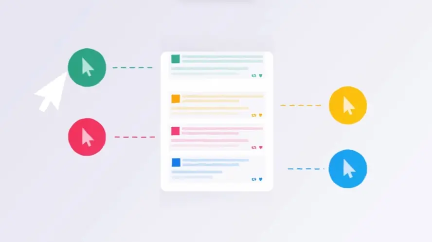
Measuring Real Impact: UI Video Analytics & ROI
Moving past production metrics, teams now focus on the tangible business impact of their Ui Walkthrough Video efforts. Understanding how viewers interact transforms videos from simple assets into powerful tools driving user success and influencing bottom lines. Data reveals a compelling story: users watching onboarding videos finish tasks faster, needing less support intervention. This directly translates to improved user efficiency and reduced operational costs.
True measurement extends beyond view counts. Key metrics reveal genuine viewer engagement and comprehension. Analyzing watch time, completion rates, and crucial drop-off points pinpoints sections where users lose interest or encounter confusion. Click-through rates on embedded calls to action demonstrate the video's effectiveness in guiding users toward desired next steps. Analytics platforms offer second-by-second insights into viewer behavior, invaluable for identifying unclear segments requiring optimization in both the video and potentially the UI itself.
Calculating the overall return on investment for these videos involves comparing creation costs against savings derived from fewer support tickets, faster user onboarding, higher feature adoption rates, and increased conversion rates for trial users. A data-driven approach ensures video strategy aligns with business goals, maximizing value.
Viewers completing tasks quicker reduces demands on customer support teams.
Analyzing drop-off data precisely targets areas needing video or UI clarity improvements.
Tracking click-through rates measures the video's success in prompting user action.
Interactive elements can significantly boost engagement by allowing simulated interaction within the guide.
Measuring impact provides a roadmap for continuous improvement, ensuring videos effectively empower users and deliver measurable business outcomes.
Why Advids for Ui Walkthrough Video?
At Advids, we create compelling Ui Walkthrough Videos that drive results. Our blend of creative storytelling, advanced technology, and proven experience ensures your vision translates into effective animation. We've completed over 3400 successful projects for clients ranging from startups to Fortune 500 companies, including brands like Razorpay, Ola, Mercedes, the United Nations, Continental, and Mercer. Our dedication to client satisfaction is reflected in over 109 five-star Google reviews.
Ui Walkthrough Video Expertise:
12+ Years of Proven Success: With over 3400 completed projects, we understand what makes a Ui Walkthrough Video truly effective. 270+ Ui Walkthrough Videos Created: We've produced between 185 and 470 successful Ui Walkthrough Videos, showcasing our specialized expertise in this area. Trusted by Industry Leaders: We've partnered with diverse clients, from startups to Fortune 500 companies, to bring their Ui Walkthrough Video visions to life.
The Advids Approach to Ui Walkthrough Video:
Customized Solutions: We tailor each Ui Walkthrough Video to your specific needs, brand, and target audience. Creative Storytelling: Our team crafts engaging narratives that captivate viewers and drive action through compelling visuals and storytelling. Cutting-Edge Technology: We utilize the latest software and techniques to create visually stunning and impactful Ui Walkthrough Videos. Collaborative Process: We work closely with you from concept to completion, ensuring your vision is realized in the final product. Strategic Communication: We prioritize clear communication to understand your goals and create Ui Walkthrough Videos that resonate with your target audience.
Ready to unlock the potential of Ui Walkthrough Video for your business with the latest video design trends of 2024? Let Advids be your trusted partner in transforming your ideas into engaging and effective animated experiences.
Checkout some of the projects and work our team at Advids has been producing:
Mastering UI walkthrough videos requires a strategic approach focusing on user experience and clear communication.
defined scope : Focus on core features; avoid overwhelming viewers with unnecessary details. Prioritize clarity.
target user profile : Tailor the language and examples to resonate with the specific user group. Emphasize relevance.
streamlined user flow : Use visual cues and transitions to guide viewers smoothly. Prioritize ease of navigation.
Problem/Solution Clarity: Present the problem and solution concisely and memorably. Prioritize impact.
professional screen recordings : Use high-resolution recordings with clear, concise annotations. Prioritize visual appeal.
concise feature spotlights : Highlight key features using animation or visual emphasis. Prioritize key information.
engaging visual story : craft a narrative that connects emotionally with the viewer. Prioritize emotional connection.
authentic use cases : Show relatable scenarios that demonstrate the UI's value. Prioritize relatability.
Results-Oriented Metrics: Use charts or graphs to visually represent data. Prioritize data visualization.
compelling CTA : Make the call to action clear, concise, and visually prominent. Prioritize clarity and impact.
What makes Ui Walkthrough Video effective?
A clear, concise storyline that mirrors the user journey guides the viewer, beginning with a problem or goal and culminating in a satisfying solution. Strategic use of subtle transitions, such as cross dissolves for section changes and zoom effects to highlight key features, maintains visual flow. 4K screen recordings with consistent frame rates and optimized for clarity, combined with professional-grade editing and consistent branding, ensure visual appeal. Subtle, informative motion graphics guide the viewers eye and reinforce key concepts.
A clear, concise, and authoritative voiceover with a natural, conversational tone complements the visuals, providing concise explanations and maintaining a consistent tone. Emphasize user pain points and how the UI solves them, showcasing the aha moments. Clean, legible on-screen text complements the voiceover, not duplicating it, highlighting key actions and information. Employ techniques that minimize screen clutter and ensure optimal visual clarity.
A well-paced narrative balances conciseness with thorough explanation, keeping viewers engaged and preventing information overload. Ultimately, an effective UI walkthrough video seamlessly blends visual storytelling with clear, concise information, leaving the viewer with a comprehensive understanding of the UIs functionality and value.
How long should your Ui Walkthrough Video be?
Optimize UI walkthrough video length for maximum impact by aligning video type, use case, and funnel stage.
Pre-production Considerations for Determining Video Length:
Demonstrating user interaction naturally, suitable for intuitive apps, realistic style
Consideration/Conversion
Walkthrough Video
1-1.5 minutes
Comprehensive guide, covering all key features, various styles can be used
Consideration/Decision
Tutorial Video
1.5-2 minutes
Step-by-step instructions, best for educational software, flat style or illustrative style
Decision/Action
Explainer Video
45-75 seconds
High-level overview, focusing on core value proposition, kinetic typography style
Awareness/Consideration
How to create Ui Walkthrough Videos?
Craft compelling UI walkthrough videos that resonate with your target audience and achieve measurable results. Mastering these key phases ensures your video delivers maximum impact.
* Define Purpose - Focus on a single, measurable objective to maximize impact.
Target Audience - User personas ensure messaging resonates with the intended viewers.
Narrative Structure - A clear, logical flow keeps viewers engaged and informed.
Visual Style Selection - Consistent branding and aesthetics create a professional image.
Storyboard Creation - A detailed storyboard prevents costly reshoots and ensures quality.
Script Writing - Concise, benefit-driven language keeps viewers focused on value.
Screen Recording - High-resolution footage ensures clarity and professionalism.
Visual Capture - Strategic visuals enhance understanding and memorability.
Animation Integration - Micro-interactions highlight key features and improve comprehension.
Voiceover Recording - A professional voiceover adds credibility and enhances engagement.
Video Editing - Smooth transitions and pacing maintain viewer interest.
Call to Action - A clear, concise CTA drives conversions and maximizes ROI.
Creating Accessible UI Walkthrough Videos for All Audiences
Developing accessible UI walkthrough videos transcends mere compliance; it fosters an inclusive environment that embraces every viewer. Our goal is to enable users of varying abilities to completely comprehend and connect with our interfaces. This necessitates a deep understanding of how diverse audiences interact with digital media and tailoring our video designs to match.
Envision a scenario where a visually impaired individual navigates an e-commerce platform seamlessly, guided by vivid audio descriptions in a UI walkthrough video example. Consider a deaf user grasping the full scope of a new application via accurate captions within an application walkthrough video example. These are the empowering interactions we aim to generate.
Here is how we can elevate the accessibility of our UI walkthrough videos:
Supply Textual Substitutes for Audio: Providing captions and transcripts is vital for audiences who are deaf or hard of hearing. These tools also assist viewers in loud settings or those who prefer reading. Captions render spoken words and sound effects on-screen, whereas transcripts offer a comprehensive textual record of the video's material.
enhance visual clarity: Viewers with diminished vision depend on adequate color contrast and distinct, legible fonts. Select typefaces that are easily readable and guarantee strong differentiation between foreground text and background elements.
Optimize for assistive technologies: Verify that your videos integrate smoothly with screen readers, translating text into speech or braille for visually impaired individuals. Furthermore, architect your UI to support full keyboard navigation, empowering users with limited mobility.
Validate with Diverse User Groups: The most effective method to guarantee true accessibility is to perform usability testing with individuals representing different disabilities. This approach helps pinpoint and rectify any lingering obstacles.
By embedding these accessibility principles, we produce UI walkthrough videos that are not merely educational, but also genuinely inviting and inclusive for all.
The Importance of a Strong Narrative in UI Walkthrough Videos
Crafting a compelling narrative transforms UI walkthrough videos from simple demonstrations into engaging stories. We want our viewers to connect with our product, understand its value, and ultimately, take action. A strong narrative is the key to achieving this.
Let's explore how a well-crafted story elevates the effectiveness of our UI walkthroughs:
Imagine a platform walkthrough video example that seamlessly guides new users through its interface. Or consider UI walkthrough video examples for education that captivate students with interactive lessons . These examples highlight the power of narrative.
establish context : Begin by setting the stage. Clearly define the problem your UI solves. This resonates with viewers facing similar challenges.
showcase the solution : Introduce your UI as the hero of the story. Focus on the benefits, not just the features. How does it improve users' lives?
Guide the Journey: Create a logical flow that takes viewers on a step-by-step journey through the UI. Use visuals, animation, and music to maintain momentum and highlight key features.
connect emotionally : Use relatable scenarios and user personas to build a connection with your audience. Evoke emotion and make your video memorable.
By weaving a compelling narrative, we transform our UI walkthrough videos into powerful tools that engage, educate, and inspire.
The Benefits of Using UI Walkthrough Videos in Marketing
Let's face it, explaining complex software features can be a challenge. But what if we could show, not just tell? That's the power of UI walkthrough videos in marketing. They transform complex functionalities into engaging narratives, boosting user understanding and driving conversions. Imagine using a UI walkthrough video as an explainer video, showcasing your product's key features in a clear and concise way.
Think about how a feature demonstration video can highlight the specific functionalities that set your product apart. This isn't just about listing features; it's about showing them in action, making it easier for potential customers to visualize the value. UI walkthrough videos bridge the gap between telling and showing, creating a more engaging and persuasive experience.
Drive Conversions: By showcasing value, walkthroughs directly influence purchase decisions.
Boost Engagement: compelling visuals and narratives encourage social sharing and brand interaction.
Reduce Support Costs: Self-service learning through videos minimizes the need for customer support inquiries.
Gain a Competitive Edge: Stand out from the crowd with engaging and informative video content that captures attention.
UI walkthrough videos are more than just a trend; they're a strategic investment. They empower us to connect with our audience on a deeper level, driving results and building lasting relationships.
UI Walkthrough Videos for Complex Software Explanations
Explaining complex software can feel like navigating a maze. But what if we could provide a clear, guided tour? That's the power of UI walkthrough videos. Let's explore how to make these videos truly shine when tackling intricate software functionalities. We aim to empower users, not overwhelm them.
Think about those moments when software feels too complicated. That's where we step in. By focusing on user pain points, we can tailor our videos to address specific challenges. For instance, UI walkthrough video examples for healthcare can demystify complex patient portal features, empowering patients to manage their health information effectively.
Now, let's break down the key steps:
Structure a clear narrative. Instead of jumping between features, guide viewers step-by-step. Imagine onboarding new users to project management software. A clear narrative makes the process smooth and engaging.
Visuals are our allies. Use diagrams and animations to simplify complex concepts. Think of a data analytics platform. Visuals can transform raw data into understandable insights.
Highlight benefits, not just features. Show users how the software improves their workflows, not just its technical capabilities. Consider a CRM system. Focus on how it streamlines sales processes, not just its data storage capacity.
Real-world examples bring it home. Show the software in action, addressing relatable scenarios. High-quality software walkthrough video examples can transform user onboarding, reducing support tickets and boosting user satisfaction.
By focusing on user needs and crafting compelling narratives, we transform complex software explanations into engaging learning experiences.
Author & Editor Bio
A video producer with a passion for creating compelling video narratives, Jai Ghosh brings a wealth of experience to his role. His background in Digital Journalism and over 11 years of freelance media consulting inform his approach to video production. For the past 7 years, he has been a vital part of the Advids team, honing his expertise in video content planning, creation, and strategy.
His collaborative approach ensures that he works closely with clients, from startups to enterprises, to understand their communication goals and deliver impactful video solutions. He thrives on transforming ideas into engaging videos, whether it's a product demo, an educational explainer, or a brand story.
An avid reader of modern marketing literature, he keeps his knowledge current. Among his favorite reads from 2024 are "Balls Out Marketing" by Peter Roesler, "Give to Grow" by Mo Bunnell and "For the Culture" by Marcus Collins. His results-driven approach ensures that video content resonates with audiences and helps businesses flourish.