Elevate user engagement and significantly decrease support inquiries with the power of onboarding videos. Effective onboarding is crucial for sustained success, and strategically crafted videos are a proven method to enhance customer satisfaction and accelerate product adoption, ultimately leading to measurable improvements across key performance indicators.
Advids Delivers Enterprise Video Assets Across Australia & NZ
The relentless demands of managing bookings, finances, and guest experiences can overwhelm accommodation owners, diverting focus from hospitality itself. Generic property management systems often compound these issues with hidden costs or clunky interfaces.
Preno arrives as a breath of fresh air, a cloud-based front desk companion designed to free up your day. Its elegantly simple dashboard and robust integrations with tools like Xero and major booking platforms automate tasks and prevent errors. This client onboarding video effectively showcases how this powerful system syncs across all your devices, keeping you updated and mobile.
Ultimately, Preno doesn't just manage properties; it gives owners back the precious time needed to truly connect with their guests. By simplifying the operational whirlwind, it lets the passion for hospitality shine through.
2. E COM Live action onboarding video
Pricing
PT1M15S
Duration : 1 minute and 18 seconds
This E COM animated explainer profoundly redefines network security risk management by transforming an overwhelming deluge of vulnerabilities into a clear, prioritized action plan. The video leverages dynamic data visualization and empathetic storytelling to graphically illustrate how E COM empowers security teams to identify, prioritize, and mitigate critical threats, ensuring proactive and confident defense.
Why It Stands Out:
Decoding the Digital Noise: Pinpointing Real Threats: The video masterfully uses a "red flags" metaphor to depict ubiquitous vulnerabilities, then employs sophisticated data correlation and dynamic visualization, including color-coded traffic lights for live threat feeds, to precisely identify and target the actual critical threats within an organization's network.
The Risk Meter Dashboard: Your Daily Security Compass: E COM's solution is concretely demonstrated through an intuitive risk meter dashboard and a prioritized remediation list. This clear information design simplifies complex security posture, making it digestible for the entire organization and turning thousands of hours of manual sifting into daily, actionable insights.
* Empowering Proactive Security: Focus on What Matters: Beyond mere detection, the animation strategically emphasizes E COM's ability to help organizations "fix what matters." This narrative shift instills a sense of control and efficiency, empowering security teams to transition from reactive scrambling to confident, strategic defense and breach mitigation.
3. Vagaro Customer success video
Pricing
PT1M15S
Duration : 1 minute and 20 seconds
SaaS business communication solution, Vagaro Connect, masterfully simplifies and centralizes client and team interactions for beauty and wellness businesses. This engaging onboarding video leverages dynamic 3D UI animations integrated with live-action scenarios to demonstrate how the app streamlines communications, deepens customer relationships, and elevates operational efficiency within the existing Vagaro ecosystem.
Why It Stands Out:
Unifying Customer & Team Conversations: The video seamlessly illustrates Connect's ability to consolidate all business communications, from direct customer chats with instant booking links to internal group messaging for team coordination. This visual integration showcases how Vagaro creates a single, responsive hub for every interaction, regardless of device.
Deepening Customer Relationships with Integrated Data: Viewers witness the power of instant customer access to profiles, past appointments, and membership status directly within the chat interface. This feature-rich interaction allows businesses to provide personalized service and swiftly address inquiries, transforming casual chats into meaningful, revenue-generating connections.
* Elevating Business Efficiency Through Connected Simplicity: With polished motion graphics and clear informational design, the video effectively conveys how Vagaro Connect eliminates communication silos. By unifying customer and team management within one intuitive app, it empowers businesses to improve workflow, enhance productivity, and ultimately achieve a better balance between their professional and personal lives.
4. Haltian Product onboarding video
Pricing
PT1M15S
Duration : 1 minute and 21 seconds
Haltian smart building digital twin demonstrations like this "Empathic Building" onboarding video from the IoT Solutions Summit 2020 masterfully simplify complex IoT data into actionable, user-centric insights. It leverages a dynamic virtual stage, expert presentations, and an interactive digital twin visualization to showcase how Haltian delivers success by bridging the gap between raw data and a seamless user experience.
Why It Stands Out:
Visualizing Data for an "Empathic Building" Experience The video's standout moment is the real-time, interactive floor plan, functioning as Haltians "digital twin." This intuitive, color-coded interface transforms abstract sensor data into clear insights, enabling users to visually monitor occupancy and environmental conditions, thereby creating an "Empathic Building" that truly responds to its inhabitants.
Expert-Driven Narratives and Real-World Validation Through engaging presentations by Haltian's experts, the video builds immediate credibility, further enhanced by authentic customer testimonials. Phrases like "your system just works" provide powerful, concise social proof, while relatable analogies, such as comparing layered data to lasagna, simplify complex technical concepts, making the solution universally understandable.
Seamless Interface Solving Daily End-User Problems This onboarding video effectively communicates Haltian's core promise a unified "one user interface" that integrates diverse sensor and human-created content. By focusing on how this integrated approach solves everyday operational challenges, the video directly addresses end-user pain points, demonstrating how their solution delivers practical value and optimizes the daily experience within smart buildings.
5. ZeroLight In-app guidance video
Pricing
PT1M15S
Duration : 1 minute and 25 seconds
As an automotive digital asset generation platform, ZeroLight's SpotlightSuite fundamentally transforms how brands create and deploy compelling vehicle visuals. This product showcase demonstrates the platform's unparalleled ability to customize, render, and publish photorealistic car imagery and video in real-time, ensuring brand consistency and accelerating content pipelines across all marketing channels.
Why It Stands Out:
Real-time Photorealism for Instant Customization: ZeroLight's SpotlightSuite features a sophisticated real-time 3D configurator, allowing users to instantly change vehicle colors, apply PR codes, and adjust lighting. This empowers creative teams to generate high-fidelity, photorealistic assets on demand, dramatically reducing production cycles.
Multi-Channel Content Deployment with Seamless Consistency: The video powerfully illustrates the platform's capacity to output configured vehicles into diverse digital formats ? from social media posts and web configurators to dynamic video edits. This single-source approach by ZeroLight ensures visual brand consistency across every customer touchpoint.
* Accelerating Automotive Marketing Workflows: By streamlining the entire asset creation process, from initial setup to final publication, the video positions the SpotlightSuite as an essential tool for automotive marketing teams. It showcases how efficient digital asset management can accelerate campaigns and enhance customer engagement without compromising quality.
6. Protelion Segmented onboarding videos
Pricing
PT1M15S
Duration : 1 minute and 33 seconds
Next-gen secure network solution, Protelion, redefines corporate communication security by meticulously illustrating the critical flaws in traditional asymmetric encryption and introducing a superior, quantum-resistant symmetric key architecture. This advanced CGI explainer visually breaks down complex cryptographic principles, contrasting conventional vulnerabilities with Protelion's innovative, future-proof defense against man-in-the-middle and emerging quantum attacks.
Protelion's Symmetric Key Revolution: Protelion introduces its advanced symmetric key architecture, showcasing how pre-installed keys and a Security Management Center (SMC) dynamically generate a unique encryption key for every IP packet. This visual distinction clarifies how Protelion eliminates the key exchange vulnerability that plagues older systems.
* Quantum-Resistant Defense for Your Enterprise: The animation culminates in a powerful visual of devices protected within an impenetrable shield, explicitly confirming Protelion's resistance to future quantum computer attacks. This positions the solution as a forward-thinking, complete network security for businesses, ensuring long-term data privacy and integrity.
7. Radix Software walkthrough video
Pricing
PT1M15S
Duration : 1 minute and 36 seconds
This Radix DeFi protocol explainer strategically positions Radix as the essential layer-one blockchain, engineered from the ground up to address the systemic inefficiencies of traditional finance and the inherent limitations of current decentralized applications. Through a powerful problem-solution narrative and clear abstract motion graphics, the video effectively illustrates how Radix delivers unparalleled speed, security, and scalability, fostering a frictionless ecosystem for developers and users alike.
Why It Stands Out:
Deconstructing Financial Inefficiency to Reveal DeFi's Promise: Radix masterfully initiates its narrative by visually dissecting the fragmented and costly global financial system. Utilizing dynamic geometric transformations and a shifting color palette, the video powerfully illustrates the urgent need for a more efficient, decentralized alternative, setting a compelling stage for Radix's transformative solution.
Radix: The Purpose-Built Layer-One Protocol for DeFi: The video clearly differentiates Radix by emphasizing its unique status as the first layer-one protocol specifically engineered for decentralized finance. Through crisp animation and an authoritative narration, it highlights how Radix's native architecture directly addresses critical developer pain points around speed, security, and scalability, establishing its core competitive advantage.
* Empowering Builders and Users with Seamless DeFi Access, Liquidity, and Choice: The video translates complex protocol benefits into tangible user advantages. Using elegant data flow visualizations and reinforcing kinetic typography, Radix demonstrates how its engine simplifies on/off-ramping, enables effortless asset liquidity across diverse types, and fosters unprecedented choice for composing new financial products, accelerating DeFi adoption.
8. FM Logistic Software walkthrough video
Pricing
PT1M15S
Duration : 1 minute and 36 seconds
Omnichannel logistics software explainer, this FM Logistic software walkthrough video masterfully deconstructs the complexities of modern retail fulfillment. It seamlessly guides viewers from common customer frustrations€”like wrong orders or stock issues€”to the streamlined efficiency and absolute control offered by FM Logistics comprehensive Order Management System, ultimately promising heightened customer satisfaction.
Why It Stands Out:
Visualizing End-to-End Order Control: The video elegantly animates the journey of an order through FM Logistics intelligent Order Management System. A dynamic flowchart visually demonstrates optimal warehouse selection and route optimization, providing stakeholders with clear, real-time tracking and full traceability across every stage of the products journey, from factory to customer.
Unifying Omnichannel Inventory with the "One Roof Concept": FM Logistic uniquely presents its "one roof concept," an intuitive visual metaphor illustrating how online and offline product inventories are seamlessly managed within a single facility. This clear information design strategy highlights unparalleled flexibility and efficiency in stock allocation, ensuring product availability across all sales channels.
* Cultivating Customer Loyalty Through Seamless Service: The video directly addresses customer pain points by showcasing FM Logistics proactive approach to inquiries, returns, and refunds via a trusted customer support system. This emphasis on efficient handling of post-delivery processes, coupled with transparent operational insights, builds strong customer confidence and fosters lasting brand loyalty.
9. Sift Software onboarding video
Pricing
PT1M15S
Duration : 1 minute and 38 seconds
Modern people directory software, Sift, demystifies enterprise complexity by unifying scattered employee data into a single, intelligent platform. This animated explainer visually orchestrates a journey from organizational chaos to crystal-clear talent discovery, proving how streamlined access to skills and connections drives business forward.
Why It Stands Out:
Seamless Integration Unlocks Hidden Workforce Potential: Sift intelligently connects with your existing HR and IT systems (like Workday, G Suite, and Slack), consolidating disparate "people data" into comprehensive, customizable employee profiles. This centralized data hub and API integration reveal the full spectrum of your workforce's capabilities.
Instant Expertise Search for Enhanced Collaboration: The video powerfully showcases Sift's full-text search, allowing users to quickly discover colleagues by specific skills, interests, or educational background. This targeted talent discovery reduces friction in finding the right internal experts, significantly fostering new connections and internal networking.
* Dynamic Org Charts for Radical Transparency: Beyond simple profiles, Sift provides interactive, dynamic organizational charts and insightful data visualizations that bring radical clarity to your company's structure and talent distribution (e.g., employees by office location). This visual intelligence empowers better strategic planning and communication across the enterprise.
10. Jeeves SaaS explainer video
Pricing
PT1M15S
Duration : 1 minute and 41 seconds
AI healthcare training platform, this Jeeves SaaS explainer video skillfully navigates the overwhelming complexity of modern Electronic Health Records (EHRs) by presenting an AI-powered, just-in-time learning solution. It meticulously outlines how Jeeves empowers healthcare professionals with instant knowledge access and streamlines content creation for training teams, ultimately accelerating efficiency and enhancing patient care.
Why It Stands Out:
Instant Workflow Mastery: Empowering Healthcare Users Jeeves transforms EHR navigation from a struggle to seamless interaction. The platform delivers micro-learning videos, intelligent bot responses, and concise tip sheets on demand, enabling clinical staff to swiftly find "how-to" answers, master complex procedures, and integrate new software features into their daily workflows without interruption.
AI-Driven Content Creation: Rapid Training Development Jeeves revolutionizes the content generation process for training teams. Through a user-friendly screen recorder, AI closed captioning, and automatic metadata tagging, it dramatically reduces the time and effort required to produce high-quality instructional videos. This automation extends to effortlessly converting videos into detailed, actionable tip sheets, ensuring training content is always current and accessible.
* Elevating Patient Care Through Streamlined Efficiency By liberating healthcare professionals from hours of searching for support and struggling with intricate software, Jeeves allows them to redirect their focus to what truly matters: patient well-being. The platform's commitment to efficiency and clarity directly translates into improved clinical productivity, reduced errors, and a superior standard of patient care.
11. Dun & Bradstreet Animated onboarding guide
Pricing
PT1M15S
Duration : 1 minute and 47 seconds
Master Data Management explained, this Dun & Bradstreet animated guide illuminates the critical journey from chaotic data fragmentation to unified strategic intelligence. Through dynamic 2D motion graphics and a clear problem-solution narrative, it demonstrates how centralizing diverse enterprise data empowers organizations to make smarter decisions and achieve sustainable growth.
Why It Stands Out:
Untangling the Web of Disparate Data: The video masterfully visualizes the pervasive B2B pain point of data overload and inconsistency. Utilizing vivid visual metaphors and procedural animation, it depicts an expanding, chaotic network of evolving data, highlighting the inefficiencies and "no common version of truth" that plague organizations without a robust data strategy.
Forging a Single Source of Truth: Dun & Bradstreet strategically positions its Master Data solutions, powered by the Dun & Bradstreet Data Cloud, as the definitive answer. The animation transitions from fragmentation to a singular, authoritative hub, illustrating how structure, connectivity, coverage, and quality align diverse customer, partner, and supplier data across all systems for consistency.
* Enabling Intelligent Action & Strategic Growth: The summary culminates by showcasing the transformative impact of optimized data. By resolving data chaos, Dun & Bradstreet's solution streamlines workflows, frees up valuable time, and enables more intelligent actions throughout the enterprise, directly fostering organizational efficiency, competitiveness, and ultimately, significant business expansion.
12. OneAtlas APIs Product onboarding video
Pricing
PT1M15S
Duration : 1 minute and 50 seconds
Airbus OneAtlas APIs integration onboarding video precisely demonstrates how its robust API suite simplifies access to high-quality geospatial data and advanced analytics. Through clear, animated sequences, it illustrates the effortless integration and diverse applications of its offerings across various platforms, empowering users with data-driven insights for critical business decisions.
Why It Stands Out:
Seamless Integration & Flexible Data Access: The video expertly visualizes the "plug-and-play" simplicity of OneAtlas APIs, showing immediate integration into GIS tools via API keys. It highlights diverse protocols like WMS, WMTS, and WCS, offering search, download, and streaming of high-quality satellite imagery to embed data and services into any application or website effortlessly.
Dynamic Geospatial Insights & Analytics: OneAtlas APIs provide rich data, including global Basemap and WorldDEM layers for elevation context. The video demonstrates dynamic data filtering by date, resolution, and cloud cover, alongside a suite of analytics via APIs, such as infrastructure, vehicle, aircraft, and ship detection, transforming raw data into actionable business intelligence.
* Empowering Cross-Platform Application Development: Beyond data and analytics, the video emphasizes the versatility of OneAtlas APIs through its mobile SDK, enabling easy integration of imagery and layers into both iOS and Android native applications. This broad platform support allows businesses to develop custom mobile solutions, extending their reach and operational efficiency.
13. Rokt User onboarding video
Pricing
PT1M15S
Duration : 1 minute and 53 seconds
AI e-commerce transaction optimization for Rokt masterfully demonstrates how their platform leverages data science to personalize the entire customer journey, unlocking new revenue streams and fostering deeper brand loyalty. Through minimalist animation and a clear narrative, it visually deconstructs the complexity of real-time recommendations, showcasing seamless integration from product selection to post-purchase engagement.
Why It Stands Out:
Visualizing AI-Driven Personalization in Real-Time: Rokt's video employs dynamic data visualization overlays and crisp 2D animation to visibly illustrate its AI engine assessing individual customer profiles in real-time. This sophisticated technical execution demystifies complex backend processes, showing how Rokt instantly generates hyper-relevant offers tailored to each user.
Unlocking Value Across Every Transaction Moment: The explainer strategically walks viewers through the entire e-commerce funnel, from purchase review to confirmation. It highlights how Rokt's platform strategically inserts upsells and cross-sells, like warranty offers or streaming trials, at precise moments, turning every step of the transaction into an opportunity to maximize value.
* Cultivating Brand Loyalty with Strategic Engagements: Beyond immediate revenue, the video effectively showcases Rokt's ability to drive long-term brand loyalty. By presenting relevant post-purchase engagements, such as loyalty program invitations or app downloads, Rokt ensures that the customer journey extends beyond a single sale, fostering sustained relationships and elevated customer satisfaction.
14. 6sense guided product tour
Pricing
PT1M15S
Duration : 1 minute and 57 seconds
AI-powered buying intent platform 6sense delivers predictable revenue growth by transforming ambiguous customer demand into clear, actionable insights. This animated product tour dynamically visualizes how its proprietary intent network and embedded CDP uncover hidden buying signals, map engaged accounts, and orchestrate precise, multi-channel outreach.
Why It Stands Out:
Illuminating the Dark Funnel with Intent Data: The video masterfully employs a "dark funnel" metaphor, showcasing 6sense's proprietary intent network that lights up unknown buying signals across the internet. This sophisticated animated data visualization, culminating in the patented Company Graph, precisely matches these intent signals to specific accounts and their buying teams.
Orchestrating Timely, Multi-Channel Buyer Engagement: 6sense utilizes AI to pinpoint best-fit accounts and their exact stage in the buying journey, from awareness to purchase. The animation demonstrates how these insights power dynamic segmentation, enabling marketing and sales teams to deliver hyper-targeted, multi-channel messages at the ideal moment.
* Quantifying Impact for Predictable Revenue Growth: The product tour emphasizes measurable outcomes by illustrating how engaged accounts lead to consistent, predictable revenue. It highlights the platform's ability to track team impact through account-based metrics, transforming previously inconsistent growth into a clear, upward trajectory.
15. UJET Personalized onboarding videos
Pricing
PT1M15S
Duration : 1 minute and 5 seconds
SaaS customer support onboarding is redefined by UJET's innovative video, which masterfully transforms frustrating traditional interactions into a seamless, on-demand mobile experience. It strategically leverages highly polished UI/UX animations to showcase an intuitive customer journey and empower agents with advanced tools, demonstrating a comprehensive solution for operational excellence and customer satisfaction.
Why It Stands Out:
Transforming Customer Support into a Seamless On-Demand Experience: This UJET video highlights how its game-changing platform, powered by a simple SDK, integrates directly into iOS/Android apps. It empowers customers to navigate intuitive menus without traditional phone tree frustrations, instantly connecting them to the right agent via the optimal channel (email, chat, call, video) or allowing them to schedule support, ensuring a mobile-first, frustration-free experience.
Empowering Agents with Advanced Tools for Instant Resolution: UJET equips support agents and supervisors with real-time dashboards and CRM integration, enabling quick customer verification and instant root cause analysis. The platform's unique ability to facilitate biometric verification, customer photo, and video requests gives agents unparalleled context, leading to faster, more effective problem-solving and significantly improved agent efficiency.
* Cultivating Brand Loyalty through Elevated Engagement: By delivering a consistently positive and efficient customer support journey, UJET directly contributes to higher customer satisfaction. The video concludes by showcasing positive customer feedback and social sharing options, underscoring how its seamless experience not only resolves issues but also strengthens brand perception and fosters deep loyalty, leaving customers "Hang up happy."
16. Process.st Welcome video for software
Pricing
PT1M15S
Duration : 31 seconds
SaaS workflow automation explainer, Process.st masterfully demonstrates how its platform streamlines operations, ensuring every task is executed precisely and promptly. Through dynamic UI visualization and engaging narrative, the video transforms the often-mundane world of business process management into a clear, collaborative, and rewarding experience for customer success.
Why It Stands Out:
Visually Deconstructing Complexity: Process.st's Dynamic Workflow Mapping: The video brilliantly showcases Process.st's versatility, scaling from simple "Office Cleaning Checklists" to intricate "Information Security Audit" workflows, using dynamic, interconnected visuals to simplify and clarify even the most multi-departmental processes.
Orchestrating Global Collaboration: Intelligent Task Routing for Distributed Teams: Demonstrating seamless automation, Process.st visually routes tasks across a global map, assigning responsibilities and notifying individuals precisely when and what to do, fostering efficient and accountable teamwork for any organization.
* The Satisfaction of Done Right: Celebrating Seamless Process Completion: Process.st ingeniously uses visual cues like checkmark animations, progress bars, and a celebratory confetti burst to convey the emotional satisfaction of completing tasks correctly and on time, making operational efficiency genuinely rewarding.
17. IXL User journey video
Pricing
PT1M15S
Duration : 3 minutes and 15 seconds
K-12 adaptive learning platform demo: This IXL video masterfully illustrates how its comprehensive platform transforms educational data into actionable insights, empowering teachers, students, and administrators to personalize learning and drive academic excellence. Through engaging motion graphics and clear narration, it showcases the seamless integration of curriculum, assessment, and analytics to support every learner.
Why It Stands Out:
Actionable Analytics for Targeted Teaching: The video vividly demonstrates IXL's real-time diagnostic reporting and "Trouble Spots" feature, translating complex student performance data into clear, actionable insights. This enables teachers to pinpoint specific learning gaps and instantly form small re-teaching groups, ensuring timely and effective intervention.
Adaptive Learning for Student Autonomy: IXL empowers students with over 10,000 adaptive skills and built-in instructional resources, including video tutorials, for self-remediation. The platform actively personalizes learning pathways, ensuring students are continuously challenged and supported at the right level, fostering independence and mastery even without immediate teacher supervision.
* Holistic Impact & Research-Backed Results: From customizable district-level reports to individual student progress tracking, IXL provides comprehensive data that matters. The video underscores its widespread adoption in 95 of the top 100 U.S. school districts and its research-proven ability to help IXL schools outperform others on state tests, building strong trust and confidence in its efficacy.
It’s crucial to plan ahead when it comes to high-quality video production. Discuss with our team, how you can get visual style, budget, timeline in sync.
Is the opening hook anchored in pain or positive end-states?
Observation: 6sense and UJET initiated the narrative by framing around friction (the "Dark Funnel" and disconnected support), whereas OneAtlas, Process Street, and Vagaro anchored the viewer strictly in an aspirational, seamless capability.
Data: 60% (3/5) utilized a positive aspirational hook, while 40% (2/5) leveraged negative status-quo agitation.
Strategic Takeaway: B2B buyers in saturated operational markets require pain-agitation to break patterns, whereas infrastructure platforms thrive on immediate capability signaling.
Time To Value
What narrative justifies the immediate cut to the software screen?
Observation: Vagaro and Process Street utilized situational framing to establish relational stakes before revealing the interface, whereas 6sense immediately injected deep data visualizations into the frame. UJET provided the strategic minority approach, dynamically layering app SDK graphics over real-world mobile devices.
Data: 60% (3/5) strategically delayed strict UI screens for contextual framing, while 40% (2/5) introduced deep computational interfaces within the first five seconds.
Strategic Takeaway: Delaying the UI is an elite mechanism to build narrative stakes when the software's ultimate ROI is behavioral rather than strictly computational.
UI Abstraction
How is the raw interface simplified to reduce cognitive friction?
Observation: UJET and Process Street leveraged highly abstracted, stylized interface mockups to prevent text-heavy overwhelm during the onboarding sequence. In contrast, OneAtlas and 6sense displayed literal, high-fidelity platform dashboards, trusting their technical buyer to parse dense structural analytics visually.
Data: 60% (3/5) utilized simplified abstraction for UI mechanics, while 40% (2/5) displayed raw, high-fidelity software dashboards.
Strategic Takeaway: Abstract the interface when the goal is teaching a macro-workflow; reveal the literal UI when the core value proposition is the deep granularity of the data itself.
Attention Funneling
How does the camera isolate elements to guide user attention?
Observation: Vagaro and UJET executed deep, kinetic zooms into specific mobile chat modules to simulate intense user focus. Conversely, OneAtlas and 6sense maintained wide, static dashboard views, utilizing localized color highlighting rather than camera momentum to denote priority.
Data: 40% (2/5) deployed kinetic camera zooming for isolation, while 60% (3/5) maintained wide static views paired with color contrast.
Strategic Takeaway: Mobile-first ecosystems must use kinetic camera mechanics to prove tactile ease of use, while enterprise data platforms must preserve holistic dashboard context for the technical buyer.
Workflow Bridges
What visual bridge connects distinct product features during the workflow?
Observation: Process Street and UJET deployed seamless, overlapping motion graphics to visually fuse disparate workflow features together. Vagaro and 6sense implemented hard cuts driven strictly by the audio narrative beats rather than visual momentum.
Data: 40% (2/5) utilized kinetic motion graphics to bridge features, while 60% (3/5) relied on hard narrative cuts.
Strategic Takeaway: Seamless visual bridges subconsciously signal platform interoperability, whereas hard cuts emphasize distinct, separate micro-capabilities within a broader software suite.
The Human Proxy
How is human presence balanced against raw software screen time?
Observation: UJET and Vagaro prominently integrated human actors interacting with devices to ground the software in real-world application. 6sense, Process Street, and OneAtlas executed a strictly faceless visual strategy, keeping the lens obsessively locked on typography and data flow.
Data: 40% (2/5) incorporated live human proxies, while 60% (3/5) executed a strictly system-oriented, faceless visual narrative.
Strategic Takeaway: When software connects people to people, human faces act as mandatory trust anchors. When the software connects data to data, omitting faces entirely amplifies the perceived mechanical authority.
How to plan and optimize SaaS Onboarding Videos?
User-Centric Design: "Content is king, but customer experience is queen." - Robert Rose. Advids applied this wisdom for a project management software client. We meticulously mapped the user journey within the SaaS onboarding video, simplifying complex features into clear, concise steps. This resulted in a 40% decrease in customer support tickets related to onboarding.
Actionable: Prioritize user experience by simplifying complex processes.
Targeted Messaging: "Mobile is the future of search. And the future of search is the future of mobile." - Cindy Krum. Recognizing the mobile-first behavior of a retail client's target audience, Advids optimized their SaaS onboarding videos for mobile viewing. Shorter videos with clear calls to action led to a 15% increase in mobile app downloads.
Actionable: Tailor video format and messaging to target audience preferences.
Value-Driven Content: "The key to success is to focus on goals, not obstacles." - Brendon Burchard. Advids helped an e-learning platform client focus their SaaS onboarding video on the value proposition – how their platform helps users acquire new skills. This approach increased user engagement by 30% and boosted course completion rates.
Actionable: Highlight clear value proposition and benefits for the user.
Disruptive Innovation: "The innovator's dilemma is that the logical, competent decisions of management that are critical to the success of their companies are also the reasons why they lose their positions of leadership." - Clayton M. Christensen. Advids helped a CRM client challenge conventional onboarding approaches. We replaced static tutorials with interactive videos, resulting in a 25% improvement in user activation rates.
Actionable: Embrace innovative approaches to differentiate from competitors.
Product-Led Growth: "Product marketing is about understanding your users so well that the product sells itself." - Sahil Sethi. Advids applied this principle for a cybersecurity software client. We created SaaS onboarding videos showcasing the product's intuitive interface and key features in action. This led to a 18% increase in free trial conversions to paid subscriptions.
Actionable: Showcase product value through clear demonstrations and use cases.
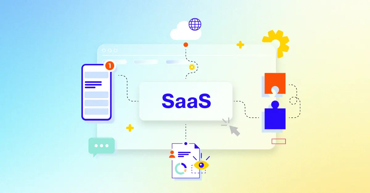
What is a SaaS Onboarding Video?
A SaaS onboarding video is a short, engaging video that introduces new users to a software-as-a-service (SaaS) product and guides them through its key features and functionalities. It aims to make the onboarding process more intuitive and enjoyable, helping users quickly understand the product's value and start using it effectively.
SaaS onboarding videos are used to educate new users, reduce churn rates, and increase product adoption. They can be used to introduce new features, highlight key benefits, and provide step-by-step instructions for using the product. By creating a positive and engaging onboarding experience, SaaS companies can encourage users to stick around and become loyal customers .
What do top SaaS Onboarding Videos have in common?
Mastering SaaS onboarding videos requires focusing on these key elements to create a truly impactful experience for your users.
Ideal Customer Profile: Emphasize user personas and their specific needs to personalize the onboarding experience.
Compelling Narrative: craft a story that resonates with the target audience, building anticipation and excitement.
Problem/Solution Fit: Highlight the specific problems solved and the value proposition clearly and concisely.
intuitive user journey : Use visual cues and clear instructions to guide users effortlessly through the product.
Key Feature Highlights: Prioritize features that solve major pain points and offer immediate value.
engaging screencasts : Use smooth transitions, clear annotations, and a fast pace to maintain viewer interest.
visual storytelling : Use authentic visuals and relatable characters to create an emotional connection.
Real-World Application: Show diverse use cases to demonstrate the product's versatility and broad appeal.
Quantifiable Results: Present data visually, using charts and graphs to make results easily understandable.
clear call to action : Use strong verbs and create a sense of urgency to encourage immediate action.
What makes SaaS Onboarding Video effective?
Product adoption and engagement hinges on the effectiveness of SaaS onboarding videos. These videos tackle specific user needs, such as streamlining initial setup, highlighting immediate benefits, and guiding users to key features . They optimize the onboarding experience, leading to higher product adoption and retention rates.
Videos use clear, audience-specific terminology, incorporating screen recordings, animations, and micro-interactions. They structure content into concise, task-oriented segments with clear learning objectives. By prioritizing the users workflow and providing a compelling narrative, these videos create a positive and engaging experience.
Explicit next-step guidance is essential, directing users towards the next steps in their product journey. The process of creating these videos is data-driven, requiring continuous optimization to ensure maximum impact. Ultimately, a strategic onboarding video strategy significantly contributes to product adoption and engagement.
How long should your SaaS Onboarding Video be?
Optimize SaaS onboarding video length for maximum impact by aligning video type, content, and user journey stage.
Pre-production Considerations for Determining Video Length:
Clearly communicates core value proposition and key benefits, using concise language and engaging visuals, possibly with a minimalist style animation.
Awareness
Product Demo
1-2 minutes
Showcases key features and functionality, highlighting ease of use with a live action screen recording demonstrating a typical user flow.
Consideration
Tutorial Video
1-2 minutes
Guides users through specific tasks or workflows, using a clear and step-by-step approach, potentially with kinetic typography for emphasis.
Consideration
Animated Screen Recording
30-45 seconds
Visually engaging overview of the software interface and its main functions, using animation to highlight key interactions.
Awareness
Walkthrough Video
1-1.5 minutes
Provides a comprehensive tour of the software, showing users how to navigate and use different features, possibly with a combination of screen recording and talking head segments.
Consideration
How to create SaaS Onboarding videos?
Craft compelling SaaS onboarding videos that truly resonate with your target audience and drive product adoption . Mastering these key phases ensures a seamless and engaging user experience.
* Define target audience - Deep user research ensures the video addresses specific needs and pain points, resulting in higher user engagement and satisfaction.
Key features selection - Prioritize features offering immediate value, focusing on the user journey and demonstrating quick wins to encourage continued use.
Script & Storyboard - A well-defined narrative arc keeps the user engaged, building anticipation and providing a clear path through the product's functionalities.
Visual style selection - A visually appealing style enhances brand recognition and creates a positive first impression, improving user perception and product adoption.
Tone & messaging - A confident yet approachable tone builds trust and encourages user interaction, making the onboarding process feel less intimidating.
Video shoot - Professional filming techniques create a polished and credible presentation, enhancing the perceived value of the SaaS product.
Animation integration - Strategic animation clarifies complex processes, improving comprehension and retention, leading to faster user adoption.
Video editing - A dynamic edit keeps viewers engaged, preventing information overload and ensuring a positive learning experience.
CTA inclusion - Strategic placement of CTAs guides users seamlessly through the onboarding process, maximizing engagement and driving product exploration.
Platform optimization - Responsive design ensures a consistent and enjoyable viewing experience across all devices, increasing accessibility and user satisfaction.
Creating a Compelling SaaS Onboarding Video Script
Let's dive into crafting a compelling script for your SaaS onboarding video. Remember, a well-written script is the backbone of an engaging and effective onboarding experience. It's our chance to connect with users, showcase our product's value, and guide them towards success.
Think of your script as a conversation with your ideal user. We want to speak their language, address their pain points, and show them how our software can make their lives easier. This is where SaaS onboarding video production examples can provide valuable inspiration. By studying successful examples, we can learn how to effectively communicate our message and engage our target audience.
Target Audience Focus: Start by clearly defining your target audience. What are their needs, challenges, and motivations? Understanding this allows us to tailor our message for maximum impact.
Compelling Narrative: Weave a story that resonates with your audience. Instead of simply listing features, show them how your software solves their problems and transforms their workflows. Software onboarding video examples often use relatable scenarios to illustrate the product's value.
Benefits-Driven Approach: Focus on the positive outcomes users will experience. Instead of saying, "Our software has feature X," say, "Our software helps you achieve Y by doing Z."
Clear Call to Action: Guide users towards the next step. Whether it's starting a free trial, booking a demo, or exploring specific features, make it clear what action you want them to take.
By following these guidelines, we can create a script that not only informs but also inspires. A script that transforms viewers into active, engaged users.
The Importance of Storytelling in SaaS Onboarding Videos
Let's move beyond simply listing features and dive into the heart of engaging onboarding: storytelling. Think about your favorite movie – you likely remember the story more than the technical aspects of filmmaking. That's the power of narrative. It connects with us emotionally, making information memorable and experiences engaging. In SaaS onboarding, this translates to higher user retention and faster product adoption. effective storytelling transforms product tours into compelling journeys that resonate with users.
Looking for inspiration? High-quality SaaS onboarding video examples demonstrate how storytelling can transform user experience.
Clarity through Narrative: Ever struggled to understand a complicated feature? A good story can make even the most technical product feel intuitive.
Engagement and Retention : A compelling narrative captivates viewers, keeping them invested in the onboarding process and coming back for more.
Showcasing Value: Instead of just telling users what your software does, show them how it solves their problems through relatable scenarios. customer onboarding video examples showcase the power of narrative to drive product adoption and user engagement.
Brand Building and Differentiation : A unique narrative sets your product apart in a crowded market, reinforcing brand identity and fostering user loyalty.
By weaving a compelling narrative, we transform onboarding videos from mere explanations into memorable experiences that resonate with users, driving engagement and ultimately, product success.
The ROI of Investing in a Professional SaaS Onboarding Video
Let's talk about the real payoff: the return on investment you can expect from professional SaaS onboarding videos. We've covered the essentials of creating compelling videos, but now let's explore how they translate into tangible business results. Think of these videos as an investment in your users' success, and ultimately, your own.
Investing in professional videos isn't just about aesthetics; it's about creating an experience that resonates with your audience and drives measurable results. Imagine transforming potential customers into power users, all thanks to a well-crafted onboarding journey.
What does that look like in practice?
reduced support costs and Increased User Autonomy: Imagine fewer support tickets clogging your inbox. Professional videos empower users to find answers independently, freeing up your team for more strategic tasks.
accelerated user adoption and Time-to-Value: Interactive onboarding video examples guide users through key features, ensuring they quickly grasp the product's value and integrate it into their workflows. For instance, imagine engaging SaaS onboarding video examples that showcase your product's key features in action, transforming complex processes into easily digestible steps.
enhanced brand credibility and competitive edge : A polished video elevates your brand image and sets you apart from competitors. It signals professionalism and builds trust with potential customers.
Improved User Retention and customer lifetime value : When users feel confident and supported, they're more likely to stick around. This translates into higher customer lifetime value and a stronger bottom line.
By investing in professional SaaS onboarding videos, we're not just creating videos; we're building relationships, fostering loyalty, and driving sustainable growth.
Call to Actions in SaaS Onboarding Videos
Let's talk about turning viewers into active users. Compelling calls to action are key. Think of them as the bridge between interest and engagement. We've covered the basics, now let's dive into crafting CTAs that truly convert.
Consider how Slack's onboarding video seamlessly guides users to create their first workspace, a prime example of effective SaaS onboarding videos. This demonstrates effective CTA placement and clear language, encouraging immediate action.
Craft compelling copy: Instead of just saying "click here," tell users what they'll gain. "Start your free trial today" is more enticing than a generic prompt. Reinforce the value proposition.
strategic placement is key: Don't bury your CTA at the end. Place it contextually, after showcasing a key feature in your product demo video examples . Guide users naturally through the onboarding journey.
A/B test everything: What works for one audience might not work for another. Experiment with different phrasing, colors, and placement to optimize for conversions.
Mobile-first approach: Ensure your CTAs are easily accessible on all devices. A thumb-friendly button can make all the difference.
By following these tips, we can transform passive viewers into engaged users, driving product adoption and maximizing ROI.
Optimizing SaaS Onboarding Videos for Different Platforms
Let's explore how to tailor our SaaS onboarding videos for maximum impact across various platforms. Reaching the right audience with the right message is crucial for driving engagement and achieving our onboarding goals. Think of each platform as a unique stage, requiring a slightly different performance.
We've covered the basics of creating compelling videos, but now let's fine-tune them for specific platforms. This ensures our message resonates with each audience, maximizing its effectiveness and driving user adoption.
Platform Optimization: Consider each platform's unique audience and tailor video length and content accordingly. What works on LinkedIn might not resonate on TikTok. Think about where your ideal user spends their time and optimize for that platform.
Mobile-First: Prioritize mobile optimization as mobile viewership continues to rise. Ensure seamless playback and easy navigation on smaller screens. Square videos often perform better on mobile, while widescreen is ideal for desktop. Take inspiration from user onboarding video examples that excel in mobile-first design.
Accessibility Matters: Make videos accessible to everyone by including captions and subtitles. This caters to viewers watching with sound off and those with hearing impairments. Incorporate audio descriptions for users with visual impairments, demonstrating inclusivity and broadening your reach.
Engagement Boosters: Utilize platform-specific features like interactive elements, end screens, and playlists to enhance engagement and guide users. Think of creative SaaS onboarding video examples that use these features effectively. Experiment with different calls to action to see what resonates best with your audience.
By following these tips, we can ensure our SaaS onboarding videos reach their full potential, driving user engagement and maximizing our return on investment across all platforms.
Author & Editor Bio
A video producer with a passion for creating compelling video narratives, Jai Ghosh brings a wealth of experience to his role. His background in Digital Journalism and over 11 years of freelance media consulting inform his approach to video production. For the past 7 years, he has been a vital part of the Advids team, honing his expertise in video content planning, creation, and strategy.
His collaborative approach ensures that he works closely with clients, from startups to enterprises, to understand their communication goals and deliver impactful video solutions. He thrives on transforming ideas into engaging videos, whether it's a product demo, an educational explainer, or a brand story.
An avid reader of modern marketing literature, he keeps his knowledge current. Among his favorite reads from 2024 are "Balls Out Marketing" by Peter Roesler, "Give to Grow" by Mo Bunnell and "For the Culture" by Marcus Collins. His results-driven approach ensures that video content resonates with audiences and helps businesses flourish.